Our view at Stack - Shopify has just about everything you need if you're looking to sell online. It excels with unlimited products, user-friendly setup, and 24/7 support. It offers 6,000+ app integrations, abandoned cart recovery, and shipping discounts up to 88%. Plus, it allows selling both online and in-person, scaling as your business grows.
Blogs have been a staple of the web since the late 1990s. In the early years, many blogs were the digital equivalent of personal journals, sharing opinions and links to topics individuals were passionate about. Later, businesses got in on the format, using blogs to express brand identity and values, share practical information, and engage with customers. Whether personal or professional, the blog has become an effective digital space for sharing news, valuable content, and fun goings on.
If you’re starting a blog or want to give your existing business blog a makeover, read on to learn what elements go into great blog design so you can attract readers and improve engagement.
What’s the purpose of a blog?
A blog is one of the greatest opportunities to connect with your audience. A good business blog oozes personality and a passion for delivering quality customer experiences. It’s where you keep visitors abreast of news and insights, provide educational content, and offer inspiration.
Many businesses recognize the power of merging news and views with a lifestyle blog that builds community. A good business blog paints a picture, showing customers a vision of who they are and why they’re here.
The best blog designs boost your website’s search engine optimization (SEO), too. They publish rich content that search engines crawl and rank, thus driving incoming organic search traffic.
What elements go into great blog design?
Here are the components of great blog design:
- Homepage. The blog homepage is like the front page of a newspaper. It should capture attention and invite easy access to blog stories.
- About page. The About page is where the essential who, what, where, when, and why questions are answered, and where you can introduce the blog’s personality.
- Headers. Headers add structural integrity to the blog design by using bold fonts and sizes to convey hierarchy.
- Logo. A professional logo gives brand consistency to the blog.
- Navigation bar. The nav bar—usually placed across the top of the blog—offers menus and categories for navigating the site.
- Negative space. Negative space (also known as white space) is the use of generous margins and gutter space around text blocks and visual design elements that let the layout breathe and shine.
- Thumbnails. Thumbnails are visual elements that accompany blog post headlines. They add a visual cue to what would be an otherwise text-heavy table of contents.
- Related posts. These links to other, similar blog posts get added to the end of blog pages, offering visitors the opportunity to explore and spend more time engaging with the site.
Tips for great blog design
Developing your own blog design begins with an understanding of the blog’s mission and target audience. The kinds of stories you will share should guide the blog’s design. Here are some tips for packaging your content in one cohesive design:
Write catchy titles
The blog title delivers a first impression, so it better be attention-grabbing or visitors won’t be drawn to read the featured article. Give a brief description of the article’s purpose that’s relevant and never misleading. To make it enticing, you can pose a sharp question, employ powerful words to evoke an emotional response, and create suspense that makes the reader want to dive in.
Break it up with visuals
Blogs tend to feature a lot of textual content, which isn’t necessarily a bad thing, but a successful blog breaks up long text blocks with engaging visuals such as pictures, charts, graphs, videos, flashy animations, and infographics. Ensure they relate to and enhance what’s being discussed. When used well, visuals prevent reader burnout, extend dwell time, and improve user engagement.
🌟 Looking for visuals? Download stunning photos, all free for website and commercial use.
Make it skimmable
Users won’t often read a blog post from start to finish. Expect visitors to skim and browse. Use layout elements such as headers, subheadings, legible typography, and visual chunks to make the blog page content organized.
Avoid tall and wide walls of text that are difficult to process. Bold or italicized text and colors can spice up a paragraph, guiding the user’s eyes toward important takeaway concepts.
Embrace long-form writing
We frequently think the web is for short attention spans, so we should keep our blog articles short. Actually, it’s perfectly OK for a blog to have long-form content of more than 1,000 words. Research suggests that longer blog posts can deliver a terrific reading experience and get more social shares than minimal posts. The longer dwell time can boost SEO, too.
🌟 Whether you’re blogging for fun or profit, your tireless work deserves an audience. Learn how to connect with them by writing memorable blog posts.
Include CTAs
For each blog article, add a call to action button (CTA). This doesn’t mean you have to hard sell. It could be as simple as telling the reader to explore related articles, or subscribe to the company newsletter. Or you might provide a download link. The CTA is the means for inviting site visitors to stay longer or keep in touch. When they stick around the site longer, the better it is for business.
Make it shareable
Blog traffic is driven by social media sharing. By adding social sharing links to a blog post, you’re making it extra convenient for readers to share the blog’s goodies with their network.
Add commenting features
Businesses use blogs to connect with existing and potential customers, so it only makes sense if that connection is two-way. Encourage readers to weigh in with feedback, questions, comments, and suggestions. A commenting system gives them a voice. Just be sure to moderate the comment section to keep the spammers, scammers, and malcontents at bay.
Prioritize responsive design
Adapting a blog to different devices and screen sizes will maintain a consistent user experience across the desktop to mobile browsers. Choose a responsive design template to attract readers, whether they are coming from a phone, a laptop, or tablet.
Examples of great blog design
Discover what makes a blog great by looking at this diverse range of outstanding blog design examples:
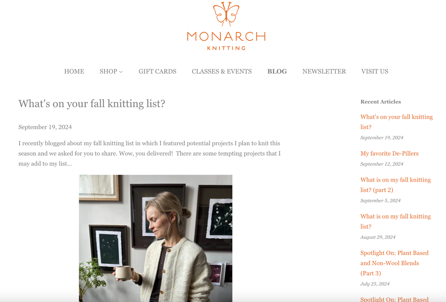
Monarch Knitting
Monarch Knitting sells yarn, kits, needles, and notions, as well as knitting classes and other events. The blog’s minimalist layout and color scheme are tasteful and spacious, with ample empty space around each post.
Visitors see five blog posts per page, enough to whet the appetite without making readers scroll endlessly. A sidebar menu links to recent posts and content categories. Headline writing makes generous use of questions to arouse reader curiosity. Full posts are a balanced mix of short paragraphs and illustrations, and readers are welcome to comment.
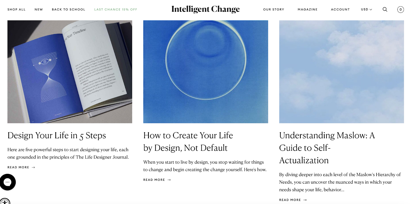
Intelligent Change
Intelligent Change sells journals, productivity tools, games, and stationery to the mindfulness lifestyle community. Article links on the blog homepage are presented in a minimalist design grid, with each cell containing an attractive illustration, headline, text snippet, and “Read more” links. A search bar provides another way to dig into the blog.
On article pages, the social media icons promote sharing of blog content. Story content leans heavily into the mindfulness spirit of the brand, providing wisdom, guidance, and inspiration. The footer contains the CTA asking readers to subscribe to their newsletter of more than 200,000 readers. The blog is being used to harvest a list of potential and existing customers.
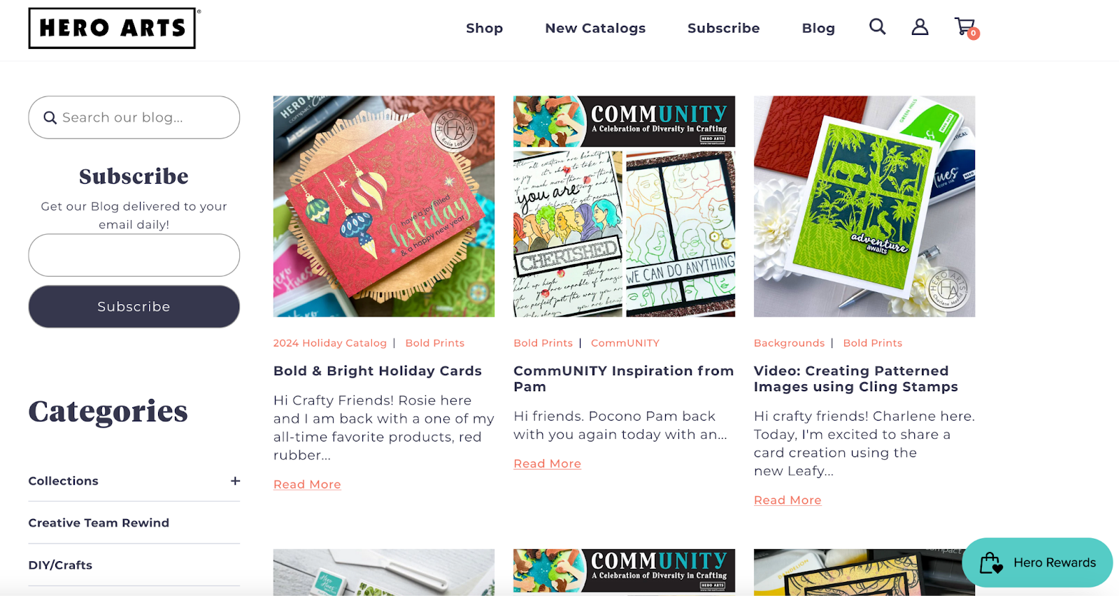
Hero Arts
Hero Arts is a retailer of stamps, dies, stencils, and inks. Their blog, accessible from the homepage navigation bar, presents a great blog layout grid for recent stories, plus a sidebar CTA to subscribe by email. The grid holds splashy imagery to go along with the bold headlines and text snippets.
A breadcrumb menu shows blog categories like Community, Bold Prints, Backgrounds, and Friendship; this gives visitors another pathway into the content besides date of publication. Stories are heavy on imagery and easy-to-digest paragraphs. Social links for X, Facebook, and Pinterest invite readers to share with their followers. Each article is personalized with a signed byline and headshot of the author.
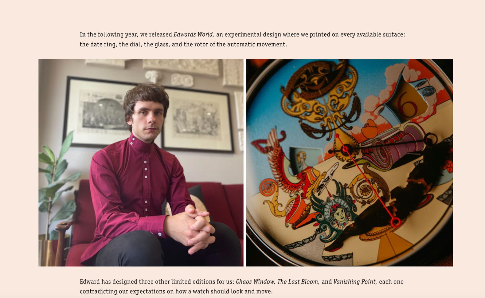
Mr. Jones Watches
Mr. Jones Watches is a London-based seller of distinctively designed watches. Its Design blog is accessed from the navigation bar, in the About menu. The blog homepage leads with a high-quality image of its London storefront near Covent Garden, evoking a stylish sense of place. A thin modern serif font creates a whimsical flair, and the grid format places photos in boxes with rounded corners, which feels friendly.
Many stories feature behind the scenes looks at watch designers and their creative process, ending with an in-text CTA link to share the blog and an invitation to tag the brand. The up-close-and-personal images are a great example of how readers can get to know the artists behind the products, which adds value to the brand.
The Featherweight Shop
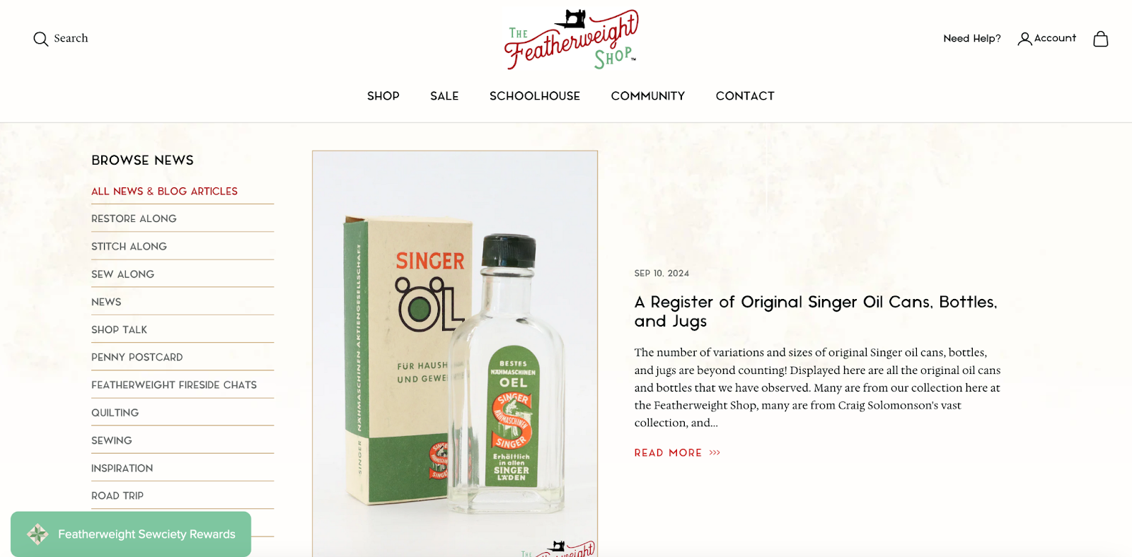
The Featherweight Shop appeals to a vintage nostalgia niche—owners of Singer Featherweight sewing machines and the quilting community. Its blog is nested under the Schoolhouse/Resources submenu, and there are a few ways to navigate the blog content. A simplified image grid displays recent story categories. Clicking through a category leads to subcategories and the blog topics associated with it. Or you can browse all the stories together.
Navigation is made easier thanks to a sidebar menu with categories to browse. A two-column layout displays an image, headline, and deck (the subtitle text) for each story. Appropriately enough, the logo and headline font convey a vintage vibe.
Decathlon
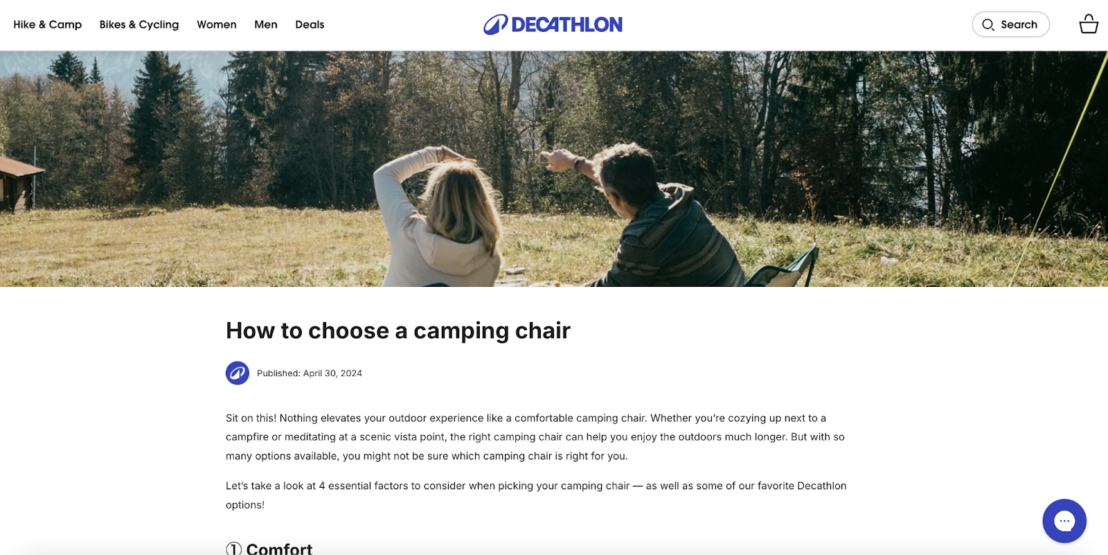
Decathlon sells outdoor gear to hikers, campers, and cyclists. Its blog, accessible from the homepage footer section, has three main categories: Sports Advice, Community, and Inside Decathlon.
The design incorporates bold typography, a clean font, active lifestyle featured images, and concisely written “how to” and “what is” informational stories. Ample white space helps to highlight story content in the middle of the screen.
Unbound Merino
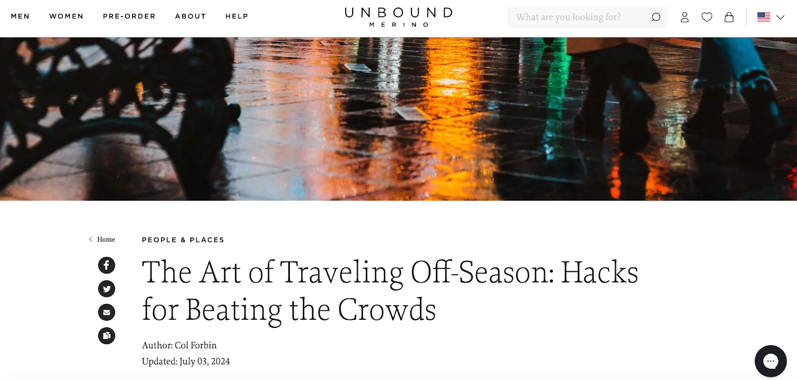
Unbound Merino sells wool clothing made for travel and everyday life. Its blog is consistently aware of the target audience, with plenty of enticing stories about world travel and travel tips. Stunning high resolution photography is the kind of featured image eye candy readers find addictive, and it affords an opportunity to showcase clothing products.
Many of the blog stories are long-form, but the high-quality images segment the text and open up breathing room. The blog footer contains product samples that drive readers toward conversion.
Rancho Gordo
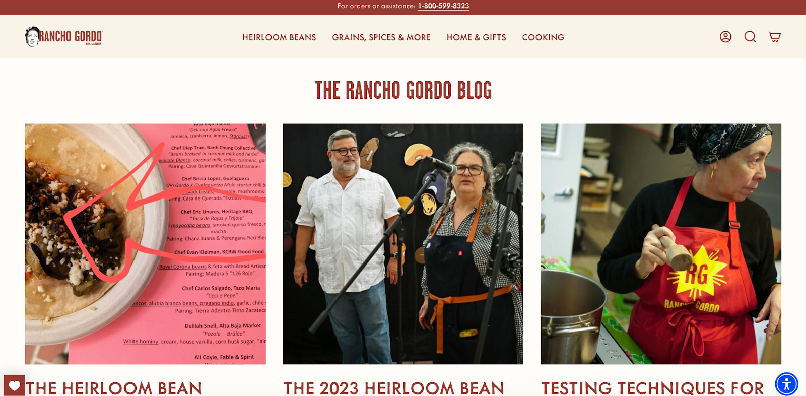
Rancho Gordo sells heirloom beans, grains, chiles, sauces, and spices. A leisurely browse through its blog is likely to trigger your appetite. The photos play center stage here. They embody a celebration of good eating and the people who make it happen. Popular blog posts feature prominently on the blog homepage.
itrees.com
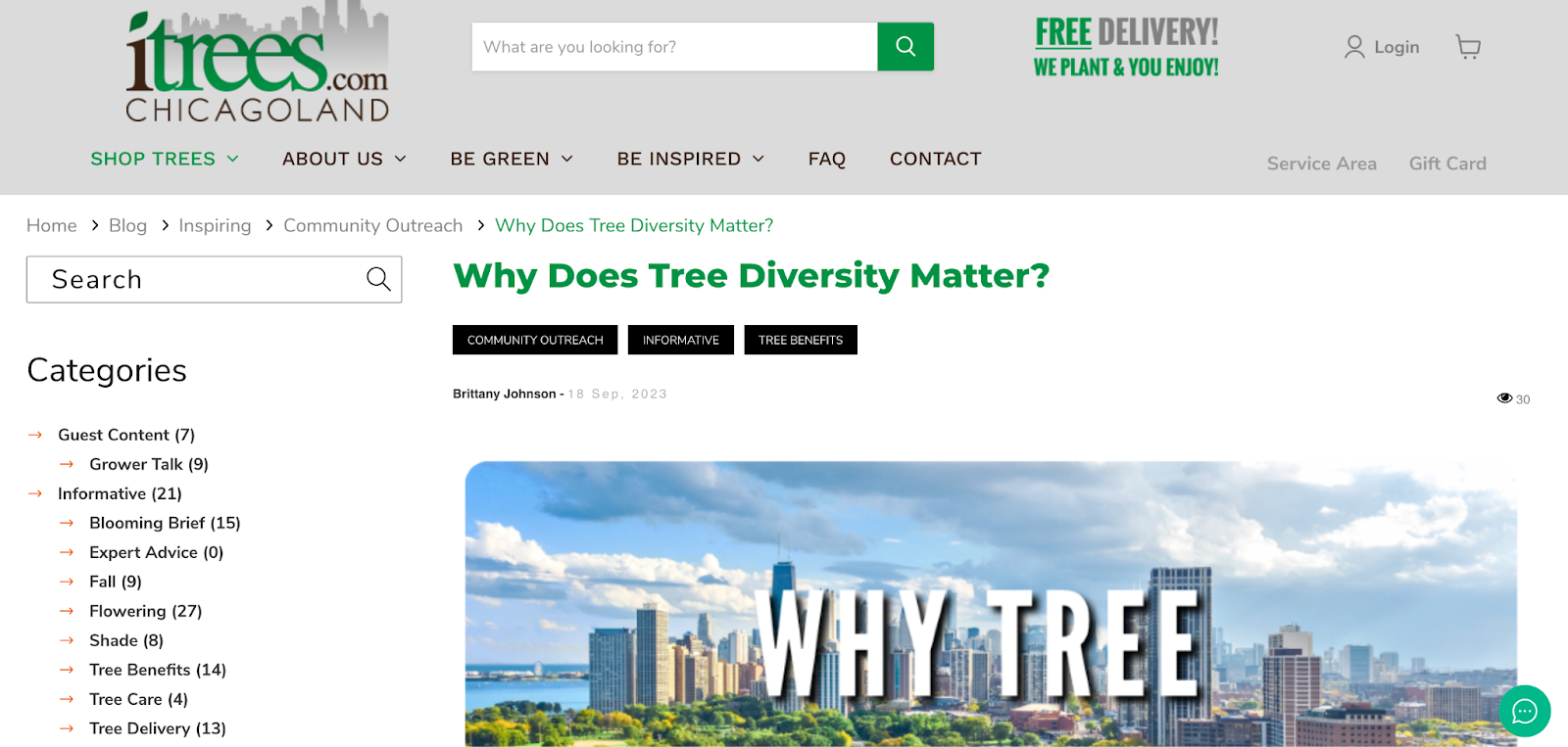
Itrees.com is a family business that offers a simple way for customers in the Chicago area to access locally grown specimen trees, expert advice on tree selection, and installation. Its blog resides under the Be Inspired menu on the homepage navigation bar. Blog navigation is easy thanks to the highly structured sidebar categories.
The article pages themselves show the category label and tags. This is a prime example of how adding more ways to move around and explore can enhance the reader’s experience and sense of discovery.
Blog design FAQ
How do I design my blog?
Understand your brand values and personality and the kind of image you want to project in the blog. Then choose a beautiful blog template layout, consistent color scheme, high quality imagery, and adopt a writing style that pairs well with the brand identity.
What does a blog layout look like?
Blog designs use beautiful blog layout template grids and columns to align text, graphics, and navigation elements consistently in a visually appealing fashion. Use high-quality images to break up long blocks of text. A clean and minimalist layout works better than a cluttered one.
How do I structure my blog?
Most blogs use a simple structure consisting of the blog homepage, individual blog posts, category menus, a sidebar menu, and footer. Each blog post features bold clean headers, short paragraphs, high-resolution visuals, CTAs, and social sharing icons.
If Shopify is of interest and you'd like more information, please do make contact or take a look in more detail here.
Credit: Original article published here.
