Effective online forms kickstart customer interactions—like signing up for a newsletter or completing a purchase. A well-designed form enhances the user experience (UX) and improves conversion rates. But what makes a form truly effective?
In this guide, we’ll explore the key principles of form design, from understanding user needs to optimizing form fields, all while keeping your forms responsive and user-friendly.
Start by understanding the needs of your users
Forms that are built with intention—whether it’s saving time, reducing friction, or providing clear instructions—will be the ones your customers complete.
Latest posts on Tips
So, how do you figure out what your users actually need? Here’s a simple, three-step process to get it right:
1. Look at behavioral data: Dive into your analytics to see where people are dropping off. Are there certain fields that take too long to fill out or seem confusing? Behavioral data will tell you exactly where users hesitate or abandon the form.
Tip for Typeform users: Typeform provides built-in drop-off insights, making it easy to pinpoint where users lose interest or face friction.
2. Gather direct feedback: Send out surveys or follow-up emails asking users why they didn’t complete the form. What did they find unclear or irrelevant? This qualitative data can fill in the gaps that raw numbers can’t explain.
3. Segment your audience: Not all users are the same—someone signing up for a free trial probably needs less info than a customer making a big purchase. Segmentation helps you personalize forms based on user type, keeping the experience relevant and meaningful for everyone.
Follow form design best practices
A clean design helps people focus on what matters without feeling overwhelmed. Here are three form design principles to follow:
-
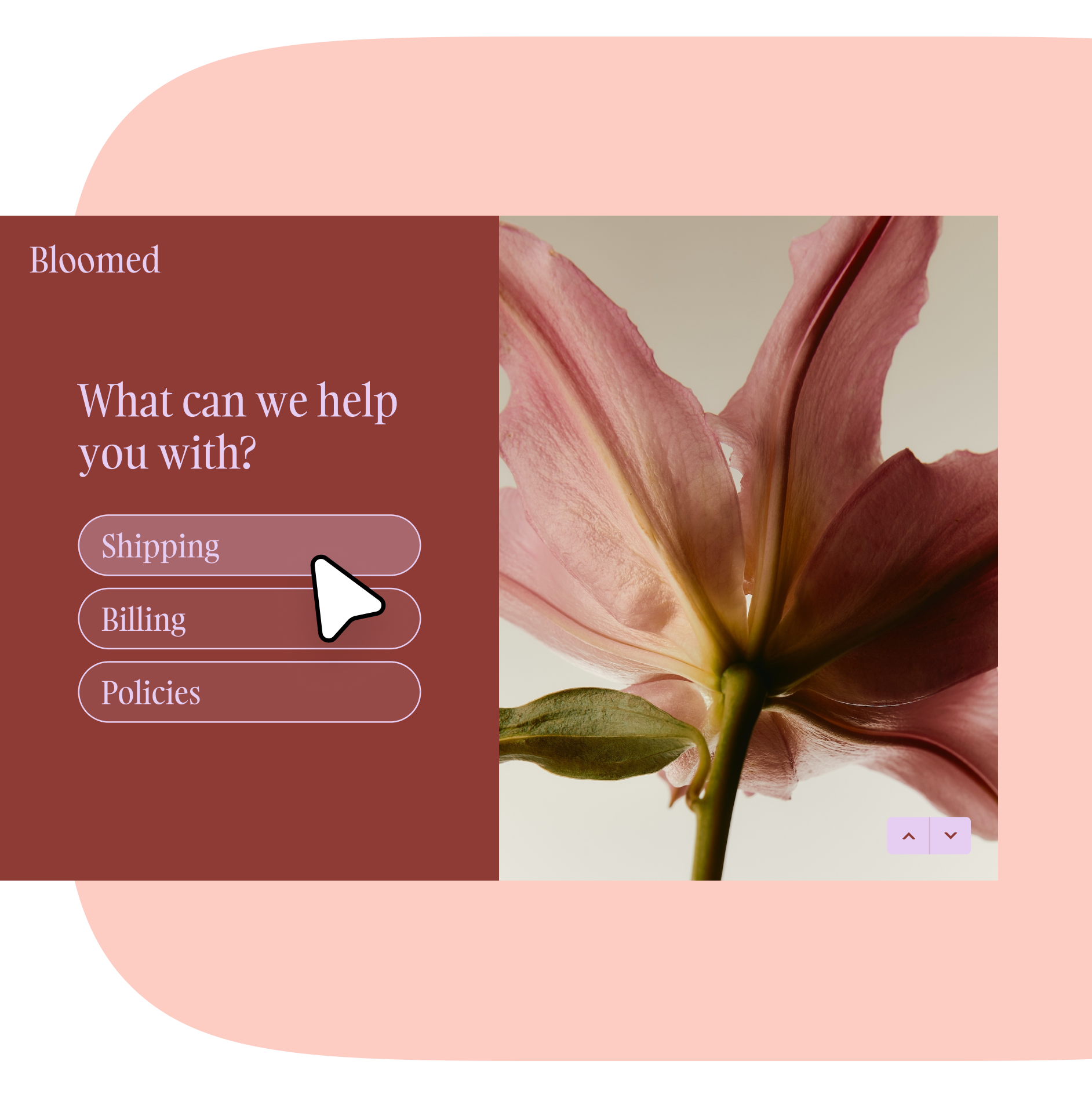
Use a conversational flow: Multiple columns or bundled questions make people jump around and lose focus. A one-question-at-a-time format feels more like a conversation, keeping users engaged and making it easier to follow.
-
Limit the number of fields: According to our data report, forms with fewer than 10 questions see the highest completion rates, with six being the sweet spot. Keep things simple by only asking for the information you really need.
-
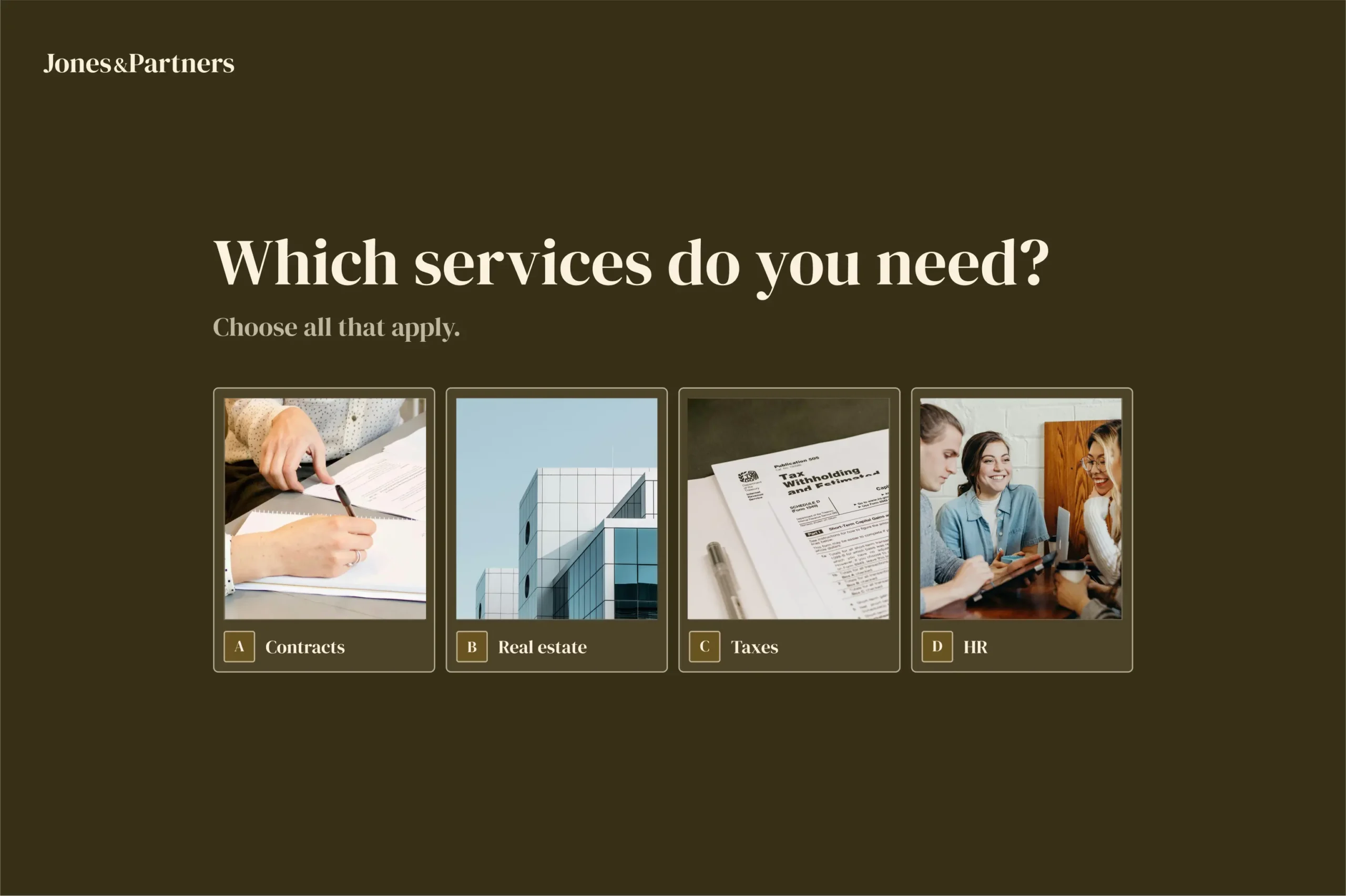
Lead with intent: Label your fields clearly and use helpful microcopy to gently guide users through the process. For example, this Typeform adds, “Select all that apply” to make it clear that users can select multiple options.

Design and user experiences that shine
Good design isn’t just about looking nice—it’s aboutguiding your user’s attention to make their experience easier. Keep these visual design principles in mind as you go:
“It’s very important to take time to think about which colors to use—and how many. Different colors inspire different emotions, so make sure the ones you choose transmit how you want people to feel,” says Veronica Fuerte, founder of creative design studio Hey.
-
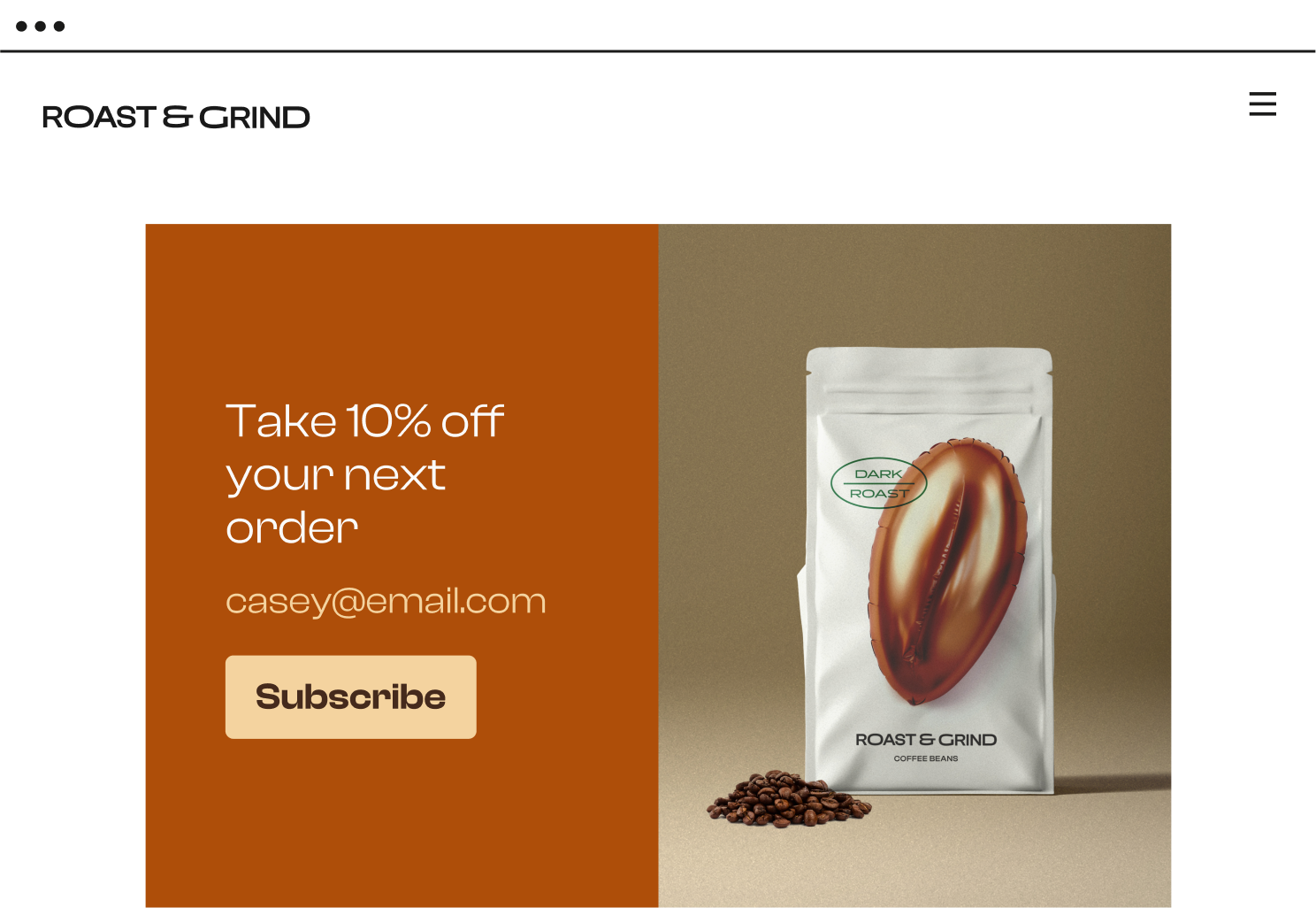
Give your fields room to breathe: Give each element room to stand out. Don’t use a crowded background image, push the fields too close together, or add extensive microcopy.

For example, Grind Coffee’s CTA button stands out because of its contrast to the background and surrounding text.

-
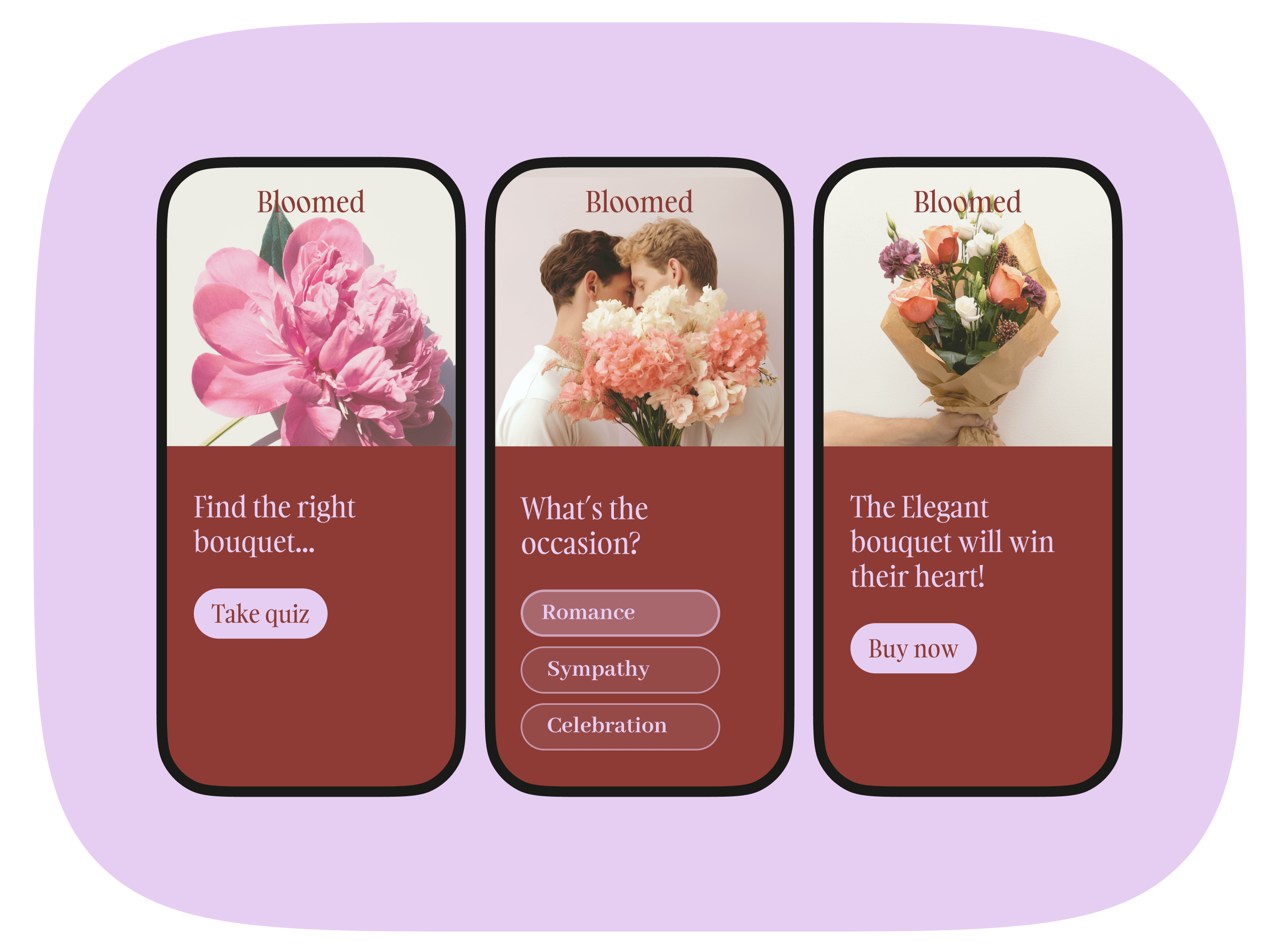
Mobile-first thinking: Your form should be as easy to fill out on a phone as on a desktop. Your users shouldn’t need to scroll to reach form fields. For example, travel planning company Lykke uses an interactive mobile-first form to survey prospective customers.

Be interactive
Form design isn’t just about looks—it’s about how it feels to use. When your form does the heavy lifting, people are more likely to stick with it.
Include user interaction features like:
-
Conditional logic: Tailor the form experience for your customers by showing or hiding fields based on previous answers. Your customers will only see questions that are relevant to them—making the form feel more personalized.
-
Auto-fill and drop-down menus: Simplify things for people by suggesting answers or filling in common details for your customers for example city codes or email domains.
-
Progress indicators: Break down long forms with progress bars that show how far users have come. It turns a multi-step form into easy, bite-sized sections.
What makes a form effective
A great form does more than just collect information—it creates an experience that feels natural and effortless. By focusing on design that’s intuitive and user-friendly, your form can leave a lasting positive impression while boosting completion rates.
