• Skip to primary navigation
  • Skip to main content
software stack logo

Software Stack

Get your Software Stack together

  • Knowledgebase
    • All Categories
    • Accounting Software
    • Automation & Workflow Software
    • Customer Relationship Management
    • E-Commerce Shopfronts & Payments
    • Marketing Automation
    • Online Courses & Membership
    • Project Management
    • Surveys & Forms
    • Web Hosting
  • Home
  • About Us
  • Contact Us
  • Show Search
Hide Search

Workflow & Automation

How to build design systems that empower marketing teams

Software Stack Editor · May 11, 2025 ·

Design systems are the secret weapon smart marketing teams deploy to create consistent, scalable brand experiences while minimizing production time and endless approval bottlenecks that kill campaign momentum.

In today’s fast-paced digital landscape, marketing teams need efficient ways to maintain brand consistency while accelerating output. Enter design systems — the structured framework changing how marketing and design teams collaborate. Whether you’re creating landing pages, social media assets, or email campaigns, a well-implemented design system can transform your marketing operations from chaotic to cohesive.

This comprehensive blog will walk you through everything you need to know about design systems for marketing: what they are, their essential components, and a step-by-step approach to building one. We’ll explore the specific advantages design systems offer marketing teams, from streamlining workflows to ensuring brand consistency across all touchpoints. Finally, we’ll share insights from our experience at Refokus, where we’ve helped marketing teams implement powerful design systems that drive results.

Let’s start by understanding what exactly a design system is and why it’s becoming indispensable for modern marketing teams.

What is a design system?

produck design system
Produck’s Design System sets guidelines for how the brand should manifest itself across all mediums.

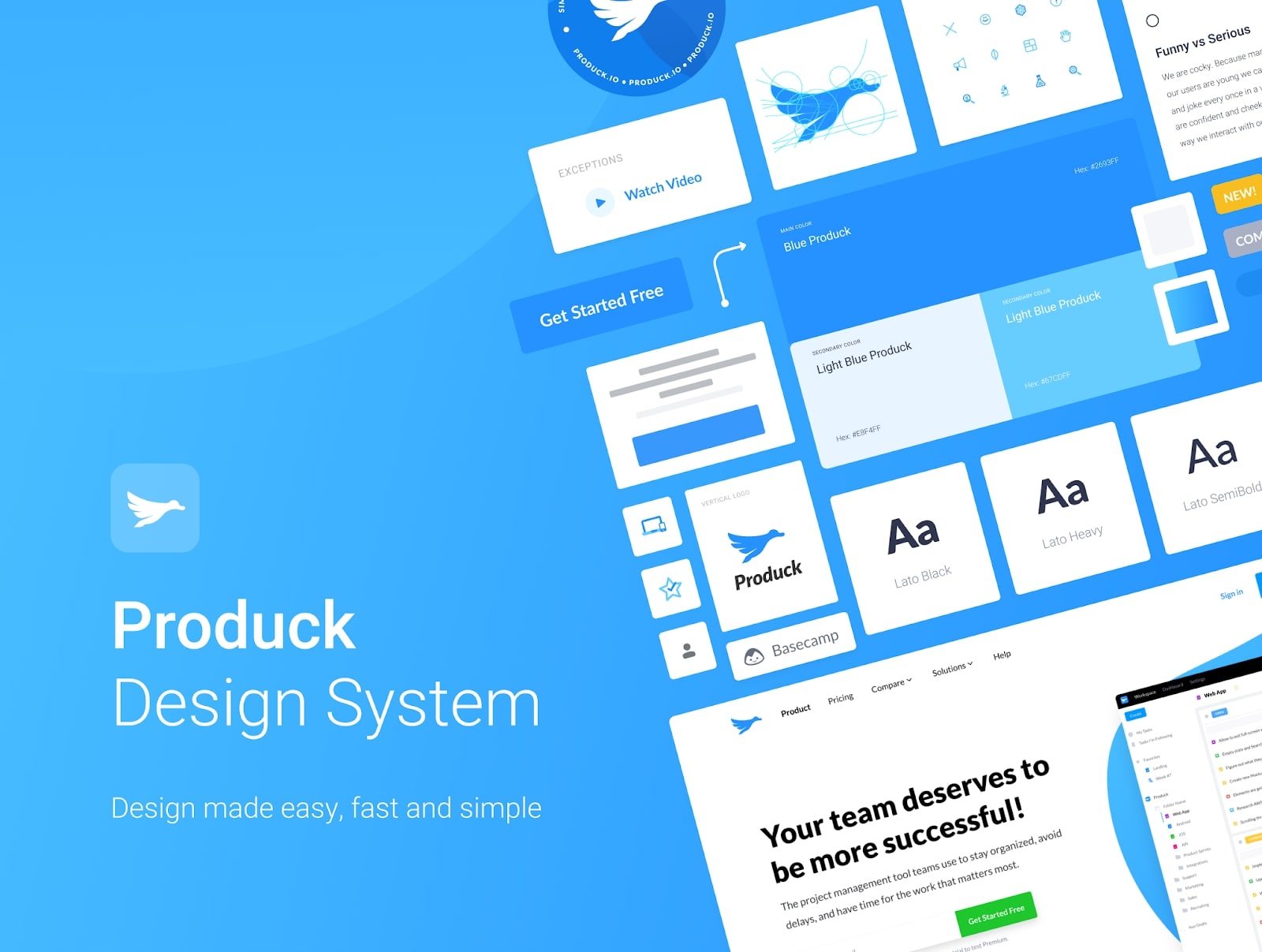
A design system is the single source of truth containing elements that help teams design, conceptualize, and develop products and marketing websites that deliver satisfying and consistent experiences to users.

These elements include (but are not limited to):

  • Brand guidelines
  • Design principles
  • Typography
  • Color
  • Layout
  • Reusable components
  • Webflow implementation guidelines
  • Design implementation guidelines

These elements help teams tie the product or website together into a solution meant to delight and help their target audience.

All in all, a design system does the following:

  • Provides a shared language for designers, developers, AND marketers.
  • Allows designers, developers, AND marketers to reuse images, buttons, code snippets, and styles on the fly.
  • Encourages a modular approach to product and website building

We’re not the first to make this analogy, but a good way to understand how design systems work is to compare them to LEGO building blocks. Like LEGO blocks, a design system provides you with the components to build a greater whole in a way that everyone understands intuitively how it all fits together.

Key components of an effective design system

While design systems can be customized to suit your business’ specific needs, the most powerful ones typically include these essential elements:

  • Design principles: The foundational values and guidelines that inform all design decisions, reflecting your brand’s unique identity and vision. These principles serve as the North Star for designers and marketers alike.
  • Design pattern library: A comprehensive collection of approved, reusable design patterns that solve common visual problems. These patterns — combinations of design elements working together — ensure consistency across all touchpoints while reducing decision fatigue.
  • Component library: The practical building blocks of your digital presence, including buttons, forms, navigation elements, and other UI components. This ready-to-use toolkit allows marketing teams to assemble on-brand assets without reinventing the wheel each time.
  • Design tokens: The fundamental design variables (colors, typography, spacing, etc.) that can be easily implemented across different platforms and technologies. Tokens translate your brand’s visual identity into code-friendly parameters.
  • Process documentation: Clear workflows and methodologies that guide teams through design implementation, ensuring everyone understands how to properly apply the system to new projects.
  • Accessibility standards: Detailed guidelines ensuring all digital experiences remain accessible to users of all abilities, compliant with the Web Content Accessibility Guidelines, and inclusive by design.

When seamlessly integrated, these features create an ecosystem that empowers marketing teams to create consistent, high-quality assets while reducing production time.

How to build a design system step-by-step

Every effective design system requires thoughtful implementation. Here’s a streamlined approach to creating one that will serve your organization’s needs:

  1. Secure stakeholder buy-in: Form a cross-functional team including product managers, marketers, and executives to ensure organization-wide adoption and diverse perspectives.
  2. Audit existing design elements: Catalog all UI components and visual elements currently in use, identifying inconsistencies that need standardization.
  3. Define your design language: Establish core principles that reflect how you want customers to feel when interacting with your brand, along with guidelines for color, typography, and imagery.
  4. Create a pattern library: Develop reusable UI components built on design tokens (foundational visual elements like colors and spacing) that bridge design intent with implementation.
  5. Document usage guidelines: Provide clear instructions on when and how to use design elements, including contribution and maintenance procedures.
  6. Include practical examples: Offer real-world applications that demonstrate the design system in action, giving teams visual references to follow.
  7. Maintain and evolve: Schedule regular audits, gather feedback, and implement updates to keep your design system aligned with evolving brand needs and industry standards.

A well-executed design system isn’t static — it’s an ecosystem that grows with your business while maintaining the consistency that makes your brand recognizable.

Benefits of design systems for marketing teams

While marketers mostly deal with KPIs, brand messaging, and marketing touchpoints, that doesn’t mean they’re not capable of thinking visually. Marketers (or some of them) may have limited knowledge of UI and UX design, but put a good design system in their hands and they’ll be able to build websites like a professional designer in no time.

A design system — if implemented well — will give your return on investment a big boost, especially when put in the hands of multiple marketing teams (as is possible in an enterprise).

Let’s take a deep dive into how design systems can benefit marketing teams.

1. Improved collaboration

Marketers are concerned about brand messaging, KPIs, and marketing strategy, but it can be useful to give them the tools to present their ideas in visual form. Once a design system onboarding is complete, the marketing team can create more detailed and conversion-focused web pages, eliminating a lot of unnecessary back-and-forth that tends to waste everyone’s time.

By implementing a design system that allows your marketing team to create simple websites with ease, designers and developers can focus on creating customs and new components that will add more value than repetitive work ever could.

2. Consistent and better user experiences

Giving marketers a platform to communicate their ideas visually in service to the company’s core goals doesn’t just improve collaboration — it leads to better user experiences.

When you have a centralized system that contains pre-approved components and assets, marketers can create web pages and user interfaces without compromising visual consistency, resulting in solutions that create better experiences.

3. Better efficiency and reduced expenses

A design system contains reusable assets and components that marketers, designers, and developers can use to create web pages on the fly. No one has to create anything from scratch because everything they need is within the design system.

Pretty convenient, right? This means no more resources wasted on duplicate assets. And because everything is consolidated in the system, the company is less likely to incur “design debt,” allowing everyone to complete their respective tasks more efficiently.

Implementing a design system and maintaining it will require resources, sure, but when you have a single source of truth that creates efficiency across the board, the positives far outweigh the negatives.

Even if your internal team lacks the know-how to build websites (or is too busy to learn about it), you can always get help from agencies like Refokus.

4. Ability to create yourself without depending on anyone

You may have the best product, but if you can’t launch your offering before your competitor does, you’re going to get beat almost every time. Remember, in today’s fast-paced, competitive environment, you will lose out on opportunities, customers, and market share if you don’t move fast.

The point? Your marketing team can’t afford to wait for your design team to step in if a similar product is already gaining traction in the market. Why wait around when marketers can design their landing pages themselves?

With a design system in place, your marketing team can capitalize on current trends and get ahead of the pack by launching marketing campaigns without waiting for the design team.

How Refokus creates design systems for marketing teams

An image of the Refokus home page.

At Refokus, we use a tried-and-true methodology to create design systems that empower marketing teams. We adopted this process to make sure that what we’re building is impactful, sustainable, and relevant to our clients’ needs. We also aim to build a design system that marketing teams can easily use.

We split our process into five stages: discovery, strategy, design, Webflow, and workshops.

1. Discovery

We start things off by learning as much as we can about the client’s business — what are their business goals? What are their target audience’s needs? What are their current strategies?

On top of conducting interviews with the client’s marketing team, we also review the client’s current websites to see what can be improved and identify potential issues and gaps that may hurt business outcomes.

2. Strategy

After we have collected and reviewed all the necessary information, we enter the strategy phase. Here we create the visual assets and documentation that will help everyone understand what’s going to be built and how. These include:

Mood board

A design system project offers a great opportunity to improve the client’s design and take it to the next level. But to do that in a way that maintains brand consistency, we create a baseline that will define the brand’s visual language — a mood board.

By taking all the information we’ve gathered during the discovery session, we can create a mood board that accurately represents and conveys our client’s brand personality.

To come up with the best visual ideas, we conduct a brainstorming session with the client to curate the best ideas and categorize them in a way that’s easy to navigate and understand.

Wireframes

We then create wireframes and share them with the client. A wireframe is a sketch of what the design system will look like. This stage is important because it sets the client’s expectations and helps establish a consensus on how to move forward.

This collaboration allows us to create a prototype of the design system and iterate on layout and structural changes before investing in design and development. Next, we work with the client to conceptualize the layout and structure of the design system.

Webflow implementation guidelines

Once we’ve agreed on the design system’s overall structure, we define how everything is going to be built in Webflow. We do this by defining class nomenclatures, organizing atoms and components, and setting up templates and examples. We also provide thorough documentation to streamline implementation.

3. Design

The design phase is where we define the front-end look and feel of the design system, creating the components’ user interface and giving each detail a final polish. We do this by creating a style guide in Figma and sharing it with our client’s team to foster collaboration.

With a style guide in place, we can keep growing and refining the design system in Figma before jumping into Webflow. By this time, not only do we have reusable components for building new websites in Figma, but we’re also given the means to create new components in the future.

UI design

We create the visual design for all pages and components, adding iconography, illustrations, and animated graphics to provide users with a great overall user experience.

Handoff for development

By this time, all technical specifications are clear, the detailed design is fully approved, and all outstanding questions are resolved. Once these conditions are met, the development team can start with Webflow implementation.
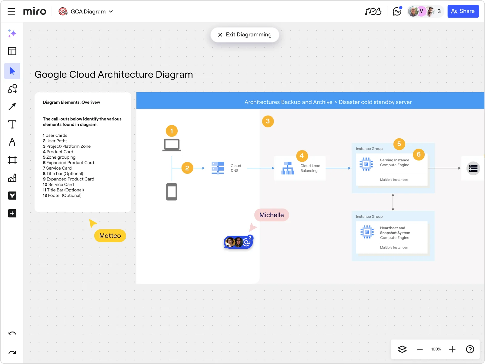
4. Webflow

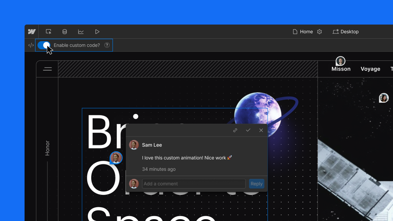
We believe in building quality products with solid foundations, which is why we care deeply about standards and processes. While we’re always open to trying out the newest shiny tool, Webflow has been the only constant in our tech stack repertoire since 2013! In fact, every marketing website we’ve made over the last seven years has been built in Webflow.

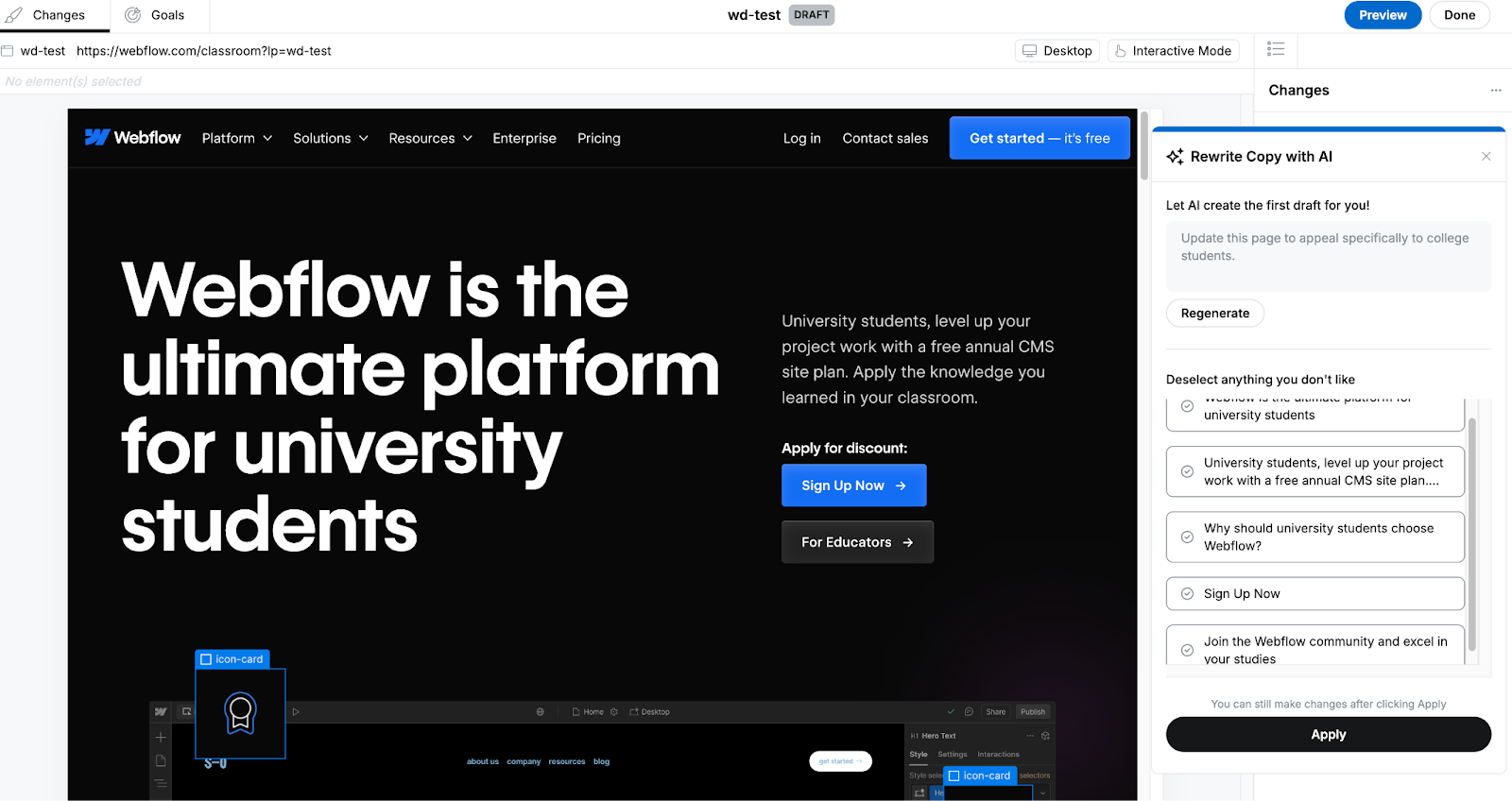
Webflow is the perfect tool for building design systems, and with the recent release of content overrides for symbols, we can create design systems that help marketing teams build faster without compromising or diluting their brand’s visual identity or core values.
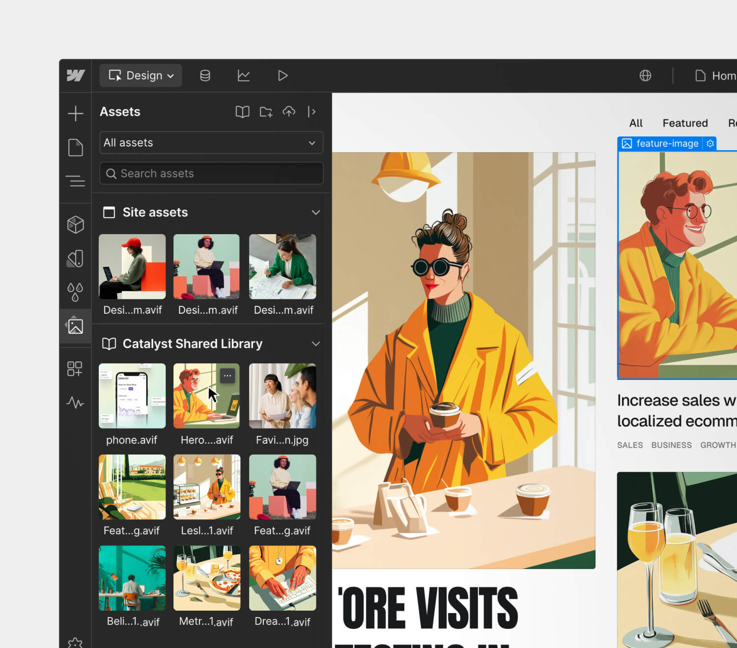
Webflow symbols

Previously, we could reuse symbols across pages, but they had to have the exact same content. Now, we can add symbols, create bindable fields to each content node (text, rich text, image, links), and add content overrides on each instance. This improves usability signifcantly as we can create a card component with a heading, an image, and a text block and reuse it across pages with different text and media.

We can now use Webflow to implement every designed component into reusable symbols, streamlining the process for marketing teams. All they need to do to create websites and update the content is to drag and drop the reusable symbols we’ve created into the canvas and edit the content. Too easy!

Haufe Coaching offers quick and easy access to top business coaches for key leaders and experts on their new website which we are building with using Webflow’s New Symbols. Here’s an example in action:

[embedded content]

‍

We build design systems to help marketing teams build websites faster, as well as to help them execute their marketing ideas on the web pages they’re creating. To achieve this, we make sure that the symbols we create have the following two key characteristics:

  • Flexibility: We create symbols that work for different use cases. This way, the design system is stripped down to its essential components, making it easier for teams to browse through them.
  • Standardization: One key benefit of a design system is that it allows teams to build with the same atoms and components. By standardizing the use of fonts, colors, buttons, and iconography, your team can speak the same language, eliminating guesswork and ambiguity in their decision-making and processes. This, of course, boosts productivity, efficiency, and work satisfaction.

Templates

Having a design system is great, but those who don’t have a design background can feel stuck the moment they face the blank page. To give them a good starting point, we review the most used components and combinations and then create a set of template pages out of them. Once these templates are up in the design system, marketing teams can create simple landing pages faster and with ease.

SEO and page speed

By defining the symbols in advance, we allow ourselves more room to optimize and refine their performance. But we also do so in ways that fit SEO best practices to make it easy for our clients to build web pages that will rank high in search engine results.

5. Workshops

A robust design system can boost your ROI, but that alone is not enough to turn a client’s organization around. We don’t simply hand over a design system and let the client run with it without proper training and guidance — we conduct Webflow Workshops instead.

On top of educating our clients on how to use their custom-made design system, we also help them reestablish their design philosophy so everyone can tailor their processes accordingly. These workshops are instrumental in helping marketing teams get the most out of Webflow’s component library. Moreover, these sessions provide them with the knowledge needed to maximize the limitless possibilities offered by digital products like Webflow and Refokus.

What’s next?

To truly empower your marketing team, provide them with the functionality and usability of a design system. Don’t just leave them to draw on whiteboards all the time. Because believe me, if you give them a design system that is tailored to their needs and provide them with the training to help them maximize its benefits, they will accomplish great things. And that will only help elevate your brand and smash your ROI goals.

Why you should attend Webflow Conf 2025

Software Stack Editor · May 9, 2025 ·

image

Webflow Conf isn’t just another industry event.

I know, I know — your calendar is probably bursting at the seams, and I have to craft my best pitch to convince you to carve out a special hold just for us. But the truth is, some events truly do stand out from the rest and are worth putting a “Do not disturb” block on your calendar for. They’re the ones where you’re able to leave with more insights and learnings than just what you can read in a recap blog post or a handful of tweets. Instead, you walk away feeling invigorated, inspired, and with new ideas that actually stick. They’re also the ones that foster a sense of real community, facilitating real-time or future opportunities for genuine connection with fellow attendees.

Webflow Conf checks these boxes and more, but rather than taking my word for it, I sat down with two members of our community — Florian Bodelot and Alexander Diner — who have attended the event in years past to share a bit about their unique experiences as attendees, how the event has influenced how they build websites and collaborate with teammates and customers, and what they are most excited for at this year’s conference.

Can you share a little bit about yourself — your background, a bit about your career journey, and how long you’ve been a member of the Webflow community?

Florian: I’m the cofounder of Digidop, an award-winning Webflow agency with a business-first approach.

We launched Digidop when I was 24, during my last year of business school. We mainly learned everything related to the web — from design to development — online, supported by Webflow University and the Webflow community.

Alexander: I’m a formally trained designer who started designing websites and taught myself custom code while I was in design school. I worked in small startups, had my own small studio building WordPress sites, and hopped around between in-house and freelance gigs for a bit before starting my brand consultancy, Shapemaker, in 2017. 

That’s when a friend of mine introduced me to Webflow. I was cautious at first, but I gave it a try on a project for a client and it blew my mind, quickly becoming a favorite tool of mine. We became one of the earliest partners in the Partner Program, and worked our way up to an Enterprise Partner. I eventually went on to work for one of my clients, who is a Webflow Enterprise customer before joining Webflow’s Creative team this year.

In your own personal experience, what does it mean to be part of the Webflow community?

Florian: It means a lot to me — and to our entire team here at Digidrop — because we’re basically “born” from this community. We’ve built a profitable agency of 10+ full-time people, and that would not have been possible without learning from the Webflow community.

Alexander: I found Webflow at a point in my career when I really needed it because it enabled me to ship great experiences for my clients at a faster rate, putting me on a path toward greater profitability. And because Webflow really leaned into empowering creators in those early days of low-code code and no-code by building resources like Webflow University, the community just formed organically. Today, there are so many folks with similar stories like me — people who have built companies on the back of Webflow — who I know well and am able to still learn from and connect with regularly.

As an attendee of past Webflow Confs, what has been the most impactful part about participating in the event and any associated programming?

‍Alexander: Last year, as someone who was now leading a team in-house, I really went into the event with the mindset of wanting to sharpen my marketing skillset. I leaned into the unique learning opportunities for marketing teams and discovered innovative website strategies from companies doing cutting-edge work using experimentation and AI. This helped me feel more empowered in my new role as a leader, and I was also able to learn more from a technical perspective simultaneously, too.

How is Webflow Conf different from other industry events you’ve attended?

Florian: The energy at Webflow Conf just feels different. That, along with the people you are able to connect with, makes it the one industry event every year that has the most direct positive impact on our business. It always presents great learning opportunities and you feel inspired by its conclusion, which is why I always recommend it to fellow community members.

Additionally, some of my favorite memories with my team have been forged at Webflow Conf, like when we became the first French Webflow agency to win a Webflow Award (which we vlogged when some of us traveled to San Francisco in 2023). These moments are really special and are ones I’ll remember for years to come.

Were there any particular content sessions from last year’s Webflow Conf that really stand out?

‍Alexander: There were so many sessions last year that I still think about. Carla at Docusign’s session with BASIC/DEPT® about building their brand site has been a huge source of inspiration for me, especially as I’ve stepped into this new role here at Webflow and work on big projects that we’ve brought agency partners in for. The team from Greenhouse’s session about experimentation was another one I really enjoyed, especially since I was working on a team that was an early adopter of Webflow Optimize. 

Chuck Gahun from Forrester’s talk about CMS’s also stands out. Being able to hear an analyst discuss how Webflow fits into the future of the CMS landscape was fascinating, especially as someone was working for a company that was both a Webflow customer and also interacted frequently with their own industry analysts. 

Do you have any tips or strategies for first-time virtual attendees or new members of the Webflow community?

Florian: Show up! Attend as many sessions as you can, actively pay attention, and try to attend any local events organized by community members to connect with people in close proximity to you even if you’re attending the programming virtually (I recommend engaging with community members on X to follow what’s happening). Most importantly, appreciate it and have fun — it goes by fast!

Alexander: I’ve found this community to be so open and welcoming — my advice is to be open to forming connections with people. This presents both an opportunity to learn from people, and help people learn. This is a mindset that has been incredibly rewarding and has helped me advance my career.

What are you looking forward to the most during this year’s event?

Florian: I’m really excited to reconnect with fellow Webflow community members! It’s always great to have these opportunities to learn, share, and meet new people. I’m also looking forward to seeing where Webflow is investing in new features and getting a preview of their latest product vision.

Alexander: I’m excited to see the event come to life because now I’m on the other side! My team is responsible for much of the physical and digital experience at Webflow Conf, and I’m looking forward to seeing how we are able to mature the way we connect with our audience. 

I’ve also gotten a sneak peek of the agenda and can’t wait to hear some incredible speakers dig into topics like hyper-personalization and what the future of the web looks like in the age of AI. And honestly, I just love Webflow Conf — the speakers, the learning, the energy, so I’m just excited for the whole event.

Register for Webflow Conf today!

Webflow Conf 2025 is a can’t-miss gathering of the visionaries and changemakers shaping the future of the web in the age of AI — from designers and devs to marketers and execs. Taking place September 17th and 18th, attendees can join our online event from anywhere in the world, for free. 

Don’t wait — register today to save your spot, and stay up-to-date on key announcements like agenda launches, Webflow Awards, and more! 

How we built Tables & Timelines

Software Stack Editor · May 8, 2025 ·

At Miro, we’re constantly releasing new features to help customers get from idea to outcome faster. But while we like to think we’re pretty good at explaining what they are and how to use them, we don’t spend a lot of time talking about why we choose to build certain things, and how our own teams actually use Miro to make that happen.

Until now. We’re taking you behind the canvas to meet the people who actually make Miro, starting with the product and engineering managers behind the Tables & Timelines format.

Tables & Timelines make it easy for teams to turn their creative ideas into structured tasks, so they can move from brainstorming to project planning and delivery without having to switch apps. We first announced these new capabilities at Canvas 24, but of course the work started well before then – as the team explains.

Identifying pain points with Miro Insights

“First and foremost, we try to understand what user problem we’re solving,” says Laurens Kersbergen, one of two Product Managers on Tables & Timelines alongside Vanessa Lee. The PM role is critical – think of them as the quarterback scanning the field and calling the plays to the engineers, designers, and researchers that make up the rest of the team. 

So why did Miro decide to prioritize Tables & Timelines over the hundred other things the team could have done instead? Laurens admits these decisions can be “more art than science”, but like all the best ideas, this one started with an observation about customer behavior. “We knew that a lot of customers were moving their data out of Miro as they wanted to structure it after brainstorming and ideation,” says Laurens. “But we also knew from user research that they didn’t like that experience so much because it was very rigid and they had to constantly switch tools.”

“We knew that a lot of customers were moving their data out of Miro as they wanted to structure it after brainstorming and ideation. But we also knew that they didn’t like that experience because it was very rigid and they had to constantly switch tools.” Laurens Kersbergen, Product Manager

The idea for Tables & Timelines began to take shape. But when it came to deciding exactly what to build, the team needed more data. So they turned to Miro Insights. “This nicely aggregates our data sources, like Gong calls as well as some other external platforms that we integrate with,” explains Laurens. This gave an initial picture of what customers were looking for, information that the PMs could then triangulate against other inputs like the direction of the market, company strategy, available resources, and competitor differentiation.

The result, says Vanessa Lee, was that the team decided not to try and build something that was so heavily specced it could replace more established tools. Instead, they set out to leverage the strengths of the canvas. “We’re thinking, ‘How can we reduce this manual effort? How can we package these amazing ideas that people have on Miro in a way that’s digestible, shareable, and more structured as well. Maybe we can be the platform that helps them transition their ideas into something concrete.”

With the discovery phase complete, the next step was to define and build a solution. Enter Alex Martishin, an Engineering Manager who led a small team tasked with developing something that appealed to 90m potential users. So no pressure, then.

As the EM, Alex was responsible for communicating with stakeholders, deciding when to show the product to users, and ultimately making sure the project hit its milestones. There was also the small matter of motivating the team (which, contrary to popular stereotypes, requires more than just an infinite supply of excellent coffee. “Engineers are people, too,” says Alex).

Alex’s approach to all this is to visualize the project as three points on a triangle. “You have the scope, the resourcing, and the time,” he explains. If you care about the scope, then maybe you have to be more relaxed on the time frame. If you want to hit a specific deadline, then maybe the scope slips. And both of these are dependent on how many people you actually have to hammer out lines of code.

“Then we understand, ‘Okay, for this initiative we need this amount of people to work for this amount of time.’ We estimate the confidence we have if we’ll be able to make it by that time with this amount of people, and then we just plan the work.”

Staying on track with synced copies and integrations

Of course, there were challenges along the way. Some of them were technical, for instance Alex’s team had to teach Miro to recognize these new objects – tables and timelines – and synchronize updates between server clients. They also had to build a new rendering engine to handle more complex widgets. 

But perhaps surprisingly, the biggest challenge wasn’t technical at all. According to Alex: “It was just organizing the work because there were more than 20 teams involved in building this solution. So holding everybody accountable if something went wrong, making sure that they have proper channels where they can tell us that something is going wrong, and at the same for us to tell them something is not going according to plan… That was the biggest challenge.”

Fortunately, the team had a secret weapon. As Tables & Timelines took shape, the team actually building it immediately became customer zero. “I think it’s very funny when people ask me, ‘Do you even use it?’ says Vanessa Lee. “I use it all the time. We’re tracking all our initiatives and projects on it across engineering, product, and design.”

 “I think it’s very funny when people ask me, ‘Do you even use Tables?’ I use it all the time. We’re tracking all our initiatives and projects on it.” Vanessa Lee, Product Manager

Laurens agrees: “We’re using the table itself to prioritize the features we need to build. So we have a backlog which has multiple views per quarter and per focus area. This is our single source of truth for all of the ideas we have in mind. In practice, it means that if I’m seeing something new popping up – let’s say in Miro Insights where some new request has been mentioned multiple times in Gong calls with our customers – then I would dive into that to understand it, and I would then add it to our backlog and reprioritize whatever we already had there.

It sounds simple in theory, but what happens if that backlog has been shared on a bunch of different Miro boards? Does that mean the PMs have to waste time tracking down and updating every single instance? No, thanks to Vanessa’s favourite feature: Syncing between views.

“We have this ability to sync between tables and timelines across boards,” she explains. “That saves us a lot of time in terms of manual effort. We just update it once and if everything’s programmed right, it updates everywhere else. Then we have this kind of magical ability to switch it into a timeline and see everything on a timebounded axis.”

The PM team also makes liberal use of the Jira integration to visualize tasks and run daily stand ups. In fact, according to Laurens, “We’re not logging in Jira anymore. We now have this information on our Miro board in a table so during our planning sessions or as we do our standups we have all of the context in one place. This is a lot faster than going into Jira, losing the context, and then when we revisit a discussion we don’t remember what decisions we made and everything is scattered.”

Unlocking deeper use cases for customers

If the Tables & Timelines team have been able to move faster because of their own handiwork, what about Miro customers? “We had this goal that customers would use tables and timeline in these deeper use cases,” says Vanessa. “And actually in a recent user interview we saw someone doing it in the way we imagined – with multiple tables synced to track their big projects. So it’s really cool to see some users already going that direction.”

It’s not just this one customer – over half a million tables have been created since the product was launched just a few months ago. But Alex thinks that people are only just beginning to understand the potential. “It’s only recently been possible to create a sync view when you copy and paste. In a lot of user interviews people are pleasantly surprised that we have this capability. They’re like, ‘It was so cool to be able to sync it,’ but because they didn’t try to copy and paste it they just didn’t find that there is this capability. We’ll definitely be working on making that more discoverable.”

Laurens agrees: “I’m proud of the potential of Tables & Timelines,” he says. “It’s so horizontal and there’s so many things it can do, which means it can play a huge role in where Miro is going next. I’m really proud to contribute to that.”

8 top font pairing examples for eye-catching web design

Software Stack Editor · May 8, 2025 ·

A great font pairing can make all the difference in establishing your website’s unique style.

The best font pairings use varying sizes and styles to complement web layout. By carefully selecting the right pairings, designers make their websites easier to navigate and more compelling to read. 

Because there are so many typefaces and font families to consider, creating a clear visual style can be difficult. This guide will provide eight great font pairing examples and explain everything you need to know when selecting your own font combinations.

Typefaces to consider when coming up with font combinations

The first thing you’ll need to do when pairing fonts is to choose the typefaces you want to use. Typefaces are categories that describe some basic elements most fonts share, such as the following:

Serifs

A serif font includes embellishments on each letter that make them resemble cursive, handwriting, or script. These details add a touch of flair to your text. They work best for website designs that use a lot of detail and styling. 

Sans serifs

As the name implies, sans-serif fonts don’t have any embellishments on their letters. They’re usually plain and generously spaced. That makes them great fonts for legibility, so you’ll usually find them on text-heavy websites like blogs.

Display fonts

Display fonts can be either serif or sans serif. Designers use them as a primary typeface for large headings and titles. 

When selecting a display font, consider how well it contrasts with the other fonts you use and ensure it suits your brand’s overall style. For example, an elegant font like Josefin Sans might not work well for a brand that prioritizes edgy, bold designs.

Monospaced typefaces

Monospaced typefaces are usually sans-serif fonts in which every letter takes up precisely the same amount of space. Roboto Mono is a popular example, and designers typically reserve it for code snippets or quotes that need to stand out from the surrounding text.

8 font pairing examples

Here are eight examples of the best font pairings for legibility and style. Use them as-is in your next web design, or consider how you might mix them up to create new font combinations.

1. Roboto and Open Sans

Sample text where the heading uses Roboto, and the body text uses Open Sans.

This font combination appears in everything from white papers to websites. It may be standard, but it’s very readable, approachable, and clean. Roboto has several weight options that can be adjusted for different heading sizes, and Open Sans is the epitome of legibility. This plain but useful combination makes a great font pairing for technical documentation, knowledge bases, or support FAQs.

2. Montserrat and EB Garamond

Montserrat is a neatly spaced sans-serif font. This semi-bold version contrasts with the elegant linework of EB Garamond, which has a classic typewriter appeal. The headings in this font combination are especially easy to pick out, making it great for news articles that readers might want to scan through.

3. Alfa Slab and Source Code Pro

Use this font combination if you really want to break away from the norm. The Alfa Slab font is bold, serifed, and heavy, while Source Code Pro is light and spacious. This monospaced version of Source Sans Pro is useful for code examples, quotes, and long text blocks like the above excerpt. It’s a great font for scripts, too, and when you pair it with a slab font like Alfa Slab, you have a stark contrast that’s pleasing to the eye.

4. Abril Fatface and Bad Script

This all-serif font pairing combines the classic appeal of old-school typography with the handwritten look of script fonts. It’s a great font pairing for printed products like wedding invitations or playbills. The bold, slab appearance of Abril Fatface clearly marks all your headlines, while the scrawled handwriting of the Bad Script font provides a unique look.

5. Playfair Display and Montserrat

Playfair Display is an elegant, modern font that resembles newspaper typography. The medium-weight version adds enough bolding to make the headings distinct from the body text without losing its sharp serifs. Playfair delivers a bold, modern statement when paired with the spacious and consistent Montserrat.

6. Josefin Sans and Lato

Sample text where the heading uses Josefin Sans, and the body text uses Lato.

Josefin Sans resembles handwriting, and this sans-serif version is the best font for landing pages or homepages where you want the text to appear inviting. If you follow it up with the equally inviting and readable Lato, you get a consistent text block with just enough subtle contrast to draw attention.

7. Open Sans and Lato

Pairing two sans-serif fonts is a great choice that prioritizes readability, or for sites that use a minimalist design style. Open Sans is familiar to most readers, and when paired with the tight spacing of the Lato font, you get strong headings followed by body text that maximizes use of the page. 

8. Source Code Pro and Space Grotesk

If you’d rather put a monospaced font in your headings, try pairing Source Code Pro with Space Grotesk, a generously spaced sans-serif font that’s easy to read. This font pairing works perfectly for tech and science blogs where a monospaced font will be familiar to the audience, while the body text is ideal for long, highly detailed papers and case studies.

Tips for combining fonts in your web design

Consider the following ideas if you’d rather make your own combinations:

Use fonts that have different tones

Every font adds its own personality to the text, and you should select ones that enhance the tone you’re trying to achieve. For example, cursive script fonts like Lucida are great for conveying elegance on a wedding planner’s website, while slab fonts like Alfa Slab are usually better for a disruptive tech brand. 

Create the right amount of contrast with typeface pairs

Your main objective is to keep body text legible and headlines eye-catching, but that doesn’t mean any combination that achieves those goals is the right choice. You don’t have to stay in the same font family or even typeface category, but you should look for commonalities like stroke weights, spacing, and style that make different fonts compatible.

Limit different typefaces to three or fewer

As with color palettes and page layouts, you should stick to a small selection of fonts on your site. Too much variation throughout your page increases the cognitive load required to interpret it, which could cause frustration that leads readers to bounce out of your website. 

Communicate visual hierarchy through font pairing

Your font pairings should clearly distinguish between titles, headings, and body text. If you keep those differences consistent, readers will naturally learn how to navigate through your website. Here are a few ways to achieve this effect:

  • Use font size to imply order. Scale your font size down as you move from titles to headings to body text. Somewhere between a 20–30% reduction for each step is usually best, such as 20pt, 16pt, and 12pt. 
  • Experiment with different weights. Different weights, such as medium and semi-bold, provide noticeable visual cues for readers. Lean into that behavior by using bold weights for headlines and titles and medium or normal weights for body text.
  • Vary font color shades. Your body text should usually be flat black to make it readable, but you can play around with the shades of your heading fonts. For instance, you could increase the saturation of the font color as the headings get bigger to create an obvious visual hierarchy.

Use a font generator

Try font pairing tools to browse hundreds of unique fonts. Notice which ones catch your eye immediately, and then try different font combinations to determine which ones you like most.

Transform your web designs with perfect font pairings

The perfect font combination can make all the difference in website design. Whether you want to leverage the familiar simplicity of Roboto and Open Sans or the elegant readability of Playfair Display and Montserrat, you’ll need a keen eye for detail and a platform that encourages experimentation. 

Start by experimenting in Webflow, testing font pairings side by side on a visual design canvas. Once you’ve locked in the pairing that best fits your brand, use components and global styles to apply them consistently across your entire site — no need to manually update every text class.

The ultimate pre-launch checklist for your website: 6 essentials

Software Stack Editor · May 7, 2025 ·

After pouring time and energy into developing a website, you’re likely keen to see it go live — but complete a final review first.

You owe it to yourself to check (and double-check) your site to prevent complicated fixes down the road.

Don’t know where to start? We’ve compiled a six-part website launch checklist to help developers like you cover the key details of a stunning website ready for publishing.

Planning your website checklist

Before diving into design and development, establish a solid foundation for your website with these essential planning steps. A thoughtful strategy at the beginning prevents headaches later and ensures your site will effectively serve its purpose.

Clarify goals and audience

Define your website’s objectives and identify your primary audience to guide the entire development process.

Choose domain and hosting

Decide on a memorable domain name and reliable hosting service during the initial planning phase.

1. Design and build

It’s all too easy to miss (or break) something during design iterations and feedback sessions with clients. Here’s a design checklist to ensure everything’s in order before launching:

  • Spacing: Is spacing consistent across the site? Do all elements have enough breathing room?
  • Colors: Is there a consistent, harmonious color palette? Do you have clearly defined brand colors?
  • Shadows: If you used drop shadows, is the light source consistent across each one? Do they have the same blur, opacity, and spread values?
  • Typography: Is the font stack logical and consistent? If fonts are italic or bold, is it obvious why? Are heading sizes consistent? Is all text readable and web safe?
  • Imagery: Do any images look blurry or pixelated? Are any images broken or a drastically different file size? Do all non-decorative images have alt-text?
  • Logo: It’s an image, but it’s so important it warrants its own step. Is  the latest and most up-to-date version used throughout the site? Does it appear crisp and sharp (not blurry or pixelated)?

Consider implementing a design system to maintain consistency across your site. A well-documented design system serves as a single source of truth for your design elements, component styles, and usage guidelines — making it easier to ensure visual coherence and streamline future updates.

Cross-browser and cross-device checks

Beyond those initial visual checks, verify your site delivers consistent experiences and functionality across all browsing environments.

Each browser (Chrome, Firefox, Safari, Opera, Edge) interprets and renders designs with subtle differences, making thorough cross-browser testing non-negotiable. Testing on just your preferred browser or two leaves you vulnerable to display issues that could frustrate users and damage credibility.

When testing across browsers, pay special attention to:

  • Layout integrity
  • Font rendering
  • Color accuracy and gradient smoothness
  • Image display quality
  • Logo clarity and positioning

Your site needs to flex and adapt to countless screen dimensions through thoughtful responsive web design. Navigation becomes particularly critical here — visitors should flow naturally between pages, finding information without friction or confusion.

After you’re confident in your development environment, run real-world tests across desktop, smartphone, and tablet to confirm the experience remains cohesive and functional across the device spectrum.

Image optimization

Images and graphics enhance user experience, improve SEO, and affect a site’s loading times.

Mobile devices now have ultra-high-definition displays with high refresh rates, so having high-quality graphics is crucial. Grainy images look unprofessional.

Upload graphics at twice the size they display on your site. If your site is equipped to optimize images — like sites created on Webflow — you can resize and compress images for lower-resolution devices while maintaining larger files for high-resolution devices. This approach maintains high-quality imagery plus support with slower devices or internet speeds.

Check out our responsive images and read our article on site performance to learn more about the impact of image optimization.

2. Edit content

Quality content engages visitors and encourages conversions. Visitors are also more likely to share content if they find it valuable.

Content testing typically involves combing through all content on the site to ensure it’s accurate, free of typos, and up-to-date. Be thorough — you don’t want a section of your website to have a lorem ipsum paragraph still lying around or your brand name spelled incorrectly. Spelling and grammar mistakes lower the value of content, so if you’re not a strong editor, outsource this to a professional.

It’s perfectly fine to change content after the site goes live. You or the client can continuously adjust text and images through a content management system like Webflow even after a site’s been published. Content testing ensures the first batch of content presents the website and brand in a professional way.

Consider performing competitor analysis to identify content gaps or opportunities for improvement as you refine your text and visuals.

3. Test website functionality

It’s key to strike a balance between design and usability to ensure your website looks like you imagined and performs as intended. Otherwise, you could end up with an aesthetically pleasing website that doesn’t function smoothly or a well-functioning site that looks unprofessional. Neither option provides a positive user experience.

Functionality testing usually involves two aspects: integration and link testing.

Integration testing

Website integration is when your site shares information with another application, system, or website. Integration testing analyzes the individual integrations of your website as a group to make sure they’re all functioning. How long this testing takes depends on how many integrations you have.

Some common integrations to test include:

  • Web forms: Web forms collect volunteered user information, like a visitor’s name, number, and email address.
  • Autoresponders: Autoresponders automatically reply to incoming messages and emails collected through a site.
  • Ecommerce tools: These integrations enable a website to connect multiple tools together such as product listings, cart additions, and payments to manage ecommerce functionality.
  • CRMs: Customer relationship management (CRM) tools monitor interactions between an online business and its clients with the aim of improving customer relationships for growth.
  • CMS: A content management system (CMS)  allows authors to create, edit, and maintain digital content on a website.

We recommend keeping a list of any integrations during the design stages so that you don’t forget to test any later.

Link testing

Checking links can be tedious due to the number of links on an average web page. An ecommerce site, for example, requires links on calls-to-action (CTAs), navigation, and to all product pages. It’s common to find a link or two that goes nowhere, but it’s important to find these before customers do, as broken links negatively impact both SEO and user experience.

Some of the most important links to check are:

  • Top navigation links
  • Footer links
  • Links to social media profiles
  • Links placed on logos

Rather than performing each check manually, use a link crawler like the W3C Link Checker, the Chrome plugin Check My Links, or Screaming Frog. These crawlers work through your site and flag broken links for you to double-check and repair.

Performance checks

Evaluate your site’s speed and responsiveness to give visitors a fast, efficient user experience.

Elevate your web strategy

In our ebook, experts from Slalom, HubSpot, Microsoft Clarity, Zapier, and more weigh in on the marketing strategies and Webflow Apps teams can integrate across the customer journey to build powerful web experiences.

Read now

↗

Elevate your web strategy

In our ebook, experts from Slalom, HubSpot, Microsoft Clarity, Zapier, and more weigh in on the marketing strategies and Webflow Apps teams can integrate across the customer journey to build powerful web experiences.

Read now

↗

Read now

4. Optimize your site for search

Search engine optimization (SEO) is the process of optimizing the quality and quantity of website traffic driven to a site by search engines. Appearing higher on result pages improves your website’s visibility, which can increase visits and conversions.

Analyzing and optimizing your website after publishing is a never-ending process, but considering semantic site structure and content quality before launch reduces the amount of tweaking required later on.

Proper semantic structure

Web crawlers scan your site to understand its content and determine when to show it in search results. Help these crawlers navigate by using semantic HTML — code that clearly defines what each element on your page represents.

Start with these essential semantic tags:


  • to

    for headings

  • for paragraphs

    • /

    for lists

Elevate your SEO with these powerful HTML5 semantic elements:


  • ,

    , and

    for page structure

  • and

    for primary content


  • and

    for content organization


  • and

    for visual content

These tags help search engines connect searchers with your content. The good news? Webflow automatically handles much of this semantic structure for you, no manual coding required.

SEO meta tags

Aside from on-page structure, you can help web crawlers understand a site by titling and describing its pages.

Meta title

A page’s meta title is the linked text that appears on search engine result pages (SERPs). It usually displays on the browser tab when users click through to the page, unless you choose to code a separate title for blog content.

A stellar meta title:

  • Defines the page’s central topic
  • Is under 70 characters in length (including spaces)
  • Uses relevant keywords
  • Appeals to and engages a searcher

Meta description

The meta description is a short snippet that describes what a site’s page has to offer in more detail than the title. It appears below the meta title on a SERP, unless the search engine selects an excerpt from the page it finds more relevant. Google rewrites 70% of meta descriptions to offer searchers a more accurate summary of the site.

An effective meta description:

  • Uses relevant keywords to describe the page and its value
  • Stays within 135-160 characters (including spaces)
  • Appeals to people, not web crawlers

Open Graph settings

Social media plays a crucial role in your SEO strategy. To maximize visibility and engagement across platforms, implement proper Open Graph (OG) tags that transform plain links into rich, compelling previews when your content is shared. These metadata elements ensure your brand’s first impression remains under your control, even when others are doing the sharing.

Indexing and structured data

Consider submitting your sitemap to search engines and implementing structured data markup for richer search results.

5. Set up analytics

A screenshot of a company’s Google Analytics dashboard.

Connect your site to an analytics tool before launch to gain immediate insight into your website’s performance. Setting up a Google Analytics account is free and seamlessly integrates with Webflow, allowing you to track visitors and engagement from day one.

Analytics, performance, and SEO work together as a powerful trio. Google prioritizes sites that deliver exceptional user experiences, with factors like hosting speed, size, and responsiveness directly impacting your search rankings. Today’s users expect instant loading — slow sites lead to high bounce rates and search engine penalties.

Take advantage of tools that help you measure performance and identify improvement opportunities. For a deeper dive, explore our guide to website performance test tools and put analytics to work for your site’s success.

6. Test your site before and after launch

Once you’ve checked the site’s design, functionality, content, and SEO elements, take on the final step: testing your site. We recommend three testing phases: before, during, and after. Testing in waves makes it easier to pinpoint mistakes and when they occurred. Plus, it keeps testing more organized.

Before launch

Before hitting “publish,” browse through the website yourself to search for any bugs or other issues with performance you may have missed. Have colleagues and the client click through, too.

Once you, your team, and the client are happy with the pre-launch tests, make the website live.

During launch

As soon as you publish the website, immediately look for any glitches or mistakes that might have crept in due to technical errors. Once again, involve other members of your team in this process to catch anything that you may have missed.

Check your notes and the site blueprint to ensure your live website runs the same way as your pre-launch tests did, and double-check navigation and functionality.

Once live, it’s also vital to keep your website’s security intact. The minimum is to install a Secure Sockets Layer (SSL) certificate — which enables a site to move from HTTP to the more secure HTTPS — before upgrading to higher defense protocols as your traffic grows.

Post-launch

Remember, maintaining your website is just as important as creating it.

  • Maintain design consistency across your entire site
  • Regularly update content to keep visitors engaged
  • Track performance metrics to guide improvements
  • Implement robust security measures and backup routines

Consistently verify if your site is working properly or needs maintenance. Run regular checks for bugs or security breaches, and ensure webpages load as quickly as they did on day one. Adapt to changing SEO strategies by tailoring new and existing content to provide more value to visitors to stay relevant.

Gather feedback and fix issues

Encourage users to share their feedback after launch and address any issues promptly. It’s also a good idea to schedule regular site backups so you can quickly recover from unexpected data loss or technical issues.

Launch day: Time to celebrate your success

Creating a website involves considerable collaboration and careful attention to detail. When your site finally goes live, take a moment to celebrate this achievement with your team and client.

Consider holding a website retrospective to reflect on the process and identify opportunities for improvement in future projects. Then maintain your momentum by regularly monitoring analytics to guide ongoing optimization.

Webflow simplifies your pre-launch process with built-in tools that streamline development and testing. Our visual web development platform lets you preview your site across devices without complex coding, while automatically optimizing images for performance across all screen sizes. Experience how Webflow can transform your web development workflow — start building your next project with us today.

Build websites that get results.

Build visually, publish instantly, and scale safely and quickly — without writing a line of code. All with Webflow’s website experience platform.

Start building for free

↗

Build websites that get results.

Build visually, publish instantly, and scale safely and quickly — without writing a line of code. All with Webflow’s website experience platform.

Start building for free

↗

Start building for free

Last Updated

May 7, 2025

The art of optimizing conversions for growth

Software Stack Editor · May 6, 2025 ·

Marketing budgets are under the microscope. Again.

Customer acquisition costs (CAC) are on the rise, for both paid and organic channels. Digital ad costs keep climbing as privacy changes make targeting harder, reducing conversions. And many organizations are pre-emptively tightening their belts to weather yet another period of economic uncertainty. 

As marketing leaders face mounting pressure to prove the value of every dollar spent, one proven strategy can help improve return on investment (ROI) across campaigns and channels: website conversion optimization.

Conversion rate optimization captures more value from every visitor

Every visitor who lands on your website represents an investment. You’ve already paid for them through ads, content creation, public relations, SEO, or other channels. But an ineffective conversion path turns that investment into wasted spend.

Conversion rate optimization (CRO) flips this equation. Instead of chasing more traffic, you capture more value from existing visitors — capitalizing on the demand that other channels are driving to your website. 

Optimizing your site for conversions involves tactics like addressing speed and performance issues, personalizing content, refining messaging, optimizing layout and navigation, and tailoring CTAs. It’s all about reducing friction and making it as easy as possible for your audience to convert, whether that’s making a purchase, subscribing to a newsletter, or requesting a demo. 

Pulling this strategic lever is the fastest way to improve ROI from your website, but also creates a multiplier effect across your entire marketing strategy.

How CRO drives results beyond the website

Website optimization isn’t just about changing button colors or tweaking headlines. It’s about building a discipline of constant testing, iterating, and analysis that:

  • Improves marketing efficiency across all channels
  • Prioritizes audience research and customer understanding
  • Promotes a culture of data-driven decision-making 

Increasing conversions is always a good idea. But when marketing budgets are scrutinized and ROI dominates conversations, the broader impacts of optimization help leaders speak to measurable, meaningful results.

1. Make the most of your entire marketing budget

Website optimization can drive big results. For every second a site loads faster, conversion rates improve by 17%. Personalizing content can increase revenue by 5-15%. 

When more website visitors convert, every marketing dollar works harder. It’s simple math: double your conversion rate, and you’ve effectively cut acquisition costs in half without changing your spend.

These improvements cascade throughout your entire marketing ecosystem. Paid campaigns become more profitable. Content marketing delivers higher ROI. Email marketing drives more revenue. All because you’re maximizing the value of traffic you’ve already acquired.

2. Understand your audience and refine lead quality

Conversion optimization also turns your website into a powerful research tool. Every test reveals more about what your audience wants, how they behave, and what motivates them to act.

For example, testing different messaging reveals which value propositions resonate, while experimenting with content types shows what formats drive engagement. This continuous learning cycle creates a feedback loop that informs the rest of your marketing strategy. 

And as you better understand who converts on your site, you can refine your target audience and tailor your content to reach high-quality, likely-to-convert leads.

3. Rely on data, not opinions, for decision-making

Marketing has always balanced art and science. Conversion optimization tips the scale toward evidence without sacrificing creativity. Instead of making decisions based on hunches or opinions, you build a culture of testing and learning. 

Data-driven optimization also aligns every team’s goals around concrete, measurable business outcomes. Designs and copy aren’t judged solely by opinion, but by their ability to drive results. 

Especially when resources and headcount are limited, data-driven optimization keeps teams focused on making changes that drive measurable improvements, not one-off suggestions or personal taste.

How Walker & Dunlop drove ROI with conversion optimization

One other advantage of conversion optimization: it’s gotten a lot easier in recent years. With the right tooling, website teams can autonomously set up multiple experiments and get results quickly — avoiding the need for development resources or dedicated CRO specialists.

Let’s see what this actually looks like — here’s how the team at Walker & Dunlop is using Webflow Optimize’s AI-driven testing and delivery to improve conversions across their site. 

Commercial real estate services firm Walker & Dunlop chose Webflow to transform their rigid, developer-dependent website into a dynamic, scalable marketing asset that could keep pace with their expanding business lines.

“Combined with Webflow’s visual-first platform, Optimize and Analyze empower our teams to evolve with our clients, experiment and pivot quickly, and, ultimately, create more personalized digital experiences,” says Kokko Tso, Vice President of Digital Marketing.

Walker & Dunlop website banner promoting small balance multifamily lending, featuring a smiling professional woman using a smartphone.

After launching their new site and implementing Webflow Optimize and Webflow Analyze, Walker & Dunlop saw a 56% increase in form fills, 23% growth in YoY organic search traffic, and the ability to push 10-15 content updates daily. The marketing team now leverages real user data to track conversion paths and runs tests to understand exactly how to optimize content for engagement, increasing quote requests and driving more leads.

Unlock the long-term value of website optimization

Conversion rate optimization can deliver fast results, but it’s not a quick fix or a one-time project. It’s an ongoing practice. Each improvement creates a new baseline to improve on, and each test delivers insights that inform your broader marketing strategy. 

To get started, learn how Webflow Optimize helps teams achieve always-on optimization — testing, learning, and improving conversions while connecting website performance directly to business outcomes.

Why is content mapping crucial for website building?

Software Stack Editor · May 6, 2025 ·

image

A content map guides visitors step by step, ensuring they find the right info and take action. Align your site with user goals to see real results.

It pairs every step of a website’s structure with the content a visitor needs to continue their journey. Without it, users often get lost, failing to reach — or even find — the destination you want them to get to.

A content map aligns content with your business objectives, guiding users toward the information they need. Creating content with goals in mind helps nudge users toward desired areas, leading them toward additional information about a product or your checkout flow.

Learn more about why content maps matter and how to create one with the right tools and templates.

What is a content map?

Content mapping is a user experience (UX) design technique. Visitors need varying information — product images, FAQs, customer reviews — at each stage of the user journey. Pairing site content with user intent creates a more valuable, relevant, and engaging experience for your target audience.

Content on a website’s landing page, for example, tells visitors about the brand. It directs them to other pages that are closer to a conversion goal, such as “Products” or “Services” pages.

From there, they can get the necessary information before deciding whether this is the product or service they’re after. And if they don’t complete a sale, they leave valuable data to show where they dropped off in the process — giving designers and analysts clues about areas they can improve.

Why do you need a content map?

Content mapping gives users the best possible experience by presenting the right content at the right time. For example, the size chart for an online clothing store isn’t on the homepage — it’s on individual product pages. Customers generally aren’t interested in sizing information before they’re interested in buying.

Next, consider what each page actually needs, versus what you’d like it to have. If you are an apparel brand that has both a physical and online store, for instance, your physical address and a well-designed navigation bar should be on the homepage rather than a size chart that could instead be included on a product page.

How to build a content map: 4 steps

Even in 2025, businesses continue to refine how content leads visitors from discovery to purchase. A content map helps you focus on meeting users where they are in their journey.

A practical website content map increases your understanding of buyers’ interests and uses content to drive them toward solutions. This step-by-step guide to content mapping will help you get started.

1. Develop buyer personas

Identifying different personas is one of the first tasks for a content map. Understanding distinct user profiles helps pinpoint the messaging and resources each group needs.

There are two primary methods to identify buyer personas:

  • Reach out directly to potential customers: Run polls on platforms like Instagram and LinkedIn or use survey tools like SurveyMonkey to learn who is and isn’t interested in your product. This is a great time to reach out to your email list if you have one.
  • Use competitor analysis: If you can’t implement a hands-on approach, consider analyzing competitors to find out more about what they’re doing. Search for data on their strategies, website functionality, social media campaigns, and more. Someone with a similar product likely targets similar personas as those you’d be interested in.

2. Monitor consumer interests in your industry

Use forums, social media, publications, and blogs to see what people are saying about your niche. You might find a whisper of a potential trend or a new angle you can try in your next ad campaign. Watching your target audience could help you be among the first to offer something new, giving you a competitive advantage when you make these connections.

When you find gaps in the market, include them in your map and create content that fills the void.

3. Learn about the buyer’s journey

Creating buyer personas is just one step of a comprehensive content marketing strategy. After identifying interested personas, analyze how close they are to making a purchasing decision. This is also known as the customer lifecycle.

There are three stages in the customer lifecycle that are also part of a marketing funnel:

  • Awareness: A potential buyer likely knows what they want or need. In this stage, your goal is to grab attention and offer a solution. This part of your content map includes advertising or search engine marketing. Your goal is to find and attract.
  • Consideration: A potential buyer is looking for a solution to their problem. In the consideration stage, steer your marketing efforts to more product- or service-oriented content so customers can better understand what you are offering and how it can help them.
  • Decision: A potential buyer decides to take action. Demonstrate that you can satisfy their needs by using content to address concerns and make it easy for them to complete the purchase.

Each buyer persona moves through a content funnel: Awareness, Consideration, and Decision. Your content map should list which pages and resources best match each funnel segment.

4. Identify the best type of content for each stage

Content maps are all about the customer journey. Map out the journey through the marketing funnel first, then decide what content you need to pair with each stage.

Consider the information a potential customer needs at each point in the marketing funnel. During the decision stage, for example, customer reviews and FAQ pages can answer customers’ questions, address their concerns, and lead them to convert.

During the awareness stage, on the other hand, an FAQ won’t be as helpful because potential customers are not yet familiar with who you are or what you offer.

Different use cases call for different content types. For example, a short infographic might perform better on Instagram than an ad for an ebook. Meanwhile, an ebook could perform well in an email campaign where your established audience is prepared to spend more time reading.

It’s important to consider not just the type of content, but also who it is presented to and when. A short infographic might work well in the awareness stage because it does not deliver too much information at once. An ebook, on the other hand, could be effective during the consideration stage when buyers are looking for more details.

Tools to build and refine your content map

Whether you’re a freelancer, small agency, or large corporation, here are some tools for your next content map.

  • SEO tools. SEO tools like Ahrefs help you discover what people search for and what keywords they use. Combining these tools with the best SEO practices can improve site traffic and lead customers to your content.
  • Diagramming tools. Tools like Lucidchart and MindMeister help create user flows that visualize the customer journey. With the journey in front of you, think of relevant content ideas for each stage.These insights not only help build a structured content map but also strengthen your overall content strategy.
  • Survey tools. Survey tools like SurveyMonkey and Google Forms help you learn more about your target audience. Create a survey about what products, services, and content interest them to align with their expectations.
  • Google Workspace. The tools in Google’s professional suite have specialized functions for various stages of content mapping. With Google Docs, you can create diagrams based on surveys and user behaviors. Plus, Google Workspace is collaborative, meaning everyone on your team can work on the same document in real time.

When choosing tools, consider how each platform enhances both your buyer personas and overall content strategy for a seamless user journey.

Even a quick draft of a content map can give you new insights. Try sketching your site’s main pages, noting how each connects to user goals, and list specific content pieces that match each step in the funnel.

Optimize your content map and website with Webflow

Content mapping is one aspect of a broader strategy to get visitors where they need to go. There are lots of factors to consider before launching or updating a website.

More creators than ever use content maps to shape their online presence. By pairing a clear content map with Webflow’s content management system, you can organize your site structure faster and keep your audience engaged. Webflow offers resources and templates to help you create effective and stunning websites.

Introducing Webflow Cloud: Bring full-stack web apps to your website experience

Software Stack Editor · May 5, 2025 ·

The future of the web is composable, connected — and hosted on Webflow Cloud.

Last October, we unveiled our evolution from website builder to the Website Experience Platform — a unified, end-to-end solution that empowers teams to build, manage, and optimize beautiful, on-brand websites that drive meaningful growth, customer engagement and conversion.

Today, we’re excited to introduce the latest addition to that platform: Webflow Cloud. 

Webflow Cloud extends the Webflow platform beyond visual development, content management, and optimization. It leverages our robust, native hosting infrastructure, powered by Cloudflare, to empower developers to deploy full-stack web applications and dynamic web experiences on Webflow – from booking engines, to dynamic SEO pages, to custom integrations with top LLMs.

Webflow Cloud is now available in private beta, with support for the JavaScript + React ecosystem including Next.js and Astro. Over time, our vision is for Webflow Cloud to be agnostic across JavaScript frameworks and libraries to ensure developers can work in the tools that best support their use cases. You can learn more about the beta and request access here.

[embedded content]

From websites to full-stack solutions

As customer expectations grow and digital touchpoints become more complex, we’ve seen some of our largest customers push the limits of what’s possible in Webflow — powering full-stack, best-in-class digital experiences through custom code and intricate routing workarounds. And while we’ve loved watching teams push the platform to new levels, we also saw an opportunity to make this easier and more scalable.

By unlocking the ability to host full-stack web experiences natively within Webflow we’re making it easier than ever for technical teams to integrate with third-party APIs, build bespoke logic, or deploy real-time data experiences by bringing their Next.js or Astro project right into Webflow, or using the Webflow CLI in their IDE. 

Screenshot of the Github connection / dashboard experience with Webflow Cloud.

​​And because we know how critical it is for brands to show up consistently across every touchpoint, Webflow Cloud beta users can use the same components from their Webflow site in their Webflow Cloud apps to ensure that their brand shines across their entire digital experience.

Together, we believe these additions to our growing platform eliminate the need for separate infrastructure or fragmented workflows by providing teams with a unified, efficient way to build and manage all your web experiences — with one vendor, one platform, and no compromises.

While this beta is just getting underway, here are some ways we expect to see customers extending their Webflow sites with this new addition to the platform:

1. Highly-customized, full-stack experiences

Orangetheory Fitness's website homepage, displaying people working out on a rower machine with the headline text

Webflow Cloud lets technical teams deliver advanced functionality alongside the same level of design control and performance your less technical teams love in Webflow. Connect your Webflow sites directly to GitHub to build and deploy directly to Webflow’s hosting environment so you can create more dynamic, interactive experiences, all without leaving the platform.

Use it for:

  • Booking engines with dynamic availability and user authentication
  • Custom pricing calculators that pull real-time data from APIs
  • Custom integrations with top LLMs
  • Headless ecommerce storefronts
  • SaaS product sign-up flows or onboarding journeys

By combining visual-first design with developer-grade tools, Webflow Cloud empowers teams to ship high-impact features faster — without breaking the customer experience into disconnected pieces. That means better experiences for your users, higher conversion rates for your business, and tighter collaboration between developers, designers, and marketers working from a single source of truth.

2. Programmatic SEO and scaled content marketing 

An integrations library web page displaying blocks of different integration organized by category.

For content and growth teams investing in SEO at scale, Webflow Cloud unlocks a whole new level of automation and flexibility. Instead of manually creating hundreds (or thousands) of landing pages, teams can now programmatically generate dynamic pages based on structured data – without sacrificing design consistency and site performance.

Teams can connect to external data sources like product catalogs, location data, or long-tail keyword sets and deploy high-performance pages that are server-rendered, indexable, and fully customizable. And because these programmatically generated pages live within the same platform as your marketing site, you maintain a unified brand experience across static and dynamic content alike — without needing to utilize a subdomain.

Use it for:

  • Location-based landing pages
  • Long-tail SEO keyword campaigns
  • Dynamic landing page for pay-per-click campaigns
  • Dynamic pages to power your account based marketing campaigns

With Webflow Cloud, what once required a separate codebase, dedicated infrastructure, and siloed engineering efforts can now live directly on your Webflow domain.

3. Internal tools & admin interfaces

A platform dashboard displaying an overview of statistics and performance metrics.

Every business needs internal systems — but building them often means settling for clunky software or expensive custom development. With Webflow Cloud, teams can quickly build and integrate internal tools with your Webflow site. 

Use it for:

  • Employee directories and internal HR portals
  • CRM-style lead management systems
  • Custom analytics and reporting portals
  • Content moderation and review tools

One platform, endless possibilities

We’re just getting started, and as we continue expanding the Website Experience Platform, our mission remains the same: to bring development superpowers to everyone.

Quote from Dane Knecht:

We’re releasing Webflow Cloud today in private beta and will be giving customers who sign up for the beta access over the coming weeks. During the beta, Webflow Cloud will be available on all site plans. We will be sharing more about our pricing during the beta. You can request beta access now, and start exploring our developer documentation to get familiar with the platform’s full-stack capabilities.

Over the coming months, you can expect to see continued investment in new tools and infrastructure for developers in Webflow – from expanding framework support to enhanced deployment workflows and improved code management, we’re building toward a future where anyone on your team can contribute to exceptional digital experiences that move the needle for your business.

UX design process: A simple (but complete) guide

Software Stack Editor · May 5, 2025 ·

When you understand UX design, you help your audience connect with your brand more naturally.

The UX design process begins at understanding the objectives of a business and how best to serve a target audience. By comprehending the psychology of a user, as well as applying widely accepted methods, it’s possible to provide them with a positive and memorable experience. We’ve put together this guide to help you with the UX design process — every step of the way.

What is a UX design process?

What is a UX design process? A UX design process provides a strategy for organizing how you research, design, and iterate to craft a seamless experience. It aligns your business objectives with what people truly need.

The UX design process aims for better web experiences

User experience design influences the entire structure of a website — guiding people through its expanse, and giving them something that affects how they feel. Visuals, content, structure, and navigation all come together to give someone a memorable experience.

End users are at the center of the UX. If someone is able to easily find the information they’re looking for, they’ve accomplished their goal and may return again.

UX concerns itself with an end users’ motivations. Why did they decide to check out a website? What information are they seeking? And what solutions are they after to the problems they may be facing? UX looks into the mind of a user, tailoring an experience that’ll give them what they’re after, in the least complicated way.

The elements of a design like navigational options, buttons, calls to action, and other interactions shuttles a users journey through a design — with content filling out the substance. UX design provides the intent for all of these in leading a user to where they need to go and what they should learn.

Any discussion about user experience must also mention user interface design. UI (user interface) concerns itself with the specifics of a design, touching everything from the typography used, to the look and feel of buttons and other interactions. UX design, unlike UI design, pulls itself back from these details and focuses on how someone will connect and engage within the product design. User experience designers take into account what people want from a web design and build an experience during the design phase that’ll meet these expectations.

Related reads: UX vs UI: What makes them different?

Key steps in the UX design process

User experience and branding go hand in hand

Branding and UX share a symbiotic relationship. Well established brands may have their reputations tarnished by a website with a terrible user experience. Conversely, an up and coming company can get a boost from an easy to navigate and functional experience. Branding and user experience are about perception, and both must be consistent for a business to succeed. Interaction design

Mailchimp’s branding revolves around quirkiness, combined with the straightforward practicality of their products. Their website captures the duality of their brand identity striking just the right balance of fun and information.

gif of mailchimp homepage

At the beginning of the UX design process, and throughout the product development process, UX designers must keep sight of a businesses’ branding and how it’s going to be communicated in a design.

Business goals are a part of the UX process

A new business website or redesign must fit into a business strategy. Both content and functionality must come together to develop a memorable brand. There must be reasons that guide the ux design process and an understanding of why this work needs to be done. A design team, and development team, needs to not only be experts in design thinking, but also understand the larger marketing goals of a company.

If it’s a redesign, look at what works and what needs improvement. Take into consideration what’s lacking, and how designing an improved user experience can help address these problems.

And for any website, whether it’s one that’s brand new or a pre-existing page that needs tweaking, identify the type of actions you’d want a user to take, whether it’s purchasing a product, signing up for a service, or requesting more information.

Design thinking plays a valuable role here because it frames every decision around genuine user needs, helping you maintain each business initiative aligned with real customer goals.

UX puts the user in usability

Intuitive navigation, onboarding UX, and a logical structure allows someone to interact and find their way through a design without obstacles. UX provides the guides that allow for a smooth flow, rather than one that’s complicated and frustrating to get through.

The wide range of design skill sets a UX designer has allows them to architect the structure that real users will follow. Usability concerns the who, what and when. Who, being the user, what being the content, and when being the order and logic in experiencing the web design.

A user’s experience should be guided by empathy

Before even starting the development process of a project, a UX designer needs to put themselves in the shoes of the end user. They must know the motivations and pain points that users have. Designers must be able to see a website through a user’s eyes, and anticipate the best ways that they should move through it. They need to take the multitudes of pieces and assemble them in a way that makes sense for those navigating through it.

UX designers understand how all of the pages fit together holistically, while never overlooking at the microscopic level how each page functions in helping people meet the users’ goals.

Understanding an audience means crafting an experience that they’ll find valuable and enjoyment when scrolling through.

User research within the UX process

“You can only understand people if you feel them in yourself.”

–John Donne, “An Anatomy of the World,” 1611

The people you want to bring in are more than just “users.” It’s important to understand their problems and the journey they’re on to getting to where they want to go. Never just assume the wants and needs of others. We may be able to gather a cursory understanding, but doing UX research will give us a more accurate understanding of their actual interests and desires.

User research and identifying the different user types allows for a more laser focused development process. Instead of making assumptions, actual data informs how a website design will be put together and what features need to be integrated.

User research takes out the guesswork, allowing us to see the challenges and expectations that real people have. True empathy can’t exist when companies don’t know those that they want to reach.

User research should be ongoing

User research provides an important starting point, allowing a design to be built around people’s hopes and circumventing potential frustration with an experience custom made to meet their needs.

User testing and research never ends. Shifting objectives from stakeholders, changing consumer habits, and the competition may all change how people perceive a design. A website that left people satisfied two years ago, may now be less effective. User research needs to be ongoing to see if a design is still relevant to those using it.

Determine what answers you’re looking for from user research

Maximizing user research means knowing what questions and information you’re after. Like any process, success needs to be defined. Without any sort of limitations or measures, user research can get out of control and become its own form of scope creep, bogging down the design process.

A website is a product. You must determine what people want out of it.

Interview actual people

What’s a better way to connect with your audience then to be in the same room as them? User interviews generally seat a few people and have them go through a website while members of the team observe. Seeing how people interact, and having them give you feedback in real time can pinpoint problems a design may have, and inform any changes that need to happen before it goes live.

User interviews let others expose things you may have missed from having looked at and worked on the same project for weeks or months. Maybe navigation isn’t as easy as you thought, or people are missing out on the CTAs. Outside perspectives will let you know the problems everyday users may experience when trying to complete the tasks you want them to do.

Create user personas

A persona constructs a rough approximation of who a typical user may be — based on your user research.

This user persona, example by Vimala on Dribbble, for a travel service lays out all of the important statistics of who might be an average user. Not only do we get background information of who they may be, but we also see what type of travel products or services they’re interested in.

user persona diagram

A persona isn’t an average of all users, but represents a slice of your likely audience. Defining personas will help you create an optimal experience for how you want a particular individual, or team, to perceive your brand.

Conduct surveys

User surveys and questionnaires are also an effective way to gather important data. They give the opportunity to ask very specific questions about what people are looking for or to get feedback about a particular design and whether or not it’s delivering what they want.

Surveys can gather specific data — with yes/no answers, ratings, and other clear cut answers that can be compiled and analyzed.

But along with these data points, surveys are also used to gather more qualitative information. Users may be presented with a blank slate to fill with their thoughts and opinions. This long-form information complements the quantitative information compiled, and can bring light to issues that hadn’t been considered.

When coming up with those questions, keep in mind that you don’t want to lead people to the answers that you want. Keep the questions neutral, free from your own biases. Let them provide an answer with their own bias, not yours.

Construct user flows

When figuring out the blueprint of a web design, you need to know what you want people to do and what steps they need to take. User flows provide a guide, showing the succession of interactions users should take from a landing page to other sections of a website. Knowing the roads you want a user to take inform how a design needs to be structured, which you’ll need to build wireframes and prototypes.

Whether you want to illustrate the steps someone will take in adding a product to a cart and checking out, or how they’ll access additional information about a given topic, user flows show each point along these paths. There are plenty of UX design tools like FlowMapp, Stormboard and Whimsical that can help you sketch out these ideas. Or, you can always go the analog route with pen and paper.

This Dribbble user, Seabass, shows how someone would interact with a medical app, and the paths and actions they would take when navigating.

user flow through a website

Understand information architecture

Our brains prefer order over chaos. Whether it’s a book we’re reading, movie we’re seeing, or website we’re navigating, we need to understand what’s being communicated. Information architecture takes the components of a web design and puts them in an arrangement that’ll make sense to someone experiencing it.

Imagine your content is like blocks in a bag. Opening it up and pouring these out results in a jumbled mess. By analyzing, grouping, and stacking them, you can put these together in a way that makes sense. Information architecture takes content, classifies it, and assembles it together in a way that makes sense to you and your end user.

Information architecture can be broken down into these parts:

  • Identify: What content do you need to tell your brand’s story? Determine every piece necessary in communicating what you want to relay to your audience.
  • Classify: Categorize content and figure out how it will be divided off into the organization of the design.
  • Map: Structure and organize the ideas, showing how each concept or block of content will lead to the next.

Information architecture arranges content into a manageable hierarchy. This framework lays out how people will take in the ideas presented in a logical succession.

One of the most common ways to do this is through card sorting, which can be done the old fashioned way with paper and pen, or through software like Optimal Sort and UserZoom.

Related reads: Why your design process should start with content

Creating wireframes

Creating a wireframe provides the blueprint for each page, with visual indicators like lines, grids, and boxes showing where content, images, and other elements are going to go. They can be high resolution, full of detail, or they may be low resolution with a sparse, minimal layout for each individual page. Whether it’s a simple map of boxes, lines, and placeholder text, or a more sophisticated representation, wireframes provide developers the structure they’ll need to follow in building out a website.

website wireframe

The wireframe from Dribble user Michal Roszyk shows in a clear and simple way the organization of website layout.

Wireframing also serves another important function and that’s communication. They’re a visual tool, making it possible to show everyone, no matter their role, how pages will be structured.

Prototyping and mockups

Some people get mixed up between what’s a wireframe, mockup, or prototype. Prototyping is never a single-step exercise. Design iteration, informed by ongoing testing, helps perfect the usability and overall feel.

A wireframe communicates in a basic manner the layout and organization of each individual page within a design. Though they may have varying levels of sophistication they generally don’t have functioning interactions, or artistic embellishments. They exist to show how each page will look from a general perspective.

Mockups are one step above a wireframe. If you’re using a platform like Webflow, which generates code while you design, you won’t have to bother with this step, as you end up with a fully functioning website. Mockups take what’s been established with wireframes and offer a graphic representation of the design. There may be some functionality like with navigation, but the focus here is to show what the design will look like.

Prototypes function an almost fully realized version of a design. Navigation, interactions, and all of the major visuals and blocks of content will be in place. It isn’t necessary to have every single element, but everything that a user will want to interact with and experience should be there. This means that features like call to action buttons, animations, and other dynamic elements that you want a user to experience have been integrated. Prototypes let you get the necessary feedback and to make tweaks and edits before going live. With prototyping, you have both low fidelity and high fidelity prototypes. Low fidelity prototypes focus on function over visual design, while high fidelity prototypes focus on what the final version will look like.

Usability testing

Once you have a functional prototype, it’s time to do usability testing. This means taking someone who has never seen the design before, and letting them loose in going through it.

Usability testing often happens in person or can be done remotely. Having people in the same room as you gives the opportunity to see how people are emotionally reacting to their web experience. It lets you get unfiltered feedback and see what’s working in a design and what isn’t.

People need to be given specific tasks that you want them to perform. If it’s an ecommerce website, you might have them go through the process of adding items to a cart and following them through check out. Or maybe you want them to find an answer to a common question that people may have about your product or service(s). Seeing how easy or difficult it is for a user to navigate through the content will give you a wealth of information about how effective the design may be and any edits or changes that need to happen.

Usability testing can happen at any point during the design process, but can be more valuable at the beginning stages. Major changes are easier to make early on, rather than later when it’s more fully built out. Taking care of changes in the structure, navigation, and information architecture are less labor intensive at the early stages compared to trying to do all of this at the final stages of a design.

Launch and continuous iteration

Once you’ve thoroughly tested your UX design, it’s time to launch. But the work doesn’t end here. Gather user feedback, monitor metrics, and keep refining the user journey to maintain alignment with your business goals.

If you’re looking for a platform that empowers both designers and their teams to bring these UX insights to life, consider exploring Webflow’s visual web development approach.

Keep your users at the center of the UX process

Design should never lose sight of the people it serves. Every decision — whether it’s color, navigation, or content — should support a straightforward user journey. It’s easy to get caught up in the latest trends and fads that pop in and out of web design. But rather than try and have the hippest and coolest of web designs, it’s better to create something that never falls out of touch with what end users want.

Ease of use, organization, and consistency all factor into how someone will experience a design. If there’s one take away, user experience concerns itself with empathy — making sure users are given what’s required to have a positive and fulfilling experience.

7 top appointment scheduling apps to simplify booking in 2025

Software Stack Editor · May 5, 2025 ·

Whether you’re an independent freelancer or running a service-based business, you likely need a simple way for people to book time with you.

Scheduling apps automate appointment booking, eliminating the need for emails or phone calls.

With everything that’s out there, picking the best scheduling systems and tools can feel overwhelming. The good news is that you have options. Here’s a closer look at some apps that might make appointment booking straightforward for you.

What are appointment scheduling apps?

Appointment scheduling apps let you manage booking requests online without endless email chains or phone calls. They streamline your schedule by showing real-time availability to clients, saving you effort while improving their experience.

Top appointment scheduling apps for booking client meetings

Here’s a quick overview of each tool’s main features and price points:

  • Google Calendar: Straightforward scheduling, free for personal use, booking page with Business plan at $12/month
  • Calendly: User-friendly interface, free basic plan, more features from $8/month
  • Square Appointments: Customization, free for basic features, advanced options from $29/month
  • Doodle: Fast setup, free with ads, Pro tier at $6.95/month
  • Zoho Bookings: Advanced scheduling, $6/month Basic plan, $9/month Premium plan
  • SimplyBook: Multiple booking channels, free for up to 50 bookings/month, paid plans start at $8.25/month
  • Calendar: User-friendly, free basic plan, Standard plan $6/month

1. Google Calendar

If you’re already using Gmail, Google Calendar comes with a suite of tools built into your account. It’s the go-to scheduling tool for many teams and freelancers, offering an intuitive interface that makes setting up one-time or recurring client meetingsfast.

The system is flexible. You can create and view multiple client calendars, automatically set up video conferences with Google Meet or another platform, and sync appointments and tasks to one main calendar.

Google Calendar week view showing appointments in different colors.

Google Calendar is incredibly user-friendly. If you’re looking for a tool that lets you set up appointments with a select group of contacts, it’s probably all you need. However, if you want a dedicated booking page, you’ll need a Google Workspace account and a paid Business plan.

Pricing: Google Calendar is free to use. Appointment booking pages are only available with the Google Workspace Business plan, which is $12 a month per user.

Takeaway: If you already rely on Gmail, Google Calendar is a straightforward option for basic scheduling.

2. Calendly

Calendly stands out with its user-friendly design. This appointment scheduling app lets you create a booking page that you can share or embed on your own website in minutes. The app has ameticulous layout, with a user-friendly interface that makes online scheduling a breeze, and it excels at time management too.

Calendly full month calendar view, showing available time slots for a 30 minute meeting

Along with its main booking system, Calendly offers workflows for client communications through its paid plans. One feature you might appreciate is Calendly’s automated email reminders and follow-ups, which saves you the time you’d spend reaching out yourself.

Pricing: Calendly has a free Basic plan that lets you set up an online scheduling calendar with a customized booking link and automated event notifications. If you need more features and customization, there’s an Essentials plan for $8/month and a Professional level for $12/month.

Takeaway: If you want a quick, user-friendly booking page with flexible integrations, Calendly is a solid choice.

3. Square Appointments

Square’s free scheduling app provides all the features that most freelancers and small businesses would need for an online appointment booking system.

If you’re looking for personalization, Square Appointments offers plenty of options. Color schemes, typography, and layout options can all be customized, giving you everything you need to create a booking page in line with your brand. Given the creative freedom and features, there’s a bit of a learning curve.

Square Appointments, Online Booking view with options to add online booking to a website, social media channels, and google search

Pricing: The free plan likely has everything a freelancer needs, including automated SMS reminders and a mobile app for tracking bookings. It also includes a Book Now button that easily integrates with an Instagram business page. If you’d like Google Sync or text and email booking confirmations, you’ll need to sign up for the Plus plan at $29/month.

Takeaway: If brand customization is important and you don’t mind a learning curve, Square Appointments can fit your needs.

4. Doodle

Doodle offers a fast setup, guiding you through a few prompts to generate a booking page with a shareable URL. Its calendar sync lets you connect with Google Calendar or Office 365, so you can see upcoming bookings without confusion.

Free Doodle account view, showing a full month view with available time slots for a 1 hour meeting

One drawback is the amount of ads with the free plan. Both your admin panel and booking page have ads, which can feel distracting.

Pricing: The Free plan is enough to get you started, but you’ll have ads on your booking page. The Pro tier is $6.95 a month, ad-free, offers unlimited booking pages with custom branding, and includes conferencing through Microsoft Teams, Webex, and Zoom.

Takeaway: If you need a quick setup and don’t mind ads in the free version, Doodle’s straightforward approach could work for you.

5. Zoho Bookings

Zoho Bookings is a solid option for those looking for a more advanced scheduling tool. Its industry-specific templates are visually appealing and offer user experiences geared toward different audiences. They also let your clients pay you ahead of time through Stripe, PayPal, and several other payment processing options if you sign up for their Premium plan.

Zoho Bookings template for booking a general consultation

Another advantage is the features discouraging no-shows and cancellations. You can set time limits for canceling or changing appointments and require a deposit. If you’ve dealt with the hassle of last-minute cancellations, you’ll appreciate these features.

Pricing: Zoho Bookings’ Basic plan of $6/month offers color customization, Zoom and Zoho video conferencing, and a Zapier integration. If you want to accept online payments, sync with Zoho’s CRM, or need three or more workspaces, go with their Premium level for $9/month.

Takeaway: If you deal with frequent cancellations or want industry-specific templates, Zoho Bookings might be your best bet.

6. SimplyBook

SimplyBook offers quick setup, along with several well-designed themes that will work for almost any type of business. Instead of a one-size-fits-all approach, SimplyBook provides booking pages tailored for a wide range of industries, including beauty and wellness, sports and fitness, medical and health, and more.

SimplyBook also lets you accept bookings through Facebook and Instagram or through your own website via an embeddable widget. Having diverse ways to display your booking page can help you reach more potential clients.

SimplyBook design consultants booking template

Pricing: If all you need are 50 bookings a month, the free plan will suffice. If you have multiple people on your team and need more bookings, you’ll have to go with one of their paid plans starting at $8.25/month.

Takeaway: If you want multiple ways for people to book with you, SimplyBook can be a flexible choice.

7. Calendar

Calendar is well established, with over 80,000 companies in its user base. It’s a booking system with plenty of features, all in a lightweight interface.

Calendar full month view,

Scheduling appointments based on mutual availability is simple. Calendar factors in all your linked calendars to keep your availability updated. You send one link to clients, and they choose a slot from a standard calendar layout.

Pricing: The Free plan works well for individuals or small teams. It lets you sync one calendar (Google, Office 365, or Outlook) and invite up to five people per event. The Standard plan at $6/month expands these options and adds analytics and Zapier integration.

Takeaway: If you want a single link to share for scheduling, Calendar offers a simple approach with options to scale.

How appointment scheduling apps help you run a better business

Trying to juggle multiple appointments and email exchanges can waste your valuable time. Appointment scheduling apps let your clients choose a time that also works for them, helping you grow your business without extra hassle.

With so many aspects to running a business, you shouldn’t have to worry about repeated back-and-forth. The right solution frees you to focus on what you love.

How to get started

Pick the scheduling app that best fits your needs and sign up for an account. Set your availability, integrate it with your calendar, and add the booking page to your website or social media channels. Test your booking flow, then share the link so clients can schedule without hassle.

How growth marketers can boost conversions with a modern CMS

Software Stack Editor · May 1, 2025 ·

Websites drive more revenue than any other channel, yet most content management systems (CMS) fail growth marketers at critical moments. 

While there are several CMS categories to choose from — headless, open-source, no-code, and DXPs, to name a few — they all share fundamental limitations for growth-focused teams around scalability, speed-to-market, optimization, and martech integrations. 

Solutions like Webflow’s visual-first, composable CMS give growth marketers — sometimes referred to as performance marketers — the independence to drive results on their own terms. Webflow prioritizes experimentation and speed in recognizing that effective websites must balance compelling storytelling with conversion optimization and operational efficiency. This empowers growth marketers to continuously refine marketing channels and comprehensive customer journeys — driving accelerated growth without technical limitations standing in their way.

How growth marketers use — and want to use — CMSs

Growth marketers use content management systems as their command center for digital engagement — rapidly deploying, testing, and optimizing websites, landing pages, and promotional assets. 

These platforms serve as both a creative canvas and an analytical engine, allowing marketers to execute multichannel strategies. Through streamlined workflows and experimentation capabilities, CMSs allow growth teams to identify winning approaches and scale them across the customer journey.

For growth marketers, a truly effective CMS includes:

  • Content creation and management that centralizes and streamlines production workflows, enforces brand standards, and orchestrates content across the entire lifecycle without constant engineering intervention, ensuring consistency while reducing time-to-market.
  • Digital strategy activation that powers marketing execution, enabling rapid campaign iteration, content distribution, and audience engagement. This can include SEO, personalization, localization, and interactive experiences that convert visitors into customers.
  • Growth and performance martech integrations that connect marketing activities to measurable outcomes. With a cohesive tech stack, growth teams can gain insights into content performance, user behaviors, and conversion pathways. This feedback loop enables data-driven optimization through experiments like A/B testing.

However, not all CMSs check every box for growth marketers. Built primarily as publishing tools rather than marketing engines, they lack the agility, connectivity, and marketer-centric functions needed to deliver and scale sophisticated growth strategies. 

Common CMS challenges for growth marketers

Growth marketers consistently face challenges with traditional CMSs, including costly technical dependencies, inadequate marketing functionalities, and slow implementation cycles that diminish campaign impact.

Inefficient speed-to-market and scalability

Growth marketers are on a mission to move fast and scale what works quickly. Managing high volumes of content and campaigns across different channels, markets, or customer segments becomes unwieldy without proper taxonomy and organization. 

Performance issues from bloated code hurt search rankings and conversion rates. Technical debt accumulates through legacy code and outdated plugins, creating security vulnerabilities and maintenance headaches. Even basic SEO adjustments to metadata, schema markup, and URL structures typically require developer intervention, creating bottlenecks in optimization cycles.

Limited experimentation and optimization capabilities

Many CMSs lack native A/B testing functionality and dynamic content features essential for conversion rate optimization. Not only are growth marketers missing the power to create and update content at scale, they don’t have the tools to test, iterate, and learn from their experiments. 

Marketers also face difficulty implementing tracking codes such as pixel tracking, which typically requires developer assistance, creating bottlenecks. And from email marketing and CRM to marketing automation and analytics, poor integration with other marketing tools creates disconnected data silos that prevent thorough analysis and audience understanding.

Rigid content structures

One thing growth marketers need in CMSs is creative flexibility to build and manipulate landing pages and conversion-focused content. However, today’s CMSs are sometimes barriers to progress — clunky templates and content models often need developer support for customizations, undermining marketer agility and autonomy. 

Complex approval workflows introduce delays that compromise time-sensitive campaigns. These constraints conflict with growth marketing’s core principles of rapid testing, iteration, and optimization needed to maximize conversions and ROI.

Webflow named a Strong Performer

Learn why Webflow has been named a Strong Performer in a rapidly shifting CMS market and how Webflow is a best fit for price-conscious enterprise buyers.

Read now

↗

Webflow named a Strong Performer

Learn why Webflow has been named a Strong Performer in a rapidly shifting CMS market and how Webflow is a best fit for price-conscious enterprise buyers.

Read now

↗

Read now

How growth marketers can harness the power of Webflow

In today’s digital landscape, growth marketers need tools that can keep pace with rapid campaign demands while delivering measurable results. Webflow stands out as a powerful visual-first, composable CMS that addresses the core challenges growth marketers face daily. 

By eliminating developer tickets and technical bottlenecks, Webflow enables marketers to launch quickly and experiment continuously — transforming how marketing teams operate, test, and scale their efforts.

Solving for speed and scalability

Speed-to-market often determines campaign success, and waiting for development resources can cripple growth initiatives. Webflow’s visual editor allows growth marketers to create and iterate without code dependencies. 

“Growth marketers need to move fast and scale what works and that’s where things like components, page builder, and templates are a huge solve. Being able to create brand-approved pages quickly and programmatically gives much more power and ability to drive impact,” says Elliott Chapman, Director of Growth Marketing at Webflow.

Rather than submitting tickets and waiting in development queues, growth marketers can directly build landing pages, implement A/B tests, and launch campaigns in hours instead of weeks. With Webflow, growth marketers can: 

  • Access designer-built and approved shared component and design libraries, giving building blocks to quickly assemble new pages and experiences — ensuring brand consistency while accelerating production
  • Implement SEO optimizations directly in Webflow without technical dependencies, including metadata adjustments, schema markup, and URL structures
  • Avoid technical debt and security issues that plague traditional CMS platforms with plugins and legacy code
A screenshot of Webflow's asset management interface showing a left sidebar with various file categories and thumbnails of design assets. The main panel displays a large illustrated image of a person with sunglasses wearing a yellow jacket holding a coffee cup at what appears to be a cafe counter. A portion of a webpage design is visible on the right side with text about increasing sales.
Webflow’s Shared Libraries

Enhancing optimization capabilities

Growth marketing thrives on the ability to identify what works and rapidly scale it. Webflow’s component-based approach creates systems that make this possible, eliminating the repetitive creation of common elements while ensuring brand consistency.

Growth marketers can also launch and iterate on A/B tests directly within their website workflow — no coding required. With Webflow Optimize, marketers can test everything from headline variations to complete page redesigns without developer dependencies and see results that directly tie to their goals, like conversion rates.

With Webflow, growth marketers can: 

  • Deliver AI-powered personalized experiences with dynamic content that adapts to user behavior, preferences, and context 
  • Leverage region-specific messaging without maintaining separate websites
  • Boost conversions with data by learning how specific content performs, which pages work best for certain audiences — even which variations convert best in specific channels 
A screenshot of Webflow Optimize showing a dropdown menu of optimization experiments for a website called
Webflow Optimizations

Integrating with marketing tech stacks

Growth marketing relies on connected systems that share data and trigger actions. This level of integration creates continuity between ads, landing page experiences, campaigns, and more, ensuring visual content and user experiences remain optimized across all touchpoints.

With Webflow, growth marketers can:  

  • Complement existing analytics tools like Google Analytics or Optimizely with Webflow Analyze for quick visibility into basic visitor behavior to make initial data-driven decisions without switching platforms
  • Connect to third-party apps, CRMs, email platforms, and other marketing tools
  • Embed custom attributes to tag elements for easier tracking and analysis of user behaviors and conversion paths
  • Gather site and page insights within Webflow, done with one-click setup and automatic event capture
  • Support multi-language campaigns to expand international reach
A screenshot of Webflow's analytics dashboard for a site called
Webflow Analyze

Breaking down team silos

One of Webflow’s most transformative impacts comes from how it bridges traditional gaps between marketing, design, and development teams. Marketers can create and publish content directly in Webflow without developer help. Designers can work with live content without writing code or managing complex databases. Developers can easily manage content and seamlessly integrate with tech stacks. And they can do it all in Webflow’s centralized environment. 

With Webflow, growth marketers can access: 

  • Collaborative workflows with creative teams to build and share component and design libraries that empower marketers and ensure brand consistency
  • Granular editor permissions that assign access levels based on team roles
  • Staging environments for testing changes before publishing, enabling quality control without bottlenecks
Webflow’s editor permissions

The growth marketer’s advantage in Webflow

For growth marketers who master Webflow’s capabilities, the advantages compound over time. Campaigns reach the market faster, more experiments can be run simultaneously, and successful approaches scale more efficiently. Webflow eliminates technical debt concerns that plague traditional CMSs, freeing growth marketers, designers, and developers to focus on strategy and innovation rather than maintenance.

By removing the technical barriers that traditionally slow marketing execution, Webflow transforms growth marketers from requestors into creators. This shift doesn’t just improve campaign metrics — it fundamentally changes how marketing teams approach their craft, fostering experimentation, iteration, and continuous improvements that drive sustainable growth.

Last Updated

May 1, 2025

Introducing Aura: Miro’s Product Design Language

Software Stack Editor · April 30, 2025 ·

At Miro, our goal is to help teams collaborate better to create the next big thing. Over the past year, we’ve built new features that help teams go further and faster together, transforming Miro into the go-to Innovation Workspace for millions. 

We also know true innovation doesn’t come from tools or features alone. It’s the emotions sparked throughout the creative process that make the difference, unlocking a connection to the work that inspires bold, meaningful innovation.

The Magic of Miro

In developing our design language, we made a commitment to underscore Miro’s unique spirit that our users know and love, while exploring even more ways to deepen team engagement and create memorable experiences.

Our users feel as though ““if you can dream it, if you can think about it, if it’s something you want to do, you can do it in Miro”. We learned that Miro has become the tool for blue sky creation and out-of-the-box thinking, because people feel confident to be themselves. Miro’s playful and creative essence gives users a safe space to take risks, and the optimism to try something new. The presence of others on the canvas also creates a unique energy and connection to draw from – most people don’t even hide cursors: “nobody turns it off, because they want to know where their colleagues are.”

Amplifying that energy, creativity, freedom and shared activity, was at the heart of our design language.

Aura Design

[embedded content]

Our new Product Design language — Aura serves as a meaningful expression of Miro’s identity.

The name “Aura” was chosen because it implies that Miro is more than just a tool — it is a space that empowers creativity and brings energy to every interaction. It is about the flow of ideas, the freedom to create, and the sense of connection that comes from working together. Aura also reflects the essence of light, clarity, and insight, which are central to fostering innovative thinking.

Much like the subtle yet powerful atmosphere surrounding a person or space — Aura represents the seamless blend of function and feeling that defines the Miro platform.

The foundation of Aura is a set of design principles that shape Miro’s design, ensuring every step along the journey is paved with intention.

Energize minds

Innovation isn’t just about the final launch – it’s the momentum teams build along the way. When teams contribute, collaborate, and inspire one another, that flow of energy is amplified through playful and creative design interactions.

Illuminate moments

When you’re in your flow, Miro is present and intelligently anticipating the next move to accelerate team creativity. By illuminating pivotal steps along the journey, momentum stays high and teams are energised to bring ideas further.

Feel the pulse

Picking up a pencil or flipping through notepaper sparks creativity, and Miro brings that same physical charge to the digital space. Tactile objects and interactions create a tangible connection to the work, making collaboration feel immediate and immersive.

Spark emotions

Human expression thrives in spaces that welcome authenticity. Miro is an invitation for individual creativity, creating an inclusive space to experiment, explore, and bring ideas to life.

By focusing on thoughtful, human-centered details, Aura enhances the user experience in ways that are both functional and inspiring.

When you’re brainstorming with sticky notes, you’ll notice how they capture the charm of their real-world counterparts. Slight variations in angles, shadows, and textures give them an authentic feel. It’s a subtle touch that makes your ideas feel alive.

Collaboration on Miro is now even more expressive and engaging, giving you new ways to connect with your team. With playful stickers, reactions, and animations, you can add personality and energy to your canvas. Interactive stickers evolve as your teammates react, turning every plus-one into a celebration of shared enthusiasm that makes teamwork feel lively, fun, and rewarding. (Want to bring our new Interactive Stickers beyond Miro? Download them here and use them as custom Slack emojis or fun stickers anywhere you like!) 

The Aura Design System

The new Design System, built with the Aura Design Language at its core, serves as a comprehensive framework to deliver a consistent and seamless user experience across Miro’s platform.

Place  [🖼️ image to show design system overview] here

Enhanced readability and visual clarity

Our updated color palette features a wider range of modern, refreshed shades that enhance contrast and readability. The added variations give you more flexibility in creating hierarchy and matching colors. Whether you’re designing detailed workflows or brainstorming ideas, the new palette supports clarity and focus.

A global font for all users

To meet the needs of Miro’s diverse, global community, we’ve introduced Noto Sans as our new body font. Noto spans over 100 writing systems and supports 800 languages, ensuring that content is legible and inclusive for users worldwide.

Simplified and cohesive visuals

We’ve refreshed Miro’s icons and thumbnails to prioritize simplicity, consistency, and scannability. The new icons feature a mix of beveled and rounded edges, inspired by our brand identity, making them distinct yet harmonious across the platform. The updated board thumbnails further enhance visual clarity, helping users navigate and organize their work effortlessly.

Live now on the platform, these updates are designed to make the interface more vibrant, and cohesive, creating a more engaging and collaborative experience for everyone.

You can explore more details about the new design system on our landing page. We can’t wait to see how Aura enhances your experience in Miro!

GCP security best practices: 6 steps to building a safer cloud environment

Software Stack Editor · April 30, 2025 ·

Google Cloud Platform (GCP) powers the world’s largest companies and applications. But this kind ubiquity also brings with it greater security risks. And guaranteeing secure code — which can extend to secure data for your organization and customers — requires more than just flipping a switch.

In this guide, we’ll walk through six practical GCP security best practices designed to help DevOps teams build safer, smarter cloud environments from day one.

What is GCP and why is security so important? 

Google Cloud Platform (GCP) is the third-largest public cloud platform, behind only AWS and Microsoft Azure, with 10% of the total cloud market share.

GCP offers services for compute, storage, networking, machine learning, DevOps, and more. It powers everything from high-availability microservices and apps to massive enterprise data lakes for the world’s largest companies. 

As adoption of GCP grows, so will its risk potential. Even small missteps in GCP configuration and maintenance—like leaving a storage bucket publicly accessible or over-permissions for a service account—can leave the door open to attacks. 

Security on GCP isn’t optional. You need to plan for it from the start, and build your cloud environment with protection, visibility, and governance baked in at every layer. 

6 GCP security best practices to protect your cloud environment 

GCP gives you incredible flexibility. But with that flexibility comes responsibility. To build a secure and scalable cloud environment, DevOps teams need to establish strong security practices from the ground up.

Here’s how.

1. Secure your GCP environment with IAM and network policies

Most cloud breaches stem from simple missteps, like giving too much access or forgetting to restrict traffic. To prevent this, start with the fundamentals:

Quick definitions:
IAM (Identity and Access Management) is GCP’s tool for defining who can access which resources—and what they’re allowed to do.

  • Define least-privilege access with Identity Access Management (IAM). Assign users and service accounts only the permissions they truly need. Avoid using broad roles like “Editor” or “Owner” in production.
  • Use IAM Conditions. Add contextual rules like restricting access based on IP address, device type, or time of day.
  • Enable multi-factor authentication (MFA) for all users. This extra layer of identity protection helps prevent account compromise.
  • Segment workloads using virtual private cloud (VPCs). Create isolated environments for sensitive resources using private subnets.
  • Set strict Cloud Firewall rules. Allow only required traffic between services. Deny everything else by default.
  • Enable Google Cloud Armor. Protect public-facing apps from DDoS attacks and malicious traffic.
  • Use VPC Service Controls. Create a security perimeter around data services like Cloud Storage and BigQuery to prevent data exfiltration.2. Protect data with encryption and key management

Data is your most valuable asset. GCP encrypts it by default, but you can—and should—take extra steps for high-sensitivity workloads. 

Steps include:

  • Use customer-managed encryption keys (CMEK). With Cloud KMS or Cloud HSM, you control encryption keys for services like BigQuery and Compute Engine.
  • Set key rotation policies. Rotate access keys regularly to limit the impact of potential exposure.
  • Protect encryption keys with IAM. Only allow trusted identities to access or manage keys.
  • Control access to storage. Apply Cloud Storage bucket policies to prevent public access and enforce secure sharing.
  • Enable object versioning and retention policies. These features guard against accidental deletions or overwrites.
  • Secure data in transit. Ensure all communication between services, clients, and APIs is encrypted with SSL/TLS.

FYI: Cloud HSM stores keys in FIPS 140-2 Level 3–certified hardware modules for maximum security.

3. Embed security into your development pipeline

Security should be baked into every stage of the development lifecycle, not tacked on at the end. Strengthen your CI/CD workflows by:

  • Securing automation with service accounts. Use short-lived tokens and least-privilege roles for tools like Cloud Build.
  • Storing secrets securely. Use Secret Manager instead of hardcoding credentials in pipelines or configs.
  • Running automated security scans. Scan source code, containers, and dependencies during builds.
  • Enabling container analysis. Automatically scan container images in Artifact Registry for known vulnerabilities.
  • Using binary authorization. Ensure only signed, verified containers are deployed to Google Kubernetes Engine (GKE) environments.
  • Applying Policy-as-Code (PaC). Use Organization Policy or Config Validator to enforce deployment rules, like disallowing external IPs or enforcing required labels.
  • Requiring peer reviews. Just like app code, infrastructure-as-code should go through version control and team approval.

Quick definitions: 
Policy-as-Code lets you write security and compliance rules in code and apply them automatically at deployment time. Infrastructure as Code (IaC) is the practice of managing infrastructure with code for consistent, repeatable deployments.

4. Monitor and respond to threats in real time 

Even the best preventive controls can fail. That’s why continuous monitoring is essential. 

Here’s how to enable this:

  • Enable cloud logging and cloud monitoring. Track activity across your resources and set alerts for unusual behavior, like spikes in traffic or repeated failed login attempts.
  • Turn on cloud audit logs. Capture a full history of actions taken by users and services across your environment.
  • Use Security Command Center (SCC). Scan your projects for misconfigurations, vulnerabilities, and compliance issues—all from a single dashboard.
  • Integrate with an SIEM. Feed logs into Google Security Operations (formerly Chronicle) or third-party SIEM tools to correlate events and detect advanced threats like suspicious network traffic, compromised VM instances, or data exfiltration attempts.
  • Limit admin access. Use Identity-Aware Proxy (IAP) or OS Login for just-in-time access to VM instances, which can reduce your attack surface.

Tip: Just-in-time access means ports like SSH and RDP stay closed until explicitly opened for approved, time-limited access.

5. Conduct regular audits and enforce compliance standards 

Security isn’t a one-and-done project. Maintain your posture over time with structured audits and standards. 

You should:

  • Run quarterly internal security reviews. Check IAM roles, network configs, and resource settings.
  • Use Security Command Center’s compliance reports. Monitor alignment with benchmarks like CIS security configuration guidelines, NIST frameworks to manage cybersecurity risks, or PCI-DSS to protect cardholder data.
  • Label everything. Apply consistent labels—like owner, environment, or sensitivity—to improve visibility, accountability, and reporting.
  • Review access controls. Identify over-permissioned users or dormant service accounts that could become entry points.
  • Bring in third-party auditors. An outside perspective can uncover blind spots and validate your cloud security strategy.

Quick definition: 
CIS benchmarks are security configuration guidelines developed by the Center for Internet Security to help organizations harden their systems. 

6. Map your GCP architecture with Miro 

Strong GCP security starts with clear visibility and close alignment between stakeholders and network professionals. The GCP Architecture Diagram Template in Miro helps you visualize your cloud environment, making it easier to spot risks, plan securely, and collaborate across teams.

Use the template to:

  • Map IAM roles, VPCs, and firewall rules
  • Tag sensitive data and encryption points
  • Diagram CI/CD workflows and security checks
  • Document logging, alerting, and response plans
  • Support audit reviews with up-to-date architecture diagrams

With built-in icons, tags, and commenting tools, Miro makes cloud security a shared, visual process by helping you document and plan your security infrastructure. Whether you’re building or auditing, Miro ensures security remains top of mind for your whole team.

Build, deploy, and maintain a secure GCP environment 

Strong security starts early and never stops evolving. By building in protection at every layer, embedding it into your pipeline, and keeping a close eye on changes, your team can stay ahead of threats without skipping a beat.

And remember: the clearer your architecture, the stronger your posture. Use Miro’s GCP diagram template to bring your strategy to life—visually, collaboratively, and securely.

Webflow makes GSAP 100% free — plus more exciting updates

Software Stack Editor · April 30, 2025 ·

Webflow makes GSAP 100% free for the web community, giving developers more freedom to harness the full breadth of GSAP-powered motion.

As the first Website Experience Platform, our goal at Webflow is to empower modern teams to create engaging, brand-differentiated experiences that turn visitors into customers — and the best-performing sites we see are interactive and use animation to stand out.

This is why in the fall of 2024, Webflow acquired the industry-leading JavaScript animation library, GreenSock Animation Platform (GSAP), to take our Interaction solutions to the next level. We’re honored to be able to partner with GSAP on this journey to give web animation superpowers to everyone — whether you want to bring your ideas to life visually or through code.

Today, we’re excited to share some major updates to GSAP and Webflow, made with the broader GSAP community and our shared customers in mind.

GSAP is now 100% free — here’s why

We’re fully committed to investing in GSAP’s future, guided by your feedback and the expertise of the original GSAP team who brought this technology to life. And that investment starts with making GSAP 100% free for all users. 

This means everyone — whether or not you’re a Webflow customer — will be able to leverage all of GSAP’s tools completely free of charge, including the previously paid Club plugins. We’re also expanding the standard license to cover commercial use, so you’re fully empowered to use GSAP anywhere, at no cost to you.

The GSAP team has always strived to make their offerings free to as many people as possible while maintaining high quality standards that benefit the entire community. That’s why Webflow is excited to be able to help them achieve this goal of becoming 100% free. With Webflow’s support, the GSAP team can continue to lead the charge in product and industry innovation while allowing even more developers the opportunity to harness the full breadth of GSAP-powered motion. 

What’s new from GSAP and Webflow

In addition to making GSAP 100% free, we’re excited to release a series of improvements for GSAP developers and our shared Webflow customers. Here’s what we’ve been working on together: 

Major upgrade to GSAP’s SplitText plugin

As part of our ongoing investment in GSAP, we’ve honed in on making one of GSAP’s most popular plugins even better. SplitText has been completely rewritten from the ground up with exciting improvements that include:

  • 50% file size reduction for faster load times and improved performance 
  • Baked-in accessibility for screen readers
  • Easy masking for advanced “reveal” effects
  • New deepSlice feature that intelligently handles nested elements that spill onto multiple lines
  • New responsive features allowing for cleaner reflows and more seamless animations
  • And more!

With 14 new features in total, we’re excited to see more community members leveraging the improved — and now free — SplitText plugin. To get started, see GSAP’s updated documentation on SplitText.

Easier GSAP plugin integration in Webflow

Screenshot of Webflow's GSAP animation settings panel, showing options to enable the GSAP animation library. The interface displays that GSAP Core is enabled on the site, with a section for GSAP Plugins where users can select additional animation capabilities. The
All GSAP plugins are now directly available in and hosted by Webflow.

Previously, using GSAP Club plugins in Webflow was often a cumbersome process. We’ve made it easier by making all GSAP plugins directly available in and hosted by Webflow. Here’s how it works: 

  1. Go to Site Settings and toggle on the GSAP Core library and plugins you want to include on your site.
  2. Create your animations with custom code. 

And that’s it! To learn how to get started, check out GSAP’s Webflow guide. 

Preview custom code in Webflow before publishing

Screenshot of a Webflow editor interface with a space-themed website design. The interface shows a toggle for
You can now preview your Webflow site with custom HTML, CSS or JavaScript applied —including animations written with GSAP!

To give you more confidence and control in your deployment, we launched site previews with custom code. This allows you to preview the effects of any custom code before publishing it on your Webflow site — including animations written with GSAP.

What’s next 

In the coming months, we’ll be expanding our native Webflow Interactions with:

  • Popular GSAP features, so you can start building GSAP-powered animations visually
  • The ability to create with and preview your Interactions on a horizontal timeline for a more intuitive motion development experience
  • The ability to reuse any Interaction across your site, resulting in increased workflow efficiency and design consistency

These updates unlock the ability for anyone — regardless of coding knowledge — to build GSAP-powered motion into Webflow sites. It also sets the foundation for the next generation of native Webflow Interactions. This will be entirely replatformed on GSAP and deeply integrated with our Website Experience Platform — from design systems to collaboration workflows and much more.

We can’t wait for what’s to come. Together, GSAP and Webflow are committed to shaping the future of web animation and continuously raising the ceiling on what developers, designers, marketers, and agencies can build — visually or with code.

Stay connected with us:

  • Learn more during our announcement video: Join us on May 9 at 9 AM PT on YouTube to hear from myself (Rachel Wolan, CPO of Webflow), Cassie Evans (GSAP Developer Education Lead), and Keegan O’Leary (Webflow & GSAP Developer) as we share more about these Webflow and GSAP updates, including live demos. Subscribe to Webflow’s YouTube channel to get notified.‍
  • Participate in our community challenge: In partnership with Codepen, we’ve kicked off an exciting Webflow and GSAP community challenge running throughout May. We invite all GSAP developers — Webflow customer or not — to participate. We can’t wait to see what you build — learn more about the challenge.

Build safer in the cloud: 5 Azure security best practices

Software Stack Editor · April 29, 2025 ·

Securing Microsoft Azure can feel daunting. It’s an enormous platform with near endless customizations and settings. Plus, threat actors are always on the hunt for vulnerabilities, and even small missteps—like an overlooked setting—can put your entire cloud at risk. The best strategy? Start secure from day one.

Below, we’ll walk you through five security best practices every engineer team should know in order to protect their Azure environment. 

But first: What is Azure and why is security so important? 

Microsoft Azure is one of the world’s biggest—and most important—cloud platforms, hosting everything from virtual machines to serverless applications.

According to Microsoft, 95% of Fortune 500 companies rely on Azure in some form. This makes it a popular tool for cloud development and management, but also a high-profile target for hackers and other nefarious actors. This is why security on Azure is critical. 

Common security holes in Azure deployments often involve: 

  • Exposed credentials (e.g., unsecured tokens or passwords)
  • Misconfigured resources
  • Unsecured network configurations
  • Overly permissive access

Security lapses, therefore, are most commonly associated with user or management error, rather than the platform itself. Even a single oversight—like an improperly secured storage container—can escalate into a serious incident if it’s exposed by the wrong person, leading to data breaches and failed cloud migrations. 

5 Azure security best practices to protect your cloud environment

To avoid security lapses, data breaches, and compromised cloud infrastructure, it’s important to follow some specific Azure security best practices. We’ll explore those below. 

1. Secure your Azure environment from day one 

When you first spin up Azure, it’s easy to focus on getting services up and running quickly. But before you do, you should pause to consider the security requirements for your deployment. Securing your Azure cloud architecture right from the start reduces the chances that your team will have to play security whack-a-mole in the future. 

Quick definitions: Microsoft Entra ID A cloud-based service that manages user identities and permissions. Azure Security Center: A built-in platform for detecting threats and improving security across Azure. Azure Key Vault: A secure store for passwords, certificates, and cryptographic keys. Network Security Group: An Azure feature that filters inbound and outbound network traffic to and from Azure resources. It acts as a basic firewall.

At the start of your Azure deployment, focus on: 

  • Identity and access controls. Use Microsoft Entra ID (formerly Azure Active Directory  or AAD) for authentication, enable multi-factor authentication, and stick to the principle of least privilege. Don’t forget the importance of conditional access policies in Entra ID to enforce MFA based on user risk or location. 
  • Network hardening. Use Network Security Groups (NSGs) to filter wanted and unwanted traffic. You can use application security groups to simplify the NSG management and improve security. Consider Azure Firewall for an extra layer of control.
  • Azure Security Center. Also called Microsoft Defender for Cloud, it gives you a “Secure Score” and highlights weak spots. Use this dashboard to monitor your security performance and needs.
  • Protect logins and sensitive data in Azure Key Vault. Never store credentials in code. Keep them under lock and key, secure through the Azure Key Vault. For added defense, implement protocols for key rotation, monitoring access for unusual credential use, and enabling soft delete for data and file recovery. 
  • Patch systems regularly. Set up automated OS updates to close security holes before attackers can find them.Pro tip: Need a quick overview of your Azure network set-up to help you identify possible vulnerabilities and areas that need extra security? Miro’s Azure Architecture Diagram Template helps you visualize simple to complex Azure networks, showing the steps and modules throughout our cloud architecture. 

You can use Miro’s tagging, icons, commenting, and collaboration features to help with planning and auditing your security infrastructure, and maintaining alignment across teams and departments.

2. Optimize Azure DevOps for better security 

Azure DevOps is the engine behind your builds and releases. Securing it reduces the risk of bad actors injecting malicious code or altering your data pipelines. 

To secure Azure DevOps, you should: 

  • Integrate with Microsoft Entra ID. Restrict Azure DevOps to authorized users only.
  • Embed security in CI/CD. Use managed identities for Azure Automation accounts to eliminate manual credential management, ensuring automated vulnerability checks are performed as part of each build. 
  • Use Azure Policy. This is a tool that lets you set and enforce organizational standards (such as restricting allowed VM sizes or enforcing specific configurations) and assess compliance at scale. Then you can automatically correct or block resources that don’t meet your standards.
  • Apply branch policies. Mandate code reviews and approvals before merging. This practice ensures that all changes undergo peer review or lead approval before being incorporated into the main codebase, helping you catch errors and vulnerabilities before code gets shipped.
  • Monitor data and process pipelines. Use Azure Monitor and audit logs to stay informed about unusual activity.

Miro’s Azure architecture diagram is useful for this stage as well, helping you sketch your data and process pipeline in detail, and tag steps that require added protections. 

3. Manage resources efficiently with Azure Resource Manager 

A cluttered Azure environment can lead to confusion and security blind spots. Organizing resources with Azure Resource Manager helps you maintain consistent access rules and easily track deployments. 

Quick definitions: 
Infrastructure as Code (IaC): The practice of managing infrastructure with code for consistent, repeatable deployments. ARM templates or Terraform: Tools that define environments in code, eliminating guesswork and manual errors.

Azure Resource Manager can help you with: 

  • Setting role-based access control (RBAC). Assign only the permissions each person really needs, at the resource group level.
  • Implementing resource locks. Protect critical systems (like production databases) from accidental deletions or changes.
  • Deploy Infrastructure as Code (IaC). Use ARM templates or Terraform to define and deploy everything in code, ensuring each environment has the right security settings from day one. 
  • Monitor cost and usage. Keep an eye out for spikes that may signal unauthorized activity.4. Enhance compliance with Azure tagging 

Tagging is an often-overlooked security strategy that can make your life easier. By labeling each resource with fields like project name, department, or environment, you can more effectively manage and monitor large cloud environments. 

You can enforce tagging through Azure Policy to ensure no one forgets to add proper labels.  We recommend developing a consistent tagging taxonomy and automating tag enforcement to ensure your system doesn’t become cluttered and unstructured over time. Azure Resource Graph also allows pull reports on all your tagged (or untagged) resources, so you can spot anything out of place quickly.

Bonus: Tagging also offers better cost transparency. Breaking down resource usage and spending by tags makes it clear which projects or departments are driving resource usage, which encourages responsible management and ownership.

5. Monitor and respond to security threats in real time

Even with the strongest security measures, you still need 24/7 visibility into your Azure environment to identify and mitigate vulnerabilities and breaches before they turn into disasters. 

Best practices for continuous, real-time Azure monitoring include: 

  • Deploying Microsoft Defender (MD) for Cloud: MD continuously scans for vulnerabilities and keeps your Secure Score current.
  • Monitoring Azure Sentinel: This is a Security Information and Event Management (SIEM) tool that brings together logs from various sources to catch suspicious activity, like unusual spikes in failed sign-ins.
  • Using Just-in-Time (JIT) access: Temporarily open management ports like RDP or SSH only when needed, which allows you to shrink your attack surface as needed.

For ongoing security hygiene and monitoring, Microsoft recommends using Azure Monitor to keep tabs on all logs and metrics in your cloud environments. You can also set triggers and alerts to catch anomalies and suspicious activity early. 

Deploy a secure Azure environment from the start

The best protection against threats to your Azure environment is to make sure security is a priority and not an afterthought. As your cloud infrastructure grows, it becomes more complex, often leading to more vulnerabilities that bad actors can exploit. 

By applying these Azure security best practices early—and using visualization tools like Miro to meticulously map areas of focus—you can create a stable and resilient cloud foundation that scales with your company. 

What’s New: What we launched in April 2025

Software Stack Editor · April 28, 2025 ·

From powerful planning tools to interactive meeting and a visual refresh that makes everything feel just a little smoother, this month we’ve been busy bringing you updates designed to help your team move faster and collaborate more intuitively.

Last month, at Behind the Canvas, we shared our vision for helping teams move from ideas to execution with greater speed, fewer barriers, and tighter alignment across every stage of work. The future of innovation in Miro is here — and it’s built for real impact.

Let’s dive into everything new this month.

Tables and Timeline 

Tables and Timeline are available for you to use in your daily workflows, and they’re here to bring structure and consistency. Whether you’re roadmapping, goal setting, or managing a project, Tables help you get organized without giving up the freedom of a visual canvas.

Think of Tables as your new favorite organizer: sortable columns, grouping, filtering, and even the ability to seamlessly switch to Timeline view. You can track progress at a glance and keep everyone moving in the same direction.

And the best part is that you can come back to Tables again and again. Tables support teams as a system of record that you can continuously come back to, helping you to update and track progress over time.

Slides, Diagrams, Formats & Focus mode

Slides (Beta)

Slides are everything you love about a traditional slide deck, with all the added benefits that Miro brings to your workflow. This format combines the structure of presentation slides with the flexibility of an interactive canvas, making Slides the ideal choice for meetings, workshops, and client sessions. 
Work on your slides in Focus mode to keep all the tools you need on hand. You can easily drag-and-drop slide reordering, work on presenter notes, and add smooth content imports without the distractions of the rest of your working board.

Formats & Focus mode (Beta)

Need to focus? Focus mode cuts out the clutter so you can zero in on what matters. Set any format — like Docs, Tables, Timelines, Slides, or Diagrams — as the board’s default view to keep your team aligned and turn scattered ideas into clear, organized outcomes

Embed diagrams directly into Docs (Beta)

Use diagrams frequently in your workflow? You can easily drag a Diagram widget into a doc, creating a Synced copy of the original diagram that’s automatically embedded. This means any updates made to the original diagram will instantly reflect in the doc, ensuring consistency across your work. This is a simple way to keep everything aligned and up to date without the hassle of manual updates.

Synced copies

And that brings us to Synced copies. Create a live embed of key formats like Docs, Tables, Timelines, Diagrams, and Slides — along with all their nested content — and use them across multiple boards. No more manual updates or version control headaches; any changes made to the original will automatically sync everywhere, keeping your work consistent and up to date.

Blueprints (Beta)

Announced in our Behind the Canvas event, Blueprints are available in the Miro template library. These pre-made, multi-step templates are automatically set up with all the boards, formats, and resources you need for each step of your process. Whether you’re following best practices or replicating existing workflows, Blueprints help you hit the ground running and keep everyone aligned from start to finish.

Blueprints bring entire end-to-end workflows (like roadmap planning, OKRs and AI initiative planning) into a single source of truth, and help you get work done faster amongst the chaos of daily tasks. 

Sketch to Diagram (Beta) with Miro AI

Miro AI keeps on getting better and better! You can transform screenshots or sketches of diagrams into readily editable diagrams in Miro, allowing your teams to move directly to editing and collaboration. With Sketch to Diagram (Beta), simply upload an image of your sketch and convert it to a fully editable diagram with just a few clicks. This feature is accessible through the context menu when selecting any image.

Planner updates 

Here are the Planner updates that will give you the flexibility to easily filter and organize your Planner. 

  • Filter by active sprint: Users can see all tickets by default. To focus on the current sprint, turn on the active sprint filter via the filter icon in the top-right menu after selecting Sprint. 
  • Add unassigned to Planner: Users can filter or organize unassigned tickets into a column or swimlane for better visibility and workflow management.

Collaboration updates with Flip cards (Beta) & mobile apps 

Flip cards (Beta)

Want to improve engagement and collaboration in your virtual workshops or meetings? Flip cards make it easy to create engaging, interactive moments with your team. With this Intelligent Widget, you can add a question or prompt to the front, and reveal the answer or explanation on the back. Great for icebreakers, quizzes, brainstorming, or teaching sessions, Flip cards bring a touch of surprise that keeps everyone involved and curious.

Collaboration apps in the Miro mobile app

Collaborate anywhere with your team with two collaboration apps that are available in the Miro mobile app.

With the Timer app, you can effortlessly track time for the workshops, both as a moderator and a participant. And here’s a helpful hint: you can manage the timer in the Miro mobile app while focusing on the workshop or presentation on your laptop.

With Reactions, you can express your feelings and provide feedback quickly and visually right in the Miro mobile app.

A refreshed look with Miro Aura

For a more consistent, clear, and aligned look, we’ve updated our product design language with Miro Aura. This round of updates includes:

  • Refined color palettes: more shades for better contrast and easier color pairing.
  • Updated typography: a new font that supports more languages and improves readability.
  • Consistent icons & visuals: more uniform and recognizable elements for a cohesive experience.
  • Refreshed sticky notes: adjusted shadows for easier alignment and updated colors for added vibrancy and contrast.

These design language refresh give Miro a more polished, modern look while keeping the intuitive feel you know and love.

We partnered with three experts in our Creator Community who crafted Blueprints to demonstrate the power of Spaces. Those frameworks are available for all paid plans:

Have your own ideas? Publish templates to Miroverse and share your expertise with 90M+ users.

Stay tuned for May!

And that’s all of our updates this month! We’ve been busy, and we’re sure you will be too with these new features and tools. 

While you’re here, why not download our Coda ebook where you can learn how to amplify your Agile events and other innovation rituals with Coda and Miro. And don’t forget to watch the recording of our Behind the Canvas event, where you can hear from our very own Mironeers about some of the biggest updates that will help you turn your work into fast-moving success stories. 

10 Best Project Management Tools & Software In 2025 [Reviewed]

Software Stack Editor · April 28, 2025 ·

Are you trying to figure out what the best project management solution is for your organization?

A good project management platform can improve your team’s productivity by providing a centralized platform for task management, real-time collaboration, and effective communication.

In this article, I’ll go over the 10 best project management platforms for 2025, including their top features, pricing structure, and pros and cons.

Factors To Consider When Evaluating Project Management Tools

Before we begin with the list of the best PM tools, I wanted to go over the factors I took into consideration:

#1: Depth of project management features

If I were to look for a project management solution for our team right now, I’d start by looking at the key features required to plan, manage, and execute projects, such as:

  • Task management: You can start by assessing if the software caters to your project management methodology, such as agile. You want to see the different views of visualizing your tasks, such as Kanban board, Gantt charts, and Timeline views. 
  • Automation capabilities: Check if the platform comes with a native automation builder or offers integrations with your existing automation solution, like Zapier.
  • Team collaboration capabilities: Look for features like a native document builder, comments, @mentions, whiteboards, and communication tools.
  • Reporting: Check the report types you can build and whether the tool offers a customizable dashboard that can curate data from different projects.
  • Time-tracking and budgeting so you can keep track of billable hours by contractors.
  • Resource management: Explore the platform’s resource management features and see how it helps you allocate, manage, and report your resources.
  • Risk management features, such as identifying risks associated with projects, including overdue tasks or potential impact on projects.

#2: Customizability

As you work on multiple projects, some of them will require a tailored approach.

The best project management tools will allow you to: 

  • Create workflows that match your specific processes, regardless of whether you follow Agile, Waterfall, or another methodology.
  • Customize your dashboard to display the metrics, KPIs, and tasks to be done for different projects.
  • Get access to a variety of templates that you can use and tailor to your needs. These standardized templates are ready-to-use, such as a risk matrix template.

#3: Range of integrations

If you are looking to create a cohesive project management workflow with your team, you need to be looking for a PM solution that connects with your existing productivity tool stack.

For example, if the platform has a native integration with Slack, that would facilitate instant communication, and there wouldn’t be a need to switch platforms.

#4: Intuitiveness and ease of use

Your team and clients wouldn’t want a tool that takes ages to figure out and requires extensive training to figure out how to use.

Project leaders prefer tools that are intuitive and quick to learn to avoid disrupting their workflow.

Here are a few questions you can ask to make informed decisions.

  • How easy is it to understand the hierarchical structure of all the tasks?
  • Can my team navigate the interface without getting confused?
  • Is the navigation menu clear and outlines all the options?
  • How easy will it be for my team members to update the task’s status?
  • Would you need to configure the tool according to your enterprise project’s goals and deliverables? 

In such cases, look for the onboarding and set-up support offered. 

💡 For example, when you purchase 25 or more user seats on SmartSuite (that’s us), you get a dedicated customer success manager who offers personalized training and continued support.

#5: Pricing structure

Lastly, you’ll need to consider the pricing structure of each project management platform before you can make the final decision.

Since almost all project management tools’ pricing is based on seats, it’s crucial to consider which tool gives your large or small team the best value for your buck.

➡️ Some of the platforms we will review also have a generous free plan that you can use to get a sense for their platform before committing to a paid plan.

What Are The Best Project Management Tools In 2025?

#1: SmartSuite: An all-in-one project management solution that lets you plan, manage, and track projects, resources, and stakeholders.

#2: ClickUp: Manage complex projects in a custom-built interface.

#3: Monday.com: Advanced reporting and workflows.

#4: Asana: Build advanced workflows through dependencies and automation.

#5: Smartsheet: Manage multiple projects using a spreadsheet-like interface.

#6: Todoist: Manage complex tasks via checklists and subtasks.

#7: Miro: Intuitive and simplistic project management tool.

#8: Basecamp: Simplify task management and cross-department communication between different teams and clients.

#9: Wrike: Manage complex workflows across multiple departments in your company.

#10: Airtable: Manage workflows through relational databases.

#1: SmartSuite

SmartSuite offers the best project management tool on the market that lets you manage all your projects on a centralized platform with built-in automation and a communication centre.

But we are not trying to add to the noise of other project management solutions on the market.

Our solution aims to create one unified no-code platform that runs the entire operation, from project management to process automation to real-time collaboration.

Let’s go over the features that make SmartSuite the ideal choice for companies looking for a comprehensive project management solution: 👇

Plan, Track & Manage Simple To Complex Projects

SmartSuite’s project management features help teams plan, track, and manage multiple projects at scale. 

To simplify the process, your team will get numerous built-in, intuitive features to execute your tasks.

💡 Interested in how other team leaders are using SmartSuite? You can check out our video walkthrough:

[embedded content]

Here are the features that teams from all over the world love the most about SmartSuite:

  • Smart task management: You can turn any item field into a task—a checklist item, comments, or sub-item. It’s possible to build a solid task list and assign it to the right person with a due date and priority status.
  • Project phases and milestones: Ensure your project stays on track and moves towards the objective. With SmartSuite, you can set milestones, monitor through your reporting dashboard, and flag issues.
  • Files and project deliverables: Manage and organize all your documents. It is also possible to attach project-related files, share feedback with your team, and manage version history, all within your work context.

💡 SmartSuite supports formats like PDF, GIF, CSV, PNG, and MP4 and integrates with Dropbox, Google Drive, Box, and Microsoft OneDrive, making adding files to your team’s workflows easy.

You can add images directly in SmartSuite by connecting your social media and Unsplash accounts.

  • Native time tracking: Teams can monitor and evaluate task and project completion times. Built-in tracking helps group time entries, see estimates, and segment billable and non-billable entries.

Native Team Collaboration

Crucial feedback on tasks is likely getting lost in long email threads or Slack messages if your team is not using a dedicated project management platform.

SmartSuite’s built-in communication and collaboration features help centralize communication.

The conversation happens where the work is, in your project management tool.

Here are the key features that make collaboration easy in SmartSuite:

  • Built-in communication centre for connecting with peers in group chats or 1:1 conversations for quick feedback and keeping stakeholders updated throughout the project.
  • The member’s directory lets you see all the details about your co-workers, including their availability status and job profile, making it efficient to contact the right people.
  • SmartSuite docs help you brainstorm with your teams, map out the campaign’s resources, or do a SWOT analysis.

Comprehensive Project Reporting & Custom Dashboards

Our platform has a dynamic project analytics tool with configurable charts and graphs.

The reporting dashboard helps you track project performance, understand resource allocation, and identify slow-moving projects. 

Based on that information, you can develop plans to overcome roadblocks and get the project back on track.

Your team can visualize reporting in Grid, Card, Kanban, Timeline, Map, Calendar, or Dashboard views. 

You can add as many as needed to build a visual storyboard for your project’s progress.

To share reports with your stakeholders or clients, you can make the report public and share the necessary access.

No-Code Automation Builder

SmartSuite’s no-code automation builder lets teams automate some of the repetitive tasks that they face in day-to-day operations.

For example, you can assemble automation at the task and project level and automate repetitive tasks based on triggers like changing dates, sending notification emails, or updating statuses.

There are six pre-defined triggers and 15+ actions, with options to build custom ones.

Once you’ve set up a workboard in SmartSuite, head to “Automations” and automate anything from record creation to updates to task assignments and notifications. 

Here’s more information about SmartSuite’s workflow automations: 👇

[embedded content]

SmartSuite Pricing

SmartSuite offers a free plan with access to 250+ automation actions, team collaboration, multi-dashboard views, and more.

There are four paid plans with a 14-day free trial:

  • Team: Starts at $10/user per month, including Gantt charts, timeline views, 5000 automation runs, and time tracking.
  • Professional: Starts at $25/user per month and adds two-factor authentication, Gmail & Outlook integrations, and unlimited editors.
  • Enterprise: Starts at $35/user/month and includes access to audit logs, data loss prevention, and 50,000 monthly API calls.
  • Signature: A custom plan tailored to your organization’s needs and team size with no predefined limits.
Factors to Consider When Choosing an Organization Software

SmartSuite Pros and Cons

✅ The free plan includes access to advanced features.

✅ 200+ project templates for various business use cases.

✅ Dynamic dashboards and reporting that are easy to navigate.

✅ Integrated document and file management.

✅ Comprehensive workflow automation.

❌ Fewer native integrations when compared to other alternatives.

#2: ClickUp

Best for: Managing complex projects in a custom-built interface.

Similar to: Monday.com, Asana.

ClickUp offers a cloud-based project management platform that helps teams automate workflows and manage tasks.

The solution gives you access to Gantt charts, board views, and portfolios that you can use to simplify your work management, as well as advanced reporting features.

Who Is It For?

ClickUp is best for large teams looking for customization options so they can tailor the platform for different use cases and standardize their process.

ClickUp’s Top Features

  • Task management: You can get an overview of each project’s tasks with the app’s multiple task views, custom fields, dependencies, and comment-based collaboration.
  • Whiteboards: A virtual canvas where your team can build agile workflows, outline dependencies, and figure out action items to meet the project’s objectives. 
  • Sync time tracking to improve your team’s productivity and billable hours for your HR team.

➡️ Learn more about ClickUp and its features in our comprehensive ClickUp review.

ClickUp Pricing

ClickUp’s pricing offers a free plan that includes unlimited task creation, access to 100 MB of storage, and collaborative docs.

The platform has three paid plans with a 14-day free trial:

  • Unlimited: Starts at $7 per user/month, which includes access to unlimited custom views, timesheets, guest access, and 100 mind map creations.
  • Business: Starts at $12 per user/month and adds private docs, sprint reporting, and all dashboard views.
  • Enterprise: Custom price that adds white labelling, enterprise-grade security, and AI features.

ClickUp Pros and Cons

✅ Low entry-level pricing plans for smaller teams.

✅ Highly customizable with a comprehensive range of built-in tools for large enterprises.

✅ Solid team management and collaboration tools.

❌ Can get overwhelming for new users due to the platform’s complex interface, which is why some organizations have been looking for ClickUp alternatives.

❌ It can take longer to set up a dashboard that fits the bill, according to some G2 reviews.

#3: Monday.com

Best for: Teams that are looking for advanced reporting and workflows.

Similar to: Asana, SmartSuite.

Monday.com offers an all-in-one project management app with an excellent range of features for organizations of all sizes, such as work management, automations, and reporting.

The PM software helps you build project-level goals, plan resources and budgets per project, and assign responsibilities to employees and contractors.

Who Is It For?

I think of Monday.com as ideal for medium to large enterprises (such as consultants) looking to equip their team with best-in-class reporting and automations.

Monday.com’s Top Features

  • No-code automation builder: Build automations and send timely alerts or update status to clients and employees.
  • Organize multiple projects: Portfolio management features that let your team track overall progress and assign resources and budgets to each project.
  • Custom work forms: Build custom forms to collect and share feedback from your company. Your team can then sync form responses by adding them to relevant projects.

➡️ Learn more about Monday and its features in our in-depth Monday review.

Monday.com Pricing

Monday.com offers a free plan for up to 2 seats, where you can test out the tool’s basic project management features.

💡 In our guide on Monday’s pricing, we discuss the platform’s pricing structure and aim to figure out if it has good value-for-money plans.

To access the platform’s advanced features, you’d need to be on one of their four paid plans:

  • Basic: Starts at $17 per user/month and adds Kanban board view and unlimited users with view-only access.
  • Standard: Starts at $20 per user/month and adds 250 automated actions/month, 3+ dashboard views, and Zoom integration.
  • Pro: Starts at $32 per user/month, and adds all five dashboard views, time tracking, and 2-factor authentication.
  • Enterprise: Custom price, which adds a dedicated customer success manager, enterprise-level reporting, and administration control.

Monday.com’s Pros and Cons

✅ Advanced reporting and analysis at the project and portfolio level, which is ideal for large teams that work with clients.

✅ 200+ integrations across apps, including communication and productivity.

✅ Custom work forms that you can turn into actionable tasks for your team members.

❌ Plan upgrade available in set increments of 5 and 10 users, making it not ideal for start-ups or smaller businesses.

❌ Automation features are gated to the more expensive plans, which is why lower-budget teams have been looking for alternatives to Monday.

#4: Asana

Best for: Building advanced workflows through dependencies and automation.

Similar to: Wrike, SmartSuite.

Asana is a project management solution built for large organizations that helps teams of all sizes streamline processes through workflows and work portfolios.

The project management platform lets you organize multiple projects with access to all documents, tasks, and due dates in one place, so you would not have to switch between projects each time.

Who Is It For?

I think of Asana as ideal for medium-to-large-sized marketing teams looking to manage multiple client projects simultaneously.

Asana’s Top Features

  • You’ll be able to create standardized forms to send to your prospective and new clients to collect all of their details right away.
  • Advanced capacity planning: Teams can allocate and optimize resources (time, people, and cost) to each project throughout its lifecycle.
  • Dedicated portfolios for client work to organize multiple projects: Each portfolio can be personalized to your clients and provides an overview of work status and go-live dates.

➡️ Learn more about Asana and its features in our in-depth Asana review.

Asana Pricing

Asana’s pricing offers a free plan for up to 10 users with unlimited file storage (100MB per file), and three task views: board, list, and calendar.

The platform has four paid plans with a 30-day free trial:

  • Starters: Starts at $10.99/user/month for up to 500 members, which includes Asana AI, private projects and teams.
  • Advanced: Starts at $24.99/user/month, which includes 25,000 automations/month, 100 portfolios, universal reporting, and goal tracking.
  • Enterprise: Custom pricing, which includes advanced integrations, unlimited seats, portfolio, and automation bundles.
  • Enterprise +: Custom pricing, which includes audit log API, HIPAA compliance, and data loss prevention integrations.

Asana Pros and Cons

✅ Good workflow automations with no coding skills required.

✅ 270+ native integrations with other productivity apps.

✅ AI features, such as smart chat, smart fields, and smart status, to get quick updates on your projects.

❌ Lack of built-in collaboration tools, so your team might have to rely on its integration with Slack.

❌ Limited customization fields, unlike other alternatives to Asana.

#5: Smartsheet

Best for: Managing multiple projects using a spreadsheet-like interface.

Similar to: Airtable, SmartSuite.

Smartsheet offers an enterprise-grade project management solution that helps teams plan, track, and manage client work in a spreadsheet-like interface.

The platform stands out from its competitors with its variety of pre-built templates, one of which is its risk matrix template, which can help you visualize potential impacts on projects.

Who Is It For?

I see Smartsheet as ideal for accountants working in large organizations looking to manage complex and numerous projects in a spreadsheet interface.

Smartsheet’s Top Features

  • Built-in proofing that helps you expedite content planning and approval. Your team can invite collaborators to review, edit, and approve images, videos, documents, and PDFs.
  • Plan resource consumption with the platform’s resource management features, where you can review usage throughout the process and then take action to keep projects on track.
  • Build workflow automation: You can set up automations, such as sending due date reminders, requesting signatures via DocuSign integration, and performing calculations.

➡️ Learn more about Smartsheet and its features in our detailed Smartsheet review.

Smartsheet Pricing

Unlike the other tools in this buyer guide, Smartsheet’s pricing does not offer a free plan (anymore) for its solution.

There are 4 paid tiers:

  • Pro: Starts at $12 per member/month and includes private sheet creation and unlimited form access with a 10-user limit.
  • Business: Starts at $24 per member/month for a minimum of 3 user seats, which offers unlimited automated workflows, PowerBI, Tableau, and Adobe Creative Cloud integration.
  • Enterprise: Custom pricing that adds unlimited storage, enterprise plan manager, and AI tools.
  • Advanced Work Management: Custom pricing that adds portfolio management and a premium support package.

Smartsheet Pros and Cons

✅ Comprehensive library of project templates.

✅ Powerful analytics and reporting tools for enterprise teams.

✅ Integrations with tools like Jira and Salesforce.

❌ Steep learning curve for spreadsheet beginners, according to G2 reviews.

❌ Data is not updated in real-time, unlike some of the other Smartsheet alternatives.

#6: Todoist

Best for: Managing complex tasks via checklists and subtasks.

Similar to: Asana, Smartsheet.

Todoist is a task management software that helps teams manage complex tasks by breaking down tasks into smaller work blocks.

Your organization can filter and sort set priorities, and attach labels to keep tasks organized and visible across your workspace.

Who Is It For?

I think of Todoist as ideal for small-sized teams and individual freelancers (such as writers) who have a complex but limited number of tasks to manage.

Todoist’s Top Features

  • Subtasks and checklists: Your team will be able to use subtasks and checklists to break down bigger projects or tasks into manageable ones.
  • Team collaboration: You can assign tasks, share updates via comments, and build shareable projects with your clients.
  • Custom views: Add filters, sort, and grouping options and save them as custom views. Each custom view can then be used across the workspace.

Todoist Pricing

Todoist’s beginner plan is available for free and lets you create up to 5 projects with access to a 1-week history to see your tasks in the list and board layouts.

The project management software has two paid plans for both individuals and teams:

  • Pro (individuals): Starts at $5/month, including 300 personal projects, unlimited activity history, and Calendar layout.
  • Business (Teams): Starts at $8 per user/month and adds shared team workspace, 1,000 team members and guest invites, and centralized team billing.

Todoist’s Pros and Cons

✅ Synchronization across all devices and platforms.

✅ Work reports, including productivity and team activity.

✅ Relatively affordable when compared to other solutions on the market.

❌ No advanced automation features, unlike alternatives like ClickUp, Airtable and SmartSuite.

❌ No built-in team communication option.

#7: Miro

Best for: Teams looking for an intuitive and simplistic project management tool.

Similar to: SmartSuite, Asana.

Miro offers a digital whiteboard solution that was built for visual collaboration, making it ideal for teams who need a space for brainstorming and conceptual work.

Who Is It For?

I see Miro as the right choice for ideal for creative leads who collaborate with UX and UI teams.

Miro’s Top Features

  • AI-powered canvas: Your co-workers can create expansive visual workspaces for road mapping, sprint planning, and task organization.
  • A built-in documentation tool: You’ll be able to create SOPs, outline proposals, and keep track of the team’s feedback.
  • Real-time collaboration: Multiple employees can work on the same board at the same time for brainstorming.

Miro Pricing

Miro offers a free plan with unlimited contributors that includes 3 editable boards, 10 AI credits, and access to 150+ integrations. 

To access the platform’s advanced features for more editable boards, you’d need to be on one of their 3 paid plans:

  • Starter: Starts at $8/user/month, which adds a private mode, 25 AI credits per member/month, brand centre, and task timeline estimation app.
  • Business: Starts at $16/user/month, which includes 50 AI credits per member/month, a smart diagramming tool, dependencies and a task planner.
  • Enterprise: Custom pricing with a minimum team size of 30, which adds advanced administration control, dedicated support, and premium security.

Miro’s Pros and Cons

✅ Visual interface that aligns well with designers’ work style.

✅ Good for collaboration and virtual workshops.

✅ Extensive integration capabilities with other project management and productivity tools.

❌ Limited project management features for more complex projects.

❌ Pricing can get steep for larger teams.

#8: Basecamp

Best for: Simplifying task management and cross-department communication between different teams and clients.

Similar to: SmartSuite, ClickUp.

Basecamp offers a visual task management software that has been designed for ease of use, which helps team leaders get a bird’s eye view of their projects.

The platform allows teams to communicate through a built-in messaging option, manage tasks through their calendar, and track task progress through visual graphs.

Who is it For?

I see Basecamp as ideal for small-to-medium-sized businesses looking to prioritize clear communication and straightforward project organization.

Basecamp’s Top Features

  • Advanced Hill charts: Track project progress and identify potential bottlenecks.
  • Integrated team chat: Keep conversations organized by project and communicate with your co-workers and clients in one place.
  • Prompt workers to share updates with automatic check-ins, which are scheduled questions for your teams to reduce the need for status meetings.

➡️ Learn more about Basecamp and its functionality in our detailed Basecamp review.

Basecamp Pricing

Basecamp’s pricing offers a free version that lets you run one project at a time with 1 GB of storage space.

To access the platform’s advanced project management features, you’d have to be on one of their two paid plans:

  • Plus: Starts at $15/user per month, and adds unlimited projects, 500 GB storage for files & documents and guest invites.
  • Pro Unlimited: $299/month fixed price for unlimited seats, which adds 5 TB of storage space, Admin Pro Pack upgrade, Timesheet upgrade, and personal onboarding.

Basecamp’s Pros and Cons

✅ Generous freemium plan with up to 1 GB of storage space.

✅ Clean, distraction-free interface that promotes focus for smaller teams.

✅ Good for cross-department communications alongside internal tasks.

❌ Limited integration options, which is why some people have been looking for Basecamp alternatives.

❌ May not be best for complex projects requiring complex task dependencies, such as IT teams.

#9: Wrike

Best for: Managing complex workflows across multiple departments in your company.

Similar to: Airtable, Asana.

Wrike offers a client management software that helps teams manage multiple client accounts.

The platform lets you streamline client feedback and keep all stakeholders informed with best-in-class collaboration features.

Who Is It For?

I think of Wrike as a good option for medium-to-large-sized businesses managing multiple clients that are looking for collaboration features to improve client communications, such as remote marketing teams.

Wrike’s Top Features

Project Management Software Features by Wrike

‍

  • Collect and manage requests from clients through the tool’s custom forms. Each request will then get automatically added to your workspace. 
  • Adobe Creative Cloud integration: Wrike integrates with Adobe Creative Cloud, reducing friction in cross-team collaboration, approvals, and feedback requests.
  • Manage workflows by keeping internal and external stakeholders in the loop through built-in collaboration features, including comments and @mentions.

➡️ Learn more about Wrike and its functionality in our in-depth Wrike review.

Wrike Pricing

Wrike’s pricing offers a generous forever-free plan with email integration and enterprise-grade security. 

To access the platform’s advanced features, you’d need to be on one of their five paid plans, which also come with a 14-day free trial:

  • Team: Start at $9.80/user/month for up to 25 users, including custom fields, workflows, unlimited request forms, and dynamic Gantt charts.
  • Business: Starts at $24.80/user/month for up to 200 users, including portfolio management, AI Risk Prediction, nested projects, and real-time reports.
  • Enterprise: Custom pricing, which adds unlimited users with advanced admin, reporting, security, and integrations. 
  • Pinnacle: Custom pricing, which adds a native Power BI integration, locked spaces, and budgeting features. Contact sales for a quote.

Wrike Pros and Cons

✅ The platform offers 400+ integrations with other productivity tools that your team might already be using.

✅ Generous free plan with unlimited users.

✅ Library of customizable project templates.

❌ Learning curve due to overwhelming features, according to reviews.

❌ The budgeting feature is only for Pinnacle plan clients, which is why smaller teams have been looking for Wrike alternatives.

#10: Airtable

Best for: Teams looking to manage their workflows through relational databases.

Similar to: Smartsheet, SmartSuite.

‍

Airtable offers a non-standard PM solution as a database management software that offers relational capabilities.

The platform lets you connect multiple data sources so you can draw conclusions and insights from your projects.

Who Is It For?

I think Airtable is ideal for teams who are dealing with B2C clients, such as healthcare teams. 

This is because the platform lets you connect customer feedback data with a research database to draw insights from consumers.

Airtable’s Top Features

  • You’ll be able to build multi-sequence automated workflows to reduce your team’s repetitive tasks through more than 15 actions and 10 triggers.
  • Build custom views for different departments: Offer a more transparent peek into the work progress of each department. You can access lists, Gantt charts, Kanban boards, and calendar views.
  • Build custom interfaces to show your stakeholders specific and relevant information with the platform’s interface designer.

➡️ Learn more about Airtable and its functionality in our in-depth Airtable review.

Airtable Pricing

Airtable’s pricing has a free plan that offers access to a single workspace with all basic dashboard views and 100 automations per month.

The paid plans come in three tiers, with a 14-day free trial available only for the Team plan.

  • Team: Starts at $20 per user/month, which adds a timeline view, 25,000 automations per month, and Airtable AI.
  • Business: Starts at $45 per user/month, which adds multi-source syncing and dynamic filtering.
  • Enterprise scale: Custom pricing, which includes admin reports, enterprise-level integrations, and premium support.

Airtable Pros and Cons

✅ High-level customization and flexible dashboards.

✅ User-friendly interface with multiple views.

✅ A good variety of pre-built templates for different use cases.

❌ Limited reporting capabilities regarding other competitors on the market, which is why some project leaders have been looking for Airtable alternatives.

❌ Limited team communication, according to G2 reviews.

Next Steps For Project Leaders: Get Started With SmartSuite’s Free Plan

Selecting the ideal project management software for your team involves carefully considering your needs, workflow, and dynamics.

Each software we’ve explored offers unique strengths but the best choice depends on your team size, project complexity, client involvement, and specific processes at work.

➡️ Smaller teams might prefer the simplicity of Asana or Miro, while larger businesses could benefit from Wrike’s scalability or ClickUp’s comprehensive range of features.

➡️ SmartSuite stands out from the list due to its comprehensive list of offerings suitable for basic to complex client projects.

Our platform’s built-in automation, extensive template library, custom dashboards, and robust communication features make it the best choice for teams of all sizes.

Try a 14-day free trial or sign up for a free plan to explore how SmartSuite can help your organization.

Here’s what’s in it for your team when you try SmartSuite:

  • Access to a generous free plan with features including multi-board views (Kanban, Chart, Map, Timeline, Card, and Calendar), 100 automations/month, and 40+ field types, including formula and linked record fields.
  • No-code automation builder to set up to 500,000 trigger/action workflows.
  • Built-in productivity tools, including time tracking, status tracking, and checklists.
  • Team collaboration and planning tools such as whiteboards and SmartSuite docs.
  • Resource management across projects and teams.
  • 40+ field types, including the option to add your custom fields.

Sign up for a free plan to test the water or get a 14-day free trial to explore all its amazing features.

Or, if you’d like to talk to our team of experts, schedule a demo.

Read More

‍

How to Automatically Create Tasks for New Projects in SmartSuite

Software Stack Editor · April 25, 2025 ·

How to Automatically Create Tasks When New Projects Are Added in SmartSuite using Looping Automations

[embedded content]

Welcome back to another SmartTips blog! I’m Gavin Brennen, a Product Specialist here at SmartSuite. Today, I’m going to walk you through how you can automate the creation of tasks automatically whenever you add a new project to your project management solution.

Let’s dive right in!

The Goal

Whenever you create a new project, SmartSuite will automatically generate a predefined set of tasks based on the project type and link them back to the newly created project — no manual work required!

Setting Up Your Solution

First things first: we’re using a standard Projects solution template from SmartSuite’s Solution Library. No custom changes have been made yet. You can download the same template to follow along.

Here’s how you set it up:

Step 1: Create a Template Table

  • Duplicate the Tasks table and rename it Template.
  • This new table will house the “master” tasks for each project type.

Tip: You can hide this Template table later, but keep it visible for now while setting up.

Step 2: Add Project Type Field

  • In the Template table, add a Single Select field named Project Type.
  • Ensure the selections exactly match those in your Projects table (no extra spaces, correct spelling, etc.).

Step 3: Group Templates by Project Type

  • Group your Template tasks by Project Type.
  • Assign specific tasks to each type of project.

For example:

  • Product Launch: 4 tasks
  • Brand Development: 6 tasks

Keep in mind: exact matches in Project Type names are critical!

Step 4: Clear Existing Tasks

  • Delete any tasks in your Tasks table — start fresh!

Now your solution should look like this:

  • Projects Table: List of your projects
  • Tasks Table: Empty for now
  • Template Table: Predefined tasks grouped by Project Type

Building the Automation

Here comes the magic part: creating the automation!

Step 5: Configure Automation

  1. Trigger:
    • When a record is created in the Projects table.
  2. Action 1: Find Records
    • Find records in the Template table where Project Type equals the newly created project’s type.
  3. Action 2: Looping
    • Add a Looping action.
    • Select the records found in the previous step.
  4. Action 3: Create New Record (Inside Loop)
    • Create a new record in the Tasks table.
    • For each field:
      • Use Current Item (from the Template) for fields like Task Name, Status, Priority.
      • Use Field from Trigger (from the new Project) to link the task to the correct project.

Important: Always pick fields from “Current Item” unless you’re linking back to the new project (then use “Field from Trigger”).

Step 6: Turn It On

  • Save and activate your automation.
  • Group your Tasks table by Project to easily see new tasks as they come in.

Testing Your Automation

Let’s do a quick test!

  • Submit a new project form.
  • Choose a project type (e.g., Product Launch).
  • Watch SmartSuite automatically create the correct tasks based on your template!

You’ll see tasks roll in almost immediately, populated with details from your templates such as priority and status. You can expand the automation to include fields like Owner or Due Date if needed — just add them in the “Create Record” step.

Common Pitfalls to Avoid

  • Exact Match Needed: Project Types must match exactly across tables.
  • Correct Field References: Always use “Current Item” for template fields and “Field from Trigger” for linking back to the new project.
  • Field Selections: Make sure you’re copying values from the right source (current template item vs. new project).

Why This Method Is Best

Before SmartSuite introduced Looping Actions, automating this kind of workflow was much more complicated. Now, it’s streamlined and powerful — saving you hours of manual work!

If you found this guide helpful, leave a comment below and let us know. We love hearing your feedback! Until next time, keep enjoying SmartSuite!

‍

How we built AI-powered website optimization

Software Stack Editor · April 25, 2025 ·

Creating a beautiful, functional website is only the first step.

The real challenge begins when it’s time to optimize for conversions, engagement, and business outcomes. Teams pour countless resources into attracting visitors, but what happens next? How do you ensure every click counts?

At Webflow, we set out to answer that question with Webflow Optimize – an AI-powered tool designed to help customers test, analyze, and improve their websites. Our approach follows a structured cycle: idea generation → testing → actionable insights → iteration.

Idea testing circle. Create an idea. Test the idea. Get actionable insights. Repeat.
Idea testing cycle

Webflow Optimize streamlines the user experience for marketers to create, test, and analyze their website content, saving them valuable time. This innovative solution leverages a sophisticated system that combines proprietary neural network models and generative AI.

This blog post will delve into the engineering choices, trade-offs, and solutions that drive Webflow Optimize’s optimization engine and illuminate how AI is harnessed to empower marketers.

AI suggestions: Accelerating idea creation

Generating high-impact website improvements – such as headlines, layouts, calls to action (CTAs) – is often slowed by creative blocks and time constraints. To address this, we built generative AI tools like Suggest Copy and the AI Landing Page Generator.

Suggest Copy helps marketers craft compelling headlines, CTAs, and other types of variations. The AI Landing Page Generator goes a step further, proposing both text and precise placement suggestions tailored for new landing pages.

As with many applications built on large language models (LLMs), a key challenge is ensuring that outputs are not only inspiring, but also highly relevant to the user’s context. For the AI Landing Page Generator, this also meant ensuring that the proposed placements could integrate seamlessly into the structure of an existing page.

To tackle these challenges, we built a webpage “crawler” to collect metadata about the target webpage, including detailed context around the areas being tested. We also retrieve live testing information from our internal system to give the model a complete view of the environment. Because relevance to the context is essential, we created interactive playgrounds where users could test suggestions and provide feedback. That feedback was distilled into our prompts.

To validate the outputs from the AI Landing Page Generator, we use our placement validators to ensure the AI responses are legitimate. In some cases, a final touch is inevitable – specifically, correcting common errors in AI-generated code using specialized programs. Doing this final validation for part of our “last mile” approach greatly boosted the accuracy of the output.

Below are some screenshots that present an example of our solutions.

We prompted the AI Landing Page Generator to create an updated webpage with the instruction: “Update this page to appeal specifically to college students.” In response, it suggested five changes in a list format.

AI suggests copy changes

In the two screenshots below, we see that the updated text explicitly refers to “university students” rather than the more generic “students.” The AI’s output was contextually relevant, aligning well with both the surrounding page content and the original request.

Original text: Students, booest your Webflow knowledge with a free annual CMS site plan. Educators, get access to a free workspace account to teach Webflow in your classroom.
Original text
Optimized suggested text: University students, level up your project work with a free annual CMS site plan. Apply the knowledge you learned in your classroom.
Optimized suggested text

We can also see that AI suggested updates to two heading items separately, showing that different headings are uniquely identified.

Heading: Why should university students choose Webflow?
First heading
Heading: Join the Webflow community and excel in your studies
Second heading

AI-optimized tests: Engineering for dynamic traffic allocation

Traditional A/B testing splits traffic randomly across variations, which works, but it can be inefficient. Poor-performing variations waste traffic. Moreover, the method assumes a static environment, but in reality a winner identified over a specific period might not remain the best option in the future.

Webflow Optimize takes a smarter approach. Using Bayesian neural networks, we dynamically allocate more traffic to better-performing variations as the test progresses. Initially, traffic is distributed evenly across all variations. But as data accumulates, the model begins to predict the probability of each variation being the best. Based on these estimations, more traffic is steered towards the stronger variations – while still continuing to explore others to avoid overconfidence. When performance trends shift, traffic allocation shifts accordingly, ensuring that emerging winners receive greater exposure.

Characteristics of web traffic

It is the dynamic and continuous optimization nature of our approach that sets it apart from the traditional multi-armed bandit algorithms. Why is dynamic and continuous optimization so important? Because a website is never static. In practice, we see this play out in many ways. Content frequently changes to support new product launches, time-limited promotions, or event-based campaigns. The sources of incoming traffic shift regularly as ad campaigns evolve. Even patterns in traffic volume vary throughout the week, with clear differences between weekdays and weekends.

To account for these domain-specific dynamics, our training processes are designed with several technical considerations in mind. First, we apply weighted sampling to ensure that traffic patterns are balanced over a longer time horizon. Second, we include contextual features such as ad campaigns, traffic source patterns, and device types into our models to help us tease apart confounding factors that might otherwise skew variation performance.

Why Bayesian neural networks?

Bayesian neural networks (or neural networks trained through Bayesian methods) are a well-known framework with extensive literature and broad applications [reference 1, reference 2]. They offer two key advantages that make them especially suitable for our setting: quantifying uncertainty and preventing overfitting.

Quantifying uncertainty helps the system balance exploration (trying all variations) with exploitation (focusing on strong candidates). Preventing overfitting is particularly useful in domains where data is scarce. While web traffic may seem large, the number of samples for any specific combination of feature values is often quite limited.

Taken together, these benefits make Bayesian neural networks particularly well-suited to the volatile nature of web traffic, especially when models must account for many interacting and impactful features.

Training

Whenever you train a neural network model with a large number of samples, efficiency is a major concern. Here are some tactics that we use in our training pipeline to boost efficiency:

To accelerate training, we use Apache Spark on AWS EMR (Elastic MapReduce) for efficient and scalable feature preparation. AWS EMR dynamically scales compute resources, enabling us to process large datasets quickly and cost-effectively. Once the features are prepared, we leverage AWS Batch for TensorFlow model training, allowing us to run up to 10,000 training jobs in parallel for individual customers.

In training a Bayesian neural network, we need to sample the weights based on their estimated distributions. It would be prohibitively expensive if we did this naively for every sample. The Flipout trick [reference 3] provides an efficient implementation of the equivalent group sampling, so that’s what we used in training.

The Flipout trick
The Flipout trick

When we examined memory usage during training, we found that it clearly increased as training batches/iterations progressed. That indicated a memory leak. The root cause was a bug in TensorFlow’s tf.py_function, which is not an issue for tf.numpy_function [reference 4]. We refactored our code to use tf.numpy_function when necessary.

In general, training a neural network involves a great deal of detailed tuning – not only for the model’s performance, but also for training efficiency. There’s no shortcut; you must test extensively.

AI insights: Turning data into insights

Running tests is one thing; interpreting the results is another. Experiment results often include complex metrics and a great deal of information from various dimensions, making it difficult to identify clear, actionable insights.

To simplify this, we built the AI Insights feature, which uses LLMs to analyze test outcomes. This LLM-powered tool highlights key patterns, answers questions, and summarizes the experiment results, saving teams time and effort.

AI Insights dashboard
AI Insights

Using LLMs

From an engineering perspective, this feature posed challenges similar to those in AI suggestions, though with different details. These included:

  • Context management: LLMs need a structured understanding of the experiment data to provide accurate answers.
  • Performance optimization: Reading and synthesizing large datasets is challenging.
  • Professional jargon: The insights should be in language that marketers understand.

To address these issues, we adopted several engineering strategies. We leveraged assistant and thread APIs for AI Insights, following a chatting format with chat history maintained in the threads. Since the UI alone doesn’t carry all necessary background information, we equip the assistant with product “manuals” by placing them in its system context, enabling more grounded and relevant responses.

Instead of trying to load and summarize all data at once – which is infeasible at scale – we take a multi-stage approach. When a session begins, the assistant preloads information shown in the default dashboard view. To enrich the initial response, we also preload several frequently referenced stats, even if they are hidden in the default view.

As the conversation continues, the assistant can dynamically fetch additional statistics through function tool calls. These stats are the same ones surfaced through our server APIs, but we expose a simplified version specifically for the LLM. This design helps reduce token usage and makes the data easier for the model to interpret, given its limited visibility into our internal systems.

To round out the experience, we carefully prompt the assistant to communicate in language that resonates with marketers, making technical insights easier to understand and act on.

Evaluations

Robust evaluation is critical for any LLM application, and we’ve built a multi-layered system to assess quality and guide improvements.

We begin with tool-level accuracy, where it’s straightforward to determine whether the assistant triggered the correct functions. On top of that, we use a custom “LLM judge” – an assistant prompted to act like a savvy marketer – to provide automated quality assessments of generated responses.

Finally, we incorporate human feedback. Internal reviewers from across the company regularly evaluate outputs, providing scores and comments that help calibrate both the assistant and the automated judge. Post-launch, we continue improving through real-world signals: customer feedback helps us evolve both the product and the evaluation criteria, including how the LLM judge itself is tuned.

UI/UX

We also want to emphasize the critical importance of UI/UX design. Effective UX techniques are pivotal in addressing common challenges associated with using LLMs, such as lengthy response times for data analysis, inconsistent analysis quality, and limited user engagement. The use of conversational dialogs – rather than static summary reports – combined with suggested initial and follow-up questions, is particularly impactful.

This approach not only mitigates the challenges mentioned above but also delivers a significantly enhanced, interactive user experience. It feels as though the user is consulting with an expert, guiding them to iteratively refine their questions for deeper, more precise insights.

Engineering for speed, scalability, and accuracy

At the heart of Webflow Optimize is a deliberate focus on handling massive data loads in real time without compromising the quality of insights. We achieve this by using generative AI to inspire new test ideas, Bayesian neural networks to dynamically adjust traffic distribution, and LLMs to transform raw metrics into clear recommendations. Together, these technologies empower marketers to optimize their websites quickly and effectively, all while supporting tens of thousands of tests across diverse traffic patterns.

Looking ahead

Webflow Optimize is just getting started. As AI technology evolves, our goal is to continue building tools that empower teams to optimize websites effortlessly, making every visitor interaction count. Behind every AI-powered tool lies a series of engineering challenges: balancing speed with scalability, inspiration with accuracy, and creativity with structure. In Webflow Optimize, we’ve brought together proprietary models and LLMs to deliver a robust solution for website optimization. We will continue training our own models and leveraging state-of-the-art multimodal models alongside agentic frameworks.

References

  1. Probabilistic Backpropagation for Scalable Learning of Bayesian Neural Networks
  2. A Survey on Bayesian Deep Learning
  3. Flipout: Efficient Pseudo-Independent Weight Perturbations on Mini-Batches
  4. Unbounded Memory leak when using tf.py_function in tf.data.Dataset.map()
  • « Go to Previous Page
  • Page 1
  • Interim pages omitted …
  • Page 7
  • Page 8
  • Page 9
  • Page 10
  • Page 11
  • Interim pages omitted …
  • Page 51
  • Go to Next Page »

Get your Software Stack together. softwarestack.tech

Software Stack

© 2024–2026 - Software Stack is a trading name of SouthwestCIO Limited ac ompany registered in England & Wales 11319049

  • Knowledgebase
  • Home
  • About Us
  • Contact Us