Our view at Stack - our team love using Miro as an online workspace for innovation, enabling distributed teams to dream, design, and build together. With a full set of collaboration capabilities, it simplifies cross-functional teamwork, meetings, and workshops. Create concepts, map user stories, and conduct roadmap planning in real-time.
A look at how developers can leverage app marketplace profiles, reviews, metrics, and more to build a trusted reputation on Miro’s developer platform and marketplace.
Developers and partners can find a variety of opportunities on Miro’s award-winning Developer Platform and Marketplace with a potential audience of Miro’s 80+ million users eager to streamline their workflows with the power of 3rd-party apps and integrations.
For developers and partners, development is half the battle, but creating a strong developer presence on Miro is another important factor that end users will consider when browsing our public collection of 160+ apps and integrations. By leveraging just a couple of our key developer resources, developers can highlight their experience, present themselves as a trusted Miro partner, and utilize tools to make sure they’re growing their business and brand as seamlessly as possible.
Building your Marketplace Profile
Creating a public profile on the Miro Marketplace empowers you to build a recognizable brand that complements your published apps. Marketplace profiles are prominently featured on the Marketplace, fostering trust and engagement with potential customers. Each profile has a dedicated landing page that you can create and maintain to showcase your Miro offerings.
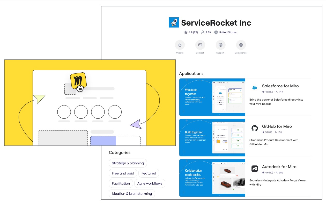
Marketplace profiles are a one-stop-shop for users to explore a developer’s published apps, average rating, contact information, and more. At a glance, developers can share:
- Brand logo: An image or logo that visually represents your company or brand. This will be prominently displayed on your profile.
- Developer Name: The official name of your company or team.
- Developer Description: A concise description of your company, highlighting your expertise and achievements.
- Operating Country: The country where your company is based or primarily operates.
There’s also space to share more practical details about your company or product, such as support and contact links.
We know from experience that end users are far more likely to authorize an app or integration that has been built by a trusted partner whose profile showcases their work and business details.
Learn more about creating your Marketplace Profile in our documentation and check out the video walkthrough by Miro Developer Advocate, Horea Porutiu.
How to Build Your Brand in Miro’s App Ecosystem – Marketplace Profile
Managing existing apps and integrations
Another surefire way to maintain a stellar reputation on Miro’s developer platform and marketplace? Listening to your users, understanding their feedback, and making informed decisions based on data.
App review management
Accessible from our Developer Hub, app review management allows partners and developers to view any reviews that users have left on their apps, including a 1-5 rating and an optional description field.
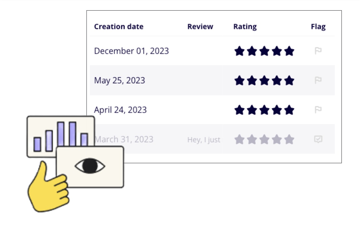
There’s no better way to ensure the apps and integrations you’re publishing to Miro’s Marketplace are meeting the needs of users than to keep a pulse on their feedback and an eye out for bugs or other issues they might be facing. Regularly checking your apps’ reviews is a great way to keep on top of this.
Developers can also flag any reviews they feel are erroneous or misleading, so the Miro team can help take a closer look.
If you have a published Miro app, you can explore app reviews from your app list in the Developer Hub.
App metrics
App analytics empower developers with powerful data and insights.
Developers can make data-driven decisions, enhance their applications, engage users more effectively, and achieve better results in user acquisition, retention, and revenue generation.
By regularly monitoring and analyzing these metrics, developers can adapt to changing market dynamics and create more successful, user-centric applications.
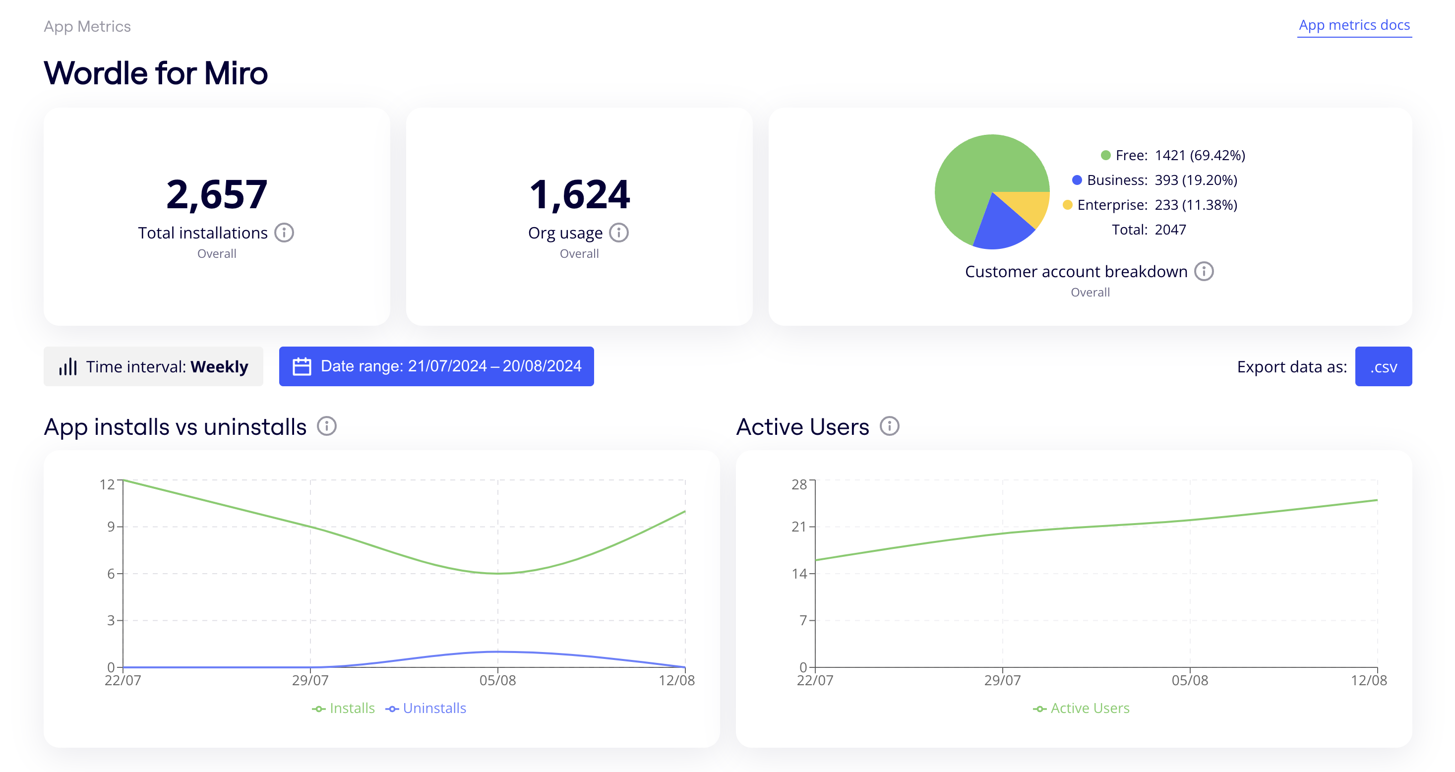
App metrics allow you to explore key metrics such as:
- Total installations: Total number of application installations for a team since it was created.
- Org usage: Total number of unique company accounts that have installed the application since it was created.
- Customer account breakdown: Total number of unique active users of the application since creation, broken down by organization type.
Developers can also find more details around active users and over-time metrics. For a full breakdown of the available metrics, check out the overview page in our documentation.
Get started with your developer journey
Whether you’re a seasoned partner, or someone who’s just starting on their Miro app development journey, these tools and tips can help you to scale your reputation and business on Miro as efficiently as possible.
If Miro is of interest and you'd like more information, please do make contact or take a look in more detail here.
Credit: Original article published here.