• Skip to primary navigation
  • Skip to main content
software stack logo

Software Stack

Get your Software Stack together

  • Knowledgebase
    • All Categories
    • Accounting Software
    • Automation & Workflow Software
    • Customer Relationship Management
    • E-Commerce Shopfronts & Payments
    • Marketing Automation
    • Online Courses & Membership
    • Project Management
    • Surveys & Forms
    • Web Hosting
  • Home
  • About Us
  • Contact Us
  • Show Search
Hide Search

Workflow & Automation

How Jasper streamlined workflows & increased efficiency by 4x

Software Stack Editor · May 28, 2025 ·

Jasper, the AI-powered marketing platform, dramatically improved their web development speed and output by rethinking how they build and manage their website.

In our recent webinar, How Jasper increased web efficiency 4X with Webflow, Josh Jacobs, Staff Brand Designer at Jasper, shared how his team transformed their approach to website development workflows, resulting in faster launches and better business outcomes.

With a growing Marketing team and a dedicated Brand team, Jasper needed a way to maintain brand consistency while moving quickly. Their solution? A thoughtfully structured Webflow implementation that empowers team members across the organization.

Build a scalable component system

Building a scalable, component-based design system accelerates web development and ensures brand consistency. By leveraging Webflow’s components, props, and variants, Jasper’s team can rapidly assemble new pages while maintaining strict adherence to brand guidelines. This modular approach empowers both designers and non-technical marketers to contribute safely, reducing bottlenecks and risk of errors.

“The ability to create really custom components is so cool,” says Josh. “We’re doing a ton of work right now with component props, collection list props. Those have been a game changer for us, variants. So when all those things come together, it makes for a really flexible system.”

For Jasper, components solve two critical challenges:

  • Speed to market: By creating reusable, flexible components, the team can build landing pages in record time.
  • Consistency: Standardized spacing, typography, and visual elements are baked into components, so even novice users can’t break the design system.

How to implement component-based design in your workflow

If you’re looking to build a more efficient web development process, start with these steps:

  1. Identify your most frequently used page sections and UI elements.
  2. Create components with appropriate variables for content that needs to change.
  3. Set up style variants to accommodate different visual treatments.
  4. Document usage guidelines for your marketing team.
  5. Train content creators on how to use the component system.

This approach is particularly valuable for agencies and marketing teams who need to launch campaigns quickly while maintaining brand standards.

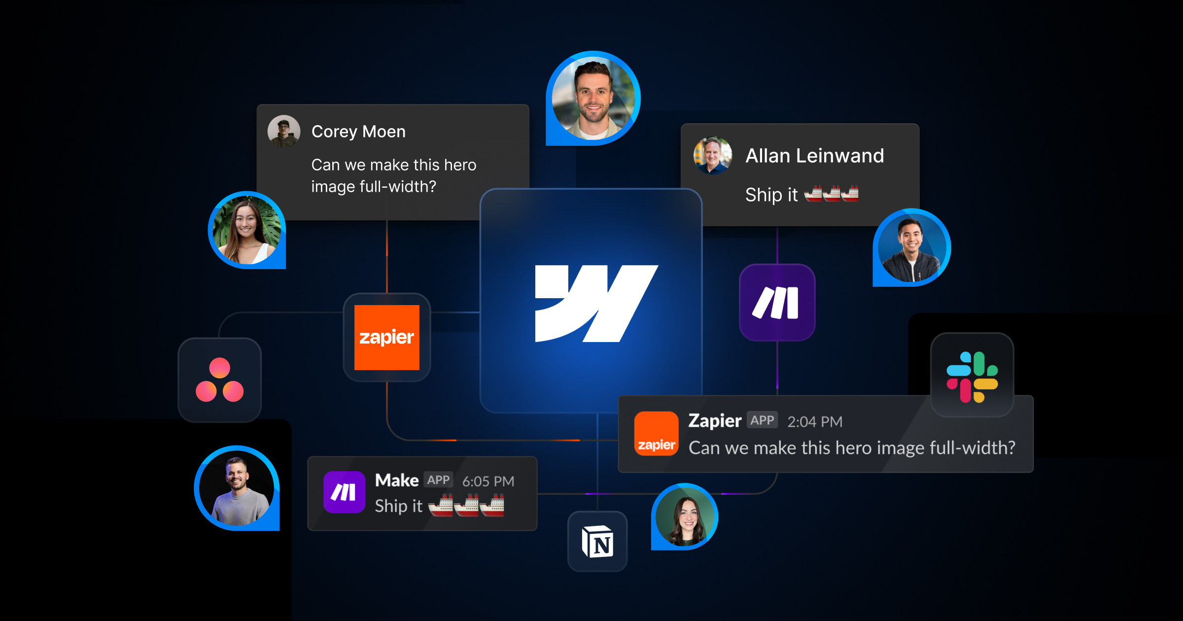
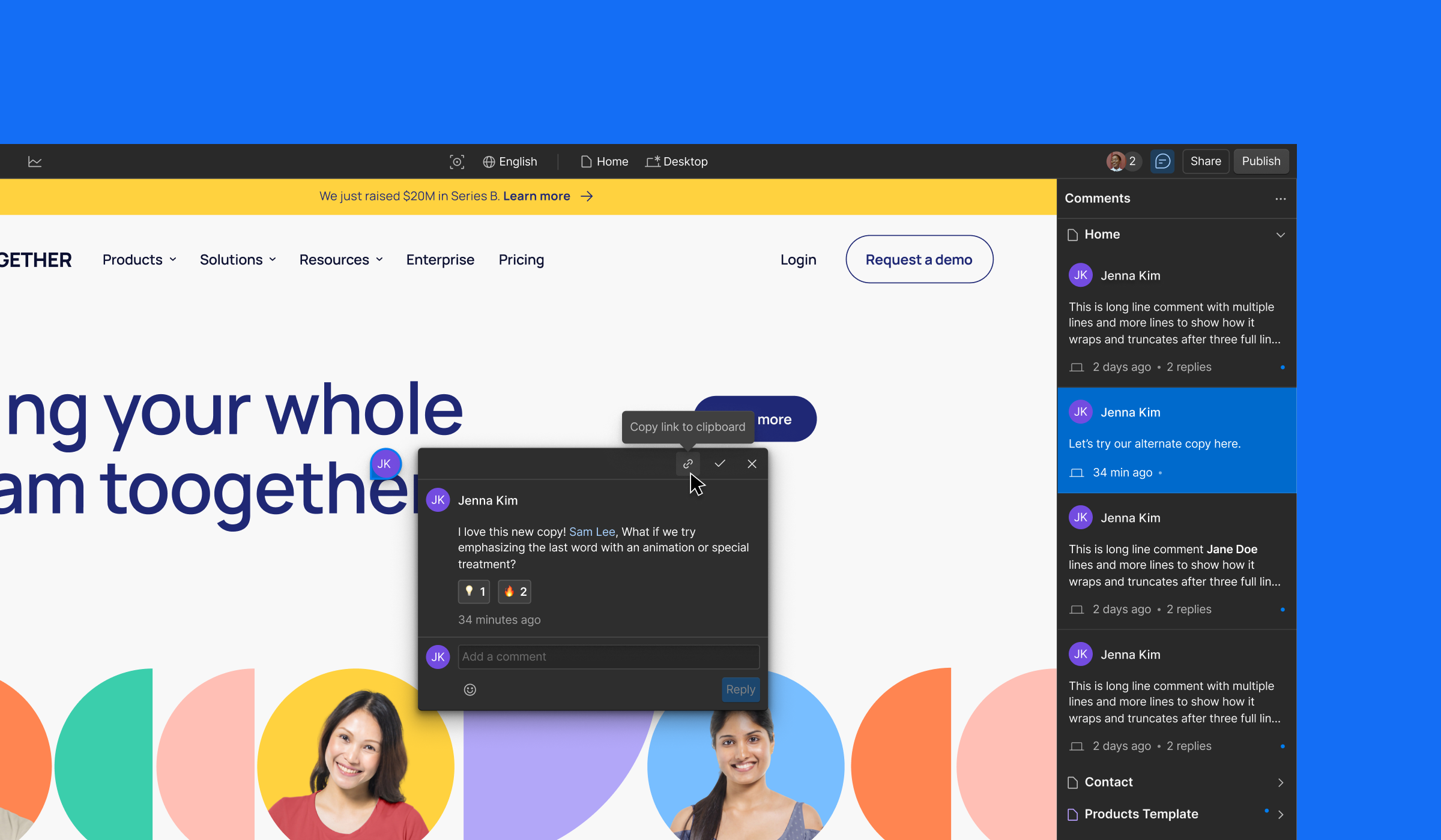
Streamline collaboration with branching

Collaborative workflows and branching in Webflow eliminate context switching and speed up approvals. Webflow’s branching and approvals workflows allow multiple team members and agencies to work concurrently on different site sections. This reduces delays caused by external review tools, keeps all feedback and changes in one place, and simplifies the path from concept to launch.

Josh highlights how this has transformed their workflow: “Collaboration is something that has significantly improved over time within Webflow. Just this morning, there were four different designers in Webflow, from different agencies to people on our team, just doing work on branches. And that’s all thanks to branching improvements, the approval workflows.”

This integrated approach keeps everyone aligned and working efficiently. “It’s all about simplifying our tech stack,” Josh explains. “In previous worlds, we may have had to stage a link, copy the link, share it in Slack or whatever project management tools we’re using; that kind of context switching can take time. So by staying inside of Webflow, we don’t have to worry about any of that context switching. It all happens within the same tool.”

How to optimize your publishing workflow

To implement a more efficient collaboration system:

  1. Set up page branching for all major updates.
  2. Establish clear roles for who can review and approve changes.
  3. Use in-tool comments to provide feedback without leaving Webflow.
  4. Create a standardized process for QA and staging before publishing.
  5. Document your approval workflow so everyone understands the process.

This approach works particularly well for teams with multiple stakeholders involved in web updates, from legal to content creators to designers.

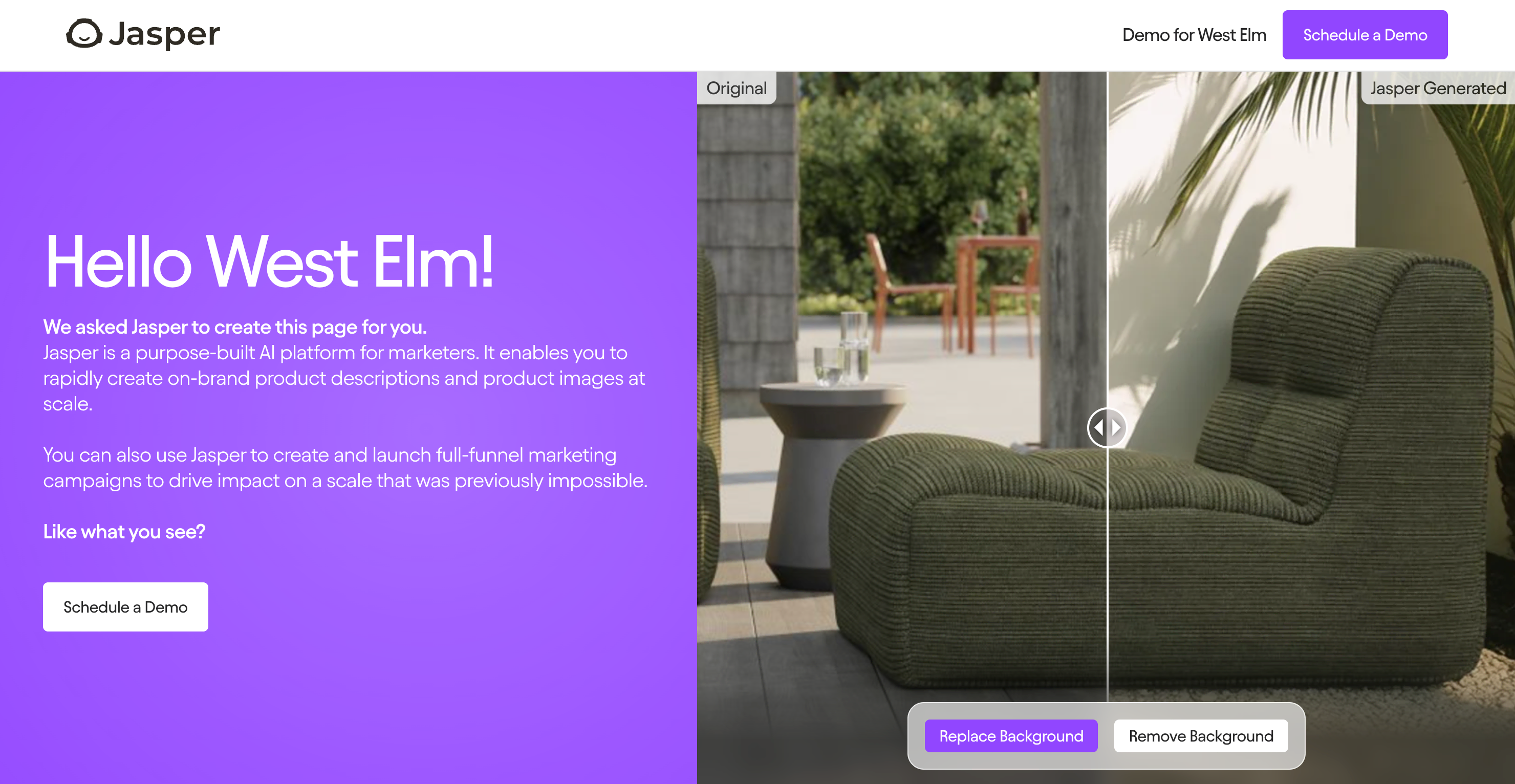
Automate campaign creation at scale

Automating account-based marketing (ABM) campaign page creation with Webflow CMS and Jasper’s AI saves weeks to months of manual effort. Jasper uses Webflow’s CMS to generate hundreds of personalized ABM landing pages, automating most of the process. This enables rapid scaling of targeted campaigns, allowing the team to focus on strategy and creative work rather than repetitive tasks.

“90% to 95% of this work has all been automated,” Josh shares. “If you think about the amount of time it takes to create content, to manipulate images, to bring it into your CMS and your CRM or whatever else it is that you need to power a full end-to-end ABM campaign, the amount of time savings has been rather significant.”

Jasper’s approach demonstrates how they “drink their own champagne” (as Josh puts it) by using their own AI tools to:

  • Generate custom brand voices based on target companies’ websites.
  • Create tailored product descriptions for different seasons and use cases.
  • Modify images for personalized campaigns.
  • Populate the CMS with all this bespoke content.
Jasper's account based marketing landing page for West Elm

How to scale your campaign creation

To implement a similar approach for your campaigns:

  1. Structure your CMS collections to support templated campaign pages.
  2. Identify which elements need customization for each audience segment.
  3. Use automation tools to populate your CMS with personalized content.
  4. Create a flexible template that pulls in the right content based on parameters.
  5. Test your campaigns with sample audiences before scaling up.

This strategy is particularly powerful for marketing teams that need to create personalized experiences for multiple audience segments or accounts.

The measurable impact of streamlined development workflows

The business results of Jasper’s approach to trimming website development workflows speak for themselves. After implementing a major website update powered by Webflow, Jasper saw a 62% increase in demo requests.

“The biggest impact has been our ability to put things out in a speedy manner,” Josh explains. “I’ve worked at companies where that type of campaign or level of effort or level of quality could take a significant amount of time. Having the ability to put things out into market at an incredible clip is what I would directly attribute to our growth and to our results.”

Beyond just performance metrics, Jasper also tracks perception — how people think and feel about their brand. Their Webflow site has become a powerful tool for brand perception, with Josh noting they regularly receive positive feedback about the website’s design and functionality.

In combining component-based design, collaborative workflows, and automation, Jasper has created a web development system that delivers both speed and quality. Their approach shows how the right tools and processes can transform how marketing and design teams work together.

Take your web efficiency to the next level

Whether you’re managing a growing marketing team or looking to improve your web development process, Jasper’s approach offers valuable lessons.

Want to see exactly how Jasper built their system? Watch the full webinar to get a behind-the-scenes look at their Webflow setup, including a demo of their component system, branching workflows, and ABM campaign automation.

Website footer designs: Best practices and 11 unique examples

Software Stack Editor · May 28, 2025 ·

The bottom of your website is often the last thing people see — make sure it leaves a lasting impression.

Because headers are often the first thing website visitors see, footers can end up being an afterthought during the design process. However, a well-designed footer is an opportunity to remind website visitors of your value and invite them to take action. It improves your site’s user experience (UX) by offering your visitors easy access links to helpful pages and contact info if they want to reach out.

Read on to learn how to optimize footer designs with inspiration from modern layouts and effective websites.

Understanding website footers

A website footer is the section at the bottom of a website, typically consistent across every page. It might seem like the end of the journey, but it’s also the final point of interaction.

Footers give visitors quick access to important links, contact information, legal disclaimers, and calls to action (CTAs). They let you reengage with users who scroll to the bottom of a page, where you can help them easily find what they need.

The importance of well-designed website footers

Here are a few reasons footers are important for your website:

  • Footers mean better navigation. A well-structured footer is like a mini sitemap. It helps people who’ve scrolled through your content quickly jump to other areas without having to scroll back up.
  • Website footers communicate relevant information. Many visitors expect to find contact details, opening hours, social media links, and company info in the footer. Including this information builds trust and makes your site feel approachable and transparent.
  • Footers give a final call to action. A well-placed CTA at the bottom of your site, like a newsletter sign-up or free trial button, can convert passive scrollers into active customers. It’s a subtle yet strategic way to guide prospects toward your next goal.
  • Footers can boost search engine optimization (SEO). Keyword-rich links and important site pages in the footer help search engines like Google crawl your site more effectively.

What to include in a website footer

A strong footer brings together widgets and other clickable elements people expect to find when they reach the bottom of your site. Here are the essentials to include:

  • Contact information. This makes it easy for people to get in touch if they have questions, feedback, or want to do business. It also builds trust by showing there are real people behind your site.
  • Navigation links. Including links to popular or secondary pages (like the about page, customer support, products, and services) helps visitors quickly find what they need, even after browsing — it keeps them exploring instead of bouncing.
  • Copyright information. Copyright notices are a small yet important detail. They state who owns your content and protect your site from those who steal or copy information without permission.
  • CTAs. Adding CTAs like “Get started” or “Try it for free” gives people a final chance to engage, especially those who’ve read all the way through and might be ready to take the next step.
  • Newsletter sign-up. A sign-up form (or a link to one) in the footer can subtly capture leads without interrupting the browsing experience. Newsletters are a low-pressure entry point for visitors and are handy for sharing updates, offers, and content.
  • Sitemap. A simple sitemap in the footer gives search engines a clear structure of your website and its content, making it easier to index. It also improves navigation by helping visitors find less obvious pages.
  • Social media icons. Social media icons for popular platforms like Instagram, TikTok, or X (formerly Twitter) invite people to connect beyond your website and let them know they can engage on apps they already use. It’s a subtle way to show you’re active everywhere.
  • Privacy policy and terms of use. These legal links tell visitors you promote transparency, comply with legal guidelines, and protect their privacy. It’s a must-have in your footer if you collect user data.

11 unique website footer design examples

Here are 11 examples of website footers showing how to effectively tie all your site’s elements together at the bottom of each page.

1. GenRevv

A screenshot of GenRevv’s website footer with a purple layout, white accents, text fields, and the text “Get Your Free Growth Playbook.”
Source: GenRevv

GenRevv’s footer, designed by Black Peak, nearly takes up the whole screen, making it memorable, unlike typical slab-style footer designs. The curved layout and bold purple background also make it stand out. However, it still includes essentials like contact links, legal info, and even awards, showing GenRevv’s credibility as a marketing agency.

2. Clade Design

A screenshot of Clade Design’s website footer showing a two-tone design with yellow on top and dark blue at the bottom, with illustrative elements and links.
Source: Clade Design

Clade Design’s footer reinforces the brand’s visual identity through bold colors, playful shapes, and a uniquely wavy split cutting through the screen. This distinct style tells people the studio thinks differently and can set themselves apart from the competition. There are important links, social icons, and a contact CTA button — all neatly organized without overwhelming the design.

3. VSCO

A screenshot of VSCO’s website showing a monochromatic footer with white text on a black background.
Source: VSCO

VSCO’s footer, designed by Jan Losert, is clean, content-rich, and well-structured. It mirrors VSCO’s minimalist aesthetic as a photo editing app, with a mini gallery above the footer. Four distinct columns make scanning by these categories easy:

  • Company
  • Features
  • Community
  • Learn

You’ll find multiple links to tools, resources, and community content. The stark black-and-white contrast keeps the focus sharp on information, while using softer outlines for CTA buttons avoids feeling pushy.

4. Cecilia Energy

A screenshot of Cecilia Energy’s website footer with gray UI cards and black text.
Source: Cecilia Energy

Cecilia Energy’s footer has soft gray tones, rounded corners, and generous spacing to create a calming effect. Instead of pushing salesy CTAs, friendly nudges like “Let’s talk” and “Follow us on LinkedIn” encourage you to connect. Meanwhile, the menu on the right side has its own stage, letting you quickly navigate from here to any main section on the site.

5. Osmo

A screenshot of Osmo’s website footer with a black-and-white theme.
Source: Osmo

Osmo’s footer has a minimalist black-and-white aesthetic, and the messaging makes a stark impact as well. While the colors are subdued, copy like “You read this far, might as well sign up” and “Let’s make this official” humanize the experience and make the invite feel casual. It also adds personality to the brand and tells people there’s a real team with a sense of humor on the other side. There are clear footer columns for navigation, legal, and support, while an oversized brand mark reinforces Osmo’s identity without overwhelming the layout.

6. The Resonance

A screenshot of The Resonance’s website footer with a dark green background and neon accents.
Source: The Resonance

The Resonance studio’s footer showcases a tech-forward aesthetic. It has a dark, grid-like layout and neon green accents popping against the background, where the colors grab attention but don’t distract from the content. Four neatly divided sections make navigation quick and easy, and the standout neon “Subscribe” button encourages you to sign up for the brand’s mailing list.

7. Astra Security

A screenshot of Astra Security’s dark blue website footer with white text, social icons, and legal information.
Source: Astra Security

Cloud security company Astra Security’s site footer showcases their credibility. Third-party review badges (like G2 and Capterra) act as testimonials, telling potential customers they can trust Astra’s services.

Additionally, the grid layout separates product, company, and resource links, making it easy to find what you need. While the rest of the site has a light blue theme, Astra’s footer uses a darker blue background to visually separate it from the page above it and keep the focus on the content.

8. Fiddler

A screenshot of Fiddler’s website footer showing a grid-style layout with columns for different categories.
Source: Fiddler

Fiddler’s footer has tons of information but remains easy to navigate thanks to the grid layout and section headings. Each column focuses on a specific user intent:

  • Product
  • Explore
  • Company
  • Resources
  • Learn

Under “Company,” a “Hiring” badge stands out. It tells interested applicants that Fiddler is actively looking for new employees and invites them to apply. At the bottom of the footer, you’ll see social media links, the privacy policy, and terms of use, rounding out the footer with all the essential elements.

9. Brass Hands

A screenshot of Brass Hands’ website footer in a two-tone display, with the top half in a cream color and the bottom half in green with oversized “BRASS HANDS” text branding.
Source: Brass Hands

Brass Hands’ footer has dynamic variations in typography, a soothing color palette, and generous spacing that gives multiple links room to breathe. Including real project names lends the website credibility, while the prominent branding at the bottom reinforces Brass Hands’ identity without adding clutter.

10. ListenUp!

A screenshot of ListenUp!’s website footer with a large yellow “Get started for free” CTA and resource links.
Source: ListenUp!

ListenUp!’s footer has a playful color scheme with yellow accents and a huge “Get started for free” button that reinforces visual identity while providing a CTA. The site sections the content into three categories — Resources, Product, and Company — making it easy to navigate. The “Product of the day” badge in the lower left-hand corner adds social proof, telling you that the company’s services are well-reviewed on Product Hunt.

11. Diana’s Seafood

A screenshot of Diana Seafood’s website footer with large, branded text and resource links.
Source: Diana’s Seafood

Designer Sam Charpentier used oversized typography and a bold blue-cream color combo to make Diana’s Seafood’s footer loud and unmistakably branded. Despite the text’s massive size, the footer packs a lot of information — store hours, location, a newsletter sign-up form, and a hiring prompt. It shows how an impactful visual identity can coexist with helpful info at the end of a page.

Seal the deal with a strong footer

A great website footer wraps up your page while encouraging visitors to take the next step. Whether it includes a sign-up form, contact details, navigation links — or all of the above — a well-crafted footer reinforces your brand and leaves a lasting impression.

With components in Webflow, you can design your footer once and reuse it across every page — no need to recreate or manually update it. Make a change to your footer component, and it updates sitewide.

Explore standout footer designs in the Made in Webflow showcase, or start building with Webflow to turn every scroll to the bottom into a fresh opportunity to engage your audience.

What’s New: What we launched in May 2025

Software Stack Editor · May 27, 2025 ·

At Miro, we’re always evolving to help teams collaborate more effectively, move faster, and stay aligned. Whether you’re working solo or across teams, here are the updated ways to simplify your workflows, increase momentum, and bring your ideas to life with greater ease and clarity.

Miro Prototyping (Beta)

Now in Public Beta, Miro Prototyping gives product teams a fast, flexible way to turn early thinking into interactive prototypes, right on the board where those ideas begin.

Use the context already on your board, like sticky notes, Docs and screenshots, or start from a prompt to generate editable mockups and multi-screen prototypes in minutes. Drag and drop UI components, add click-through interactions, apply your brand styling, and iterate with AI-powered editing — no design files needed. 

Whether you’re exploring new concepts, aligning stakeholders, or running a sprint, Miro helps you prototype earlier, validate faster, and keep momentum — all without leaving the board.

Miro Prototyping is free during beta for users on Free, Starter, Business, and Education plans. Enterprise company admins can request early access here.

Create with AI update (Beta) 

Go from idea to outcome even faster with improvements made to Create with AI. Create docs, images, stickynotes, diagrams, tables and prototypes from a prompt enhanced by selected ideas on the canvas.

You can also iterate on AI-generated results privately, so that you can edit and tweak without others seeing, until the work meets your needs. Switch between versions to see the changes between iterations and only apply to the board when you’re ready. 

Transform any collaboration into a document to align on proposals, a diagram to visualize a solution architecture, a roadmap to share next steps, or a prototype of your early ideas. Create with AI helps maintain momentum across all of your projects.

Tables Focus Mode (Beta) 

You can now freeze columns in Tables while in Focus mode, so key information like names or statuses stays visible as you scroll. Just drag the freeze bar, use the column menu, or move columns in and out of the frozen area. Watch our latest guide to using Tables and Timelines in Miro here.

Miro Slides

In Miro Slides, you can add multiple lanes within a single slide container, making it easy to organize slides into different sections of the same deck. You get a clear visual layout of each section while still being able to present, edit, and manage everything in one place.

Spaces update

Reorder boards and sections in Spaces by dragging and dropping boards and sections to reorder them in a Space.

Diagramming Shape Pack

Visualize agentic workflows, including AI models, cloud services, tools, and input/output components with the Agentic Workflows – Diagramming Shape Pack. It supports teams with diagramming and designing and planning AI workflows directly in Miro.

Synced copies update

Synced copies are now even easier to use with a set of improvements designed to help teams stay aligned while reducing manual work.

  • More flexibility and control: You can unlink synced copies to create static versions, perfect for final deliverables or tailoring content, while also syncing multiple frames at once to quickly scale consistent content across boards.
  • Smarter templates and exports: Synced copies in Blueprints retain cross-board links, making workflows fully reusable. Plus, synced content is now included in PDF exports, so shared or archived work stays complete.

VPAT update

We’re excited to share Miro’s continued commitment to accessibility, ensuring our platform empowers everyone to collaborate with confidence. Diverse teams build better products, which is why we have launched an internal self-serve accessibility strategy to embed accessibility into our development processes.

This dedication is further reinforced by our recent Voluntary Product Accessibility Template (VPAT) update, demonstrating our proactive approach to meeting key accessibility standards like those outlined in the European Accessibility Act. For access to the VPAT, please reach out at accessibility@miro.com. 

We’re constantly innovating, with capabilities like keyboard-only navigation, screen reader announcements, and support for voice control, all aimed at creating an inclusive and empowering experience for all our users. Learn more about Miro Accessibility.

Check out these ready-to-use frameworks that demonstrate how AI can supercharge your workflows, from strategic planning to user research and startup innovation:

  • Martin Szugat’s Lean Data & AI Strategy Workshop guides your agile transformation to a data-driven and AI-powered business.
  • Kate Ivanova’s User Interview Notes template is a simple framework for your team to capture research notes and quickly synthesize them into key takeaways with Miro AI.
  • R GENERATION’s AI-First Startup Canvas is a workshop to shift your organization to an AI-first mindset for fresh ways of thinking, building, and delivering value.

Have your own ideas? Publish templates to Miroverse and share your expertise with 90M+ users.

Stay tuned for June!

With these updates, you have more control, flexibility, and creative power than ever before. Whether you’re refining ideas, collaborating across teams, or building something from the ground up, you can now move faster, stay aligned, and adapt as you go.

Explore new ways of working, prototype earlier, visualize more clearly, and share your vision with confidence. Watch our latest How I do it in Miro video to see how you can go from discovery right through to delivery in one space. And to take it one step further, tap into Miro’s Solution Partner Program, connecting you with trusted experts who help you unlock the platform’s full potential through tailored strategy, seamless implementation, and custom integrations.

However you work, Miro is here to help you make it happen.

Website analytics 201: making data click

Software Stack Editor · May 27, 2025 ·

You’ve perfected counting website visitors. Now learn how to glean insights from their behavior to make them stay longer.

Once you’ve nailed the basics of website analytics — tracking visitors, understanding pageviews, and monitoring bounce rates — you’re ready to take your data game to the next level.

The next step in our website analytics journey teaches you how to transform raw data into strategic decisions. In this post you’ll learn how to:

  1. Segment users
  2. Track meaningful engagement
  3. Define goals
  4. Analyze conversion funnels

These techniques aren’t just for data scientists or marketers. As a designer, developer, or site owner, these are the skills that will help you create better user experiences based on actual behavior.

1. Segment users

Treating all website visitors as one homogenous group is like creating one-size-fits-all content. In the end, it’s so general that it doesn’t fit anyone. User segmentation helps you identify distinct visitor groups so you can build better user flows and personalize content — optimizing experiences for those distinct groups.

Start by analyzing your audience through three primary lenses:

  • Demographics: Where are your visitors located? What devices do they use? When do they visit?
  • Behavior patterns: Which visitors consume multiple content pieces? Who bounces immediately? Who engages with interactive elements?
  • Acquisition channels: Do social media visitors behave differently than organic search visitors? Does a high percentage of your traffic come from a certain channel?

Once you’ve identified meaningful segments, you can adjust layouts, navigation, and performance to better match how different groups interact with your site. For example, visitors coming from paid advertising might expect faster page load times, so you could streamline those landing pages by reducing heavy images or other elements slowing it down. 

Notice you have a high proportion of website visitors from a certain country or that speak a certain language? It might be notable feedback to pass along to your sales team, and a good opportunity to explore localization strategies.

Tip: Webflow Analyze gives you visibility into your global audience demographics, showing which countries your visitors are coming from, what devices they’re using to browse your site and what languages they speak — all without leaving the platform.

2. Track meaningful engagement

Pageviews and bounce rates are helpful to understand basic engagement, but these metrics don’t capture deeper insights on the effectiveness of your content or pages. Engagement tracking helps you understand, at a deeper level, how users consume your content. Here are a few examples:

  • Scroll depth: How far do visitors make it down your pages? Are they reaching your key messages? Set up tracking at 25%, 50%, 75%, and 100% to identify where interest drops off.
  • Interactive element engagement: Which buttons, forms or calculators are visitors actually using?
  • Time on page: Not all pageviews are created equal. Are visitors staying and engaging with your content? Or are they moving on quickly?
  • Return visits: Who comes back for more? Return visitors signal content that resonates.

These deeper engagement metrics help you identify which areas of your site perform well and resonate with your audiences’ needs, and which sections could use refinement. 

For example, if you notice that users drop off early at a certain point on your page, try repositioning key CTAs at that drop off point, or break up text heavy sections with engaging visual elements to keep them scrolling further down. 

If you notice low time on page metrics for a product page, experiment with interactive expandable sections for specs, reviews, and FAQs to keep the experience engaging and educational. Tracking clicks on those expandable sections can also give your team feedback on what information most prospective buyers are seeking.

Tip: Webflow Analyze can track click events on interactive elements without requiring any code setup. This gives you insights into which buttons, links, and navigation items visitors engage with most.

3. Define goals

Website analytics become more powerful when you define clear goals for your site and individual pages. Goals give metrics meaningful context.

To start, define what “success” means for different parts of your site:

  • Primary conversion goals: These represent your site’s main purpose — newsletter signups, contact form submissions, product purchases, or demo requests.
  • Secondary engagement goals: These track meaningful interactions that indicate interest but aren’t yet conversions by your definition (video views, resource downloads, or tool usage).
  • Page-specific goals: Different pages serve different purposes. Your homepage might aim for navigation to key sections, while a product page might aim for scheduling a demo or starting a free trial.

Define goals that serve both visitor needs and business objectives. This intentionality will support users achieving their goals (learning more about your business or becoming a customer or community member), while naturally advancing your goals.

Tip: Webflow Analyze can track goals across your site — monitoring key CTAs such as form submissions and button clicks. You can group and define specific elements across your site as a goal, and measure conversion rates without code or any external tools.

4. Analyze conversion funnels

Funnel analysis transforms isolated pageviews into meaningful user stories, revealing how visitors navigate toward — or away from — conversion. By visualizing these movement patterns, you can find opportunities to improve how users navigate your site and remove friction points. Some ways to connect the dots across your visitor journey: 

  • Identify valuable sequences: Discover high-converting pathways (like visitors who view your pricing page after a certain customer story and convert at twice the rate).
  • Pinpoint drop-off hotspots: Find exactly where visitors abandon their journey and why.
  • Bridge expectation gaps: Compare your ideal user flows with actual behavior to understand the biggest optimization opportunities.
  • Tailor paths to visitor context: Design separate flows for the different navigation patterns of returning visitors and first-time browsers.

Tip: Webflow Analyze provides page-to-page navigation flow data to show the journey a visitor takes before and after landing on a given page. Using this data, you can optimize navigation elements, strengthen natural conversion pathways and remove any points of friction that could be limiting conversions.

Screenshot of a Webflow Analyze dashboard showing

Webflow Analyze: Drive your designs with data

Website analytics is about more than just watching numbers. It’s about using data to inform strategy and drive better design and content decisions.

Ready to make it happen? Webflow Analyze gives you the clear, accessible insights you need to understand visitor behavior and transform that context into improvements that drive results.

Website performance monitoring: 7 best tools to track performance

Software Stack Editor · May 25, 2025 ·

image

Discover the best website performance monitoring tools and find the most efficient ways to track your website’s health, speed, and reliability.

Slow load times and broken pages hurt the user experience and can frustrate visitors — even turn them away from your site. Site monitoring helps you catch these issues early. With relevant analytics and a data-driven approach to how your pages perform across different devices, locations, and traffic conditions, you can proactively address issues to provide the best website experience for your audience.

Read on to learn about the types of website performance monitoring tools available for various site objectives.

What’s website performance monitoring?

Website performance monitoring continuously tracks a website’s technical abilities. It focuses on how well your site functions — how fast it loads, whether pages are responsive across devices, how often it’s available (uptime), and how stable it is during high-traffic periods. It’s about ensuring your site performs consistently, regardless of where people come from or what device they use.

This is different from website analytics, which measures how visitors find and interact with your content. While website analytics tools measure performance metrics like page views, bounce rates, and conversion paths, website monitoring tools measure the user experience itself.

Types of web performance monitoring

Depending on your website’s complexity and needs, you can implement different types of performance monitoring, from simple checks to detailed diagnostics. Here are the most common approaches.

Synthetic performance monitoring

This type of monitoring mimics user interactions by running automated tests on your site from different browsers, devices, and locations. It helps benchmark your performance and catch glitches during updates.

For example, synthetic monitoring can test how quickly your homepage loads from Europe versus North America or how a subscription checkout performs across different mobile devices, using a simulation that doesn’t rely on actual traffic.

Basic website performance monitoring

Simple uptime checks and load time tracking are the hallmarks of basic performance monitoring. It tells you if your site is online and how long a page takes to load in a particular region. Basic monitoring only offers limited insight into why there might be slowdowns, but it’s a good starting point if you’re new to performance checks.

Mid-level website performance monitoring

Mid-level monitoring goes beyond simple uptime checks and helps you understand what might be slowing your site down. It measures how long it takes for the first part of your page to load (first contentful paint), when the largest element finishes loading (largest contentful paint), and whether the layout shifts around while loading (cumulative layout shift). These are part of Google’s Core Web Vitals, which directly impact search engine optimization (SEO) and the user experience.

For example, your blog might have steady traffic, but you see your engagement drop after a redesign. Mid-level monitoring tools can show you that large images or extra animations delay the page load.

Advanced website performance monitoring

Advanced monitoring tools track what real people actually experience when they visit your site. Known as real user monitoring (RUM), these tools collect performance data from visitors’ browsers so you can spot issues based on devices, locations, or connection types. This includes session replays (showing precisely what a user saw during their visit) and error tracking (identifying bugs or broken scripts).

For instance, if people in one country are being dropped from your site, RUM can reveal that pages load slowly only for users on a particular mobile network. You can then focus on fixing that issue rather than relying on guesswork.

7 best web performance monitoring tools for different needs and budgets

Regardless of industry or target audience, here are seven website performance monitoring tools that might fit with your workflow.

1. SolarWinds Pingdom

SolarWinds Pingdom combines synthetic monitoring with RUM to track uptime, transaction flows, and page speed from multiple locations. Its artificial intelligence (AI) alert system identifies anomalies and root causes, helping you troubleshoot quickly. It’s ideal if you want fast insights into how real people experience their site every day.

2. Manage Engine Site24x7

Manage Engine Site24x7 offers performance monitoring across websites, servers, networks, and cloud environments. Its AIOps engine uses machine learning (ML) to detect issues and automate resolution, so you don’t have to worry about manual intervention.

3. UptimeRobot

UptimeRobot specializes in fast, reliable uptime monitoring with checks every five minutes or faster. It tracks website availability, SSL certificates, domain status, and port activity across multiple locations. Smart alerts and notifications ensure you’re aware of issues immediately.

4. Datadog

Datadog combines real-time monitoring with AI to track infrastructure, applications, and the user experience on every layer of your stack. Its ML engine, Watchdog, flags only the most relevant issues, helping you catch bugs early and improve performance across the board.

5. Zipy

Zipy uses AI to track session replays, product analytics, and error monitoring into a single view of user experience. Its ML engine helps you understand usability issues and see if visitors regularly drop off. Instead of guessing why users leave, you can watch, learn, and optimize in one dashboard to promptly address performance concerns.

6. Uptime.com

Uptime.com uses AI and synthetic checks to simulate real user behavior and monitor uptime, application programming interfaces (APIs), and real-time performance. Its smart alerting system relies on AI to reduce noise by filtering out false positives and prioritizing urgent issues. This helps you stay ahead of outages so you can solve issues before your users notice them.

7. Dynatrace

Dynatrace uses its proprietary AI engine Davis to process billions of dependencies across infrastructure, code, and user behavior to surface insights automatically. You don’t need a manual setup. Davis analyzes the context in real time to help you pinpoint root causes and prioritize fixes without affecting the user experience.

How to track website performance monitoring: 5 best practices to build monitoring into your workflow

Ideally, you should build performance monitoring into your team’s regular workflow so your site always remains fast and reliable. Here are five best practices to help you stay ahead of technical issues.

1. Track uptime

Uptime monitoring checks whether your website is live and accessible to the public. It pings your site at regular intervals to confirm its online status. You want to know immediately when something breaks, not after a customer tells you.

If your site goes down, performance monitoring tools will notify your team through email or Slack the second your site becomes unreachable. Then, you can investigate and promptly resolve the issue so your site is up and running again.

2. Measure time to first byte

Time to first byte, or TTFB, measures how long it takes for a browser to receive the first portion of data from your server after a user makes a request, like submitting a form or adding an item to their cart. A high TTFB might indicate server-side issues like slow hosting, inefficient back-end code, or database delays, all of which slow down the entire loading process.

Tools like Google PageSpeed can measure your site’s TTFB. If it’s too high, consider optimizing your server setup or using a content delivery network (CDN) to deliver content faster.

3. Keep an eye on the bounce rate

Bounce rate is the percentage of people who leave your website after viewing only one page — without clicking, scrolling, or engaging.

While bounce rate is technically a user behavior metric (often found in analytics tools), sudden spikes can signal performance issues like broken links, long load times, or a poor mobile experience.

Use analytics tools to check bounce rate trends. If you notice unusually high bounce rates on specific pages, investigate their load speed, mobile responsiveness, or other underlying issues.

4. Monitor page speeds and load time

Page load times refer to how long it takes for a webpage to load completely and become interactive. Slow-loading pages frustrate people and lead to the bounce rates outlined above. They also affect search rankings by telling Google that users don’t find your site worthwhile.

Use page speed monitoring tools to test your site’s performance on different devices and network conditions. These tools will flag slow-loading elements like large images and tell you what to improve for faster page speeds.

5. Check database performance

Database performance is how quickly and efficiently your website handles requests, such as loading content or retrieving user data. If the database is slow to respond, it can delay page loads, cause timeouts, or even crash parts of the site.

A database is where your website stores and retrieves structured content like blog posts, product listings, user accounts, form submissions, and content management system (CMS) data. Whenever someone visits a dynamic page, the website often queries the database to load that content on the page. Queries are requests your site sends to the database to receive, update, or delete information.

If your website runs on a CMS or custom back end, use server logs or application monitoring tools to track query performance. Look for slow-running queries or bottlenecks and work with your team to optimize the query structure within your data for better performance.

Analyze your website’s performance with Webflow

Website performance monitoring is more than just tracking uptime — it’s about delivering frustration-free experiences every time someone visits your site. From synthetic testing to real user monitoring, the right tools help you detect issues early so you can optimize before these issues hinder the user’s experience.

Webflow supports every website performance goal, be it ensuring your homepage loads quickly, reducing bounce rates, or making data-driven decisions about design changes. With Webflow Analyze, performance insights are built-in and offer a clear view of how people engage with your site — without extra setup or third-party analytics tools.

Experience enterprise-grade hosting with 99.99% uptime, global CDN coverage, and automatic scaling that keeps your site running smoothly even during traffic spikes. Create a reliably fast website with Webflow today.

How AI is reshaping — not killing — search in 2025

Software Stack Editor · May 23, 2025 ·

AI isn’t killing search — but it is undeniably changing how people find information and interact with content online.

New platforms like Perplexity and ChatGPT are giving users faster access to direct, detailed answers, while Google’s AI Overviews provide direct responses without requiring clicks to websites. These AI tools are creating more zero-click searches, leading to lower clickthrough rates (CTRs) and reduced web traffic from traditional search engine result pages (SERPs).

But two and a half years after ChatGPT’s launch threatened to upend search as we know it, Google remains the undisputed king. According to a deep dive from Rand Fishkin at SparkToro, Google processes 373x more search queries than ChatGPT and grew search volume by 21.64% in 2024. 

Meanwhile, all AI tools combined still represent less than 2% of the search market. And not all AI interactions are searches. While ChatGPT’s weekly active users have doubled to 400 million in just six months, according to SEMRush analysis, only about 30% of ChatGPT messages fit traditional search query criteria — the rest may be creative or productivity-related tasks like generating images, summarizing text, or writing code. Meanwhile, Google has invested heavily in AI Overviews, AI modes, and Gemini integration, while maintaining its search dominance. 

AI may be changing the way we think about driving traffic to our sites, but it’s also creating opportunities to connect with more intentional, high-value users. 

So marketers need to evolve their strategies right alongside SEO and get familiar with AEO (Answer Engine Optimization). In this post, we’ll cut through the hype and arm leaders with practical guidance. No panic necessary — just smart adaptation.

How AI is changing search 

Several types of AI-powered experiences now compete for user attention. ​​Conversational LLMs (large language models) like ChatGPT, Claude, and Gemini now supplement their training data with web searches when needed (or requested). Dedicated AI search engines like Perplexity were built specifically for searching the web. 

Unlike traditional searches, conversational LLMs allow for ongoing follow-up questions, providing tailored answers that go much deeper than a traditional SERP ever could. Meanwhile, Google’s AI Overviews (AIOs) provide direct, detailed answers at the top of search results.

An example of an AI Overview snippet on Google for the search query

However, both Google’s AIOs and LLMs searching the web provide citations and links to their sources — creating the opportunity for brand visibility even without clicks.

The impact of AI on search traffic

When it comes to search traffic, AI platforms are a double-edged sword. Seer Interactive’s research shows that AIOs decrease clickthrough rates by 70%, while paid search CTRs decrease by about 12%. At the same time, AI search tends to drive higher-value traffic. 

‍

“This isn’t a user who searched [for] a random keyword and accidentally clicked on your site,” said Alisa Scharf, Seer’s VP of SEO and AI. “This is somebody who engaged in a conversation with an AI assistant about your product or services. So these are high-value users, and we want to pay attention to them.” 

Marketers need to think beyond raw traffic numbers and consider how brand visibility in AI searches — even without direct clicks — can influence the customer journey. That involves understanding how these AI platforms find, select, and cite sources. 

Understanding Answer Engine Optimization (AEO)

The SEO industry never met an acronym it didn’t like. So naturally, optimizing for AI has already spawned several terms — including LLM SEO, AI SEO, GEO (generative engine optimization), and CSO (conversational search optimization). But we’ll stick with Answer Engine Optimization (AEO) as we explore what it is, how it works, and how it differs from traditional SEO. 

What is AEO?

While traditional SEO focuses on ranking web pages in search results, AEO is the practice of optimizing your content to appear in AI-generated responses, making your content the source that AI systems cite when answering relevant queries.

To optimize effectively, you need to understand where AEO gets its information: 

  • LLM training data includes vast datasets of published content from the web, books, and other sources used during model training. For ChatGPT, this also includes partnerships with premium publishers like Time, Hearst, Conde Nast, and Vox.
  • Real-time web searches supplement training data when LLMs need current information. Due to its Microsoft partnership, ChatGPT’s web search function primarily pulls from Bing’s search index. 
  • Google AI Overviews ground their AI-generated answers with real-time search data using retrieval augmented generation (RAG). About half the time, its cited pages rank in the top ten for the search query.

For both LLM web searches and AIOs, certain sites are frequently cited: Wikipedia, YouTube, Reddit, and LinkedIn, along with authoritative sources in the relevant industry (like Healthline or Nerdwallet).

AEO vs. SEO: An evolution, not a revolution

The good news for marketers is that AEO best practices already align with mature SEO practices. The old days of keyword stuffing have evolved to understanding user intent, topics, and the relationships between concepts — foundations that also serve AEO well. 

Quality content that comprehensively answers user questions is the north star for both SEO and AEO. There are a few key differences to note:

  • Content format is more crucial: using clear headers, FAQ sections, tables, and schema markup helps AI systems crawl and understand your information.
  • Developing an earned media strategy is as important as having an owned content strategy. Your owned content — the content your brand produces and publishes on your own site and platforms — may help you rank in traditional search. Earned media — where your content is cited and mentioned — is also critical because AI and LLM tools summarize many search results into a single answer. As a result, the stronger your owned content is, the more likely your content will be cited.
  • Citations will be more important than traditional backlinking: metric. AI citations (especially mentions for the categories and topics that you want your brand to be known for) create brand awareness among high-value users, even when they don’t click through to your site. As SEO expert Kevin Indig writes, “Visibility, not raw referral traffic, is becoming the main currency of organic search.” 

Practical strategies for combined SEO and AEO success

Building on the foundation of quality, comprehensive content, here are more ways to help your site show up in AI-generated responses. 

Brand visibility tactics

  • Expand your PR and earned media strategy. Experts agree that LLMs heavily rely on brand mentions in their training data to generate responses. Most recommend focusing on strategic PR to increase relevant mentions in high-quality publications (especially influential sources frequently cited in LLMs). 
  • Maintain consistent brand messaging. Use consistent terminology and develop standardized descriptions of your brand, products, and services to create the repetition that helps AI connect your brand with relevant queries.
  • Diversify your platform presence. Establish content on platforms frequently cited in AI responses: YouTube (with clear speech for transcriptions and comprehensive metadata), LinkedIn (especially for B2B brands), and Reddit (ideally, with earned upvotes). 

Content optimization strategies

  • Implement proper schema markup. Add FAQPage schema for frequently asked questions, HowTo schema for tutorials, and QAPage schema for community Q&A sections. These structured data formats make it easier for AI systems to extract and cite your information.
  • Optimize product pages for AI citation. One study shows that product-related content shows up frequently in AI citations (46-70% of all cited sources). Include clear specifications, original insights, and  comprehensive comparison content to make your product pages citation-worthy. 
  • Create content specifically for question queries. AIOs are most frequently triggered by queries with 4+ words and questions, usually for informational searches. Consider creating content that directly addresses specific questions your audience is asking — if you’ve done keyword research before, this will feel familiar. 

Technical considerations

  • Ensure AI crawler accessibility. Check your robots.txt file to confirm AI crawlers aren’t accidentally blocked. Like traditional SEO best practices, ensuring that your site and pages are crawlable helps AI bots access and cite your content. 
  • Minimize JavaScript dependency. Most AI crawlers often struggle with JavaScript-heavy pages. Ensure critical content appears in HTML source code and consider simplifying the technical structure to improve crawlability.
  • Don’t forget Bing optimization. Given the crucial role of Bing results in determining ChatGPT citations, optimizing for Bing can provide significant AEO benefits. Kevin Indig recommends adding your site to Bing Webmaster Tools and monitor performance alongside Google Search Console.

Evolving with AI, not fighting it

By putting your website in a good position to benefit from AI now, before it becomes a serious threat to Google, you can claim a first-mover advantage. 

Start by assessing your current content strategy. Most likely, you’re already doing many things right: creating quality content, answering user questions, and structuring information clearly. Now, enhance these efforts with AI-specific tactics like expanded PR, consistent brand messaging across platforms, and technical optimizations for AI crawlers.

The one thing we know for certain about AI: it will keep evolving and improving, probably faster than we expect. But the fundamentals of reaching your audience with valuable information won’t change. 

Remember that visibility in AI responses creates brand awareness among highly engaged users — an audience worth pursuing even if traditional traffic metrics shift. By adapting to this new frontier, you’ll ensure your brand remains visible wherever your audience looks for answers.

From idea to validated concept: Introducing Miro Prototyping

Software Stack Editor · May 20, 2025 ·

If you work in a product team, you’ve likely faced this challenge: How can we move faster from idea to product? How can we test and align on concepts before work gets locked into roadmaps or design queues?

Too often, early-stage ideas get stuck in static documents or buried in conversations. Designers are stretched thin, and non-designers often don’t have the tools or confidence to bring concepts to life. That slows innovation, creates misalignment, and leads to rework down the line.

At Miro, we believe prototyping shouldn’t wait for handoff — it should start with the idea.

Meet Miro Prototyping (beta)

Miro Prototyping (beta) brings the speed of sketching, the clarity of interactivity, and the power of collaboration into a single, shared space. With AI-powered flows and drag-and-drop components, anyone on the team can turn rough ideas into interactive prototypes — right inside your Miro board. Perfect for early exploration, quick feedback, and collaborative iteration.

No design files needed. No momentum lost.

Miro Prototyping (beta) isn’t about replacing your design tools — it’s about democratizing the ability to visualize and test ideas early, so teams can: 

  • Product managers: Test ideas fast — without waiting in the design queue. Build interactive mockups from scratch or screenshots, get real feedback, and iterate early.
  • Designers: Stay focused on high-impact work. Let teammates explore early concepts independently — so by the time they reach you, they’re more concrete and aligned. Or explore multiple approaches and concepts yourself in no time.
  • Developers: Understand user flows sooner. See how things should work before you build, leading to better estimates and smoother handoffs.

Iterate without barriers

Working on an existing product? You shouldn’t need design files or a designer’s time to suggest small improvements. You can now test and share changes in minutes without access to original design files, showing changes rather than describing them.

  1. Start from what you have: Upload a screenshot, place interactive elements on top, and show changes visually.
  2. Apply real-world inspiration: Use Import Style from Image to pull colors and styles from any reference — and instantly see your product in a new light.
  3. Explore one screen at a time: Use the Canvas as your AI prompt to suggest alternatives for key moments — whether it’s a flow tweak or a visual refresh.

Zero to one concepts — fast

When you’re starting from scratch, speed matters. You can now turn written ideas into interactive concepts — instantly, so you can create new product concepts with just the right fidelity to communicate vision while remaining flexible enough to evolve. 

  1. Start from your ideas: Select your sticky notes from a brainstorm, a PRD, or describe your idea in a prompt to generate a multi-screen prototype in minutes — ready for discussion or feedback.
  2. Iterate with AI: Try different layouts, tweak content, and explore variations with Create with AI 2.0.
  3. Fine tune from there: Edit screens with an intuitive drag-and-drop UI library and add any extra steps as your idea becomes clearer.

Build together in workshops

Early ideas are better when shaped by the team and easier to understand alongside the context that shaped them. It’s now easier to build prototypes together — directly from workshops or design sprints. Now diverse team members can contribute meaningfully during productive sessions or sprints to create aligned, actionable concepts.

  1. Turn ideas into action: Drop in sticky notes, images, or notes from the session and instantly start prototyping with the team — no setup needed.
  2. Leave the meeting aligned: End with a shared prototype, not a long to-do list. Everyone sees where things are going — and why.

Start prototyping where ideas begin

Whether you’re leading a sprint, proposing a new feature, or running a discovery session, Miro Prototyping (beta) helps you bridge the gap between conversation and creation.

  • Validate concepts faster: Get feedback on interactive experiences already in the early discovery phase
  • Reduce design bottlenecks: Enable anyone to create and iterate on early-stage concepts
  • Improve team alignment: Build shared understanding before committing to development
  • Expanded ideation: Generate more ideas to curate and validate earlier in process
  • Make better decisions: Test and refine ideas based on concrete interactions, not abstract descriptions

Your ideas are ready to move. Now they can.


Miro Prototyping is free during beta for users on Free, Starter, Business, and Education plans. Enterprise company admins can request early access here.

How to build a successful designer and developer partnership

Software Stack Editor · May 20, 2025 ·

image

Exceptional user experiences don’t just happen — they’re built by teams that move quickly and work well together.

This requires teams, especially designers and developers, to balance an ambitious user experience and practical technical constraints. However, miscommunication, messy handoffs, and siloed workflows can get in the way, resulting in delayed launches and compromised product quality. 

Without a seamless partnership between designers and developers, too much room opens up for inefficient websites that leads to lower traffic, higher bounce rates, and decreasing conversions.

In this article, we’ll share four tips design agency OFF+BRAND shared at Webflow Conf 2024 to help designers and developers overcome these hurdles and work effectively together.

[embedded content]

1. Confirm final features before committing 

One common collaboration challenge is the handoff process when designers share the final designs with the development team for implementation. In a traditional handoff approach, the process is often impersonal and lacks collaboration, resulting in infeasible designs and communication gaps. 

For example, designers might email static mockups without discussing implementation constraints, and developers might make assumptions to fill in the gaps. Ultimately, this results in confusing user flows, visual inconsistencies, and a suboptimal product. 

To avoid these challenges, designers and developers should treat handoff as a critical part of the collaboration process, not an afterthought. Both teams should confirm the final features before executing by walking through all functionality, including key edge cases, design details, and timelines. This collaborative approach ensures that designers create feasible designs for engineers, and engineers build features that honor the designer’s vision. Additionally, design and development teams will also build more shared context with this approach, as they’ll learn more about how each side thinks.

2. Leverage tools to bridge the gap

Tools can ease the gap between developers and designers in several ways: 

  • Create a single source of truth: Give designers and developers a shared reference point, which helps improve communication since everyone is operating from the same shared knowledge base. 
  • Enable collaborative workflows: Empower designers and engineers to independently complete tasks and access information, accelerating development. 
  • Create empathy: Foster mutual understanding of each other’s challenges, such as grasping technical constraints and appreciating key design requirements.

One tool that does all of the above is a design system. A design system is a combination of reusable components, principles, and guidelines that power all product experiences. This gives designers and engineers everything they need to develop consistent product and web experiences, resulting in better productivity. A side benefit: it also helps both disciplines better empathize. 

As Diana Mounter, Head of Design for Github, explains, this shared language “teaches designers how to think in engineering and software development terms, and enables engineers to understand a little bit more about design and to get further with developing UI than they might otherwise.” 

Platforms like Webflow further bridge this gap through visual interfaces that enable quick changes by either team. For example, OFF+BRAND’s design team creates complex 3D animations that require fine-tuning. Instead of requiring developers to implement each iteration, they use Webflow Components to test various values and ship the winner — without risking code stability. 

3. Prototype early to avoid surprises

Prototyping helps teams visualize and demonstrate design functionality, layout, and user experience before implementation. This improves designer-developer collaboration in several ways:

  • Make abstract discussions more tangible: Prototyping tools help designers translate their ideas and concepts into visible, interactive experiences. This helps provide context for scoping and feasibility discussions, reduces miscommunication, and streamlines any back-and-forth. 
  • Catch errors: Prototypes can help teams avoid big surprises by revealing technical limitations and integration challenges early in the process. This ensures that the scope remains feasible in the given timeline. 
  • Conduct user testing: Designers can use prototypes to collect user feedback and assess whether the product experience aligns with user expectations. Based on this feedback, they can also iterate on their designs much more quickly. 

OFF+BRAND leverages prototyping frequently to de-risk complex requirements that could derail projects. For example, when building a website for a sporting company, the client wanted specialized graphics to represent sports objects (think boxing gloves, a stadium, and a football). However, the team wasn’t clear on what the graphics should look like or how to build them without compromising other parts of the user experience. They built a rough prototype of these objects to get the developers and client on the same page for a smooth project completion.

Check out our comprehensive guide on the best prototyping tools and how to choose the right one for your team. 

4. Innovation comes from both sides

To maintain a healthy working relationship, designers and developers must listen to and make space for each other’s expertise. Sometimes, this might result in a compromise, whether it’s a suboptimal technical approach or a different user experience. 

However, this collaborative approach builds shared context over time. For example, if developers understand what the design team prioritizes in a user experience, they can propose technical solutions that satisfy their team’s and the design team’s needs — raising the bar for the product. 

OFF+BRAND experienced this firsthand when building a website for a kitchen appliance brand. To bring the product to life, the design team wanted to show the appliance “dropping” from the sky but didn’t know if this experience could be built without slowing down the website. 

Fortunately, the development team anticipated this need and had already built performant components. The team leveraged this work to quickly ship a dynamic experience that brought the client’s vision to life without impacting performance. 

[embedded content]

Happy devs, happy designers 

When developers and designers collaborate effectively, they create outcomes that exceed what either could achieve alone. However, this requires active, intentional effort to establish and refine systems, tools, and structures to ensure the relationship’s success. 

Designers and developers can form a stronger partnership using Webflow. Check out our design and development guides to get started today and register for Webflow Conf 2025. 

‍

SEO title tags: What they are and how to write great ones

Software Stack Editor · May 20, 2025 ·

Your page title or SEO title tag is the first thing people see in search results — and it can make or break their decision to click through to your site.

A title tag for search engine optimization (SEO) is a small piece of content with a big impact: a short, clickable headline that allows search engines to understand your page and signals to visitors what they’ll find.

Crafting compelling SEO title tags is one of the most effective ways to increase visibility, drive clicks, and boost your rankings on search engine results pages (SERPs). In this guide, you’ll learn how to write and optimize SEO title tags to drive more traffic to your site.

What are SEO title tags?

SEO title tags (also known as page titles or meta title tags) tell web users and search engines like Google what a page’s content is about. They appear in search results, browser tabs, and links shared on social media or messaging apps.

Title tags live in the back end of a site’s code — inside the element of a page’s HTML. Search engines use them to understand your content, and users rely on them to decide whether to visit your site.

A clear, well-optimized title tag can help your page rank higher and encourage people to click, making it a vital part of an on-page SEO strategy.

SEO, page, and meta title tags vs. H1 tags

SEO title tags, page titles, and meta title tags all refer to the same thing: the title that appears in search engine results, browser tabs, and shared links. But H1 tags serve a different purpose.

While meta title tags are primarily visible outside of your website, the H1 tag appears on the page itself. It’s the main heading that introduces the page’s topic to visitors while organizing the content for easier reading.

Here’s what these tags look like in practice:

  • Meta title tag (appears in search results): Beginner’s Guide to SEO | Free SEO Basics Tutorial
  • H1 tag (appears on the page itself): The ultimate beginner’s guide to SEO basics

Meta titles are designed to attract clicks from search engine users, while H1 tags introduce your content once someone arrives on the page. Ideally, they should align closely in topic and tone to offer a consistent experience from search to site.

It’s also important not to confuse the title tag with the meta description, which is the short summary of a page’s content that appears in search results between the title tag and page URL. Meta descriptions provide additional context to help users decide whether to click.

Why are title tags important to SEO?

Effective title tags can boost your site’s visibility, traffic, and user experience. Here’s how they directly impact a website’s SEO performance:

  • Improve search rankings. Title tags allow search engines to quickly understand what the content on your page is about. Including relevant keywords — “project management tools for freelancers,” for example — increases the odds that search engines will match your page to a user’s query. Using clear, keyword-rich titles will improve your ability to rank higher, especially when the titles accurately reflect the page’s content.
  • Increase click-through rates (CTRs). A strong title can grab attention and earn a click even if your page isn’t the first result. For example, “10 easy ways to boost team morale” is more engaging than a short, vague title like “Team morale tips.” More clicks signal to search engines like Google that your page is valuable, which can also improve your rankings over time.
  • Shape user expectations. A good title sets clear expectations about what users will find on your page, which can reduce bounce rates. If someone clicks “How to design an AI marketing strategy” and the content delivers exactly that, they’re more likely to stay and engage. Misleading or generic titles, on the other hand, can frustrate people, causing them to leave quickly and harming your SEO performance as a result.‍
  • Boost visibility beyond search. Title tags aren’t just for Google — they also appear in browser tabs and in links shared on social media or messaging apps. A clear, branded title tag like “Credit Card Processing Online | AB&C Payments” makes it easy for audiences to recognize your content, improves shareability, and reinforces your brand wherever the link appears.

How to write effective SEO title tags: 6 best practices

Here are six best practices for creating optimized, compelling titles that improve search engine visibility and drive more clicks.

1. Create unique title tags for each page

Each page on your site should have its own distinct title tag that reflects its specific content. If multiple pages use the same title, search engines and visitors will struggle to tell them apart.

To create unique title tags that help search engines show searchers the right content, use keywords or phrases that match each page’s purpose. Be sure to keep your titles stylistically consistent to build recognition and reinforce trust in your brand. For example:

  • Homepage: ABCSign | #1 Electronic Contract Signature Company
  • About us page: About ABCSign
  • Solutions page: Enterprise Solutions & Applications | ABCSign Corp

2. Make your title tags an appropriate length

Title tags should be between 50–70 characters. This is especially true for pages you hope to rank for in Google, like the homepage or blog posts. If a title is too long, Google might cut off key information, which can hurt click-through rates. But if it’s too short, it might not give users enough context.

Aim for a balance of clarity and conciseness. Avoid filler words, and try to position your primary keyword or core message at the beginning of the title tag. For instance:

  • Too long. “How forward-thinking organizations are modernizing their operations with AI-powered workflow automations” is wordy and likely to get shortened in Google search results.
  • Too short. “Automation” lacks enough detail to attract clicks or tell users what the page is about.
  • Just right. “How to Automate Your Workflows with AI – FakeBrand” is clear, concise, and communicates value without fluff.

3. Include your target keyword in the title tag

Search engines rely on keywords to understand a page’s content and match it to user queries. Since Google tends to prioritize the first few words of a title tag, placing your primary keyword at the beginning of your page title can improve your chances of ranking higher.

This best practice is easy to implement: Identify the keyword you want to rank for and start your title with it. For example, if a blog page’s primary keyword is “product marketing tools,” a good title tag would be “Top 10 product marketing solutions for enterprise businesses” because leading with the keyword immediately shows both search engines and users what this page is about.

4. Use framing words in your SEO tags

People are more likely to click when they know what they’re getting and feel confident they won’t have to return to Google for more answers. One way to boost their confidence is by using framing words like “how to,” “guide,” “tips,” or “examples.” These words tell search engines and visitors exactly what content to expect, making titles more trustworthy — and, in turn, more clickable.

Here are some common framing words for different contexts.

Instructional or how-to content

  • How to
  • Step-by-step
  • Learn
  • Guide
  • Tutorial
  • Tips
  • Strategies

List-based or curated content

  • Best
  • Top
  • Most popular
  • Essential
  • Must-know
  • Examples of
  • Ideas for
  • Tools for

Time-based content

  • [Current year]
  • Updated
  • Latest
  • New
  • Trending

Comparative or review-based content

  • [Topic] vs. [topic]
  • Differences between
  • Review
  • Comparison
  • Alternatives to
  • Pros and cons

Value-oriented content

  • Free
  • Affordable
  • Beginner-friendly
  • Advanced
  • Complete
  • Ultimate

5. Include your brand name when the content is brand-specific

Include your brand name in title tags for branded content like product pages, landing pages, or blog posts. Adding the name at the end of the tag will help people recognize that the content appearing in search results comes from a brand they know and trust.

Use a separator like a pipe (|) or dash (–) to keep the title clean, and place your brand name at the end of the page title (unless the brand is the primary focus of the page). 

6. Make sure to update your title tags

SEO title tags should always reflect the page’s current content. As your content evolves, keeping your titles updated will help you avoid confusing users, reduce bounce rates, and keep your messaging accurate and up to date.

Review your title tags whenever you update a page or notice a drop in performance. Tools like Google Search Console make it easy to spot pages with low click-through rates, giving you a chance to test refreshed titles that better match your goals or keywords. This data-driven approach to updating title tags will keep content visible, accurate, and aligned with what your audience is searching for.

SEO title tag example

Here, you’ll see how different on-page elements work together to support a strong SEO title tag. In this example, Webflow’s blog post on SEO testing includes four key elements that signal the topic to both users and search engines:

  • Slug: /seo-testing
  • Title tag: SEO testing: How to use testing to improve your search rankings
  • H1: SEO testing: How to use testing to improve your search rankings
  • Subheading: Learn why SEO testing is essential to keeping your website competitive. Discover the best practices for conducting successful tests and optimizing content.
A screenshot of Webflow’s blog article,

Together, these elements introduce visitors to the topic and reinforce the content’s relevance. The slug is short and keyword-rich, the title tag is clear about the subject, and the H1 mirrors the title tag for a consistent search-to-site experience. The subheading adds value by expanding on the article’s purpose and inviting you to explore the rest of the article.

Boost your website’s visibility with powerful SEO title tags

Title tags might be just a few dozen characters long, but they play a major role in how people discover and experience your website. A strong page title also allows search engines like Google to understand your content, which can improve your rankings and encourage more users to click through.

Webflow enables you to customize your SEO settings and optimize every web page with the right visuals, messaging, and structure. Start building discoverable, high-performing websites today and turn every page into an opportunity for growth.

19 essential web designer skills for 2025

Software Stack Editor · May 18, 2025 ·

image

Being a web designer involves harmoniously combining visuals and content. But non-technical skills, like collaboration and communication, are also important.

The demand for skilled web designers today continues to surge as businesses of all sizes recognize that their digital presence is often the first touchpoint with customers.

The rise of AI-assisted design tools hasn’t replaced human designers but rather elevated expectations for what makes a truly exceptional website. Companies are investing more in distinctive web experiences that blend aesthetics with functionality, and they’re looking for designers who can create interfaces that not only look stunning but also drive conversions, accommodate diverse accessibility needs, and adapt across an ever-expanding ecosystem of devices.

19 must-have web designer skills

Here’s a list of 20 skills to help you become a design expert, no matter where you’re at in your career.

Creative & technical skills

1. Visual design principles

You don’t need to know music theory to write a song. If you’ve never taken an art class, you can still draw.

Some of us might have an innate artistic ability, but knowing the basic fundamentals can make the difference between recreating what you see and being able to build a design that’s calculated and unique.

Our guide to visual design principles explores concepts rooted in Gestalt psychology like proximity, similarity, and figure-ground relationships. These fundamentals form the backbone of effective web and graphic design and are essential for creating intentional, cohesive experiences.

2. Typography

Typography shapes our perception of ideas. A type’s weight and geometry communicates meaning, and as a designer, it’s important to know the best way to deliver messaging with the appropriate typographical choices.

All the font options can make it hard for new designers to know what to choose. For body copy, try practical fonts like:

  • Georgia
  • Verdana
  • Roboto

Meanwhile, more decorative typefaces should be used sparingly as ornamentation. Good designers know the difference between type styles, and where to use them.

There are plenty of resources on the web to help broaden your typographic knowledge. FONTS IN USE shows different typefaces applied to a variety of media. Check out our guide to web typography best practices and tips for effective font pairing to elevate your typographic designs and create more cohesive visual experiences.

3. Composition

The arrangement of text, visuals, and other elements serve both an artistic and utilitarian purpose. There’s the visual harmony of a design and the organization and hierarchy of ideas. Important content should grab our attention and look great.

A well-composed layout involves creating balance with contrast, negative space, and proportioned elements. Pay attention to design around you — websites, paintings, movie scenes, billboards. The more you’re aware of and can recognize good composition, the more it’ll show up in your own design.

4. Color theory

Understanding fundamental color principles — such as how primary colors blend to create secondary and tertiary hues — will empower you to build harmonious and intentional color schemes for your web projects.

As a designer, you should develop fluency with the color wheel and understand the psychological impact of various color relationships:

  • complementary,
  • contrasting,
  • analogous

The use of clashing colors is a common mistake that plagues beginner designers. A bit of visual dissonance can help make for an interesting design, but conflicting hues can also render a layout unreadable.

Text, calls to action, and headers should use colors that work well together and maintain a strong sense of legibility. Understanding and knowing when to use lights and darks, contrast, and saturation are also important color skills in website design.

5. Design tools

Proficiency with these industry-standard design tools is essential for today’s web designers:

  • Adobe Creative Cloud (Illustrator, Photoshop, XD)
  • Figma
  • Webflow
  • Sketch
  • Framer

Beyond understanding these platforms, you should develop a solid foundation in photo manipulation and vector editing to handle everything from image optimization to logo refinements.

Budget-conscious designers can leverage powerful free alternatives like Gimp for photo editing or Inkscape for vector work without compromising capability. As your skills advance, exploring motion design through tools like After Effects or Lottie will help you create more dynamic, engaging web experiences that capture attention and enhance user engagement.

When selecting your primary web creation platform, Webflow offers the ideal balance of design flexibility and development power — allowing you to create responsive, professional websites without writing code while still maintaining complete creative control over your projects.

6. Design frameworks & content management systems

Understanding frameworks and various content management systems is essential for modern web designers. A well-designed CMS makes managing large blocks of content significantly less burdensome, allowing for efficient updates and organization.

For content that requires regular refreshing—like blog posts, recipes, or events—a robust CMS will streamline the entire process. Using a CMS to link related data and customize templates makes content management much more efficient. Many platforms offer built-in CMS features with customizable templates that give you the flexibility to create and organize content exactly as you need it.

7. Responsive design

Responsive design is a key component of the web development process. The guidelines for responsive design help guarantee that HTML, CSS (cascading style sheets), and JavaScript elements like menus, text, and buttons are clear and usable everywhere.

Responsive design ensures consistent delivery of your content. It works by having a primary layout that adjusts to fit the screen it’s loaded on. Making sure your designs translate to different devices helps them reach more people without sacrificing the user experience. And with tools like Webflow, you don’t need to rely on a web developer to bring responsive designs to life.

In addition to responsive layouts, understanding the fundamentals of accessibility is essential for creating inclusive experiences everyone can use.

8. User experience (UX)

User experience now encompasses the entire journey a visitor has with your website — from their emotional response to the design to how efficiently they accomplish their goals. Modern UX blends intuitive usability with thoughtful micro-interactions and personalized elements that create memorable digital experiences.

UX aims to not just guide users through a site, but to anticipate their needs and create moments of delight throughout their journey.

Current UX best practices include:

  • Minimalist layouts with strategic negative space that reduce cognitive load and guide attention (prioritize clarity).
  • Inclusive design that considers diverse user needs, abilities, and contexts while maintaining a human-centered approach (practice universal empathy).
  • Data-informed personalization that adapts to user behavior and preferences in real time (dynamic audience understanding).

9. User Interface (UI)

Where UX is concerned more with broad aspects of how a design affects someone, UI focuses on specificity. Web pages, buttons, menus, and micro-interactions are all a part of UI.

These elements guide an audience through a design, free from obstructions, for a smooth experience. Today, designers must be fluent in creating interfaces across an expanding ecosystem — from traditional screens to voice interfaces, AR overlays, and even haptic feedback systems.

UI touches many different facets of usability including:

  • Navigational elements and straightforward, intuitive interfaces that adapt to context (whether on a smartwatch, foldable device, or ambient display).
  • Calls to action that guide people to do what you want them to do in the shortest amount of time,with considerations for different input methods.
  • Intuitive and repeatable interaction patterns your audience can follow and learn when using your design, regardless of the device or platform they’re engaging with.

10. Graphic design

Website and graphic design share a similar creative space. Both involve the artistry of crafting visuals. But while web design is a medium where ongoing changes and updates are a part of any project, graphic design is about creating visuals with longevity.

Designing a website or a logo may be different design disciplines, but they’re both a part of branding. Graphic design skills will round out your skill set, allowing you to create typography, custom illustrations, and other types of creative flourishes that enhance your web design work.

11. Search engine optimization (SEO)

SEO has evolved beyond just keywords into a fundamental design consideration. Understanding search engine optimization principles ensures your beautiful designs actually get discovered. Modern SEO blends technical elements (like site structure and page speed) with content strategy to create websites that both humans and algorithms appreciate.

The most effective designers recognize that SEO shouldn’t compromise user experience — forced keyword stuffing creates clunky, unnatural content that drives visitors away. Instead, aim for a harmonious balance where SEO enhances rather than detracts from your design’s readability and flow.

12. Emerging technologies

Staying informed about cutting-edge technologies keeps your design work relevant and forward-thinking. From AI-powered design tools to immersive experiences like AR and VR, the landscape is constantly evolving.

Understanding how technologies like generative AI can enhance (not replace) your creative process gives you a competitive edge. Whether it’s using AI to generate initial concepts, exploring 3D elements, or implementing motion-triggered interactions, embracing these innovations allows you to create more dynamic, personalized experiences that captivate users and solve problems in novel ways.

Soft skills

13. Patience

Design challenges — from difficult feedback to complex navigation problems to career plateaus — all demand patience. This fundamental skill helps you gracefully navigate both technical obstacles and professional relationships, and prevent hasty decisions when frustration peaks. Step away from your screen when needed; a brief walk or task switch often reveals solutions that weren’t previously apparent.

Patience extends beyond design problems to human interactions. While clients bring valuable business expertise, they may not understand design terminology. Taking time to explain concepts clearly — sometimes through multiple approaches — builds trust and elevates your status from service provider to valued partner.

14. Collaboration

Collaboration is the cornerstone of effective web design. Working alongside developers, marketers, and clients brings diverse perspectives that strengthen your work, though balancing feedback with your creative vision can be challenging. The most successful designers cultivate a mindset that values input without becoming too attached to initial concepts. They recognize that developers spot technical constraints, marketers understand audience needs, and clients know their business objectives better than anyone.

When advocating for design decisions, balance conviction with openness — articulate your rationale with evidence when elements serve clear usability or branding goals, but remain genuinely receptive to compromise. True design leadership isn’t about “winning” every discussion, but facilitating outcomes where everyone’s expertise contributes to a superior result that serves both user needs and business objectives. This collaborative approach transforms potential friction points into opportunities that elevate the final product beyond what any individual could create alone.

15. Time management

Effective time management is crucial for web designers, especially freelancers and teams who must balance multiple projects with competing deadlines. Creating a structured work schedule, blocking out focused design time, and using productivity techniques like time-boxing or the Pomodoro method can help you maintain momentum while preventing burnout.

The key is establishing boundaries: knowing when to step away from social media and other distractions that fragment your attention and diminish your creative output.

16. Communication

People skills are as important as pixel skills. Explaining your vision for a project in a way that non-designers understand is essential. Stakeholders can include anyone from the marketing department to the founder, and you need to communicate how your design meets project goals.

Much of design is a solitary pursuit, but it’s still important to step outside your creative bubble, be an active listener, and share what you’re working on.

17. Strategic business thinking

Understanding the business context behind every project transforms you from a pixel-pusher to a strategic partner. Effective web designers don’t just create beautiful interfaces—they craft solutions that directly support conversion goals, brand positioning, and market differentiation. This requires asking probing questions about target audiences, competitive landscapes, and success metrics before diving into design work, ensuring your creative decisions align with measurable business outcomes.

Business acumen also helps you prioritize design efforts for maximum impact. Rather than automatically pursuing flashy redesigns, you’ll develop the analytical mindset to recommend precisely what a situation requires — whether that’s optimizing the checkout flow to reduce abandonment, improving information architecture to boost engagement, or strategically refreshing visual elements to better communicate brand values. This discernment not only delivers better results for clients but positions you as an invaluable advisor who can translate business challenges into effective design solutions.

18. Attention to detail

Exceptional web design emerges from intentional decision-making, not happy accidents. Every pixel, interaction, and visual element should be purposeful — from the precise spacing in your navigation to the subtle color transitions that guide user attention. This meticulous attention to detail creates cohesive experiences where nothing feels arbitrary or disconnected.

When you approach design with this level of precision, you naturally eliminate superfluous elements that don’t contribute to your goals. The result is work that feels refined and focused, where each component not only looks beautiful but meaningfully advances both user needs and business objectives. Remember: in thoughtful design, nothing exists without reason.

19. Continuous learning

The web design landscape evolves at lightning speed, with new tools, techniques, and best practices emerging constantly. Successful designers cultivate a growth mindset—actively seeking out fresh perspectives through design blogs, industry podcasts, and community events rather than relying solely on what worked yesterday. This perpetual curiosity helps you stay ahead of trends like design systems, accessibility standards, and emerging technologies before they become mainstream requirements.

Beyond just consuming information, effective continuous learning involves deliberate practice and experimentation. Challenge yourself to implement one new technique in each project, participate in design challenges that push you outside your comfort zone, and regularly analyze innovative websites to reverse-engineer their solutions. This active approach to professional development not only expands your technical toolkit but also keeps your creative thinking fresh and prevents your work from becoming formulaic or dated.

Practical ways to grow your web designer skills

Take advantage of free and paid courses

Online platforms like Coursera, Udemy, and Webflow University offer structured lessons to boost your web design knowledge. Start with the basics, then move to advanced techniques at your own pace.

Collaborate with the design community

Online communities like Webflow Forum, Behance groups, and local meetups are great places to find support, exchange feedback, and stay inspired by other designers.

Test your skills on real or mock projects

  • Redesign a local nonprofit’s site to improve clarity and impact.
  • Create a single-page promo site for a community event or product launch.
  • Experiment with a personal portfolio to showcase your best work.

Web design is more than making great websites

Web design in 2025 demands a versatile toolkit that spans both technical expertise and human qualities. The most successful designers balance visual fundamentals — typography, color theory, and spatial relationships — with a deep understanding of user behavior and business objectives. These elements don’t exist in isolation but work together to create experiences that are both beautiful and purposeful.

The soft skills we’ve explored elevate your work beyond pixels and code to create meaningful connections with clients and users alike. Navigating client feedback sessions doesn’t just improve your designs; it builds the resilience and empathy that serve you in every aspect of life. In this ever-evolving field, being a great designer means continuously learning, staying curious, and remembering that behind every screen is a human seeking an experience worth their time and attention.

10 graphic design styles to help you craft your own

Software Stack Editor · May 16, 2025 ·

Graphic design is an art that encompasses a range of techniques and styles. To be successful in this field, you’ll need to experiment to discover what makes your work stand out.

Because this is a competitive field, exploring a variety of styles is a great way to carve out a space for yourself. Designers often challenge or revamp old styles, experiment with new tools, and flow with (or against) broader design trends for 2025. Different approaches to typographic design, color, and layout further underscore the versatility and creativity that graphic design offers, making it a dynamic field for those willing to push boundaries and try new things.

Defining your identity in such a diverse field is challenging, but exploring foundational graphic design styles, their history, and aesthetic characteristics can help you forge your own distinct creative path.

What are graphic design styles?

Graphic design styles are distinct approaches that define how designers use color, typography, and layout to create cohesive visuals. Whether you prefer sleek minimalism or daring maximalism, these styles shape the look and feel of your work.

Now let’s explore 10 key graphic design styles that have shaped the creative world.

10 key graphic design styles

Here’s a collection of 10 fundamental graphic design styles that laid the foundation for graphic design as we know it today. We’ll briefly discuss the design principles of each style, then look at one example of each.

1. Minimalism

Minimalism is all about reducing design to its essential elements, focusing on clarity and simplicity. It emerged in Western art and architecture in the early 1960s as a response to ornate, decorative styles from previous decades.

By stripping away everything but what’s absolutely necessary, minimalist designers aim to communicate messages with efficiency and aesthetic impact. Neutral or pastel color palettes, ample white space, and clean typography often define this style.

  • Simple layouts with few distractions
  • Neutral or pastel color palettes
  • Generous use of negative space (the empty or blank areas in a design)
  • Light sans serif fonts for optimal readability
Minimalist food blog site with a simple design and three featured posts: creamy coconut chicken curry, Japanese milk bread, and five essential lessons of five years of vegetable gardening.

Designer Mike Ouellette employs minimalist design in The Maker Makes, a food blog stripped down to a gray color palette, line drawings, and abundant negative space. This clean approach showcases fresh, natural food elements.

Key takeaway: Minimalism delivers clarity by focusing on only what’s essential.

2. Maximalism

Maximalism is all about visual impact, guided by a “less is a bore” and “more is more” mentality. It emerged as a vivid counterpoint to minimalism, thriving on bold color palettes, exaggerated elements, and daring type choices.

Designers who embrace maximalism have ample creative freedom, but balancing it with readability is crucial. Vibrant, layered visuals can quickly overwhelm users if accessibility isn’t top of mind.

  • Bold, contrasting color choices
  • Exaggerated design elements and typefaces
  • Frequent use of abstract visuals

This style is gaining popularity among web designers who want layouts that make a show-stopping first impression and leave a lasting memory.

Website “about us” section with a peach-and-purple background and cartoon-style drawings in bold colors: a mushroom, an eye, and a field.

Designer Eloy Be infuses bold color schemes and playful interactions in Paradam Studios. The site’s vivid animations and contrasting backgrounds draw attention to their portfolio while ensuring text stands out through heavy contrast.

Key takeaway: Maximalism embraces more elements for a striking, memorable visual statement.

3. Art Deco

Art Deco is known for bold lines, rich colors, and detailed decorative elements that exude luxury and opulence. It first appeared in 1920s Paris, reacting to the softer, nature-inspired motifs of Art Nouveau.

Triangles, starbursts, and chevron patterns evoke theatrical ambiance, often referencing stage lights and grand architecture. Typography features curves, sharp angles, and strong strokes for an elegant look.

  • Geometric shapes and symmetrical patterns
  • Rich color contrasts for a lavish look
  • Decorative flourishes reminiscent of stage and screen
Designer site with a black background and white and yellow-green font saying “Nick Herasimenka: New York-based designer & digital product creator.” A black-and-white photo of a man looking down is in the bottom right corner.

Product designer Nick Herasimenka mixes Art Deco flair with modern design by featuring an iconic line drawing of the Empire State Building. The bold color choice evokes the drama of classic stage lights, delivering a stylish, contemporary portfolio.

Key takeaway: Art Deco adds a sense of grandeur and boldness, celebrating ornamental design.

4. Geometric

Geometric design centers on shapes like triangles, circles, and squares to create order and harmony. Its roots tie back to the Bauhaus movement of post-WWI Germany and the function-led Swiss style, emphasizing clean lines and clear communication.

By using bright colors, sans-serif typefaces, and balanced compositions, geometric designs achieve both clarity and artistic expression, allowing for a wide range of possibilities in any layout.

  • Use of basic shapes: circles, squares, triangles
  • Bright, often primary-based color schemes
  • Strong grid-based layouts
Website with a geometric illustration of a bird in bright colors with black font saying “Geometric birds and animals” and an “illustration” subtitle underneath.

Graphic designer Ritesh Raj showcases geometric illustrations of animals that highlight streamlined curves and bold colors. The simple palette and shape-driven approach capture the form of each animal with striking clarity.

Key takeaway: Geometric design blends simplicity and precision to communicate ideas clearly.

5. Flat

Flat design focuses on two-dimensional visuals, steering clear of textures and drop shadows that mimic real-world objects. It gained momentum in the early 2010swhen brands like Microsoft, Apple, and Instagram shifted away from skeuomorphism (a design style that imitates real-world objects).

Google’s material design introduced a middle-ground approach, adding subtle layers and depth, while neumorphism further experiments with combining 3D effects and flat design.Overall, this style emphasizes function and simplicity.

  • Two-dimensional icons and graphics
  • Minimal or no gradients
  • Clean, straightforward layouts
Instagram logo before and after the logo redesign.
Original Instagram logo and current logo (Source: Underconsideration )

This modern style also works well for logo design and infographics due to its clarity and emphasis on function over form.

“Under construction” site with a flat design showing cranes and trucks building mobile phones.

Retro’s Under Construction animation is a perfect flat design example: everything is purely two-dimensional, with simple colors and shapes for a clear, playful look.

Key takeaway: Flat design strips away unnecessary decoration to maintain clarity and focus on essential elements.

6. Retro

Retro-style design taps into nostalgia by referencing visual trends from past decades like the psychedelic 60s and 70s, the grunge-heavy 80s, or the early internet of the 90s. This style appeals to specific audiences by evoking cultural memories.

Despite its vintage inspiration, retro design can be refreshed with modern tools to stay relevant. It honors past aesthetics while engaging today’s viewers in a fun, nostalgic experience.

  • Heavily nostalgic color palettes
  • Vintage typography and graphic elements
  • Visual motifs from past cultural or technological ages
Beige desktop mockup with pixelated icons saying “portfolio,” “services,” and “contact.” In the middle of the screen is a black silhouette of a cat and the title “cats with jobs.”

Designer KC Katalbas infuses that nostalgia in Cats With Jobs by displaying loading animations, pixelated icons, and a “shut down” menu reminiscent of 1990s computer interfaces.

Key takeaway: Retro design resonates by channeling cultural memories into modern digital experiences.

7. Corporate

Corporate design aligns with a company’s brand identity, emphasizing professionalism and trust. It typically features clear hierarchies, conservative color palettes, and straightforward calls-to-action.

Most corporate designs stick to consistent brand guidelines, featuring simple palettes like white, black, and one or two accent colors.By projecting competence and success, companies build confidence with potential clients.

  • Professional, straightforward layouts
  • Consistency across branding materials
  • Bold accent colors used sparingly
Website with white text against a cityscape background. The text “Global Solutions with Graditur” appears in the middle of the page with a button labeled “About us” beneath it.

On consulting firm Graditur’s website, designer Gerson Iglesias chose a cityscape image to match the brand’s engineering and construction focus. The sans serif font communicates professionalism and competence thanks to its familiar appearance and legibility.

Key takeaway: Corporate designs showcase reliability and consistency, reflecting a company’s defined brand persona.

8. Neobrutalism

Neobrutalism (or “neubrutalism”) is a modern trend inspired by 1950s brutalist architecture.It rejects refined minimalism to highlight raw, structural design elements for a stark, industrial feel.

In graphic design, neobrutalism relies on vivid color blocks, hard drop shadows, and visible gridlines. The philosophy favors substance over style, embracing a rugged authenticity that stands in contrast to smoother, more polished layouts.

  • Strong color contrasts and stark backgrounds
  • Visible grids and harsh drop shadows
  • Brutalist, industrial-feeling typography
Website with black text against a light-gray background and black text. The company name, Contekst, is in the middle, alongside the logo (a stylized C).

Created by Phil Bastiaans, interior architectural firm Contekst’s graphic design includes a brutalist monospace font and intentionally exposed design structures. It matches the firm’s self-description: “Creativity always trumps vanity around here.”

Key takeaway: Neobrutalism strips design down to raw fundamentals for a refreshingly bold and honest look.

9. Media blending

Media blending mixes different visual forms — such as photography, illustration, and collage — to create multilayered, dynamic effects.By combining various platforms of visual communication, designers can introduce playful textures and leading lines into a composition.

This approach draws the viewer’s eye without overwhelming them. It often results in unique, engaging visuals that hold attention longer.

  • Combines photographs, illustrations, or textures
  • Layered compositions with intentional overlap
  • Playful and experimental visual themes
Examples of visual blending that combine photographs with illustration.
Examples of visual blending that combine photographs with illustration. (Source: ColorWhistle)

Blending illustration and photography is a common media-blending tactic, creating unique visuals that stand out in portfolios, ads, or social media campaigns.

Key takeaway: Media blending fuses diverse elements into a cohesive narrative, adding depth and intrigue.

10. Interactive media design

Interactive media design elevates traditional graphic design by using technology-driven elements like scroll animations, hover effects, and transitions. Instead of passively viewing, visitors actively engage with on-screen features.

Though it’s more of a medium than a strict style, interactive media design merges visual appeal, UX principles, and storytelling. This approach guides users through a digital journey that’s immersive and memorable.

  • Dynamic scroll-based or hover animations
  • Focus on user engagement and feedback
  • Combines visual design with interactive technology
Website showing the large white text “Colibri” being swallowed by a blue-and-white ceramic bowl.

Designer Sergio Martos showcases interactive design in Cerámica Colibrí by animating text and graphics as visitors scroll, creating an engaging narrative around the artist’s ceramic work.

Key takeaway: Interactive media design transforms passive viewing into a fully engaging, user-driven experience.

While Swiss style or postmodern design aren’t covered in-depth here, they’re also influential movements worth exploring for extra inspiration.

Now that we’ve looked at 10 key styles, let’s see where each one truly shines.

Where each style works best

Knowing each style is just half the battle — understanding the right context for each can take your work from good to great:

  • Minimalism: Great for showcasing premium products, modern portfolios, and sleek app interfaces.
  • Maximalism: Perfect for creative industries, art projects, and brands seeking a bold, unforgettable look.
  • Art Deco: Ideal for luxury or upscale brands, especially in fashion, architecture, or event design.
  • Geometric: Works well in tech, startups, or educational materials where clarity and structure are key.
  • Flat: Best for UI design, apps, and infographics that need quick readability and a modern feel.
  • Retro: Resonates with brands aiming for nostalgic appeal or targeting audiences who appreciate vintage looks.
  • Corporate: Suited to businesses that value professionalism, consistency, and brand authority.
  • Neobrutalism: At home with edgy, disruptive brands or artistic projects that embrace raw authenticity.
  • Media blending: Great for creative fields, portfolio sites, and campaigns that need a playful, layered feel.
  • Interactive media design: Best for immersive websites, promotional campaigns, and storytelling-driven experiences.

With this understanding of which styles excel in certain contexts, you’re ready to refine your own design approach.

Pro tips for choosing a design style that fits you

Looking over these 10 styles, you’re bound to feel drawn to some more than others. That initial intuition is your first clue. Take a deeper dive into styles that resonate by asking yourself:

  • Which themes or patterns recur in my past work?
  • What design styles best appeal to the clients I want to attract?
  • What’s my target industry or audience, and what styles dominate there?
  • How can my style stand out from other designers in this field?

Once you’ve narrowed it down to two or three styles, experiment freely or blend them for a unique look. Combine techniques from designers you admire, and draw inspiration from everywhere — family, friends, natural and urban environments, art, and music.

To keep evolving, explore relevant graphic design blogs or other resources. Inspiration isn’t limited to the design world alone — fresh ideas can come from unexpected places.

Finally, every client project is a dialogue between your style and the client’s specific requests. Stay flexible and open to collaboration — each job will present new challenges and ways to grow.

Looking for more inspiration? Explore popular variations of graphic design in Made in Webflow for more ways to refine your style.

Show off your designs in style

Once you’ve created various designs that showcase your style, publish an online portfolio to share your work with others and attract new clients.

Whether you build your portfolio from the ground up or streamline the process with a portfolio website template, Webflow gives you powerful creative control and extensive customization options to bring your vision to life. It’s about shaping a unique experience that sets you apart — exactly where your work deserves to be.

Celebrating Global Accessibility Awareness Day 2025: How Miro is approaching accessibility

Software Stack Editor · May 15, 2025 ·

image

This article was co-written by Philip Strain, Robert Schroeder, Peter Gould, Marcin Pająk, Andrew Hayward, and Stefano Baldan.

At Miro, we believe that diverse teams build better products. That’s why we’re deeply committed to creating a platform where everyone can collaborate with confidence. 

Today, on Global Accessibility Awareness Day, we are excited to share our continued commitment to accessibility and how we’re proactively addressing key accessibility standards. This includes requirements established by the upcoming European Accessibility Act (EAA) and its transposition into national rules in the European Union. 

In this post, we’ll take a closer look at how Miro is approaching the European Accessibility Act and embedding accessibility into our development processes. From enabling Miro employees, to our embedding accessibility into our core design principles, every aspect of our work includes rigorous testing to ensure an inclusive and empowering experience for all.

Miro’s approach to the European Accessibility Act

The European Accessibility Act (EAA) is a directive by the European Union that sets out accessibility requirements for a range of products and services, which will become enforceable through EU member state law starting 28 June 2025. The primary aim of the EAA is to harmonize requirements for providers of accessible products and services in member states and increase their availability for people with disabilities by establishing minimum principles. 

At Miro, we have an established accessibility team whose mission is to remove the barriers that may prevent people with disabilities from collaborating effectively.

While we have previously written articles and published our approach to accessibility, one aspect that we’ve wanted to improve is how we engage and motivate Miro employees to progress accessibility. We’re always looking for ways to build a culture of accessibility at Miro, and below, you will find the steps we are taking to achieve this goal.

Embedding accessibility into our daily operations

Our approach to embedding accessibility into the daily operations of our teams is structured around four key pillars: enablement, automated testing, canvas accessibility, and accessibility excellence. Internally, we introduced our “Self-Serve Accessibility Strategy” earlier this year. The goal of the strategy was to provide Miro employees with the tools and resources they need to create accessible experiences for all users. 

In practice,  Miro teams are now able to independently design, build, test, and maintain accessible products. 

Enablement

Our first pillar, enablement, ensures that all Miro employees have the tools they need to make our product accessible for all. Many large tech companies prioritize risk mitigation and potentially compromise on products that effectively meet user needs. But not at Miro. Here, we build for the user first and acknowledge our diverse customer base. We enable Miro teams to embed accessibility from the outset, recognising that designing and building with disabilities in mind – such as sight or hearing loss – is beneficial for everyone.

While our accessibility specialists are invaluable, we believe that a combination of the right tools, comprehensive education, and a supportive culture is crucial for success. This empowers individuals to verify their work confidently against accessibility standards, equips them with the necessary skills to create accessible services, and cultivates a deep understanding of accessibility’s importance. This encourages accessibility integration throughout every project phase.

Automated testing

Our second pillar, automated testing, makes it easier than ever for Miro employees to ensure accessibility. When it comes to accessibility testing, we recognize that prevention is better than cure. By using automated tests at multiple stages of the development process, we create several layers of defense to prevent, detect, and remediate accessibility issues as early as possible.

During development, we use extensive linting and accessibility unit tests to catch the most common compliance issues before they enter the codebase. At build time, we run end-to-end tests using real assistive technologies to ensure that changes don’t introduce unexpected regressions in the user experience. We also continually run page-level scans on fully rendered pages to identify any remaining issues.

Canvas accessibility

For the third pillar, we are looking directly at accessibility on the canvas itself. Unlike regular web content, the HTML-based Canvas does not provide built-in support for assistive technologies. To the browser, canvas content is read as pixels on the screen, without specific meaning. This means we have to build accessible capabilities specifically for the Canvas.

A significant part of our work toward making Miro accessible consists of building and maintaining the platform that allows the creation of accessible canvas content. Miro has accessible capabilities like: 

These are only a few examples of the areas that require custom accessibility support on the Canvas. It is fairly uncharted territory that requires a lot of research, innovation, and regular engagement with our customers and users to ensure the effectiveness of our solutions.

Accessibility excellence

Our final pillar is Miro’s commitment to accessibility excellence. Everything we do at Miro comes back to a dedicated focus on our users. Our Miro teams engage directly with organizations who leverage Mio to discuss and get feedback on our accessibility strategy. We also run regular user research sessions with people with disabilities to both inform future work and get feedback on the existing experience.

Learn more

As you can see, our commitment to the principles established by the European Accessibility Act is embedded into the daily operations of Miro. We are committed to delivering accessible capabilities so there is space for every great idea, not only on Global Accessibility Awareness Day, but every day.

For more information on Miro Accessibility, please explore our web page and our Help Center documentation. We recognize that accessibility is a journey, and so we welcome any feedback at accessibility@miro.com. 

8 common website mistakes that drive visitors away

Software Stack Editor · May 15, 2025 ·

Competition for visitors’ attention is high, as you only have a fraction of a minute to make a good first impression — or risk users abandoning their website. 

To capture and retain user attention, you must prioritize a great user experience that enables users to complete key actions with minimal friction. However, building a good user experience requires getting a thousand details right. Even minor annoyances can lead to rage clicks away from your website, resulting in a 6% reduction in page views. 

In this blog post, we’ll cover eight common website mistakes and how you can solve them to boost your website’s user experience and conversion. 

1. Intrusive pop-ups

A website pop-up is a trigger-based window that appears when a user browses your website. It can be triggered when they click a button, scroll to a certain point on the page, or after a set time. 

Pop-ups can be a great way to inform users about important information or guide them to take action. For example, a pop-up might ask users for consent to track cookies. However, many websites have poorly designed pop-ups that interrupt and “hijack” a user session, creating an extremely frustrating user experience. Users may abandon your site if these pop-ups appear too frequently or keep blocking important content. 

To overcome these challenges, integrate pop-ups with your website’s design rather than as an “add-on” element that interrupts the key flow of your user experience. Consider implementing the following best practices: 

  • Concise messaging: Keep your message brief to dissuade users from clicking away without reading.
  • Simple design: Use your brand’s colors, fonts, and themes in your pop-up’s design so the momentary interruption feels like a natural extension of your website’s experience. If you’re using Webflow, you can use Webflow’s templates to find inspiration for well-designed pop-ups. 
  • Strategic timing: To minimize a disruptive experience, show the pop-up when the user is least likely to be interrupted: after the user has been on the page for a certain amount of time, after they click a button, or when they scroll a certain distance on the webpage. ‍
  • Holistic approach: Instead of designing a pop-up in isolation, create it in the context of the other pop-ups a user might see. Ensure that their experience isn’t blocked by pop-up after pop-up (especially if it’s the same one), as that will create a negative user experience and impact your conversion rate. 
Screenshot of the Jasper website homepage showing their AI marketing platform. The header displays the Jasper logo and navigation menu. The main content reads
Jasper.AI features a sticky popup but non-intrusive pop-up at the bottom of the homepage, asking users for cookie permissions.  To minimize cognitive load, the popup presents straightforward “accept all” or “decline all” options, with more detailed choices available under “More Choice.”

2. Autoplaying music and video

Adding interactive content like videos and music can make your website more engaging. But if done poorly, it can have the opposite effect. 

Autoplaying audio and video can confuse or distract users. Instead of interacting with your website’s content, visitors must figure out how to stop the video and/or audio. This can result in users spending less time on your website, or worse — rage clicking and abandoning. 

Autoplaying content also creates accessibility issues. The screenreader’s voice will overlap with the website’s audio track, creating a jarring and confusing user experience for visitors who use screen readers. Additionally, it can impact SEO, as videos and audio take longer to load, slowing your website and impacting SEO ranking. 

To fix this, give users control over when to start playing the content. They should also be able to pause, play, and rewind the content. For example, creative agency OSCO Studios embeds multiple videos on its website, but all require user input to start playing.  

Portfolio showcase from a creative agency featuring two video projects. The top project shows
Portfolio showcase of video content featuring three video thumbnails. The top video shows a person relaxing in a modern chair with feet up, holding a phone, beside large glass windows overlooking a garden. The middle video displays two off-road vehicles driving through green countryside, with what appears to be kayaks or surfboards mounted on the roof of the white SUV in the foreground. The bottom video is partially visible, showing what looks like a person in a green outfit. All thumbnails have play buttons and expand options.
OSCO Studios portfolio page displays nine videos that highlight their work across various creative campaigns. Users must press the play button to start the video, giving them control over their viewing experience. 

3. Slow page loads

If a page takes over three seconds to load, over 53% of mobile visitors will abandon the website. This statistic reflects the rising user expectation that pages should load quickly and instantaneously. You can benchmark your website speed with Google’s Core Web Vitals framework, which provides three metrics to measure the speed of a website: 

  • Page load performance: how fast the page elements load 
  • Responsiveness to user input: how quickly the user can interact with the page 
  • Visual stability: how well it minimizes disruptive layout shifts as the page loads 

You can use these metrics to understand which part of your page load experience needs to optimize. Here are some other best practices to keep in mind when optimizing your website’s performance: 

  • Optimize images: Large, unoptimized images can significantly reduce page load speeds since they require servers to transfer more data to browsers. Invest in tools to help you optimize your images before you add them to your website.  
  • Minimize HTTP requests: Adding more HTTP requests to your website adds bloat, which increases load time. Audit your third-party requests, JavaScript libraries, and CSS styles for redundancy and necessity, and remove unnecessary requests. 
  • Choose reliable web hosting partners: Reliable providers host your website on high-performance servers optimized for speed, uptime, scale, and security. For example, Webflow’s hosting platform handles 10 billion web pages across six continents and provides features such as global CDN, image compression, and SSL certificates. 

4. Confusing navigation

An inconsistent or unclear website navigation impacts users’ ability to find key information, resulting in users rage-clicking and abandoning the website. For example, a user expects to see a clear “log in” CTA on the homepage, but if the link is hidden in the “Profile” page, they might get lost and abandon the task. 

The solution is to have a clear information architecture (IA) for your website. An IA organizes your website’s content into clear logic and predicts how visitors will naturally browse the webpages. Creating the IA requires understanding how users expect to navigate your site and complete specific tasks, then leveraging this understanding to build out the key flows. 

Screenshot of HelloPatient website homepage with a dark teal background. The header features the HelloPatient logo and navigation menu with options for Product, About Us, Manifesto, and a
Hello Patient’s website is designed to help medical practices evaluate their solution efficiently. Therefore, they’ve organized their IA into four parts: “Product” (showcasing key features), “About Us” (introducing the team), “Manifesto” (more details on the problem space), and “Schedule a call” (their primary CTA). 

Ask yourself these questions as you create the IA: 

  • What key tasks do users come to my website to do? Where might they expect to find these actions? 
  • What key information do users need to know on my website? 
  • What order should I organize this information?

Once you have your IA, you can quickly implement it by reorganizing your page navigation using Webflow’s design tools.

5. Non-responsive design

As more users primarily use their mobile devices to browse websites, they expect responsive websites that work seamlessly across all device types — laptops, tablets, and smartphones. When users come across a non-responsive design, they might miss critical content, creating a frustrating experience. For example, if a website is designed only for laptops, the CTA button or other contact information might disappear or be difficult to find when someone views it on their phone. 

To solve this challenge, brands must implement responsive design principles to provide a good user experience across all device types. A platform like Webflow makes it easy to design responsive pages through built-in features to preview and adjust layouts across all devices. 

6. Poor color and contrast

Contrast is a powerful design tool that makes pages visually appealing by using different colors, sizes, and shapes to create a visual hierarchy. This can help call attention to specific elements (like CTAs) or improve the text’s readability. 

However, if done poorly, it can increase cognitive load and negatively impact the user experience. For example, yellow text on a white background creates insufficient contrast, making content difficult to read and failing key accessibility standards for people with visual impairments. 

Sonar Music uses white on black contrast to draw a user’s eye to the image and the caption (“The Sound of Sonar Music”), creating a visually compelling yet cohesive homepage experience. 

To overcome this challenge, take a thoughtful and iterative approach to contrast. Some tips to keep in mind: 

  • Determine what to emphasize: Use contrast sparingly to highlight the most critical elements of your page, such as CTAs, the brand’s value proposition, or key product features. For inspiration on how other brands have effectively utilized contrast, take a look at the examples in our blog post.
  • Maintain consistency: Contrast should align with your site’s central visual identity to avoid confusion or a chaotic appearance. Stick to a consistent color scheme and typography hierarchy. If you need creative inspiration, browse Webflow’s templates for ideas on utilizing contrast on your page — or better yet, reuse the template for your site. 
  • Test and iterate: What works in theory may not always be effective in the real world. Show your design to others or use tools like Webflow Optimize to test new designs. 

7. Lack of accessibility

Web accessibility refers to your site’s accommodation and availability to users, regardless of their abilities or challenges. Neglecting accessibility means many potential visitors can’t use your site effectively — alienating them and exposing your organization to compliance lawsuits, which damage brand reputation. Additionally, creating an accessible website brings your site design closer to industry-standard web design best practices, improving the overall user experience. 

To ensure your website is accessible to all users, follow the Web Content Accessibility Guidelines (WCAG). These standards outline specific recommendations to minimize usability issues for folks with visual, hearing, motor, and cognitive disabilities. With Webflow’s suite of accessibility tools, you can audit your website and get guidance on implementing these guidelines. 

8. Poor form design

Forms are critical to a website’s conversion funnel and fuel lead generation or payments. However, poorly designed forms can result in a frustrating user experience, such as: 

  • Endless form scrolling: Users see new fields as they scroll down instead of all the fields upfront. This can be frustrating and prevent them from understanding the form’s length or completion status. 
  • Improper error validation: When users get a submission error but aren’t told what went wrong, they don’t know how to fix it. This can impact your form completion rate and website conversion rate. 
  • Lack of confirmation states: If users successfully submit a form, they expect a confirmation page or message. Without this confirmation, they might get confused about the status of their submission. 
Screenshot of LEGALFLY's demo request page with a split design. The left side has a black background with
LegalFly’s demo booking page features a well-designed form that asks users for key information upfront (using asterisk to signify mandatory information). If users misenter any information (like email addresses), they display error states to help users identify and fix the error. 

To avoid making these mistakes, here are some best practices to keep in mind when designing your forms: 

  • Set clear expectations: Show users exactly what they’re getting into. Show all fields upfront so that users can immediately gauge the time commitment. For long and complex forms, use a progress bar to showcase completed and remaining sections. 
  • Give users feedback: Provide real-time validation as users complete each field. This instant feedback builds user confidence, maintains momentum, and prevents frustrating submission errors. 
  • Pay special attention to error states: Ensure all error states have helpful messages to help users fix their errors. This allows users to successfully resubmit the form, reducing frustration and improving form conversion. 

If you’re using Webflow, you can browse pre-made form templates that already follow these best practices. 

The compounding value of user experience

The difference between website success and failure often comes down to user experience. The brands that thrive continuously iterate and improve their user experience, fixing mistakes and optimizing key touchpoints across the customer journey. These improvements might appear minor in isolation, but the impact compounds — resulting in significant top-level conversion gains in the long run. 

Want to learn more strategies to improve your website’s user experience? Check out our ebook on proven B2B website optimizations. 

Automate 5X more work at the same cost with Airtable AI

Software Stack Editor · May 14, 2025 ·

What you can do with Airtable AI for $40

Automate 5X more work at the same cost with Airtable AI

Running AI at scale is much more cost effective than you might think. Here are a few examples of AI outputs that each cost about $40 total, depending on the model you choose. 

  • Analyze 1,000 competitor web pages to analyze their pricing strategies, messaging techniques, and market positioning.
  • Transform 8,000 product feedback submissions into prioritized feature requests with impact scores and complexity estimates.
  • Generate 10,000 localized social media captions tailored to your brand voice and campaign messaging for higher engagement rates.

Understanding credit usage

You can now preview how many credits each AI action will use.

You can use this preview to understand how many credits you’ll need to run a workflow at scale, with these simple 3 steps: 

  1. Actions: Create a prototype app with sample data and inspect the credit preview for each AI action. 
  2. Volume: Estimate the total volume of records that need to be processed in your workflow over a certain time period. 
  3. Total: Multiply them together to estimate credits needed. 

For example, let’s estimate total credits needed for a customer data enrichment workflow. 

  1. Actions: 
  • AI Field 1: Summarize latest earnings call transcript (12 Credits)
  • AI Field 2: Search the web and summarize recent company news (12 Credits)
  • AI Field 3: Taking step 1 and 2 as input, generate discussion topics for upcoming meeting (1 Credit)

= 25 Credits / Customer Enrichment

  1. Volume:

Number of customers to enrich per month: 1000

  1. Total: 

Total estimated credits / month: 25,000

Approx total cost / month: $40

Cost per enrichment: $0.04

With the new credit consumption rates, you can scale up your AI workflows with marginal cost impact. 

What’s new in Airtable AI? 

In case you missed it, we also introduced Airtable Assistant this month. 

  • Your personal app builder – Simply ask Assistant to build, modify, or add to any of your apps in Airtable.
  • AI business answers – Ask any business question and get answers based on data in your Airtable apps.

Plus, Airtable AI now supports two new ways to bring structured data into your apps to power even more impactful workflows: 

  • AI web search – Put thousands of web researchers to work across every row in your Airtable base.
  • AI document analysis – Turn unstructured documents into data and workflows, at scale.

Get fully up to speed with what’s possible with Airtable AI by watching our latest livestream on-demand: 

Watch now

5 lessons in digital transformation: AI, composability & more

Software Stack Editor · May 14, 2025 ·

For decades, enterprise CMS platforms overpromised and underdelivered. Veteran CTO Liz Spranzani reveals how companies are now abandoning complexity and technical debt for a radically different approach.

Company websites started as little more than digital brochures — but today, consumers expect personalized experiences, responsive design, microsecond load times, and safeguarded privacy. It’s a world away from the simple HTML pages of the early web. 

Few leaders have tracked this digital transformation more closely than Liz Spranzani, Chief Technology Officer at digital experience agency Verndale. Her team has helped enterprise brands like Stanley Black & Decker, GE, and Honda implement (and untangle) nearly every major content platform on the market. 

Onstage at Webflow Conf 2024, Liz shared her 20-year perspective on the evolution of the CMS (content management system) landscape, the rise of the DXP (digital experience platforms), and her vision for the future: composable architectures that combine no-code agility with enterprise-grade freedom.

What is digital transformation?

Digital transformation isn’t a one-and-done migration project — it’s the ongoing act of reshaping how value is created, delivered, and optimized. Just as door-to-door sales have transformed into outbound programs fueled by automation and intent data, website development technology has leapt from the single-site CMS to cloud-native, AI-infused stacks. 

Liz traces the start of this transformation to the early 2000s. Back then, the CMS was focused and effective at doing one thing really well, on one channel: publishing content on your website. But as CMS competition increased, vendors started adding features — like customer data platforms, marketing automation, media libraries, testing, and personalization tools — to stand out. 

Soon, the all-in-one DXP emerged, managing content and customer communications across channels. It was powerful, but painfully difficult and expensive to maintain. 

“The DXP claimed to be everything, but weren’t the masters of anything,” Liz said. “It was not agile and it was not fast, and everything was bogged down with technical debt and other problems.”

In 2020, brands hit an inflection point as the pandemic moved every interaction online, overnight. Digital laggards struggled to keep up — but so did companies already paying expensive licensing fees to DXPs. These marketing teams realized their digital infrastructure wasn’t agile enough to adapt to new consumer needs. 

Agility, not feature count, became the new differentiator. Liz noted that companies became interested in ditching monolithic DXPs in favor of assembling their own composable architectures — picking and choosing best-in-breed solutions, and loosely assembling them into an integrated martech stack. 

Liz’s take on the CMS landscape

Today, Liz sorts the current website tech landscape into four pillars, each with its own promise and price tag:

  • DXP suites that support omnichannel delivery with single-vendor simplicity, but are often weighed down by monolithic code and complexity.
  • Open‑source CMSs offering license‑free flexibility, offset by inefficiencies requiring developer intervention and DIY security.
  • Headless CMSs that separate admin tools from content delivery with API-first flexibility, yet demand continuous engineering lift that undermines promised agility.
  • No‑code builders that are lightning‑fast for simple sites, but historically thin on creative and enterprise capabilities.

These threads reveal the real meaning of digital transformation: finding a balance between flexibility, speed, and scale without drowning in technical debt. 

5 lessons in digital transformation

As the shepherd for numerous enterprise digital transformations over the years, Liz shared five key lessons for building the right website stack: 

1. Prioritize agility over complexity

Traditional CMS and DXP solutions have become bloated with features and technical debt that slow organizations down. Liz has observed companies spending years implementing these platforms, only to find themselves constantly playing catch-up with upgrades, replatforms, and redesigns — never reaching the promised vision.

“Our clients are tired,” says Liz. “They’ve been spending money on licenses for decades, getting a promise of a vision, but they don’t actually get there.”

Instead, she advises organizations to prioritize platforms with fast implementation and flexible architectures, and focus on delivering value quickly rather than endlessly adding features. 

2. Put business outcomes first

Digital transformation is about creating tangible business value. But too often, Liz observes organizations get lost in manual interventions and subjective design tweaks — or caught up in implementing technology for technology’s sake. 

Rather, she advises marketing leaders to hyperfocus on what websites are supposed to do: drive user conversions. Whether that’s completing a purchase or filling out a form, the technology should enable these outcomes while requiring minimal maintenance. 

“What really matters is that the code is maintainable and accessible and performant and secure,” says Liz. “Ultimately, after that, it doesn’t really matter — so long as the user experience is fantastic to drive those conversions.”

3. Democratize digital creation

No-code platforms give marketing teams autonomy to create their own designs and run their own experiments — without the need for engineering resources. But, Liz cautions, many traditional no-code platforms like Wix or Squarespace have been fast, easy, cheap — and very limited.

However, Liz still puts no-code capabilities on her must-have requirement list for enterprise organizations. The key is to find a website platform that can deliver this autonomy without sacrificing the ability to create unique experiences that engage customers and drive conversions.

4. Leverage AI as a collaborative partner

Similarly, AI is no longer just a nice-to-have — it’s becoming an essential component of digital transformation strategies, embedded throughout the entire web experience ecosystem.

Liz shared a vision of AI-driven website creation where technology assists at every stage, across sitemap generation, design, content creation, deployment, experimentation, and reporting. This approach shifts power from developers to business and marketing teams, while maintaining quality and consistency through constant manual oversight and intervention.

She emphasized that AI should be integrated into workflows throughout the platform rather than standing alone as its own product. When properly implemented, AI can help teams overcome the potential threat of homogeneity by generating content and designs that align with a brand’s unique identity.

5. Stay focused, but be ready to evolve

For most organizations, the focus should still be on the website. “I’ve been doing this for 23 years,” says Liz, “and everyone keeps saying other channels are going to be more important. So far, the website is still 90% of our work.” 

That’s why composability is key. Unlike the DXPs of the last several years, composable platforms excel at their core capabilities while providing the flexibility to integrate with specialized tools for specific needs. This approach allows teams to create a best-of-breed stack that can be tailored to meet any unique requirements. 

The emergence of the Website Experience Platform

Liz’s realization: none of the four traditional frameworks offer a perfect solution. 

DXPs try to do everything, but often become bloated and slow. Headless solutions offer flexibility but can be complex and developer-dependent. Open-source options may seem cost-effective initially. but often require significant support and maintenance investment. Traditional no-code tools limit creativity and functionality. 

When Liz and her team started adopting Webflow in 2023, they encountered a new category: the Website Experience Platform (WXP). As a visual-first, composable platform, Webflow gives complete design and marketing autonomy without sacrificing creativity or user experience.

🚀 New Templates in Miroverse

Software Stack Editor · May 13, 2025 ·

What a month it’s been! April saw Miroverse bloom with 167 new templates, reflecting the diverse ideas, ingenuity, and collaborative spirit of our community. Whether you’re a seasoned Creator or just starting out, it’s never too late to share your own Miro templates with the world.

Thinking about publishing your first template? Submit today! 

If you have questions, join us for our next How to Become a Creator training on May 28. Learn about the submission process and what makes a good template with the Miroverse team. You can also visit the Creator Toolbox to learn more.

DIY-Toolkit led the charge this month, publishing 29 templates! Their tools are designed to help practitioners innovate, adapt, and deliver better results with innovation, design, and business development theories. Templates like Scaling Plan, Fast Idea Generator, and Innovation Flowchart are just the tip of the iceberg.

Congrats to DIY-Toolkit for this incredible launch in Miroverse — we look forward to seeing even more from you!

Said Saddouk, the Facilitainer | Most Copied Miroverse Template 🚀

A long-time Miroverse leader, Said Saddouk specializes in games and joyful facilitation. This April, their Easter Egg Puzzle Hunt was copied 100 times. Said’s work proves their mastery of bringing fun and engagement to the community!

Well done, Said — you’re a true legend!

Paul Snedden | Most Liked Miroverse Template 🚀

Paul Snedden, another Miroverse legend and multiple Miroverse Choice Award winner, published the Facilitation Toolkit this month, earning 33 likes. If you’re looking for a comprehensive, structured collection of tools and templates for every stage of your facilitation process, Paul’s template is a must-see.

Thank you, Paul, for sharing your tried-and-true methods with the community. They definitely loved it!

Tomek Radzioch | Most Viewed Miroverse Template 🚀

Want to spice up your next team retro? Tomek Radzioch’s Severance Retrospective received 800 views this month. By tapping into pop culture, Tomek cracked the code for making retrospectives engaging and fun.

Thank you, Tomek, for sharing this clever template with the community!

Design Declares Ireland | Social Impact 🚀

Design Declares Ireland, a movement focused on addressing climate and ecological emergencies, released their Toolkit for Sustainable Design. Designed for educators preparing the next generation of conscientious designers, this template helps facilitate meaningful conversations and actions about sustainability.

A huge thank you to Design Declares Ireland for bringing positive change to the community and the world!

R GENERATION | Staff Picks 🚀

R GENERATION, a global community of remote professionals, creators, and digital nomads, shared their Pressure Map template. This strategic tool helps uncover the psychological, social, and environmental pressures shaping behavior today, paving the way for effective interventions. Expect to see behavior through a fresh lens and discover opportunities to shift the balance.

This template stands out for its exceptional design and impressive use of Miro widgets—well done, R GENERATION!

Victoria Tam | Professional Spotlight 🚀

Meet Victoria Tam, a UX Researcher at Cisco IT Design. Their Jobs To Be Done Journey Map combines a journey map with a jobs-to-be-done approach, helping teams document research and align stakeholders on focus areas. With smart Miro’s cards widget and clear structure of pain points, this template supports seamless collaboration and decision-making.

We’re excited to see Victoria’s template in action!

Explore thousands of templates created by and for the Miro community in Miroverse. Discover a new template you loved? Share what you’ve found in the thread below. 👇

If you can’t find the template you’re looking for, submit it in Template Requests.

Teamwork gets an upgrade: A new commenting experience in Webflow

Software Stack Editor · May 13, 2025 ·

We’re making it easier for you to collect your team’s feedback in one place and keep web projects on track with enhancements to the commenting experience in Webflow.

In our 2025 State of the Website report, 96% of marketing leaders stated that they need more tools to help foster collaboration between teams working on the website. Given the central role that the website plays today in growth strategies for companies of all sizes, being able to build, manage, and optimize websites effectively as a team (without slowing things down!) is no longer a nice-to-have – it’s mission-critical.

The commenting experience in Webflow has allowed teams to leave feedback in context, refine work, and streamline reviews. But we’ve heard there was even more we could do to make those workflows even more intuitive, expressive, and deeply integrated into how your team works.

Today we’re announcing a number of improvements to the commenting experience to make working as a team in Webflow more collaborative, dynamic, and intentional — whether you’re designing, editing content, or managing feedback across tools. Here’s what’s new:

  1. See your fully rendered site — custom code included — when leaving comments
  2. Streamline content feedback with on-canvas CMS item commenting
  3. Stay in the loop with comment notifications in the tools your team uses everyday
  4. Tiny but mighty improvements to create a more seamless, expressive commenting experience

[embedded content]

See your fully rendered site — custom code included — when leaving comments

Previously, when teammates reviewed pages that contained custom code – like animations and forms – they weren’t able to see those custom code elements rendered on the page in preview or comment mode, which resulted in an incomplete reviewer experience. With this update, you can enable custom code to run in both preview and comment modes, creating a more accurate, seamless feedback experience. Stakeholders now have full context while reviewing to enable better feedback and fewer surprises at launch.‍

See your fully rendered site — custom code included — in preview and comment modes.

Learn more about enabling custom code in preview & comment mode here.

Streamline content feedback with on-canvas CMS item commenting

We know how critical collaboration is in the content creation process, so we’re bringing feedback to more surface areas in the Webflow platform. Now, your team can leave feedback on structured content directly on-canvas for CMS item pages, enabling content editors, marketers, and designers to review and refine content as it will be displayed on your website. This update helps bring more of the content feedback process into Webflow itself, helping content, design, and other stakeholders stay aligned from first draft to final publish without needing to juggle between more tools.‍

Now you can leave feedback directly on-canvas for CMS item pages.

Learn more about on-canvas CMS item commenting here.

Stay in the loop with comment notifications in the tools your team uses everyday

To make sure you never miss an important update from your team, we’ve partnered with Zapier and Make to allow you to surface Webflow comment activity in the tools your team is already using — like Slack, Asana, Jira, Notion, and many others. This means you can notify a Slack channel when a new comment is left on a project, track unresolved comments in an Asana task, sync key feedback to a Notion doc or Jira board, and more. As part of this release, we also shipped comments APIs and a webhook to allow you to build integrations and Apps that extend Webflow comments even further.‍

Now you can surface Webflow comment activity in the tools your team uses everyday.

Learn more about how to stay in the loop with Webflow comment notifications in other tools here.

Tiny but mighty improvements to create a more seamless, expressive commenting experience

We’ve also shipped a series of enhancements to make Webflow comments feel more intuitive and user-friendly. These quality-of-life improvements help your team communicate more clearly — and move faster together.

  • Share a link to a specific comment to direct teammates to specific pieces of feedback with a single click.
  • Emoji reactions add a layer of expressiveness, speed, and clarity to every conversation.
  • Click on links in comments and copy-paste comment text to make referencing assets and instructions seamless.

Together, we hope these tiny but mighty updates will create a more delightful, productive experience for everyone collaborating in Webflow.‍

Tiny but mighty improvements to make Webflow comments feel more intuitive and user-friendly.

Learn more about these tiny but mighty improvements to commenting here.

What’s next for teamwork in Webflow

We’re all-in on making it easier for teams to work collaboratively on their website, so we’re not stopping here. We’ll be investing in making it easier and faster to invite teammates to review and leave feedback on sites, as well as lowering the barrier to entry for people who are invited to leave quick feedback without too many steps to get started.

We’re excited to get these capabilities into your hands and look forward to continuing to invest in improving the way teams work together in Webflow. Try out the new commenting experience today, and invite stakeholders into Webflow to review and leave comments with our free Reviewer seats!

Integrated marketing: 6 tips and 3 examples for better branding

Software Stack Editor · May 13, 2025 ·

image

Integrated marketing helps you show up intentionally so audiences recognize and connect with your brand at every turn.

Rather than treating each campaign or platform like a separate project, integrated marketing connects them under a single strategy. That means your audience hears the same brand voice anywhere they find you, whether it’s your website, social media, emails, or offline materials.

Integrated marketing is what builds recognition and trust. It’s a unified approach that uses brand storytelling to promote cross-functional collaboration and turn disconnected campaigns into a single, strategic experience for your customers. Here’s how integrated marketing works and how to apply it to your next campaign.

Integrated marketing: An overview

Integrated marketing is a strategy in which every customer-facing message reinforces the same brand identity. Instead of running isolated campaigns by channel or department, you connect them within a single strategy so people have a consistent experience wherever they encounter your brand.

When your messaging varies across platforms, it can dilute your brand’s impact, even if each piece of content looks great in isolation. With integrated marketing communication (IMC), every piece of content supports the others, making your brand more recognizable and memorable over time.

Integrated marketing vs. multichannel and omnichannel marketing

There are differences between integrated, multichannel, and omnichannel marketing strategies. Let’s clarify how each approach shapes your marketing efforts:

  • Multichannel marketing means your brand is active on multiple platforms (like email, social media, and your website), but those efforts aren’t always coordinated. For example, a design studio’s marketing team might send out an email newsletter, post on Instagram, and update the company blog, but each channel could be promoting different services in different tones and styles.
  • In omnichannel marketing, the focus is on customizing marketing content so it “hits” across every platform. For instance, to showcase a software-as-a-service (SaaS) company’s product, the marketing team might use short-form video content for Instagram and Facebook and a long-form article paired with an infographic for LinkedIn. The general messaging could be the same, but the medium would be different to increase marketing material efficacy.
  • Integrated marketing emphasizes consistent messaging across every channel, even if the format or medium differs. For example, a web dev studio that’s launching a new service could use a branded slogan and colors across their landing page, social ads, email newsletters, and blog posts.‍
  • Simply put: Multichannel marketing is about presence, omnichannel marketing is about experience, and integrated marketing is about alignment.

Benefits of integrated marketing

Integrated marketing offers creative and operational advantages, especially for in-house teams looking to maximize impact across channels. When your campaigns are connected, every element works as part of a cohesive strategy, resulting in:

  • More budget-friendly campaigns. Aligning efforts across multiple channels reduces duplicate work and lets you use your existing assets better. You can adapt one brand message for different formats, like turning a blog post into a social media series or a landing page into an email campaign. Instead of creating separate content from scratch for each channel, you can repurpose it strategically, saving time and money without sacrificing quality.
  • Streamlined customer experience. Integrated marketing makes the user experience feel interconnected. Whether someone finds you through a paid ad or a blog post, the visuals and information feel like they come from the same brand.
  • Uniform messaging across platforms. When your brand uses one tone of voice across all touchpoints, it becomes easier for your audience to understand who you are and what you offer.
  • Strengthened brand perception. Integrated marketing reinforces your brand’s personality and values at every step of the user experience. Instead of feeling fragmented, your brand’s messaging shows up with purpose, and this shapes how people understand and connect with your message.‍
  • Maximized return on investment (ROI). Integrated campaigns amplify each other. Say you’re running a paid ad that leads to a landing page with the same messaging, and your email newsletter follows up with a related offer, like a discount or a personalized recommendation. That kind of consistency builds a more connected experience for your audience. When your marketing channels work in sync, it can improve engagement and trust, which may lead to higher conversion rates, stronger customer retention, and clearer insights into what’s working across the entire funnel.

Key components of integrated marketing

Successful integrated marketing depends on a handful of core components that keep everything moving in the same direction. Here’s a breakdown:

  • Consistent branding. Brand consistency means using the same tone of voice, visual identity, and messaging across multiple channels. When your brand’s visual identity, tone, and core brand message are consistent, people will find it easier to recognize the brand and remember it later. Regardless of the medium, the experience should always feel like it’s coming from the same organization.
  • Multichannel marketing strategy. An integrated marketing process spans multiple platforms but treats them as parts of a single strategy. It includes search engine optimization (SEO) and search engine marketing (SEM), which help you reach audiences through organic and paid search. Different audiences spend time in different places, but a multichannel approach allows you to meet them where they are while reinforcing your presence at every point.
  • Content marketing. Content is often where audiences learn about your brand, engage with it, and eventually take action. While individual pieces may serve different purposes, like encouraging a newsletter sign-up or promoting an event, they should still align with your brand’s overarching objectives and narrative. Think of content marketing as telling different parts of the same story, with each piece tailored to a campaign or audience segment.
  • Customer-centric approach. You must understand your audience — who they are, what they need, and where they spend their time. Build your campaigns around their journey instead of basing them on internal team silos or department-specific preferences. Your messaging will feel more relevant when it revolves around your customers’ goals and challenges.
  • Data-driven insights. Use analytics to refine your strategy. Campaign performance, user behavior, and engagement data can help you understand what’s working — and what’s not. Without data, it’s hard to know whether your marketing efforts are integrated or fragmented.
  • Performance tracking. Tracking key performance indicators (KPIs) across all channels lets you measure campaign impact as a whole — not just in pieces. This includes metrics such as website traffic, engagement rates, conversions, and customer feedback. Measuring performance across the entire journey helps you see how everything connects and where to optimize next.

How to build an integrated marketing campaign: 6 steps

Here’s how to build a memorable marketing campaign while delivering an integrated, consistent experience.

1. Define your primary objective

Before choosing marketing channels or creating content, clarify the campaign’s goals. Are you launching a new service, promoting an event, or driving demo sign-ups? A focused objective aligns every part of the campaign and keeps your messaging sharp and your results measurable.

Example: Set one clear goal and define how to track success. For example, “Increase sign-ups for our new design tool by 20% in Q2” is more actionable than “Raise brand awareness.”

2. Understand your target audience

Knowing who you’re speaking to shapes how — and where — you communicate. Your audience’s behaviors, preferences, and challenges should drive the campaign strategy. For instance, a message targeted toward one group might fall flat with another. The more specific your understanding, the more relevant your content will be.

Use existing customer data, user feedback, and analytics to identify audience segments. Then, map their journey to understand what they need at each stage. This approach will help you make informed decisions about which content to create and when to share it.

3. Create a unified messaging strategy or brand message

Every asset should share the same core brand message, even if it’s adapted for different channels. That brand message will ideally include your campaign slogan, value proposition, and tone of voice.

This step is essential because repetition strengthens recognition. When your audience sees a campaign message on your homepage and again in an email or ad, it starts to stick. Sharing a business style guide with your team will help everyone stay on the same page and keep messaging consistent.

4. Develop a multichannel marketing strategy

Choose the right mix of platforms based on where your audience is most active. This could include your website, blog, social media, email, search (SEO and SEM), and even offline channels. A multichannel approach will broaden your reach, but only if every marketing channel is connected. Without a thoughtful marketing strategy, you risk overextending your team or diluting your messaging.

Build a channel plan that explains what content goes where, how often, and how each piece ties back to the campaign goals. For example, a video on LinkedIn can link to a blog post that goes deeper into the same topic.

5. Make engaging campaign content

Once you map out messaging and marketing channels, it’s time to bring the campaign to life by adapting your content to each platform while connecting every piece back to your brand message. Integrated marketing content makes the campaign feel cohesive while giving your audience different reasons to engage on every platform.

Use a modular content approach. Start with a hero asset (like a landing page or long-form article), then repurpose it into smaller pieces — things like social posts, email blurbs, or short-form videos.

6. Launch the campaign and evaluate results

Running the campaign is where strategy becomes reality — and where gaps become visible. That’s why tracking performance is a key part of optimizing and sharing insights with your team.

Launch your campaign with a coordinated rollout and a plan for measurement. After launch, monitor results and make data-informed adjustments. If the data points to a better direction, don’t hesitate to pivot to a new plan.

Marketing platforms like Google Analytics or social media ad managers offer features like UTM parameters, dashboards, or artificial intelligence (AI)-powered analytics that help you see how each marketing channel contributes to the bigger picture. These tools make it easier to track performance and spot opportunities to improve your next campaign.

3 examples of successful integrated marketing campaigns

Here are a few standout campaigns that show how brands have integrated marketing communications to connect with people, promote products and services, and share the company’s values.

Nike’s “So Win” campaign

What it was. Nike launched the “So Win” campaign during Super Bowl LIX to highlight the mental strength and resilience of women in sports. The campaign used digital videos, billboards, posters, athlete stories, social media content, and in-store visuals — and all of them tied to a single empowering message: Block out the noise and let the hard work speak for itself. Doechii, fresh off a Grammy win, was the voice of the campaign.

Why it worked. Nike adapted the message to different sports and athletes, but the emotional core remained the same. Consistency built momentum across platforms and marketing channels, especially as campaign athletes amplified it on social media. The “So Win” campaign didn’t just promote individual athletes — it promoted a mindset, and every piece of content played a role in telling that story.

Heineken’s “Go Places” recruitment campaign

What it was. Instead of a traditional hiring push, Heineken launched “Go Places,” an interactive digital experience that introduced their company culture through storytelling, videos, and a choose-your-own-path quiz. The campaign appeared on LinkedIn, YouTube, career sites, and internal HR channels.

Why it worked. “Go Places” blurred the line between marketing and recruitment by using brand storytelling to highlight Heineken’s company culture. While the interactive format made each interaction personal, the messaging and visuals stayed consistent across every platform.

Spotify’s “Spotify Wrapped” campaign

What they do. Each year, the “Spotify “Wrapped” campaign uses bold visuals and playful copy to give users a personalized summary of their listening habits. “Spotify Wrapped” content rolls out across the Spotify app, email, social media, and a dedicated microsite, and the campaign encourages listeners to share their stats online.

Why it works. “Spotify Wrapped” turns data into storytelling. The campaign’s look, tone, and voice are unmistakably Spotify across every channel. And because “Spotify Wrapped” is built into the product itself, it becomes a natural part of how users interact with — and share — the Spotify brand and products.

Integrate your marketing efforts with Webflow

Integrated marketing helps you tell a consistent story across every platform. With a shared strategy and the right tools, you can build more intentional, impactful campaigns.

Webflow offers your team the creative control to bring those campaigns to life. From landing pages and microsites to branded content hubs, you can design and launch high-performing web experiences — all within a single visual design platform.

Get started with Webflow to build cohesive, content-rich experiences that elevate every part of your marketing strategy.

Turn traffic into revenue: Expert strategies that drive results

Software Stack Editor · May 12, 2025 ·

image

Ever wonder why some websites consistently turn visitors into customers while others struggle to convert?

In our recent webinar Turning traffic into revenue, industry leaders shared powerful insights on website conversion optimization that can transform your site’s performance. This collaborative session brought together three remarkable experts: Scott Brinker, VP of Platform Ecosystem at HubSpot, Lindsay Rothlisberger, Director of Revenue Operations at Zapier, and Bruno Estrella, Head of Marketing at Clay.

These conversion specialists explored practical strategies for maximizing your website’s ability to convert visitors into customers. From aligning teams to leveraging automation and data-driven experimentation, they shared actionable approaches that can help you improve your conversion rates and drive better business outcomes.

Let’s dive into the key takeaways from this insightful conversation about conversion rate optimization (CRO) and how you can apply them to your own website strategy.

Team alignment

Creating high-converting websites starts with strong collaboration between your design and development teams. When these groups work in harmony, the result is a website that looks great and performs exceptionally well.

Scott Brinker of HubSpot emphasized this critical point during the webinar:

“The best CRO results come when marketers and developers work together from the start, not in silos.”

Scott highlights a fundamental truth about website CRO: when teams collaborate from the beginning of a project, they create more cohesive, conversion-focused experiences. Rather than having marketers design something that developers struggle to implement, or developers building something that doesn’t align with marketing goals, alignment creates a shared vision for success.

What does this alignment look like in practice? It means:

  • Regular cross-functional meetings where teams share their perspectives and constraints
  • Shared KPIs that focus everyone on conversion goals
  • Collaborative workflows where design and development decisions are made with input from both sides
  • A common language for discussing website conversion optimization priorities

This approach removes technical barriers that often hamper CRO initiatives. When your developers understand marketing objectives and your designers appreciate technical considerations, you can implement more effective optimization strategies.

For website conversion optimization to succeed, break down the walls between departments. Create processes that encourage continuous communication between teams responsible for different aspects of your website. The payoff comes in the form of more agile, impactful CRO initiatives that drive measurable results.

Marketing automation

As your website grows and your conversion goals become more sophisticated, manual processes become increasingly limiting. That’s where marketing automation enters the picture as a powerful multiplier for your CRO efforts.

Lindsay Rothlisberger from Zapier shared this valuable perspective:

“Automating your marketing workflows frees up your team to focus on creative strategies that actually move the needle on conversions.”

This insight cuts to the heart of why automation matters for CRO. When your team spends less time on repetitive tasks — like manually sending follow-up emails or updating contact records — they can dedicate more energy to high-impact CRO activities that drive results.

Automation can support your website conversion optimization in several key ways:

  • Personalizing user experiences based on visitor behavior and preferences
  • Triggering targeted messages at optimal moments in the customer journey
  • Segmenting audiences for more relevant communication
  • Streamlining A/B testing processes to gather data more efficiently
  • Capturing and organizing conversion data for better analysis

The beauty of automation in CRO is that it allows you to maintain personalized, relevant experiences at scale. You can create sophisticated conversion paths that respond to individual user behaviors without requiring constant manual intervention.

Start by identifying repetitive tasks in your conversion process that could be automated. Look for opportunities to create triggered responses to user actions, personalize content based on user data, or streamline your testing procedures. Each automated element frees up time and resources that you can redirect toward strategic thinking and creative problem-solving — the human elements that truly drive conversion improvements.

Data-driven experimentation

Website conversion optimization is about making decisions based on real user data and continuous testing. The experts in our webinar emphasized that this mindset is what separates effective CRO from superficial changes that fail to impact the bottom line.

As Scott says, conversion optimization isn’t a one-time project — it’s a continuous process of hypothesizing, testing, learning, and improving. Each iteration builds on previous insights to create increasingly effective conversion experiences.

Bruno Estrella of Clay reinforced this point by discussing the importance of systematic testing and analysis. The panel agreed that several key practices form the foundation of data-driven CRO, including:

  • Regular A/B testing of website elements (headlines, CTAs, forms, images, etc.)
  • User feedback collection through surveys, interviews, and behavior analysis
  • Comprehensive tracking and analysis of conversion metrics
  • Prioritization of tests based on potential impact and implementation effort
  • Documentation of learnings to build institutional knowledge

For your own website conversion optimization strategy, establish a structured approach to experimentation. Start with clear hypotheses based on user data and business goals. Design tests that isolate specific variables so you can attribute results accurately. And create a system for implementing successful changes and sharing insights across your organization.

Remember that not every test will yield positive results, and that’s okay. Negative results provide valuable information about what doesn’t work, helping you refine your approach for future experiments. The key is maintaining momentum through consistent testing and analysis.

Measuring what matters

Throughout the webinar, all three experts emphasized the importance of focusing on the right metrics when evaluating your website conversion optimization efforts. While it’s tempting to track everything, successful CRO requires identifying and prioritizing the measurements that truly impact your business goals.

Lindsay Rothlisberger shared practical advice on this topic, explaining how different metrics serve different purposes in the CRO process:

“When measuring conversion performance, distinguish between diagnostic metrics that help you understand what’s happening and outcome metrics that tell you whether you’re achieving business goals. Both are necessary for a complete picture.”

For effective CRO, consider tracking these key metrics:

  • Primary conversion rate (the percentage of visitors who complete your main goal)
  • Secondary conversion rates (micro-conversions that lead toward your primary goal)
  • Traffic sources and their respective conversion rates
  • User engagement metrics (time on page, scroll depth, interaction rate)
  • Form completion rates and abandonment points
  • Page load speed and its correlation with conversions
  • Return on investment for CRO activities

The panel also discussed the importance of segmenting these metrics by user types, traffic sources, devices, and other relevant factors. This segmentation reveals patterns and opportunities that might be hidden in aggregate data.

For your own CRO strategy, start by clearly defining what “conversion” means for your business. Then build a measurement framework that captures both the final conversion actions and the steps leading to them. Review these metrics regularly, looking for patterns and anomalies that might suggest optimization opportunities.

Remember that metrics should drive action — if you’re tracking something but not using it to inform decisions, consider whether it’s truly necessary for your conversion optimization efforts.

Putting it all together

The insights shared by Scott, Lindsay, and Bruno point toward a comprehensive approach to website conversion optimization — one that integrates team collaboration, automation, data-driven experimentation, and strategic measurement.

Bruno summarized this holistic perspective:

“Successful website conversion optimization happens when you combine creative thinking with analytical rigor, and when you balance short-term wins with long-term strategic improvements.”

To implement this approach for your own website:

  1. Build cross-functional teams that bring together design, development, and marketing perspectives.
  2. Establish clear conversion goals aligned with business objectives.
  3. Implement automation to scale personalized experiences and free up strategic resources.
  4. Create a structured testing program with clear hypotheses and evaluation criteria.
  5. Develop a measurement framework that captures both outcomes and diagnostic insights.
  6. Foster a culture of continuous improvement based on data and user feedback.

The panelists agreed that this systematic approach yields not just incremental improvements but transformative results over time. By treating CRO as an ongoing process rather than a one-time project, you build a conversion engine that consistently turns traffic into revenue.

Optimize your web pages with Webflow

From team alignment to data-driven experimentation, every aspect of CRO works toward one goal: turning website potential into business performance. When building your site for better conversions, having the right tools makes all the difference.

That’s where we can help.

Webflow equips you with the features you need to fine-tune every detail of your website. Our visual web development platform lets you build powerful pages that are beautiful, fast, and optimized for engagement — all without draining precious developer resources.

Want to see how industry experts are maximizing their conversion rates? Watch the full webinar to get all the insights on turning traffic into revenue.

Color meanings: The impact of color psychology on web design

Software Stack Editor · May 12, 2025 ·

Every color carries emotional weight, subconsciously shaping how people perceive your website.

Our ability to see colors and instill them with emotion is a valuable tool in a designer’s toolkit. When you understand colors and their perceived meanings, you can use color psychology to create elements that evoke the reactions you want from your visitors.

Read on to learn about the meanings of colors and how to use a robust palette to shape your site’s user experience.

Factors that influence color meanings

While colors carry general symbolic meanings, their impact isn’t always universal. Several factors shape how people perceive colors in web design, including:

  • Cultural context: Colors have different meanings depending on culture. For example, white often symbolizes purity and harmony in Western cultures, while people in Eastern cultures may associate it with mourning. Understand your audience’s background to use colors more intentionally.
  • Personal experiences: People bring their own memories and emotions to colors. Some might associate yellow with happiness from childhood memories, like sunshine and flowers, while others may link it to caution or warning signs. Part of color psychology is personal, so it’s important to understand as much as possible about your target audience’s general perception toward specific colors before using them.
  • Industry norms: Certain industries commonly use similar color palettes to build trust with their customers. For instance, financial trackers often use red to denote market losses, while organic or health brands lean toward green to reflect nature and wellness.
  • Design trends: Trends can shift how people perceive colors. A color that once seemed outdated might feel fresh and modern after a viral marketing campaign or new design movements. For example, during the Prohibition era, barrels that contained Coca-Cola were painted red to signal that they contained no alcohol.
  • Color combinations. A color’s meaning can change depending on the colors you pair it with. For example, red and green might evoke festive holiday feelings because of Christmas, while red with black might feel bolder and more intense.

The meaning of colors

Here’s a breakdown of what different colors typically mean and how they influence perception in web design.

Red

Red is one of the most emotionally intense colors, symbolizing energy, excitement, passion, and urgency. It grabs attention and can trigger faster decision-making for promotions or limited-time offers. However, it’s best to use red carefully to avoid overwhelming visitors.

A screenshot showing Jax Snacks’ website with the text “JAX MAX” against a fiery red background with one “X” stylized using two flaming chips.
Source: Jax Snacks

Jax Snacks’ homepage has a fiery red background to match the intensity of their product — spicy, flavorful snacks. The red immediately tells potential customers that Jax brings heat with bold flavors.

Two flaming hot chips form an “X” within the text “Jax Max,” reinforcing the idea of spiciness through animated visuals. The bold, white, handwritten-style font also contrasts strongly with the red, making the text stand out even more.

Orange

Orange combines the warmth of red with the optimism of yellow. Sitting in the middle of the two, it’s often thought of as a friendlier color than red, making things seem more approachable, energetic, and open. In web design, orange highlights innovation and growth.

Source: Box Orange

Box Orange’s orange background, designed by Matt Blak, tells people that the marketing agency is a bright-eyed, approachable group that helps companies grow. The orange highlighter motif and budding plants in the illustration visually reinforce the idea of marking a clear path forward.

Yellow

Yellow shades symbolize optimism, warmth, and fresh thinking. They evoke happy or carefree feelings, making people feel more positive. In web design, yellow can energize a layout. You can use it to highlight important areas and spark interest. However, too many overly bright yellow shades can create fatigue in the viewer, so it works best with darker or neutral tones.

A screenshot with the text, “Discover The Best Apps and Tools For Your Brand,” with a pastel yellow background and black buttons and text.
Source: 1-800-D2C

The 1-800-D2C website has a soft yellow backdrop across nearly every section to create a warm, welcoming atmosphere. The pastel tone avoids the harshness of brighter yellows, giving the platform a calm appearance while still standing out.

Designer RC Williams uses different shades of yellow on this website to help users navigate. Darker hues are used for headings and titles, while muted yellows highlight buttons, tags, and labels, intuitively guiding attention to subtopics without overwhelming the interface.

Green

People tend to associate green with growth due to its presence in nature. It evokes calmness, sustainability, and stability. Green is great for your website’s branding if your company is about eco-friendliness, health, wellness, or ethical business practices. In finance, it also symbolizes positive market gains.

Source: SupaDupa

For example, SupaDupa’s primary background color is calming forest green. This green isn’t just aesthetic — it matches the brand’s mission of building purpose-driven companies and making a positive, sustainable impact. Lighter neon green and soft yellow accents create contrast, keeping the layout vibrant while still feeling earthy.

Blue

Blue is one of the most versatile colors in web design. It represents professionalism, intelligence, and calm reliability. Many companies in tech, finance, healthcare, social media, and SaaS use blue for their branding because it conveys competence, especially when paired with minimal layouts and clean typography that allow the blue to stand out.

Source: Oddit

Oddit leans into a crisp royal blue across its entire page, with shades of the color appearing in text, illustrations, and button shadows. The digital-friendly tone feels sharp and modern, while the caricatures add a playful personality to the website.

The royal blue hue stands out against the white and soft blue backgrounds, helping CTAs, testimonials, and illustrations pop without relying on more aggressive or urgent colors like red or pink.

Purple and pink

Though not primary colors, purple and pink blend the stability of bluish hues with the energy of red. They often represent luxury, wisdom, and forward-thinking. At times, these colors can feel mystical or exotic, a nod to their rarity in nature. Depending on the shade, purple and pink can be bold, standout choices, or provide a calming, sunset feel. They seem energetic in brighter tones but add softness and ambiance in gradients.

Source: Tavus

Tavus uses bold pink and glowing accents to position itself as a “human-first” AI brand. The homepage opens with a deep purple-to-pink gradient, setting a warm, cinematic ambiance.

Neon pink buttons grab attention and contrast strongly against the darker purple backdrop. Throughout the page, Tavus integrates pink into facial graphics, interactive illustrations, and highlight states, giving a human warmth and movement to their AI models. The overall effect is a brand that feels intelligent, emotionally aware, and futuristic.

Black, white, and gray

Black, white, and gray create contrast while providing clarity and form. Black has a stronger, authoritative tone, while white is simpler and adds negative space to a layout. Gray lives in the middle — refined, balanced, and often subtle.

Darker monochrome color schemes remove distractions, giving the content or product center stage. Depending on contrast and tone, the emotion can be calming, minimalistic, or dramatic.

Source: OFF MENU

In web design, premium agencies or design-forward brands use monochrome palettes when they want their work to speak louder than their interface. It puts typography, structure, and form at the forefront.

For example, OFF MENU’s crisp monochrome palette helps highlight typography-led messaging and 3D visuals, with subtle mint green accents used sparingly for contrast. The lack of bright colors enables the brand’s identity to come through in the layout and copy. Instead of overwhelming visitors with color, OFF MENU lets their messaging do the talking.

Beige and brown

Beige and brown are grounded, neutral colors that draw from nature; this is due to their presence in natural materials like wood, clay, sand, and rocks. People generally associate these colors with warmth, comfort, and stability — qualities that feel timeless, human, and handcrafted.

A screenshot of IDEO’s website with a beige header bar that contains a menu and search button in the top-right corner above a video loop.
Source: IDEO

IDEO uses beige as its core background color, creating a warm setting that lets the video header and typographic headlines take center stage. Paired with complementary black text and yellow accents, the beige tones make the site feel earthy and rustic, reflecting IDEO’s human-centered design approach.

Use colors to connect with your audience

The colors you choose can instantly shape how visitors feel about your website, guide their attention, and even influence their decisions. Through color psychology, you can make smarter design decisions that look good and contribute to your goals.

With Webflow, you’ll be able to put your color insights to work. Create websites in a visual design environment and let our platform bring your favorite colors to life. 

Make lasting impressions with every shade — get started with Webflow.

  • « Go to Previous Page
  • Page 1
  • Interim pages omitted …
  • Page 6
  • Page 7
  • Page 8
  • Page 9
  • Page 10
  • Interim pages omitted …
  • Page 51
  • Go to Next Page »

Get your Software Stack together. softwarestack.tech

Software Stack

© 2024–2025 - Software Stack is a trading name of SouthwestCIO Limited ac ompany registered in England & Wales 11319049

  • Knowledgebase
  • Home
  • About Us
  • Contact Us