• Skip to primary navigation
  • Skip to main content
software stack logo

Software Stack

Get your Software Stack together

  • Knowledgebase
    • All Categories
    • Accounting Software
    • Automation & Workflow Software
    • Customer Relationship Management
    • E-Commerce Shopfronts & Payments
    • Marketing Automation
    • Online Courses & Membership
    • Project Management
    • Surveys & Forms
    • Web Hosting
  • Home
  • About Us
  • Contact Us
  • Show Search
Hide Search

Workflow & Automation

Architecting AI workflows for AEO, accessibility, and impact

Software Stack Editor · June 30, 2025 ·

image

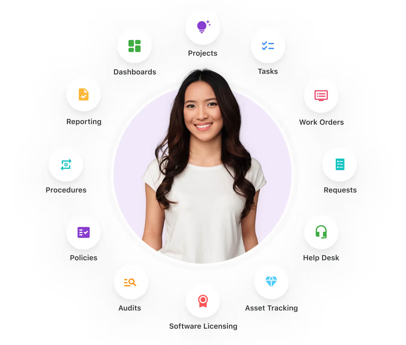
The web is experiencing its biggest transformation in decades, and AI-driven workflows are at the center of this shift.

In the recent Webflow webinar Architecting for AI: Strategies to drive AEO, conversion, and impact, industry experts Steven Male (Head of Growth Marketing, AirOps), Sarah Mendham (Technical Lead, Beyond), and Dan Locke (Head of Digital, IMB Bank) shared practical strategies for adapting to this new reality. Their insights reveal how businesses can balance AI automation with human expertise to create content that performs well in both traditional search and emerging answer engines.

The stakes are high: research from Semrush shows that visitors from large language models (LLMs) are worth 4.4 times more on average than traditional organic search traffic. This dramatic shift in user behavior demands new approaches to content creation, structure, and optimization.

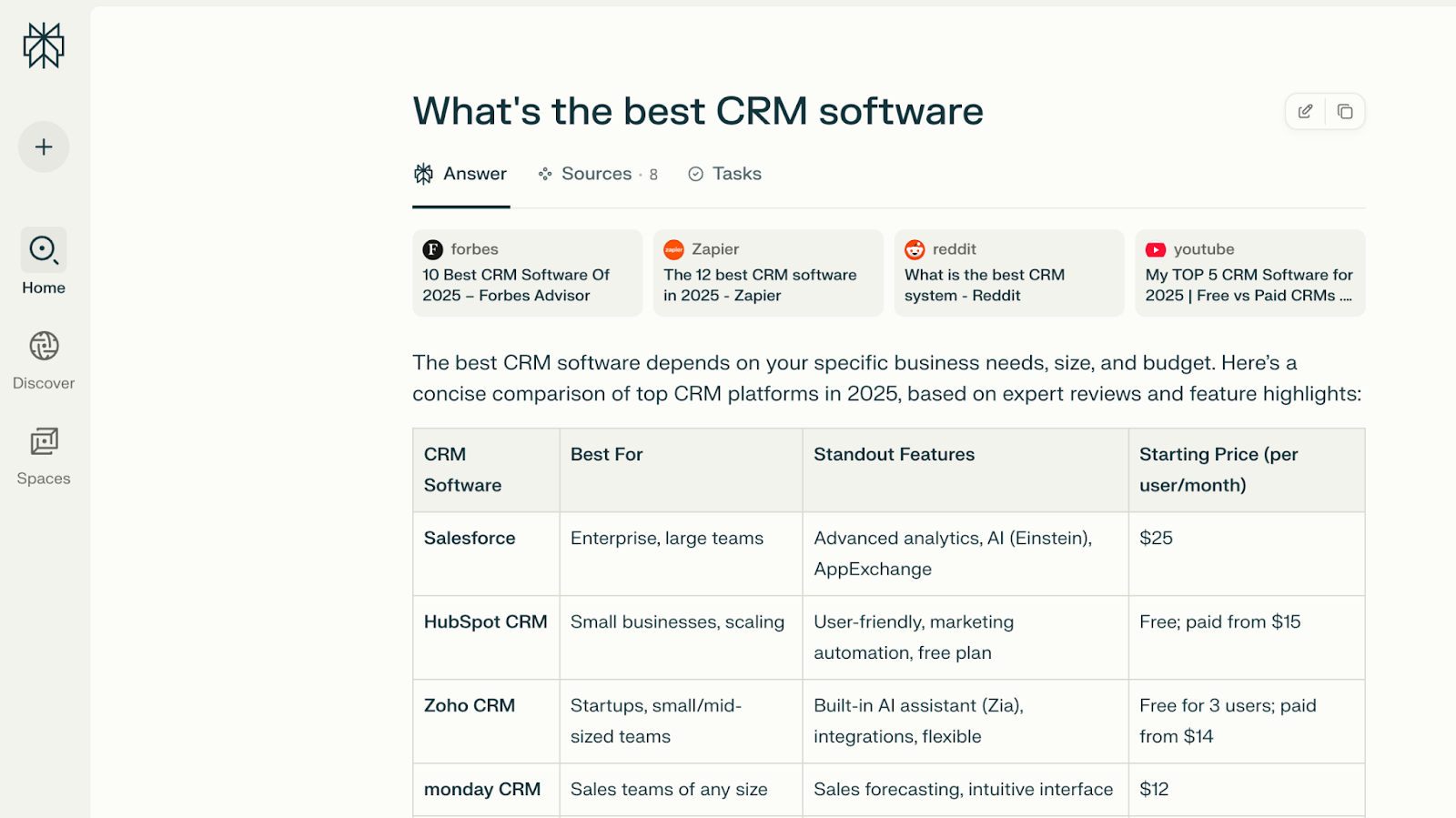
Optimize for answer engines

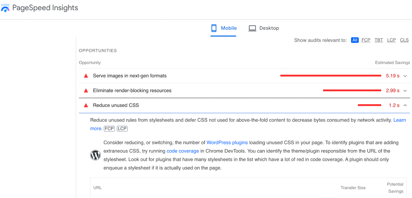
AI-powered search prioritizes up-to-date, deeply valuable, well-structured content.

Steven Male, Head of Growth Marketing at AirOps, believes that while the tactics for SEO and answer engine optimization (AEO) will eventually merge, the quickly growing traffic from LLMs represents a huge new opportunity for brands. He recommends grounding AEO efforts in five pillars — freshness, structure, authority, snippet extractability, and brand alignment — to deliver value to both users and LLMs.

Data in a recent AEO report by AirOps shows that sites with content updated every 90 days receive 4.8 times more citations than those that update less frequently, while pages with visible last-updated schema get 1.8 times more citations than those without.

To optimize for answer engines, regularly update pages, include visible timestamps and schema recency signals, and ensure concise formatting for snippet extractability. Also:

  • Schedule quarterly content audits to refresh existing pages.
  • Add visible “last updated” timestamps to all content pages.
  • Implement schema markup for articles, FAQs, and dates.
  • Structure content with clear H-tags and concise paragraphs.
  • Create easily extractable snippets using lists and Q&A formats.
  • Focus on brand alignment and author personas with proper schema.

The shift from keyword-based searches to conversational queries — averaging 23 words on LLMs versus 4 words on Google — means your content structure and unique insights matter more than ever. Pages need to answer specific, contextual questions while maintaining the clarity and organization that makes information easy for both humans and bots to extract.

Automate accessibility improvements

AI tools can also be used to ensure that the websites you’re building are accessible. 

Sarah Mendham, Technical Lead at Beyond, highlighted how AI tools excel at accessibility tasks that have always been important, but are often neglected due to resource constraints. 

“A lot of the things that are important for AEO have always been important for creating an accessible website, like the semantic structure of the page,” she explained. 

Sarah’s team uses AI to retrofit legacy pages where the structure of the site may be off, or where heading levels are based on styling rather than semantic structure. AI-generated alt text and automated bulk uploads can transform legacy content into structured pages. This saves manual effort while maintaining quality.

Key accessibility automation opportunities include:

  • Batch-processing images to add descriptive alt text
  • Restructuring pages to follow proper heading hierarchies
  • Converting styling-based layouts to semantic HTML
  • Validating content structure before client handoffs
  • Testing templates with bulk AI-generated content
  • Ensuring consistent accessibility standards across large sites

Sarah also emphasized using AI for bulk content uploads during testing phases. This approach helps teams validate that templates work correctly across all content scenarios before going live, which prevents the accessibility issues that often arise when clients add their own content later.

Accelerate migrations and accessibility improvements with MCP

Sarah also breaks down how Model Context Protocol (MCP) servers enable AI applications to connect with website services, and can be used to accelerate workflows and migrations. Pre-built options, like Webflow’s MCP, offer immediate value for content-heavy workflows.

“Webflow’s MCP server lets developers securely pull site structure and content into local AI environments (IDEs or tools like Claude Desktop),” Sarah explains.

With your site’s content and structural data readily accessible from the MCP server, you can utilize AI to support in:

  • Content migration: Transform unstructured data into organized collections.
  • Accessibility updates: Generate alt text for images at scale.
  • SEO optimization: Restructure content for better search visibility.
  • Quality assurance: Identify broken links or missing metadata across pages.

The MCP setup process is straightforward:

  1. Authenticate your connection. Add an API key to your local mcp.json file to allow connections to your website.
  2. Pull your site structure. Download your current content organization.
  3. Apply AI transformations. Let AI analyze and restructure your content.
  4. Review and deploy. Check AI suggestions before pushing changes live.

“MCP is how AI tools communicate with services, whether that’s querying an internal database or using APIs,” Sarah explained. 

This means you can connect multiple services — your CMS, analytics platform, and customer database — through a single MCP implementation.

For teams managing legacy websites, pre-built MCP servers offer a path to modernization without complete rebuilds. You can gradually improve content structure, enhance accessibility, and optimize for AI-driven search while maintaining your existing design and functionality.

Build strategic AI frameworks

Develop a framework that maps AI use cases — such as call-transcript analysis or social listening — to business objectives. This clarifies governance requirements and ensures focused investment.

Dan Locke, Head of Digital at IMB Bank, discusses how regulated industries can successfully adopt AI by linking every initiative to strategic outcomes. His team partnered with a local university to conduct multi-year research, combining academic rigor with practical application. 

“We built a framework that […] said, there are significant benefits if we can unlock […] what people are saying through calls, through chats, through searches, through customer feedback,” he shared.

Essential framework components:

  • Map AI use cases directly to business strategy.
  • Assess data sensitivity for each application.
  • Start with low-risk applications like content creation.
  • Build stakeholder confidence through education.

Dan’s team discovered that AI-powered listening, including call and chat transcript analysis, could surface insights within hours that previously took weeks of research through manual sampling. By establishing clear governance early, they were able to move quickly on low-risk initiatives while maintaining compliance and a safe path to including sensitive customer data applications.

Transform your workflows with Webflow

The convergence of AI-driven content creation, AEO, and accessibility automation represents a fundamental shift in how we build for the web. Success requires balancing AI efficiency with human creativity, maintaining content freshness while ensuring accessibility, and building governance frameworks that enable, rather than restrict, innovation.

These strategies work best when implemented on a platform designed for rapid iteration and optimization. Webflow’s visual development platform empowers teams to quickly update content structures, implement schema markup, and maintain the accessibility standards that both users and AI systems demand.

As search behavior continues to evolve and AI becomes more integrated into content workflows, the businesses that thrive will be those that adapt their strategies now. The insights shared by Steven, Sarah, and Dan provide a roadmap for that transformation.

Watch the full webinar to discover more practical tips for optimizing your content workflows and preparing for the future of search.

502 bad gateway: What it means & how web developers can fix these errors

Software Stack Editor · June 30, 2025 ·

From time to time, you may open a website to find nothing but a blank white page, perhaps with bold black letters reading “502 bad gateway.”

That error message is even more of a headache when it’s your website that’s failing to load. Luckily, you can start troubleshooting HTTP errors like this as soon as you understand the information they’re conveying.

Any time a website fails to load properly, you risk frustrating visitors, losing potential conversions, and negatively impacting your search engine ranking.

But how do you address this? It’s simple: by understanding how HTTP status codes work, you’ll be able to troubleshoot more quickly and solve 502 bad gateway errors on your site.

What is a 502 bad gateway error?

An HTTP 502 error is a server-side error indicating that the proxy server you’re using to connect to another web server has received an invalid response. This happens when a web server is being used as a gateway to fetch the data you need to load the page from an upstream server.

A 502 bad gateway error is a type of Hypertext Transfer Protocol (HTTP) status code. These HTTP status codes are issued by the server when you make a request, so if you understand what the codes mean, you can decipher errors and troubleshoot more easily. The four HTTP status code types are:

  • 100 Informational – Your request was received by the server, and it’s processing further.
  • 200 Success – Your request was completed, and the browser received the expected response from the server.
  • 300 Redirection – Indicates the server needs to take another action, like a 301 redirect, which you can use to reroute a URL to an updated page on your website.
  • 400 Client Error – The request was invalid. This happens when a site or page can’t be reached, like a 404 page not found error.
  • 500 Server Error – Indicates your request was valid, but there’s a problem on the server side. This is the category the 502 error falls into, along with the common 500 error that indicates an internal service issue.

A 502 bad gateway error may not always appear the same way every time. There are different versions of the 502 error message, including a blank white screen. Some of the most common include:

  • 502 bad gateway
  • 502 server error
  • Error 502
  • 502 Server Error: The server encountered a temporary error and could not complete your request
  • Bad Gateway: The proxy server received an invalid response from an upstream server
  • HTTP Error 502 – Bad Gateway
  • 502 proxy error
  • 502 Service Temporarily Overloaded
  • HTTP 502
  • Temporary Error (502)

What to do if you see a 502 bad gateway page when browsing

If you’re browsing the internet and receive a 502 bad gateway page, you can try a few techniques to fix it on your end.

First, try checking to see if the website is down generally or just for you. Check a website like downforeveryoneorjustme.com and the business’s social media for other folks receiving the same error. Or see if a friend can access the site from their browser.

If you can’t find any indications the website is down, try some of the following strategies:

  • Refresh the page. The first and easiest step — this often does the trick.
  • Try accessing the site on another browser. For example, if you’re on Chrome, try Firefox.
  • Check the website on your other devices. For example, if you’re on mobile, check on your laptop.
  • Restart your browser or computer. Reload the page after restarting your browser or computer.
  • Clear your cache or delete your cookies. Sometimes, the site is back up but your browser cache version is still giving you an error.
  • Use your browser in “safe mode” without extensions or add-ons. Some extensions can “break” websites.
  • Restart your router and modem. Your home equipment can be the origin of unresolved DNS errors.
  • Wait and try again later. Sometimes, you just have to wait out a server error. Most are resolved quickly, and you’ll have luck trying again in a few minutes.
  • Reach out to the website owner. If you’ve been trying to access a site for a while with no luck, you can use social media or email to contact the website owner and inquire about it.

What causes the 502 bad gateway error?

The cause of an error can originate from your equipment, the website’s hosting services, or the CMS used to manage the website.

  • Unresolved DNS – An incorrect or outdated DNS record can result in visitors receiving a 502 error. This may be caused by their DNS server, equipment, browser, or ISP. A DNS error can also happen temporarily if a website has just switched hosting services.
  • DNS server issues – If your DNS server is down or unresponsive, your site can throw 502 errors because the domain can’t resolve properly.
  • Other browser or home equipment issues – There are other issues that can originate from your equipment that can cause or perpetuate a 502 error, like browser extensions.
  • The origin server is down – The server the hosting service is using to store the website data is down. This could be due to overload or other technical issues.
  • A firewall is blocking the request – This happens when your website’s CMS is overzealous in its security services, like DDoS protection systems.

If you know what may be causing an error, you’ll be able to hunt down the origin and make sure it’s resolved quickly.

Common 502 error variations

When you’re troubleshooting a 502 bad gateway error, it’s helpful to recognize that different services and platforms may present this error in slightly different ways.

  • Cloudflare 502 – If you’re using Cloudflare, you might see a specific Cloudflare-branded error page that says “Error 502: Bad gateway.” This often indicates an issue between Cloudflare’s servers and your origin server.
  • Nginx 502 – If your server runs Nginx, you’ll typically see a “502 Bad Gateway” message referencing Nginx, which can indicate that Nginx couldn’t successfully proxy a request to an upstream server.

For more details, check out MDN’s official HTTP 502 documentation.

How to prevent and fix a 502 bad gateway error on your website

If it’s your own website that has started serving 502 bad gateway errors, you’ll want to fix it as soon as possible to avoid disappointing your users and negatively impacting your SEO. Recurring 502 errors can indicate that your site is frequently inaccessible, which could negatively affect your search engine rankings. A temporary server error that is resolved within a few minutes won’t hurt your search ranking. However, frequent extended periods of server errors will become detrimental

Note: you may not always be able to fix a 502 error since it’s often caused on the hosting or user side, but there are some ways you can prevent, fix, or address the impact of 502 errors.

Contact your web hosting provider

First, reach out to your web hosting provider to look closely at the problem and provide more information. They’ll have greater visibility into the servers hosting your site and may be able to pinpoint the problem.

Check your plugins, themes, and firewall

  • If your CMS uses a lot of plugins or themes, they can cause problems that result in a 502 error. Try disabling them one by one to identify conflicts.
  • Temporarily disable your CDN or firewall to see if the issue persists. This can help you narrow down where the error is coming from.
  • In general, choose plugins that are updated frequently and opt for a CMS that relies less on plugins for functionality.

Check your server logs or error logs

Reviewing your server or error logs can provide valuable insights into why 502 errors occur. These logs often show specific error messages or timestamps that help you pinpoint whether the issue is with your server configuration, overload, or another factor.

‍

How 502 errors affect user experience

When your site goes down due to a 502 error, visitors are left with no way to access your content. This can damage trust, reduce conversions, and prompt users to leave. Frequent or prolonged outages can also hurt your reputation long-term.

Make sure users can contact you

Your visitors may be the first to notice that your site is down or showing 502 bad gateway errors. They can alert you so you can quickly resolve the problem. Make sure they have an easy way of contacting you in addition to your website. This could be social media, a publicly available email address, or a Google Business Profile.

Customize your error page

Creating customized error pages for your website is straightforward. While it won’t fix the underlying issue, a well-designed error page shows visitors they’ve reached your site but it’s temporarily unavailable — much better than facing a blank screen or generic error message. These custom pages maintain professionalism, preserve brand trust, and encourage visitors to return later.

Remember X’s (formerly Twitter) Fail Whale? This iconic 502 error page kept users engaged during technical difficulties and became part of their brand identity. In Webflow, you can customize your 404 page with a design that matches your site’s aesthetic. For inspiration, check out our collection of creative 404 pages that transform frustrating moments into delightful experiences.

Prevention remains the best strategy. Minimize 502 errors and other HTTP issues by establishing a solid foundation from the start. Select a robust CMS and reliable web hosting service, then implement proper security practices, technical SEO, and redirects. These foundational elements work together to create a seamless user experience free from disruptive error codes.

Keep your site running smoothly

502 bad gateway errors can be frustrating, but by troubleshooting your server logs, checking plugins or firewalls, and ensuring reliable hosting, you’ll resolve them quickly and keep your site running smoothly. Keep learning about website optimization and best practices to prevent future errors and give your visitors the best experience possible.

How Webflow cut CI costs by a third

Software Stack Editor · June 27, 2025 ·

image

When thousands of builds a month pushed CI into our top three expenses, we saw an opportunity and rebuilt it for cost, scale, and resilience.

Webflow’s Continuous Integration (CI) system is critical for our monorepo’s development process. As part of that process, we execute an extensive suite of unit and browser-based tests by dynamically sharding the suite across Buildkite jobs and horizontally scaling as needed to meet compute demand. Running tens of thousands of builds a month with Engineering continuing to grow at Webflow has meant that our pre-existing cost savings measures have been outgrown. For example, we utilize the Nx build system to optimize test execution in our monorepo, but our complex dependency graph limits its effectiveness. Additionally, our smoke testing suite is in its infancy, so we still run all of our 88000 (and counting) tests for every pull request test branch in our merge queue, which merges thousands of PRs a month.

As a result, the Delivery Loop team’s CI costs are substantial, ranking third in overall spend within engineering. This high cost is primarily driven by the volume of EC2 instances required to execute our test suite while keeping the feedback loop short for engineers. A full monorepo Buildkite pipeline execution (a.k.a. build), which includes building our code for testing and then running the tests, can take over 30 machine-hours. We utilize over 9000 vCPUs and 36000 GiB of memory at peak.

How can we significantly reduce our CI costs without sacrificing system reliability or runtime, and without introducing any manual work for engineers? We undertook a targeted optimization effort, focusing on key areas like EC2 instances, AWS Config settings, and EBS volume sizes. According to Cost Explorer, these areas were our account’s top three sources of spend. Our efforts achieved a 33% reduction in amortized monthly CI costs while maintaining performance and reliability.

Leveraging Spot Instances

We significantly reduced our CI costs by transitioning most of our workloads to EC2 spot instances. While we had an active EC2 Instance Savings Plan, it locked us into a specific instance family which discouraged experimentation with other kinds of instances. Furthermore, the savings plan’s coverage was not sufficient for typical weekday compute needs and wasteful on the weekend when there was little compute needed. Spot instances offer flexibility and substantial cost savings, up to 60% compared to on-demand instances, which directly addresses our team’s number one cost driver: EC2 spend. The majority of our compute workload consists of testing jobs, so we gradually moved them over while leaving critical jobs, such as our target determinator job, alone. This move required addressing the inherent risk of spot instances being interrupted — we observed a 13% spot interruption rate for the month of April. We handled the risk in two key ways: building resilience into the system and carefully managing the rollout.

Designing for interruptions

To ensure our CI pipeline remained stable despite potential spot instance interruptions, we implemented robust retry mechanisms and test checkpointing. Our approach here mirrors successful strategies used by other companies.

  • Use Buildkite’s automatic job retries. This feature allows us to specify that jobs interrupted by a spot instance being reclaimed should automatically restart, preventing manual intervention by engineers at Webflow. Since interruptions can occur at any point in time and a job could unluckily be interrupted multiple times, we specified a limit of 5 retries.
  • Add test checkpointing. This more complex solution allows us to save progress on test runs. If a spot instance is interrupted, we can resume testing from the last saved point rather than restarting the entire file. We leveraged a Redis instance in our CI cluster’s VPC as a fast, temporary datastore for this checkpointing information. This choice was driven by the large volume of tests, high daily build count, and the temporary nature of the data. One challenge we faced here was having to implement checkpointing four different times for the four test runners we use within our monorepo.

A gradual, monitored rollout

Finally, to avoid disruptions to our engineers during this transition, we carefully managed the rollout of spot instances.

  • We selected the price-capacity-optimized allocation strategy for Spot instances. This strategy results in fewer spot interruptions than a price-optimized strategy at an increased cost. While test checkpointing reduces the time cost of a spot interruption, there is still fixed overhead from our agents needing to clone branches, fetch missing Docker images or node_modules directories from our cache, and start up services. Initially, we did not specify enough instance types for the strategy, so we ran into capacity constraints because EC2 could not provide enough spot instances. We saw CI performance regressions until we manually fell back to on-demand instances. To resolve the problem by giving the allocation strategy more options to work with, we used the Instance Advisor to add similar instance types with the same vCPU count and a low interruption rate. In some cases that included network-optimized, disk-optimized, or memory-optimized instance types.
  • We ran initial experiments in a staging version of our CI environment. We started with interrupting individual instances across multiple job types, then moved on to running aggressive interruption experiments using AWS Fault Injection Service (FIS). These tests allowed us to identify and address issues with our automatic retry configuration and dynamic pipeline generation code without affecting production builds.
  • For changes requiring production-level load testing, we implemented a lightweight feature flagging system. This system enabled us to control the use of spot instances without requiring code changes to be merged into PR branches. Using FIS did not accurately represent the real-world spot interruption rates we would see by allowing autoscaling for our spot instance queues up to their maximum instance counts. If we saw an unhealthy amount of interruptions, we could retreat to our on-demand queues which were still in place.
  • We then followed a gradual rollout strategy, starting with draft pull requests, then expanding to all pull requests, and finally enabling them for the merge queue. This phased approach minimized the risk of disruptions and gave us time to monitor the system via CloudWatch and Buildkite advanced queue metrics. We adjusted the system and built up teamwide knowledge along the way:
    1. We wanted to cap the amount of increased spending resulting from doubling the amount of queues and ASGs. Across each phase of the rollout, we gradually adjusted max instance counts by decreasing the max for our on-demand auto-scaling groups (ASGs) and increasing the max for our spot instance ASGs. In other words, we were temporarily overprovisioning the system, so we reduced where the overprovisioning was as compute needs shifted to spot instance queues.
    2. Prior to and during the spot instance rollout to draft PRs, we created a new dashboard, added automated alarms for spot interruption rates and long Buildkite job queue times, and wrote on-call runbooks to manage the system. We needed whoever was on-call to be able to handle spot capacity constraints, which was addressable by either adjusting the percentage distribution of the ASG between spot and on-demand or adding base on-demand capacity. We typically chose the latter option and found it to work well in practice for our situation. We eventually stopped seeing capacity constraints by adding more instance types to the mix as described above.
    3. After rolling out to all PRs and due to the spot interruption rates we observed, we made the decision to implement test checkpointing starting at the file-level with Buildkite metadata as the checkpointing data store. We deemed the metrics acceptable enough to not roll back to draft PRs only. Following that implementation, we saw improvements in our metrics, enabling the smooth rollout of spot instances to the merge queue. We then followed up with suite-level or test-level checkpointing depending on the runner and moved to Redis to store test results to handle the increase in volume of data.

This methodical approach to adopting spot instances and handling spot interruptions allowed us to capture significant cost savings without compromising the stability and reliability of our critical CI pipeline.

Exempting AWS Config resource types

To further reduce costs, we optimized our AWS Config settings, which were generating unnecessary overhead due to our high volume of short-lived EC2 instances. AWS Config tracks changes to AWS resources, which is crucial for security and compliance. However, for our CI pipeline, we create thousands of temporary EC2 instances each day, leading to a massive amount of tracking data and associated costs. With the increase in instance count due to our rollout of spot instances, we also saw increases in Config costs. We needed a way to filter what was being recorded, without creating a security hole. Thankfully, these adjustments were relatively straightforward.

We addressed this issue by selectively exempting certain EC2 resource types from AWS Config recording.

Certain resource types such as EC2 volumes were not critical for our security monitoring, so we created fine-grained exceptions to exclude them. We added exceptions, checked the Cost Explorer after a day, and made additional tweaks to the settings until we saw significant cost reductions here. To counteract some cost-associated compliance rules not being able to function without these data being recorded, we’ve chosen to periodically check the Cost Optimization Hub.

As a result, we eliminated unnecessary costs without compromising our overall security posture.

Shrinking our EBS volumes

We significantly reduced our CI costs by right-sizing our EBS volumes, which were previously over-provisioned. This was a surprisingly large area of potential savings, as many of our EC2 instances had unnecessarily large attached volumes. By analyzing our usage patterns and metrics via post-job logging, we identified opportunities to reduce volume sizes without affecting performance.

For our EC2 instances with local storage, we optimized the volume size to match the size of our base AMI, plus a small buffer.

  • We played it safe here and chose the minimum EBS volume size and then added some extra space “just in case.”
  • We also ran into inode exhaustion issues with the default ext4 filesystem due to the large number of small files that is typical of `node_modules` directories. To resolve this, we switched to the XFS filesystem for our SSDs, as it is better at handling a high number of inodes and generally has better performance for our workloads.

For our other EC2 instances, we conducted a detailed analysis and discovered that the attached disks were significantly over-provisioned.

  • Metrics showed that many volumes could be reduced by roughly half. We took a cautious approach and cut back on all volumes, while making sure to monitor usage afterwards.
  • We also optimized our extensive `node_modules` caching system, improving its handling of disk exhaustion. This optimization involved refining our cleanup policies to ensure we efficiently managed space by iteratively cleaning out old cache entries and removing old Docker volumes whose cleanup was previously not needed.

By addressing these issues, we significantly reduced EBS volume costs while maintaining our overall system performance.

What’s next?

Our CI cost optimization journey doesn’t stop here. We’ve identified several exciting areas for continued improvement and potential for even greater efficiency gains.

Graviton Adoption: We evaluated AWS Graviton instances and observed promising cost-performance benefits. However, we encountered some incompatibility issues with parts of our CI stack and had to wrap up the project before we were able to fix them all. We plan to revisit Graviton instances later in the year. We’re confident this will unlock further cost reductions without sacrificing performance.

S3 Lifecycle Management: We have S3 buckets storing data that have grown nonstop. Simply deleting all old data is not feasible due to how we handle site assets and snapshots since there’s no common prefix we can use to apply lifecycle rules. We should be able to enhance our asset and snapshot copying scripts to use S3 Object Lock in governance mode on these objects then turn on lifecycle rules, which would enable us to save tens of thousands of dollars per year.

By tackling these next steps, we aim to further refine our CI infrastructure, driving down costs and optimizing our resources.

Conclusion

As a direct result of these optimization efforts, we’ve achieved a significant 33% reduction in amortized monthly CI costs when comparing end-of-Q4 spend last year to end-of-Q1 spend this year. To break the reduction down a bit further, we saw a 42.7% reduction in EC2 instance spend, an 89.6% reduction in Config spend, and a 42.4% reduction in EC2 other spend. We’re already seeing these savings reflected in our budgets and expect that reduction to grow even further in Q2 as the full impact of our more recent changes takes hold.

But these numbers represent more than just cost savings. For Webflow’s engineers, this means a faster, more reliable CI pipeline as my team reinvests our savings into enhancements elsewhere. It means less time waiting for builds and tests to complete as we can horizontally scale further than before, and more time spent building features and solving complex problems. With these optimizations in place, we’ve laid a foundation for future growth and innovation without being hindered by excessive CI costs. The positive impact of these changes will ripple through our daily workflows, enabling us to deliver higher-quality software more efficiently. We’re excited about the momentum we’ve gained and the potential it unlocks for our team and our users.

Site speed scores: What’s good and how to improve yours

Software Stack Editor · June 26, 2025 ·

A slow website costs your business real money through lost visibility, traffic, leads, and revenue.

In 2025, site speed remains a critical factor for both search rankings and user satisfaction. While we’ve come a long way from the dial-up days of the 90s —when images loaded line by line and a phone call could interrupt your browsing—today’s users still abandon slow-loading sites within seconds.

The good news? You don’t need to be a technical expert to improve your site’s performance. This article will walk you through the key metrics that matter, how to measure your current speed, and practical steps to fix what’s slowing you down.

Fortunately, there are easy-to-use tools and tips to help you rate your website’s speed, diagnose the issues, and solve whatever’s throttling your site.

Let’s take a closer look.

Why site speed matters

Site speed impacts every crucial web performance metric — from page views to bounce rates to your bottom-line conversions.

According to a 2023 Portent study, websites that load in 1 second have conversion rates nearly 3x higher than sites loading in 5 seconds. The research showed that conversion rates drop dramatically as load times increase, with the sweet spot for maximum conversions being between 0-2 seconds. Sites in this range convert at an impressive 2.9%, while slower sites (5+ seconds) see conversions drop to 0.6%. Even more concerning for ecommerce sites, revenue per visitor decreases steadily with each second of delay. For context, it takes about one-third of a second for a human to blink — and in that time, you could be losing potential customers.

Target a 90+ PageSpeed score and healthy Core Web Vitals

According to Google, a score above 90 is considered good. Anything below that likely needs improvement to avoid the risk of lower rankings in the Google search results.

Google rewards websites that deliver exceptional user experiences, with site speed being a crucial component of their Core Web Vitals initiative. These Core Web Vitals — Largest Contentful Paint (LCP), Interaction to Next Paint (INP), and Cumulative Layout Shift (CLS) — have become official ranking factors that directly impact your site’s visibility in search results.

Even slower websites can rank well if they excel in other areas of search engine optimization (SEO). Lightning-fast sites may struggle to rank if they fall short in other user experience metrics. Google’s algorithm takes a holistic approach, weighing multiple factors beyond just speed.

To deliver a positive user experience that satisfies both visitors and search engines, ensure your content is helpful, thorough, and credible. Google evaluates this through various signals including backlinks, internal links, semantic relevance, well-structured headings, comprehensive body copy, and properly tagged images.

While you should prioritize your overall SEO strategy, don’t overlook site speed and Core Web Vitals as they’ve become increasingly important ranking signals. These performance metrics directly impact how users experience your site on both desktop and mobile devices, influencing everything from bounce rates to conversions.

Try dedicated site speed testing platforms

Tools like Google’s PageSpeed Insights and Webflow’s built-in performance monitoring can give a quick overview of how your pages perform. Running these tests highlights areas that need attention right away, such as large image files or unused CSS.

Measure site speed with these 6 key metrics

These metrics help you see exactly how users experience your pages, from when they first see content to how quickly they can interact.

Largest Contentful Paint

Largest contentful paint (LCP) measures how quickly the main content of a page becomes visible to users. This typically refers to the largest image, video, or text block within the viewport — often your hero image or featured content.

User satisfaction directly correlates with faster loading times. Google recommends keeping your LCP under 2.5 seconds for optimal performance. Research consistently shows that each 100-millisecond improvement in load time leads to measurable decreases in bounce rates and increases in conversion rates.

Best practices:

  • Optimize server response times through efficient hosting and caching
  • Preload critical resources that contain LCP elements
  • Properly size and compress images using next-gen formats like WebP
  • Implement resource prioritization for above-the-fold content
  • Remove render-blocking resources that delay content display

Interaction to Next Paint (INP)

Interaction to Next Paint (INP) — which replaced First Input Delay (FID) by Google in March 2024 — measures your site’s overall responsiveness to user interactions like clicks, taps, and keyboard inputs.

Unlike its predecessor which only measured initial delay, INP evaluates the full interaction duration—from when a user first interacts until the browser displays the visual response. Google considers an INP of 200 milliseconds or less as “good,” while anything above 500ms needs improvement.

Best practices:

  • Break up long tasks into smaller, manageable chunks
  • Optimize event handlers to respond quickly to user interactions
  • Minimize main thread work during critical user interactions
  • Use web workers for processor-intensive tasks
  • Implement code-splitting to load only what’s needed
  • Avoid large DOM sizes that slow down rendering

Cumulative Layout Shift

Cumulative Layout Shift (CLS) measures visual stability—that frustrating experience when you’re about to click a button, only to have it jump away as images or ads load, causing you to click something else entirely.

Google considers a CLS score of 0.1 or less as “good,” while anything above 0.25 needs urgent attention. These unexpected shifts significantly damage user experience and hurt conversion rates. According to a Yahoo! Japan case study, reducing layout shifts by just 0.2 seconds increased pages per session by 15.1%.

Best practices:

  • Always specify dimensions for images, videos, and embedded elements
  • Reserve proper space for dynamic content like ads and banners
  • Avoid inserting content above existing content without user interaction
  • Use CSS transform animations instead of properties that trigger layout changes
  • Preload critical fonts to prevent text layout shifts during page load

How to improve your site speed score

Just because you have a sub-90 site speed score doesn’t mean you’re doomed to a low page ranking forever. You can make choices in both the design of your website and the content you include on its pages to improve that score.

1. Run a website speed test

The first step is to see where your website stands now by performing a website speed test. Enter your website URL into a tool like PageSpeed Insights and let it analyze your site.

You’ll receive a dashboard of metrics like LCP, INP, and CLS for both desktop and mobile versions of your website.

2. Prioritize mobile optimization

People in the US are more likely to access the internet through their mobile device. If you need to prioritize which version to focus on, start by ensuring your site performs well on mobile.

3. Focus on underperforming metrics

Each metric will be color-coded based on your site’s performance:

  • Green: Your website is performing well
  • Yellow: Needs improvement
  • Red: Performing poorly enough to hurt user experience and search rankings

This dashboard serves as your priority list. Start with the metrics marked in red before tackling those in yellow.

4. Take immediate action

When you’ve gathered your insights, focus on quick wins such as:

  • Compressing large images
  • Cleaning up outdated scripts
  • Removing unnecessary redirects

Your dashboard results will offer specific suggestions to improve each metric. In the example below, PageSpeed Insights identified unused CSS stylesheets and slow-loading plugins that need attention.

Sample of Google's PageSpeed Insights tool, highlighting opportunities for improving site speed.
This screenshot of Google’s PageSpeed Insights is one of many speed tests that shows specific actions you can take to speed up your website. This includes things like optimizing images and getting rid of unnecessary code.

Use a staging environment for performance tweaks

Some of the common suggestions PageSpeed Insights will make for improving your website include:

  • Image optimization: Images are resource hogs. Compress your images using modern formats like WebP to trim 25% of the fat from your images without any loss in quality compared to.png and.jpeg files.
  • Browser caching: Save time for returning visitors by enabling browsers to store things locally like style sheets, JavaScript code, and images. The next time that same visitor arrives on the web page, their browser will already have that information stored. The browser won’t have to download the information from the website’s server, which reduces the page load time.
  • Minimizing JavaScript and CSS stylesheets: Strip comments, spaces, and unnecessary code from your JavaScript and CSS files with free tools like Minifier. The less extraneous information you have in your code, the faster it loads.
  • Removing unnecessary code and plugins: The longer you’ve had your website, the more likely you are to end up with too many redirects, extra tools, and information you aren’t using anymore. That could be because you changed how your website looks or operates. Or you found a new tool that works better than what you used before but forgot to delete the outdated tool.

Make it a point to regularly look through your website to make sure it’s not carrying around excess weight in the form of too many lines of code, outdated stylesheets, and large images.

Site speed is an important ranking factor, but it’s only the beginning

Optimizing your website is an important component of ranking well on search engines. Once you’ve got those technical aspects figured out, it’s time to mix a little art and creativity into the science of SEO.

Learn more about SEO and how to optimize your site with our SEO essential guide.

What’s New: What we launched in June 2025

Software Stack Editor · June 25, 2025 ·

image

Tired of wasting time on formatting, syncing, or tracking changes? Miro’s latest updates cut the clutter so you can focus on solving problems. With smarter diagrams, real-time collaboration, AI-powered catch-up, and seamless cloud and data tools, it’s easier than ever to stay aligned and move work forward—fast.

Before we dive in, a quick heads-up: Canvas 25 is back—live in NYC and online on October 14. Don’t miss the latest on AI collaboration and new Miro product drops. Save the date!

Miro Diagrams

Miro Diagrams is now available to all users, giving technical teams a faster, more precise way to map systems and processes. With a focused diagramming experience—featuring 3,000+ shapes, a dot-grid canvas, layers, object dimensions, and AI-assisted creation – you can bring structure to complexity in seconds and stay laser-focused on solving problems, not formatting them.

Miro AWS Cloud Diagrams (Beta) 

Huge news: AWS Cloud diagrams are moving into the new format. Whether you’re creating them manually or importing via the AWS Cloud View app (currently in beta), as soon as AWS shapes are detected, Miro automatically surfaces relevant tools like AWS Cost Calculator, Cloud View, and Filters. This makes it easier to plan, visualize, and collaborate on cloud architecture all in one place.

Formats & Focus Modes

Navigating between the canvas and full-screen formats like Tables, Timelines, Diagrams, or Slides just got easier. With Formats & Focus Modes, you can open up work in a full-screen view or in the wider context of the canvas, and then switch between them at any time.

This update also introduces a more consistent layout across formats: Key tools are now aligned to the left side of the header for easier access and a cleaner experience. Whether you’re moving between high-level planning and detailed work, switching views in Miro is now more intuitive and seamless.

Updates to Tables

New fields

Tables are getting even more sophisticated thanks to new “Blocking” and “Blocked by” fields. Create dependencies directly in Table view or draw lines between bars in Timeline – your updates stay in sync across both views. You can quickly search, filter, and group by dependencies to stay aligned and spot blockers before they slow you down.

Table formulas

We’re also introducing formulas in Tables to perform calculations across columns, so it’s easier to score priorities, calculate budgets, or support weighted decisions directly in Miro. Just add a Formula field, select the columns and operators using the visual builder, and Miro will calculate values automatically for each row. Table Formulas supports numeric fields and row-level calculations (like Column A + Column B), with full keyboard navigation for accessibility.

Collaboration indicators

See who’s editing Tables and Timelines in real time, making collaboration more transparent and efficient. Whether you’re working in a different synced view or layout, you’ll still see exactly where others are making changes no matter the configuration.

As teammates select or edit cells, their name and a color indicator appear instantly, so it’s easier to stay aligned and avoid conflicts while working together on the same board.

Catch-up

Catch-up allows you to stay on top of board activity with AI-powered visual summaries that highlight key changes and comment threads, helping you prioritize faster and reduce catch-up time. 

Catch-up adds a clickable, themed index of changes alongside the text summary. You can also view edits by collaborators and jump straight to the exact spot on the canvas where each change was made.

Canvas is the prompt

We’ve upgraded Create with AI so it can process images, diagrams, and visual layouts on your board, when selecting objects on the board to enhance your prompt. This enables you to analyze visual relationships between elements, and deliver more relevant responses with Miro AI. For example, use Create with AI to expand on an existing diagram, summarize only a specific color of sticky notes, and understand how you’ve organized your board in inputs.

Doc-level AI Actions

It is now easier to enhance your content with Miro AI. Previously, you could fix grammar, rewrite for clarity, or translate text by selecting specific sections within a document. But when it came to applying these actions across an entire document, the experience wasn’t quite as smooth.

That’s why we’re introducing Doc-level AI Actions. Apply AI actions to the whole document in just one click – no need to select text manually. Miro AI will generate a new version of your doc side-by-side with the original, so you can easily compare and choose what works best for you.

MS Office Miro Import Exports

Drag and drop Excel (.xlsx) and CSV files directly into Miro to automatically convert them into fully editable Tables—no manual setup required. This makes it easier to bring structured data into Miro, so you can organize, visualize, and collaborate on it instantly.

Team Field in Jira Cards

Create, convert, and edit the Team field in Jira cards directly from the Miro side panel – with full bi-directional sync. This is a key field for planning, roadmapping, and Agile rituals. Note: this update is currently supported only for Jira Data Center and is available in Jira Cards.

Flip cards

We’re bringing Flip cards to all Miro customers, regardless of your plan. Plus, you can reshuffle cards to keep interactions fresh and unpredictable. Show a question or prompt on one side, then flip to reveal the answer. Perfect for energizing meetings, quizzes, and collaborative workshops.

Explore these ready-to-use frameworks designed by and for Miro users to help your team stay aligned, organize key insights, and smash their productivity goals:

  • Alexander Ilic’s Transformation Map is a lightweight tool for teams working on multiple work streams to ensure alignment and progress towards a common goal.
  • Velebit’s Customer Journey Map with AI elevates your understanding of the customer experience by integrating AI’s analytical power into your user journey mapping.
  • Looppanel’s UX Journey Map helps teams visualize and communicate user pain points in any critical workflow.

Have your own ideas? Publish templates to Miroverse and share your expertise with 90M+ users.

Stay tuned for July!

As this month’s updates show, great collaboration happens when the tools get out of your way and let you focus on what matters most—creating, connecting, and building the next big thing together. With AI that understands your visual context, seamless data integration, and smarter ways to track progress, you’re equipped to tackle even the most ambitious projects with confidence.

Dive into these features, and as always, happy collaborating!

The hidden cost of brand inconsistencies (and how to avoid them)

Software Stack Editor · June 25, 2025 ·

A brand’s visual identity can be a powerful way to get customers to connect with it quickly — but only if people recognize it.

According to Lucidpress, consistent brand presentation can increase revenue by up to 23%. However, in practice, ensuring brand consistency can be challenging. As organizations scale, they create multiple web properties: custom landing pages, blogs, and microsites. Each introduces new opportunities for inconsistency without proper guardrails. Over time, these inconsistencies create compounding costs that hurt brand trust, ultimately hurting customer conversion and retention and slowing down the pace of execution. 

Companies can overcome this challenge by investing in design systems. These systems help enforce a consistent brand experience across all touchpoints while improving cross-functional collaboration, resulting in faster time to market without compromising brand integrity. 

In this blog post, we’ll explore the hidden costs of brand inconsistencies and how investing in a design system can prevent them.

Design systems: Building the foundation for a scalable, consistent brand

A design system helps organizations conceptualize, create, and iterate on web experiences and collaborate cross-functionally. It’s the single source of truth about how the brand manifests in the digital experience. By creating a design system, brands can: 

  • Create a consistent brand experience: Design systems automatically ensure that any design decision across a property is consistent with brand guidelines, whether typography or font size. 
  • Increase execution speed: Instead of building new pages from scratch, teams can use reusable components, accelerating the time to market. Additionally, if teams update guidelines or need to make any changes, developers can easily change one part of the codebase to replicate it across others. ‍
  • Improve cross-functional collaboration: With a shared source of truth, developers, marketers, and designers have a shared language and understanding of the brand guidelines, which can help them work more effectively together.

The compounding costs of foregoing investment in design systems

Despite the advantages, brands often delay investing in design systems because of the significant time investment. Teams must audit their existing digital experience for inconsistencies, align on the solution, implement the new design system across all their digital properties, document everything, and train team members on the new system. This is a significant undertaking, but without these systems, brands risk creating an inconsistent brand experience across their websites. Over time, these inconsistencies can impact business outcomes and team performance in several ways: 

1. Reduce conversion and retention

If your website doesn’t follow consistent brand guidelines (like conflicting UX behavior or mismatched fonts), it will confuse and frustrate your customers, resulting in lower conversions and poor customer retention. Here are a few different ways this can play out: 

  • Increase abandoned visits: Customers might get confused about your brand and leave your site. For example, if a customer visits your product page but the style or brand treatment on the page doesn’t match the rest of your website, it can be a disorienting experience, leaving them confused and even prompting them to exit the page altogether. 
  • Reduce conversion: Inconsistent user interfaces create friction in conversion funnels, reducing completion rates. For example, when Brad Frost created United Airlines’ design system, he streamlined three different date pickers across the homepage, booking page, and logged-in experience into one. This reduced friction by simplifying how users entered dates into the website, reducing cognitive overload, and improving the overall user experience. 
  • Reduce brand recall: When customers encounter inconsistent brand experiences, they struggle to recognize your identity across touchpoints, which hurts brand recall and loyalty. Think of how confusing it would be if Starbucks used its familiar green logo in stores and on coffee cups but different colors and fonts in its app (like bright orange Comic Sans font). Customers would struggle to connect these as the same brand, hurting Starbucks’s brand recognition.  

2. Erode brand trust and credibility 

Brand inconsistencies can impact how customers perceive your company. At best, they make you look careless. At worst, they can make you look unprofessional, eroding trust and loyalty. Over time, this can impact your standing in the market and lead to market share loss. 

For example, if you’re a financial services company, and your navigation bar looks different in one part of the app versus another, users might feel as if the website is “broken,” which might raise other questions about your product’s capabilities. This doubt can make it more likely for users to switch to another service, or not recommend your product to their network. 

3. Create operational inefficiencies

Marketing teams can leverage design systems to ship on-brand campaign assets quickly. Without them, they have to redesign components from scratch, which slows down execution and delays time to market. Redesigning these components also introduces room for human error, resulting in brand inconsistencies that require manual effort to resolve. Over time, these inefficiencies shift teams from a proactive optimization mode to a reactive, firefighting mode. 

This inefficiency also extends to maintaining or updating existing assets. Without a design system, developers must manually update the same component across all marketing assets. A design system makes this process more efficient by automatically propagating updates across all instances of the components. Developers must change one part of the codebase to automatically update the component across all assets, simplifying the project’s scope and effort. Marketing teams can leverage this agility to experiment and optimize their brand’s identity. 

4. Introduce (and deepen) cross-functional collaboration friction 

Without a shared source of truth, cross-functional teams, such as design and development, might make assumptions about how your brand identity translates into actual digital components and experiences. This can introduce friction in the relationship or, if teams already operate in siloes, worsen misalignment. Ultimately, this weakens an organization’s agility to launch bold initiatives that require cross-functional collaboration (like rebrands, new product rollouts, etc.).

Reduce brand inconsistencies with Webflow Shared Libraries

A website platform can make it easy to build and deploy a design system and maintain brand consistency while scaling. Webflow takes this further by enabling true reusability, consistency, and change management through multi-site design systems. 

Webflow Shared Libraries enable brands to easily share, discover, and experiment with components and style guidelines across all their web properties. Whether you’re making minor tweaks or executing a major rebrand, Shared Libraries provide governance and scalable change management flows that empower marketers to build on-brand experiences. Here’s how: 

  • Centralize: Share variables (i.e., for color, typography, spacing, etc.), components, and assets across the organization. 
  • Safeguard: Leverage roles and permissions to control who can share, install, and manage Shared Libraries.  
  • Review: Each designer can review and accept updates to Shared Libraries when ready, rather than rushing to implement changes all at once, ensuring a smooth and stable deployment.‍
  • Evolve: As your brand evolves, update your Shared Library just once. After the updates are accepted, Webflow cascades them across all sites — no extra effort required.
Webflow pop-up showing updates to the Catalyst Shared Library, including changed sections, added variables, images, and assets, with options to accept or cancel updates.
A sample update to a shared library, featuring tweaks to existing library elements and the addition of new ones.
  • ‍Optimize: Brands can use Webflow Optimize to run experiments on components across all their sites, making it easy to test and optimize a brand’s visual identity. For example, you can use Webflow to test the effectiveness of a particular CTA button sitewide so that you can make data-driven updates to your design system.

Turn brand consistency into your competitive advantage 

Brand inconsistencies can feel like death by a thousand paper cuts — each successive one chips away at your customers’ trust and erodes brand loyalty. But it doesn’t have to be this way. 

By investing in a platform like Webflow, your design system can live in the same place where your website is built. This eliminates the time-consuming back-and-forth handoffs between designers and developers (that become increasingly complex as your digital presence scales) and reduces the risk of brand inconsistencies across your design system. 

Further, with a design system that curtails this handoff process, the process of accessing, managing, and updating components is simpler and centralized. Best of all, this streamlined approach speeds up development cycles, resulting in faster time to market and greater brand consistency at scale. 

Ready to take the leap? Learn more about Shared Libraries and get started with Webflow today to design consistent, on-brand web experiences.

Accelerating AWS Migrations: How Sopra Steria Uses Miro to Align Teams and Drive Cloud Transformation Success

Software Stack Editor · June 24, 2025 ·

Digital transformation has become a defining challenge for modern enterprises, with cloud migration evolving from a simple infrastructure change to a strategic imperative. Organizations today are looking to exit legacy data centers and gain the advantages of cloud to accelerate their operations. 

Recognizing this challenge, Sopra Steria, a leading European technology consulting firm and AWS Advanced Tier Partner, has emerged as a key partner for enterprises seeking to navigate this complex journey. By developing innovative, people-centered approaches to cloud migration, they help transform technological challenges into opportunities for organizational growth and adaptation.

Story highlights

  • Engagement from 150 stakeholders across business and technical domains
  • Elimination of travel requirements through hybrid participation model
  • Up to one week saved in workshop preparation time
  • 70% faster insight generation through AI-powered theme grouping

Client Challenge: Balancing Cloud Migration with Organizational Adaptability

For Sopra Steria’s enterprise customers, cloud migration represents more than a technology replacement—it’s about building long-term organizational adaptability. One particular client faced this challenge while transitioning from significant on-premises infrastructure investments to AWS cloud solutions, with the goal of responding faster to business demands and accelerating innovation.

Håkon Eriksen Drange, Principal Cloud Architect and AWS Ambassador in Sopra Steria, identified several key risks that could emerge from a hasty or poorly planned migration:

  • Potential migration wave stagnation
  • Unforeseen bottlenecks
  • Complications arising from complex legacy environment integrations
  • Potential disruptions across interconnected domains and services

To address these concerns, Sopra Steria implemented a dynamic Cloud Adoption Framework (CAF) workshop designed to:

  • Ensure comprehensive stakeholder engagement from the beginning
  • Give all potentially affected teams a platform to voice concerns
  • Identify potential risks early in the transformation journey
  • Develop a measured, phased modernization strategy

The underlying objective was to help the client build capacity for rapid business response while maintaining stability in their existing infrastructure—balancing transformation with operational continuity.

Solution: Hybrid Cloud Adoption Framework Workshop

Approach

Sopra Steria implemented an innovative hybrid workshop using an AWS CAF template in Miro, transforming what could have been a slow, disjointed process into a highly engaging and collaborative experience. This approach delivered significant advantages by:

  • Creating an inclusive, collaborative environment via a hybrid model that broke down traditional silos
  • Lowering participation barriers through the use of customer-specific templates
  • Facilitating richer conversations that would be impossible in conventional meeting formats

The result was unprecedented engagement: A total of 150 stakeholders across business, technical, and operational domains participated—something that would have been impossible in a traditional workshop. According to Sopra Steria, without Miro’s collaborative platform, both participation numbers and input quality would have been significantly lower, resulting in critical gaps in alignment and understanding.

Key Workshop Features

  • Pre-Workshop Preparation: Two-week open input collection period
  • Hybrid Participation: Enabled remote and in-person engagement
  • Anonymous Feedback: Used Miro’s Private Mode to encourage candid input
  • AI-Powered Insights: Leveraged Miro AI to accelerate theme grouping by approximately 70%, significantly reducing manual workshop tasks
  • Direct Action Planning: Integrated Jira for immediate task creation

Impact: Transforming Cloud Migration through Collaborative Engagement

The workshop transformed the organization’s approach to cloud migration by creating broad alignment between teams and establishing a shared understanding of priorities and challenges.

“One of the biggest benefits we’ve seen is that there is now a better connection between business and technology,” explains Drange. “By aligning cloud transformation with business strategy, we avoided roadblocks and took a more proactive approach—anticipating system changes, integration needs, and procurement timelines well in advance.”

This collaborative approach directly addressed critical risks like migration wave stagnation, which could have resulted in increased cognitive load on technical teams, costly “double bubble” infrastructure environments, and missed deadlines triggering expensive software & hardware refreshes. 

With input from 150 stakeholders across diverse domains, the process revealed crucial insights into financial and operational challenges – potentially saving millions of dollars should the company meet the 4-year migration deadline.

Collaborative Advantage

By leveraging Miro’s collaborative platform, Sopra Steria transformed what would typically be a targeted, on-site activity for a smaller audience into a cohesive, engaging process that brought together diverse perspectives and expertise. This people-centered approach has established a new benchmark for cloud migration planning that standardizes workshop facilitation, minimizes administrative overhead, and creates a scalable, repeatable migration readiness framework for Sopra Steria. 

Miro for AWS Cloud Adoption Framework (CAF) Workshops

Software Stack Editor · June 24, 2025 ·

Miro’s AWS CAF Workshop Blueprint helps organizations plan and execute their cloud transformation strategy. These workshops play a key role in defining business goals, aligning stakeholders, and creating a clear cloud adoption roadmap – following AWS best practices. 

This Miro Blueprint offers a structured, organized approach for setting up and running AWS CAF workshops, minimizing preparation time while allowing focus on meaningful discussions about cloud adoption. 

You can use it to:

  • Drive dialogue to areas of greatest consequence for accelerated transformation
  • Align goals and business outcomes with business drivers
  • Facilitate decision-making across stakeholder and technical domains
  • Build momentum and capability for cloud transformation
  • Create a high-level strategic roadmap with prescriptive guidance

Blueprint Structure

The Blueprint includes three main sections to support the entire CAF Workshop process:

Pre-Read

  • Customer Introduction
  • Facilitator Guidance Overview
  • Envisioning Workshop Documentation
  • Alignment Workshop Documentation
  • Preparing for the Workshop (Facilitator)

Envisioning Workshop

  • CAF Envisioning Workshop
  • CAF Envisioning Workshop Brainstorm
  • Recap & Reflection

Alignment Workshop

  • CAF Alignment Workshop Goals
  • CAF Alignment Workshop Intro
  • CAF Alignment Workshop Activities Block 1 & 2
  • Recap & Reflection

This Blueprint is built in collaboration with AWS to ensure you and your team follow best practices for successful cloud adoption. Whether you’re just starting your cloud journey or looking to accelerate existing initiatives, this comprehensive toolkit provides everything needed to facilitate impactful CAF workshops that drive real business outcomes.

Web standards: Essential guidelines for better websites

Software Stack Editor · June 24, 2025 ·

image

If you’ve ever switched between browsing on your smartphone and your desktop, gone online on varying connection speeds, or found a website using Google — you’ve benefited from established web standards.

One reason for the World Wide Web (the web)’s prolonged success is the standards set during its inception. When Tim Berners-Lee started hosting public pages on private servers in 1989, he made the earliest version of the web standards we rely on today. Without these established standards, the internet experience would vary widely across devices, locations, and internet connections.

Let’s explore some of the history behind web standards and learn how to adhere to them when creating for the web.

History of web standards

After his initial creation of the WWW, its use continued to grow. In 1994, Tim founded the World Wide Web Consortium (W3C). The W3C is an international committee that includes businesses, nonprofits, universities, governmental entities, and individuals with full-time staff who develop internal standards and improve web-based technologies.

The International Organization for Standardization (ISO) also contributed to the first web standards. It formalizes solutions to global challenges, such as environmental, health, safety, and energy management standards. It also identifies international standards across industries, including some aspects of the web.

Soon after the W3C and ISO came the European Computer Manufacturers Association (ECMA) — a nonprofit organization that sets standards for information and communication systems, such as programming languages and data exchange between systems, fostering web page interoperability and more.

Together, these organizations formalize standards for all the web’s content and use.

Before W3C and accompanying bodies set these standards, there weren’t rules for content creation or site structure. Now, developers build websites to meet the same standards so they’re compatible across browsers, censorship-free, and accessible to as many people as possible.

What are web standards?

Web standards are the specifications that define the WWW, including best practices for web development and design.

Web standards were created to formalize all pages across the web and establish ethical guidelines that don’t exclude people. The first three web standards might sound familiar:

  • HyperText Markup Language (HTML)
  • Uniform Resource Identifier (URI, aka URL)
  • HyperText Transfer Protocol (HTTP)

From its inception, the W3C agreed that all web-related technologies would be free to use. Once governing organizations set standards and Tim Berners-Lee worked out how to link between servers, web browsers popped up by the dozens, servers by the thousands, and web pages by the millions.

Today’s web standards are more varied than the first three, but they’re all based on five early ideals:

  • Decentralization: Anyone can post anything online without explicit permission from a governing body.
  • Nondiscrimination (net neutrality): The same level of communication should exist across platforms, no matter how good or bad the internet service is.
  • Bottom-up design: Developers build code publicly, encouraging collaboration and experimentation.
  • Universality: All computers should speak the same language, no matter where they’re located or who’s controlling them.
  • Consensus: Everyone involved in the technical aspects of the web must agree to use web standards.

Net neutrality principles emphasize data equality so that internet traffic is treated fairly, a core idea behind nondiscrimination in web standards.

5 of today’s most common web standards

Thanks to web-focused governing bodies, several standards are common across the web. The most common ones are terms you might be familiar with, regardless of your web development experience:

1. HTML

HTML is the web’s publishing language — developers code every page in it. There have been several iterations: 2.0 enabled cross-browser functionality, 3.0 and 3.2 extended the original language, 4.0 added accessibility options, style sheets, and an improved framework. The most current version, 5.0, launched in 2014 and allows for faster, more complex sites and web applications.

2. XML

Extensible Markup Language (XML) is a web language that allows for more personal definitions of web page elements rather than the fixed nature of HTML. Developers most commonly use XML for machine-to-machine rather than in-browser communication.

3. XHTML

Extensible Hypertext Markup Language (XHTML) mixes the style sheet, accessibility, and internationalized concepts from HTML 4.0 with the stricter syntax rules of XML. This language separates structure and presentation, enabling reprocessing of content to display on different browsers and devices.

4. CSS

Cascading Style Sheets (CSS) replaced early HTML style sheet elements. Some websites assign each site element (e.g., header, page body) a style sheet. Others use a master stylesheet covering every element. CSS defines the appearance of each component or section. It also takes up less file space than old HTML style sheets and is easier to organize. Nearly all websites use CSS to define their appearance.

5. WCAG 2.0

Web Content Accessibility Guidelines (WCAG) outline how site creators can make the web more accessible. These accessibility guidelines include adding alt text to images and captions to videos, for example. The WCAG 2.0 guidelines are also an ISO standard, meaning countries that maintain ISO technical standards should formally adopt these guidelines.

For each standard, consult official specification pages (e.g., the W3C’s HTML Living Standard or the ISO’s accessibility guidelines) to stay current.

‍

Why we need web standards

Web standards benefit both the people who use the web and those who build for it. Adhering to web standards and following WCAG guidelines improves search engine results and accessibility while supporting evolving technology and design flexibility.

Improved browser and search visibility

Web standards help search engines like Google or Bing index and access your site more easily.

Google, for example, uses site crawlers that comb your content to figure out what it ’’ s about, where numbered lists are, what words are on each page, etc. From this information, it decides which keywords your content is relevant to and where to place your website in its search engine results pages (SERPs).

Accessibility

HTML accessibility options and WCAG’s guidelines help as many people as possible effectively use the web. This is excellent for users, and increases your target audience.

Versatility

Technology evolves quickly and web standards help the web keep up and accommodate different devices or browsers

Design flexibility

CSS reduces web design size across devices and increases loading speed by sitting separately from the website code. This makes it easy to change fonts, colors, and other design elements without altering web page structure.

Compliance testing, such as running an HTML validator, helps confirm every site follows standards. This fosters consistent experiences for end users.

Best practices for standardized web design

Here are some tips on following web standards throughout your web design process:

Whether you’re refining CSS or adding accessible markup, aligning with recognized specifications helps create a strong, user-friendly framework.

  • Implement accessibility from the start: Follow WCAG 2.1 (or the latest version) guidelines by incorporating alt text, proper heading structure, and keyboard navigation. Use accessibility tools like WAVE or Axe to audit your site regularly and ensure it works with screen readers.
  • Prioritize mobile-first design: With over 60% of web traffic now coming from mobile devices, start your design process with smaller screens in mind. Use responsive frameworks, implement Core Web Vitals best practices, and aim for load times under 2 seconds to improve both user experience and SEO rankings.
  • Embrace visual development: Take advantage of modern visual builders that generate clean, semantic code automatically. Use responsive layouts with Flexbox and Grid without writing CSS, implement interactions visually, and focus on creating consistent design systems. This approach maintains web standards compliance while dramatically speeding up your workflow and eliminating common coding errors.

Building with web standards in a visual platform

Complex coding isn’t as necessary as it used to be to make appealing and intuitive sites. While some organizations might still write HTML, Javascript, and CSS, increasingly more people are turning to no-code or low-code tools.

Webflow’s visual development platform enables people to build for the web while keeping an eye on adherence to web standards like WCAG guidelines. For more information, check out our free course on Accessibility on the web.

How Miro helps organizations consolidate to great

Software Stack Editor · June 23, 2025 ·

image

In the last decade, global SaaS revenues have increased by a massive 10x, with employees in large organizations now enjoying access to an average of 112 apps. So enterprise IT is booming, right?

Maybe not. Teams are drowning in a swirl of disconnected and disparate tools. Take visual collaboration. Sure, there are lots of options, but they don’t always cater to the functionality needed by different user groups. Some (think Figma or LucidChart) are too narrow; others (like FigJam or Mural) are too shallow.

So IT leaders are shifting their approach from investment to optimization, if not outright cost-cutting: In fact, 31% of software buyers say they’ve replaced tools that are too expensive.

“IT leaders are shifting their approach from investment to optimization, if not outright cost-cutting: In fact, 31% of software buyers say they’ve replaced tools that are too expensive.”

But a new report from Forrester reveals the risks in this strategy. Focusing on cost reduction too often comes at the expense of product innovation, which yields a much higher (if less easily measurable) upside over time. Instead, Forrester has created a framework to help inform a “next-generation business case that’s appropriate for today’s technologies and challenges.”

At its heart is a new way of thinking, one which optimizes team potential over tools. That means working closely with stakeholders across the business to understand the reality of how they work, where friction exists, and what truly enables productivity.

It also means adopting people-centric, value-based metrics like user satisfaction or incremental efficiency gains to measure the success of your company’s tech stack. The goal isn’t just to reduce tools – it’s to equip teams with the right tools, aligned to how they work best.

How Miro supports strategic IT planning

We’re making Forrester’s excellent and timely report available for anybody who wants to read it. And that should be every IT leader grappling with the need to change. We urge you to take a look, but what we’re also excited about is the role that Miro can play in helping organizations consolidate to great.

Miro eliminates the chaos of tool sprawl and offers teams a smarter way to work by providing a single, secure, and scalable platform for visual collaboration. It supports both broad-based use cases and specialized workflows, enabling cross-functional project work to move from idea to outcome faster.

Let’s take a closer look at how Miro helps IT leaders consolidate their tech stack based on Forrester’s recommended approach.

Scale and optimize with AI

According to Forrester, IT leaders should focus on technologies like automation, data analytics, and AI to scale and optimize the performance of business processes and organizations. With Miro AI they can do exactly that. Miro AI is built directly into the canvas, so instead of wasting time switching between tools or working out prompts, teams can stay focused on moving projects forward faster. For instance, AI will help them cluster sticky notes by keyword or sentiment, turn rough ideas into research summaries, or even turn screenshots into clickable prototypes. 

Accelerate collaboration for key use cases

Forrester’s experts point out that IT doesn’t exist in a vacuum – harnessing collaborative partnerships with the rest of the business is a key to fuelling innovation and delivering better results. Miro is already the place where teams come together to work on their most important projects, from roadmapping to goal management, to AI transformation. It’s easier than ever to get started with blueprints and templates, and move from unstructured to structured work thanks to distraction-free formats like docs, diagrams, slides, and tables.

Turn scattered data sources into smarter decisions

“CIOs should articulate the promise that technologies like AI, IoT, and advanced analytics hold in creating disruptive business models,” says the Forrester report. But it’s difficult to tell that story when the data you need is split across so many different sources. Miro helps companies take that scattered data from CRMs, research platforms, or even Gen AI assistants, and bring it all together in one place so it’s easier to actually use it to inform decision making. Our insights tool even uses AI to forecast the revenue value of future features.

Ensure operational stability and compliance

Finally, Forrester is clear that high-performance IT decisions should be grounded in security, compliance, and safeguarding. Miro is focused on infrastructure, operational, and product security so companies can focus on innovating faster. With Enterprise Guard, organizations can find and secure sensitive data anywhere on Miro, even when it’s not being caught by your internal AI systems. We’ll also automatically make sure that no private data is ever fed into Miro AI so you have peace of mind that your most important IP stays right where you expect it to be.

The benefits of app rationalization with Miro

When organizations use Miro to support tool consolidation decisions, the benefits are clear:

  1. Greater productivity

Miro drives increased employee engagement and productivity across your entire organization by providing a central workspace that empowers cross-functional work.

  1. Organizational efficiency

Consolidating onto Miro increases control, optimizes costs, and reduces risk for IT leaders.

  1. Accelerate strategy

With Miro at the center of your company’s workflows, it’s faster and easier to design, plan, and deploy new IT strategies and AI transformations.

This is why we’re already helping thousands of companies making the switch from their current visual collaboration tools. Like Workday. The HR software platform was looking to eliminate redundancy across its platform and consolidate onto a more user-friendly, feature rich product. In just six months, 80% of Lucid users transitioned to Miro, with over 50% utilization in less than a year.

“Miro showed up as head and shoulders above the competition in every way.” – Murali Rathnam, VP of IT Infrastructure, Workday

Ecommerce software provider Lightspeed also wanted to consolidate from Lucid to Miro to enable better collaboration (and budgeting) across departments. With Miro’s Professional Services team on hand to identify inactive Lucid users, migrate documents, and onboard teams into Miro, over 35 Lightspeed departments were quickly able to work together more efficiently.

“We greatly appreciated the efficiency of the Miro team. They were able to find solutions, including demands for embedded links and static images of Lucid documents.” – Gus Haddad, Lead IT Project Manager, Lightspeed

If you want to know how Miro can help your strategic IT planning, check out our cost calculator tool and discover the value of application rationalization for your business.

The end of marketing silos: Bringing brand and growth marketing together

Software Stack Editor · June 23, 2025 ·

image

Customer behaviors and expectations have evolved significantly, but most companies still divide brand and performance marketing into separate functions.

This split made sense 20 years ago, but now actively hurts business.

Brand marketing is traditionally focused on awareness, perception, and long-term value through storytelling and emotional connection. Performance marketing, on the other hand, emphasizes immediate, measurable outcomes: conversions, attribution, and direct ROI. 

These fundamental differences also extend to how these teams function in an organization. Brand and performance teams report to different leaders, operate different budgets, and are measured against opposing goals. But this siloed approach comes with hidden costs — missed opportunities, duplicated efforts, and campaigns that excel in one area while falling short in another. However, successful marketing requires brand impact and performance results working in harmony. 

The hidden costs of marketing silos

Customers don’t experience your organizational structure — they experience your brand. But organizational silos often lead to visible brand inconsistencies that erode trust, personalization opportunities, and conversion potential. For instance, a prospect might receive competing messages across channels because teams haven’t coordinated their targeting. 

Today’s customer journeys are non-linear and span multiple touchpoints across weeks or months. When brand and performance teams operate separately, they can’t optimize for these non-linear paths. Brand teams can’t track who saw their messaging, and performance teams drive traffic to experiences that don’t align with brand messaging. 

Constant handoffs between teams create compromises and delays. Competitors with unified teams launch campaigns faster and convert more customers, while you might experience missed revenue targets, longer sales cycles, and reduced customer lifetime value. 

The impact extends beyond metrics to team effectiveness and culture. When brand and performance operate separately, marketers struggle to connect their work to business outcomes and feel limited by narrow specializations rather than developing multiple skillsets.

Common barriers to unifying marketing teams

Even for teams that want to integrate performance and brand marketing teams, they need to overcome several barriers:

  • Organizational structure: Brand and performance teams usually operate on separate budgets and are measured against separate success metrics. This results in teams that have different vocabularies, priorities, and working styles.
  • Different measurement approaches: Performance marketing relies on direct attribution models that track specific actions to specific touchpoints, whereas brand measurements focus on long-term indicators like awareness studies, sentiment tracking, and brand health metrics. This mismatch makes it difficult to align teams on shared success metrics and can lead to conflict over budget allocation. ‍
  • Technical infrastructure: The technical infrastructure often reinforces these silos. Brand teams use different analytics platforms than performance teams, creating data silos. Customer data lives in separate systems with incompatible definitions and reporting structures, making it difficult to align on a common KPI or problem. Even when teams want to share insights, the data doesn’t connect.

How to break down silos

With conviction and clear strategies, you can unify your marketing operations. Here are some tips to breaking down silos:

Create shared successes with objectives and metrics

The foundation of unified marketing starts with developing KPIs that capture brand and performance impact, rather than forcing teams to compete for credit. Instead of measuring brand awareness and conversion rates separately, track how brand interactions influence conversion quality and customer lifetime value. Everyone should be moving in the same direction with progress being tracked on all fronts. Performance campaigns should be evaluated for their brand impact, and brand campaigns should receive credit for downstream conversions.

Teams need shared goals and dashboards that show how brand and performance activities work together in the short and long term, making collaboration visible and valuable. Set up regular cross-departmental planning sessions and campaign post-mortems to celebrate successes together and reflect on what you can improve. 

Integrate cross-functional processes and restructure team dynamics

Organizational alignment means nothing without process changes that make collaboration the default rather than the exception. This requires workflows that require teams to integrate, rather than hoping they will choose to. A good place to start is integrated campaign planning that involves both teams when developing brand concepts and performance strategies. 

Rather than handing projects between teams, create blended teams or working groups with members from both brand and performance functions. These teams share responsibility for outcomes and develop working relationships beyond individual campaigns.

Align technology to enable rather than fragment teams

Technology infrastructure should support unified workflows. This doesn’t mean replacing all tools, but instead integrating existing data and systems. With unified customer data platforms, teams can see the complete customer journey and make better decisions about messaging, timing, and channel efforts. 

The most successful organizations adopt platforms that support brand storytelling and performance optimization. Instead of integrating separate tools, they choose solutions where collaborating is natural rather than forced.

How Webflow unifies teams and helps solve organizational challenges

With Webflow, teams can work in one platform for multiple marketing needs. Brand marketers can build visually stunning, narrative-rich experiences using the same system that performance marketers use for conversion-optimized landing pages. 

  • Breaking down technical barriers between teams: The integrated CMS in Webflow supports both long-form brand content and performance-focused copy without requiring different workflows or approval processes. Brand updates automatically appear on performance pages, and performance optimizations maintain consistent branding. 
  • Enabling rapid experimentation across brand and performance: Webflow’s visual development environment means brand marketers can build and modify experiences directly without waiting for developer resources, and performance marketers can create testing variations without going through lengthy approval processes. Real-time collaboration features enable both teams to work on the same projects simultaneously. 
  • Streamlining workflow from concept to conversion: Webflow’s design-to-launch process eliminates traditional handoff friction by enabling direct implementation of design concepts. The integrated SEO and performance optimization tools ensure that brand experiences don’t sacrifice discoverability for aesthetics, while performance pages don’t sacrifice brand quality for conversion optimization. These considerations get built into the workflow rather than addressed as afterthoughts. 

Why marketing unity can’t wait

Organizations trapped in silos simply can’t compete effectively in this environment. While they coordinate handoffs and navigate internal friction, competitors with unified teams launch campaigns faster and prove marketing’s total business impact rather than defending separate metrics. The question is whether your organization will lead this transformation or spend years catching up to competitors who moved first.

Platforms like Webflow make it practical and scalable to unify brand and performance operations without sacrificing the specialized capabilities each function requires. 

Ready to break down your marketing silos? Get started with Webflow to unify your brand and performance marketing teams.

How to design a website in 10 steps + examples

Software Stack Editor · June 23, 2025 ·

Learn how to design a website with a step-by-step guide that helps you navigate this complex but rewarding process.

It’s no use planning out a lengthy resource blog for a website that doesn’t yet have a homepage. Every step of website design, from planning layouts and internal linking structures to selecting font pairings and optimizing for search engines, becomes more efficient when done in the proper order.

The process defined here streamlines how to design a website from scratch, so that you can spend less time strategizing and more time building.

How to design a website from scratch: 10 steps

Following this 10-step process, you’ll plan, develop, and publish a website efficiently, without much effort or running into roadblocks. Read on for a tried and tested website design process that can help you turn your website idea into a reality.

1. Determine the type of website you want

Every website is designed to meet certain user needs. You should determine early on which one you’re designing so that you can know what kind of user experience you’re planning to create. 

Below are some examples of common website types.

Transactional

The Eco Homestead homepage begins with a promo for their French Clay Cleaning facial bar.
Source: The Eco Homestead

Transactional websites like The Eco Homestead from Charlee Alexeev are online stores, or ecommerce sites, that market and sell products. They often use rich text and structured data as search engine optimization (SEO) techniques so that their product pages appear higher in search engine results.

Informational

The Curatist homepage promises to offer architectural news that inspires readers.
Source: The Curatist

Informative websites like The Curatist from Timea Szabo aim to teach website visitors something and act as a credible source of data that they’ll want to use again. Their web designs often feature blogs that excel at capturing keywords and topics that search engines look for when ranking content.

Interactive

The Weglot Like Magic homepage features an eye floating above a button to “Let The Magic Begin!”
Source: Weglot Like Magic

Interactive web designs, like Weglot like Magic from Refokus, offer entertaining, memorable user experiences. They typically invite visitors to actively engage with their content through games, videos, and animations. Interactive sites focus less on selling anything and prioritize impressing their audience with visually appealing interactions.

2. Define your website’s scope and goals

Now that you’ve chosen a website type, it’s time to develop a clear idea of what you want your website to do. Ask yourself these questions to begin building a foundation:

Why should this website exist? 

Determine why you’re building this website for yourself, a client, or a team, paying special attention to how the target audience should engage. Review competitors’ sites, too and identify how you’ll differentiate yours from theirs. Define what will make your user experience different from theirs, and why that’s important.

What should this website achieve? 

Define the goal your website should drive visitors toward, such as making a one-time purchase, signing up for a newsletter, or subscribing to a product. To keep your design choices focused, your website should have one primary goal — although you can also have secondary goals in mind.

How will the website serve its purpose and goals?

Outline some basic strategies this website will use to engage its audience and encourage them toward the end goal. Typical methods include offering SEO content, showing testimonials, and leveraging creative layouts. How you execute these techniques will be unique to you, but you should be able to grasp the guiding principles for your design decisions.

3. Plan your site architecture and content

Get some paper and a pencil, or use a digital whiteboard tool like Figma, and sketch a basic skeleton for your website design. List every page your website should contain, and organize them into categories, just as you would in a card sorting test. This structure will become the navigation menu for your first draft.

With the basic skeleton sketched, take notes about the content that belongs on every page. For example, an “About us” page might include information about your brand’s history or mission statement. Planning these details now will help you later when designing the interconnected user experience (UX) that directs visitors through the website.

For complex sites, take this planning further with a flowchart tool like Lucidchart. Use lines and arrows to indicate which pages connect and highlight the intended user journey with color coding. This flowchart can help you add new pages or consolidate content later in the process. 

4. Pick your preferred website builder

Now that you clearly understand what you want your website to do and how it should look, find a tool that can aid you in achieving your vision. Here’s a list to help you select the best website builder for your needs.

Webflow 

Webflow is a comprehensive website platform with a visual-first canvas, a powerful native content management system (CMS), built-in SEO tools, and fast web hosting. You can use it to create any website from scratch, or customize one of hundreds of website templates available in the Templates marketplace. Try it for free, and when you’re ready to upgrade, there are several plans to choose from.

WordPress 

WordPress offers a core platform that you customize with plugins and add-ons. These extensions add to the overall cost of WordPress and require you to purchase the toolset you need to design your website piecemeal. While its drag-and-drop editor makes designing easier, it introduces limitations that make for basic layouts.

Wix & Squarespace 

Wix and Squarespace are both streamlined website-building platforms that don’t share WordPress’ reliance on plugins. Their secure web hosting is on par with Webflow’s. However, their lean design tools can limit creativity. They’re great for people with little web design experience who want to quickly build a simple but serviceable website.

Shopify

Shopify specializes in creating websites for selling products online. Their content management system, SEO tools, and templates are all built with ecommerce in mind. These features make them an excellent choice for online merchants, but designers using Webflow can also get the best of both worlds by integrating with the Shopify platform.

If you’re having trouble deciding between these website builders, try one. Pick a page or feature you know your website needs and try building it with each platform — it shouldn’t take long to determine which provides the best experience for you.

5. Create wireframes and draft site copy

Now that you’ve settled on a website builder, use it to plan out all the pages your website needs. Start wireframing the UX and add rough draft headlines, calls to action, and text that establish the basics. Try experimenting with making your layouts responsive for different screen sizes, which will increase the accessibility of your content. 

You don’t have to settle on anything just yet. If you’re having trouble getting your ideas off the ground, find a template or website design example that sparks your creativity. And if you’re adding an SEO blog to your website, take this time to draft a few articles. That way, you’ll have something to work with when planning your blog layout later. 

6. Develop a design system

Create a separate page where you’ll build out your design system — a collection of reusable components, principles, and guidelines that provide designers and engineers with a shared language. Include a reference for your color scheme, icons, and typography so that all elements are in your brand style. Then, use these to create all the reusable components your site needs. While you’re doing this, keep accessible design principles in mind to ensure that you can reach a broad audience.

Headings

Dedicate a space to create text boxes for headings. Organize them by size (H1, H2, H3) and configure them with the font pairings you want your website to use. A general rule of thumb is to reduce the font size by 20% for each step down. For example:

  • H1: 20pt
  • H2: 16pt 
  • H3: 12pt

CTA buttons 

Create your call-to-action buttons, such as “Contact sales,” “Learn more,” and “Get started.” Organize them by priority and make multiple versions that align with your color palette. Primary buttons should use bold colors and thick outlines, while secondary ones can be more subtle, using pale colors without outlines, like ghost buttons.

Modals 

Create modal windows for pop-up windows, cookie consent banners, and login screens. Configure them to respond to changes in screen size with breakpoints to make navigation easier. If you want to expand your options, there are templates you can clone.

Logos

Create multiple versions of your logo for various uses, organizing them by size and color so they’re easy to drag and drop into navigation menus, headers, and footers where needed. It’s best to use Scalable Vector Graphics (SVGs) for logos, since they can be readjusted to different screen sizes without losing resolution.

Containers

Create empty containers for images and text blocks so you can quickly drag and drop them into new pages. Next, configure their padding and alignment so they seamlessly drop into pages without disrupting the layout.

7. Build your website

With all the building blocks created, you can now use them to construct your page layouts. Start with the homepage since it sets the tone for your web design. Review your answers to the questions you answered in the first step, and build a homepage that sets a strong foundation for the goals you set out to achieve.

With your homepage complete, consider the next steps you want website visitors to take. Then, build your web pages in sequential order along that journey. Do this for every use case you think visitors will come to your website with, reusing and adapting pages as needed. Eventually, you’ll have a web design that serves every user’s intent.

Review the site architecture you worked out in the second step to see if you missed any pages. If so, reconsider whether they’re necessary. You might not need them if they didn’t naturally fit into any use cases.

8. Conduct user testing and gather peer feedback

Sign up for a user testing service like UserTesting.com and reach out to peers to ask for feedback. Use established research methods like tree testing and A/B testing to extract actionable insights you can use to improve your designs. Do multiple rounds of research to discover every opportunity for optimization and ensure your site functions well.

9. Publish your website domain

Purchase your domain name and run through a pre-launch checklist. When you’re ready, hit the “Publish” button and watch for build errors as your website goes live. Troubleshoot any last-minute bugs and extensively check your published web design. If you can get through every page without detecting glaring issues, then congratulate yourself on a job well done!

After publishing your website, configure your version control system. Set up a separate staging environment to experiment with new optimizations and web design ideas. Most website builders do this automatically, but check that you know how this process works. If you ever need to roll a change back, it’ll help to know an easy way to revert.

10. Manage, scale, and optimize

After publishing your new website, it’s time to set it up for long-term success. Establish a cadence for checking all your pages regularly for bugs, errors, and opportunities for optimization. It’s also important to monitor your analytics and set specific goals for conversion rates and traffic. With this data, you’ll be able to look for new ways to improve its SEO and streamline the intended user experience.

Key components of great website design

As you review your site to find ways to fine-tune it, you’ll undoubtedly discover some minor improvements to make. Follow these best practices to avoid common site design mistakes and optimize your content:

Clean layouts

The Studio Minimal homepage begins with the headline, “The architecture design studio.”
Source: Studio Minimal

Web designers are full of brilliant ideas that help them create immersive, memorable user experiences, but sometimes they don’t know when to stop. Let the Studio Minimal template from Mateusz Jaromin serve as a reminder that simple website designs, executed well, can often outperform flashy ones. For every design element in your layout, consider whether it’s truly necessary to meet your goals.

Mobile responsiveness

A screenshot showing how a CSS grid can be used to create a responsive emoji.

Every page in your website design should respond to changes in screen sizes so visitors can intuitively navigate it from any device. There are several ways to do this, from flexboxes to Cascading Style Sheets (CSS) grids like this Smiley Grid from Peter Dimitrov. Webflow has built-in tools that optimize access automatically, making your unique web designs adaptable for any device.

Loading speeds

The eCommerce Speed Hub website lists several statistics about how it helps users speed up their websites.
Source: eCommerce Speed Hub

Page speeds can impact your rankings with search engines, which are key traffic sources. Use a speed testing tool to measure your page load times. Then, look for opportunities to compress images, streamline animations, and simplify layouts. Check that your hosting provider uses a Content Delivery Network (CDN) and enable any features that can help you achieve faster loading times. 

Intuitive navigation

The Frontify homepage is blurred except for the navigation menu at the top left.
Source: Frontify

Regularly reassess your navigation menu to find ways to make it more intuitive, like this one Nancy Peng made for Frontify. It’s compact when closed, not taking up too much screen space, and it blurs the background when open to make it easier to find the category you’re looking for.

Experiment with new categories or unique presentations that could better organize your pages or make them more inviting to visitors. In your mobile designs, use techniques like the hamburger menu to make menus more compact so they’re easier to navigate on handheld devices.

Engagement optimization

Check your analytics regularly to identify pages that aren’t getting much engagement. Look at bounce rates, view times, and clicks to determine whether some pages perform better. Then, try to identify any consistent themes and apply those lessons to the pages that aren’t getting the same engagement. For more granular data, use a heatmap tool like Hotjar or Webflow Analyze to determine where users get hung up in the user experience.

SEO

Search engine optimization can help you rank higher on search engine results pages. Take the time to review your website regularly to look for ways to improve technical aspects like loading speeds and editorial SEO aspects like keywords and topics. Use an SEO tool like Ahrefs or Semrush to run regular checks on your content and discover opportunities for optimization. 

Web design tools to try

Even after you’ve settled on a website builder to use, there are still several web design tools you might want to try. These tools can help you iterate on your designs and prototype new pages and features. Here are a few tools that make good additions to any web designer’s toolbox.

Webflow

Webflow is a website experience platform with a visual canvas and powerful CMS. It’s also a great place for you to test out new ideas. You can access its wealth of templates and pre-designed assets, adapt them for your needs, and then export the HTML to your preferred platform. Its visual canvas streamlines prototyping and experimentation so you can quickly try new things and take anything that works with you.

If you decide to migrate your website to Webflow permanently, you’ll find it offers several tools to help you, like a widely compatible content management system and web hosting that supports custom domain names. The tools you’ll need will depend on which website builder you’re coming from and your goals, but rest assured that any site can move to (and look great on) Webflow.

Figma

Figma offers a digital design space that’s very useful for experimenting with new templates, fonts, and interactions. Its browser-based design tools make it easier to share a link to a proposed design with other web designers to get their feedback. With its version control and automatic prototyping features, you can collaborate on and test designs quickly, and the Figma integration makes transferring finished designs to Webflow seamless.

Canva

Canva is very similar to Figma, but with a lower price tag and leaner design tools. It’s great for casually experimenting with layouts or interactions to see how they look in practice. It offers several templates and pre-made assets that can provide some inspiration, too. While it doesn’t have as much content as Figma, it does offer a capable design space where you can collaborate with other web designers and gather feedback.

Unsplash

Unsplash offers a library of visuals that you can drag and drop into any website builder. Your subscription gives you unlimited, royalty-free downloads and access to unique, members-only content. Given the cost of hiring a graphic designer or commissioning artwork, this tool can be a huge cost saver for web designers. It won’t help much with an ecommerce site that needs a dedicated photographer, but it can help with blog articles and service pages where stock images won’t look out of place.

Minifiy

Minify is a code-checking tool that can validate your HTML, CSS, and JavaScript. Minify can also find opportunities to optimize your code, which helps it load faster. Minify is a free, reliable HTML validator, but keep in mind that some website builders, like Webflow, validate your code automatically to save you the extra step.

WebAIM

Tools like WebAIM ensure that you have enough contrast in your color scheme. Before you select a color combination to use for text and backgrounds, run it through WebAIM to make sure it passes at least a “WCAG AA” test. If not, you can use the sliders to help you find a better combination.

PageSpeed Insights

PageSpeed Insights checks your website’s load times and runs several other SEO checks on your content. Enter your domain name and it’ll surface actionable insights about optimizing your website for visitors and search engines. It also offers some accessibility checks that can help you detect ways to improve your web design.

Design smarter, launch faster with Webflow

You now have all the tools you need to streamline the entire web design process, from concept to launch. It might seem daunting at first, but with a clear goal and the right resources, you’ll hit the “Publish” button in no time. 

If you want to take your website from idea to reality with a comprehensive, visual-first website builder, Webflow can help. With its secure web hosting and wealth of templates that streamline creating and managing your content, Webflow provides a great starting point for any new website.

Try Webflow for your next best website build, and check out Webflow University to access more design resources.

In this guide, I’ll cover everything that is publicly known about Startly’s pricing structure, including what features you can expect.

Software Stack Editor · June 19, 2025 ·

Are you trying to figure out if Startly’s pricing is worth it for your brand before you sign up for a free trial or set up a demo with their sales team?

In this guide, I’ll cover everything that is publicly known about Startly’s pricing structure, including what features you can expect.

➡️ At the end of this article, I’ll also introduce you to a Startly alternative that offers advanced reporting capabilities, a no-code automations builder, and was built with both small and large IT teams in mind.

Startly pricing overview: one plan for all

Startly’s goal is to provide a complete ITSM solution for managing the entire IT service delivery lifecycle, from initial request to final resolution and billing. It does so in its only paid plan – their $15/month/seat plan that lets your team access it all.

The platform has only 1 paid plan that lets you access all of the platform’s capabilities.

The way Startly’s pricing works is that you don’t have to pay for implementation, but rather only for users per month, with no annual contract requirement.

You can also have as many paid users as you’d like, unlike some of the other tools on the market, like ServiceNow.

What features does Startly’s paid plan include?

Inside Startly’s $15/month/seat paid plan, you will get access to its all-in-one project management solution that can be used for different use cases, such as:

Service Management

Here are the features that IT teams can expect from Startly’s service management use case:

  • Ticketing and creation of a knowledge base.
  • Asset and change management.
  • Service request catalogues with customer satisfaction surveys.
  • Service-level agreements (SLAs).

Project Management

Here are the features that project managers can expect from Startly’s project management use case:

  • Project planning, risk and financial management that help you get a real-time 360° view of your project
  • Time and expense management.
  • Budget and profitability management.

Resource Management

Here are the features that teams can expect from Startly’s resource management use case:

  • Resource utilization (e.g., keep track of your team’s post, current & future utilization) and project planning.
  • Time and expense tracking.
  • Access to a mobile companion app.

Insights & Analytics

Here are the features that data teams can expect from Startly’s insights and analytics use case:

  • Customizable project dashboards.
  • Reporting and analytics capabilities (e.g., you can identify ticketing trends for your IT service management).
  • Executive insights.

Does Startly have a free plan?

Startly does not offer a free plan in its offering as of June 2025 – not anymore. However, the IT service management solution lets you try out its platform with no hidden fees for the first 60 days.

➡️ In the free trial, you’ll also be able to invite as many users as you’d like and use the tool’s full functionality.

Startly’s cons: What can you expect?

Startly’s $15/month/seat all-inclusive sounds like a deal you can’t easily pass, but what can you realistically expect?

Here’s what I was able to find from the little user reviews of the platform in G2 and Capterra:

#1: Power users sometimes experience bugs and errors

One of the most common issues of Startly is the tool’s pop-up errors, which have caused some customers to log out.

This happens often to a verified power user from Capterra, who mentions that they’re getting logged out when they’re actively working on the platform.

‘’I receive pop-up errors often and have to log out, then back in. I’m unsure if this is a time-out feature, but it happens as I’m actively working in the system frequently.’’ – Capterra Review.

#2: Limited reporting capabilities

One of the other recurring themes was that the platform has limited reporting and dashboard capabilities. 

➡️ Good reporting and dashboards are essential for getting real-time visibility into service performance so your team can improve its incident resolution.

‘’The reporting features are well, not very up to par, let me put it that way. Exploring phases of a specific project or digging deeper into individual contributions of one of the team members is not very handy.’’ – G2 Review.

Is Startly’s paid plan worth it?

If your team is running on a tight budget, Startly packs a great solution:

  • No set-up fee with no annual contract requirement like ServiceNow’s pricing.
  • 60-day free trial to get to know the platform before you commit to a paid plan.
  • All-in-one functionality with revenue recognition and invoicing capabilities coming soon to the platform.

And honestly? Most users of the platform love its modern, all-in-one solution that costs a fraction of the cost of some of the other alternatives on the market.

‘’I like that time tracking, finances, and ticketing can all be handled within the Startly system. It offers a very simple method to keep track of timesheets and expenses, and I’m able to easily add the projects I am working on to the timesheet. It has saved me a lot of time over the years since I no longer have to log into multiple apps to complete my daily work.’’ – SoftwareFinder Review.

However, the product was not designed for enterprises and their needs. The solution lacks:

❌ Advanced customization options for your workflows.

❌ A good variety of native integrations with third-party apps (limiting the automations and data exchange).

❌ Multilingual interface, which means that your international team will have to use it in English.

❌ A mobile app that has the same functionality and speed as their desktop (the features are making the app a bit slow to use).

Looking for a Startly alternative for ITSM?

SmartSuite offers the best alternative to Startly in 2025 for ITSM with our modern solution that helps you automate critical IT processes, organize projects, and remove traditional obstacles in the tech landscape.

Here’s a quick walkthrough of the platform and our solution for IT teams:

[embedded content]

Let’s go over the capabilities that make SmartSuite the best choice for small and large IT teams looking for a Startly alternative: 👇

All-In-One IT Service Management

SmartSuite helps IT teams manage their processes, projects, and assets all in one single solution. Our no-code platform lets you automate all technical processes with ease.

Here are the capabilities and use cases that your team will get with SmartSuite:

  • Manage critical IT processes: Manage IT data and workflows in one place, from deploying help desk and issue management solutions to ensuring core business operations stay uninterrupted.
  • Track tickets & issues: Deploy help desk and issue management solutions to make sure that your business operations are not interrupted.
  • Manage your IT assets and licenses: Track all of your IT assets, to which employees they are deployed to and what software versions are deployed.
  • Manage internal IT projects: Plan deployments, schedule your teams, and monitor progress to make sure that you deliver on time and on budget.
  • Integrate with your existing systems: Integrate with existing systems and data to consolidate and centralize your data. 
  • Automate for accuracy and efficiency: Remove inefficiencies and the chance for human error by automating repeatable workflows.
  • Monitor and report on your work with customizable IT dashboards: Slice and dice data, track help tickets, work requests, and more in dynamic interactive dashboards.

Automate Your Team’s IT Workflows

Our platform lets you standardize your IT request workflow with a centralized work request process. 

SmartSuite helps you prioritize tasks, assign IT staff and ensure that you achieve SLAs.

You’ll also be able to monitor your team with flexible reports and dashboards that keep you updated in real time.

Apart from that, SmartSuite’s no-code automation builder provides IT teams with a visual interface that makes it easy to respond to events and take action.

That means you can customize your ITSM workflows without technical resources.

💡 Working from mobile? Stay connected to critical IT information, tickets and device information with our native iOS and Android apps.

Your team can use our mobile apps to share files, images, updates and other feedback to resolve problems and close tickets.

Out-of-the-Box ITSM Templates

Our team has prepared a few ITSM templates for IT teams looking to get started right away, instead of building everything from scratch, such as an IT Help Desk.

Our ITSM template includes a:

  • IT Service Request Management, where you can streamline work requests, automate repetitive tasks, and manage IT assets.
  • IT Help Desk, which we built for internal IT departments looking to capture and resolve internal technology issues.
  • IT Asset Tracker, where you can keep track of IT assets issued to employees or implemented in networks, facilities and workspaces.

You can customize our ITSM management templates here for various use cases, such as IT Security Policies, IT Security Audits, and IT Work Requests.

How is SmartSuite different from Startly?

Unlike Startly, SmartSuite offers a platform with:

  • A modern solution with an intuitive interface that does not confuse your IT team or require extensive training.
  • A generous free plan to help you get started, as well as an Enterprise-grade fully custom plan.
  • Automated workflows that can help you build multi-step automations to trigger actions at the right time.
  • Customer support and account management, which will help you with setting up the automations inside the platform.

💡 Case Study: Learn how MediaLab transformed operations, minimized risk, and saved $40,000+ per year by cutting software costs.

How Is SmartSuite’s Pricing Different From Startly’s?

Unlike Startly, SmartSuite offers a free plan with access to 250+ automation actions, team collaboration, multi-dashboard views, and more.

There are four paid plans with a 14-day free trial (no CC required):

  • Team: Starts at $12/user per month, including Gantt charts, timeline views, 5000 automation runs, and native time tracking.
  • Professional: Starts at $30/user per month and adds two-factor authentication, Gmail & Outlook integrations, and unlimited editors.
  • Enterprise: Starts at $45/user/month and includes access to audit logs, data loss prevention, and 50,000 monthly API calls.
  • Signature: A customized plan tailored to your organization’s needs and team size with no predefined limits.

Next Steps For IT Teams: Get Started With SmartSuite & Our ITSM Templates For Free

If you’re an IT lead looking to build IT service management workstreams, you can give SmartSuite a chance with our free plan and ready-to-use ITSM templates.

SmartSuite’s platform offers just the right customization, native collaboration capabilities and a library of 200+ project management templates to help teams create and maintain a project management workflow.

Here’s what’s in it for your team when you try SmartSuite:

  • Access to a free plan with features including multi-board views (Kanban, Chart, Map, Timeline, Card, and Calendar), 100 automations/month, and 40+ field types, including formula and linked record fields.
  • No-code automation builder to set up to 500,000 trigger/action workflows.
  • Built-in productivity tools, including time tracking, status tracking, and checklists.
  • Team collaboration and planning tools such as whiteboards and SmartSuite docs.
  • Resource management across projects and teams.
  • 40+ field types, including the option to add your custom fields.

Sign up for a free plan to test the water or get a 14-day free trial to explore all its amazing features.

Or, if you’d like to talk to our team of experts, schedule a demo.

Read More

‍

How to start a web design business: Step-by-step guide

Software Stack Editor · June 19, 2025 ·

image

Here’s what you need to think about before you quit your day job and start your own web design business.

Shifting to a full-time web design business can be rewarding, especially if your passion lies with your freelance work. Starting your own web design business is exciting, but it’s important to think about all the factors that could affect this long-term commitment.

Are you sure of your future clients and their demands? How certain are you about their payment credibility? How will you move forward, pay your employees, bear infrastructure costs, and run the daily operations of your web design company?

How to start a web design business in 9 steps

Before you leave your current role and start your own web design business, you’ll need to consider these questions. Here’s a nine-step process to get you started.

Step 1: Plan and define your niche

Start by asking yourself these critical business questions to create a solid foundation for your web design company:

  • Decide on your niche or main focus.
  • Determine if you’ll start solo or hire staff or freelancers.
  • Plan how many web designers you’ll recruit.
  • Decide whether you’ll hire administrative staff or have designers and developers multitask initially.
  • Determine the office location and how much space you’ll need.
  • Set a budget for essential equipment like computers, furniture, and software.
  • Outline an initial budget for advertising, marketing, and branding to attract clients.

You’ll need to dedicate a lot of time and resources to get your web design business up and running, so map out clear schedules, budgets, and plans. Be sure to check out the latest web design trends so you can get a feel for what your future clients might request.

If you have a mentor, reach out to them. Talking with someone who has experience starting their own business is a great way to gain valuable insights into the entrepreneurial journey.

Step 2: Determine your services and specialties

  • Focus on ecommerce if that’s your specialty.
  • Consider setting up learning portalsif you have expertise in that area.
  • Decide if you’ll include regular blogging or only static page designs.
  • Determine whether you’ll host clients’ websites.
  • Offer SEO (search engine optimization) services if you have the skills.
  • Provide ongoing website maintenance for recurring revenue.

You don’t have to be everything for everyone. Instead, focus on the skills and services you excel at.

Consider offering services that bring in automatic recurring revenue, such as website maintenance and hosting. These services aren’t as hands-on as creating a new website, but they pay off well. For instance, hardware manufacturers make recurring income by offering annual maintenance contracts. Most annual maintenance contracts are billed with no work done as the hardware components are good to run for years.

Step 3: Set up your portfolio

Once you know what aspects of web design you’d like to focus on, build your web design portfolio around them. Your website will be the face of your company, so make sure it shows off your skills and includes your services, prices, and contact information.

If you have happy customers from your freelance days, reach out to them and ask for testimonials that you can add to your site. Those recommendations are crucial for a new business. Also consider collecting short case studies that describe the client’s problem, your solution, and measurable outcomes. This approach shows prospective clients the tangible impact of your work.

Get in touch with your previous clients and ask their permission to showcase their projects on your website. If you are unable to share business names due to confidentiality, consider anonymizing the designs or requiring a password to view them.

Step 4: Establish your business operations

Next up is staffing. When you first launch your business, you might be working solo. But if and when you have the budget, you’ll want to reach out to your network and bring trusted designers and developers to your team. As you grow, you might consider adding administrative and marketing professionals to your team, too.

Stay aware of your schedule

Balancing numerous tasks can lead to burnout if you don’t plan properly. Set realistic working hours, prioritize tasks, and remember to step away from work to recharge.

You may also consider outsourcing tasks like taxes, so you can focus on what you love. And if you have employees, you’ll need to hire a person or service to handle things like benefits and time off for them.

Equipment

You and your team will need computers with large high-definition screens and additional monitors (minimum 21 inches) for design work. Verify your camera specifications as well — you’ll need good quality cameras and microphones to communicate with your clients. Consider getting dedicated business internet services so you’ll have fast, reliable connectivity.

Next, build your tech stack with tools for:

  • Website mockups and prototypes
  • Graphic design
  • Web development
  • Document management
  • Use cloud-based collaboration tools (like Google Workspace or Figma) for design reviews, file sharing, and version control so your team can stay consistent and efficient.
  • Project management

Workflow

Set up a system to track your ongoing projects. Try to automate most of your day-to-day tasks.

  • Use autoresponders to reply to client inquiries and let them know you’re available. You can also use them during vacations or absences.
  • Use a time-tracking system that automatically creates invoices based on recorded hours.
  • Try apps such as Todoist and Asana to manage tasks, assign work, and track deadlines.

As you gain more clients, be ready to accommodate your company’s growth and provide resources and changes in infrastructure.

Step 5: Determine legal requirements

Once you’ve decided on a name for your business, it’s time to make it official.

Determine whether your company will be a private limited, LLC, corporation, etc. according to your country and/or state regulations. For example, if you live in India, you need to get a GST number to pay sales tax on goods delivered to your clients. Plus, you need to register your online domain name as well.

Ensure that your budget accounts for business insurance so you can protect both your physical assets and business.

Business taxes can be complicated, so it’s a good idea to contract a tax professional who can provide guidance and services. Work with them to set up accounting software such as FreshBooks or QuickBooks so you can easily track business expenses and export the necessary information when tax time rolls around.

Make sure you set up a business bank account for your company revenue and expenses. And don’t forget about accepting payments from your clients! Services such as PayPal or Stripe are great for processing digital payments.

Step 6: Establish deliverables and pricing

Establish a process for keeping your clients updated about deliverables. While your clients probably won’t want a daily update, you should determine specific milestones when you’ll check in with them. Working with your clients throughout the project keeps them engaged and gives them a chance to provide feedback earlier in the process.

Stick to schedules as diligently as possible and don’t forget to account for revisions. Your contract should define what types of revisions are included in the project price (if any) and outline costs for additional changes. If you need to make adjustments, work with the client on a new delivery date so they know when to expect the revised project.

If you’ve been using freelance sites like Upwork or Freelancer, you probably have a good idea of what deliverables to offer, but be careful about setting your prices. When you have your own business, there’s more overhead, so you’ll probably need to raise your rates.

There are online calculators and price charts to reference when you’re unsure about prices, such as a freelance rate calculator.

If your budget permits, you can compare your prices to your competitors’ with tools like Luminate Market Price, PROSPros, Zilliant, and Pricefy.

Step 7: Create work contracts and agreements

A vital part of your business is a work contract. Contracts clearly establish expectations and requirements for both parties — you and your client.

The contract should include details related to deliverables, timelines, and prices and account for what-if scenarios. Aim for contracts that are simple and to the point. You don’t want to intimidate clients with massive contracts full of unnecessary legal jargon.

Define the payment terms in the contract. Clearly state how and when you’ll invoice for work and include instructions on how and when your clients should make payments. Don’t forget to include stipulations for late payments.

Save yourself some time by working with a legal professional to create template contracts based on the different services and packages you offer. This way, you can simply fill in a few details for each new project. You can also use template services like LegalZoom or America’s SBDC.

Step 8: Market your services

Consider sharing case studies on LinkedIn or using paid ads to showcase your strengths. These strategies can help you reach potential customers beyond your existing freelance clients.

Share your website on your personal social media channels to start building brand awareness. You may even want to set up separate business accounts like a LinkedIn company page or Facebook business account.

If you’re providing expertise in a particular niche, mention that. That way, you stand out from the crowd. Do you create unique sites for specific industries like gaming, B2B, or software as a service companies? Do you work in a particular industry, or have you worked for government agencies? Showcase some work samples — highlighting your specialties will draw relevant clients to you from among the many looking for web designers.

Don’t ignore the importance of video marketing. Whether it’s a YouTube channel or Vimeo, make your presence known with videos.

Email marketing is a good way to promote your business, too. Services such as Mailchimp make it easy to maintain an email list of clients and share promotions, new services, and company updates with them. You could even use a newsletter to share tips or promote an affiliate program that encourages existing customers to spread the word about your business.

You might also want to use customer relationship management software, which works as an autoresponder and an email marketing tool and tracks overall business development, customers, and growth.

Step 9: Continue your education

Remain competitive by keeping an eye on web design trends and setting aside time for improving your web design skills. Sign up for web design courses or watch free lessons online through platforms like Webflow University.

Watching your competition is another way of staying ahead of them. Keep track of your competitors’ websites and growth, and it’ll inspire and motivate you to do better.

How to find web design clients

Networking is a powerful way to find potential clients. Attend local meetups, conferences, or online events to build meaningful relationships and showcase your expertise.

Online platforms such as Upwork, LinkedIn, or specialized job boards can also connect you with potential leads. Optimize your profiles and highlight case studies to develop credibility and attract your ideal clients.

Common pitfalls and how to avoid them

  • Scope creep: Set clear boundaries in your contract and maintain open communication.
  • Underpricing: Research market rates and factor in overhead so your work remains profitable.
  • Overcomplicating design: Prioritize user experience and clarity to keep projects on track.
  • Poor time management: Create realistic schedules and milestones to stay organized.

Start your web design business with the help of Webflow

Building a successful web design business requires careful planning, dedication, and the right tools. Webflow empowers aspiring design entrepreneurs with an intuitive platform that showcases your skills while streamlining your workflow. Create a stunning portfolio, deliver professional client projects, and scale your business all in one place.

Ready to transform your design passion into a thriving business? Sign up for Webflow today and take the first step toward building your design empire.

20 best Google fonts for your website

Software Stack Editor · June 18, 2025 ·

See a handpicked selection of the best Google fonts for websites and our pairing suggestions for them.

The font choices you make when building a website make all the difference in keeping your content readable on different screen sizes. You also want to pair your fonts well to establish a clear visual hierarchy in your layouts.

Instead of spending hours on Google Fonts, mixing and matching typography elements for your website, check out the following list to find the best fonts and font pairings without all the guesswork.

20 popular Google fonts

The most popular Google fonts are well-liked for good reason: They’re readable, scale well, and offer a touch of character to your text. The following are 20 of the best Google fonts for website design, because they’re all optimized for legibility and accessibility. 

1. Open Sans

A screenshot of the sentence “The quick brown fox jumped over the lazy dog” in Open Sans font, as a heading and as body text.

Open Sans is an extremely versatile sans serif typeface. While not bold or particularly elegant, it’s highly readable and generously spaced. That means it’s a popular choice for blogs and educational websites because it makes long-form content easier to read. It’s a free, open-source typeface with several font options, from Light to Extra Bold. Pairing Open Sans fonts is easy — it can work anywhere.

2. Alegreya

A screenshot of the sentence “The quick brown fox jumped over the lazy dog” in Alegreya font, as a heading and as body text.

Alegreya is a serif font with a modest elegance that adds a touch of class to your text. Its consistent stroke weight helps with legibility, but the spacing is a little tight. Some letters, like the “F” and “T” in the above image, hang over other letters, which saves space but leads to some letters running together. It’s best used for headings, where the larger font sizes ensure readability.

3. Roboto

A screenshot of the sentence “The quick brown fox jumped over the lazy dog” in Roboto font, as a heading and as body text.

Roboto is as legible and versatile as Open Sans, but with a little less spacing and a slightly bolder stroke weight. It’s good for long-form content and body text. As with Open Sans, it’s a somewhat basic choice for headings, where more interesting fonts would add character to your layouts.

4. Anek Latin

A screenshot of the sentence “The quick brown fox jumped over the lazy dog” in Anek Latin font, as a heading and as body text.

Anek Latin is a sans serif font that, despite its lack of embellishment, adds a touch of character to your text. It uses generous curvature, making it stand out more than Open Sans or Roboto. Yet it isn’t so unique that you couldn’t pair it with either as a heading font.

5. Montserrat

A screenshot of the sentence “The quick brown fox jumped over the lazy dog” in Montserrat font, as a heading and as body text.

Montserrat is a sans serif font that scales well due to its wide letters and spacing. It will use up all the space in your text block, but it keeps content readable even on very small screen sizes. That makes it a strong choice for UI text in navigation menus or buttons, though designers should avoid using it in long-form content since it’ll make text blocks appear even longer.

6. Lato

A screenshot of the sentence “The quick brown fox jumped over the lazy dog” in Lato font, as a heading and as body text.

Lato is a sans serif font that’s heavily bolded and evenly spaced. It’s excellent for dark-mode websites, where the brighter text needs thicker lines to contrast against the dark background. Its even spacing helps to keep it readable even at small sizes, so it’ll also work for body text. It’s a fine choice for headings, but you could select something similarly bolded, like Oswald or Arvo, to add more character.

7. Poppins

A screenshot of the sentence “The quick brown fox jumped over the lazy dog” in Poppins font, as a heading and as body text.

Poppins isn’t as whimsical as its name suggests, but it does offer a clean, readable typography that won’t strain readers’ eyes. Like Montserrat, it’s a poor choice for long-form content, where it’ll make a paragraph look like a wall of text, but it can work well for headings, especially if you pair it with a subtly serifed font like Alegreya to add a touch of character.

8. Oswald

A screenshot of the sentence “The quick brown fox jumped over the lazy dog” in Oswald font, as a heading and as body text.

Oswald is a unique font with tight, tall lettering and cramped spacing. Its bold stroke weight keeps it readable, though not quite legible enough for body text on small screen sizes. However, it’s a strong font for headings and UI elements in dark-mode websites, where the thick lines contrast well with the background.

9. Raleway

A screenshot of the sentence “The quick brown fox jumped over the lazy dog” in Raleway font, as a heading and as body text.

Raleway is a serif font with just a few modest embellishments. Its subtle character makes it a solid choice for headings, and thanks to its spacing, it also works for body text. If you have a more elegant font for headings, Raleway can enhance that appeal in your body text without making it unreadable on smaller screen sizes.

10. Mulish

A screenshot of the sentence “The quick brown fox jumped over the lazy dog” in Mulish font, as a heading and as body text.

Mulish is a plain sans serif font that isn’t as overused as Open Sans or Roboto. It’s a great choice for designers who need a readable, generously spaced font for long-form content, but who want to avoid the more standard options. It’s an uncommon choice for headings, though, where you’ll want to pick something that grabs your readers’ attention.

11. Rubik

A screenshot of the sentence “The quick brown fox jumped over the lazy dog” in Rubik font, as a heading and as body text.

Rubik is a bold sans serif font that works best in UI elements like navigation menus and buttons, where the thick stroke weights provide a good contrast. That also makes it very readable as body text in dark mode websites, and it pairs well with similar options, like Merriweather.

12. Playfair Display

A screenshot of the sentence “The quick brown fox jumped over the lazy dog” in Playfair Display font, as a heading and as body text.

Playfair Display is a serif font with an elegant, classic appeal. The entire Playfair font family pairs well together. For example, you can use Playfair Display for headings and regular Playfair for body text, even for long-form content. It’s reminiscent of printed typography, so it works well for blogs and websites with a particular theme, like a writer’s portfolio or a premier design studio homepage.

13. Cabin

A screenshot of the sentence “The quick brown fox jumped over the lazy dog” in Cabin font, as a heading and as body text.

Cabin is a bold sans serif font with tight spacing that makes for good legibility and versatility. It’s a little plain for headings, but it makes a great font for text blocks or long-form content, where the thick stroke weight reduces eye strain for long reading sessions. It pairs well with other bold fonts like Merriweather and Arvo, but don’t hesitate to contrast it with an elegant font like Alegreya to add more character.

14. Merriweather

A screenshot of the sentence “The quick brown fox jumped over the lazy dog” in Merriweather font, as a heading and as body text.

Merriweather is a popular serif font thanks to its subtle elegance. Unlike Alegreya, it uses equal spacing so letters don’t hang over one another or run together, giving it better readability. The thick stroke weights and wide curves make it a great display font for titles and headings, especially when paired with a sans serif font like Cabin or Rubik.

15. Asap

A screenshot of the sentence “The quick brown fox jumped over the lazy dog” in Asap font, as a heading and as body text.

Asap is a unique sans serif font that combines generous spacing with slim letters and a bold stroke weight. It pairs very well with Oswald because it shares some of the same traits, but is a little shorter. Together, they optimize readability on a dark-mode website, with Asap for body text and Oswald for headings.

16. Spectral

A screenshot of the sentence “The quick brown fox jumped over the lazy dog” in Spectral font, as a heading and as body text.

Spectral is a serif font with varying stroke weights and wide spacing. Its classic appeal pairs well with other elegant fonts, like Playfair Display. If you pair it with another serif font, use Spectral as your body text since the generous spacing improves readability. If you pair it with a sans serif font, use it for headings to help them stand out.

17. Arvo

A screenshot of the sentence “The quick brown fox jumped over the lazy dog” in Arvo font, as a heading and as body text.

Arvo is a popular font because of its versatility and excellent readability. It’s a serif font that resembles typewriter typography, complete with a bold stroke weight and equal spacing. That makes it great for dark-mode websites, where you can use it for headings or body text. However, its unique appearance doesn’t match well with elegant fonts like Alegreya or Raleway — you need a similarly bold font, like Lato or Cabin, to keep a consistent style.

18. Nanum Gothic

A screenshot of the sentence “The quick brown fox jumped over the lazy dog” in Nanum Gothic font, as a heading and as body text.

Nanum Gothic is a sans serif font with variable spacing and wide curves. Some of the linework is difficult to read on small screen sizes, so it isn’t great for body text. However, its uniquely spaced appearance makes it a smart choice for headings, especially when paired with another wide-spaced sans serif font like Asap or Montserrat.

19. Teko

A screenshot of the sentence “The quick brown fox jumped over the lazy dog” in Teko font, as a heading and as body text.

Teko is a blocky sans serif font with sharp lines, tall letters, and a bold stroke weight. Its tight spacing makes it a poor choice for body text, but it’s very useful in UI elements like navigation menus and button text.

You can use it for your largest headings, but you’ll need something with more spacing for smaller headings and body text. Its unique appearance makes it difficult to pair, but Arvo and Oswald will work due to their similarly thick lines.

20. Work Sans

A screenshot of the sentence “The quick brown fox jumped over the lazy dog” in Work Sans font, as a heading and as body text.

Work Sans is one of the most basic sans serif typefaces you can find, but that works in its favor. It offers excellent readability that scales well to any screen size, thanks to its wide letters, even spacing, and plain appearance. It’s great for documentation websites and business services where designers want professional typography.

It also pairs well with most fonts, since it doesn’t have distinguishing characteristics that could disrupt the style offered by other typefaces.

Fonts that pair well together

With the above Google fonts in mind, you can start making combinations to create impressive pairings. Check out these combinations that provide consistency and character while keeping text legible:

Arvo and Oswald

A screenshot of the sentence “The quick brown fox jumped over the lazy dog,” once as a heading in Arvo font and again as body text in Oswald font.

With Arvo as your heading font and Oswald for body text, you get a font pairing that optimizes readability at any screen size or for any color palette. It’s great for dark-mode websites, where the thick lines create enough space to contrast the background while the slight embellishment of Oswald gives your text some character. You can even carry Arvo over to your UI elements to maintain consistency.

Playfair Display and Raleway

A screenshot of the sentence “The quick brown fox jumped over the lazy dog,” once as a heading in Playfair Display font and again as body text in Raleway font.

Playfair Display makes a great display font for headings and titles when combined with Raleway for body text. They’re both serif fonts, but while Playfair Display uses varying stroke weights, Raleway doesn’t, making Playfair appear more readable on small screen sizes. You’ll want to use Raleway for your UI elements for the same reason. That way, UI buttons and navigation menus are still readable even on mobile screens.

Work Sans and Roboto

A screenshot of the sentence “The quick brown fox jumped over the lazy dog,” once as a heading in Work Sans font and again as body text in Roboto font.

For a purely professional, no-nonsense website, Work Sans and Roboto make a great combination. Work Sans is best as the heading font, with its generous spacing and thick lines, while Roboto makes all your body text perfectly readable.

What this font pairing lacks in character, it more than makes up for in readability, which readers will appreciate in long-form content like documentation or blog articles.

Merriweather and Rubik

A screenshot of the sentence “The quick brown fox jumped over the lazy dog,” once as a heading in Merriweather font and again as body text in Rubik font.

Merriweather and Rubik come together neatly with their even spacing and thick lines. Merriweather’s touch of style gives your headings and titles character, while Rubik ensures your body text can scale to any screen size. It’s a versatile font pairing that can work in almost any website design, especially minimalist websites that favor understated elegance.

How to choose the right fonts (and why it matters)

Selecting the right font pairing is crucial in keeping your website readable and responsive. Here are a few tips that’ll help you select fonts that play well together:

Typographic hierarchy

A perfect font combination creates a distinct and intuitive hierarchy to the text on a page. Select display fonts that draw visitors’ attention to headings and calls-to-action first, and use more plain typefaces for body text that fills in the space between. This visual distinction showcasing the texts’ importance is key to creating a website that’s able to convert visitors.

Font compatibility

Most fonts have one or two distinguishing features, like varying stroke weights or wide spacing, that make them more or less compatible with other fonts. Nanum Gothic, for instance, wouldn’t pair well with Teko because their spacing is so different. While your font pairings should offer some variation, the differences between fonts should be subtle, just enough to differentiate them based on their role.

Responsive scaling

Always test your font choices on various screen sizes to verify legibility. Some fonts, like Playfair Display, look great on a desktop screen, but the varying stroke weights make for very thin lines that are hard to see on small screens. Use elegant typefaces like Playfair for headings and titles, where they still have space to breathe.

Bring your fonts to life in Webflow

Choosing the right font for your website provides an opportunity to highlight your brand, message, and style. If you want to experiment with several fonts to find the right pairings for your unique web design, Webflow can help.

Create text styles and change them freely to try different combinations. Once you find the perfect match, every container that uses those styles will update in real time. You can even upload custom fonts to see if your dream pairing matches your new website build.

Learn how to add Google Fonts in Webflow to get started.

Jira Service Management Pricing: Is It Worth It In 2025?

Software Stack Editor · June 17, 2025 ·

Jira’s Service Management offering for IT teams features various pricing tiers and options, so I want to help you ensure that its pricing aligns with your IT team’s needs and budget.

In this article, I’ll break down Jira’s Service Management pricing plans and explore if the platform offers good value for money.

At the end of this pricing guide, we’ll go over a Jira alternative for ITSM that best covers the tool’s weaknesses.

Jira Service Management Pricing Overview

Jira Service Management solution helps IT teams receive, track, manage, and resolve end-user requests.

The platform packages all its features in four tiers, including a freemium plan and three paid plans.

Here’s how different plans stack up against each other. 👇🏼

  • Free plan: Includes templates for ITSM and customer service, as well as access to alerts, on-call schedules, and an incident template.
  • Standard plan: Starting from $23.80 per agent/month when billed monthly for 10 users, which adds a custom-branded help centre, and unlimited email notifications.
  • Premium plan: Starting from $53.30 per agent/month when billed monthly for 10 users, which adds Rovo Agents, Search and Chat, for AI-powered service.
  • Enterprise plan: Custom pricing, which adds cross-product insights with Atlassian Analytics and Data Lake.

💡Similar to how all Atlassian products work, Jira’s Service Management offers bulk discounts depending on how many seats you require.

What are ‘’agents’’ in Jira’s Service Management?

In Jira Service Management, an agent is defined as a user who can work on tickets and communicate directly with your end users.

Agents are capable of:

  • Viewing the portal, queues, reports, and SLA metrics within a service project.
  • Viewing, adding, editing, and deleting customer-facing and internal comments on issues.
  • Adding customers to a service project.
  • Viewing, creating, and managing content in the knowledge base.
  • Managing customers, employees and/or organizations.

For the sake of simplicity, I’ll keep Jira SM’s pricing for 10 agents, which would be realistic for an SME.

⚠️ Disclaimer: Jira Service Management has different pricing than its regular Jira pricing, which is why I decided to create this article for IT teams.

Let’s go over each one of Jira’s SM pricing tiers: 👇

Jira’s Free Plan

Jira’s freemium plan is free forever for up to 3 agents and has been designed for individuals and small teams looking to start with ITSM.

The free plan includes:

  • Templates for ITSM, customer service, HR, and incident management.
  • Alerts and on-call schedules.
  • Multi-channel support, including customer portal, email, and chat.
  • Work intake through forms that you can customize, workflows, and queues.
  • An embedded knowledge base.
  • Up to 2 GB file storage and up to 500 rule runs per month (automations).

Drawback – The Free Plan Has A Limited Functionality

While the free plan is a great starting point for small teams and individuals, Jira SM’s free plan lacks advanced features.

A few user reviews from G2 confirm this, as some of them had to upgrade to a paid tier to get the functionality they need out of the platform for their small IT team.

‘’It would be nice to have premium features for free too.’’ – G2 Review.

Jira’s Standard Plan

The Standard plan starts from $23.80 per agent/month when billed monthly for 10 agents and offers the basic features to get your IT team started with ITSM with a custom-branded help centre.

With the Standard plan, your ITSM team will get:

  • Up to 20,000 agents for unlimited customers.
  • Unlimited email notifications.
  • 5,000 rule runs per month (automations).
  • Unlimited service portals, Custom branding with your company URL.
  • Access to 250 GB of storage.
  • Access to the platform’s 9/5 regional support.

Drawback – Some Users Are Not Happy With The UI & Learning Curve

Some verified G2 users of the tool have expressed their concerns about the platform’s learning curve and interface. 

One account executive from a smaller business mentions that the tool is not as intuitive for users who are not tech-savvy.

‘’I think Jira’s weak point is ease of use. It is a tool that has a fairly slow learning curve and is not as intuitive for users who are not in the Technology environment.’’ – G2 Review.

Jira’s Premium Plan

The Premium plan starts from $53.30 per user/month when billed monthly for 10 agents and adds more AI functionality and advanced features.

The Premium plan offers everything from the Standard plan, plus:

  • Rovo Agents, Search and Chat, for AI-powered service and operations
  • Access to an AI-powered virtual service agent (1,000 assisted conversations per month).
  • Asset, incident, problem, change and configuration management.
  • Deployment gating with CI/CD tools.
  • Advanced alert integrations and incident investigation, and real-time incident monitoring
  • 24/7 support for critical issues and 99.9% uptime SLA.
  • 1,000 rule runs per user per month (automations).

➡️ Customers on Jira Service Management Premium’s plan can store 50,000 Assets objects per month and execute 1,000 Virtual Agent-assisted conversations per month at no additional cost.

Drawback – Complex Set Up

Once you get on Jira SM’s Premium plan, you’ll get access to the tool’s sea of features, but they can all be hard to set up.

According to a verified G2 user, they struggled with the tool’s complex setup process to customize the platform to their ITSM needs.

‘’Setting it up for the first time can be a bit complicated.’’ – G2 Review.

Jira’s Enterprise Plan

The Enterprise plan has custom pricing and is ideal for enterprises looking for more automation rule runs and enterprise-grade security.

The Enterprise plan starts from 201 agents and offers every feature from the Premium plan, plus:

  • Cross-product insights with Atlassian Analytics and Data Lake.
  • Advanced admin controls and security.
  • Enterprise-grade identity and access management.
  • Unlimited automation rule runs.
  • The ability to manage multiple sites (up to 150).
  • 24/7 support for all kinds of issues that you run into.

Drawback – The Platform Can Get Quite Expensive

According to a verified G2 review, the platform can get very expensive when compared to other ITSM alternatives on the market.

Even though Jira provides IT teams with bulk discounts, it can be pricey to get access to the full functionality of the solution.

‘’Jira can be pretty expensive compared to other tools. It also gets the new users confused with the complex interface if they are not familiar with the tool.’’ – G2 Review.

Any surprises at contract renewal?

A verified user review from Vendr mentions that they were facing a renewal uplift the next year of using Atlassian’s products (Jira Service Management is a part of Atlassian), and they had to agree to a multi-year contract with them to secure a good price lock.

➡️ Be warned that a multi-year contract with Atlassian can mean you have to pay the full payment upfront, as one verified user review in Vendr mentions about their 24-month contract.

Looking For A Jira Alternative For ITSM?

SmartSuite offers the best Jira Service Management alternative for IT service management with our modern, no-code project management software.

Our ITSM solution has been designed to help you streamline critical IT processes, organise projects, and remove traditional obstacles in the tech landscape.

Here’s a quick walkthrough of the platform and our solution for IT teams:

[embedded content]

Let’s go over the features that make SmartSuite the best choice for teams looking for an Jira Service Management alternative: 👇

All-In-One IT Service Management

SmartSuite helps you manage your IT processes, projects, and asset management all in one single solution.

Our no-code, easy-to-use platform empowers IT teams to automate all technical processes with ease.

Here are the features and use cases that you’ll get with SmartSuite:

  • Manage critical IT processes: Manage IT data and workflows in one place, from deploying help desk and issue management solutions to ensuring core business operations stay uninterrupted.
  • Track tickets & issues: You can deploy help desk and issue management solutions to ensure your business operations are not interrupted.
  • Manage your IT assets and licenses: Track all of your IT assets, to whom they are deployed to and what software versions are deployed.
  • Manage internal IT projects: Plan deployments, schedule your teams, and monitor progress to ensure you deliver on time and under budget.
  • Integrate with your existing systems: Our platform lets you integrate with existing systems and data to consolidate and centralize your data. 
  • Automate for accuracy and efficiency: You’ll be able to remove inefficiencies and the chance for human error by automating repeatable workflows.
  • Monitor and report on your work with customizable IT dashboards that help your team slice and dice data, track help tickets, work requests, and more in dynamic interactive dashboards.

Streamline Your Team’s IT Workflows

SmartSuite lets you standardize your IT request workflow with a centralized work request process. 

Your team can prioritize tasks, assign IT staff and ensure that you achieve SLAs.

You’ll also be able to monitor your team with flexible reports and dashboards that keep you updated in real time.

Apart from that, SmartSuite’s no-code automation builder provides IT teams with a visual interface that makes it easy to respond to events and take action.

That means you can customize your ITSM workflows without technical resources.

💡 Working from mobile? You can stay connected to critical IT information, tickets and device information with our native iOS and Android apps.

Your team can use our mobile apps to share files, images, updates and other feedback to resolve problems and close tickets.

Pre-Built ITSM Templates

Our development team has prepared a bunch of ITSM templates for IT teams looking to get started right away, instead of building everything from scratch, such as an IT Help Desk.

Our ITSM template includes a:

  • IT Service Request Management, where you can streamline work requests, automate repetitive tasks, and manage IT assets.
  • IT Help Desk, which we built for internal IT departments looking to capture and resolve internal technology issues.
  • IT Asset Tracker, where your team can keep track of IT assets issued to employees or implemented in networks, facilities and workspaces.

Feel free to customize our ITSM management templates for various use cases, such as IT Security Policies, IT Security Audits, and IT Work Requests.

How is SmartSuite different from Jira Service Management?

Unlike Jira Service Management, SmartSuite offers a platform with:

  • A modern solution with an intuitive & easy-to-use interface that does not confuse your IT team or require extensive training.
  • An affordable and transparent pricing model with a generous free plan to help you get started.
  • Easy to build automated workflows that can help you build multi-step automations to trigger actions at the right time.

💡 Case Study: Learn how MediaLab transformed operations, minimized risk, and saved $40,000+ per year by cutting software costs.

How Is SmartSuite’s Pricing Different From Jira Service Management’s?

The main difference between SmartSuite’s and Jira’s pricing is that SmartSuite has a transparent pricing structure, where you can calculate how much the platform will cost, even at the Enterprise level.

SmartSuite also differentiates itself from Jira with its generous free plan with access to 250+ automation actions, team collaboration, multi-dashboard views, and more.

There are four paid plans with a 14-day free trial (no CC required):

  • Team: Starts at $12/user per month, including Gantt charts, timeline views, 5000 automation runs, and native time tracking.
  • Professional: Starts at $30/user per month and adds two-factor authentication, Gmail & Outlook integrations, and unlimited editors.
  • Enterprise: Starts at $45/user/month and includes access to audit logs, data loss prevention, and 50,000 monthly API calls.
  • Signature: A customized plan tailored to your organization’s needs and team size with no predefined limits.

Next Steps For IT Teams: Get Started With SmartSuite & Our ITSM Templates For Free

If you’re an IT leader looking to build IT service management workstreams, you can give SmartSuite a chance with our free plan and ready-to-use ITSM templates.

SmartSuite’s platform offers just the right customization, native collaboration capabilities and a library of 200+ project management templates to help teams create and maintain a project management workflow.

Here’s what’s in it for your team when you try SmartSuite:

  • Access to a free plan with features including multi-board views (Kanban, Chart, Map, Timeline, Card, and Calendar), 100 automations/month, and 40+ field types, including formula and linked record fields.
  • No-code automation builder to set up to 500,000 trigger/action workflows.
  • Built-in productivity tools, including time tracking, status tracking, and checklists.
  • Team collaboration and planning tools such as whiteboards and SmartSuite docs.
  • Resource management across projects and teams.
  • 40+ field types, including the option to add your custom fields.

Sign up for a free plan to test the water or get a 14-day free trial to explore all its amazing features.

Or, if you’d like to talk to our team of experts, schedule a demo.

Read More

‍

Rewriting the web: How to optimize websites for AI search

Software Stack Editor · June 17, 2025 ·

AI-powered search is rewriting the rules of online discovery, and smart marketers are already adapting their strategies to stay visible.

In Webflow’s recent webinar Rewriting the web: Strategy, structure, and thriving in the AI era, industry leaders Ethan Smith (CEO, Graphite), Lauren Pleydell-Pearce (Chief Creative Officer, PwC), Danielle Ross (Vice President, Digital Marketing, Vectra AI), and Niklas Mortensen (Chief Design Officer, DesignIt) shared their insights with Guy Yalif (Chief Evangelist, Webflow) on optimizing websites for AI search. Their consensus? SEO isn’t dying, it’s evolving into something more sophisticated: answer engine optimization (AEO).

As AI agents become increasingly sophisticated at crawling, understanding, and summarizing web content, businesses need to rethink how they structure and present information. The good news is that the fundamentals of creating useful, well-organized content remain as relevant as ever. The difference now is that you’re optimizing for both human visitors and AI agents simultaneously.

Structure content for AI agents

Make your content easily digestible for both humans and machines

Danielle Ross, VP of Digital Marketing at Vectra AI, emphasizes that proper content structure is the foundation of AEO success. 

“We’re ensuring that every page on the website is structured properly — we have H1, H2, H3s,” she explains. This approach makes content more ‘quotable’ for AI crawlers while improving the user experience.

The key is formatting your content like an AI agent would present it. Danielle recommends structuring headings as questions and providing concise answers prefaced by phrases like “In summary.” This mirrors how AI agents typically format their responses, making it easier for them to extract and present your information.

She also recommended these key approaches that are being implemented on Vectra AI’s website:

  • Use question-based headings. Frame your H2 and H3 tags as questions your audience might ask.
  • Lead with summaries. Start sections with clear, quotable statements that directly answer the question.
  • Organize with bullet points. Break down complex information into scannable lists.
  • Apply schema markup. Help AI agents understand your content’s context and relationships. It’s hard to overstate the importance of this.
  • Create FAQ sections. Address common queries in a format AI agents can easily parse.
Screenshot of Vectra AI's website, showing organization of content into headers and subheaders.
Vectra AI structures pages to provide useful and easy-to-consume content for both human and AI agent visitors.

Beyond basic formatting, consider creating comparison tables and structured data that make it simple for AI to understand relationships between concepts. Danielle notes that her team also focuses on creating original research reports with data that can be easily cited — content that provides unique value AI agents can’t find elsewhere.

Develop dual content strategies

Balance earned media with owned content for comprehensive AEO coverage

Ethan Smith, CEO of Graphite, reveals a critical insight about AI search behavior: different types of queries require different content strategies. Publishers dominate broad, upper funnel ‘best-of’ queries (earned media), while product sites can win niche, lower funnel, follow-up questions (owned media).

This dual approach recognizes that AI agents pull information from various sources depending on the query type. For broad, evaluative questions like “What’s the best CRM software?”AI increasingly references third-parties like Reddit, Forbes, or industry publications. But for specific feature questions like “Which mid-market CRM has Korean language support?”, your owned content can dominate.

Screenshot of Perplexity.ai's website, showing a content comparison in a table, rather than paragraph format.
Source: perplexity.ai

Ethan’s research shows that Reddit appears as the third most visible domain in Google’s US search results (behind only Amazon and Wikipedia), making earned media strategies increasingly important. 

Ethan and Guy agreed that AEO builds on what SEO should have always been: high quality content that answers prospect questions. While there are important differences, AEO and SEO are not radically far apart from each other.

However, as Danielle points out, Reddit requires authenticity: “You can’t be really talking about your company, even if it’s sort of pitched as educational.” Instead, encourage technical employees to provide helpful, genuine responses in relevant communities.

To grow your brand visibility, develop a robust AEO strategy that focuses on both earned media and owned content strategies.

For earned media (broad queries) For owned content (specific queries)
  • Build relationships with industry publications. Ideally get on lists of “top tools for xyz problem.”
  • Encourage authentic participation on platforms like Reddit and Quora.
  • Create shareable research and data that publishers want to reference.
  • Develop thought leadership content that positions your expertise.
  • Create detailed feature pages answering long-tail questions.
  • Develop comprehensive comparison content.
  • Build out technical documentation and how-to guides.
  • Generate YouTube videos targeting specific use cases (which Ethan notes are particularly effective for long-tail AEO).

Learn more about using AI to drive marketing team efficiency in our free ebook.

Maintain human creativity

Use AI tools to accelerate ideation while preserving brand authenticity

While AI can accelerate content creation, Lauren Pleydell-Pearce (Chief Creative Officer, PwC) and Niklas Mortensen (Chief Design Officer, DesignIt) agree that human taste remains irreplaceable. 

“AI doesn’t make you more creative. It makes you faster at being whoever you already are,” Niklas observes.

The most successful teams use AI as a creative companion, enabling rapid exploration, provoking new thinking, and making abstract ideas feel emotionally real, earlier in the process. AI can help in generating concepts, testing personas, and building narrative worlds while relying on human expertise for strategic decisions and brand consistency. Lauren describes using AI for “world building” that helps visualize future products and services before development, while maintaining human oversight for quality and relevance.

She notes, “Weaving in generative AI is unlocking something deeper in creative teams. It’s not just about speed. It’s about range. Emotional range. Format range. Conceptual range.”

Ethan Smith reinforces this balanced approach with practical advice: “Use AI to make content better, not cheaper.” 

He recommends using AI for the first 80% of content creation (research, ideation, and structuring) while reserving the final 20% for human refinement and brand voice.

To effectively blend AI assistance with human creativity:

  • Train AI on your brand voice. Upload existing content and style guides to maintain consistency.
  • Use AI for divergent thinking. Generate non-obvious questions and explore new angles.
  • Create custom GPTs. Develop specialized tools for persona auditing and message testing.
  • Establish review processes. Build in checkpoints where humans evaluate AI output.
  • Focus on strategic convergence. Let humans make the final decisions about what truly matters.

As Niklas advises: “Start small, think big, move fast, but most importantly, stay human.” 

This philosophy acknowledges AI’s power while recognizing that genuine human insight, empathy, and strategic thinking remain your competitive advantage.

Lauren encourages marketing leaders to empower teams to experiment, noting “Generative AI helps us build worlds, not just as static ideas, but as multi-sensory worlds of new brands, new experiences, or new services — moving faster from hypothesis to story to impact.”

Build your AI-optimized web presence with Webflow

The shift from traditional SEO to answer engine optimization is driven by a fundamental change in how audiences discover and engage with your content. Success requires structuring information for AI agents, developing both earned and owned content strategies, and maintaining the human creativity that sets your brand apart.

As these industry leaders demonstrate, optimizing websites for AI search is about evolving proven practices for a new era of discovery. The businesses that thrive will be those that create genuinely useful, well-structured content that serves both human readers and AI agents effectively.

Ready to implement these strategies? Webflow’s visual website platform gives marketing teams the flexibility to rapidly test and optimize content structures for AEO success. From implementing proper content hierarchies to creating dynamic comparison pages, you can adapt your web presence for the AI era, development resources optional.

Watch the full webinar to discover more insights on answer engine optimization and thriving in the AI era, and see how leading brands are already transforming their digital strategies.

How to use canonical tags to improve your site’s SEO

Software Stack Editor · June 17, 2025 ·

image

Some of your pages might compete against each other in search results, but canonical tags put the primary ones front and center.

When your website has similar or duplicate content across multiple pages, it can confuse search engines and hurt your rankings. Canonical tags inform web crawlers which version to prioritize, protecting your site’s SEO and helping the right pages earn higher placement in search results.

Read on to learn more about what canonical tags are, how to use them, and best practices to implement when doing so.

What are canonical tags in SEO?

A canonical tag is a snippet of HTML that informs search engines like Google which version of your page to include in search results — this is particularly helpful when multiple versions of that content exist across your site.

The term “canonical” comes from publishing and media, where it refers to the official version of a story. In SEO, a canonical tag works similarly. When similar or duplicate versions of a page are live on your site, it identifies the preferred page. 

Without canonical tags, search engines may treat each version of your page separately, splitting backlinks and page authority. That makes it harder for any single page to rank well.

Websites typically use canonical tags in two places:

  • Canonical tags on duplicate pages: If your site has more than one page with similar content — like alternative versions of a product page or blog post — a canonical tag tells search engines which version should take priority. This helps consolidate SEO signals, avoid internal competition, and ensure the right page appears in search results.
  • Self-referencing canonical tags on primary pages: The preferred version of the page can also include a canonical tag that points to itself. This confirms its status as the canonical version, even if slight URL variations exist, such as tracking parameters or trailing slashes.

How to use canonical tags

Below are a few common situations where canonical tags can strengthen your search rankings.

URLs with and without trailing slashes

You might have two versions of the same page: one ending in a slash (/about/) and one without it (/about). They may look identical to visitors, but search engines see them as separate pages, which can dilute your page authority. A canonical tag identified which version to prioritize in search results.

Separate desktop and mobile URLs for similar content

Older websites sometimes use different URLs for mobile and desktop views, such as “m.example.com/page” for mobile and “www.example.com/page” for desktop. If they have the same content, search engines need to know which to treat as the primary version.

A canonical tag preserves your search rankings and avoids duplicate content penalties, such as search engines ignoring or deprioritizing the pages they think are redundant.

URLs with different tracking parameters

Sometimes, a single page appears under multiple URLs due to tracking codes or filters, like “example.com/design” versus “example.com/design?utm_source=newsletter.” While the page content is the same, search engines view these as two pages. Canonical tags consolidate variations into one main version, ensuring your SEO value stays with the correct URL.

Pages that exist in multiple categories

A product may appear in multiple categories, like a chair listed under both “example.com/chairs/product-name” and “example.com/sale/product-name.” Both pages show the same item, but with different URLs. This creates duplicate content, which can confuse search engines and cause the pages to compete with each other in search results.

A canonical tag identifies which page to prioritize, so the right page gets visibility in search engine results.

301 redirects vs. canonical tags

A 301 redirect automatically sends visitors — and search engines — from one page to another. It tells them, “This page has moved. Let’s get you to its new location.” When someone clicks on the old URL or enters it in the address bar, the 301 redirect instantly takes them to the new URL. This is useful when deleting, renaming, or merging pages.

Instead of redirecting visitors, canonical tags tell search engines which version of a page to treat as the main one, even if multiple versions are live and accessible. Visitors won’t notice anything different, but search engines will know which page deserves priority.

5 steps to implement canonical tags

Adding canonical tags to your website doesn’t have to be overly technical, but a thoughtful approach helps. Here’s how to get started:

1. Identify duplicate content

When building or optimizing a site, review it for duplicate or near-identical pages. This could include pages with URL variations (like added filters or tracking codes), content copied across categories, or separate mobile and desktop versions. Free SEO tools or a website audit can help you spot duplicates quickly.

2. Choose the primary URL

Search engines rely on consistent URLs to determine which version of a page should rank. Using a canonical tag to identify the preferred version helps consolidate SEO value, like backlinks and page authority, into a single URL. The preferred version is typically the cleanest, simplest one, without tracking parameters or extra query strings.

3. Add the canonical tag

Once you’ve identified the preferred URL, the next step is to add a canonical tag to it and every duplicate page. Here’s an example of a canonical meta tag you can use in the HTML section of your canonical and duplicate pages: 

With Webflow, you can add a canonical tag in two ways:

  1.  Set your site’s base URL in the global canonical tag field in Site Settings to automatically populate canonical tags for every page.
  2. Add a canonical tag in Page settings to override the global canonical tag for specific static pages.

4. Test your implementation

Use tools like Google Search Console or Chrome DevTools to confirm that the canonical tag appears on the correct pages and leads to the preferred URL.

5. Monitor performance

Canonical tags don’t work instantly — search engines need time to recognize them and adjust indexing. And because site structure can change over time, it’s worth periodically revisiting your canonical setup to make sure it still reflects the correct URLs.

Keep an eye on performance metrics like indexing reports, traffic patterns, and duplicate content warnings in Google Search Console. If something seems off, review your canonical setup and adjust as needed.

Common canonical tag errors

Canonical tags are an important addition to any website’s SEO strategy, but small mistakes can limit their effectiveness. Here are some of the most common errors to be aware of:

Linking to a page that doesn’t exist (404 error)

If your canonical tag points to a page that no longer exists or returns a “Page Not Found” error, search engines won’t know where to direct authority. Always make sure the canonical link is live, accessible, and functioning properly for both search engines and visitors. Use tools like Google Search Console to flag broken links, especially after redesigns or URL changes.

Combining canonical tags with other directives

Canonical tags tell search engines to index a specific page, while directives like “noindex,” “disallow,” or “nofollow” do the opposite. Using both on the same page can confuse search engines, leading them to ignore both instructions or skip indexing the content entirely.

Apply one clear directive per page — use “noindex” to exclude it from search results or a canonical tag to pass its SEO value to a specific URL.

Incorrectly placing tags or using multiple conflicting tags

Canonical tags should go in a page’s section. If multiple tags appear in different locations, like both the and sections, or point to conflicting URLs, search engines may ignore them or get confused about which page is primary.

In Webflow, you can add canonical tags directly in the page settings to ensure they appear consistently where they belong. 

Using relative URLs instead of absolute canonical links

Relative URLs, such as “/about,” can also confuse crawlers. Search engines need the full address (https://example.com/about) to know exactly which page you’re referencing. Without it, they might misinterpret the tag, especially if your site runs across different domains or subdomains.

Pointing to HTTP instead of HTTPS

Google uses HTTPS as a ranking signal, so your canonical tag should always point to the secure version of a page. Linking to an unsecured (HTTP) URL can hurt your search visibility, undermine credibility, and send visitors to a less secure version of your site. 

Say goodbye to duplicate indexing with Webflow

Canonical tags significantly influence which pages appear in search results. They point search engines to the correct version of a page, preventing duplicate indexing. And that’s key to maximizing your pages’ ranking potential and visibility.

With Webflow, you have complete control over your site’s structure and SEO settings, which includes the ability to implement canonical tags consistently and at scale. That means fewer technical hurdles and more time to focus on what matters: designing sites that equally prioritize visual appeal, functionality, and ranking potential.

Use Webflow’s visual website experience platform to build search-friendly sites and climb the rankings.

SSL certificate: What it is and why your website needs one

Software Stack Editor · June 17, 2025 ·

SSL is a crucial and easy-to-implement way to protect online data exchanges.

Organizations experienced an average of 1,925 cyberattacks per week in 2025 — and websites continue to be a common target.

In this article, we deep dive into what an SSL certificate is, how it works, and what types of SSL certificates will work best for your project.

What is an SSL certificate?

An SSL certificate is a digital document with a cryptographic key pair assigned to a website. The public and private keys included in the certificate authenticate and secure the connection between a web server (your website) and a browser (an incoming user request).

Regular users know SSL certificates as the “s” added to an http:// URL address of many websites (including Webflow). When an SSL certificate is added to an http, it will read: https:// ahead of the URL, like:

https://webflow.com

‍When a website uses a standard HTTP connection, all data exchanges between a browser and a server can be potentially hijacked, allowing hackers to access personal data such as your login, password, or payment details. “S” stands for a secure connection, meaning the website uses encryption to protect sensitive data exchanges. Even if a fraudster meddles with your transaction, all they’d get would be a random string of encrypted characters.

Here’s how an SSL authentication works in practice. Let’s say you want to order pizza online. To confirm a secure transaction:

  • You have to verify who the customer is (i.e., authenticate that the incoming payment request comes from a genuine browser)
  • An online shopper has to verify the legitimacy of the web interface (i.e., that someone you’re about to pay is a legitimate pizza seller)

SSL certificates help establish trust by confirming the web server’s identity in a matter of milliseconds with cryptographic algorithms. If the website’s private key matches its public key on the checkout page, all is good, and you can proceed with checkout.

This verification mechanism prevents common cybersecurity attacks such as domain spoofing, DNS hijacking, and other on-path attacks.

The history of SSL and TLS

The first ecommerce websites emerged in the late 1980s and multiplied through the 1990s. But exchanging money (and other sensitive information) on the early internet was risky and often insecure.

Dr. Taher Elgamal, a cryptographer at Netscape Communications at the time, decided to bring order to the web lands and came up with v 1.0 of Secure Sockets Layer (SSL) internet protocol. But SSL 1.0 never hit the shelves. So the public history of SSL begins with version 2.0, released in February 1995.

Within a year, SSL 2.0. became the core protocol for web security and gave a headstart for HTTPS connections. However, Netscape struggled to make SSL fully secure. SSL 2.0 (and later SSL 3.0) still contained critical vulnerabilities. The protocol was officially prohibited in 2011, and its successor dominated online security.

In 1999, the Internet Engineering Task Force (IETF) released an upgraded version of SSL 3.0, which got the name Transport Layer Security (TLS).

Why such a drastic name change? Behind the scenes, Netscape and Microsoft competed over whose SSL update version was better. IETF eventually intervened and took over protocol development and standardization. As part of the deal, Microsoft insisted on changing the name from SSL to TLS — and that’s how the confusion between SSL and TLS certificates began.

SSL is a legacy web communication protocol, deprecated and replaced with TLS – a newer protocol version with the same mechanics, but better security controls.

Today, SSL certificates use TLS 1.3, defined in RFC 8446 proposal from August 2018.

How do SSL certificates work?

SSL/TLS communication protocol uses cryptographic encryption to turn plain-text data into coded strings of random numbers during the data exchange.

An SSL certificate, in turn, helps decrypt transmitted information — name, address details, credit card numbers — by cross-validating public and private keys.

Source: Let’s Talk Science

Here’s how an SSL certificate works in the browser:

  1. A web browser or server attempts to identify an incoming connection request
  2. To do so, the web browser sends a copy of its SSL certificate
  3. The server verifies the validity of the digital certificate
  4. The browser then gets permission to start an SSL encrypted session.
  5. All subsequent data exchanges will then be encrypted. These data exchanges are called “SSL handshakes.”
  6. A padlock icon appears in the URL address bar as a visual trust signal. To learn more about the website’s security status, users can click on it.

For example, Google Chrome provides extensive details on SSL certificate validity, issuer, digital signature, associated subdomains, and expiration date, among other details.

From a visitor’s perspective, it’s easy to confirm whether a site’s connection is secure by checking for the padlock icon in the address bar. This icon indicates that all data you enter — such as form inputs or payment details — is encrypted, offering peace of mind during browsing and checkouts.

How to check if your SSL certificate is working

You can verify your SSL certificate is installed correctly by clicking the padlock icon in your browser’s address bar. Alternatively, you can use online tools like SSL Checker or Qualys SSL Labs, which provide a detailed report on your configuration, expiration date, and potential vulnerabilities.

How to get an SSL certificate

To get an SSL typically, you typically generate a certificate signing request (CSR) on your server. The CSR includes information about your domain and organization, which you then submit to a certificate authority (CA). The CA validates you own the domain and may also verify your business details, depending on the type of certificate.

Once your certificate is issued, you’ll install it on your hosting server or platform. Many website platforms and hosting providers simplify this process, or even automate it entirely, so you can enjoy an encrypted connection with minimal technical overhead.

Who issues SSL certificates?

SSL certificates come from Certificate Authorities (CAs) — specialized organizations trusted to verify the legitimacy of an entity requesting a certificate.

According to W3 Tech, the most popular SSL certificate authorities are:

  • IdenTrust, used by 44.4% of websites
  • DigiCert Group, used by 16.6% of websites
  • Sectigo, used by 13.7% of websites
  • Let’s Encrypt, used by 6.4% of websites
  • GoDaddy Group, used by 5.4% of websites

To get an SSL certificate from a CA, you need to provide certain information about your company and complete several technical steps:

  1. Generate a Certificate Signing Request (CSR) on your server
  2. Submit your CSR to the Certificate Authority to validate your domain
  3. Install the certificate on your website

Some domain registrars and web hosting companies handle the SSL registration process automatically. If you host your site with Webflow, Webflow automatically hosts your SSL certificate, so you can focus on designing your site instead.

Different types of SSL certificates

SSL certificates have the same level of encryption but differ in validation levels and the number of domains covered. Certificate Authorities verify the identity of a person or organization behind a website using three standard levels of validation:

  • Domain validated certificates (DV SSL)
  • Organization validated certificates (OV SSL)
  • Extended validation certificates (EV SSL)

Separately, SSL certificates differ by the number of domains you wish to cover. The extra types of SSL certificates include:

  • Wildcard SSL certificates
  • Multi-Domain SSL certificates
  • Unified Communications certificates

Domain validated certificates (DV SSL)

Domain validated (DV) SSL certificates only verify domain ownership but provide minimal business verification. You can obtain them in seconds by confirming domain ownership with a certificate authority.

Pros

  • Fast, online, near-instant issuing
  • Easy application and low-cost

Best for: Blogs, personal websites, portfolio sites, and small businesses.

Organization validated certificates

Organization validated (OV) SSL certificates require extra company vetting. You’ll have to submit basic company information to CA and wait until the background check is completed. By clicking the padlock icon, you can learn more about the website owner — their location, brand name, and extra details.

Sample OV SSL certificate

Pros

  • Extra customer trust signals
  • Moderate cost

Con

  • Longer issuing time

Best for: E-commerce stores, SaaS companies, and other businesses, processing sensitive customer data.

Extended validation certificates

Extended validation certificates (EV SSL) is the topmost validation level you can get. To get approved, you must submit proof of your company’s legal existence, physical location, ownership structure, and other tidbits.

In this case, you’ll benefit from more trust indicators in the address bar (such as full company name) — and the padlock icon bar.

Sample EV SSL certificate

Pros

  • The best legitimacy guarantee you can get

Cons

  • Higher costs
  • Longer application process

Best for: Financial services providers, larger ecommerce stores, and enterprise-sized businesses.

Wildcard SSL certificates

A wildcard SSL certificate covers one domain name plus an unlimited number of subdomains (current and future ones). In other words, you’ll get an HTTPS and a padlock displayed for:

  • website.com
  • blog.website.com
  • login.website.com
  • Any other subdomain you create

You can get wildcard certificates for domain validated (DV) and organization validated (OV)  levels of validation, but not extended validation certificates (EV).

Multi-domain SSL certificate

A multi-domain SSL certificate covers up to 100 different domains (including any wildcard DNS records for future domains). This option works best if you operate several websites and don’t want to bother with individual SSL renewals (or spend extra money on securing single domains). Multi-domain SSL certificates are available at all levels of validation (DV, OV, EV).

Unified communications certificate (UCC)

UCC certificates also cover up to 100 domains and sub-domain. But they’re specific to Microsoft Exchange and Office Communications environments. To secure them, UCC uses Subject Alternative Name (SAN) extensions instead of different IP addresses. UCC certificates are available in OV and DV validation levels.

Self-signed certificates are another option, but they’re not validated by a recognized certificate authority. Because of that, most browsers display a warning when encountering a self-signed certificate, leaving visitors uncertain about the site’s security.

The benefits of SSL certificates

First and foremost, SSL certificates are a security mechanism. They protect data in transit from being intercepted by hackers or other snooping third parties.

For website visitors, an HTTPS connection and a padlock icon guarantee a safer browsing experience. 90% of consumers refuse to buy from companies that don’t adequately protect their data. With SSL, consumers can have more peace of mind that their transactions are secure.

Google also nudges companies into using SSL certificates. Starting from Chrome version 70, users get security splash screens for websites with low HTTPS security (e.g., expired certificates).

In 2014, Google also started using HTTPS connections as a website ranking signal. When paired with other Webflow SEO best practices, SSL usage can give you a lift in search traffic.

SSL implementation can provide a slight SEO advantage, as search engines often favor secure sites in rankings.

SSL is enabled by default in Webflow

Strong security is the default option for sites on Webflow. To minimize cyber risks for our users, Webflow includes different built-in security controls such as a free SSL certificate.

To enable an SSL connection for your Webflow site, simply toggle “Enable SSL” under the hosting tab of your site settings, and Webflow auto-generates an SSL certificate.

As an enterprise client, you can also upload a custom SSL certificate to enable an encrypted connection. Secure your project from the get-go to prevent unsavory cyber-surprises after publishing your website.

Always build with security in mind

With SSL certificates, you and your users can have peace of mind that connections and data are private on your site. But this is just the starting point, asmaintaining a secure site goes beyond just having an SSL certificate. Encryption remains a top priority to ensure online safety.

To learn more about how we approach security at Webflow, check out more on how we build security into design.

404 error pages: How to diagnose issues, fix them, and improve the design

Software Stack Editor · June 16, 2025 ·

A 404 error is a dead end in the user journey, and the last thing any designer wants to happen.

Users encounter the dreaded “error 404 page not found” message when your server can’t find a web page for the URL they entered. It’s an unpleasant experience that immediately impacts their impression of your site.

It isn’t always the designer’s fault — users might have mistyped the URL or found a dead link from elsewhere that leads to a deleted file — but it is their responsibility to discover why it happened and try to fix it. You should audit your site regularly to find any broken links, typos in code, and web server issues that could lead to a 404 error.

This article explains why 404 error codes happen, as well as giving tips on how you can fix them and guidance for future-proofing your designs against this common dead end.

What causes the 404 error?

When a user enters a URL into their web browser, it sends an HTTP request to your web server. The server responds with a three-digit HTTP status code indicating whether it was successful, had to redirect, or couldn’t find the resource. 

A 404 error means the web server couldn’t find anything at that URL, halting the user experience. Below are several reasons why your web server might respond with the 404 HTTP status code.

Mistyped URL

The simplest reason for a 404 error is that the user mistyped the URL. That’s easy to do if they’re trying to navigate directly to a specific page from the browser bar.

For example, web destinations that aren’t a landing page often include a backslash in their address. If users enter a forward slash instead, they get an error, since there’s no page with that name or format. 

Deleted page

Using a similar example, imagine a user who bookmarked a product page and wants to return to it. If that page has since been deleted, their bookmark will now be a broken link because the page no longer exists at that URL.

Broken or moved links

It’s also possible that other sites have outdated or dead links to your site. If an affiliate writes a guide with an external link to the product page mentioned above, but the designer moves that page, the affiliate’s link will no longer work. 

DNS issues

It’s rare, but sometimes your DNS configuration can cause a 404 error for any web page under your domain name. If your DNS settings aren’t correctly pointing HTTP requests to your server, they’ll result in a 404 status code every time.

Corrupted .htaccess file

If you use an .htaccess file to manage access to certain parts of your site, it’s possible to accidentally lock down the wrong web pages. When a user who doesn’t have access tries to navigate to a URL under access restrictions, they’ll get a 404 response code.

Impacts of 404 errors

You want to avoid 404 errors as much as possible and ensure visitors get where they want to go.

Negative impact on user experience

A 404 error always negatively impacts the user’s experience with your site. It’s a dead end, and encountering one will harm the user’s impression, whether or not it was your fault. A custom 404 page can help make the experience less jarring, but it’s still an undesirable error.

Search engines can’t crawl and index your content

When search engine crawlers like the Google Bot encounter a 404 error, they immediately remove the associated URL from their index. If this happens frequently, they may reduce your site’s rankings. Even if you redirect pages, which return a status code in the 300s, crawlers might still dock you for having too many HTTP requests between the user and the URL they want.

Unlock growth with SEO

Join Webflow and leading growth agency Graphite as they discuss actionable insights for scaling and achieving growth with SEO

Watch now

↗

Unlock growth with SEO

Join Webflow and leading growth agency Graphite as they discuss actionable insights for scaling and achieving growth with SEO

Watch now

↗

Watch now

How to fix error 404 page not found results

How you can fix a 404 status code depends on the issue that led to it. Some common solutions that’ll help you find and address broken links, deleted files, and configuration errors that lead to a 404 are listed below.

Set up a redirect

One solution is to create a redirect that directs users from a moved or deleted page to a new destination. However, this option becomes unsustainable as your website scales up and your redirect file grows. Consider whether you should move or delete pages in the first place or simply repurpose them.

Find and fix external links

Check the traffic source of users who landed on your 404 error page. If they came from another site, you know that site has broken external links. Contact the website owner directly or set up new redirects for the relevant pages.

Check your DNS settings

To fix a 404 error caused by DNS issues, check your hosting provider settings to ensure you entered the proper name and top-level domain. If not, you might have bought the wrong domain name or made a spelling mistake when configuring your settings.

Check access controls

To handle errors related to access controls, check the .htaccess file. Validate its code to check for errors, then verify that you’re blocking access to the right web pages.

If you’re using a website builder, regularly check for errors to detect any potential issues with your .htaccess file and review your access controls to ensure they’re accurate.

4 best practices for avoiding 404 errors

The best way to handle 404 errors is to prevent them from happening at all. Here are four best practices that’ll help you avoid 404 errors altogether:

1. Perform regular site audits

Use a tool like the Google Search Console to run a complete audit of every web page on your site. It’ll return a list of any dead or broken links, along with their URLs and HTTP status codes. This helps you determine if there are too many redirects on your site and how you can streamline your sitemap.

2. Use a link checker tool

Add a link checker tool to your web-building environment. These check HTML codes for dead and broken links before any content is published. Most development environments come with built-in link checker features, and you can add them to website builders with integrations like LinkNavigator.

3. Add redirects to your publishing workflow

Add a step to your standard operating procedures for deleting or moving a page that directs content creators to set up a redirect at the same time. That way, there’s no moment between them when users could get a 404 error. If a user’s cache is holding on to a broken link, it’ll be sorted once the browser cache refreshes.

4. Design a custom 404 error page

Even though your users won’t spend much time on this page, it’s still a design opportunity. With a custom 404 error page, you can teach users why they reached a 404 status code and how to avoid it in the future. You can include some interesting and even playful visuals, too, but the main goal is to tell users, “That page doesn’t exist. Check the URL, and try again.” 

Design better 404 pages with Webflow

404 errors will happen from time to time, even on a perfectly optimized site. Whether they’re caused by broken links, URL spelling mistakes, or .htaccess file issues, the chances are you’ll encounter them eventually. But if you want to build a custom 404 error page that can save the user experience and gently redirect users, Webflow can help.

To get started, take a look at some examples of 404 error page designs, or start building your own in Webflow.

Build websites that get results.

Build visually, publish instantly, and scale safely and quickly — without writing a line of code. All with Webflow’s website experience platform.

Start building for free

↗

Build websites that get results.

Build visually, publish instantly, and scale safely and quickly — without writing a line of code. All with Webflow’s website experience platform.

Start building for free

↗

Start building for free

Last Updated

June 16, 2025

  • « Go to Previous Page
  • Page 1
  • Interim pages omitted …
  • Page 4
  • Page 5
  • Page 6
  • Page 7
  • Page 8
  • Interim pages omitted …
  • Page 51
  • Go to Next Page »

Get your Software Stack together. softwarestack.tech

Software Stack

© 2024–2025 - Software Stack is a trading name of SouthwestCIO Limited ac ompany registered in England & Wales 11319049

  • Knowledgebase
  • Home
  • About Us
  • Contact Us