Our view at Stack - Simplify web development with Webflow, reduce costs, and deliver professional results. No-code, responsive, and SEO-friendly. Explore your creative potential!
An effective enterprise UI aligns technology with user expectations, ensuring a seamless and engaging digital experience.
While traditional user interface (UI) design might rely on static layouts and familiar design elements such as standard button shapes, enterprise UI is more dynamic and tailored. By implementing interactive elements, adaptive layouts, and personalized color palettes, you can use this approach to craft a more engaging and user-centric experience.
Enterprise UI design systems: An overview
An enterprise UI, tailored for large-scale projects, serves as a strategic framework for delivering a user experience (UX) that caters to broad customer segments. In large organizations, these interfaces must address complex requirements and consider diverse user needs, such as integrating multiple business systems and software, adapting to different user roles and preferences, and managing large volumes of sensitive data.
These requirements demand a comprehensive approach to UI design to ensure the interface meets immediate functional needs and enhances the overall experience for all users within the organization.
An enterprise user interface design system provides a structured framework to tackle these challenges, including comprehensive design principles, reusable components, and clear guidelines that ensure consistent and efficient development. It’s a centralized resource that provides teams with the tools and rules necessary to create a cohesive UX across different website areas.
4 stages of the enterprise design systems maturity model
As you create a UI design system that’s good for enterprise-level experiences, you’ll go through these four stages of the design systems maturity model, as outlined by UXPin.
1. Style guide stage
During this stage, teams use static style guides to establish product assets and brand visuals. Your team decides on fundamental principles to guide all future design decisions.
For example, rather than choosing individual colors for single projects, you’ll establish a color palette to ensure consistency across all digital platforms. This includes the main website, event landing pages, and the visual content you share on social media. Additionally, style guides define typography and other basic components — like icons, navigation elements, and form fields — to create a unified visual language.
While aimed at consistency, this approach can lead to inconsistencies at times. Since designers often download and store local design system versions, they risk complicating design handoffs as they merge local changes into the official guide. The style guide also risks design drift by offering guidelines without enforcing specific style usage.
Style guides also lack scalability. Any changes in the main guide require manual updates in the local versions. While some large businesses still rely on style guides, many enterprises are shifting toward more scalable systems like centralized design libraries and cloud-based design tools to avoid these limitations.
2. Code snippets
This second stage of design system maturity involves your team generating HTML and CSS code snippets to embody design elements. Here, static style guides evolve into dynamic web elements and give a practical shape to the visual principles established in the initial stage. For example, a code snippet might turn a color palette and typography defined in the style guide into a usable button style for web developers.
But code snippets alone don’t achieve a fully modular and reusable system. This code often lacks flexibility for diverse contexts, and manually tailoring code to specific situations can introduce errors. These errors risk becoming permanent system features, which could lead to inconsistencies and maintenance challenges in the design process.
3. Design and code components
When you reach the design system’s third stage of maturity, your team concentrates on developing reusable design and code components by deconstructing complex interfaces into modular elements such as buttons, forms, and navigation components. This integration lets designers and developers work together using a shared visual language and resources. It streamlines communication and minimizes the repeated creation of similar elements.
This integration also bridges the gap between design intent and technical implementation. When a designer creates a component, developers define its corresponding code to ensure the final web component reflects the intended design. Your team can now leverage these reusable, predefined elements across various interfaces to maintain visual and functional uniformity and accelerate new page and feature development.
Many organizations stay in this stage because it meets their design, maintenance, and scalability needs. But design systems of this maturity still require dedicated individuals to maintain the system and ensure the single source of truth is up to date and usable across all design interfaces.
4. Fully integrated design system
At the final design system maturity stage, your team fully integrates the system into your product development workflow. Since design systems sync automatically, design component changes immediately update across all your platforms and tools.
This synchronization ensures that developers, UI/UX designers, product team members, and marketers consistently work with the most current design elements. It also streamlines collaboration and eliminates discrepancy risks that may arise from using outdated design system versions.
The design system’s seamless integration into the project lifecycle is crucial for maintaining a cohesive and efficient design process. Supported by a robust version control system, this integration enables your team to manage design updates effectively and maintain consistency across applications, devices, and software versions.
By transitioning from synchronization to continuous improvement, this automated process empowers your team to iteratively refine the design system by incorporating feedback, adapting to new technologies, and aligning with changing business goals. This way, you ensure your enterprise UI design system remains agile and responsive in the face of evolving challenges and shifting market trends.
Enterprise UI design system benefits
Creating an enterprise-level UI design system requires dedicated resources and commitment. Here’s why the effort is worth it:
- Consistency. UI design systems ensure uniformity in appearance and feel across all your digital touchpoints. They establish a visual language that seamlessly integrates your brand identity and story to present a cohesive image to users.
- Scalability. To meet the demands of an enterprise-level company, you need an enterprise software design solution. These systems help create visually appealing designs and ensure scalability across various digital interfaces, enabling you to efficiently expand and modify your design in different ecosystems.
- Collaboration. Enterprise design systems provide tools and documentation that enhance teamwork between design and development teams. This collaboration reduces errors and prevents design drift, ensuring a more streamlined process.
- Accessibility. Design systems simplify how your teams adapt to interfaces by offering predefined components. This approach lowers the effort required to consistently design accessible elements, contributing to a more inclusive UX.
- Ease of onboarding. Standardized tools, documentation, and predefined components in a design system accelerate the onboarding process. New team members can quickly acclimate to the organization’s design principles, and this shortens the learning curve and promotes a cohesive and collaborative environment from the outset.
Enterprise UI design challenges
Building an enterprise-level UI design system involves navigating both technical and nontechnical obstacles. Below, we highlight key issues you might encounter and offer strategies for addressing them.
Securing assets
Design systems serve as vaults for crucial, proprietary design assets, style guides, and components. And you must protect this digital repository from unauthorized access to maintain the integrity of your design elements and prevent misuse.
To achieve this, implement strong encryption protocols tailored to your design files to ensure they’re only accessible to authorized personnel. And conduct regular security audits of the servers and cloud services hosting your design systems to identify and address vulnerabilities. Holding team member training sessions on secure design practices, such as password management and common phishing scams, is also crucial to prevent unauthorized access and potential breaches.
Balancing complexity and usability
Creating a design system that accommodates all your design elements while remaining simple to navigate is a key challenge. To balance complexity and usability, apply user-centric design principles to your design system and keep the system manageable for your in-house team and freelancers.
For example, you might structure your design system with clear categorizations and a searchable database to streamline access for users searching for specific elements like buttons and color palettes. By organizing components logically and intuitively and providing tools like search functions and filters, you help users efficiently locate and use required resources, regardless of their familiarity with your system.
Managing high information volumes
In a design system, effectively organizing and presenting the abundance of components, guidelines, and assets is crucial for operational efficiency and usability. As the quantity of design elements increases, effectively curating these resources prevents user confusion and preserves the system’s effectiveness.
To maintain system usability, consider adopting an adaptive content delivery approach. This means presenting the most relevant information based on the user’s role or project stage. So a designer working on initial concepts or wireframing might see different tools and elements than a developer in the later stages of implementation.
By dynamically adjusting the information displayed based on user context, the design system remains streamlined and focused so it can reduce cognitive load and improve productivity.
Responding to change
Design systems operate within a dynamic digital landscape where you need to adapt to technological shifts, evolving user expectations, and changing business needs. To build a system that effectively responds to these changes, integrate version control to track changes in design assets and maintain open communication to incorporate feedback quickly.
For example, if user feedback indicates a need for more accessible navigation, an integrated version control system can track your navigation components’ evolution from initial design to the latest iteration. This tracking lets you understand how design changes impact UX over time and provides insight into which alterations enhance accessibility and which don’t. Maintaining open communication across design and development teams then ensures the design system quickly adopts these changes, which helps it remain agile and responsive to future update requirements.
Getting approval
Changes and updates are inevitable as your design system grows. To streamline workflows and keep your design components on track, you must clearly define who has the authority to make and approve these decisions.
Say you assign a design system manager or committee to oversee these changes. This team could include lead designers, developers, and project managers who collectively review and approve system updates. By having a designated group or individual in charge, you maintain consistency, avoid confusion, and align each change with your overall design strategy and business goals.
Supporting and maintaining the system
Design systems require ongoing attention, not just a one-time setup. You must develop a structured maintenance plan and allocate resources to continually support and improve your system. Providing regular training for design system users and maintaining an active feedback loop is also crucial in addressing any issues that arise.
You might schedule monthly review meetings where team members discuss the design system’s current state, propose improvements, and highlight any challenges they’ve encountered. During these sessions, you can also offer training updates to update everyone on the latest features and best practices. Doing so cultivates an environment of continuous improvement and iteration, which is vital for long-term design system success.
3 examples of effective enterprise UIs
Here are three examples that better illustrate how you might properly build and use an enterprise-level UI system.
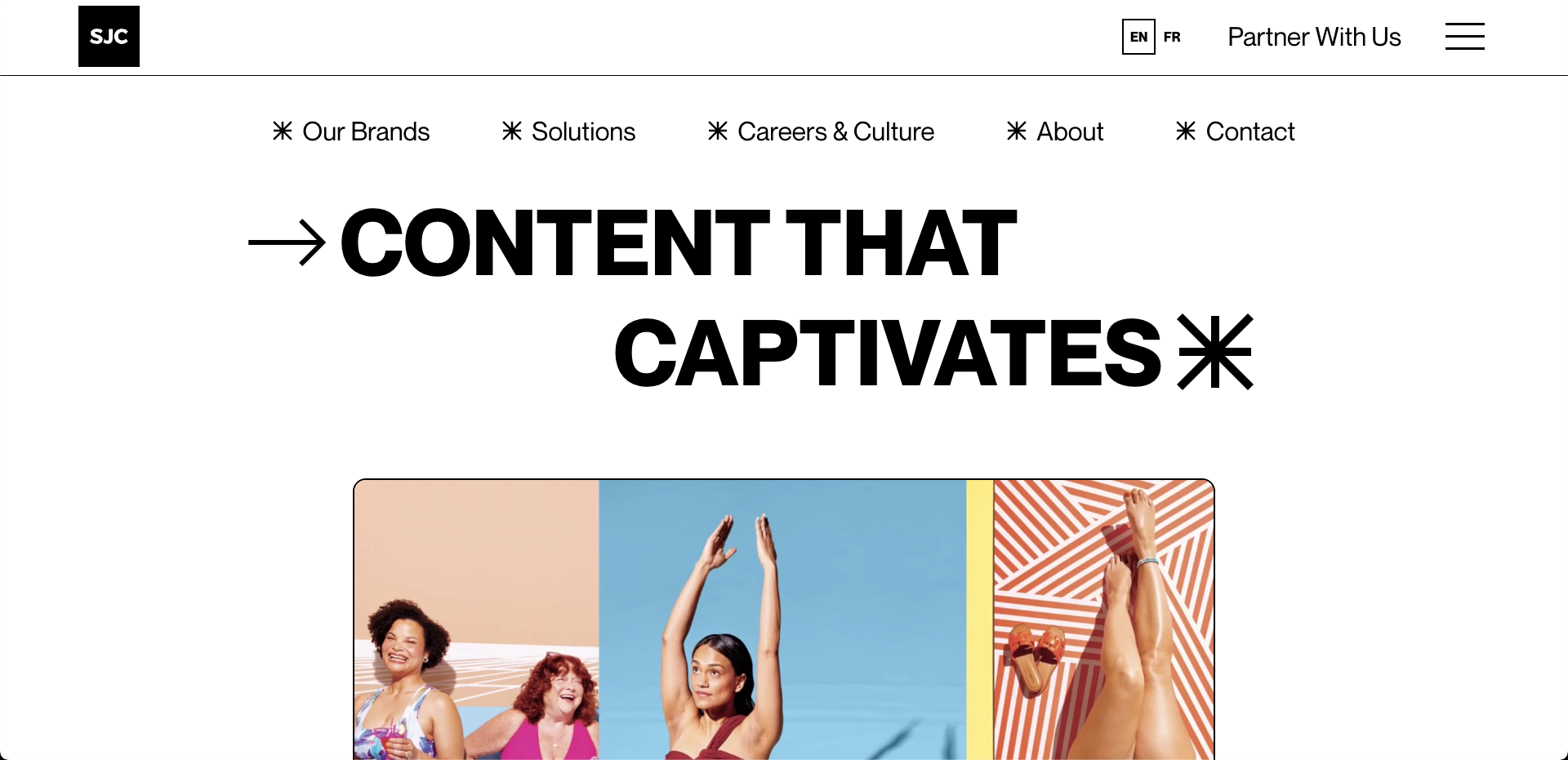
1. St. Joseph Communications

The website for St. Joseph Communications (designed by Flow Sparrow) stands out with its content-centric UI design. A centered navigation menu greets visitors when they land, enticing users to click further upon hover by engaging them with microinteractions. When visitors scroll down, a sticky progress bar replaces the menu, showing users their scrolling depth within the site and enhancing navigation by indicating their page position.
Adding to the site’s innovative UI, the sticky hamburger menu on the top-right corner introduces an efficient way to access main pages and ensures key information is just a click away even as the main navigation disappears. This menu smartly disappears as users scroll down, maximizing screen real estate and focusing attention on the content, but it reappears with a simple hover. Adjacent to this, the English/French language toggle is inclusive of their Canadian audience and allows users to switch languages effortlessly.
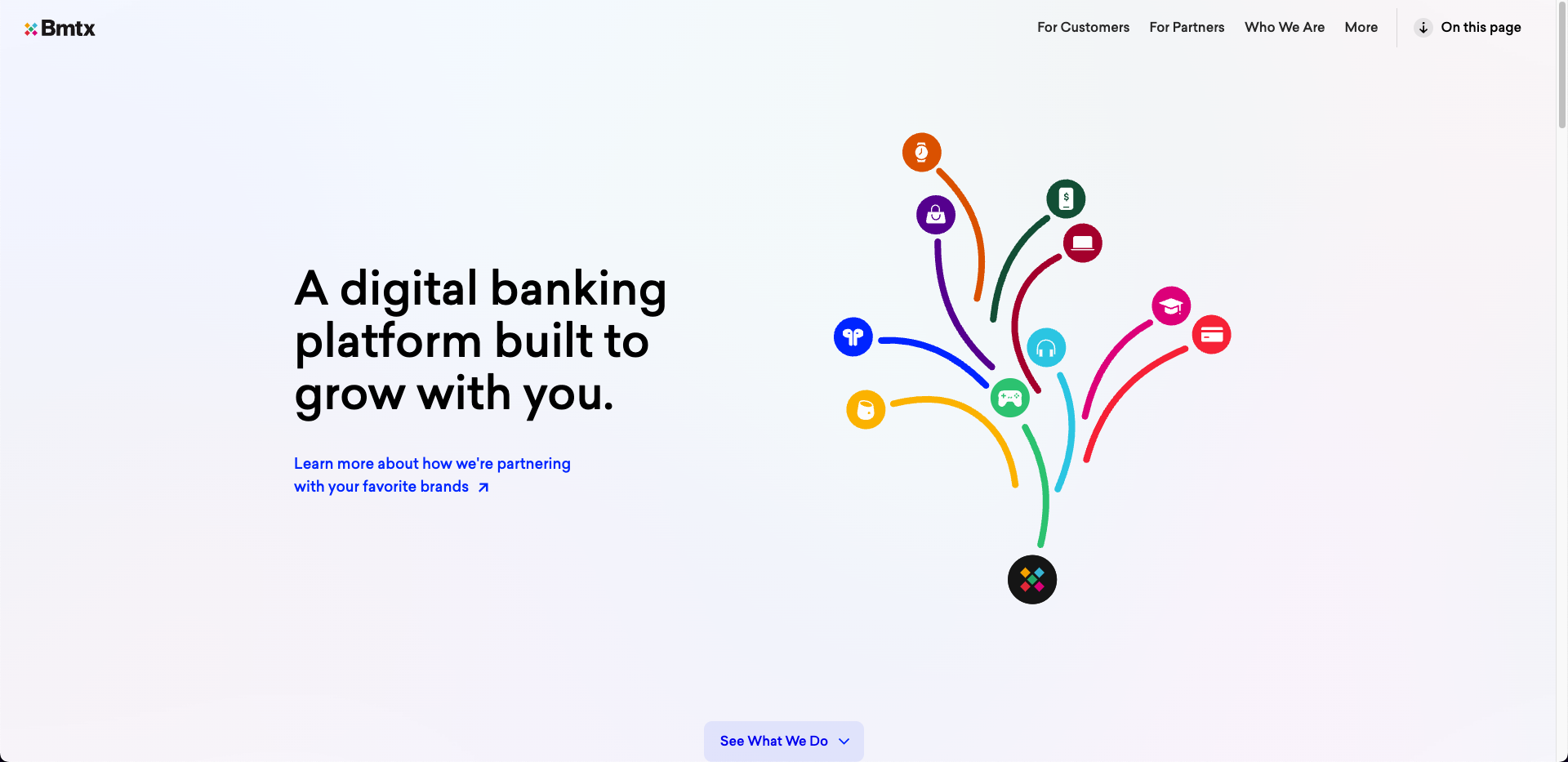
2. BMTX

Mobile banking technology BMTX’s website exemplifies modern web design principles with its minimalist navigation menu and a user-friendly interface that prioritizes functionality and aesthetic appeal. By clearly separating options for customers and partners, the site tailors the UX and makes it straightforward for different audiences to quickly find relevant information.
To maintain its minimalist design, the website places less frequently accessed yet important resources — such as investor information, career opportunities, and security protocols — under a section labeled “More.” This approach keeps the main navigation uncluttered while still providing access to essential information. It also lets BMTX scale the website effectively because they can add more sections under this tab as needed.
And the “On this page” feature, which dynamically jumps to on-page content for certain audiences, introduces an interactive element that enhances discovery and engagement. By providing a clear and immediate overview of page contents, this feature clarifies what content visitors can find without navigating away and encourages deeper exploration.
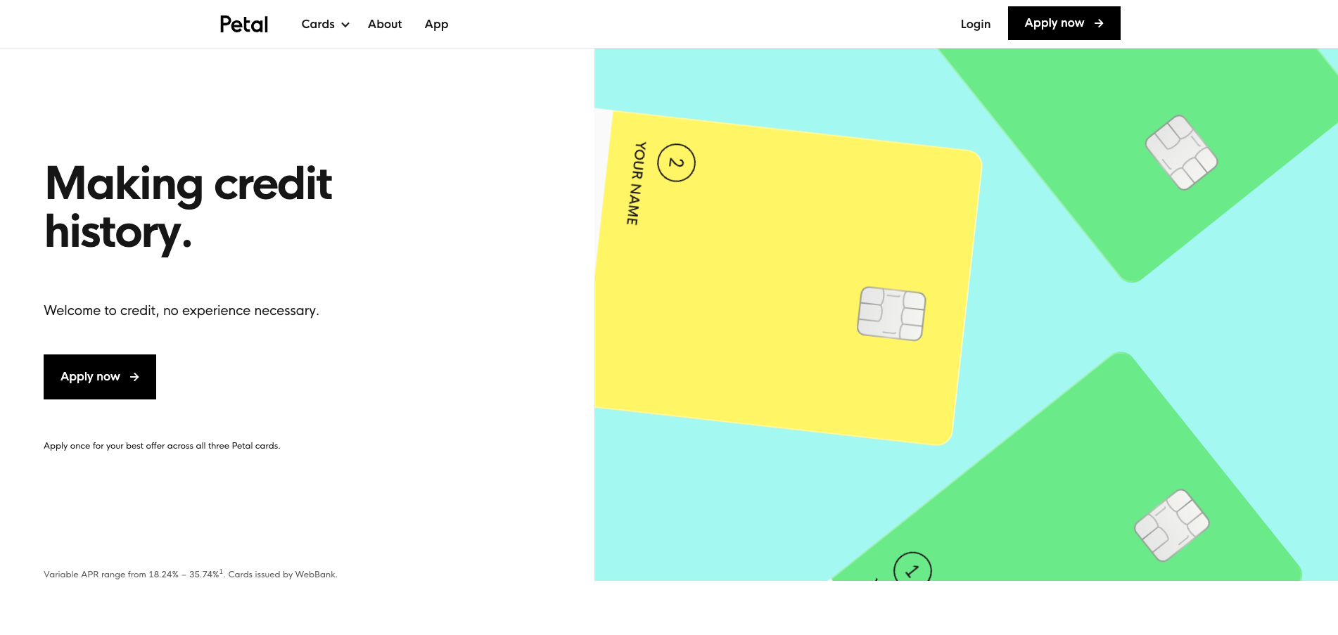
3. Petal

The website for Petal, a financial technology company, captivates users with its minimalistic and streamlined UI. The designer, Devin Fountain, uses a color palette limited to white, black, baby blue, bright green, and yellow, directly referencing the visual identity of the brand’s financial products — Petal 1 and Petal 2 credit cards.
Devin uses a sticky navigation menu, with buttons to log in and apply now on the right and tabs for cards, an about us page, and the app on the left. This clear and concise layout ensures that visitors can find the information they need and take action without unnecessary distractions and superfluous content.
Highlighting the user-focused design further, the cards tab reveals two options upon hover — Petal 1 and Petal 2 — and briefly summarizes their benefits with minimal copy (“Petal 1: build credit, simply.” and “Petal 2: all rewards, no fees.”). This interactive feature captivates users and outlines the unique benefits of each product with clarity, streamlining the decision-making journey for prospective clients.
5 enterprise interface design tips
While design systems should cater to each company’s unique needs, these five tips are universal for any enterprise-level UI design:
1. Prioritize intuitive design
Tailor your design to align with the expected user journey. An intuitive interface reduces user friction and strategically guides customers toward the desired outcome or action.
2. Maintain consistency
Develop instantly recognizable designs and use them consistently across all your digital ecosystems. This uniformity strengthens brand identity and enhances UX.
3. Think evergreen
Trends come and go, but good design endures. While it’s tempting to follow current trends, focus on creating relevant and effective visuals instead to minimize the need for major overhauls as trends evolve.
4. Ensure scalability
Design with future growth in mind. Your UI should accommodate expanding features, new content, and increased user traffic without losing functionality and aesthetic appeal.
5. Incorporate user feedback
Regularly seek and integrate user feedback. This practice helps refine your design to better meet their needs and expectations, keeping it user-friendly and effective.
Essential enterprise UI design tools
Selecting the right UI design tool depends on your design team’s preferences and specific requirements, such as collaboration, integration, and prototyping capabilities. To help you pick the right one, let’s explore several top enterprise UI design tools and how they might be the right fit for your team:
- Figma excels in collaboration. Its cross-platform compatibility ensures consistent design system management across diverse operating systems. It also has an integrated prototyping capability to help you create and test components.
- Adobe XD integrates smoothly into the Adobe system, which can enhance your design system’s cohesion within broader creative workflows. It also has prototyping and responsive resizing capabilities that add versatility and adaptability to your components, making it a strong choice for Adobe-centric teams.
- Axure’s advanced prototyping capabilities allow designers to create intricate interactions within design systems. Its adaptive views and dynamic content support also contribute to building flexible and responsive design system components.
- Webflow bridges the gap between design and development and lets you create reusable design components that ensure consistency and scalability. And our integration with content management systems (CMSs) supports managing content-heavy design systems and provides flexibility in designing and maintaining dynamic interfaces.
Elevate your design system with Webflow
Dive deeper into design systems with Webflow, a visual development platform that leverages reusable design components to empower design, marketing, product, and development teams to create powerful websites. Check out our blog to explore how to perfect UI elements, the best modern design techniques, and the difference between UI and UX design.
If you’re ready to take your design journey to the next level, Webflow Enterprise gives you everything you need to build and maintain fast, reliable websites that grow to meet your needs — and you can design it all without writing code.
If Webflow is of interest and you'd like more information, please do make contact or take a look in more detail here.
Credit: Original article published here.
