Our view at Stack - Shopify has just about everything you need if you're looking to sell online. It excels with unlimited products, user-friendly setup, and 24/7 support. It offers 6,000+ app integrations, abandoned cart recovery, and shipping discounts up to 88%. Plus, it allows selling both online and in-person, scaling as your business grows.
“Above the fold” is a concept that’s been around since the days of the newspaper industry. To attract readers, papers featured the most headline-grabbing content on the top half of the front page, above the fold line. In the same way, this physical fold concept adapted to the virtual fold of a web browser view in the early days of web development.
Websites use above-the-fold techniques to tell their story with concise text, splashy imagery, engaging videos, and calls to action—all in the space above the virtual scroll line. But now that swiping and scrolling behavior is second nature to users, is “above the fold” still the right way to improve conversation rates?
Learn why above the fold continues to be an important feature of good web design, and how it can best be applied to your website to engage visitors.
What is above the fold?
Above-the-fold content is what’s visible on a website without users having to scroll the webpage. Above the fold matters because first impressions matter. When a visitor comes to your website, above-the-fold content is what they see first. This is your one and possibly only opportunity to make an impression.
Due to the average human attention span, users rarely scroll to the bottom of the page. The user’s attention peters out the farther down they go. Since 2010, most web designers have turned to responsive design with fluid layouts that adjust and scale to screen resolutions. Webpages have gotten longer and contain more negative space. Above the fold may not be the hard and fast rule it used to be, but it remains relevant in content marketing.
Above-the-fold best practices
It can be hard to define the above-the-fold region, because screen sizes vary widely depending on device type. Available above-the-fold space on a laptop will be smaller than a desktop screen, for example, and space on tablets and mobile phones will be smaller than a laptop.
Here’s how to work around these challenges to achieve better above-the-fold website design to deliver higher conversion rates:
Put crucial information at the top of the page
For website landing pages, the most important product details should be easiest to access, which means users shouldn’t need to scroll down the browser window to find them.
If you have an ecommerce website, essential details on a product page include:
- The name and price of the product
- An image carousel
- A concise description
- Social proof validators like aggregated customer ratings
- A call to action (CTA) like an add-to-cart button
Focus on the most crucial information and calls to action and put them within the viewport (the visible area of the screen) on different devices.
🌟Looking for clever landing page examples? Learn from experts to create better landing page designs that attract—and keep—the customers you want.
Use responsive design
Websites built with responsive, mobile-friendly designs automatically adjust layout and content based on the screen size. This ensures an optimal viewing experience whether users are on desktops, laptops, tablets, or mobile devices. Fluid layouts use flexible percentages and viewport widths instead of fixed pixels. This permits resizing and adapting to different screen dimensions.
Designers use media queries in cascading style sheets (CSS) to identify the browser’s screen size and adapt the styles accordingly. Pay close attention to the above-the-fold look and feel at different sizes, and use this to refine your above-the-fold content.
Write sharp headlines
A crisp, short headline tells site visitors what the page is about. Whether you’re writing a mission statement, an About Us page, or a blog post, keep the header clear, catchy, and easy to understand. Use consistent fonts and text styles across your website, using larger fonts to highlight the most important information.
Use visuals to enhance engagement
There’s no substitute for engaging content. Use professional, high-resolution, original photos and videos that draw in visitors. Test page loading time and optimize images as needed so they can load quickly.
🌟Attractive and unique ecommerce website design has always played a key role in successful online sales. Get inspired by these 25 ecommerce website designs, featuring eye-catching styles from leading online stores.
Select the right calls to action
Have a clear call to action above the fold. Write the text in the form of a command like “Buy Now.” Keep the desired action text concise and make sure CTA button colors stand out from the background.
Be careful about ad placement
Ad space is tricky. If you’re using the above-the-fold region for display ads, less is more. Google’s algorithms don’t appreciate an imbalance of ads versus other content. Ad clutter above the fold could cost you page ranking and bounce rate, and you could end up losing traffic if ads overwhelm visitors.
Avoid clutter
It’s not just ads that can clutter space above the fold. The impulse to cram as much information up top is counterproductive. Prioritize user experience, readability, and professionalism. Choose a few pieces of representative content above the fold to get the message across. Generous negative space around key elements actually highlights them more.
Perform A/B tests
Before committing to a single above-the-fold design, have the design team try out different options using A/B testing tools. Look for the version that performs best with your target audience. Whatever increases engagement and conversion rate is the one to go with. Testing helps you identify the optimal page length and sequence of information as users scroll down the page.
Design below the fold
Just because above-the-fold content is important, doesn’t mean you should ignore the rest. The space below the fold is where you add more detail to attract business leads and curious browsers who aren’t yet committed buyers. Include content that adds value and context below the fold, with additional CTAs and links to draw them deeper into the site architecture.
Above the fold website examples
These ecommerce business examples of above-the-fold design illustrate best practices in action:
Duradry
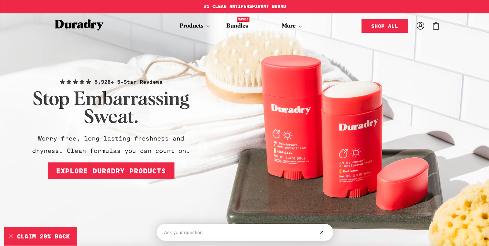
Duradry’s home page is a great example of above-the-fold design. The above-the-fold area is filled with an image background displaying the product in its natural setting—a bathroom. The clean white surface and white tiles create a neutral backdrop for placing headings and CTAs.
The top navigation menu bar is well-spaced and offers minimal menu choices. The red and white brand colors are connected visually to the CTA buttons. The headline and text get straight to the value proposition: Duradry solves your sweat problem. Social proof via star reviews above the headline affirms the product’s high ratings. At the bottom of the viewport, an input field encourages customer engagement.

UPPERCASE
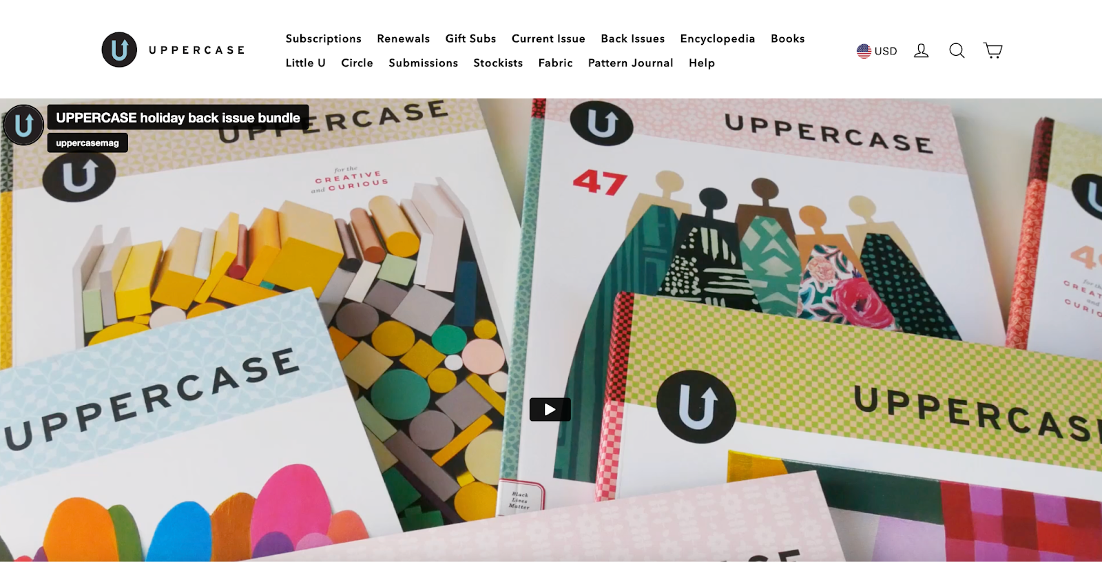
UPPERCASE magazine keeps its website design simple above the fold. A video of multiple issues of the magazine with colorful designs floods the space. There’s no doubt about what’s being offered, and the graphic design punch is on display on the magazine covers themselves.
The top navigation bar is larger than many websites—14 links have been packed into it, but it’s still user-friendly with generous negative space. The icons at the top right indicate the local currency, user login, search, and shopping cart. When visitors keep scrolling below the fold, they find more detailed information about the magazine and how to subscribe.

Keepgo
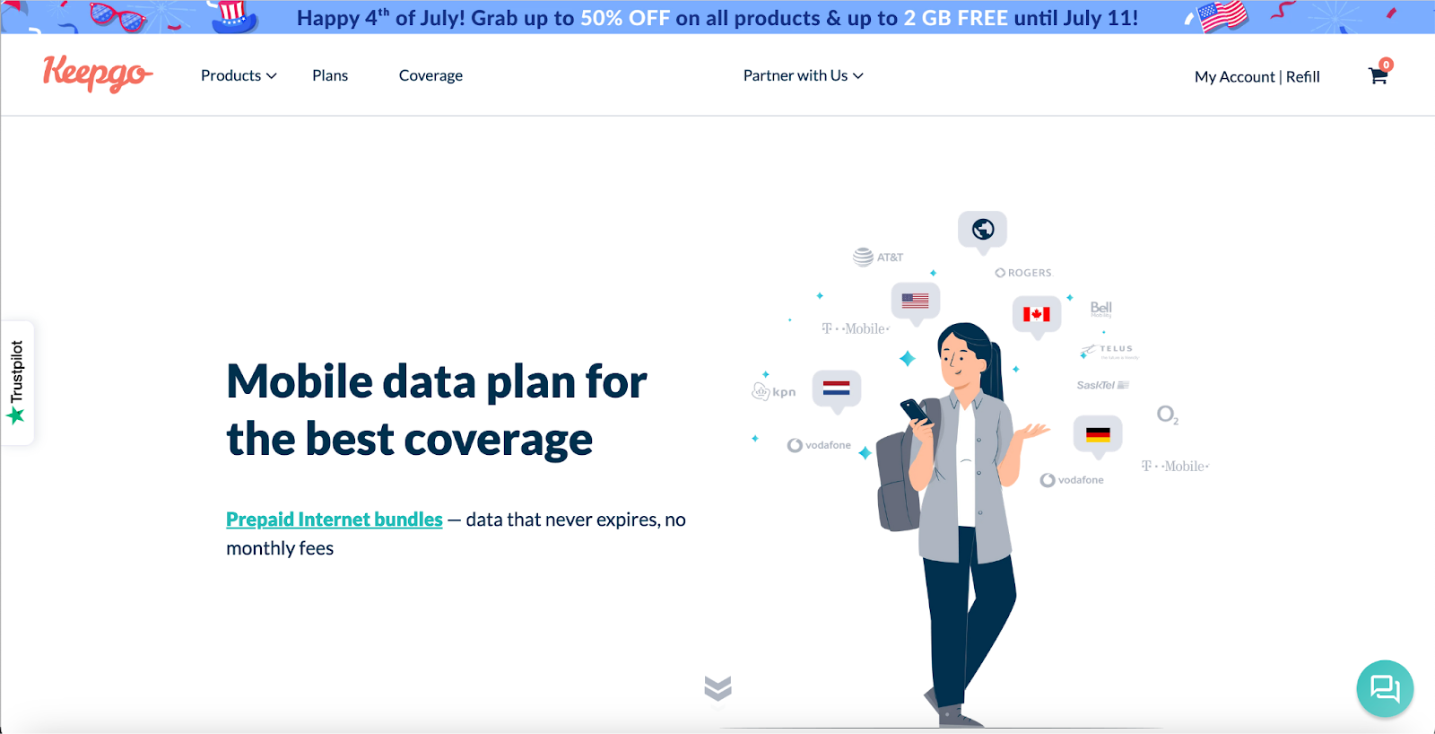
Telecom company Keepgo uses ample white space on its landing page to maintain a clean and professional design. A banner promotion in contrasting colors prompts visitors to engage with the sale.
The top navigation contains the logo and minimal menu choices, with the shopping cart in the customary upper right corner. In the center of the page, the headline is bold and concise, and the value proposition is clear. The graphic illustrates the happy shopper but doesn’t overwhelm the space.
Notice the bouncing arrows at the bottom, just above the fold? This small touch nudges visitors to scroll down, where additional selling points are delivered.

Above the fold FAQ
What does “above the fold” mean?
Above the fold is a design technique that encourages grabbing a site visitor’s attention by providing clear, well-designed information at the top of a webpage. A viewer should be able to see all the essential components without having to scroll or swipe. The concept derives from newspaper publishing where the biggest stories of the day were in the top half of the front page.
Is above the fold still a thing?
Yes, above the fold is an important concept in web browsing, even though the user behavior of website visitors has become habituated to scrolling and swiping. The concept emphasizes making a strong first impression, which is what makes above the fold important.
Should CTAs be above or below the fold?
CTAs are commonly placed in a clickable button in the prime real estate above the fold; however, it depends on the audience and purpose of the website. Too many CTAs might seem pushy.
If Shopify is of interest and you'd like more information, please do make contact or take a look in more detail here.
Credit: Original article published here.
