Our view at Stack - Shopify has just about everything you need if you're looking to sell online. It excels with unlimited products, user-friendly setup, and 24/7 support. It offers 6,000+ app integrations, abandoned cart recovery, and shipping discounts up to 88%. Plus, it allows selling both online and in-person, scaling as your business grows.
Imagine a customer breezing through your content-rich site and finding exactly what they need in seconds. That’s the power of intuitive navigation. Create a positive user experience with well-organized menus and a clear structure.
Here’s why website navigation is important and how to improve navigation design for your website.
What is website navigation?
Website navigation refers to the user interface components—menus, buttons, and links, for example—that make it possible for users to move around a website and access its content. A good navigation structure makes it easy for visitors to find exactly what they are looking for, regardless of how many pages your site has.
Why is website navigation important?
Poorly designed navigation creates friction. Without clear and intuitive navigation, visitors can get lost and frustrated, affecting conversion rates. Effective navigation, on the other hand, engages customers and encourages them to interact with the content on your site longer. Intuitive navigation can generate positive feelings about your brand.
Website navigation also helps search engines understand the structure and content of a website, enhancing its visibility and ranking.
What is a website navigation menu?
A website navigation menu is a section on a web page that contains a list of links. Usually, these are internal links to primary site pages. A clothing brand, for example, might feature links to different categories, such as dresses or shoes. You can usually find navigation menus on page headers or sidebars for easy access.
Types of website navigation menus
There are different types of website navigation menus to guide visitors through your site. Here are a few style options:
Horizontal navigation bar
A horizontal navigation bar runs horizontally atop the website page header, often remaining static as the user changes pages. It displays the high-level sections and categories, such as blog, Contact, and About pages. It may even include a search bar to help visitors find precisely what they’re looking for.
Vertical sidebar navigation menu
A vertical sidebar navigation menu appears on the left or right side of the webpage. This is a good option if you have numerous categories and different pages you want to include on the menu; vertical sidebar navigation menus allow the user to view more links by scrolling down the entire page, a more natural motion than moving to the right of the screen to see more information.
Dropdown navigation menu
You can find a dropdown menu within a horizontal navigation menu or a sidebar menu. When the visitor clicks the menu label, a nested submenu drops to reveal additional options. It’s an efficient way to conserve page space while providing more paths for the user.
Mega menu
A variant on the dropdown menu, the mega menu is a large panel that appears when you hover over a menu item in the main navigation bar. Websites with a vast amount of content and categories use this menu style. Mega menus are great at consolidating navigation options into one layout. With this option, there is a risk of clutter, but if you group items clearly and logically, you can direct users to the pages they want to see.
Hamburger navigation menu
Popular on mobile websites and apps, the hamburger menu resembles a burger—a stack of three lines. When a user clicks on the hamburger, a concealed panel pops up and presents the menu options. This space-saving menu lets you provide more links for limited screen sizes.
Footer navigation menu
A footer menu complements your page header. Appearing horizontally at the bottom of the website, it can include pages (like About Us or Contact) that couldn’t fit in your primary menu or that you want to draw extra attention to.
Tips for designing website navigation
For a positive user experience experience, ensure your website navigation structure aligns with customer expectations and usage patterns. Here are some of the most useful website navigation best practices:
Study your audiences’ patterns
Understanding how your audience navigates your website can enhance their experience. Run a user flow report (which shows the paths users take as they navigate your site) to learn about website traffic patterns and user journeys. You can use Google Analytics to do this; within the Behavior section you can see what paths users take and where they consistently drop off, possibly signaling unclear navigation.
Plan a sensible menu structure
An optimized website structure means visitors reach their destinations in as few clicks as possible. You can achieve this if you:
- Flatten the navigation structure. Too many levels in your menu can overwhelm a visitor. Flattening the structure means the most important site categories land on the main menu in the page header, and the major category pages go one layer below. On the third and bottom layers are single web pages only.
- Play into customer expectations. There’s no need to get too innovative about the menu placement. Customers expect standard conventions. For instance, top-level sections appear in a horizontal menu in the page header. Placing them elsewhere could confound customer expectations.
- Leverage the footer menu. If a visitor scrolls to the bottom of the home page, try to engage them with a carefully designed footer menu. Since you don’t have the same restrictions as the top of the page, where space is at a premium, you can include more options, allowing them to dive deeper into your website.
Group and order navigation links logically
Haphazard groupings of links can frustrate visitors. Be intentional about how you order links. If you want to nudge people to a specific page, place that link at the top of a menu list. For example, to eliminate inventory, place your limited-time sale at the top of the menu to encourage users to visit that page.
Design for different screens
Tailor your web design to accommodate different screen sizes, including mobile devices. Mobile ecommerce is forecasted to reach $710 billion by 2025. Mobile-first design prioritizes optimizing websites for smaller screens by starting with the mobile version before scaling up to larger displays.
You can also create different menu styles for different devices. While collapsible hamburger menus work well for phones, you might choose a horizontal menu bar for desktop users so they can see top-level categories without having to do any extra clicking.
Website navigation examples
You can build a usable menu structure in different ways. Here are three approaches:
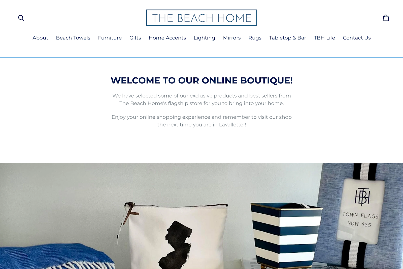
The Beach Home

Below The Beach Home’s homepage header is a horizontal navigation bar with two conventional labels—About and Contact Us—and other descriptive labels for the main product categories. The TBH Life label links to an exterior site, an interior decoration consultation page that’s designed to feel like you’re still on the same website.
The footer includes Facebook and Instagram social media icons. The menu items use ample white space to enhance readability. On the mobile version of the website, a hamburger menu icon unfurls to reveal the labels that appear horizontally on the desktop version of the website.
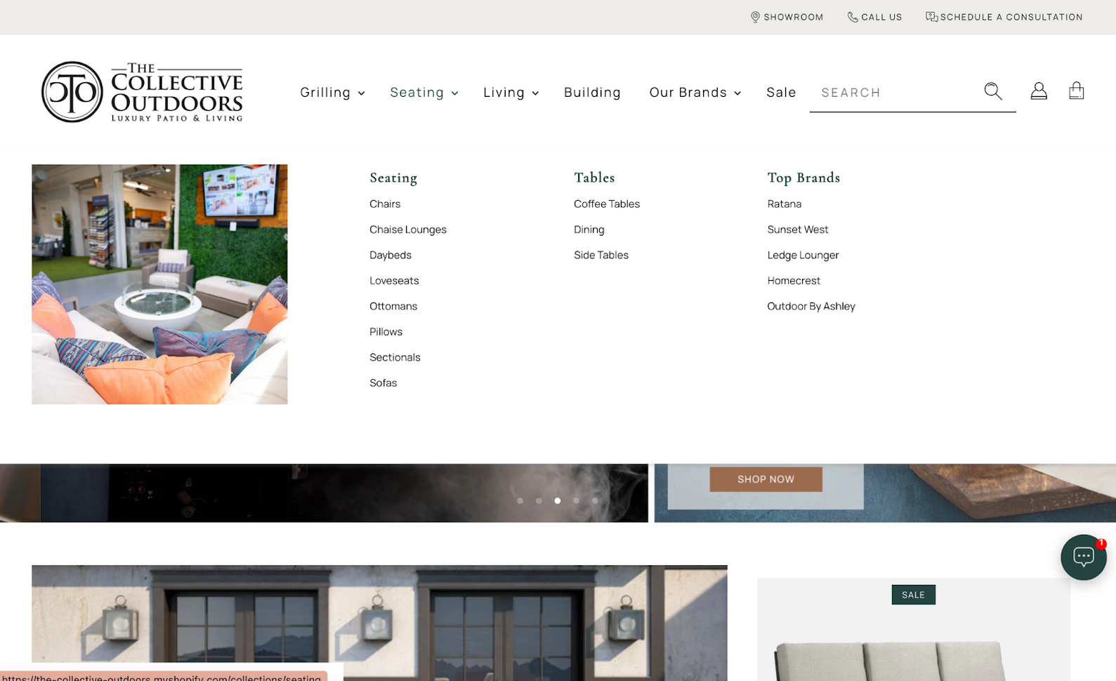
The Collective Outdoors

The Collective Outdoors features a dropdown menu. With arrows pointing downward next to a few of the menu labels, visitors know to expect a submenu. When you hover over the top-level categories, you’ll also see a photo that represents that section—for example, an outdoor couch for the “Seating” category. The Collective Outdoors’ menu includes a generous amount of white space to help present a menu with numerous options and an accompanying category image.
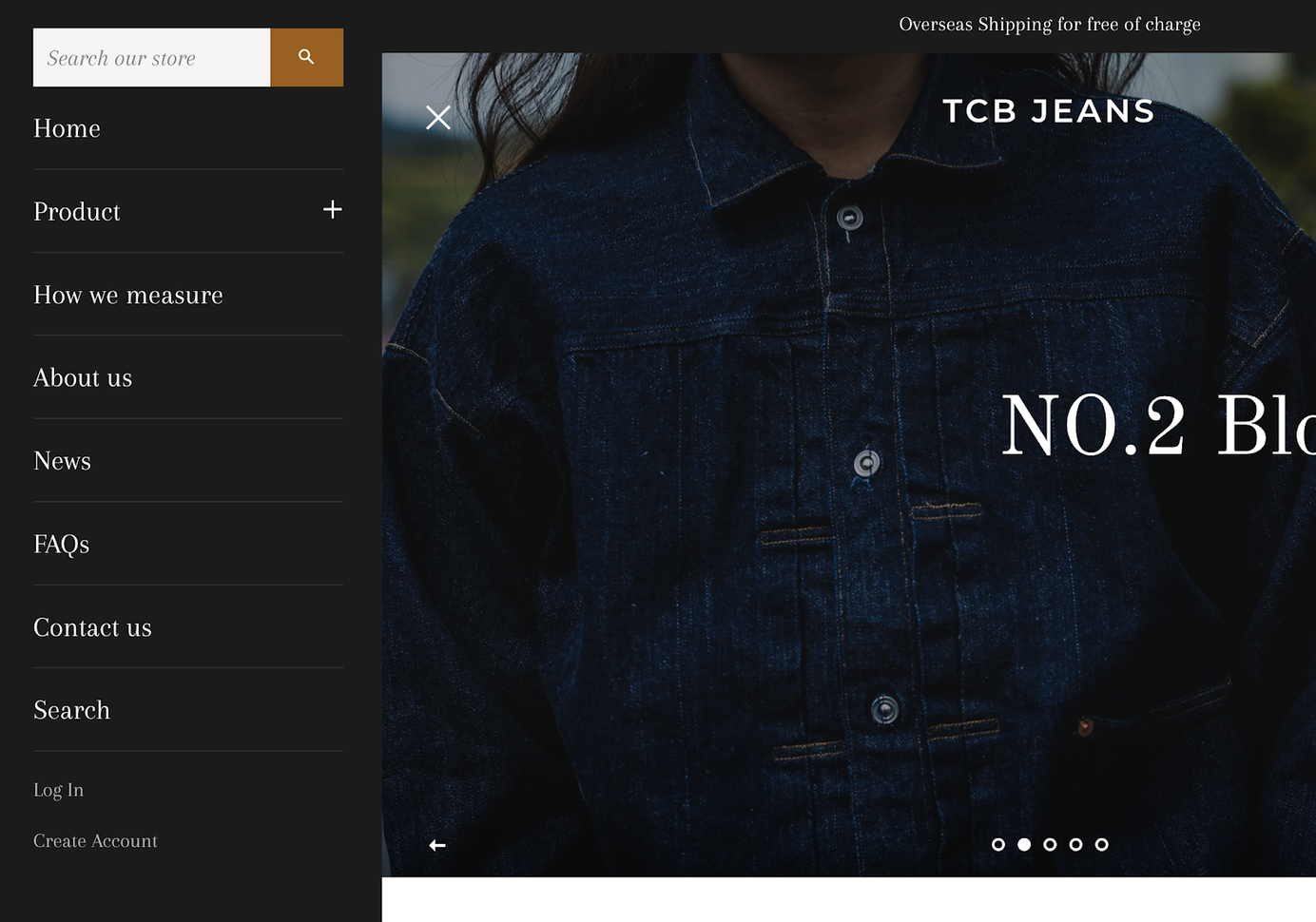
TCB Jeans

The TCB Jeans official web shop opts for a simple header design—a hamburger menu, icons for user accounts, and a shopping cart. Clicking on the hamburger opens a sliding vertical sidebar menu with items for “Home,” “Product,” “How we measure,” “About us,” and more. The Products category has a plus sign next to it to signal that there’s a dropdown menu.
Website navigation FAQ
How do I create a website navigation menu?
First, plan your navigation menu. Define the high-level sections of the website and the hierarchy of categories you’ll need. Align categories intuitively with how the visitors navigate for content. Decide if you’ll need submenus. Then, implement and customize the site’s navigation menu using built-in templates in a website builder.
What is the most commonly used navigation design in web development?
The horizontal navigation bar is the most common navigation design. It goes across the top of the website header, with links to main sections or categories listed side by side. This tried-and-true design is easy to scan, familiar, and accessible on different devices.
Why is website navigation important?
Clear navigation effectively steers visitors to the right page, boosting engagement and conversions. Without it, website visitors may get lost and wander off, reducing conversions.
If Shopify is of interest and you'd like more information, please do make contact or take a look in more detail here.
Credit: Original article published here.
