Our view at Stack - Shopify has just about everything you need if you're looking to sell online. It excels with unlimited products, user-friendly setup, and 24/7 support. It offers 6,000+ app integrations, abandoned cart recovery, and shipping discounts up to 88%. Plus, it allows selling both online and in-person, scaling as your business grows.
In life and in business, first impressions matter. Your online store’s website is the face of your brand, so it needs to look visually appealing to captivate and convert customers. But what makes a website look great? A lot of things—including a clear navigation menu, uniform color palette, and engaging CTA buttons. And underpinning all of them is a well-designed layout.
Taking inspiration from graphic designers in other media, website layout designs form the structural basis for web content that projects a positive brand image and facilitates product discovery. Done right, website layouts entice visitors to navigate, browse, and buy.
Here are effective website layout ideas and tips for picking a website design theme that matches your business vision.
Table of contents
Tips for creating a stellar website layout
A website layout determines where the visual elements will appear. With a few tips, you can keep those visual elements organized:
Establish clear goals
A good layout has a clear purpose. For example, a professional photographer’s website might organize the text around big, high-resolution images. A retailer with a large product catalog might focus on calls to action (CTAs) that make it easy to find and buy products. A blog or news website would prioritize readability so visitors can consume information. Think about what you would like your visitors to do once they get to your website and select a design that helps them accomplish it.
Design for easy navigation
A good website layout organizes information in a way that’s easy for site visitors to digest. You can help visitors find relevant information, products, or services by implementing a grid system, employing navigational breadcrumbs, or incorporating clear calls to action that work as guides.
Additionally, keep menus and the navigation bar close to one another. Group informational elements like contact info and FAQs in the same area for easy access.
Aim for simplicity
Unexpected arrangements can become off putting if they disorient the user as they try to navigate through your site. Rather than reinvent the wheel, adapt a time-tested layout to draw attention to your content. For example, if you want to build an ecommerce site, start with a theme that has all the basic structural components you need and customize it to fit your brand aesthetic.
Optimize negative space
Negative space, also known as white space, adds breathing room to a layout. It enhances readability and reduces visual clutter on your store’s pages. Add space between images, text blocks, navigation bars, and menus accordingly.
Website layout ideas
No one layout is going to be a cure-all for every situation. From the following common layouts, select important elements that complement your brand identity and match your target audience’s expectations:
Full-screen featured image
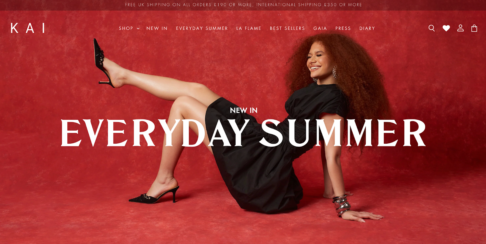
A full-screen or featured-image layout applies an image as the background that fills the page above the fold (the area of the screen visible before you start scrolling). Overlaid on the foreground are headers, calls to action, and vital navigation links. Full-screen images are a great layout option when you want the visitor to focus on a single graphic that shows off what your website offers.
Kai Collective is a London-based women’s clothing brand founded by Fisayo Longe. The homepage above the fold greets visitors with a stunning fashion shot in vibrant color. The text overlay for the navigation bar uses a thin sans-serif font that contrasts against the background without being overbearing. The text overlay featuring a seasonal product line is bigger, bolder, and clickable.
Animation
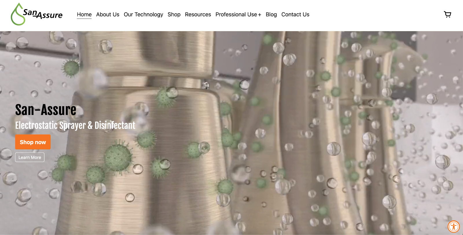
A variation on the full-screen homepage backdrop, full-screen animations can increase user engagement with attention-grabbing moving images that show your product in action.
A good example is San-Assure, which sells an electrostatic sprayer and disinfectant. A sequence of bold animations in the hero section shows you what the product looks like and is capable of doing, without scrolling.
Hero section
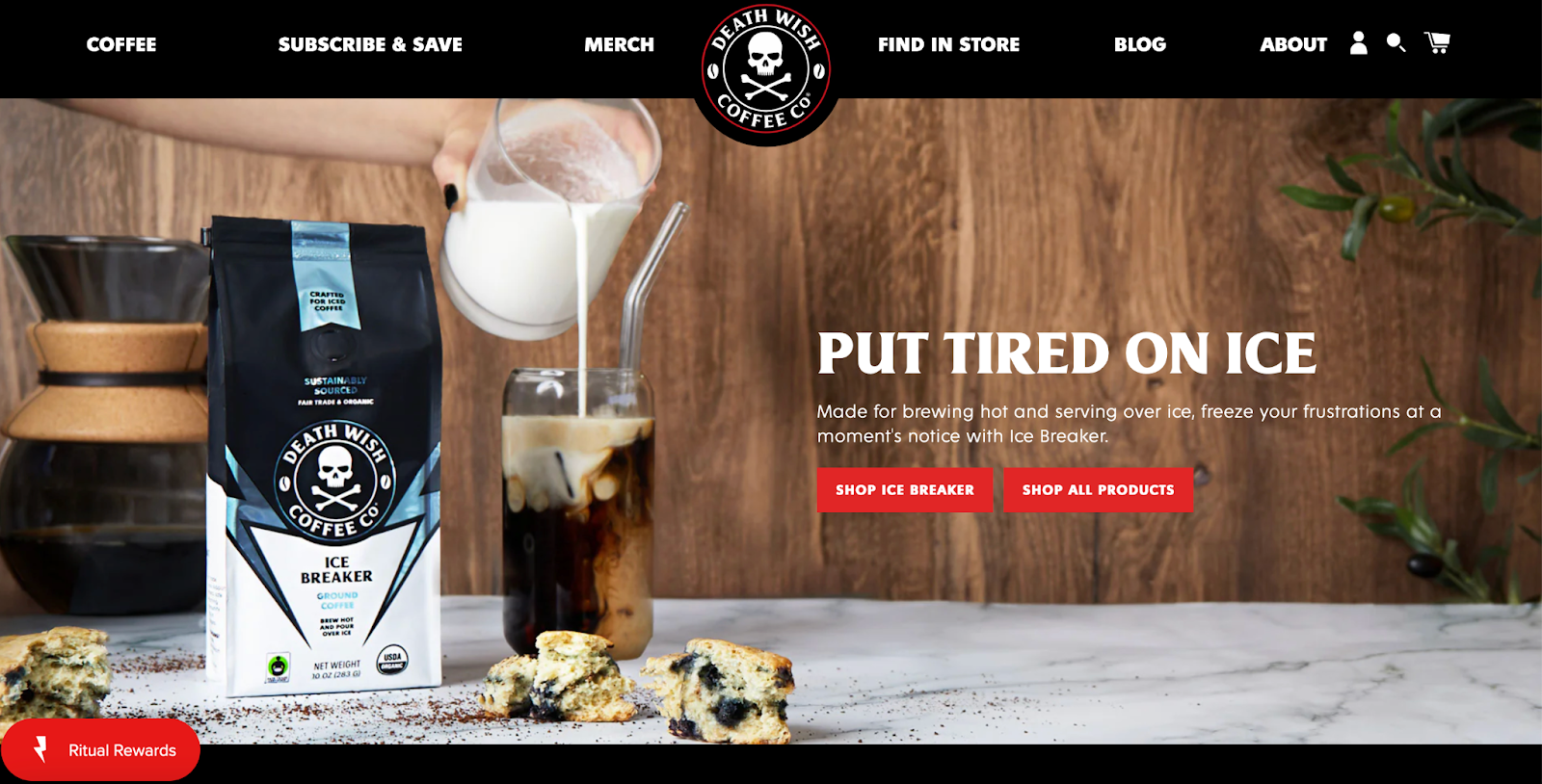
The hero section, also known as the hero area or hero banner, is the prominent section at the top of a website’s homepage. With an image and bold, concise text, you convey the website’s core message or value proposition. Elements of the hero section include the navigation bar, company logo, featured image, text block, and call-to-action button or link.
Death Wish Coffee demonstrates each element in action. The navigation bar is a horizontal black strip with white knocked-out text in all caps. The skull and crossbones logo is at the center of the navigation bar. A full-width image conveys the brand identity, while the text block promotes one of the products with bright red call-to-action buttons.
Grid
Grid design places page elements in boxes or cards on a geometric grid. Visitors can click boxes to go to a different webpage. The number of boxes can change as you scroll down the page. So the header section might be a single full-width box, with smaller boxes down below. Grid layouts are great for featuring products and specific categories while preserving the distinctiveness of each item.
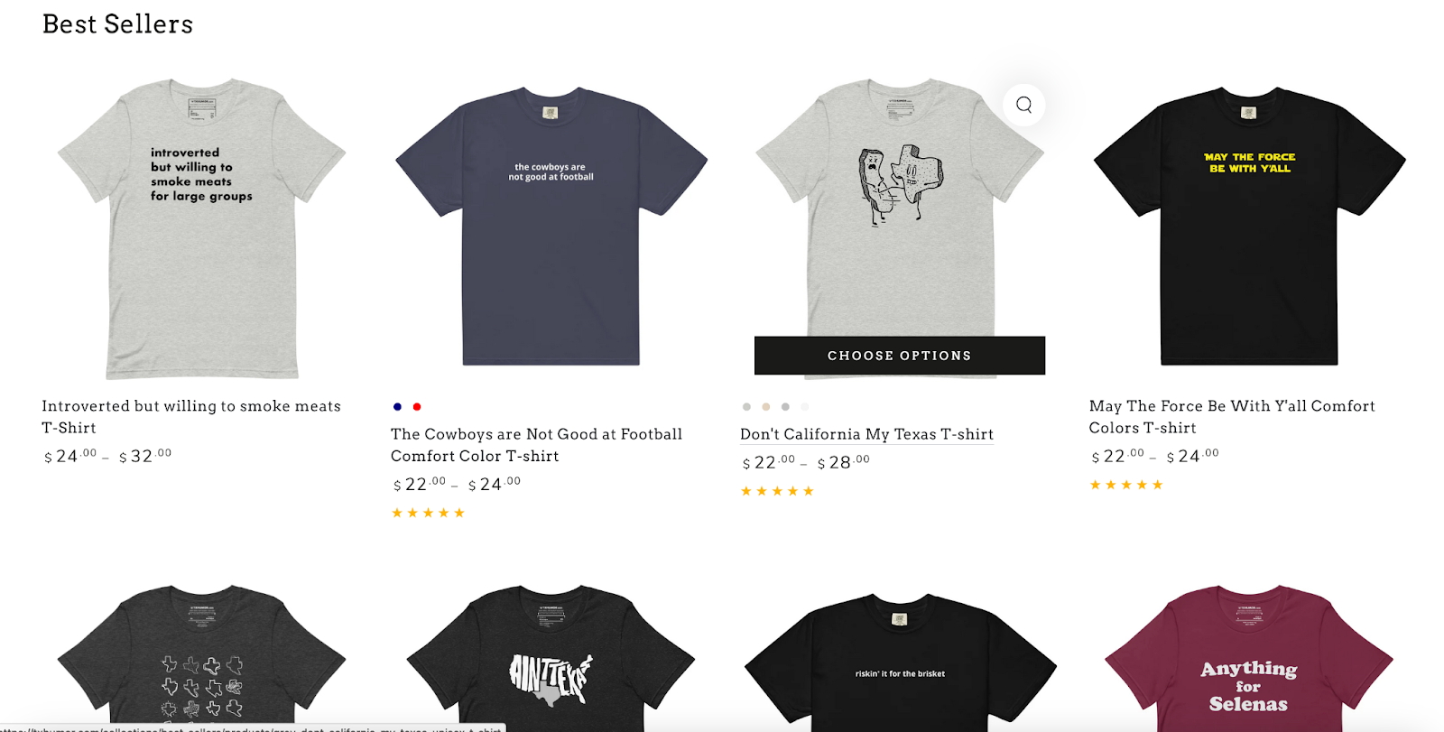
Below the hero section of the Texas Humor website, you’ll find a standard box layout for bestselling t-shirts and caps. Each “card” is the same size with ample negative space around it, bringing uniformity and breathing room to the design. It’s a classic layout that you’ll see repeatedly on many ecommerce sites.
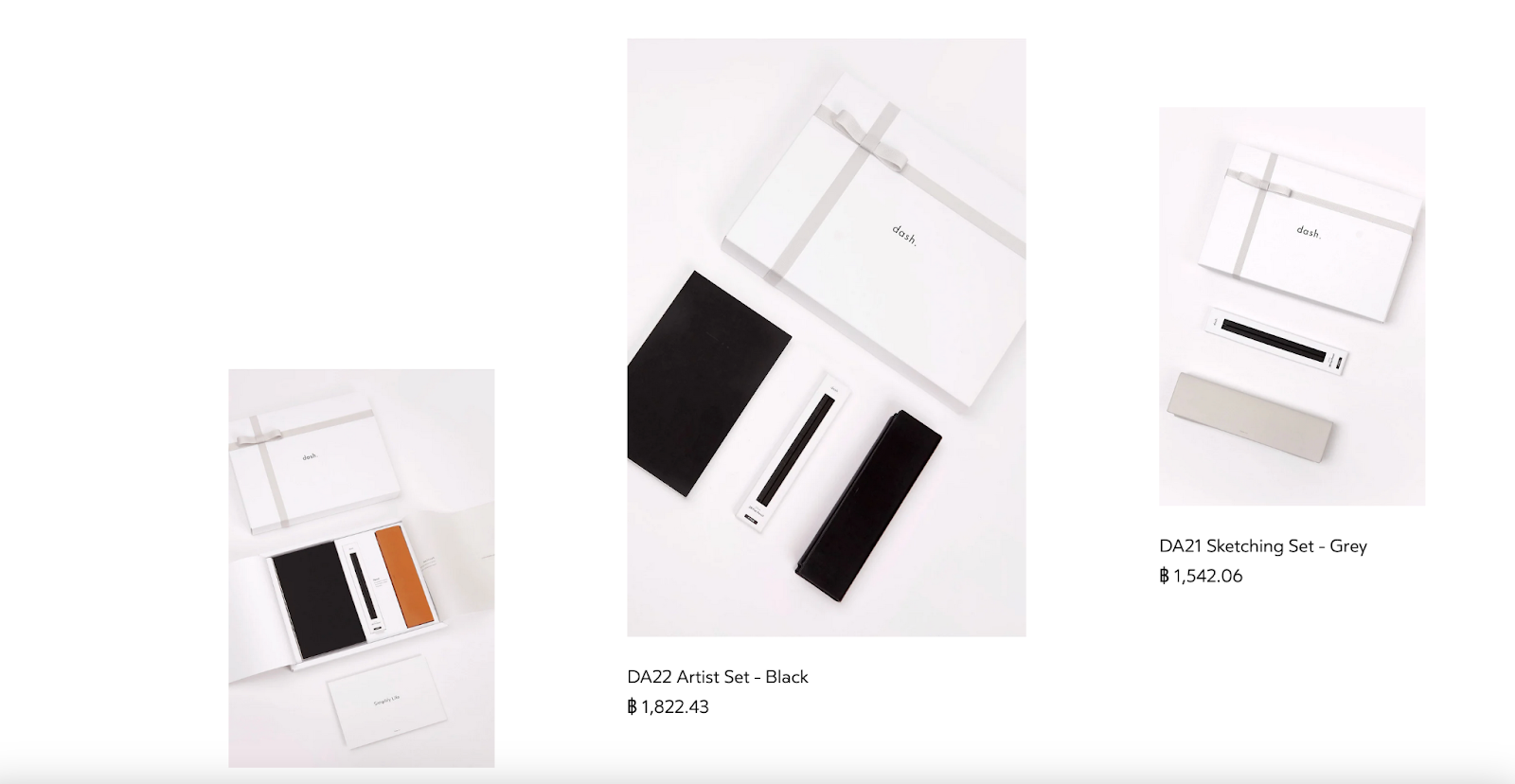
For a more fluid, flexible card design, check out how the dash website lays out stationery products. Cards vary in size and width, creating an asymmetrical layout that adds visual interest to the grid layout.
Carousel
A carousel is a space-saving layout that uses a merry-go-round technique to display several pieces of content in the same area. The carousel moves automatically a step at a time or manually when the visitor clicks an arrow. A carousel usually combines a clickable image with some brief text. Carousels are great for featuring content like products, promotional items, and special offers. They can appear above the fold or in mid-sections of the webpage.
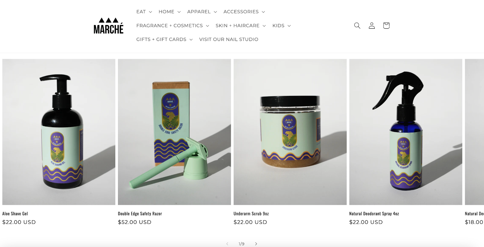
The Marché Rue Dix store uses a carousel layout to show a set of skincare products—more than can fit on the width of a laptop or mobile device screen. Users click the arrows to slide through the image set. A combination of images and concise text helps users identify the product, and hovering over the image displays a different view of the product.
Split screen
The split-screen layout divides the webpage into halves. The halves in split-screen designs can represent two distinct pathways into the site. One half could be an image, the other text. Or both halves could be images. Some split-screen layouts aren’t equal. Common ratios are 33:66 or 40:60. Larger ratios risk the smaller side of the split feeling like a sidebar. Split screens are popular for ecommerce websites that want to make a striking impact through product imagery and information about the products.
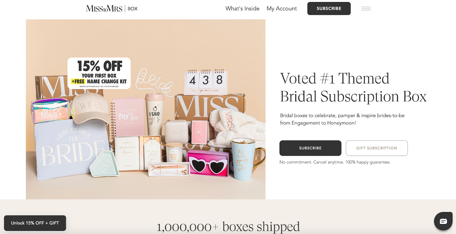
MISStoMRS sells themed, customizable bridal boxes, so it’s natural for them to feature an image of a bridal box on one half of the split. The other half features text information about the boxes with prominent call-to-action buttons.
Multiple columns
You can design website layouts with multiple columns in many formats. Often the column layout will consist of a main text column and a sidebar column. You might vary the number of columns as the user scrolls down the page for a magazine layout that balances the images and text. Multiple columns complement text-heavy web pages on desktop and laptop devices because readers quickly get fatigued when reading text that spans the entire horizontal width of the page.
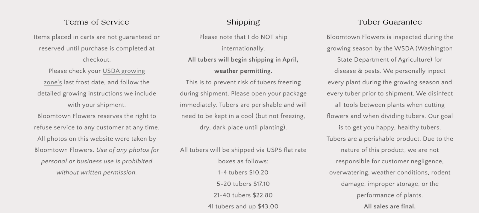
As visitors scroll down the Bloomtown Flowers homepage, they see a two-column layout. The left-hand column displays a flower photo, and the right-hand column contains “About the company” text. At the bottom of the page, the text-heavy sections for “Terms of Service,” “Shipping,” and “Tuber Guarantee” appear in a tidy three-column format.
Single page
In a single-page layout, all content (or almost all) is in a single vertical area running down the page. Uncomplicated and easy to use, site visitors simply scroll down the page to see more content. Single-column layouts work great on both desktop and mobile devices because they adapt well to different screen sizes. For websites with minimal content and a simple purpose, a single webpage works well.
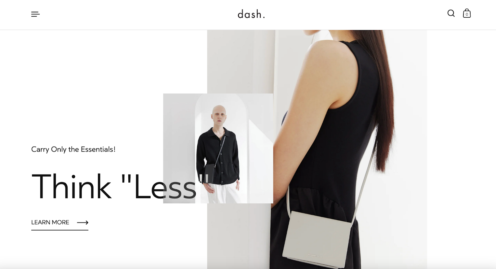
Jazz up single-page layouts with the creative use of parallax scrolling effects, which gives the impression of three-dimensional layering and movement. A case in point is dash. Notice how images slide vertically behind the text while moving down the page. It’s a minimalist design with plenty of flair that conveys the style of the brand. While technically, this isn’t a one-page layout (clicking on links opens new pages), one-column scrolling is the foremost layout feature.
Website layout FAQ
How do I create a website layout?
You can create a website layout using pre-designed themes, customizing existing themes (with some coding knowledge), or hiring a theme developer to craft a unique layout for you.
Why are website layouts important?
Website layouts ensure continuity and consistency across all pages, which plays a crucial role in shaping a positive user experience, brand perception, and ultimately, conversion rates. A well-designed layout facilitates site navigation, showcasing products, and guiding visitors toward desired actions.
Are website layout templates available?
Yes, website layout templates are readily available. You can find them within pre-designed themes or purchase them separately from marketplaces. Many theme developers, like Shopify’s website builder, also offer customization services to tailor a template to your specific needs.
If Shopify is of interest and you'd like more information, please do make contact or take a look in more detail here.
Credit: Original article published here.
