Whether you’re a beginner designer or a seasoned professional, you know firsthand the incredible impact of color.
Color is perhaps the most powerful tool at your disposal as a designer because of its influential and communicative nature. It evokes emotion, influences our perception, inspires responses — conscious or subconscious — and even impacts generational appeal.
With 16.8 million colors to choose from, color combinations for your next logo design, web design, or brand identity design are just about infinite. Luckily for you, we got you covered.
First, let’s look at color theory and the color wheel
To understand why certain color combinations work so well, we first have to consider color theory and the color wheel. Color theory feeds into color psychology, which digs into how our brains perceive color. The color wheel helps you visualize relationships between colors, putting color theory into practice.
Let’s break it down below.
Color theory
Color theory is the art and science of using color. Research has shown that color has a psychological impact on human emotions, perceptions, and behaviors. For artists and designers, color theory unlocks color mixing and color schemes, serving as a collection of rules and guidelines that designers use to communicate with and appeal to an audience.
Pro Tip: Check out our beginner’s guide on color theory or color in design guide for a deeper dive into the study.
Color wheel
Part of these rules and guidelines make up the color wheel — designed by Sir Isaac Newton in 1666. Sir Isaac intimately understood how color was defined by human perception and how it came together to create eye-catching combinations.
The color wheel is a powerful tool for visualizing the relationships between colors, thus putting color theory into practice. Sir Isaac’s experiments with prisms led to his eventual discovery of the primary, secondary, and tertiary color categorizations:
- Primary colors: red, yellow, blue
- Secondary colors (created by mixing primary colors): orange, green, violet
- Tertiary colors (created by mixing both primary and secondary colors): red-orange, yellow-orange, yellow-green, blue-green, blue-violet, red-violet
Human perception defines color. Our relationship with colors, psychologically and collectively, is what gives meaning to color; that meaning creates iconic and successful branding (think red and white for Coca-Cola). By understanding the color wheel and categories, you can better create color combos that look good together.
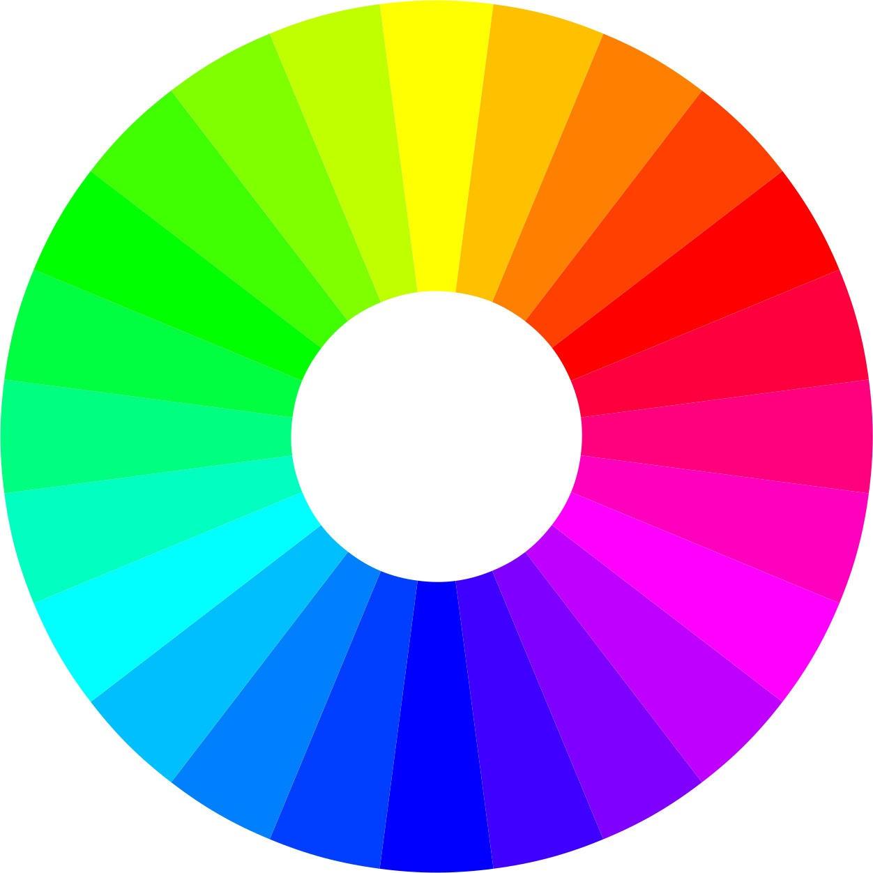
To familiarize yourself with the color wheel, imagine a vertical line through the center of the wheel. Notice the distinction between warm colors (reds, oranges, and yellows) and cool colors (blues, greens, and violets). Warm colors embody a brightness or warmth, whereas cool colors convey a calmness or, well, cool effect.
- Complementary color combinations are the pair of colors positioned opposite to each other on the color wheel. These contrasting colors catch the eye and leave quite an impact — examples: red and green, yellow and purple, orange and blue.
- Analogous color combinations refer to any two to five colors adjacent to each other on the color wheel. These combinations create a sense of balance and harmony. Typically, one of these colors will be more dominant and sit in the foreground, while the other color will sit in the background — examples: yellow, yellow-green, and green; violet, red-violet, and red; red, red-orange, and orange; blue, blue-violet, and violet.
- Triadic color combinations select three evenly spaced colors throughout the color wheel. These combinations tend to be vibrant, creating a dynamic and harmonious visual contrast when combined. You can find your three triadic colors by creating a triangle on the color wheel — examples: red, yellow, and blue; green, orange, and blue-violet; red-orange, yellow-green, and blue-violet.
- Tetradic color combinations use four colors spaced evenly on the color wheel to form a square or rectangle — examples: Red, yellow-green, light blue, purple; magenta, green-yellow, blue-green, and indigo.
Understanding universal perceptions and color’s relationship with us is essential to becoming a great artist or designer. Its communicative nuances, subtle and near-innate, are a language of its own, vibrant and elusive.
Further research the color wheel to cement your understanding of the art and science of color, and consider playing around with color palette generators.
26 beautiful color combinations that’ll inspire your next design
From contrasting colors to colors that match, here are 26 of the best color combinations to inspire your next design, including classic and trending color combos.
Classic color combinations:
1. Blue & pastel pink

Combining blue and pastel pink creates a nice balance. Pink’s softer, spring-like pastel aesthetic alongside blue’s hints of sophistication creates a serene-like duality of balance and harmony. These contrasting colors evoke refined, feminine tranquility, ideal for beauty, health, and wellness brands.
Hex codes: #2F3C7E, #FBEAEB
2. Dark charcoal & bright yellow

Dark charcoal and bright yellow form a visually striking, high contrasting color combination. Paired together, these colors feel energetic and contemporary, making the ideal color palette for cutting-edge design agencies, dynamic athletic and sportswear, and urban lifestyle brands.
Hex codes: #101820, #FEE715
3. Light red & yellow

The bold and vibrant color combination of light red and yellow is the embodiment of cheer. Reimagine this classic ketchup and mustard color pairing with a modern, pastel take by changing the tints from red to coral for children’s logos and branding and youth-focused food and beverage packaging.
Hex codes: #F96167, #F9E795
4. Cherry red & off-white

Cherry red and off-white are truly versatile classics. Defined by its duality, classic and timeless, elegant and inviting, this color combination is ideal for luxury fashion and accessories brands, fine dining and hospitality industries, and romantic and bridal branding.
Hex codes: #990011, #FCF6F5
5. Baby blue & white

Another classic color combo is baby blue and white. This serene combo communicates ease and trustworthiness, invoking the feeling of looking up at the sky on a sunny morning. Baby blue and white is the perfect color combo for brand colors in the healthcare, childcare, or non-profit industries.
Hex codes: #8AAAE5, #FFFFFF
6. Dark blue & light blue

Don’t overlook different shades of color in this the light and dark blue combo. Authoritative and cultivated, this monochrome color combination inspires professionalism and trust — making it an excellent color palette for insurance agencies or financial services firms.
Hex codes: #00246B, #CADCFC
7. Sky blue & bubblegum pink

A popular classic color combination, sky blue and bubblegum pink is a playful and bright combo that communicates adolescent joy. These bright colors are ideal for parenting brands, childcare logos, children’s apparel, products, and toys.
Hex codes: #89ABE3, #EA738D
8. Cherry red & bubblegum pink

Cherry red and bubblegum pink come together to form a fun analogous color combination. Paired, these colors create quite a gorgeous visual contrast, making an ideal color palette for bold and expressive beauty and lifestyle brands and products.
Hex codes: #CC313D, #F7C5CC
9. Forest green & moss green

Forest and moss green form a monochromatic color scheme, embodying the outdoors and nature sentiments ideal for eco-friendly and sustainable products or brands, outdoor apparel and gear brands, nonprofits, and cooperatives.
Hex codes: #2C5F2D, #97BC62
10. Midnight blue, royal blue, & burgundy red

Midnight blue, royal blue, and burgundy red combine to create a visually commanding color scheme. Mysterious, intriguing, bold, and luxurious, this combination evokes a passion and authority ideal for high-end fashion and jewelry, luxury cars and spirits, fine dining, boutique hotels, perfume, and cosmetics.
Hex codes: #1E2761, #408EC6, #7A2048
11. Terracotta red, light beige, & muted teal

Terracotta red, light beige, and muted teal combine to create a mesmerizing and mysterious color combination. This earthy and neutral color palette draws great appeal to the eye. This beautiful, timeless color palette is fantastic for farm-to-market brands and restaurants, home decor and interior design agencies, outdoor apparel and gear brands, and botanical wellness brands or products.
Hex codes: #B85042, #E7E8D1, #A7BEAE
Trending color combinations
12. Pastel olive green & salmon pink

Earthy, vibrant, and harmonious, the combination of salmon pink and pastel olive green color evokes warmth and nostalgia often associated with nature, peace, happiness, and balance. This fresh and playful color combination is ideal for eco-friendly and sustainable brands, wellness or mindfulness products, children’s products, and toys.
Hex codes: #A1BE95, #F98866
13. Deep periwinkle & soft lilac

Dreamy and ever so whimsical, deep periwinkle and soft lilac come together to create a color combination that is both ethereal and grounded, exuding sensations of refined tranquility, gentle magic, or delicate serenity. These different shades of purple are ideal for beauty, wellness, spiritual or mindfulness brands and products.
Hex codes: #735DA5, #D3C5E5
14. Salmon pink & soft peach

Soft, subtly elegant salmon pink and soft peach are trendy colors that look good together. Inviting, with a touch of cheerfulness and sophistication, this color combination is excellent for children’s products, toys, beauty and wellness products, and even food and beverage packaging.
Hex codes: #F98866, #FFF2D7
15. Seafoam green & light blue

Seafoam green and light blue offer a refreshing, harmonious balance. These cool undertones evoke a natural airiness or serene tranquility reminiscent of the sea, sky, and nature. The calming, balanced blue and renewing green combine ideally for spa and wellness brands and travel, education, and water-based brands.
Hex codes: #C4DFE6, #66A5AD
16. Teal & light green

Like seafoam green and light blue, teal and light green come together to create a fresh, serene color combination reminiscent of lagoons or lush natural springs and pools. This harmonious color palette works for health and wellness brands as well as outdoor and nature-inspired brands.
Hex codes: #20948B, #6AB187
17. Dark green & light gray

Color trends may come and go, but this classic and refined color palette is sure to stand the test of time. Dark green and light gray create a color combination that feels utterly serene and timeless. Green’s earthy and organic tones combined with gray’s calmness and neutrality create a color palette ideal for mindfulness and wellness brands, organic products, and brands offering high-quality craftsmanship, natural materials, and understated luxury.
Hex codes: #31473A, #EDF4F2
18. Cranberry red & bubblegum

Stylish and playful, cranberry red and bubblegum combine to create an eye-catching, contemporary color palette. The bold and exciting red, matched with the almost mischievous, optimistic pink, makes the ideal color combination for more creative or expressive fashion and cosmetics brands, sportswear, beverages, or candy packaging.
Hex codes: #F52549, #FA6775
19. Deep blue, orange-red, & yellow-orange
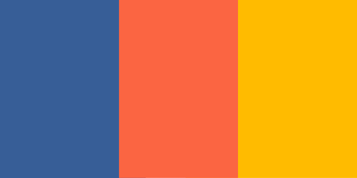
Dynamic and playful, this deep blue, orange-red, and yellow-orange color combination is bold, vibrant, and energetic. Contrasting deep blue with warm oranges evokes a sense of movement and enthusiasm, that’s great for accent colors or logo colors. This color palette is ideal for adventure and outdoor brands, adventure travel, amusement parks, and food and beverage packaging.
Hex codes: #375E97, #FB6542, #FFBB00
20. Mauve, dusty rose, & soft blue-gray

Mauve, dusty rose, and soft blue-gray go together beautifully. The combination of soft blue and dusty pinks creates a refined, feminine palette with subtle charm and maturity, ideal for wedding and event planning, beauty fashion, home decor, and the wellness industries.
Hex codes: #962E2A, #E3867D, #CEE6F2
21. Dark reddish brown, taupe, & light peachy brown
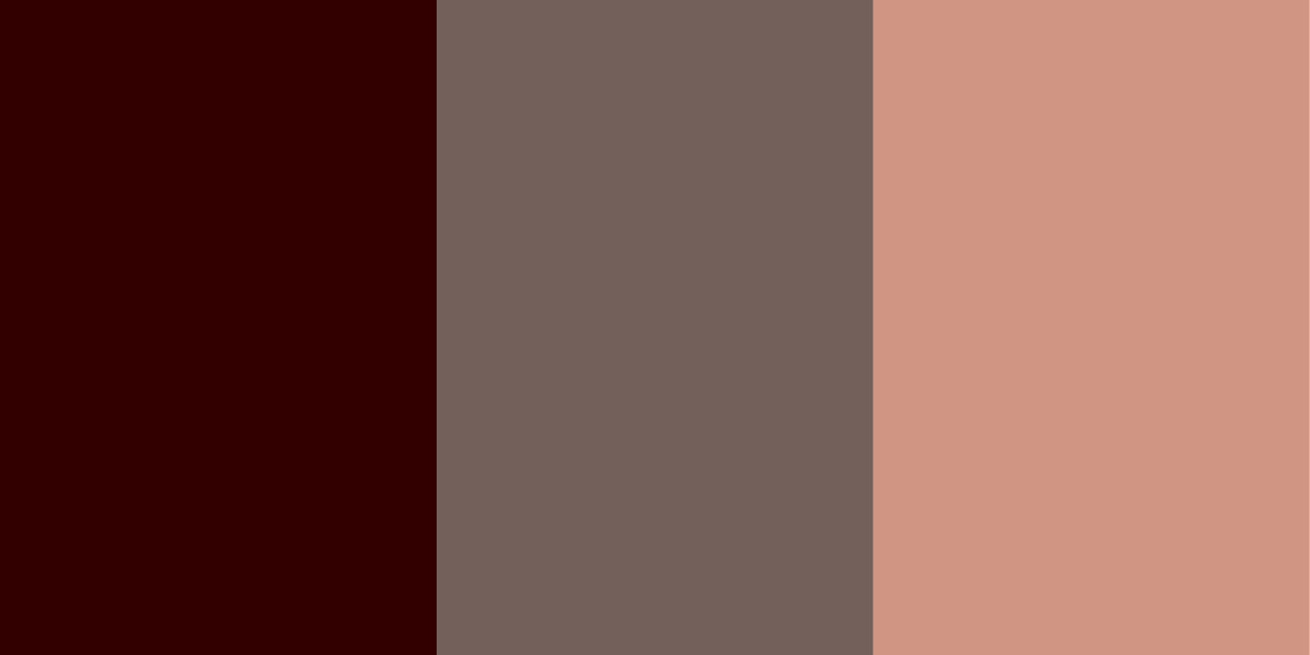
Rustic, warm, and oh-so-cozy, dark reddish brown, taupe, and light peachy brown create an earthy and inviting color combination. This timeless and sophisticated color palette is ideal for heritage and craftsmanship brands, interior design and real estate agencies, outdoor apparel and gear brands, artisanal brands, coffee shops, and bakeries.
Hex codes: #330000, #73605B, #D09683
22. Dark navy blue, bright scarlet red, & light lemon yellow
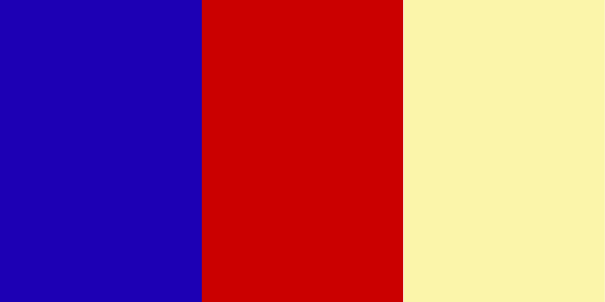
Dark blue, bright scarlet red, and light lemon yellow create a striking visual impact, evoking feelings of excitement and bold appeal. This contrasting color combination works in various styles and themes, from retro to modern — ideal for sports and fitness brands, fast food and casual dining, amusement parks, children’s products, toys, and retro-inspired ‘Americana’ designs.
Hex codes: #5031F, #CB0000, #E4EA8C
23. Teal blue, light blue, & light gray
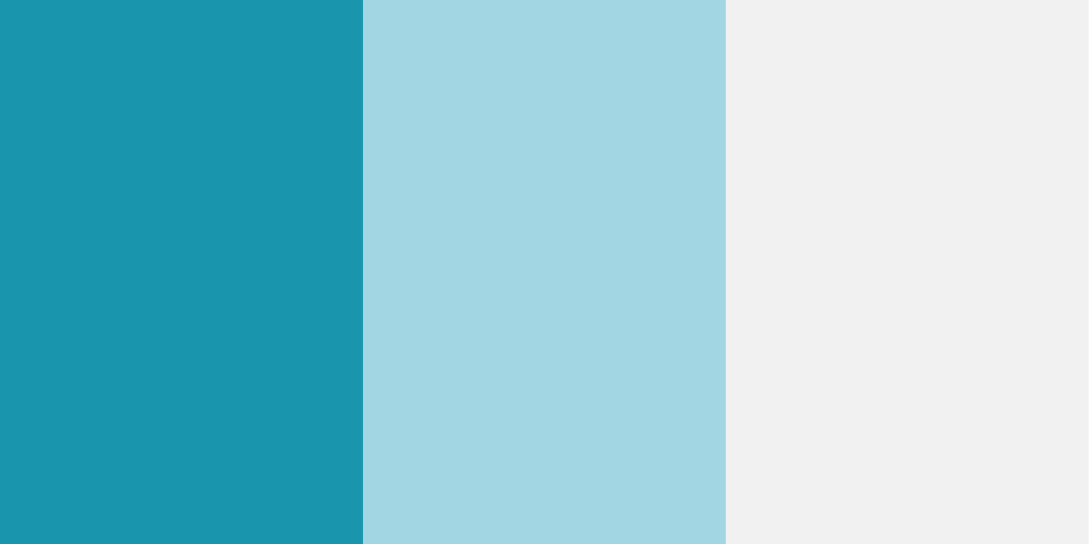
Refreshing and modern, teal blue, light blue, and light gray combine to create a serene atmosphere reminiscent of clear skies and glacier waters. The blues of this cool and clean color combination evoke strong sentiments of trust, dependability, and stability, making it an ideal palette for hospitals, clinics, financial services, insurance, law firms, and cloud-based security brands.
Hex codes: #1995AD, #A1D6E2, #F1F1F2
24. Deep navy blue, bright red, & pale pink

Ever bold and contrasting, the playfully sophisticated combination of deep navy blue, bright red, and pale pink is striking and versatile. Navy and red create a strong visual impact, evoking a sense of movement or vitality, while the pale pink adds a touch of youthful, whimsical energy. These colors look good together, specifically for luxury brands in the automobile, fashion, or jewelry industries, sportswear, or design agencies.
Hex codes: #002C54, #C5001A, #FDF6F6
25. Dark chestnut brown, burnt sienna, & soft cream

Warm and earthy, this combination of dark chestnut brown, burnt sienna, and soft cream draws inspiration from nature, evoking a rich autumn rustic theme. The balance of colors feels welcoming, traditional, and authentic, ideal for organic and farm-to-table products, heritage and craftsmanship brands, home outdoor brands, coffee shops, and bakeries.
Hex codes: #46211A, #A43820, #F1D3B2
26. Dark charcoal, deep rust, & sky blue
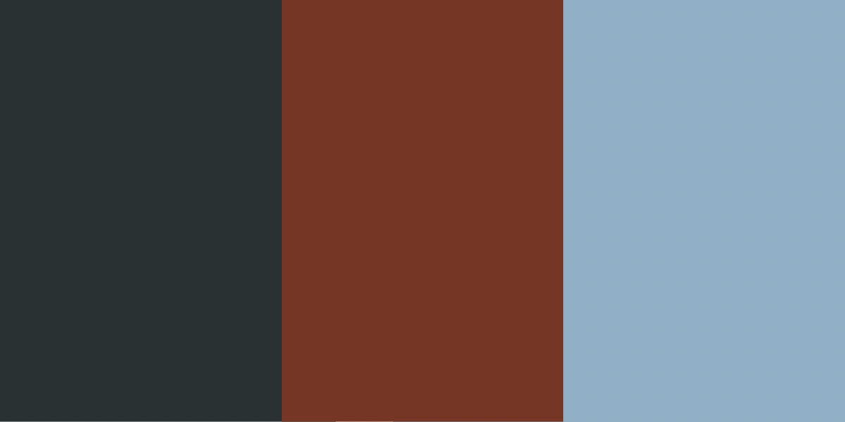
Bold and contrasting, this sophisticated and modern color combination of dark charcoal, deep rust, and sky blue evokes a sense of power, comfort, and richness ideal for luxury brands in the fashion and automobile industries, as well as design agencies or architecture firms.
Hex codes: #2A3132, #763626, #90AFC5
Get started with design resources on Webflow
So there you have it; the 26 best color combinations to inspire your next design. Check out Webflow’s Color Essentials to find the right color combo to help bring new life to your creative projects, or use a color picker tool to find new color ideas. And if you’re already feeling the inspiration, why not give these color combinations a go by getting started in Webflow.
