Our view at Stack - Simplify growth with an all-in-one platform. Powerful marketing, sales, and support automation. Integrated CMS. Scalable software. Crafted for customer experience.
Close your eyes and imagine the Starbucks siren logo in a bright HubSpot orange. At best, it’s jarring; at worst, it renders the logo unrecognizable.
That’s because the Starbucks logo isn’t just about the distinctive siren graphic, or the particular shade of green, or its round shape. Each of these elements works together to make the Starbucks brand one of the most recognizable in the world.
![Free Kit: How to Build a Brand [Download Now]](https://no-cache.hubspot.com/cta/default/53/814dd420-0d49-40e0-b59c-f01066e186c1.png)
Table of Contents
- What are brand identity elements?
- Brand Identity Elements
Brand elements are essential to your brand identity. Your brand identity gives your business a distinctive, cohesive look, and it communicates your values to customers and stakeholders.
It touches almost everything: social media photo filters, fonts on YouTube videos, sales decks, and of course your website and products.
We’ll discuss brand identity elements below, with examples and pro-tips to help you build your own.
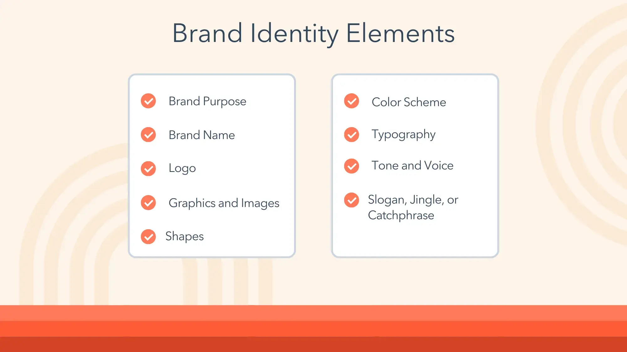
Brand Identity Elements
1. Brand Purpose
Before you start doodling logo ideas and playing around with color palette generators, make sure you’ve laid a strong foundation for your brand identity. Are you and your stakeholders in agreement on your brand’s value proposition and mission statement? Have you done a SWOT analysis?
Pro tip: We have lots of resources on these foundational elements, which will make building the rest of your brand identity a lot easier.
- SWOT Analysis
- Value Proposition
- How to Build a Consistent Brand
2. Brand Name
A brand name identifies your company and its products or services, distinguishing you from your competitors.
Your brand name is one of the most recognizable elements of your larger brand identity. As you build customer trust, your name will represent that trust — and if you lose that trust, your brand name will represent that, too.
According to the 2024 Edelman Trust Barometer, trust remains a top-three purchase criteria for consumers.
Pro tip: Consider your options within cultural and social contexts. Consumers increasingly view brands as extensions of their political beliefs and social identities, and subject brands to greater scrutiny. What you think is clever wordplay might be off-putting or even offensive to your target audience.
3. Logo
Your logo is another highly recognizable aspect of your brand. Based on logo alone, you can probably identify and describe each of the three brands below:
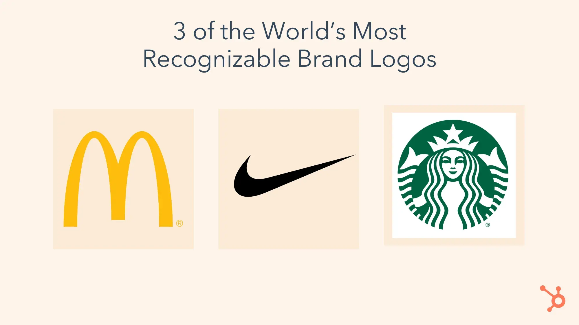
Your logo doesn’t just appear in ads or on your website; it may be on physical products you sell, in emails from salespeople, or on billboards along the highway.
Many brands have a logomark (like the three examples above) as well as a wordmark, which includes the brand name. HubSpot, Spotify, and Transport for London all use elements of their logomark within their wordmark:
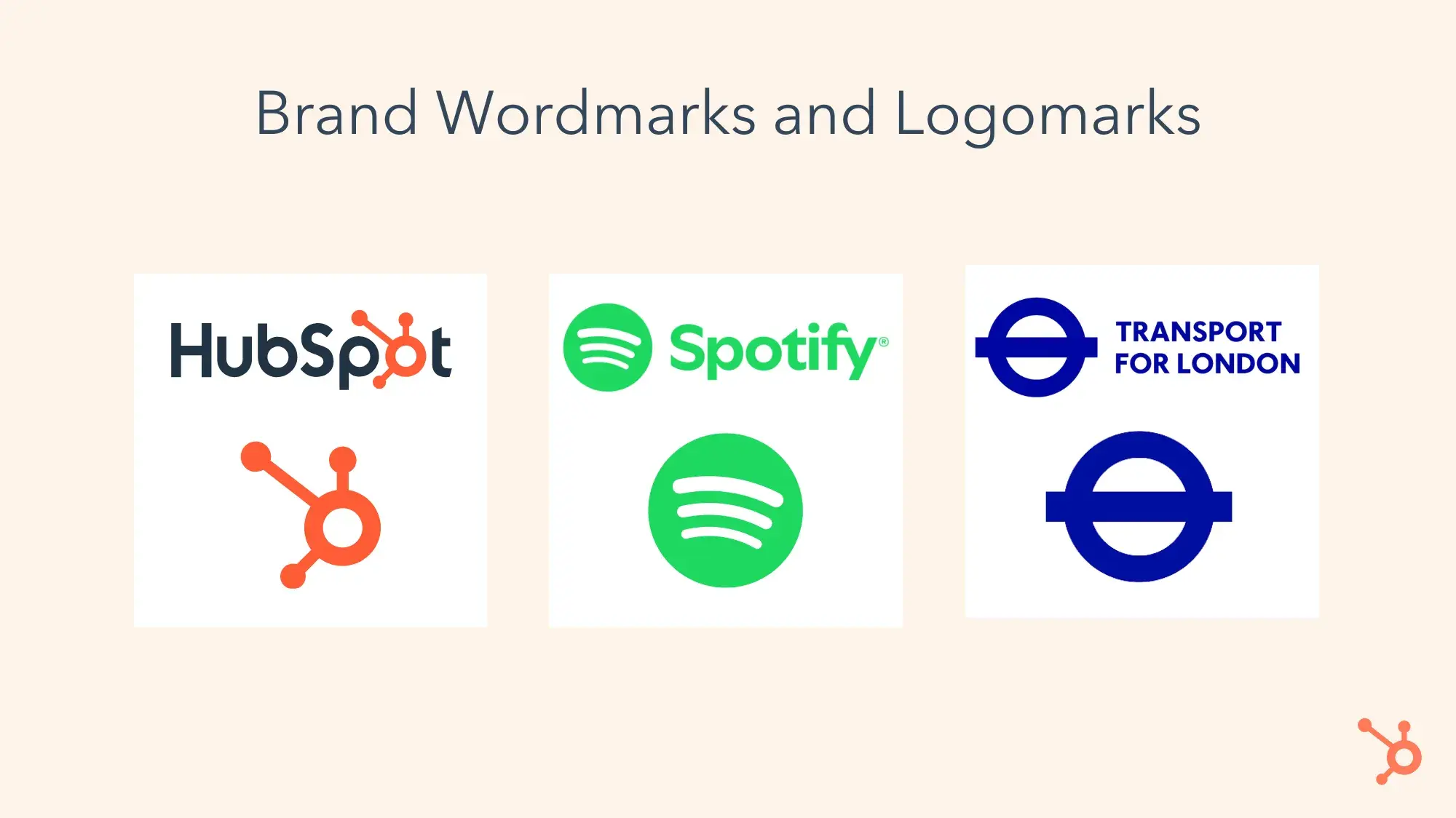
Image Source
Pro tip: If you need help creating your logo, check out our free logo maker and our video on creating logos:
4. Graphics and Images
Your visual identity should be consistent and cohesive with the rest of your brand elements. There are different ways to accomplish this — for instance, if you have an Instagram account, using the same filters on all your images will give your brand an immediate sense of harmony.
Burger King’s style guide is one of my favorites because it’s so effective at precisely defining BK’s values and interpreting those verbally and visually.
The Burger King style guide lists its four design principles as “mouthwatering, big & bold, playfully irrelevant, and proudly true.” The style guide interprets “big & bold” with clear, actionable instructions: “We play with scale using macro photography and a focus on details. Colors are unapologetically full and rich.”
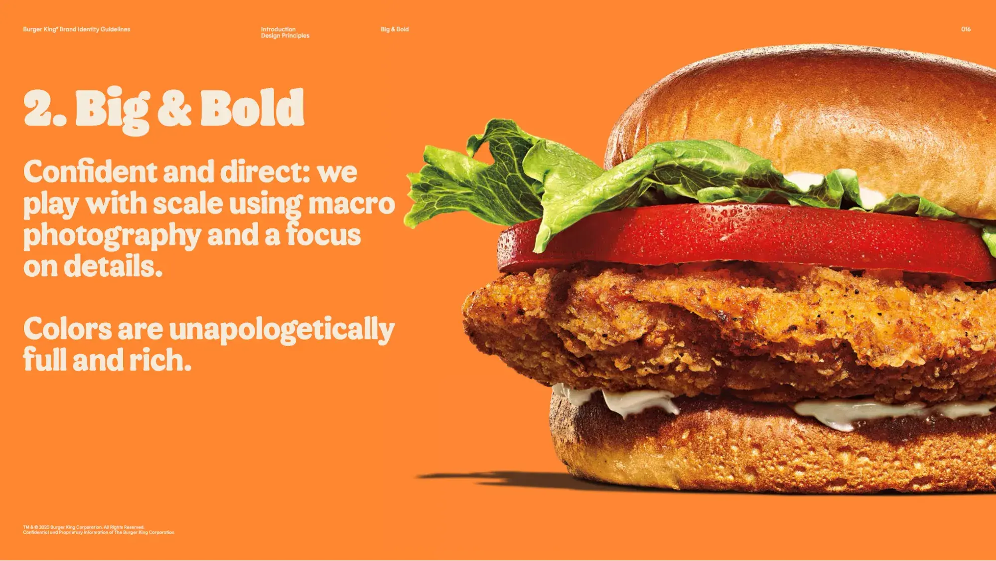
Image Source
Let’s look at how that plays out on Burger King’s Instagram account:
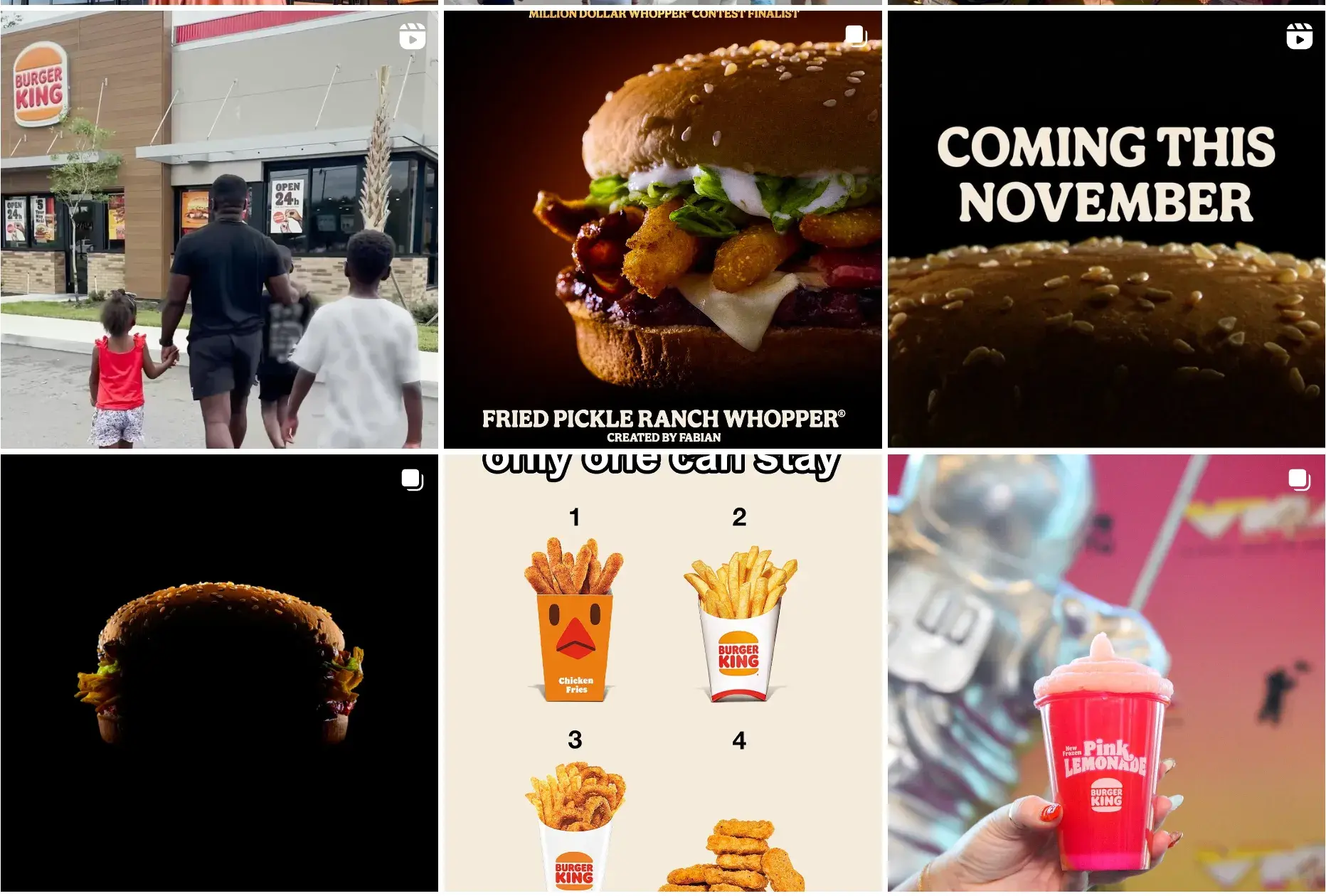
Image Source
The food photography plays with scale, featuring burgers in such extreme close-ups that the sesame seeds look like boulders atop a mountain.
5. Shapes
There’s a famous linguistic experiment in which people are shown two shapes and given two made-up words, “bouba” and “kiki.” They’re asked to assign the “word” to the correct shape:
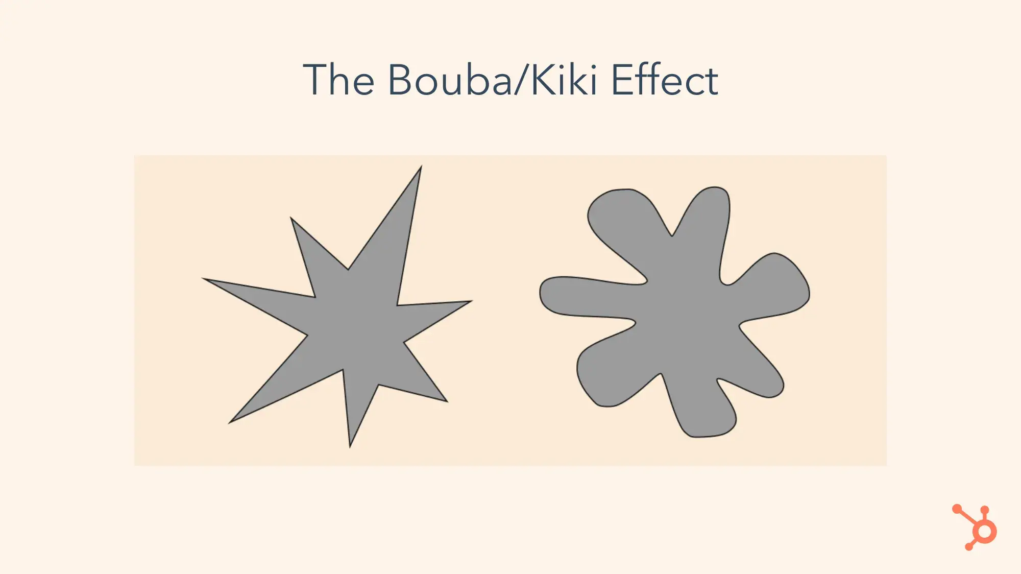
Image Source
Across languages, cultures, and ages, people almost always say that the spiky shape is “kiki” and the splotchy rounded shape is “bouba.”
The bouba/kiki effect is an excellent illustration of just how much shapes can matter in your brand’s visual identity. Troy Stange, the owner of brandpop, wrote on LinkedIn that “shapes are like the body language of your brand.”
Daniel Ocock, the managing director of Vie Design, says that he thinks of shapes as “the secret language of design; they say a lot without saying anything at all.” Ocock says that circles are “friendly and inclusive,” squares “scream reliability,” and triangles evoke excitement.
Pro tip: Have fun with shapes and use your brand colors and your imagination — but lay out best practices for those of us without a background in graphic design. HubSpot’s identity includes squares, circles, and other ornaments in brand colors, along with specific guidelines, such as using a maximum of three shapes:
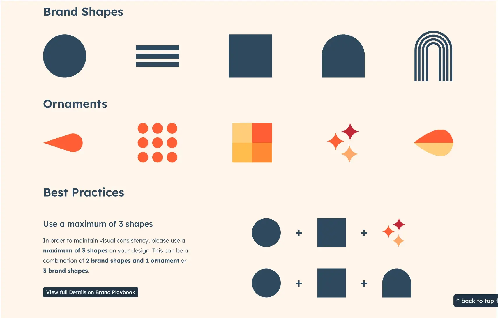
6. Iconography
Icons are everywhere in our digital world. They represent the apps we open on our phones, indicate where to tap to zoom in or zoom out, and identify all 72 browser tabs we have open.
It’s a small detail, but consistent iconography will elevate your website and other products with a professional polish. Pay attention to current design trends, because some iconography will make you look outdated.
For instance, back in 2013, when Apple released iOS 7, it redesigned its app iconography from a skeuomorphic design to the flat, two-dimensional design it still uses today.
Skeuomorphism adds texture and detail — illustrations of bookshelves might include wood grain effects, or an icon of a camera might make the lens look three-dimensional.
But when Apple switched to a flat design, the rest of the design world took notice. And by now, you’ve likely gotten so used to seeing flat iconography everywhere — not just on iPhones — that skeuomorphism looks dated:
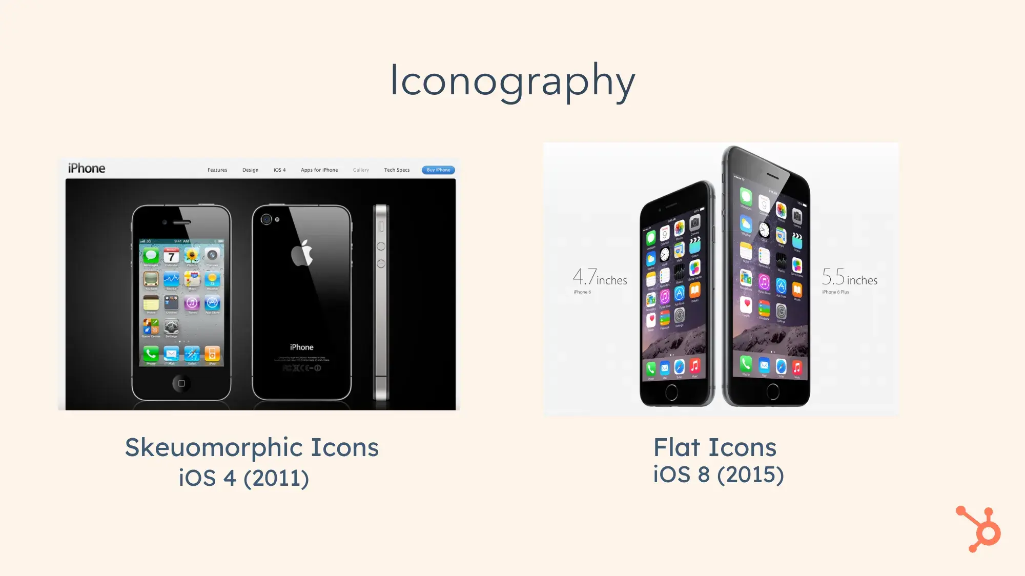
Image Source
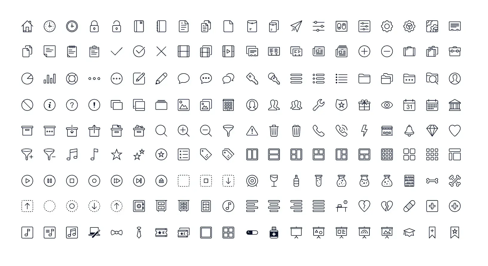
Pro tip: Make it easy for other stakeholders by putting iconography at their fingertips. HubSpot’s Google Slides templates include three pages of icons that we can use throughout our presentation. It ensures that decks across the company will look consistent, that our brand identity won’t get diluted, and that nobody has to spend hours looking for suitable icons.
7. Color Scheme
Your business’s color scheme influences all of its visual branding elements: logos, marketing materials, website, everything.
For example, Sean Garrette is an esthetician whose social media posts feature photographs with rich chocolate brown hues and complementary earth tones. He’s easy to identify even if you’re just idly doomscrolling through Instagram.
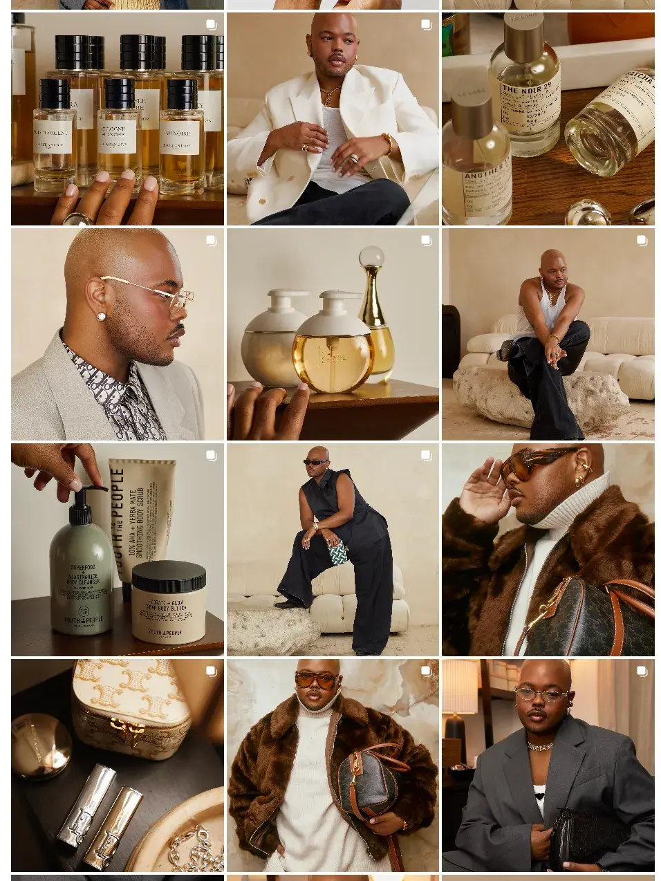
Image Source
As consumers, we can spot a great brand identity when a specific color palette immediately triggers brand recognition, like the three palettes in the GIF below (each brand name is revealed after three seconds):

Pro tip: There are lots of tools to help you find the perfect palette. I love playing with Khroma even though I don’t have any brands in need of a color scheme — it’s just that fun to use.
WhoCanUse.com is a great way to test your color palette for accessibility. And HubSpot’s free color palette generator will generate ideas based on info you provide about your brand. If you need help finding the perfect palette, try our free Color Palette Generator.
8. Typography
A brand’s typography usually includes multiple complementary fonts, and often has a mix of serif and sans-serif. This gives you both flexibility and consistency — certain mediums may be more conducive to a sans-serif font, or it may be useful to use one font family in headlines and another in body text.
Large, well-established brands often have custom typefaces. The BBC uses a bespoke typeface called Reith, named for its founder, John Reith. Reith has been customized with both a serif and sans-serif version:

Image Source

Image Source
Pro tip: Choose a web-safe font or include one in your font stack as a fallback. Although it’s not strictly necessary in today’s web design, it’s still recommended to ensure that all users on all devices have a consistent experience.
9. Tone and Voice
Tone and voice are often considered as a single element, but it’s worth thinking about them separately as you build your brand identity. I’ve worked on a number of brand style guides, and I know how easy it is to get stuck on this step.
Your brand voice is consistent across every touchpoint, whether it’s your company’s website, a TV ad, or even copy on merch or other products. Start here rather than trying to tackle tone and voice together.
Most brands use three or four words to define their voice. Those words should exude your brand purpose — perhaps your brand is helpful, kind, friendly, witty, analytical, factual, academic, or youthful.
Tone is a little more flexible. Think of it as an interpretation of brand voice; for instance, you could use the characteristics “helpful” and “factual” to describe both a vacuum cleaner manual and the HubSpot article you’re reading right now.
The tone of the vacuum cleaner manual is likely to be more direct, maybe even robotic. But because I’m writing for you, dear reader, I can speak in first person and write about burgers and coffee shops.
Let’s look at Burger King again as an example.
BK introduces its verbal identity with a note that “we’ll need to flex our voice a little for different situations: a little wittier here, a little more direct there.”
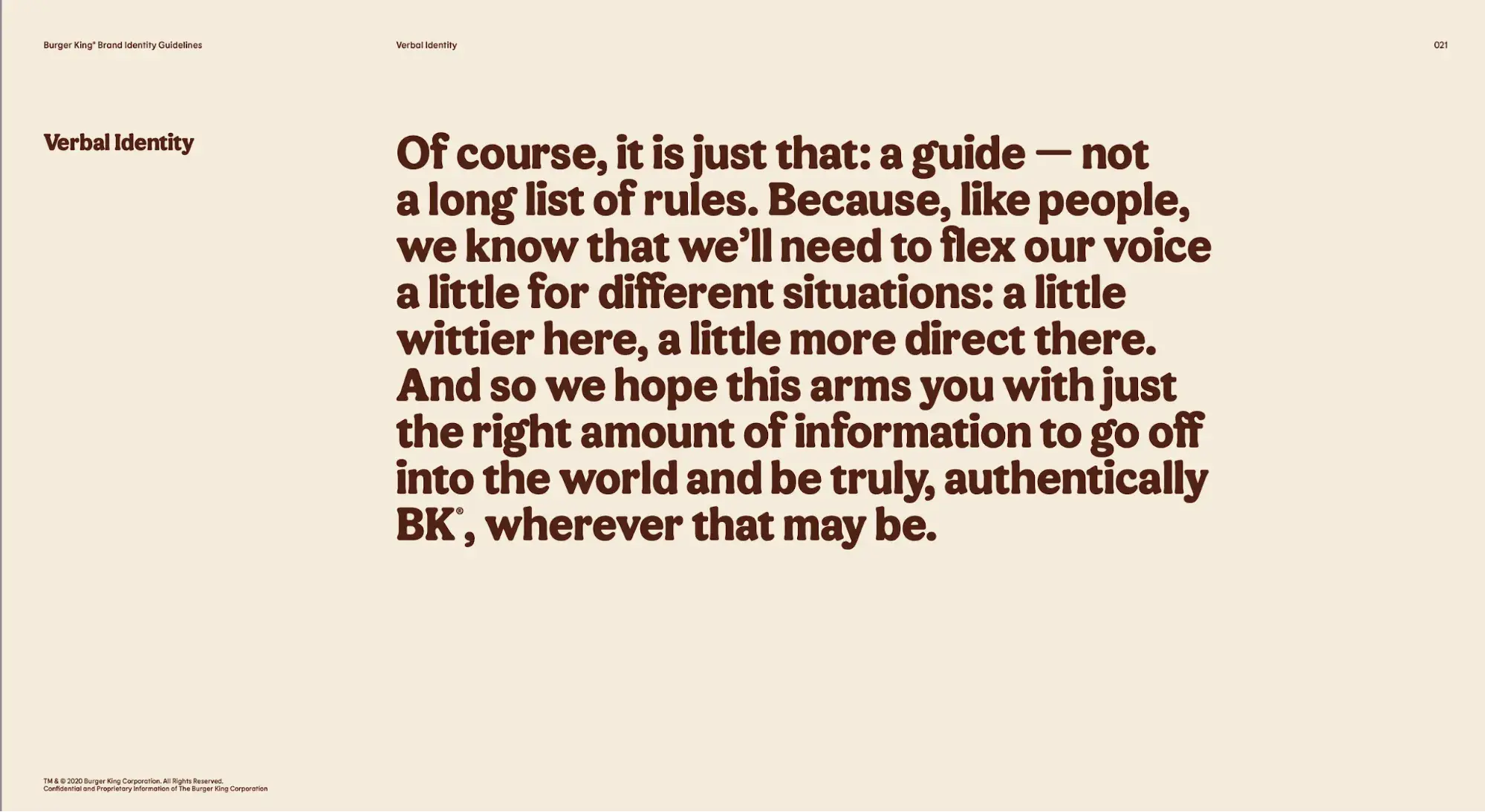
Image Source
The guide goes on to define BK’s voice with four characteristics: enthusiastic, confident, witty, and approachable.
Say you’re a copywriter for Burger King, and you’ve been asked to write two versions of an ad, one for an older audience and one for a Gen Z audience. Being approachable for the Gen Z target audience might include using a crown or burger emoji; those elements might be omitted for an older target audience.
Those small adjustments define the tone without abandoning the voice.
If you’re starting a brand identity guide from scratch, I recommend identifying four specific words that define your brand, like BK’s verbal identity guide. From there, you can make tweaks and tonal adjustments depending on target audience, the type of ad, and other considerations.
Pro tip: Make a huge list of descriptive words, including some that definitely won’t define your voice (sarcastic, stuffy, childish). Ask other stakeholders to highlight 10 words they think should define your brand voice, and continue to narrow down your list. Write the same sentence in different voices to make sure everybody’s on the same page.
10. Slogan, Jingle, or Catchphrase
Slogan and jingles don’t necessarily apply to every business, but if you use them, they’re some of the most memorable brand elements in your overall branding. (Case in point: Just try to get the Chili’s “baby back ribs” bop out of your head.)
When your jingle becomes an ear worm, you’re top of mind for consumers. You’re probably already familiar with many slogans or jingles:
- “Have It Your Way,” from Burger King
- “The Snack that Smiles Back,” Goldfish Crackers
- “America Runs On Dunkin,” from coffee company Dunkin’
- “Because You’re Worth It,” L’Oreal
- “Like a good neighbor, State Farm is there,” from insurance company State Farm
- “Snap, Crackle, Pop!” from Rice Krispies
Using Brand Elements
Remember that brand elements work in concert with each other — your jingle isn’t going to catch on if you don’t have a logo and name that people can associate it with, and your logo won’t be memorable and professional if you haven’t established your brand colors.
Use this guide to reinforce the interconnectedness of your brand identity and think about it in terms of the individual brand elements as well as the sum of its parts.
Editor’s note: This post was originally published in December 2021 and has been updated for comprehensiveness.
![]()
If Hubspot is of interest and you'd like more information, please do make contact or take a look in more detail here.
Credit: Original article published here.
