Our view at Stack - Simplify web development with Webflow, reduce costs, and deliver professional results. No-code, responsive, and SEO-friendly. Explore your creative potential!
The simplest user interactions are often the hardest to perfect.
User interface (UI) elements like checkboxes, radio buttons, and toggle switches are all purpose-built to offer simple, intuitive interactions that users can quickly understand. But for all their simplicity, creating these elements requires understanding fundamental principles that make them work just right.
To get started creating responsive UI toggle switches, you’ll need to understand what sets them apart from other UI design options, as well as how and when to apply them. With some actionable best practices for toggle switch design, you’ll be well on your way to implementing them in your design system.
What’s a toggle switch?
Toggle switches are small but powerful UI elements that let users switch between two mutually exclusive states. When users click the switch, the visual component clearly indicates its state with coloration and animation. Clicking the switch to move the toggle from one side to another enables or disables a feature, setting, or mode.
Toggle switches are common in settings menus, where users select which features to enable, such as privacy restrictions or analytics.
How to know if a toggle switch is on or off
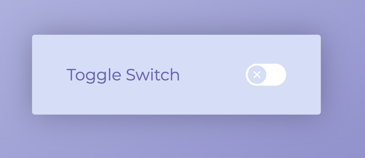
Toggle switches typically contain two elements: a flat oval and a circle that rests inside it. You can change the shapes as you like, but the basic premise is the same. The smaller shape moves horizontally within the larger shape as the switch is enabled or disabled. You can also incorporate a checkmark or X to indicate the toggle’s state.
Usually, when the toggle is deactivated, the smaller shape is on the left side. When clicked, an animation moves it to the other side and updates the color. Your designs should follow these fundamentals to ensure users can interpret toggle features quickly.

How to use toggle switches in UI and UX design
Incorporating toggle switches into your UI designs creates an intuitive, straightforward user experience (UX). In many situations, toggles are better than drop-down menus or checkboxes, which require users to click and read more before finding what they need. Here are a few typical use cases where toggle switches work well.
Enable or disable features
If each of your product’s features has only two states — on or off — a toggle is the perfect way for users to enable or disable them. You can line up all setting options in a list with on/off toggles beside them. This structure clearly displays relevant product settings and their current states so people can understand their customizations at a glance and change them as needed.
Switch preferences
Toggle switches also allow users to personalize their experience more efficiently. As they browse settings, they can instantly see which features are active and adjust them to suit their preferences. For instance, in a music app, toggles can let users turn notifications on or off with one click, rather than navigating through drop-down menus. This reduces friction and also saves screen space, making it easier to navigate without the clutter of multiple-choice options.
Toggle between viewing modes
If your site design uses different themes or viewing modes, such as light and dark modes, then a toggle is a great way to offer users the option to switch between them. You can even set the page to update immediately as someone switches between modes. That way, users can see the differences in real time.
Select privacy settings
To comply with privacy regulations like GDPR, you must incorporate options that let users control cookies, shared information, and visibility. Toggle switches are an obvious choice for these options because most involve a binary decision. For example, users can either agree to let you share their information with third parties or not. Using toggle buttons here also makes adding new options easier, as it just involves adding one line to a menu.
4 toggle switch design practices
Toggle switches are deliberately small and offer simple interactions, and it can be challenging to perfect this simplicity. Here are four essentials to keep in mind when designing toggle switches.
1. Deliberate color contrast and consistency
The most obvious component in a toggle switch’s design is its color contrast. When an option is disabled, it should be gray or white, indicating it’s inactive. When it’s enabled, give it a bright color that indicates it’s active. Green is the typical choice, but if your design system favors other colors, select a bright shade from your color palette that contrasts the deactivated state.
2. Clear and concise labels
To mirror the simplicity of the toggle switch itself, use concise language to describe the option it configures, like “Sound On” and “Sound Off.” Consistency is visually appealing and makes settings easy for people to interpret. If you need to add context, use a tooltip to offer more information or a link to a helpful article.
3. Dynamic animation
Use a basic but engaging animation that clearly indicates interaction. Some designers add an X or checkmark to the circle in the switch that changes as the toggle moves from one side to the other. But no matter what you choose, ensure the animation moves from state to state clearly so users can quickly correct a mistake if they misclicked an option.
4. Appropriate size and spacing
Toggle switches need space around them to stand out from other visual elements. If your page has a busy background, switches can quickly get lost, especially when in the off state. Inserting some padding or whitespace around your toggles is especially important to create a responsive design that functions and appears correctly, no matter the page size.
Design with UI in mind with Webflow
UI elements like toggle switches, checkboxes, and radio buttons may seem simple enough, but when it comes time to design them, you’ll realize how much the fundamental principles matter.
Explore our blog for more design resources, including how to use the golden ratio in layouts to the best design tools.
Get started with Webflow for free, and explore more interactive web design courses at Webflow University.
If Webflow is of interest and you'd like more information, please do make contact or take a look in more detail here.
Credit: Original article published here.
