• Skip to primary navigation
  • Skip to main content
software stack logo

Software Stack

Get your Software Stack together

  • Knowledgebase
    • All Categories
    • Accounting Software
    • Automation & Workflow Software
    • Customer Relationship Management
    • E-Commerce Shopfronts & Payments
    • Marketing Automation
    • Online Courses & Membership
    • Project Management
    • Surveys & Forms
    • Web Hosting
  • Home
  • About Us
  • Contact Us
  • Show Search
Hide Search

Workflow & Automation

How to identify and fix data silos to improve collaboration

Software Stack Editor · April 18, 2024 ·

image

Be proactive to prevent data silos and ensure all employees have the information they need to do their best work.

Multidepartmental enterprise organizations often struggle with information silos. Since each department might use specialized software, like customer relationship management (CRM) platforms and other enterprise applications, they risk creating isolated information environments. This, in turn, can hinder information sharing and integration across the organization, leaving valuable cross-departmental data untapped.

But addressing data silos involves more than just merging databases across disparate systems and tools — it’s about establishing an integrated framework that facilitates collaboration and data exchange. By linking departmental data streams, you create a unified and comprehensive understanding of business operations and transform isolated data into valuable, actionable insights.

What is a data silo?

A data silo, or information silo, refers to data held by one department that’s inaccessible to others within the same organization. When teams independently store and manage their data, they create barriers to sharing information, making it “siloed.”

Data silos negatively affect organizational processes and efficiency. If departments silo customer data, for instance, it becomes a barrier to delivering personalized experiences. This lack of shared data leads to generic and less effective engagement strategies, undermining the potential for targeted marketing and customer relationship building.

Why data silos are problematic

Data silos do more than just prevent data accessibility — they hurt your entire organization in the following ways:

  • Fragment data. Data silos isolate information within specific platforms, tools, and departments. This makes it challenging to develop holistic strategies that integrate insights from different departments, like customer profiles that include website behavior, purchasing history, and communication preferences.
  • Form team barriers. Data silos create virtual barriers between teams that prevent effective collaboration. Exclusive information held by one team blocks information flow and contributes to organizational silos — departmental segregation that hampers overall operational strategy and company alignment.
  • Increase costs. Maintaining and managing disparate systems often increases operating expenses because you have to invest resources to reconcile data from various sources.
  • Create missed opportunities. Teams have a harder time creating cross-functional synergies and leveraging insights from one department to use for another, leading to overlooked opportunities for optimization, risk mitigation, and new ventures.

Common causes of data silos

With multiple departments and employees, it’s common to miss data silos until they start significantly impacting the company’s bottom line. Here are some reasons data silos form.

Legacy infrastructure

Outdated or aging information technology (IT) infrastructure, often called legacy systems, can struggle to align with modern workflows. These older systems may not support current data-sharing protocols and thus pose challenges in breaking down silos and extracting insights.

If your business relies on a decades-old CRM system that doesn’t integrate well with newer data visualization tools, your marketing team might experience slow and insufficient data integration issues. Relying on this outdated technology can lead to siloed data. To solve this issue, consider migrating your legacy system to more modern solutions.

Decentralized technology management

Decentralized technology management occurs when teams choose their tools and technologies independently. This approach offers flexibility but leads to inconsistency and inadvertently creates data silos because it drives teams to select solutions that fit their immediate needs but are unaligned with your broader organizational strategy.

For example, your marketing team might choose an advanced AI personalization tool that excels in customer engagement, while the customer service department uses a separate CRM focused on customer interaction history. Without a centralized approach to integrate these different systems, crucial data points remain isolated within each team’s chosen tool.

Mergers and acquisitions

Organizations often struggle to integrate diverse IT systems and data infrastructures during mergers and acquisitions. The key issue here is incompatible datasets, which, if not consolidated into a unified enterprise application, create data silos.

If a large enterprise acquires a small business, each organization typically brings its own data management tools. Without strategic planning for integration, the small business’s data becomes siloed, making it difficult to leverage this information across the larger, combined organization.

Rogue end users

Employees may independently adopt data tools without aligning with your organization’s broader integration strategy. Known as “rogue” users, these individuals inadvertently create silos by storing sensitive information in systems outside your organization’s primary data ecosystem.

Consider a customer service employee who is subscribed to a cloud-based chatbot tool for quick client interaction management but bypassed coordination with IT or data management teams. This action diverges from the standardized service protocol and makes customer information inaccessible to other departments — creating a silo.

How companies can identify data silos

Identifying silos within your organization is the first step to fostering a more integrated and collaborative working environment. Watch for these indicators:

Difficulty in accessing data

If teams regularly struggle to access information for projects and tasks immediately, it often means a specific group or individual is siloing data. For example, if your marketing team frequently delays obtaining sales data necessary for campaign planning, it implies that this information is siloed.

Inconsistent reporting

Varying figures and metrics from different departments for the same key performance indicators (KPIs) indicate siloed data. This inconsistency arises when departments like marketing and sales access and analyze data in isolation despite working on the same project. A discrepancy in which the marketing team reports a 25% increase in customer retention and the sales team reports 30% suggests that each team draws from separate, nonintegrated data sources.

Data negligence

Neglecting data quality, updates, and maintenance signals potential silos. This negligence presents as outdated information, dataset errors, and a general lack of up-to-date data handling, and reflects an absence of a comprehensive approach to data management. So if a team consistently uses outdated customer contact information and it leads to failed communication attempts, it suggests that other departments aren’t sharing, updating, or cross-verifying this data.

Lack of cross-departmental collaboration

Limited collaboration between teams using different technologies often leads to silos. This problem is especially evident when there are few shared projects or integrated workflows, suggesting that departments are confining information.

Redundant data storage

Multiple teams storing similar datasets indicate redundant and duplicate storage, a hallmark of silos. This redundancy creates waste as multiple teams invest resources to maintain similar information independently. It also elevates inconsistency error risks because each team may update its dataset at different times and in different ways. These inconsistencies can create errors or misleading conclusions when analyzing information because analysts might unknowingly use outdated or conflicting data versions.

4 steps to fix data silos

To dismantle silos and foster a cooperative work culture, follow these steps.

1. Identify the optimal customer experience path

Understanding how your target audience and customers interact with various touchpoints allows you to identify the main focus areas for data collection. Start by mapping the user journey from awareness to conversion. Then, conduct workshops with representatives from all departments, such as marketing, sales, and customer service.

During these workshops, work collaboratively to identify critical contact points in the customer journey and leverage this insight to build a centralized system for tracking all customer interactions. This unified approach ensures that no department deviates from the defined journey and everyone works toward a shared objective.

The goal is to effectively guide visitors through various calls to action (CTAs) that encourage them to take specific actions like purchasing a product or subscribing to a service. This strategy sets the foundation for streamlined data management and aligns departmental efforts toward enhancing the overall customer experience.

2. Bridge customer data gaps across teams

Ensure customer and company data flows between departments to prevent silos from forming. One way to achieve this is by integrating a CRM that provides access to all relevant teams. Complement this system with robust data-sharing protocols, like regular synchronizations and weekly check-ins, to keep everyone on the same page. Establish clear permissions to maintain secure access and prevent rogue users from forming new silos — this ensures information access for everyone.

For example, a shared data system, like a website, makes data accessible to a company’s marketing and engineering teams, ensuring both have real-time records of the same information.

3. Establish a systematized approach to data organization

To guarantee consistency across departments, establish norms and practices for collecting and organizing data. This includes setting file naming conventions and establishing project-specific number codes for documents and assets. A standardized system prevents duplication by creating consistent storage and management methods, lowering redundant and conflicting data entry.

Conduct regular audits and data validation checks to ensure all departments adhere to these standards. If certain departments aren’t complying, provide workshops and training sessions to bring struggling parties on board while encouraging a more collaborative working environment.

4. Cultivate a collaborative culture

Create a company culture where employees feel comfortable exchanging ideas and information with each other. Highlight the existence of data silos and the importance of breaking them down to achieve common goals. A collaborative workflow and environment ensure data becomes a shared asset rather than a departmental property.

For example, you can recognize and reward team efforts contributing to data integration and project success after holding workshops. And consider investing in collaboration tools and shared communication platforms like Slack and Notion to encourage real-time cooperation and data sharing.

Break siloed systems with Webflow

Silos can quickly creep into your organizational structure and impede workflows — and breaking them down is a slow challenge. But platforms like Webflow allow you to build collaboratively in a central visual development platform that directly integrates multiple analytics and data tools into your website.

With Webflow’s visual-first approach, you can build a unified website that’s accessible, user-friendly, and scalable to suit all levels of your organization. Plus, you can monitor performance with powerful apps and optimize for your business needs.
10 best UX design portfolio examples that’ll inspire you in 2024

Software Stack Editor · April 18, 2024 ·

Your UX design portfolio demonstrates your skills and creativity. It’s not just a visual showcase — it reflects your expertise in user-centric design principles.

Creating a compelling user experience (UX) portfolio goes beyond aesthetics. It requires blending great visuals with intuitive functionality, demonstrating how you align design choices with user needs, and curating a thoughtful layout that narrates your design process.

Every detail of your site — from the structure to the color scheme — should demonstrate your capacity to deliver a seamless and impactful UX. Your portfolio is your canvas, the platform where you showcase the skills you’ve honed as a UX designer.

What’s a UX design portfolio, and why do you need one?

A UX design portfolio is a collection of work samples designers share with potential clients and employers. It showcases your best projects to demonstrate your style and expertise. Some artists and designers make printed portfolios, others post them in online galleries like Behance and Dribbble, and others create custom websites.

UX designers especially benefit from using a portfolio website because the site itself becomes a sample of their work. Even if your work experience is relatively slim, the UX of your portfolio website demonstrates your skills. It also shows potential clients how you design at your own discretion, unfettered by someone else’s product and brand guidelines. 

The 10 best UX design portfolio examples

The following are 10 top-notch portfolios that stand out from the crowd. Every one showcases the designer’s skills, with careful attention paid to each design choice. Let these inspire you to create your own skills showcase.

1. Emi Lantz

Emily Lantz’ portfolio landing page opens with the header “Hi! I design products & brands.” It also includes a purple “download resume” CTA and a transparent “view projects” CTA below the header.
Source: Emi Lantz

Emi Lantz’s portfolio uses a striking dark theme that balances purple gradients against a black background to highlight her white-font header “Hi! I design products & brands.” Near the top of the homepage, she placed icons for software she’s proficient with to showcase her multifaceted skills in design, research, and testing.

A prominent “View Projects” button directs visitors to review five curated studies that delve into her straightforward and practical design process. The inclusion of glowing testimonials, or “high fives,” from previous collaborators and team members highlights her personal flair, articulates her brand, and further substantiates her UX/UI design abilities.

2. Ljubomir Bardžić

A portfolio homepage with small text saying, “Hello, my name is ​​Ljubomir Bardžić,” followed by larger text stating “I’m a freelance product designer and Webflow expert with 10 years of experience helping startups deliver better experiences.”
Source: Ljubomir Bardžić

Freelance UX/UI designer ​​Ljubomir Bardžić’s portfolio balances minimalist design with colorful aesthetics. Using a classic black-and-white background theme draws attention to colorful project work. His portfolio includes client feedback, user journey mapping, and wireframes to illustrate ideation and design processes.

The text leaves no room for ambiguity. He succinctly communicates his service offerings — web design, UX/UI design, and Webflow development services — to clearly describe his value proposition. 

Ljubomir’s portfolio offers a straightforward experience for potential clients to quickly evaluate his style and expertise with minimal clicking and scrolling.

​​3. Karolis Kosas

White homepage featuring text in the top and bottom center, and a picture of a CUJO device with closed eyes on the right. The text on the screen says “Karolis Kosas is a product designer at OpenAI, previously Stripe.”
Source: Karolis Kosas

Product designer Karolis Kosas uses a minimalist approach that lets their design prowess shine. A stark black-and-white color scheme subtly comes to life with animated blinking eyes on a CUJO device, adding a touch of motion to the otherwise static homepage to engage viewers.

Each case study consists of a vertical stream of unadorned grids that provide comprehensive explanations and visual representations of each step. Side-by-side product design deliverables and images of the product in use illustrate how each step contributed to the final design. This thoughtful and thorough presentation indicates Karolis’s skills.

4. Pascal Strasche

Homepage with a white-and-blue gradient background with a headshot of Pascal Strasche on the right. On the left, text states “Hi, I’m Pascal: A freelance Product Designer and Webflow Expert. I help companies design intuitive digital products and develop converting marketing websites.” Below is a green CTA button saying “Let’s chat.”
Source: Pascal Strasche

When visitors land on Pascal Strasche’s portfolio website, a seamless blend of professionalism and personal flair greets them. A unique light teal color accents a murky gray background, while the header immediately boasts Pascal’s skills: They’re a freelance product designer and Webflow expert. And their many case studies further support this expertise.

Near the bottom of the homepage, Pascal discloses their personal manifesto — a clear outline of ambitions and values — symbolizing the depth of investment in their brand. Pascal’s articulate and direct approach fosters trust and reliability. By integrating their unique personality and UX/UI expertise, they create a genuinely individualized portfolio that demonstrates design acumen and a robust personal ethos.

5. Vicky Marchenko

Portfolio homepage with a white background and purple paper airplanes. On the left is text stating “Hey there! I’m a UX/UI designer that uses my background in business to create meaningful digital experiences.”
Source: Vicky Marchenko

Vicky Marchenko’s UX/UI design portfolio feels warm and inviting. The playful paper plane animation and friendly “Hey there!” expression deliver a sense of personal connection. And her consistent use of a comforting light-purple-and-white theme furthers this inviting atmosphere.

Dive into her projects page to find comprehensive and transparent case studies showcasing her cross-industry skills. From overviews to specific deliverables and examples of final designs, Vicky ensures the reader clearly understands her role in each project (and what she can offer them). Finally, her footer invites you to enter your name, email address, and a message, offering a clear line of communication to simplify getting in touch.

6. Sarah Lauchli

Sarah Lauchli’s portfolio includes two images of computer screens presenting images from her previous work while a headline floats at the top of the page reading “Hi, I’m Sarah Lauchli! UX/UI Designer.”
Source: Sarah Lauchli

Sarah Lauchli’s design portfolio website showcases her impeccable taste in colors, layouts, and typography. She uses bright graphics and a standout deep pink to complement a white-and-off-white background, with fun font use throughout. 

Sarah carefully documents the objectives and challenges she encountered in each project case study and the direct actions she took to conquer them. You’ll find the step-by-step process she undertook, including the user flows, wireframes, and palettes she created. And at the top of every page, icons indicate which tools she used for each project, demonstrating her proficiencies clearly and alongside their proper context.

After visitors are thoroughly impressed by the case studies, they can visit her “About me” page for a detailed description of her design philosophy and specialties. At any point, you can click the “Contact” option at the top to reach a lightweight contact form.

7. Olga Rody

A UX portfolio site with large text stating “Olga Rody UI/UX Designer Based in Indiana, US.”
Source: Olga Rody

Large text and a minimalist design take center stage on Olga Rody’s sleek portfolio homepage. She displays her projects in a large grid, featuring images from each project to inform visitors of what to expect before they click. And she uses a natural color scheme that prioritizes accessibility with its excellent font–background contrast.

At the top of each case study, Olga defines her role up front. As visitors scroll, she introduces various design deliverables such as journey maps, wireframes, and prototypes, painting a comprehensive picture of her process.

Her portfolio isn’t just a gallery of pictures. She also includes measurable outcomes, such as usability testing results and survey answers, to showcase her impact as a designer. This social proof might be just what convinces viewers to get in touch.

8. Ryan C. Robinson

A portfolio site with a wavy orange-and-blue background. In the center of the page is text stating “Ryan C. Robinson UX Designer Specializing in responsive web, desktop, and mobile app design.”
Source Ryan C. Robinson

Switching it up with a burst of color, Ryan C. Robinson’s portfolio gives a vivid twist to modern design. His projects pop off the screen as visitors scroll through, breaking away from the standard 2D design approach and introducing 3D elements.

Each of his project pages balances descriptive content with engaging visuals, ensuring a complete understanding of his design process. His focus tags for each project are particularly useful — like wireframing, UX, and visual design — providing an efficient reference point for potential clients or employers looking for examples of specific skill sets. 

This portfolio showcases a unique blend of creativity and function, demonstrating his versatility as a UX designer.

9. Gina Yu

Gina Yu’s portfolio site features a light-beige background with colorful paint drops throughout. Near the top is the text “Hey fellow human bean! I’m an Atlanta-based product designer, who works to create a more human and empathetic world.”
Source: Gina Yu

Web designer Gina Yu offers a refreshing departure from conventional product design portfolios that open with product images and sleek, techy designs. She uses a light-beige background to highlight fun paint drops (hinting at her artistry) and text that starts by stating “Hey fellow human bean! I’m an Atlanta-based product designer, who works to create a more human and empathetic world.” Instead of opening with a focus on her design skills, she highlights her philosophy. This sets a wonderful tone for people hoping to work with someone who shares the same human-focused values.

Navigating to her “Work” page, the spotlight first falls on her most recent project, with four other undertakings trailing closely in a simple grid layout. She populates each case study with process narratives and interactive prototypes. And she even embeds a functional prototype on a graphic representation of a Mac screen for her Outback Bikes project, offering visitors a realistic demonstration.

10. Archit Saxena

Archit Saxena’s portfolio starts with a headline that reads “I’m a creative product designer,” followed by four smartphone screens that feature designs he’s worked on.
Source: Archit Saxena

Contrasting with the previous portfolio, Archit Saxena’s site immediately highlights concise, functional examples and explanations. He starts with subtly animated design samples that lead into larger images that exemplify his work and offer links to fuller case studies.

Each case study begins with a list of interesting stats about the project, such as increased user satisfaction and daily bookings. He follows these with an example from the project and a deep-dive description. Finally, he describes his role in each project, how he approached his tasks, and what the results were. Overall, it’s a comprehensive look at what it might be like to work with him — and the results he can deliver.

What to include in your UX design portfolio

While each portfolio above tells the designer’s unique story, they all include a few consistent components to ensure their sites demonstrate their expertise, creativity, and unique understanding of what goes into effective UX design.

Case studies

UX case studies are long-form descriptions of a design project from beginning to end. They describe initial requirements, the designer’s role in fulfilling them, and their approach. Sprinkled throughout these case studies, you’ll find visuals like wireframes, flows, and samples demonstrating how the project took shape.

Project examples

UX project examples typically show the finished product a designer worked on, preferably with a link to where it’s published. These examples give potential clients something real to appraise and lend credibility to the designer’s ability to produce quality content clients ended up using.

Your design process

Case studies should include a detailed overview of your design process to help potential clients and employers thoroughly understand how you approach project work. Include research you conducted to justify your design decisions and describe the team structure you worked in so they can learn how you fit into a team. And if you’re a solo designer, outline how you manage all the disparate tasks involved in completing a project, like determining budgets, writing content, and interfacing with clients.

Visual and interaction design skills

UX designers are uniquely suited to creating online portfolios because UX is so integral to building great websites. Take this opportunity to show off your design skills, so potential employers and clients can see you at your best, unrestrained by project requirements and limitations. 

Start your portfolio with Webflow’s 21-day design course

Designing and publishing a UX design portfolio involves important decisions like selecting a platform, picking the right case studies, and building the best layout. Even veteran designers can benefit from input on those decisions. Before you get started, take the time to research tips and tricks from other designers. 

For more comprehensive guidance, check out the 21-day portfolio course at Webflow University. It provides step-by-step guidance for publishing your portfolio with Webflow, covering everything from creating layouts and interactions to launching your site. By the end of the course, you’ll have a completed portfolio website and many new skills.

Show off your talents with a UX design portfolio

Curating your top projects and describing your distinct design approach is a fulfilling exercise. Not only do you get to demonstrate your abilities, but you can also reflect on your personal growth and journey through your design career.

Let Webflow help you showcase that journey to clients. Webflow offers top-notch stability and design features like reusable components and Quick Stack elements that empower you to express your unique creativity.

Try Webflow today and get started on your portfolio right away — with or without coding.

How I do it in Miro: Jumpstart journey mapping with product designer Maureen H.

Software Stack Editor · April 17, 2024 ·

Previously we launched a new “How I do it in Miro” video series hosted both by regular users and our very own Mironeers.

These videos are designed to help you learn — fast — how you can use Miro for your specific job. The first video featured Miro UX researcher Deniz Kartepe, who demonstrated how he uses Miro to run a research project end to end. You can read about it here.

In this next video of the series, we’re excited to introduce Miro product designer Maureen, who will walk you through how she does user journey mapping in Miro.

[embedded content]

Organize journey steps

Maureen likes Miro because she can visually map out the entire journey on a canvas without any limits. In this example, she and her team held a journey mapping workshop to better understand the needs of customers who rely on business intelligence tools.

In this Miro board, the users will walk the team through each step of their journey, sharing how things work, what their needs are, their pains and gains, and the touchpoints they encounter.

Full view of a journey map in Miro

Collaborate with users 

Miro provides a painless process because Maureen can share this Miro board with their users, and together they can fill it out or make changes to the steps along the way.

All of this work is done in a table, and it’s easy to add a column or move things around. The content is also auto-fitted to the table, meaning the columns automatically adjust to the size of the content.

Consolidate research

To ensure the journey map accurately covers everything you know or have collected, you can easily add data from other places. This includes frames from other Miro boards, entire research boards, and even content from other tools altogether.

Miro integrates with a variety of apps and platforms, which means Maureen can add PDFs from user surveys, documents from Google Drive, and videos from Loom or UserTesting.

Miro board with content and files pulled in from other sources

Ideate with workshops

Maureen’s next step is to lead her team and stakeholders in a workshop to ideate how they can improve the experience in each step of the journey. 

She starts with presenting the objectives, and the team uses Miro to brainstorm ideas which can be bucketed into themes and topics.

In the past, Maureen had to switch between different tools for workshopping. But with Miro, she can present the workshop instructions and background slides by using Interactive Presentation Mode, and then switch to the pan tool when it’s time to collaborate.

Turn ideas into action points

The output of this workshop is a new “Idea Mapping” swimlane in the user journey table. This is where Maureen’s team collects ideas and turns them into actionable cards.

You can use Miro cards, Jira, or AzureDevops, depending on your preferences. No matter what, Miro makes it possible to convert ideas into action points that can be tracked for visibility.

Miro cards containing actionable tasks

Share findings with team

Now, Maureen has a complete and visual overview that shows the gaps and opportunities of the current user experience. To share the findings with her team in a digestible way and to provide more context, she records a Talktrack recording for others to watch later, in their own time.

There you have it. As you can see, it’s easy to use the same Miro board for all your user journey mapping needs. Be sure to watch the video to hear straight from Maureen how to use her full-fledged, easy-to-use journey mapping template for your own team.

And check out the template once you’re ready to dive into your own journey map.

Webflow REST Data APIv2: Part 1

Software Stack Editor · April 17, 2024 ·

To advance a developer platform forward, you sometimes need to first take a step back.

From 2015 to 2016, our team launched Webflow’s REST API, which focused on web builders across the market verticals where Webflow was being widely adopted. 

Initially, the API allowed 3rd-party developers to query the Webflow CMS and respond to site events (e.g. form submissions). Over time, the surface area of the API continued to expand as we continued to add features to the platform, and more developers were integrating Webflow into their visual development practices. 

Within our engineering department, this meant that more feature teams were contributing to the codebase and associated APIs. However, as the API surface area continued to grow and more new customer requests kept coming in — the API started to fragment.

Webflow was growing fast, third-party developers wanted to integrate into our platform, and some were building their entire business by writing applications that connected to our APIs millions of times a day. But to achieve this level of success, developers had to wade through a confusing assortment of different error response formats, and webhook payloads.

As we planned how we could motivate more 3rd-party solutions to build on top of Webflow, we started by reflecting on what we should do differently.

We identified three main areas for improvement:

  1. Consistency, using non-standard response codes, and brimming with surprising behaviors (eg. having to pass id: null for setting SKU properties).
  2. Using a style and governance model. Even if we cleaned up the API in its current state, we didn’t have a mechanism to prevent further sprawl and fragmentation.
  3. Granular permissions requiring users to grant wholesale authorization to their site. A dealbreaker for many of our Enterprise customers.

At the start of 2023, our Developer Platform team— the team that interfaces directly with our 3rd-party developers on a regular basis via Twitter, Slack, and other channels — dedicated a week to audit our existing API, recording, and grouping “API papercuts” to identify how we should redesign our developer foundations.

This is the first part of a multi-part blog series providing a behind-the-scenes look at our journey of designing, engineering, scaling, and launching a revamped API for all of Webflow’s 3rd-party developers (and there are a lot more now than there were in 2015!).

Conducting a papercuts exercise

The first step we took was to dive into the API papercuts. We allocated a week to identify the gaps/limitations in our then current APIs (v1) and find all of the annoying little things that  were pain points for our 3rd-party developers. Also, we defined a public API style guide that laid out our design principles and best practices to set ourselves up for success during the development of the next version of our APIs (v2).

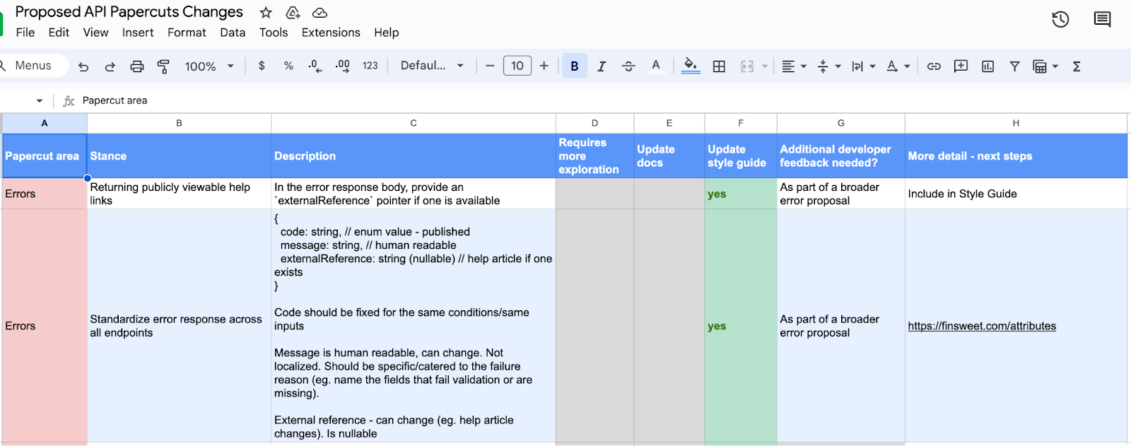
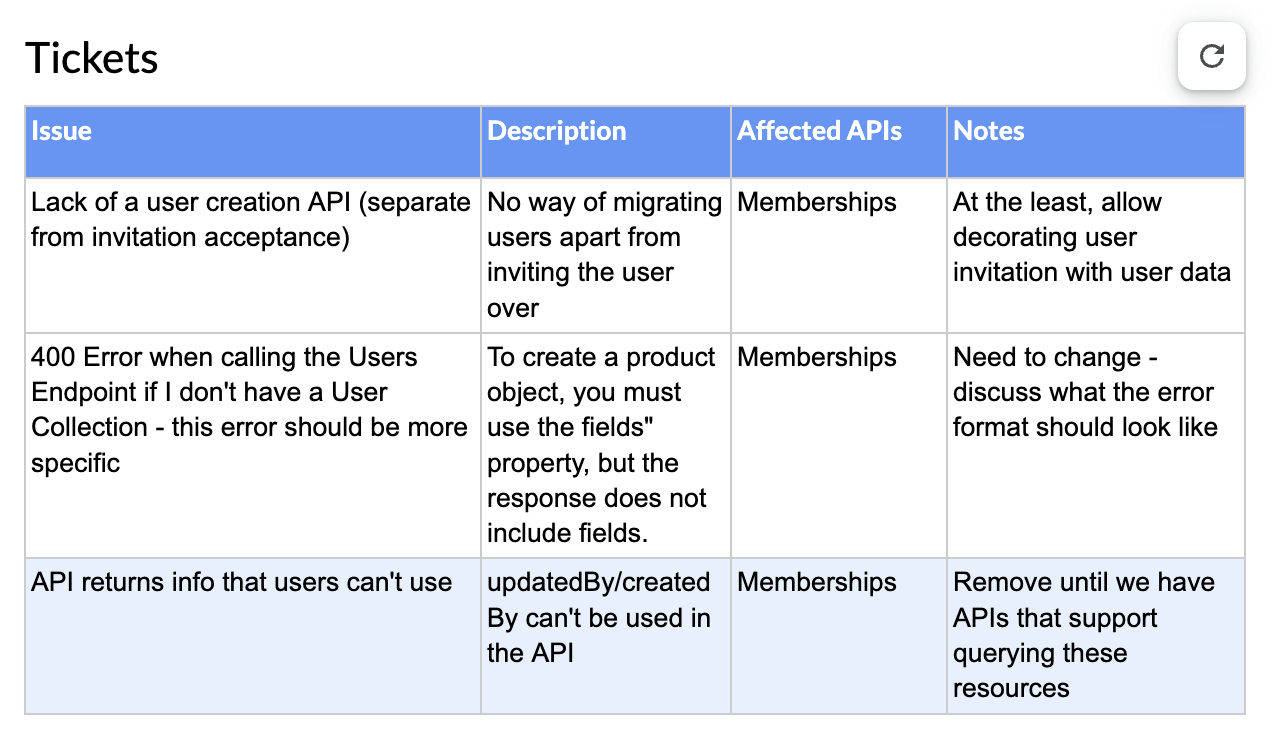
We conducted an exercise where we prepared a list of issues (from both internal and 3rd-party developer feedback) associated with our API suite. We broadly categorized the gaps/limitations into the following themes: API Response Errors, Webflow Users/Membership API vertical, API Ergonomics, Nomenclature, and Webhooks.

The sequence of process oriented activities that we executed are as listed below:

Step 1

We funneled down the top developer asks, along with issues/tasks from our JIRA boards, to identify the popular topics within the aforementioned themes and prepared a sample space of themed items.

Step 2

We started holding discussions within our working group to prioritize the themed items into the following actionable steps:

  • Requires more exploration (yes/no)
  • Update public developer documentation (yes/no)
  • Update style guide (yes/no)
  • Additional developer feedback sough (yes/no/comments)
  • More details/next steps

An example of how we tackle prioritization:

Step 3

We prepared a Public API style guide laying out our API design principles and best practices. The style guide was sectioned into the following topics:

  • Naming conventions for our API endpoints, API scopes, and fields
  • API response entities: data types (null values, objects, arrays, booleans, etc), HTTP status codes, and error standardization
  • Structure fundamentals: endpoint structure and pagination conventions 
  • Open API specification

Step 4

Start incorporating the style guide as well as prioritized actionable steps from the Papercuts Exercise into driving our cross-functional company wide initiative of revamping/launching our API suite. 

The power of auditing and improving development building blocks

Building a developer platform requires constant iteration and self reflection. As you add new functionality, it’s important to consider how a new endpoint fits into the existing patterns already established. Nonetheless, as any API matures, you’ll inevitably accrue some degree of quirks, inconsistencies, and designs stretched beyond their intended purpose. 

Launching a new API version offers a rare opportunity to reevaluate these past decisions and holistically redesign how your API’s building blocks fit together as a cohesive suite. It’s a major responsibility that requires deep collaboration with stakeholders, as well as a clear understanding of developer scenarios and where the organization is heading next. Taking a comprehensive audit of the existing APIs is a first and critical step in setting this course. 

Please stay tuned for part 2 of this series, where we’ll dive into our next set of efforts around versioning practices, rollout lifecycle, API scopes design, and customer comms.

Creating a contact form on your website: A complete guide

Software Stack Editor · April 17, 2024 ·

A website contact form offers valuable insights and encourages customers to reach out.

A contact form is an excellent way to establish a communication channel between you and your customers. You can use it to request feedback, generate leads, and encourage engagement. 

To help you create your own for your website, we’ve gathered some helpful tips along with contact form examples and templates you can work from. Whether crafting a basic contact form or a complex, multi-step system, you’ll be set for success.

Why use a contact form?

Inviting customers to reach out to your company using pre-configured fields provides users a consistent communication structure. And on your end, it’s easy to respond and then pull and track data from correspondences.

Here are a few more benefits of including a contact form on your site.

Reduce spam emails

Spam accounts and bots can easily send emails in huge quantities, but they can’t complete contact forms at the same scale. It’s more challenging for these bots to find and fill contact fields, which often contain disruptive CAPTCHA tests. Using contact forms ensures that most communications your company receives are legitimate. 

Track inquiries

Contact forms use consistent fields that lend themselves to automation. Many task management tools, such as Jira and HubSpot, help you automatically create tasks based on contact form information. This feature makes tracking and managing these contacts significantly simpler.

For example, if your form includes fields for customer platform, related product, and issue description, your task management tool can extract these values, automatically place them into the relevant fields, and file a ticket. This process is much easier to automate than an email, which would lack these fields. Your automation would have to dump the whole message into a blank task, and you’d have to sort out the fields manually. 

Generate more leads

Forms involve less friction than email correspondences because they provide a clear structure, leading to a more seamless contact experience for users. This seamless experience encourages more customers to reach out, resulting in more high-quality leads.

How to create a contact form for a website

Contact forms have become a mainstay in website design, so it’s no surprise there are many ways to set them up. The following are the two most common methods.

Online tools

Web development platforms offer templates and form builders that let you set up contact forms and other interactions with little to no code. This method is the simplest, allowing you to leverage the creativity and experience of web designers who specialize in creating intelligent, flexible user experiences. You can check out Webflow’s contact form templates for some ideas.

Design your own

Designing a contact form from scratch is a more involved method, but doing so allows you to make one that suits your brand. However, you must take adequate measures to ensure the form stores and transmits information securely whenever a user completes it. Consider investing in a data governance tool like Informatica or Alation to help navigate data privacy regulations like GDPR.

You’ll also need a firm grasp of these coding languages:

  • HTML — You’ll need to use the
    element along with all the and required for each section.
  • CSS — You need CSS to style the various form elements, deciding their spacing, fonts, and colors.
  • PHP — You can embed this scripting language in HTML to gather the inputted data and send it where it needs to go.

What should you include in a contact form design?

When designing your contact forms, you don’t need to get overly creative. Remember that your customers have probably filled out similar forms before, and they have expectations about how quick or simple they should be. Follow this familiar structure to ensure a smooth customer experience:

  • Name field — A simple field for inputting the customer’s name
  • Email address — A field where customers input their email addresses (validated to ensure accuracy)
  • Subject — A character-limited field where customers enter a title for their message or select from a dropdown menu
  • Message or comments — A text box where customers input comments, concerns, or intentions (with a limited character count to encourage concise responses)
  • Security features — A CAPTCHA or other feature that blocks bots
  • Confirmation message/page — A pop-up or separate page that gives the customer a chance to review their input before submitting
  • Privacy and data usage information — A paragraph or two describing how you’ll protect the customer’s information and what you’ll use their data for

Contact form types and examples

Contact forms come in many shapes and sizes, and which type you select depends on your company’s needs. Are you trying to generate leads, reach out for feedback, or establish a platform for fielding concerns? As you read the following contact form options and examples, consider which ones suit your unique use case.

Pop-up form

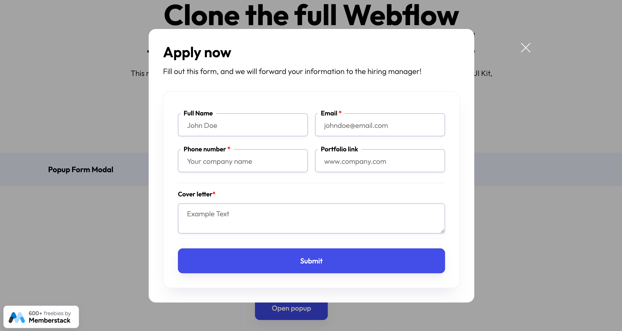
A pop-up form is a simple message that pops up on a screen and encourages customers to fill out a few simple fields. Brands typically use them to ask visitors to sign up for their mailing list. They can also work to offer promotional discounts. Webflow offers pop-up form templates you can seamlessly integrate with your web design.

Popup contact form template in Webflow
Popup form modal template designed by Memberstack

Vertical contact form

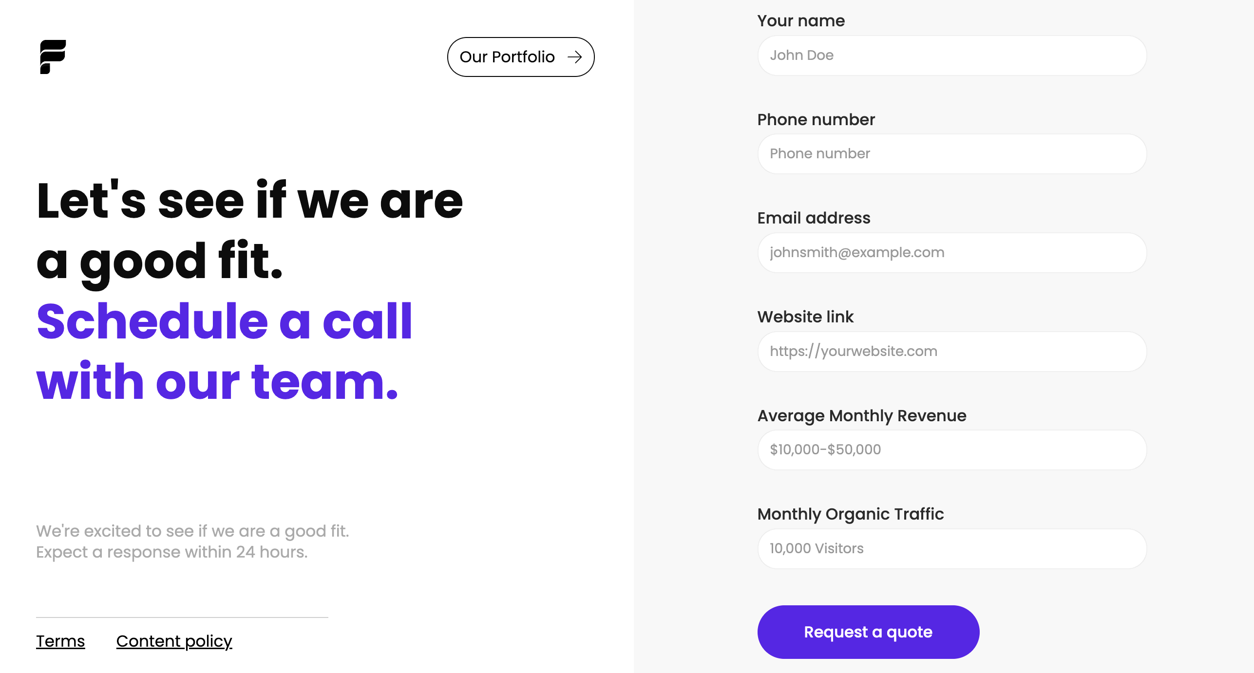
Vertical contact forms are the typical format for contact pages. They lay out every field vertically, usually featuring additional information or calls to action in the adjacent space. 

To improve your customers’ experience, include information about how soon they can expect a response and suggest actions they can take in the meantime, such as visiting a help center or watching informative videos. You can explore templates made in Webflow, like this vertical contact form template designed by Flagship Ads, which cover various use cases.

Vertical contact form template
Agency contact form template designed by Flowbase

Multi-step form

A multi-step form takes the vertical contact form further. Businesses use these forms to ask questions in high volume, breaking various interactions up across multiple fields.

For example, this onboarding form template, designed by Flowbase, uses a clean, simplified UI that breaks questions into separate interactions. As the customer fills out each field, they click the button to move to the next. This results in a more interactive experience.

Multi-step contact form template
Multi-step onboarding form designed by Flowbase

Footer form

A footer form serves a similar purpose to a pop-up but works in the opposite way. Rather than grabbing the customer’s attention, it lays unobtrusively at the bottom of each page. Customers will only notice this subtle form if they scroll down, but it’s an excellent way to provide a sign-up method for a mailing list or let users reach out with one interaction.

This footer component template, also designed by Flowbase, is an excellent example. It includes some simple navigation options, a header, and a single field and button customers can use to subscribe to emails.

Footer contact form
Footer component cloneable designed by Flowbase

3 tips for a perfect contact form design

Contact forms may seem simple, but a perfect structure goes a long way to increasing conversions and engagement. These three tips will help you craft an ideal form that engages customers and invites them to interact with your brand.

1. Anticipate user inquiries

Start with a clear expectation of what inquiries you’ll receive from the form. Then, choose fields that request information relevant to those inquiries. For example, if you’re looking for customer satisfaction feedback, ask which product the customer is referring to and their satisfaction level. Alternatively, if your form is for demo scheduling, include a field for selecting time slots and a dropdown for common use cases.

2. Keep forms short to boost conversion rates

The shorter your form is, the higher the chance customers will complete it. If possible, fit your entire form in one screen so it doesn’t require scrolling down. In a multi-step form, use a visual indicator that shows how many pages the form has and try to include the fewest possible fields on each page.

3. Dedicate a form for social media

Social media creates segmented communities, so it’s easy to reach out to specific target audiences through these channels. Tap into multiple social media avenues by creating dedicated forms that appeal to each platform’s users.

Enhance user interaction with Webflow

Contact forms are vital to the user experience, but your website’s overall design also requires thoughtful planning to promote seamless interactions. Webflow offers a suite of helpful templates to inspire and streamline your development process. You can also leverage tools like Quick Stack elements and reusable components to fine-tune designs for your unique brand. 

Next time you assemble a contact form, update your site layout, or add a new feature, start with a template and see where your creativity takes you.

Achieve continuous improvement with as-is and to-be process mapping

Software Stack Editor · April 16, 2024 ·

In 1952, brothers Richard and Maurice McDonald closed their BBQ restaurant for three months to focus on one small aspect of their business: hamburgers. Like many other restaurants at that time, their processes were slow and inefficient. They cooked menu items to order, used non-disposable dishes, and delivered meals via carhops. 

To cut costs and serve hamburgers faster, the brothers took their crew out to a tennis court. They mapped out the kitchen appliances in chalk and had their team practice cooking with a timer. Then they scrubbed the chalk out and adjusted the kitchen layout to optimize their cooking time. On the second day, it rained and they had to start over. 

When they finally re-opened, they introduced the world to the Speedee Service System, a process that would catapult McDonald’s into franchise history books. They achieved this system (and 15-cent burgers) all thanks to as-is and to-be process mapping on that tennis court. 

These process mapping techniques frame the opportunity for companies to improve by illustrating the gap between what is and what could be. 

Process mapping basics

Process mapping is a method of visualizing processes, workflows, and procedures. The maps themselves use shapes and lines to diagram the relationships between tasks, decisions, and people. 

Putting together these maps pushes teams to define roles and responsibilities, and align communications across silos. Once the map is created, it can help teams understand a complex process at a glance and give leaders the information they need to make strategic decisions. 

Below we’ll dive into how these distinct types of process maps serve different purposes. 

Learn how to make a basic process map via Miro’s guide to process mapping

What is an as-is process map?

An as-is process map represents a workflow or procedure as it currently functions — helping teams and leaders understand what’s happening now, at a glance. Here are some of the ways it can add value. 

Onboard and train new hires

It’s difficult and time-consuming to train new hires when your processes aren’t documented well (or at all). The presence of updated as-is process maps can get new employees up to speed faster and shorten their time to productive contribution. 

Identify bottlenecks and inefficiencies

Inefficient processes slow down production, which can lower profits and decrease employee and client satisfaction. Most companies know when a process is broken, but they don’t know how to fix it.

When you create an as-is process map, it’s easier to pinpoint which stages of a process are slowing things down or causing extra work.

When Amazon was trying to cut down fulfillment time in their warehouses, they noticed it took too long for one employee to walk across a warehouse to shelve lipstick in a cosmetics section and another employee to find and retrieve it. To save time, they adopted the practice of shelving an item wherever they could find available space and keeping track of the item’s location with a barcode. By spreading inventory throughout a warehouse and carefully tagging the location, employees no longer need to walk all over a large warehouse to fill one order. 

Collaborate better

Most processes require multiple people, often from across functional areas. Companies report that cross-departmental collaboration is a challenge. For example, Deloitte and MIT found that 75% of organizations are coordinating their workforces across functional areas, but just 41% say their organization has the right functions working together in the right way. With an as-is process map, even cross-functional teams can better understand roles and responsibilities, and align their priorities. 

As-is process map examples

Looking for inspiration? As-is process maps can be used to illustrate anything from workflows to organizational structures and user flows. 

Workflow diagram

A workflow diagram is an as-in process map that illustrates a single workflow. You can use a flow structure to show a starting point, steps and decisions, and an endpoint. This helps teams pinpoint missing information, visualize end-to-end processes, and onboard new employees.

workflow diagram example

Use this template

Roles and responsibilities

A roles and responsibilities chart maps responsibilities within a team (or project) to help teams stay focused and operate efficiently. The visual branching style shows relationships between managers and teams, which guides important conversations and enables teams to set boundaries and expectations. 

roles and responsibilities map example

Use this template

What is a to-be process map?

A to-be process is a process in a future or theoretical state. To-be process maps serve as a planning and strategy tool, illustrating a process that’s still in development and yet to be implemented. Here are some of their benefits. 

Plan and allocate resources

Process mapping isn’t just for refining existing processes. It’s a powerful tool for planning new initiatives. One example is a product roadmap, which is a strategy document outlining the steps needed to bring a product launch from concept to go-to-market. This visual representation of a future process lets companies budget appropriate resources and staffing to bring a plan to fruition. 

Facilitate scenario testing and assessments

Hypotheses and testing are important parts of the scientific method. A to-be process is essentially a hypothesis about how a new or improved process will work. Companies may build multiple to-be process maps so they can test and assess the effectiveness of each one, tweak their process, then try again. 

Improve productivity and team satisfaction

Inefficient processes lead to low morale and employee churn. This translates to a big price tag for businesses — McKinsey & Company estimates that employee disengagement and attrition costs a median S&P 500 company $228 million per year. 

When employees don’t understand their roles or feel like their work doesn’t matter, everyone loses. To-be process mapping helps teams align around a common purpose, communicate and contribute ideas, and feel valued as a part of the improvement process. 

To-be process map examples

You can turn any as-is process map into a to-be process map by simply adding the changes you want to test and implement. There are also unique process maps designed for strategic planning. 

Value stream map

A value stream map is a diagram that illustrates the flow of materials and information in a process. This method was pioneered by Toyota, who created a just-in-time manufacturing process with continual processing to avoid excess production.

value stream map example

Use this template

Action plan

An action plan is a list of tasks that details everything you need to do to complete a project. These plans can include dependencies, roles, deadlines, and instructions for assignees. Managers can create action plans for repeatable projects to save time and optimize productivity. While there are different formats for action plans, the one below is structured as a Kanban board. 

action plan template example

Use this template

How to create as-is and to-be process maps

Before creating your process map, take a page from a cartography textbook. Start by answering these three questions:

  • What is the purpose of the map? Articulate why the map is needed and the expected outcome. 
  • Who is the audience for this map? Consider who the map is for, what information they will care about the most, and the most effective communication method for them.
  • How will it be displayed? A process map that will be printed and hung in a manufacturing facility should be designed differently than one that will live in digital form. 

Once you know these three answers, you’re ready to dive in. 

1. Determine your stakeholders

Ask yourself who needs to be included in the process. While you don’t want the group to become too large, make sure that all important parties that might be impacted are in attendance. It’s much more difficult to sell people on a new process when they are left out of the conversation. 

2. Choose a diagram format and mapping tool

Next, choose the diagram format. A flow chart is the simplest process map and the easiest to pick up. However, a swimlane diagram or value stream process map may be appropriate for complex processes. 

The mapping tool that you choose also makes a difference. Choose one with preset shapes and connectors, and a template library to save time and deliver professional designs. A collaborative virtual tool like Miro enables stakeholders to converse, diagram, and adjust their maps live, cutting down on back-and-forth time over email. 

3. Document your process

Bring your group together to determine what information you have today, what you still need, and which details are the most important. 

For an as-is process, this is the most important step. Observe a process in action or ask different parties to share their version of a process to understand it better. For a to-be process, collect as much information as you can about what needs to be accomplished or case studies of what’s worked elsewhere. 

4. Diagram a high-level flow

Before you zoom in on the details, diagram a high-level flow of the main action steps of a process. Ask contributors for feedback before adding details to your diagram. 

5. Add in the details

Add details about inputs and outputs, and who is performing each task to make the process map complete. Even with a detailed view, be careful to avoid lengthy text. Instead, use color coding and symbols to convey concepts and responsible parties.

6. Have everyone sign off

This step is critical. Process maps need multiple perspectives to be the most efficient. The key part of collaboration is making sure all parties are in agreement, and if they aren’t, set aside time to get there. 

7. Assign action items and follow-up items

In an as-is process map, you may not have any action items following a map creation. A to-be process map, on the other hand, is a catalyst that will propel you forward. Keep your momentum going by assigning action items to individuals and turning your process map into a roadmap for implementation. Don’t forget to assign someone to take ownership of maintaining the map going forward.

8. Schedule time to review the map in the future

Whether you created an as-is map or a to-be map, it’s certain that the process will need to be modified at some point. Scheduling a time to review the map will keep teams accountable, ensure that process changes stay documented, and help teams identify long-term improvements. For an as-is process map, an annual review may be sufficient. For a to-be map, choose a review cadence appropriate for the speed of the project.  

From as-is to to-be: Closing the gap between the current state and the ideal state

Process mapping has come a long way from chalking a tennis court, but the basic concept is the same. To improve a process, it’s critical to understand the current state of affairs first. Involve stakeholders to diagram processes with an as-is process map, then brainstorm ways to improve with a to-be process map. Incorporating both these elements helps to train new hires, identify and remove bottlenecks, and improve productivity across the board.

How to unlock the full potential of your cross-functional teams

Software Stack Editor · April 16, 2024 ·

image

Teamwork makes the dream work. But how do you achieve it?

The familiar saying likely resonates deeply with leaders who manage cross-functional teams. But turning dreams into reality requires a robust culture of mutual respect and goal-oriented teamwork. A cross-functional team combines multiple departments in a unified group, allowing members to share knowledge and collaborate on ideas.

In web design departments, developers, marketers, and QA professionals work together to collaborate cross-functionally. This model lays a solid foundation for innovation and strong communication. Learn the strategies, practices, and tools you’ll need for successful multi-group work that delivers. 

What’s a cross-functional team?

Cross-functional teams comprise a mix of colleagues from different disciplines, such as design, development, and marketing. Combining various departments helps colleagues learn from each other, which fosters widespread knowledge sharing and innovative collaboration. 

Most web development teams work this way since developing sites and products requires disparate yet interconnected expertise. For example, here’s how a cross-functional team of designers, marketers, and developers might collaborate on site design:

  • Designers gain valuable design input from the marketing team’s market research.
  • Developers validate and approve bold ideas before designers commit to them.
  • Marketers keep a steady pulse on the whole team’s progress to plan their marketing campaigns accordingly.

This contrasts the traditional “department” team model, where each discipline is siloed. That approach has worked for so long because it lets each department keep a laser focus on its responsibilities. But in a new age of sophisticated technology, it’s easier to collaborate cross-departmentally due to abundant technology advancements and new collaboration tools. Multi-team participation encourages innovation and bypasses tedious chains of discussion in favor of real-time communication. 

Benefits of working cross-functionally

When you bring people with diverse perspectives together, you use a wider lens that can let you create a better product. Every team member provides valuable insights that might be novel to their colleagues.

Here are just a few benefits of implementing a cross-functional team structure.

Real-time communication 

A cross-functional team can detect and resolve flaws in project ideas in real time. Their meetings might take longer since there are likely more competing viewpoints, but collaboration occurs in one place, rather than across many separate meetings, messages, or emails.

Increased innovation 

Different departments may approach a project or challenge with different viewpoints. Working together — as opposed to in isolation — means teams face conflicts head-on, together. This can lead to improved creative problem-solving and generate fresh ideas. For example, a developer might tell a designer that a feature isn’t feasible, but as their teams combine their expertise to work out an alternative, they could discover an even more effective solution. 

Knowledge sharing

Fostering a culture of sharing expertise and experience can lead to valuable learning moments. As designers work with developers, they’ll learn the steps and nuances of the development process, and they can use that information when evaluating their designs. Likewise, when marketers learn how designers test and iterate, they can translate those techniques to their campaign testing process. All this knowledge sharing encourages every team member to better understand the project, product, or company as a whole.

Streamlined workflows

Relying on siloed teams to meet separately, arrive at conclusions, and then share with other departments can take up valuable time and lead to delays. Late in the process, other departments might find flaws in the isolated team’s conclusion. Then, the siloed team must meet again, account for the flaw, and arrive at a resolution — only to repeat the same workflow with other teams. 

Cross-functional teams bring these departments together to cut through wasteful processes and establish collaborative workflows. For example, if a siloed website content team discovers a malfunction in a design feature that impacts text readability, they would then need to meet or correspond with the design team to sort out the issue. This might involve extensive back-and-forth exchanges. But, if they made decisions together early and continuously while developing the feature, they could more easily fix or avoid such issues in real time.

Common challenges of cross-functional collaboration

When bringing together an interdisciplinary team, conflicts might arise while collaborating, often stemming from competing viewpoints. Here are the common hurdles your team may face, plus tips for overcoming them.

Conflicting goals

Marketers want to drive sales, designers want to build engagement, and developers want a stable product launch. This intersection is a tremendous strength for cross-functional teams. But it can also be a source of conflict. On one hand, differing goals encourage teams to collaborate on solutions that meet all key criteria. On the other, these varying viewpoints may create turmoil as competing goals clash.

The trick is to nurture a respectful, collaborative environment where everyone feels empowered to offer and object to ideas. That delicate balance is difficult to achieve, but it’s worth the effort. As a starting point, consider hosting engaging team-building exercises when you bring departments together to set a positive tone from the outset. 

Lack of trust

It takes time for any group to trust and rely on one another, especially when everyone’s viewpoint stems from entirely different disciplines. But wise leaders know to start small and build trust piece-by-piece with attainable goals and short-term gains. A few easy wins at the start will prime your cross-functional team to handle the larger challenges together down the road.

Misunderstandings

As team members share knowledge, it’s only natural for misunderstandings to occur. It takes patience and experience for everyone to completely comprehend each other’s roles. For example, a designer might not immediately grasp how marketing concepts impact their own work — this takes time and repetition. 

To push through misunderstandings, encourage a growth mindset in the team. When someone misinterprets a concept or strategy, the feedback they receive should build them up, not tear them down. Candid but respectful communication must remain a central team practice, to keep everyone accountable and empowered.

5 essentials for building a cross-functional team

To build a strong cross-functional team that’s ready to do great things and navigate inevitable challenges, you’ll need robust processes, competent leadership, and a flexible structure. These elements knit your team together into a cohesive unit that’s ready to take on all kinds of tasks.

Here are five critical elements for assembling and managing a successful cross-functional team.

1. Leadership

A capable leader can make or break a cross-functional team’s success by determining and guiding strategies and workflows. In a cross-functional team, the leader will likely be making decisions that sometimes fall outside their core competencies, so they must openly rely on all team members’ input and expertise.

2. Robust processes

Everyone on the team will have different proficiencies, so it’s important to outline how each member should start tasks, review progress, and report results. Incorporate templates, milestones, and peer review steps to surface problems early and often. 

Task management software and Standard Operating Procedures (SOPs) are great tools that optimize the team’s workflow for transparent, organized collaboration.

3. Flexible roles

Encourage everyone to use the knowledge they’ve gained from working on your cross-functional team and explore each other’s roles. If you have a strong team of developers, let them dabble in UI/UX design while the designers try their hand at development. This reinforces cross-roll learning, encourages professional growth and creativity, and lets everyone contribute meaningfully to the project. 

4. Transparent communication

Every process and communication method should remain open and available, so all team members have access to the same crucial information. Keep SOPs in a shared folder for all to see, and include all team members, regardless of their involvement, in group chat channels. This full transparency ensures fair treatment for everyone and helps to prevent cliques or siloes from forming on your team.

5. Recognizing accomplishments

Remember to spotlight accomplishments, both as a team and individually. Set aside time during meetings to acknowledge notable progress or recognize someone who went above and beyond to deliver a goal. It’s vital that everyone feels encouraged to think past their job title, and rewarding them for that is an excellent way to encourage that mindset.

Driving growth through cross-functional collaboration

Effective cross-functional management calls for many essential ingredients — including your team’s collaboration platform. Selecting the right platform will lead to smoother operations, increased transparency, and seamless communication.

With Webflow Enterprise you can unite your team in real time in the Webflow Designer. In this fully collaborative space, each team member can leave feedback, edit content, and build website layouts with an seamless, built-in handover process.

Evergreen content: An essential part of every SEO strategy

Software Stack Editor · April 15, 2024 ·

image

Evergreen content is timeless and relevant, no matter how market dynamics shift and industries evolve.

“Timeless” might sound lofty, but it’s actually quite attainable. Moreover, evergreen content is an excellent way to boost your SEO. Google ranks compelling and useful content highly in search results. And, according to BrightEdge, 53% of trackable web traffic comes from organic searches — so evergreen material supported by strategic SEO practices has great potential to boost your visibility. 

But how do you write evergreen posts, and what’s a strong evergreen topic? Creating lasting material for your website all comes down to a long-term, evergreen content strategy. Leverage creative ideas that will remain relevant and useful for years. Learn about what is or isn’t a good candidate for evergreen content and how to create it.

Getting started with evergreen content

Evergreen content stays relevant and “fresh” for a long time. It avoids time-sensitive information and instead leans into anything likely to remain static. 

Producing evergreen content drives more traffic to your site than topical, short-lived information because it covers topics and keywords that stay relevant over time.

Here are typical evergreen content examples:

  • How-tos — Instructional content like how to export a PDF or update Windows remains applicable as long as products or services don’t change drastically.
  • Product reviews — Most products stay in the primary or secondary market years after launch, so those products’ reviews tend to remain relevant.
  • Tips and best practices — General guidance, such as “Tips for organizing your cloud storage” and “Team leadership best practices,” remains relevant even as industry dynamics change. 
  • Glossaries — Short, descriptive articles that define terms such as “cache” or “proxy server” remain helpful if the terms stay relevant.
  • Informational content — Articles such as this one provide general information that isn’t likely to change over time.

What’s not considered evergreen?

Even the content types listed above could lose the “evergreen” label if they cover seasonal or otherwise time-sensitive topics. Generally, any content about an issue likely to lose relevance within a few weeks isn’t evergreen. 

Here are a few examples of non-evergreen content:

  • News articles — Current events might drive incredible website traffic for a short time, but content that covers them quickly drops off the radar when the news cycle moves on.
  • Trending topics — Chasing trends and pop culture news might tick up your traffic for a short while, but these topics become irrelevant within a few days — or weeks if you’re lucky.
  • Seasonal topics — Covering holidays and seasonal content could offer recurring traffic, but there’s no telling if this year’s “Fall travel ideas” or “Best Christmas gifts” will remain relevant the following year.
  • Market and tech trends — Businesses and technology can change rapidly, so any content you produce about them may soon be too outdated to deliver steady, reliable website traffic.

The benefits of producing evergreen content

Evergreen content creation is a long-term marketing investment that should be part of every enterprise content strategy. It’s a reliable method for meeting web traffic goals because it doesn’t suffer from the hit-or-miss challenges of topical material. 

Expect the following benefits when sharing timeless content. 

Higher ROI

Creating an evergreen article or video is typically as efficient as developing non-evergreen content. Both require authoritative information, sources, and good writing. Since you’re spending time and effort during creation anyway, why not cover a topic that’ll offer returns on that investment for years to come?

Steady flow of traffic

Unlike topical articles or current events media, evergreen content appears steadily in search results. It might see peaks and valleys in popularity, but it stays relevant year after year. “How to fix your A/C,” for example, is an evergreen topic because it generates traffic year-round. When it’s winter in the northern hemisphere, someone in the southern hemisphere is desperately trying to fix their A/C unit to keep up with the summer heat.

Timeless topics are also great candidates for cornerstone content — or content that fits under your strategy’s essential pillars, such as how-to guides or step-by-step instructionals. Articles within these pillars will often become your most-visited pages, providing reliable, robust traffic for many years.

More backlinks

Evergreen content is more attractive to other site creators looking for external links on their own websites — especially if your evergreen work is authoritative, permanent, and well-sourced. Develop as a trustworthy source of truth, and you’ll soon find that other outlets backlink to your content more often, which results in better site search engine optimization (SEO).

More shares than trending topics

Trending content might get shared frequently soon after publication, but evergreen content can surpass trendy media over time. For example, a trending article about a vehicle recall might gain views suddenly and widely, but an article about what to do when your vehicle gets recalled will ultimately be shared more — audiences need that information every time a recall happens.

5 steps for writing evergreen content

An evergreen content marketing strategy looks very similar to one for current events, but the topics you’re working from couldn’t be more different. 

Here’s a tried-and-true strategy you can follow for effective evergreen content.

1. Find a category

Before identifying content ideas, brainstorm categories that could include many topics. For example, if you’re writing for a company like Figma (a UX design platform), select general categories users might care about, such as prototyping and user research.

2. Identify topics

With some high-level categories in mind, visit Google Trends and research each category. Expand the timeframe to the past 12 months to see more results. Record how many searches a term receives on average.

Then, check the “Related queries” section and change the drop-down to top results. That’s where you’ll find individual topics and keywords you can write about. For example, if you search for “user research,” you’ll see that people also search for “user experience” and “market research.”

After you’ve recorded data about each category, see which has the most activity. Then, select a handful of popular topics from those categories.

3. Determine keywords

Take all the topics you identified and perform keyword research for each. You can use Google Trends again, but there are also tools like Semrush and Moz that specialize in keyword research. Organize the keywords for each topic according to their relevance.

4. Select a format

Some topics are best to address in a video, while others require a step-by-step article or podcast. Identify which format best suits each topic and then group them according to these formats. If you’re unsure, perform a Google search to learn what formats are popular for these topics. Ultimately, you should have a list that details categories, topics, and the best format for each.

5. Create and publish content

Select a topic group that uses the same format and begin scaling that content type. Staying in the same format at first gives you a strong starting point and teaches you lessons you’ll apply to other formats. You can then circle back to update your content as you learn more from other formats.

For example, if your team creates blog posts, build a content library that can link video posts. Through this process, your writers will learn essential writing skills applicable to creating the scripts for videos. Then, after producing some videos, direct team members to the blog posts and apply the lessons they learned for more engaging material. 

All formats involve skills that apply to other formats, so all that matters is growth and improvement. Have your team repeat this process until they’ve built up a diverse content offering, and implement routine web traffic analytics evaluations to identify trends and strategize accordingly.

Create timeless content to elevate your SEO strategy

Evergreen content should be an essential part of your SEO strategy. Maintaining and refreshing content requires a reliable platform that scales as your site grows. With Webflow, content teams can create and publish content quickly — without relying on developers — that drives marketing results.

What you need to know about website audits to improve SEO

Software Stack Editor · April 15, 2024 ·

image

A comprehensive website audit can boost site performance, improve SEO, and enhance online visibility.

Site performance plays a critical role in your website’s conversion success for two key reasons: First, optimizing your site usability by creating a flawless user experience (UX) increases organic engagement. Second, maximizing your search engine optimization (SEO) will influence how search algorithms assess, rank, and display your website in search result pages. This boosts your visibility and helps users find your website.

SEO and online presence are deeply interconnected, so improving site performance is a bit of a circular challenge. More engagement leads to better SEO and a higher search engine results page (SERP) placement, but higher SEO leads to more visibility and higher user interaction.

If you’re unsure where to focus your efforts, a website audit is a great place to start. Keep reading to learn why audits are beneficial and how best to conduct them.

What’s a website audit?

A website audit is a thorough inspection to identify issues affecting your site performance, crawlability, and user experience, like broken links or confusing site navigation. It also detects problems behind the scenes, like inefficient caching that negatively affects page load times or missing canonical tags that impact your SEO.

Some factors to consider in a website audit include:

  • Site traffic: The volume of visitors engaging with your site within a specific time period
  • Site performance: The speed in which your webpages are downloaded and viewed by visitors, as well as how visitors engage with your content
  • Content quality: The accuracy, comprehensiveness, and relevance of your content within the context of your industry target audience’s needs
  • Keyword targeting: Your content’s inclusion of highly searched terms and phrases relevant to your target viewers
  • Metadata: The use of metadata, like title tags, descriptions, and canonical tags, that helps search engines categorize and rank your content
  • User feedback: Input generated by visitors through engagement such as surveys, customer service interactions, and iterative testing
  • Backlink quality: The value and relevance of content and sources linking to your website from other online locations

Examining these elements lets you assess your website presence and determine improvement areas. By uncovering and addressing weaknesses, a website audit provides actionable direction for streamlining your web initiatives and growing your bottom line.

Types of website audits

A comprehensive site review pulls together various auditing processes to appraise all aspects of your platform that impact performance. Here are a few standard website audits.

SEO audit

SEO is crucial to any marketing strategy because it generates organic traffic, which comes from visitors who land on your page from unpaid search results. High visibility and search rankings promote business, cultivate customer connections, and establish your site’s authority in your industry.

An SEO audit evaluates your website to identify and integrate improvements that increase its rankings in the SERPs. An SEO audit involves these key tasks:

  • On-page SEO audit. Conduct keyword research for your market and competitors using tools like Ahrefs or SEMrush. Then determine how well you’ve optimized your webpages for relevant keywords that align with user search terms. This boosts your chances of ranking higher in search results.
  • Off-page SEO audit. Assess the quality and relevance of your link-building strategies and the backlinks pointing to your site using SEO tools like Ahrefs or Moz. High-quality backlinks from reputable sources boost your website’s authority and search engine rankings.
  • 404 errors. Resolve broken links or page errors so your users don’t land on a 404 error page. This provides a better browsing experience and maintains user engagement.
  • Crawlability and indexability. Crawlability is how well a search engine can discover your website using web crawlers. Web crawlers review your pages to determine your site’s indexability — the ability to add your site to a search engine’s index of possible search results. A search engine needs to be able to crawl your site to index it and rank it in the SERPs. To help web crawlers index your site, you can optimize your sitemap with logical hierarchies, page breadcrumbs, and well-categorized content.

Content audit

A content audit evaluates the quality, relevance, and effectiveness of your website content. Content audits typically assess:

  • Content freshness. Regularly refresh content on high-traffic pages with current trends and keywords to ensure that the content stays relevant and engaging. Consider implementing an ongoing refresh schedule to review and update content so you can enhance the user experience and your site’s SEO performance.
  • Keyword optimization. Just as with an on-page SEO audit, assess keyword usage for SEO and visitor search intent. If you identify gaps or discover new search-term trends, update your content accordingly to boost relevancy and visibility.
  • Engagement metrics. Analyze user engagement with your content by assessing visitors’ time spent on each page and clicks to other pages on the site (page depth). Use these analytics to determine which types of content perform well and which pieces don’t resonate with your audience, and then adapt or redevelop your pages accordingly.
  • Content gaps. Identify areas where your content lacks coverage, relevance, or value compared to your competitors. Then create a content strategy to fill these gaps.
  • Duplicate content. Duplicate and overly similar pages negatively affect your SEO because search engines can’t comprehend how to rank URLs that contain the same content. Review your site for repetition and remove duplicate content to improve your search rankings.

Technical audit

A technical audit scrutinizes the behind-the-scenes elements of your website, including technical infrastructure, server performance, and security measures. Checks may include:

  • Server response times. Evaluate the time it takes for your server to respond to user requests. A well-optimized server ensures your site operates smoothly and responds promptly to user requests. This reduces page load times and boosts user experience.
  • SSL certificate validity. Ensure your SSL certificates are up to date to secure data transmission.
  • Broken links. Identify and rectify broken links on your website. These disrupt users’ navigation and weaken your site’s reliability and credibility.
  • Mobile responsiveness. Check how well your website performs on mobile devices. Optimizing for mobile to make your site available and functional for users on their mobile devices reduces user friction and boosts engagement metrics.
  • Page speeds. Assess whether your site suffers from slow page load speeds and optimize technical aspects like caching to boost content delivery times. This includes considering image and video sizes since large media files slow down your website and frustrate users.

Usability and user experience audit

A usability and UX audit centers on how visitors interact with your website. The goal of this audit is to enhance your site’s user experience by making it as intuitive and pleasant as possible for your audience. Checks to reduce user friction may include:

  • Responsive design. As you would in a technical audit, ensure your website adapts well to various devices and screen sizes. Most designers begin with developing sites for desktop users, but it’s also important to optimize for mobile use.
  • Page load speeds. Assess the time it takes for webpages to load for users. If there are significant delays, visitors may grow frustrated and navigate away to another site.
  • Navigation effort. Evaluate the user-friendliness of your website’s menu structure and overall navigation to ensure visitors have an intuitive experience.
  • User feedback analysis. Generate user input through surveys, polls, and customer service interactions to identify improvement areas. Implementing suggestions and refinements into your website design and content shows you value your customers’ opinions and needs, and it improves site performance and engagement.‍
  • Customer journey analysis. Monitor your customer’s path as they navigate your site to determine pain points. Then devise a strategy to reduce user friction.

Website audit tools for better SEO

You’ll need a few essential tools to perform a thorough website audit. Fortunately, many of these tools are readily available and free to use. Here are features and pricing information on some of the most valuable resources available.

Site audit tools

SEO tools like Ahrefs, Semrush, Lumar (formerly Deepcrawl), Screaming Frog, and Moz Pro use crawlers to scan your website and check its general health and performance. They look for factors that might harm your website’s organic performance, like slow page loads and duplicate content, and offer resources like link-building tools, keyword research tools, and more.

Pricing:

  • Ahrefs: Starts at $99 per month with free limited access to Ahrefs Webmaster Tools
  • Semrush: Free with paid enhanced versions available
  • Moz Pro: Starts at $99 per month with a free 30-day trial available
  • Screaming Frog: Free with paid enhanced versions available
  • Lumar: Pricing is available upon request

Google Search Console

Google Search Console is a tool that checks your site’s indexing status and how it appears on SERPs. It offers performance reports, your site’s indexing status, and insights into core web vitals like interactivity and loading performance. Use Google Search Console to perform an SEO audit and determine if you’re hitting target keywords. Remember to use structured data, which maintains a standardized format, to help Google crawl your site.

Pricing: Free

Google Analytics

Google Analytics is a digital marketing tool that gathers website information and provides insights on performance, SEO, visitor retention, and more. This tool translates complex datasets into clear metrics, letting you gauge user interactions and understand traffic patterns.

Google Analytics provides essential data for an SEO audit, like:

  • Organic traffic: The total number of visitors from organic searches
  • Bounce rates: The percentage of visitors who only view one page before clicking away
  • Average session duration: The average amount of time visitors spend on the site
  • Percentage of new sessions: The percentage of visits from first-time visitors

Pricing: Free

Google PageSpeed Insights

Google PageSpeed Insights is a tool that works in tandem with the Chrome User Experience Report. It checks your website’s loading time for desktop and mobile devices and generates real-time reports on overall page speed. These evaluations help identify problems that slow down a site’s performance so you can adjust content, layout, or other hidden hindrances accordingly and improve page load times.

Pricing: Free

How to conduct a website audit: 10 elements to review

Once you have the right tools, it’s time to conduct a website audit. Here’s a 10-step checklist of things to look at during your audit.

1. Manual actions

A manual action is when someone at Google manually checks your website to determine if it meets the required guidelines. If your site doesn’t meet these criteria, it won’t be eligible for search engine rankings.

Visit the Manual Actions report in Google Search Console to examine manual activity.

2. Indexation

Google’s search engine indexes billions of webpages a day. If Google doesn’t crawl and index your pages, the site won’t just rank poorly — it’ll be absent from search results entirely. For searchers to find your website, it must stand out among the masses in this index.

Look for “no index page” warnings in your site auditing tool, which prohibit Google from indexing pages. These can result from issues like duplicate content, slow load speeds, and security risks. If you find a warning on a page you want to rank, modify your meta description or other relevant metadata.

Next, study the SEO report’s total indexable URLs. If this is unusually high, your website may have duplicate or similar pages. Duplicate content harms your SEO because Google can’t determine which page should rank higher in search results. If you have a blog with 300 articles but see 1,000 indexable URLs, Google may have indexed multiple article versions.

To fix this, determine the canonical page and implement 301 redirects. These are HTTP status codes used to correct indexed duplicate content. They alert search engines when a page moves to a new location, merging multiple page rankings into one and prompting search engines to remove duplicate URLs from their indices. This process focuses search engine authority on one version of content and clarifies which page should rank higher in search results.

3. Indexed URLs

Google may index your site under various URLs, such as:

  • http://www.yourwebsitename.com
  • http://yourwebsitename.com
  • https://www.yourwebsitename.com
  • https://yourwebsitename.com

These variations mean little to website visitors. However, they appear as different iterations of the same website to a search engine’s algorithm. It’s crucial to ensure Google indexes only one version of your website so site performance metrics are accurate and comprehensive.

To achieve this, enter “site:search” on Google and examine the number of indexed URLs. If you see duplicates, add 301 redirects and use Google Search Console’s Removals tool to remove certain websites from results pages.

4. Organic traffic

Organic traffic refers to interactions with users who land on your site through unpaid search engine results (as opposed to sponsored content). High organic traffic indicates you’re bringing in and engaging users with targeted interests, which grows your site’s credibility. Google often modifies its search algorithm through routine updates, which usually focus on limiting spam, vetting content quality, and addressing other SEO concerns.

Due to the algorithm’s ever-changing nature, spotting dips in organic traffic performance is essential to maintaining and growing visibility. To evaluate traffic, Google Search Console offers a free analysis tool. Navigate to the Search Results Report and select a period from the dropdown menu.

5. Site speed

Google’s PageSpeed Insights tool includes a page experience factor that considers both page load speeds and UX. If your site has long loading times, visitors may become frustrated and navigate away from your page to seek a better experience from competitors.

Go to the Google PageSpeed Insights Site Audit dashboard. There, you’ll find the Site Performance Report. This report will highlight existing issues and offer advice for improving your website’s performance, such as compressing design elements or optimizing images to boost loading speeds.

6. Mobile optimization

In 2023, mobile devices generated over half of all global website traffic. Google incorporated mobile indexing in 2019, and it’s been a crucial ranking criterion for content ever since. Because so many users are searching from phones or other mobile devices, considering and optimizing mobile UX supports your site’s overall performance.

To check your website’s mobile friendliness, use Google Lighthouse to run an audit for performance, accessibility, SEO, and progressive web apps (PWA). After the audit, Lighthouse will generate a report and notify you of URL issues compromising your site’s usability on mobile devices. Creating responsive designs ensures that users on any device have a cohesive viewing experience.

7. Broken links

Broken links disrupt the user experience because they don’t redirect to other pages, so it’s important to find, report, and repair them using your preferred site audit tool.

Google Search Console has an indexing option in its navigation menu. There, you’ll see a list of 404 error pages that indicate broken links. Rectify any errors by removing the links or setting up appropriate 301 redirects, then request confirmation from Google to validate and implement the solutions.

8. On-page elements

Your website’s indexed pages must include an H1 (header) tag, a title tag, and a meta description. These fundamental on-page metadata elements help Google grasp a page’s content to match it to search queries and increase clicks and traffic to your website.

Write compelling title tags and meta descriptions containing relevant keywords for each webpage. Google often displays these in the SERP, so ensure they stand out with high-quality, effective writing.

9. Content value

Your site’s content should be comprehensive, answer users’ specific questions, and meet SEO standards. If a webpage has a content gap, like missing crucial information, it delivers less value and is unlikely to rank higher than more thorough competitors. These gaps might include:

  • Keywords
  • Instructions
  • Images

For example, a page providing instructions for how to tie a friendship bracelet that’s missing instructional images and essential keywords will rank poorly.

If your content doesn’t fulfill its purpose, searchers will likely click away from the page and seek information elsewhere. When checking for gaps, examine SERP rankings, traffic, and click-through rates. Low rankings, traffic, and visitor retention suggest that people aren’t getting what they want from your content.

Your site audit tool should contain a content gap report or equivalent that indicates the webpages outranking yours with similar content. Here you can find primary and secondary keywords that affect ranking and incorporate them into your content to drive the webpage higher on the SERP.

A website audit tool may also check your page authority, which is a score that predicts how well a page will rank on SERPs. To improve your score, seek external links from high-authority pages that outrank yours. Google recognizes the value of these pages, so the links lend credibility to your content quality.

10. Outdated content

Google’s search engine algorithm constantly receives updates, but it’s not the only dynamic factor influencing SEO. Pages with high rankings on Google three years ago may not have the same performance now because the content is outdated.

When content quality declines, page rankings drop off. Resolve this by frequently updating content to keep it high-quality, relevant, and up to date. But be sure to update publishing dates on new content and confirm that it’s crawled — otherwise, search engines won’t be aware of your refreshed content, rendering this work ineffective. You can ask Google to recrawl your page using the URL Inspection Tool.

Optimize your site with Webflow

Maintaining a successful website is a constant process, and website audits aren’t a one-time task. To maintain your site performance and match the latest user needs and SEO trends, make site audits a part of your regular workflow.

Learn more about SEO best practices to stand out from your competition and stay on top of your game. See how Webflow helps you complete your audit and optimize your website to increase your bottom line.

How AI-powered tools can improve enterprise security

Software Stack Editor · April 12, 2024 ·

image

Developments in Generative Artificial Intelligence (GenAI) have had a huge impact on content creation, innovation, and collaboration. Everything from creating text, images, and videos, to sorting unstructured information, and generating or analyzing software code are easy to accomplish with the help of GenAI. But what can GenAI do when it comes to security?

When “AI” and “security” are used in the same sentence, there’s often a negative connotation. For example, we’ve seen attackers use GenAI to create deep fakes to scam people for financial gain, taking social engineering into a completely new dimension. What’s more, it’s never been simpler for threat actors to create content cheaply, quickly, and easily that imitates other companies or people for phishing purposes. GenAI can even create malicious code or look for security vulnerabilities within open sourced code to exploit.

While it’s important that all AI users — and especially leaders of organizations full of AI users — are aware of the technology’s security risks, there are also a number of ways in which AI-powered tools can improve enterprise security. This article focuses on those opportunities.

Classification and identification of different types of information

With recent developments in GenAI, it is now far simpler to identify and classify different types of information — and to impose protective measures for this information. While in the past we relied on matching static patterns of information, we can now distinguish unstructured information based on a much wider context, similar to the way a human mind can recognize information.

This will continue to have a significant impact on data protection and data leak prevention, especially when it comes to multi-modal types of information such as documents, emails, and canvases. It is even possible to see how distinct pieces of information might be sensitive in combination with other information. While previously only individual parts could be identified and classified, this distinction prevents the leaking of information that could be pieced together by an attacker to form a complete picture.

AI can also adapt to changes in the information and data based on input, so it can learn which information is considered sensitive. This is an advantage over models that need to be explicitly told and hard-coded, and it makes AI particularly well-suited to protect highly variable sets of information — which are common during innovation processes.  

Anomaly detection

Baselining for anomaly detection through statistical methods has been around for ages — detecting anomalies that are subtle or substantial against preset thresholds — but Machine Learning (ML) has enabled the learning of new patterns and the ability to include a wider range of data. With GenAI, we can much more effectively detect anomalies in more complex data (such as in texts or pictures) because its models are able to consume larger amounts of unstructured data and multimodal information. 

Hybrid approaches — GenAI-assisted anomaly detection with both supervised and unsupervised algorithms — have been shown to be more accurate and more effectively adjust to a higher variance of changes in the data (whereas traditional approaches need to be recalibrated). Most importantly, they can add more dimensions and forms of information into the anomaly detection which is a significant game changer.

These capabilities can be leveraged for everything from user anomaly behavior detection to identifying compromised accounts, network patterns, financial fraud detection, and much more. 

Threat intelligence

The introduction of Large Language Models (LLMs), as well as the image and speech analysis and translation capabilities of AI models, allows for significant advancements in threat intelligence processing.

More sources with more varying contexts can be processed and synthesized for easier consumption, making larger data sets more viable and actionable. Similar to anomaly detection, sifting through larger varying data allows AI to pick up subtle patterns that humans might otherwise easily miss. Effectively gathering threats allows enterprises to protect themselves against similar attacks that have occurred elsewhere. 

Contextual detection

Threat intelligence feed combined with anomaly detection creates an opportunity for the automation of contextual detection. Simply put, GenAI can take a large, rich data set from a threat intelligence feed and detect minute and subtle nuances in a smaller-scale environment that may otherwise go unnoticed.

Building data structures to gather data to better match other sources, such as vector databases, is a huge opportunity that newer AI models offer. Learnings from multiple sources can be collected and compared against a stream of different data, allowing a threat intelligence feed to be better operationalized in the future, similar to how GPTs or tuning of models based on one data set enables the analysis of other sets of information.  

Task automation

Another key strength of AI is its capacity to automate tedious, repetitive tasks, consequently freeing up skilled personnel for higher-level analysis. This is particularly impactful in the cybersecurity space, where the resources needed to take on the monumental task of protecting companies’ vast data and systems are often scarce.

GenAI reduces the need for expertise and experience when setting up a tasked automation or query. Natural language can be used to instruct a GenAI model to generate the query and iterate quickly towards a desired result. Prompting GenAI is undoubtedly a skill, but it’s still less complex and less dependent on strict syntax, in addition to not being limited by no/low code abstractions to accomplish the same task.

Perhaps AI’s greatest benefit is its adaptability. Just as the contextual aspects can be integrated with greater efficiency, so too the models can adjust and adapt to continuous changes or cater to higher degrees of variations. This can both increase the efficiency of security staff and reduce the required entry-level skills needed, while greatly improving coverage of preventative measures and reducing vulnerabilities and weaknesses.

Assistants

Assistants and copilots have been one of the biggest evolutions in GenAI. Now that programming tasks can be simplified, GenAI can use its models to better support engineers. Specialized tasks such as vulnerability patching are made simpler because the model provides a larger set of knowledge and expertise for developers to draw on to solve security challenges, while repetitive tasks can be performed over a larger set of code. 

Code and code analysis

With the advent of GenAI and, more specifically, Large Language Models (LLMs), we can now more easily comment or summarize code to be more accessible to engineers. What’s more, these models can boost capabilities to analyze code for security vulnerabilities, as well as suggest patches and mitigations.

Source code is usually vast for most monolithic systems and functions can be scattered across the code. There can even be dormant, unused code, which can confuse engineers unless appropriately commented or removed. AI-assisted analysis allows engineers to more effectively traverse a large code base.

While static code analysis has been around for a long time, it has often struggled with large amounts of false positives and equally false negatives. Due to the variating nature of source code, it has also been difficult to match where a vulnerability is introduced consistently. AI can sift through this vast amount of code, as well as deal with the high variance of ways to write the same function in the code. The result is a reduced rate of false positives and more accurate detection of previously unnoticed vulnerabilities in code scanning.

Security challenges with AI technologies

AI’s ability to process information makes it an attractive solution for addressing the growing volume and sophistication of cyber threats. However, organizations must approach AI-powered security with a clear understanding of its challenges. While this article focuses on the many opportunities that GenAI brings to the security space, it is important to also consider the challenges, such as:

  • Jailbreaking and Prompt injection 
  • Data poisoning and manipulation 
  • Model inversion and attackers inferring sensitive information from training data
  • Privacy risks of leaking personal information from training data
  • Bias and fairness
  • Supply chain risks 
  • Accuracy and faulty information 

To learn more about the security risks associated with LLMs and AI models, a good place to start is the OWASP Top 10 for Large Language Model Applications.

As you think about the next steps in securing your enterprise, consider using AI-powered security tools developed by trusted partners whose platforms are already integrated into your organization’s infrastructure. Be sure to take note of how they openly demonstrate their AI principles and practices. Enterprise Guard, for example, is an industry-first, advanced security and compliance layer for Miro that uses unique machine learning detection models to automatically find, classify, and secure sensitive and confidential content on Miro boards.

Ultimately, a balanced approach in which AI is deployed to augment the skills and judgment of human experts will be the most successful framework to harness the benefits of this transformative technology.

How to build resilient teams with Agile expert Diana Larsen

Software Stack Editor · April 12, 2024 ·

image

Diana Larsen is an international authority in Agile software development, leadership, and transformations. She’s also the co-author of Agile Retrospectives: Making Good Teams Great, Liftoff: Start and Sustain Successful Agile Teams, and The Five Rules of Accelerated Learning. Her most recent book, Lead Without Blame, is particularly relevant now, as it addresses the crucial need for enterprises to build resilient teams in today’s increasingly competitive and challenging landscape.

Diana and I recently spoke about her latest work and uncovered numerous strategies and insights for senior leaders. Here some of the learnings at a glance:

  • How to become learning leaders: modeling behaviors to unlock team potential and enhance resilience. 
  • Ways to conduct effective retrospective exercises: fostering constructive feedback and embracing healthy conflict to improve team dynamics. 
  • How to understand and leverage power dynamics: identifying and utilizing the team’s collective intelligence for maximum impact.

This interview has been edited for length and clarity.

Can you discuss your background, the origins of Lead Without Blame, and how you came to collaborate with your co-author, Tricia Broderick?

Retrospectives was about bringing in continuous improvement, and Liftoff was about how to charter teams and help them get started fast. Tricia and I were invited to write Lead Without Blame together. We hadn’t worked together much, though we knew of each other and really respected each other’s contributions to the community. 

The original request was that we write something about retrospectives for a broader audience. As Trisha and I started exploring what we felt like might be missing in the community and through that retrospective lens, we landed on healthy generative leadership: Leadership that fosters learning in their organizations and within teams. 

And it really hit a sweet spot because both of us are devoted to great teamwork. I’ve always been interested in how leadership can create the best possible work environment. I really believe that learning is the next big challenge for us as teams and organizations. Knowledge work is not the challenge. Learning work is.

Why is the concept of leading without blame so crucial in today’s work environments?

When you’re in an environment where there is blame, shame, judgment, and negative criticism — which for some reason or another people have been taught is the way to motivate people — it actually suppresses people’s desire to do good work, their ability to learn quickly, and their resilience. Because everybody’s looking over their shoulder. “Am I the one who’s gonna be blamed next?” 

Even if you haven’t experienced blame from a leader in your organization, you have seen it happen to other people, and then you’re on alert. And so some part of your productive energy is going toward protecting yourself from that, as opposed to creating really good work.

What are some of the common misconceptions that can contribute to a culture of blame?

I’ve always hated the word “empowerment” because it sounds like something you have to receive or get from someone else, when it really means power that comes from within. What we need to do is create a shift from “I’m going to hold you accountable” to “we” want to take responsibility for this. “We” want to be accountable for serving this customer in a really good way, and “we” want to do that together. Even the language around that shows you which one encourages you to become engaged and which one discourages you from becoming engaged.

Fear is an effective motivator in the short term. But it is very short term, and it ultimately builds resentment over time. There’s a lot of evidence that we don’t get to our best work that way. And yet, like the old saying goes, if all you have is a hammer, everything looks like a nail: If leaders only have ever been exposed to one way of leading, then that’s what they’re going to use. Because they don’t know what else is out there. So we wanted to encourage people to reflect on what might be out there. And we provided a number of ways to do just that.

What are the four Cs and how are leaders who embrace them more successful than those who lead with blame? 

Leaders need to look at their team as an entity as opposed to a collection of individual contributors. Dan Pink wrote a great book, Drive, about personal motivation. We wanted to take it from a different point of view — one of the collective. So we said, yes, purpose is a motivator, but it has to be a team purpose. Yes, autonomy is a motivator, but it needs to be team autonomy and collective identity. And then the last one is co-intelligence: what do we know, how do we know it, and what are our gaps as a team? 

Knowing that those are the three motivators and that our focus is on creating a better learning environment so that people can do better learning work, then courage means that the leaders need to model learning and give support for learning. 

Then compassion is understanding that learning is hard and that there’s always a learning curve. We need to have patience for people to learn their way through an issue or a dilemma, or learn new skills. For example, how do I learn about AI? How does AI fit into my work? That’s not going to happen overnight. 

Once you’ve supported learning publicly, and offered compassion to people for their learning, then the leader can have confidence that their team can do the learning they need to do. 

And then lastly, we have complexity. We live in such a complex world: the VUCA ideas – volatile, uncertain, complex, ambiguous. If leaders don’t understand and acknowledge that, then they’re going to have a very hard time working in the kind of conditions that come out of our current situations.

What is the core message you aim to convey through your book, and who do you believe will benefit most from its insights?

The book is for anyone who finds themself in a formal or informal leadership role. But in terms of who we would most like to influence, it’s the influencers in organizations, whether that’s the C-suite, the senior leadership, or the smartest technical person on your team. We want to encourage them to expand their skill set so that their leadership includes ways of leading without blame. And then be role models for other people, because we know that’s the most powerful way to learn. 

When you see somebody else doing something that’s really working, you want to try it out for yourself. And then when you get that internal feedback loop of, “wow, I’m getting much better results for this,” then you start modeling it for other people. We want to provide an opportunity for people of influence to show what it means to be a learning leader, meaning that you lead, you show yourself to be a learner, and you help others understand that they are learners too.

What was a surprising insight or lesson you learned about leadership and team resilience while writing this book?

While I already had a lot of respect for Tricia as a leader in the Agile community, over time I gained even more respect for her experiences as an executive leader. I came to it also with having written some other books. So I understood the book-writing process in a maybe more nuanced way than Tricia had expected it to be. It was that combination of our skills that led to the synergy and our greater understandings. Collaborations help me to remember the power of collaborations.

The book has reflection exercises for each chapter. Can you talk a little bit about the importance of reflection in the learning process? What’s the most important thing for leaders to do as they reflect?

We not only encourage reflection at the end of every chapter, but we also provide ideas about moving retrospectives beyond just a delivery team activity. We want to inspire people to use retrospectives to influence the broader organization and our leadership peer group. There’s a little chart that says here are all the possible places, issues, ideas, and groups they might want to use retrospectives with, so that people can get a little more information about them and how to facilitate them. 

Check out the Lead Without Blame Miroverse Template

Diana, thank you so much for your time. Any last thoughts that’d you’d like to share?

Be kind to each other. People sometimes call me a visionary pragmatist, and sometimes they call me a pragmatic visionary. I’m not sure which way you want to put your thumb on the scale, but I do want people to treat each other well and to have these wonderful human opportunities for learning. Being a leader in this way gets you better results.

Watch the full interview with Diana Larsen here.

Hide Record Data Conditionally in SmartSuite

Software Stack Editor · April 12, 2024 ·

SmartSuite has been making waves with its backend enhancements, and now they’re stepping up their front-end game as well. SmartSuite’s latest feature—the ability to conditionally hide sections within our records. Picture this: sharing access to a record while displaying only pertinent information for that precise moment. It’s like having a secret compartment in your digital toolbox that only pops open under the right circumstances.

[embedded content]

How Conditional Hiding Works

Utilizing a template from SmartSuite’s gallery—we picked “Event Planning” for demonstration purposes—we’ve got our playground ready. Inside, we find various tables for meticulous event organization. But let’s get down to business and inspect the ‘Schedules’ table.

Upon expanding a record—let’s say our ‘VIP Showcase Close’—we see a rich tapestry of fields. Previously, we could name a section and opt to collapse it by default. Now, imagine you want to keep certain information like ‘Event Details’ under wraps until specific conditions are met. Fear not; this ingenious new feature has you covered!

We build a new ‘Item Status’ field with options like backlog, in-process, ready for review, and complete. The goal here is to reveal ‘Event Details’ only when the status hits ‘complete’. Enter the ‘Page Settings’ and find a treasure trove of layout options, cover photo settings, field visibility controls, and our star feature, ‘Sections Visibility’.

‍

Here we set a simple conditional rule—if ‘Item Status’ is complete, unveil ‘Event Details’. Now, when you revisit records, those not meeting the criteria will keep ‘Event Details’ secret, and only when you strike ‘complete’ do the details gloriously emerge.

‍

Enriching Your Workflows

This isn’t just about hiding and showing sections; it’s about crafting tailored experiences in your digital environment. Take lead requests on a website. Initially, you may only need a smidgen of what’s provided, saving the meaty details for when a lead is marked ‘qualified’. With this feature, you unveil what you need, when you need it, preserving the pristine simplicity of your interface for all other times.

SmartSuite’s conditional hiding truly refines how we interact with data, demonstrating the potential to shave off hours of needless complexity in handling records. Never again should you wade through a swamp of irrelevant data when a few clicks can streamline your data display to sheer necessity.

I’m all geared up to see how this feature will weave itself into your workflows. Unleashing creativity and efficiency is what SmartSuite serves on a silver platter with this update. And remember, if we zipped through any steps too briskly, drop your questions below. Your curiosity fuels our community, and we’re here to craft clarity together.

So why wait? If you haven’t already infused SmartSuite into your no-code armory, there’s no better time. Go ahead, hide a little, show a little, and watch as your workflow metamorphoses into a more polished, purpose-driven powerhouse of productivity.

To experience the future of work management automation firsthand, start your free SmartSuite trial today!

Why sustainability needs to be every business’ top priority: an interview with Miro Principal Product Evangelist Bram Jonker

Software Stack Editor · April 11, 2024 ·

image

Whether it’s reported in the news or discussed in the boardroom, environmental concerns are top of mind these days — and sustainability is increasingly influencing how companies do business, what projects they’re prioritizing, and how they plan for the future. We spoke with Bram Jonker, Principal Product Evangelist at Miro, to learn how organizations are leveraging innovation to tackle this complex challenge. 

The following interview has been edited for length and clarity.

What is sustainability when it comes to business practices? 

I would expand the definition of “sustainability” to include environmental, social, and governance (ESG). When most companies talk about sustainability, they touch upon the environmental factors and leave out the other two, which is a missed opportunity. For instance, if you implement environmentally friendly production practices but don’t pay a living wage to your employees, you’re not fully contributing to a better, more stable society.

Why is sustainability a hot topic in business right now?

One of the big reasons sustainability is top of mind for businesses right now is new regulations, especially the European Union (EU)’s Corporate Sustainability Reporting Directive, which states that public and large private organizations with a presence in the EU must disclose how their business activities impact people and the environment. That means details about their carbon footprint, including that of their vendors, will be publicly reported.

Some corporations used to get away with greenwashing, making sustainability claims that bolstered their image without making a real environmental impact. These new regulations offer more oversight and require companies to disclose not just the impact of ESG initiatives on their bottom line, but on broader societal factors, like human rights, fair business practices, and the environment.

Besides regulatory compliance, what other incentives do businesses have to prioritize sustainability?

Businesses that don’t prioritize ESG risk harming their reputation, which hinders their ability to win customers and attract top talent. Employees want to be proud of their employer. Younger generations, in particular, want to work for businesses that make the world a better place, not those that have a reputation for treating people and the planet poorly. 

And just like consumers are making conscious decisions about what they’re buying and who they’re buying from, ethical companies want to partner with other ethical companies. It’s much easier to build a strong network of business partners and clients when you have a good ESG track record, especially in light of new vendor selection regulations.

But businesses don’t have to sacrifice profit for doing the right thing. If anything, it makes them stronger. A recent IBM survey of 5,000 C-suite executives across 22 industries and 22 countries found that organizations who embedded sustainability into their business operations were: 

  • 75% more likely to attribute great improvement in revenue to their sustainability efforts
  • 56% more likely to outperform their peers on talent attraction
  • 52% more likely to outperform their peers on profitability
  • Had a 16% higher rate of revenue growth

Which companies are leading the way in innovative sustainability practices?

Patagonia is famous for its dedication to making a positive environmental and social impact. As founder Yvon Chouinard says, “Earth is now our only shareholder.” They are well-known for their circular economy practices to keep their product out of landfills, like offering lifetime repairs and reselling used clothing. The clothing industry as a whole is known for its large carbon footprint, so Patagonia also transformed their supply chain systems and invested in innovative product engineering to reduce waste and stop the practice of using synthetic microfibers and forever chemicals in their clothing.

Deloitte NL, where I worked as the Director of Technology and Innovation before joining Miro, has thought strategically about how to make meaningful progress on ESG initiatives. Their Impact Foundation allows all employees to dedicate 1% of their time and expertise to making a positive societal impact. These employee-led initiatives include researching climate adaptation in the Netherlands, supporting The Ocean Cleanup, addressing teacher shortages, and scaling social programs that help people find meaningful employment. 

Innovation doesn’t just have to be about technological advancement. It can be about new ways of thinking or organizing resources to solve a problem, too — like allowing a global network of diverse subject matter experts to spend a portion of their working hours on addressing complex societal challenges.  

Should sustainability shape the future of innovation? 

While there are a few examples of companies channeling their resources toward sustainability initiatives, I don’t think we’re doing enough. The business world must take more responsibility and utilize their innovation power for good. 

At Miro, our mission is to empower teams to create the next big thing. I do hope more companies will make ESG commitments part of their next “big thing.” If innovative companies dedicate their talent and technology to solving some of our biggest problems, we could leave the world a better place for future generations. But I don’t think we’re there yet.

True innovators think beyond quarterly earnings. A sustainable company is one that can still exist in one hundred years, because a liveable planet is still there. How do we make sure that we’re still going to be around centuries from now? We won’t succeed if we’re not being innovative.

How to create an event website: Tips for attracting attendees

Software Stack Editor · April 11, 2024 ·

Draw crowds with an event website that stands out.

No matter the type or size of the occasion, an event’s website is an essential launchpad where potential attendees engage and learn key information. It’s instrumental in attracting guests and influencing their decision to show up. After all, the best event sites also act as promotional material to drive ticket sales.

Below, we’ll unpack how to create an event website that balances aesthetics, function, and valuable content to deliver a seamless online experience and convince visitors to attend.

Do you need an event website?

If your organization hosts an event of any kind, you’ll benefit from an event website — even if you already have a dedicated business or organization site.

While you could choose to create an event page on your main site, designating a separate site lets you provide all event-related details in one accessible space. Particularly for complex or multi-day functions, an event site lets you use multiple pages to convey all logistics and information and prevents cluttering your main website. Presenting logistics and overviews in an organized format like this improves your visitors’ user experience (UX) and therefore drives conversions.

An event website, also known as an event-specific web platform, is a dedicated online location tailored for a specific occasion — like a hackathon, a product launch, or a virtual event for your company. It functions as a central hub of information. Here, event organizers offer logistical details like schedules, location, or ticketing information. It also provides a space for attendees to RSVP or buy reservations. Most importantly, an event site engages attendees before, during, and after an event.

This platform builds buzz before an upcoming occasion, especially when linked to promotional material or social channels. While an event is live, attendees may refer to the website to find information on schedules, speakers, and updates in real time.

And finally, the site serves as an archive of speaker bios, overviews, or recordings of panels and presentations for attendees to revisit later. This fosters a connection between the audience and your organization and maintains interest long after the event is over, which translates into customer conversions and continued user engagement.

Tips for crafting an effective event website

Creating an event site requires a slightly different strategy than building your main company website. While your primary website serves as a comprehensive source of information about your business, an event platform is hyperfocused on a single occasion.

Consider these practical tips to get started.

Understand your target audience

Before designing your event site, you need a deep understanding of your ideal audience. This target may be more specific than your main site’s, perhaps a particular segment of your customer base or a new audience you’re trying to attract.

To accurately pinpoint and cater to your event’s target audience, consider using a combination of market research methods. Surveys and user questionnaires reveal specific interests and preferences. A/B testing — where you present two versions of a page or feature to different user groups — lets you track and compare the number of sign-ups on both sites to highlight which design or content delivers the most conversions.

Knowing your audience lets you incorporate their preferences into your site so you can create content and features that entice them to attend an event. For example, if you’re organizing a design conference, participants might be drawn to exclusive hands-on workshops. Conversely, a book launch might attract fans eager for signed first editions.

For example, Webflow Conf 2023’s event site was built to target our community of web developers, designers, marketers, and visual artists. Each menu and CTA button is interactive and changes color as you hover over it, showing design expertise through dynamic elements. Plus, ample white space ensures readers can sift through information without feeling overwhelmed.

As you scroll, you’ll see various locations and times with a brief overview of the conference, simplifying access to important information. Then, the site streamlines navigation to learn more — the menu at the top of the screen provides quick access to each location, with options to engage with workshops or view community events.

The site also highlights CTAs to additional resources, like other Webflow events and a keynote recap in video or blog form. Those who prefer recordings can watch the event back through the colorful “recordings” button in the menu, while those who favor text-based content can opt for articles.

Webflow Conf 2023’s homepage.
Source: Webflow

Understanding your target audience’s unique desires lets you customize your event site’s content and website design to resonate with potential attendees, enhancing engagement and boosting attendance rates to ultimately contribute to your bottom line.

Create a positive user experience

To encourage visitors to engage with your site, it’s essential to reduce user friction and provide a positive online experience. One way to enhance UX is with thoughtful design, like building a well-structured, user-friendly site. By making navigation intuitive, you empower visitors to quickly locate the information they need to decide whether or not they’ll attend your event.

For instance, consider creating a single-page site to quickly grasp and retain your users’ attention. For more complicated events with lots of logistics, such as multi-day summits with several concurrent sub-events and various speakers or panels, create specific pages for details like day-to-day schedules or speaker bios so you don’t clutter your main page.

Optimize for accessibility

You can also improve UX by boosting your site performance and accessibility. This requires fast page load speeds and data caching. Peak mobile responsiveness should extend to all devices to deliver an optimal experience, whether users are sitting at their laptops or browsing from their phones.

Including alt text for all visual components is essential to website accessibility, so be sure to provide concise but comprehensive written descriptions alongside images. This helps site visitors make sense of images they can’t view, which is especially key for including users who are blind or have visual disabilities. Alt text also displays in place of an image if the file hasn’t loaded or when a user has chosen not to view images.

Screen readers also enhance accessibility, particularly for readers with visual disabilities or limited sight. This assistive technology works alongside devices to convert text, images, and other visual screen elements into audio or Braille outputs. Screen readers function best with websites designed with their needs in mind, so research best practices for optimizing your site to pair well with this technology.

8 essentials to include on your event site

A website’s look and functionality aren’t enough to convince attendees that your event is worth their time and money — they need to care about your cause or be curious about the event’s topic.

So, aside from the practical aspects of building your site, you must create compelling copy about the event’s purpose to stir up interest. Your content should also establish trust and stave off logistical confusion by setting clear expectations for the event.

We’ve compiled a list of eight key elements to include on your event site.

1. Event details

Prominently feature key event information, including the event’s date, time, and location. You should also include an event calendar for a multi-day event with a detailed agenda. This not only attracts your attendees, but it also helps them plan and sets clear event expectations.

2. Registration and ticketing

Create a user-friendly and secure registration process so users will feel confident about their privacy when providing contact or payment information. This builds trust with your attendees and also encourages ticket purchases — if purchasing or registering protocols seem at all insecure, it’ll deter visitors from offering their personal information to sign up. Consider integrating with a third-party event platform to streamline the registration and ticket purchase process.

3. Speaker and presenter profiles

Highlighting your event’s talent is essential. Consider displaying speaker and presenter profiles with photographs, brief biographies, and the topics they’ll address. This not only lends credibility but also entices potential attendees with industry knowledge they stand to gain.

4. Interactive features

Engage your audience with dynamic elements — such as chats, polls, or virtual networking rooms — to help attendees form connections with each other (and your brand) before the event starts. For example, a Q&A feature where attendees submit questions to speakers in advance provides an interactive touchpoint and prepares the speakers for topics of high interest. This proactive engagement elevates the attendees’ experience and optimizes the event’s content by ensuring relevant and resonant discussions.

5. Visual content

Compelling visual content doesn’t just look nice on your site — it sets the tone for your event before it begins by lending a glimpse into the atmosphere and environment guests should expect. Use high-quality images, videos, and infographics to capture your attendees’ interest.

6. Social sharing

Integrate your event site with social media platforms to extend reach and boost visibility. You can promote the function on your organization’s main social channels, create separate channels for the event itself, and encourage speakers and promoters to share teasers and registration information on their own platforms to encourage their established followers to attend. This will help create buzz in advance of the event and continue the conversation afterward.

7. Contact information

Providing access to event organizers helps build trust and offers support to both potential and registered attendees. Rather than sharing your email — which could expose you to site crawlers that will lift and spam your address — consider using a contact form. Human interaction, even when virtual, encourages connection to your cause. Be sure to respond to any requests or inquiries so attendees feel personally cared for and confident in your organization’s attentiveness.

8. A prominent CTA

Calls to action, or CTAs, act as signposts that guide users toward desired actions, like registering for your event, purchasing tickets, or joining a community. Strategically design visually compelling CTAs and place them throughout your event site to improve engagement. Make these straightforward to act upon, not demanding too much effort from users — effort that might discourage them from moving forward.

For instance, the website for Zip Forward, Zip’s 2023 user conference, places clear “Watch now” CTAs below prominent event sections featuring company founders and team leaders. The demarcation ensures each speaker gets their own spotlight on the page and helps viewers quickly find guests and topics.

The green “Watch now” buttons contrast well against the black background and change color as you hover over them. Plus, the site includes images and videos to add visual references and a glimpse into the event. These subtle yet engaging designs prompt visitors to take action, inviting them to watch recordings and register for the company’s next event.

‍

A section of Zip’s 2023 user conference website showing links to video snippets from the event.
Source: Zip

How to promote your event online

Once you’ve built your event site, you’ll need to promote it to attract attendees and sell tickets. Check out these practical event promotion strategies to ensure a successful turnout.

Leverage social media marketing

Harness the power of social media marketing to create anticipation around your event. For instance, targeted advertising on platforms like Facebook and Instagram helps reach a wider audience. Also consider collaborating with influencers in your industry to expand your reach — advertisements on channels beyond your own will broaden your audience and showcase your event’s popularity.

Optimize for search engines

Pay attention to the importance of SEO for your event site to enhance its online visibility. Following SEO best practices, such as incorporating relevant keywords into your content and optimizing your metadata. These actions improve your site’s visibility in search engine results pages (SERPs), increasing your chances of reaching a larger audience.

Promote it through email marketing

Use email marketing campaigns to complement your event promotion efforts. These emails give you extra space to share event information, highlight key speakers, and offer exclusive early-bird discounts to incentivize ticket purchases. Craft your email content to be mobile-friendly and visually appealing to drive attendee engagement.

A place to create unforgettable experiences

An event website is more than just a digital brochure for your event — it’s the starting point for creating an unforgettable event from the moment attendees first land on your site. Strong event websites set the stage for pre-event promotion by building anticipation through compelling content, interactive features, and easy social sharing. This results in a smooth, engaging attendee experience.

If you’re ready to elevate your event website and create unforgettable experiences, explore the possibilities with Webflow Enterprise, a powerful visual website builder. Build a visually stunning event site to catch and keep your attendees’ attention before, during, and after your event.

Unlock your innovation potential with these 8 AI-powered ideas from the Miro Community

Software Stack Editor · April 10, 2024 ·

image

From organizing ideation sessions to automating manual project management updates, the opportunities to supercharge product workflows with artificial intelligence (AI)-powered tools are virtually endless. 

At this point, it’s less of a question of if, but rather, how teams are harnessing the power of AI to unlock their organization’s full innovation potential. To learn more, we created a challenge, inviting the Miro Community of creators to share how they’re using AI (specifically, Miro Assist) to power each of the three critical stages of the product development process: discover, define, and deliver.  

We received submissions from all around the globe, showcasing the many creative and diverse ways users rely on Miro Assist to expand their thinking and product potential. While our three challenge winners were selected at random, we’ve handpicked a few of our favorite submissions below to highlight the innovative and even unexpected ways you can use AI to streamline work and focus on what matters most. 

Phase 1: Discover

The discovery phase can be well summed up by the classic question: “What problem are we trying to solve?” Product teams need to gather data to fully understand the problem, define what the end-user really wants, and identify opportunities for the product or service that’s being developed. 

Customer centricity is key here, whether you’re kicking off market and user research or diving into a team brainstorming session. Check out the following boards to support the discovery stage of product development, when your team needs to:

💡 Generate ideas

The ideas generator board (with an accompanying talktrack), created by Boris Petrovitch Njegosh of R SPRINT, provides a clean template with prompts to help your team leverage the power of generative AI. 

Use Miro Assist to generate idea sticky notes based on your prompt inputs, then sort the outputs by keyword or sentiment. A third voting module can be used as a landing spot for your team’s favorites, keeping your ideation session organized in a single (and well-sorted) workspace.

📊 Analyze data to identify and take action on ideas 

Robert Johnson’s From feedback to action board (and talktrack) is a useful template when sifting through customer feedback, user research, or any other large amount of data, and map out next steps. 

Once data is imported into Miro, you can use Miro Assist to easily sort by keyword or sentiment, then further expand on that data with more ideas, questions, or topics to get the creative juices flowing. 

Phase 2: Define

In this stage, the focus shifts toward refining and synthesizing all the ideas generated during discovery to determine what the actual solution(s) and scope of work look like. 

Whether you’re creating user personas and stories or goal-setting, it’s important to determine what your most significant challenges will be. Then, collaborate to prioritize them as a team when developing your product vision, strategy, and plan. 

🧪 Test product or service propositions 

When it comes time to refine, David Balkind’s AI proposition worksheet board and talktrack walkthrough make it a snap to evaluate feasibility and shape your product development plan, end-to-end. 

Using embedded AI widgets, expand on your ideas with mind maps and set context to build a strategy framework. From there, Miro Assist can help you generate personas, value propositions, objections, social media campaigns, summaries, and more, all without the guesswork.

Phase 3: Deliver

Finally, the delivery phase involves building and launching your product. From designing, coding, and testing product features to launch planning with marketing and sales, this final phase brings your hard work from the discovery and defining stages to life. 

But what happens after you go-to-market is just as, if not more important, than the launch itself. Teams who effectively deliver also know how to iterate, and can seamlessly pivot back to the discovery and defining phases as new customer feedback and signals present themselves.

📈 Craft an engaging brand narrative to foster loyalty and growth

Tirelle LM Barron’s Content Vision Board breaks down a full omnichannel content strategy into an approachable framework of tasks and prompts that makes content mapping a breeze. 

Miro Assist can be deployed in a number of ways here to summarize sticky notes, expand on ideas with more questions and topics, or even cluster and sort to stay organized. As explained in the various Talktracks, this board is useful for creative teams looking to get buy-in for ideas, facilitate sprints, streamline current initiatives, or align narratives across all content.

🗣️ Experiment with your brand’s character and tone

Too often, user personas get abandoned post-launch as user needs change or when feedback doesn’t align with expectations. Anastasia Lebedeva’s Circle of archetypes board helps teams evolve their brand’s character in real time, allowing users to plug in user archetypes to help build and rebuild a brand’s character, voice, and tone.

Don’t be overwhelmed by the volume of information on the board: Support from Miro Assist can be smartly integrated at each step to help users create new stickies, organize their ideas, and generate answers directly in the chat. 

Find additional inspiration for more use cases 

📖 Storytelling can be a powerful tool for brands in every stage of development. Indra Kusama finds smart ways to incorporate AI in this storytelling board to help map a story from beginning to end. Find detailed steps on how to use Miro Assist for storytelling here. 

✍️ Workshop or meeting prep can sometimes feel like a necessary evil, but Yehor Kachanov explains how to use Miro Assist to prepare icebreakers and other meeting tools without the fuss. 

🪞Retrospectives offer teams a chance to reflect on past work and ideate on future improvements. Colin offers helpful tips on how to use Miro Assist with the Stop, Start and Continue framework for more organized, actionable retros.  

Remember that this is only a small sampling of the limitless ways product teams can use generative AI–powered tools to rev up performance and unleash their innovation potential. Be sure to check out more peer examples from the Miro Community for additional use cases and inspiration! 


Should we scale, and if so, how?  Dissecting the Scaled Agile debate.

Software Stack Editor · April 10, 2024 ·

image

It’s been 23 years since the Agile Manifesto transformed software development. Frameworks like Scrum and Kanban and other Agile practices have allowed teams to move away from rigid, linear processes to more flexible ones that focus on delivering value to customers faster.

Since then, the world of Agile has expanded in scope. It’s no longer just for small, scrappy software development teams — it’s been embraced across industries and disciplines as an innovative way of working that puts the customer first and allows teams to self-organize.. But as Agile methods are used in ever larger and more complex organizations, how or if they should  implement Agile at scale has become a contentious debate.

The debate: Is Scaled Agile really Agile?

Purists believe that rigidly interpreted frameworks stray from Agile’s original intent, especially when it comes to scaled frameworks like SAFe (Scaled Agile Framework), S@S (Scrum at Scale), and LeSS (Large Scale Scrum).

SAFe in particular draws a lot of criticismbecause it’s viewed as incredibly prescriptive, heavyweight, and top-down — the opposite of what Agile values and principles are all about. Some even consider it a perversion of Agile ideals because of its command-and-control elements. Detractors argue that SAFe wraps itself in a lot of Agile terminology, but beyond the team level it’s very hierarchical.

While you may believe there’s some truth to this sentiment, SAFe is trying to solve a thorny problem: how to coordinate dozens or hundreds of teams that have to work together while still preserving autonomy at the team level. It intends to provide the structure needed for teams to collaborate, build a common understanding of the work that needs to be done, and identify cross-functional dependencies in large, complex organizations.

In my opinion, there’s no “wrong” Scaled Agile framework. Instead, it’s about finding what works for your organization. Frameworks like SAFe and others like it should be viewed as a starting point — not as an immutable, unchangeable law because there’s no single framework that makes sense for all organizations and in all contexts.

That being said, I understand the reflex to gravitate toward concrete answers. Early in my career I was the Scrum Police; I never wanted to deviate from what the framework prescribed. But over the 15 years I’ve worked in Agile, I learned you don’t have to be pedantic about the frameworks you employ. All-or-nothing implementations, where teams aren’t given autonomy or a voice to provide feedback, are the antithesis of Agile.

Scaled Agile frameworks should be flexible

Anyone who wants to implement Scaled Agile needs to approach it from an experimentation and growth mindset. If you’re not sure where to start, keep in mind the values and principles from the Agile Manifesto, which should guide any type of Agile transformation, scaled or otherwise.

With these principles in mind, think of Scaled Agile frameworks as toolkits rather than the letter of the law, selecting elements that are useful and discarding ones that aren’t. (Unless, of course, the full framework does work for you. If so, that’s great too!)

When selecting Scaled Agile tools and templates to try out, think pragmatically about how they fit into the context of your business, industry, company culture, and organizational structure. Give teams the agency and  empowerment to combine different tools in ways that aren’t necessarily what the framework prescribes, as long as they provide the flexibility you need as an organization to move forward.

Once you’ve landed on an effective process, don’t become rigid. If something isn’t working, pivot or create your own internal frameworks. Then test and experiment until you find a solution. That’s the beauty of Agile — it’s meant to be adaptive and iterative. Embracing ways of working that prioritize freedom, flexibility, and feedback loops ultimately leads to effective and happy teams, incremental product innovation and satisfied customers.

The future of Scaled Agile goes beyond frameworks

This mix-and-match approach is growing in popularity. Digital.ai’s latest State of Agile Report, for example, found that 34% of survey respondents “create their own enterprise Agile framework” or “don’t follow a mandated Agile framework at the enterprise level.”  

And PMI, developers of the Disciplined Agile (DA) framework, mapped an exhaustive list of Agile approaches in their “Ways of Working Spectrum” to help users select tools from different frameworks based on the problem they’re solving and the context they’re using it in.

Exciting new ideas and methodologies are also branching off from traditional Scaled Agile approaches. unFIX, created by Jürgen Appelo, isn’t considered a framework, but rather a pattern library, in which “nothing is essential and everything is optional,” whereas FaST (Fluid Scaling Technology) focuses on forming teams around the work rather than making the work fit the team. 

Scaled Agile is at a crossroads

The question is: Will we become more entrenched in our existing frameworks, or break away into brand new ways of working? 

I don’t think this debate has a binary, black-and-white answer. The evolution of Scaled Agile isn’t about new frameworks replacing old. Instead, I think of it as the roots of Scaled Agile growing new green shoots, offering a swath of complementary tools that Agile professionals can pick from based on their team’s self-organizational needs.

I believe the future of Scaled Agile isn’t about being beholden to a singular framework, unless that framework already works for you. After all, and not to be clichéd, one of the values of the Agile Manifesto is “Individuals and interactions over processes and tools.” You can respect the principles of Agile while offering room for experimentation and flexibility, which ultimately helps teams deliver value to customers faster. And that’s what Agile is all about.

How to optimize micro-moments in marketing to boost your business’s customer engagement

Software Stack Editor · April 10, 2024 ·

Transform queries into customers with micro-moment marketing.

Smartphone technology means you carry the internet in your pocket, with Google ready to answer any question in seconds, whether you’re searching for the nearest coffee shop or deal-hunting for vacation tickets.

These spur-of-the-moment situations are called micro-moments. They may seem insignificant, but they provide minute marketing opportunities where the right messaging or advertisement could turn users’ curiosity into conversions.

Learn about the different types of micro-moments and how to capitalize on them to improve your business’s bottom line.

What’s a micro-moment?

A micro-moment is a Google-coined term that describes the brief, intent-driven moments when users turn to a device — typically a smartphone — to fulfill a need, like answering a question, gaining knowledge, or making a decision.

Users have high expectations for relevant and immediate information, and those expectations are critical to a micro-moment’s makeup. And with queries coming in at such high volumes, there are ample opportunities to engage with your audience at numerous points in the customer journey.

The 4 primary micro-moments

Before developing your marketing strategy, you must understand these four micro-moments for delivering timely and relevant content.

1. I-want-to-know

I-want-to-know moments occur when a user wants information on a product or service without necessarily intending to make a purchase. The research includes product reviews, how-to guides, and topic-specific Google searches.

Say someone is curious about a cloud storage platform and wants to explore a potential purchase. An SaaS company selling cloud solutions can write a comprehensive review comparing their offering to other options and effectively capture the user’s attention by leveraging their interest to know more about the product.

2. I-want-to-go

I-want-to-go micro-moments are instances when users look for information about a specific brand or consider purchasing in a physical store.

For example, you may be searching for the nearest smart home device showroom. The company selling products can capitalize on this by optimizing their online presence for local search results. The company can use tools like Google Business Profile and provide an accurate address and aesthetic photos, enticing people to visit and buy their devices.

3. I-want-to-buy

In these instances, users are ready to buy a product or service and need assistance. They actively look for the best places to buy and research product information — including reading reviews or comparing prices — to make the best possible decision.

Consider a founder looking to buy project management software for their employees. They explore reviews, watch YouTube videos to compare brands, and search for the best deals online.

Businesses can leverage I-want-to-buy micro-moments by providing clear and concise product and service information, showcasing customer reviews to reinforce potential buyers positively, and offering a seamless purchasing process across their online and offline channels.

4. I-want-to-do

I-want-to-do micro-moments occur when a user needs help completing a task or learning a new skill. These intent-driven searches could be anything, like a company’s marketing head researching how to localize website content.

For instance, Webflow offers step-by-step guides, video tutorials, and articles on creating a localization strategy for those seeking practical knowledge.

A real-world example of micro-moment marketing

Starbucks embraces micro-moment marketing by strategically incorporating digital features into their customer experience.

Recognizing the I-want-to-buy micro-moment, the coffee and beverage giant introduced an order ahead feature that allows customers to place and pay for orders through the company’s mobile app. This caters to people in a hurry who want to skip the line in a physical store.

The company also sends personalized offers and promotions to customers based on location, encouraging them to visit the nearest Starbucks store. The strategy effectively targets I-want-to-go micro-moments and drives foot traffic to Starbucks locations.

Finally, Starbucks addresses I-want-to-know instances by providing informative content through their app and social media platforms that offer quick insights into new releases, recipes, and products.

The future of marketing is now

Thought leaders from Silversmith, Accel and Webflow discuss the current and future impact of artificial intelligence on the marketing landscape

Watch now

↗

The future of marketing is now

Thought leaders from Silversmith, Accel and Webflow discuss the current and future impact of artificial intelligence on the marketing landscape

Watch now

↗

Watch now

The importance of micro-moment marketing

Starbucks understands micro-marketing’s impact. They integrate digital strategies to improve customer engagement by providing value during various micro-moments throughout the day. Here are a few reasons this strategy is critical for a company’s success.

Prime users for engagement

Micro-moments represent precise opportunities for customer interaction. By understanding and responding to these moments, you can capture a user’s attention when it matters the most and when they’re likeliest to take action. And a targeted approach ensures the content you deliver is relevant and aligns with a potential customer’s immediate needs and intentions.

When competing with thousands of other businesses for a place on Google’s search engine results pages (SERPs), you can significantly improve your conversion rates by intercepting and engaging people during these micro-moments. It creates a positive user experience and imprints your brand’s name in users’ minds.

Build relationships with customers irrespective of scale

Any company — big or small — can use micro-moment marketing to increase brand awareness. Whether you’re a multinational corporation or a local startup, these moments offer equal opportunities to introduce your company, showcase your products and services, and win over consumers through targeted marketing and high-quality customer service.

Over time, crafting content that resonates with users during the four micro-moments allows you to establish yourself as a valuable resource within your niche.

Gain a competitive edge

Jumping on the micro-moment bandwagon gives you a head start in a saturated market. You can continually tweak your marketing strategy, make mistakes, and refine your approach to suit customers before rivals adopt similar methods.

And consistently identifying and capitalizing on emerging micro-moments differentiates your company from the rest because you’re more responsive to customer needs. With a proactive stance, you can position yourself as an industry leader with a positive reputation and establish a solid foundation for long-term success.

4 steps for implementing micro-moment marketing

Micro-moment marketing is about creating meaningful interactions that lead to conversions. Following these four steps, you can guide users through the sales funnel and improve your bottom line.

1. Understand your audience’s micro-moments

First, conduct thorough research to identify the specific micro-moments relevant to your target audience. You can use data visualization tools to gain insights into popular searches and analytics software to analyze consumer moments that signal intent.

Consider a fitness app. During I-want-to-do moments, users look for quick workout routines and nutritional tips. Considering this, the company might tailor content to address these moments so they can capture interest and provide instant value.

2. Optimize the mobile experience

Because micro-moments often occur on smartphones, you must optimize your website and digital platforms for mobile responsiveness, including quick page loading times, effective homepage designs, intuitive navigation, and secure payment gateways.

For example, a retail company streamlines the purchasing process for users in the I-want-to-buy moments by providing precise product information for quick decision-making and implementing a one-click checkout option for conversions.

3. Create bite-sized content

After understanding your audience and incorporating responsive design, develop content that fits micro-moments’ urgency, like bullet-listed answers or short how-to videos for common queries.

Say a travel company creates short video guides highlighting local attractions for I-want-to-go micro-moments. These videos are short, concise, and accessible across multiple platforms, ensuring people can quickly absorb the information to make decisions.

4. Focus on location-based moments

Incorporate location-based marketing, such as geotargeting. This helps address I-want-to-go micro-moments by spreading ads in a specific area and reaching users near your physical business locations.

Imagine you operate a franchise with hundreds of physical stores across the country. You can send personalized offers and discounts to users near your store to capitalize on their intent to explore and encourage impromptu visits and purchases.

Develop engaging micro-marketing strategies with Webflow

Incorporating micro-moments in your marketing strategy is seamless with a visual-first website-building platform like Webflow, where you can create high-performing, responsive webpages to attract visitors.

Plus, large organizations can use Webflow Enterprise to host data-heavy websites supported by robust security measures and scalable infrastructure. Boost engagement, future-proof your digital ecosystem, and grow your business with Webflow.

Webflow for Enterprise

Loved by designers. Trusted by enterprises. Bring Webflow in-house at your company with advanced security, custom traffic scaling, guaranteed uptime, and much more.

Learn more

↗

Webflow for Enterprise

Loved by designers. Trusted by enterprises. Bring Webflow in-house at your company with advanced security, custom traffic scaling, guaranteed uptime, and much more.

Learn more

↗

Learn more

Last Updated

April 10, 2024

Miro is Google Cloud’s 2024 Technology Partner of the Year in Productivity and Collaboration: Innovation

Software Stack Editor · April 9, 2024 ·

We’re thrilled to announce that Miro has won the Google Cloud 2024 Technology Partner of the Year Award in Productivity and Collaboration: Innovation, in recognition of our commitment to an excellent customer experience.

Today, Google announced all 2024 Google Cloud Partner Award winners, celebrating companies around the globe that play a key role in helping customers drive innovation with visionary technology. Miro included!

At Miro, we’re dedicated to helping our customers build the future, and our integrations with Google Workspace showcase just how critical collaboration is to business success. Miro was the first organization to integrate with Google Meet, co-building with Google to enable a platform strategy that drives innovation. For over two years, our companies have been closely partnering to improve the experience for our mutual users by developing best practices and principles around collaboration. 

With our Google Workspace integrations across Google Meet, Calendar, Docs, and unfurl of Google Sheets and Slides content in Miro, teams that use Google products are well supported to bring their work together and build great products.

Our Google Workspace integrations allow users to: 

  • Attach boards to Google Calendar events so teammates get automatic access
  • Open Miro boards right in Google Meet to drive engaging and interactive meetings
  • Edit Google Docs, Sheets, and Slides directly while working in Miro for more efficient workflows and quicker, easier coordination among distributed teams 

“We are honored to be named a 2024 Google Cloud Partner of the Year recognizing our innovation within the Productivity & Collaboration category,” says Andrew Edelman, Head of Partnerships at Miro. “From Google Meet to Google Calendar to Google Drive, our suite of integrations with Google Workspace have fundamentally changed the collaboration experience for our users, offering streamlined workflows and enhanced efficiency. This award and continued positive feedback from our user community fuels our shared commitment to innovation and the continuous evolution of our integrated solutions.”

Miro’s experience in cross-device integrations was integral to working closely with Google on a best in class solution for Jamboard users. If you’re migrating from Jamboard, we make it easy. Plus, using Miro across your hardware devices is easy across mobile, tablet, and interactive displays, thanks to best-in-class touch capabilities and stylus support. Miro is also embedded in Google Meet Series One Board 65 and Desk 27 by Avocor, enabling access right from within the Meet room experience. 

Miro allows for endless capabilities like diagramming, real-time data visualization, workshop facilitation, and built-in support for common product development processes, including Agile practices like estimation and retrospectives. We also integrate with over 130 popular apps like JIRA, Slack, Asana, Amplitude, and others. 

For developers, Miro and Google work together consistently to highlight best practices for building on our platforms. From speaking at Google Developer Summits to presenting at Google Cloud Next, we’re excited to move forward with strong hand-in-hand support for developers building into the Google and Miro platforms. 

“Google Cloud’s Partner Awards celebrate the transformative impact and value that partners have delivered for customers,” said Kevin Ichhpurani, Corporate Vice President, Global Ecosystem and Channels at Google Cloud. “We’re proud to announce Miro as a 2024 Google Cloud Partner Award winner and recognize their achievements enabling customer success from the past year.”

We’re thrilled to be highlighted as a Google Partner of the Year and our partnership is only growing stronger. Get going with our Google Workspace integrations today and see how collaboration can drive innovation at your company.

Use CasesSmartSuite Solution Standards for 2024This blog serves a comprehensive guide for Partners and Solution Builders to follow when setting up and configuring a Solution, so that it is displayed & utilized in it’s fullest form. 5 minutesSmartSuite Staff

Software Stack Editor · April 9, 2024 ·

In our latest SmartSuite Showcase episode, hosted by Nate Montgomery, we explore the essential documentation standards for crafting new solutions tailored to your team’s needs. Departing from our usual use case examples, this comprehensive guide provides valuable insights into setting up solutions effectively, incorporating best practices gleaned from engaged customers. From naming conventions to configuring views, this video offers a thorough walkthrough to ensure your solutions are optimized for success.

‍

[embedded content]

Effective Solution Naming
‍

A crucial first step in solution setup is naming. Opt for concise titles, typically under three words, accurately reflecting the solution’s purpose or workflow. This ensures clarity, memorability, and alignment with your business objectives.

Comprehensive Solution Guides

A well-documented solution includes detailed guides outlining its purpose, tables, and workflow. Provide descriptions of each table, clarifying their roles and how records flow through them. Supplement with supporting resources such as instructional videos for enhanced usability.

Strategic Table Configuration

Tables should accurately represent tracked items and feature concise names, ideally under two words. Customize record terminology to ensure relevance and clarity. Maintain consistency and relevance to facilitate user understanding.

Tailored Views for Enhanced Usability

‍Configure six to ten views per table, catering to item characteristics. Choose descriptive names reflecting each view’s configuration and purpose. Utilize view descriptions to provide context, enhancing user comprehension.

Organized Record Views for Easy Navigation

Incorporate sections within record views to organize information effectively. Strategically group fields to guide users logically through the data. Customize page layouts based on field nature to present information efficiently.

Diverse View Types for Varied Insights

From grid views for comprehensive overviews to map views for geographical visualization, leverage diverse view types to meet specific needs. Tailor views to display relevant data accurately, ensuring users gain valuable insights.

Efficient Form Design for Seamless Data Collection

Craft forms with user-friendly names and clear instructions. Customize fields and appearance to suit external user needs. Enhance usability with help text and conditional logic, streamlining data collection processes.

Streamlined Dashboard Integration for Enhanced Visibility

Integrate dashboards to centralize access to resources and monitor metrics effectively. Prioritize metric widgets for summarizing data and promoting comparisons. Utilize embedded grid views to provide detailed data insights within dashboards.

Conclusion

By adhering to these documentation standards and leveraging SmartSuite’s unique features, you can configure solutions that optimize operations and foster collaboration. Embrace these best practices to ensure your solutions are tailored for success. For detailed documentation and steps, refer to the link in the description. Thank you for watching, and stay tuned for more insights from SmartSuite.

See further documentation here.

Theming with design tokens at Webflow

Software Stack Editor · April 9, 2024 ·

Last October, we launched our new UI redesign during Webflow Conf.

In January, we followed that up with the successful launch of new appearance settings in the Designer that allow users to choose between a default, darker, or brighter theme.

You might be asking; how did we facilitate such large-scale design updates and manage to keep the UI visually consistent? The answer: by using design tokens and CSS variables.

In this blog, we’ll explore the ins and outs of the behind-the-scenes magic that makes these large UI changes possible.

How we utilize design tokens and CSS variables

Like many companies, Webflow uses Figma to create mockups of new features. Our designers leverage design tokens – key-value pairs that use Figma’s Variables API – within their mockups.

At Webflow, we have over one hundred design tokens in Figma that cover nearly every aspect of CSS styling: colors, backgrounds, font sizes, borders, border radii, sizing, spacing, and more. We’ve carefully curated this robust collection of tokens over time through close collaboration between our Design System team and the rest of the design organization.

For example, we might have a design token for our default text color that looks like this: Text/Default: #C4C4C4. We might also have a design token that can be used as a margin or padding value that looks like this: Space/space-1: 4px. We even have some tokens that point to other tokens as their value.

We use these design tokens to create CSS variables in our code. For instance, the design token for our default text color that we saw earlier becomes var(–colors-text-default), which we can then use as the value for the CSS color property for some HTML element like this:

color: var(--colors-text-default)

That variable references an underlying color token:

–colors-text-default: var(–core-colors-gray-400);

And these color variables are then tied to our base hex values:

–core-colors-gray-400: #C4C4C4;

Usage in our code

Given that Webflow is a mature codebase that has seen several iterations of both JS-based and CSS-based styling solutions over its lifetime, implementing design tokens was not a trivial task. To further complicate matters, the codebase had numerous occurrences of hard-coded style values, which led to inconsistent styles and bespoke component designs.

We first took the time to unify our systems so that they could all use the same set of CSS variables. Then we replaced any hard-coded values to instead use those variables. The unification process took a couple months to complete. This initial work was well worth the effort though, as we now have a single source of truth for our design tokens and styles.

Our CSS-based style system using .less files defines all of our design tokens as Less variables that can be used in other .less files. Our JS-based style system defines all of our design tokens inside what essentially boils down to an object of key-value pairs.

This allows us to style our elements using CSS/LESS like this:

.button {
  color: @d2–textDefault;
}

Or to style our elements using our internal JS-based style system like this:

const HelpText = emotionStyled(‘div’)({
  color: tokens.colors.textDefault,
});

The important thing to note here is that everything is using these tokens and variables. We don’t have any instances of hard-coded base style values anywhere anymore.

We even have tooling in place to proactively catch instances where developers have tried to add hard-coded style values in pull requests in GitHub! This tooling traverses the abstract syntax tree (AST) of the code and reports any style values it encounters that don’t use our design tokens. This way we can keep our codebase clean and prevent future regressions of non-ideal style usage.

Making style updates

Having this setup in place enables us to make large-scale UI changes fairly easily.

If we want to update our default text color to be something else, we update the design token value in one place in Figma and in one place in our code. Then, the rest just works. Because all of our frontend code is using these tokens, when a token’s color value is changed, the color gets updated everywhere all throughout our app.

That’s the dream, right? To update once and see the effects everywhere. No more hunting down hundreds or thousands of instances where a color was used and replacing them, hoping you caught them all.

This system also makes theming much easier. We mentioned earlier that the Designer allows you to choose between a default, darker, or brighter theme. To support these three themes, we have three theme config files that contain all of the design token values for each theme. The variable names are the same for each theme (and enforced by TypeScript!), but the values are different. And since our components reference the variable names in their styles, switching between each theme just works for every component. All we have to do is swap out the set of tokens and values used in our app based on the currently selected theme, and the styles get applied everywhere.

const lightThemeColors: ThemeTokens = {
  textDefault: coreColorTokens.gray[800],
  /* more tokens here */
};

const darkThemeColors: ThemeTokens = {
  textDefault: coreColorTokens.gray[400],
  /* more tokens here */
};

[embedded content]

Moving forward

With our current system in place, we can respond to customer feedback and deliver value to the business much more quickly. We’ve enabled ourselves to wrangle a complex, sprawling codebase and make UI style updates with ease.

So, what’s next? We’re now in a place where we can continue to refine the look and feel of our app without requiring a significant time investment. Could that mean light mode in Designer? Dark mode in Dashboard? Even further theme customization? No promises, but the possibilities are endless!

  • « Go to Previous Page
  • Page 1
  • Interim pages omitted …
  • Page 39
  • Page 40
  • Page 41
  • Page 42
  • Page 43
  • Interim pages omitted …
  • Page 51
  • Go to Next Page »

Get your Software Stack together. softwarestack.tech

Software Stack

© 2024–2025 - Software Stack is a trading name of SouthwestCIO Limited ac ompany registered in England & Wales 11319049

  • Knowledgebase
  • Home
  • About Us
  • Contact Us