• Skip to primary navigation
  • Skip to main content
software stack logo

Software Stack

Get your Software Stack together

  • Knowledgebase
    • All Categories
    • Accounting Software
    • Automation & Workflow Software
    • Customer Relationship Management
    • E-Commerce Shopfronts & Payments
    • Marketing Automation
    • Online Courses & Membership
    • Project Management
    • Surveys & Forms
    • Web Hosting
  • Home
  • About Us
  • Contact Us
  • Show Search
Hide Search

Miro

How to drive innovation with OKRs: an interview with experts Jeff Gothelf and Josh Seiden

Software Stack Editor · June 19, 2024 ·

image

Today, organizations are grappling with high interest rates, cost pressures, declining revenues, and the transformative influence of new technologies like AI. For this time of tremendous uncertainty and complexity, Jeff Gothelf and Josh Seiden believe that OKRs (Objectives and Key Results) pave the path forward. 

In a recent webinar, we sat down with these esteemed authors and Lean UX and Agile thought leaders to understand more about the nuances of OKRs, particularly how they can help redefine value within organizations. Their unique perspective emphasizes customer-centricity as the key driver of value, particularly through OKRs. In today’s market, maintaining a focus on customer behavior is crucial because it ensures that outcomes are not just metrics, but tangible results that answer the question, “What will people be doing differently?” By aligning OKRs with customer wants and needs, teams can maintain clear direction and measure the impact of their work on big-picture innovation goals, even during challenging times. 

This conversation has been edited for length and clarity.

What are OKRs?

Jeff Gothelf: OKRs are a goal-setting framework for teams. They offer a different way to think about goals, focusing on measuring results in terms of customer behavior. OKRs change how we work, affecting the cadence, level, kind, and frequency of communication. They promote transparency and evidence-based decision-making. 

By default, they require incorporating research and product discovery into your process because as a team or organization, you must determine what to create, validate those choices, and adjust accordingly. Lastly, the culture that supports this process and goal-setting framework is crucial. 

A brief history of OKRs and command and control leadership

Pete Bradd / Miro: OKRs have their roots in the 1950s with Peter Drucker’s Management by Objectives. They were introduced at Intel in the 1970s and then popularized by Google. 

In your book, you both write about command and control leadership (a hierarchical organizational structure where decisions are made from the top down), which is what Peter Drucker was trying to tackle back in the 1950s. Why do you think this is still prevalent in 2024?

Jeff Gothelf: There are a variety of reasons. First, we’re battling a hundred years of historical inertia in management theory, canon, and lore. Management was born out of manufacturing, and we built tools for optimizing production. It’s been difficult to let those go because they influence how we budget, measure success, incentivize teams, and measure progress and value.

Despite software having been around for 50 years and most businesses being software-based or built on technology, people still find it difficult to realize that producing software doesn’t necessarily mean producing value. Many companies believe that making more digital stuff will create more value for customers and users. However, producing software only guarantees more software and technical debt. It’s what people do with it that shows if we’ve delivered value.

When we observe and learn from what people do with our products, we often find out we were wrong—we built the wrong thing, didn’t design it well, didn’t position it well, or priced it incorrectly. Most organizations still see being wrong as risky, especially at higher levels. There’s a fear of being wrong, so leaders tell people what to do without reviewing the outcomes. This way, they can say they did their job by instructing their teams. I think that’s why we’re still having these conversations.

How OKRs get the whole team on the same page

Miro: You’ve written about outcomes, alignment, autonomy, and agility. What is it about OKRs that can help solve this big problem of getting lots of people to align on a shared vision?

Josh Seiden: When we wrote the first edition of Lean UX in 2013, it was intended for the individual contributors and their managers—the people with their hands on the keyboards. The book was very successful, and we received a lot of positive feedback. But the one piece of critical feedback we received was that people still needed help with challenges on the organization-level. While there are things they can do to improve the way they work as individuals, what about the stuff that’s out of their control? How can they make their organization better?

We’re optimists, but this is a hard problem. OKRs offer us a simple and easy-to-understand framework for what an organization might look like in the future. It’s hard to align large groups of people, and part of doing that is getting people to agree on what a shared future might look like. But with OKRs, this framework is simple enough to communicate and set that shared vision.

What makes OKRs so hard?

Miro: You guys have an entire chapter in the book for FAQs and common questions that people have when you give talks about OKRs. Why have OKRs been so hard to implement? How is your approach going to help solve that?

Jeff Gothelf: It’s a lot like Agile. Agile was brought into many organizations because they saw other organizations doing it, and they said, well, if they’re doing it, we need to be doing it as well. Then it was a disaster because there was no real understanding of what it was or how to implement it. There was no real understanding of what had to change to truly be agile, lowercase a, to increase the agility of the organization. We’re seeing very similar patterns with objectives and key results. 

Oftentimes, leaders try to institute OKRs, and people are forced to go through a series of activities without any real connection to the work they’re actually doing, and without any fundamental changes in the way that the organization functions. So it ends up feeling like a box-ticking exercise. 

OKRs are difficult to get right because people don’t understand the changes that have to come with it. One of the big questions in the book is what will people be doing differently when we’re done? Think about this in terms of output versus outcome. Most organizations are treating OKRs as output, so nothing really changes. Instead, they need to say, if we implement OKRs successfully, what will we be doing differently to prove that it worked? What do we hope to see? Very few organizations are having that conversation. 

Watch our full conversation

Liked this recap? Well there’s more where that came from! Our full conversation offers more insights and tips for how to maximize innovation and impact via OKRs, so make sure to watch the full recording.  And if you’re interested in a deeper exploration of OKRs, Jeff and Josh have created a comprehensive template available on Miroverse. This seven-step approach provides a practical guide for teams looking to implement OKRs effectively.
Design effective Generative AI solutions with Cloudflare architecture templates in Miro

Software Stack Editor · June 19, 2024 ·

If you’re already using Miro as a digital canvas for collaborative work, you know it excels at workflows like ideation, planning, and process design. But did you know you can also use Miro to visually map out your Cloudflare infrastructure and service deployments for your next Generative AI solution? In this post, we’ll introduce a set of new, ready-made Cloudflare architecture diagram templates available in Miro, designed in partnership with Cloudflare. 

What are Cloudflare architecture diagrams?

Cloudflare is a suite of services to protect and accelerate websites and online applications. This includes DNS (Domain Name System), CDN (Content Delivery Network), and other services to make websites faster and more secure.

The main purpose of Cloudflare is to improve website performance, security, and reliability by acting as a reverse proxy for web traffic. This means website visitors don’t communicate with your own server, but with the Cloudflare network.

You might use a Cloudflare architecture diagram to map out how the Cloudflare network interacts with your own infrastructure, so you can architect software solutions based on your specific context and needs.

Cloudflare architecture diagram templates for common Generative AI solutions

Now let’s focus on templates. With a template, you can add a Cloudflare diagram to your Miro board with just a few clicks, then collaborate with your team to customize it, reviewing everything together in one workspace. 

The diagram can provide guidance on the decisions you should make given the certain solution you are trying to deploy.

Simply choose the template you want via the template picker and then customize the diagram from there. Because each Miro board is a living document, your Cloudflare architecture diagram becomes a centralized place where every stakeholder can brainstorm designs together, leave feedback, and always find the latest version. 

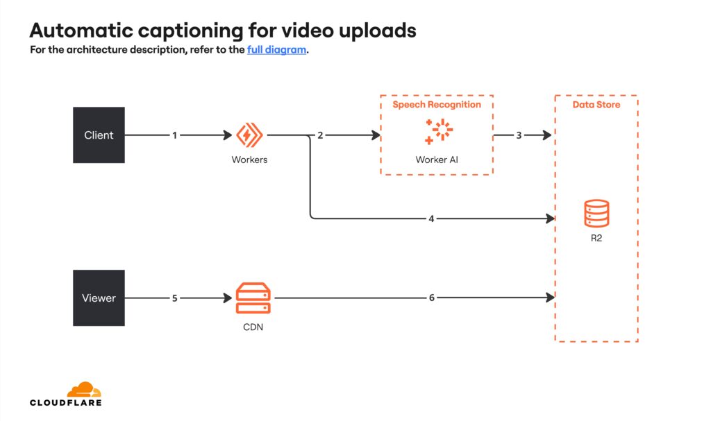
Cloudflare Automatic Captioning for Video

We’ve compiled a few Cloudflare architecture templates to help you get started on your next Cloudflare deployment.

This template outlines the process of automatic captioning for video upload. It depicts the flow from video upload to audio transcription and subtitle creation, culminating in storage and retrieval from Cloudflare’s infrastructure. It illustrates system interactions like API requests and caching mechanisms that optimize performance.

Cloudflare Automatic Captioning for Video (click on image to use template in Miro)

Cloudflare RAG Architecture Knowledge Queries

This template details the process of knowledge queries within a Retrieval Augmented Generation (RAG) framework. It illustrates the steps from a client sending a query to the system, generating embedding vectors, searching for related vectors, retrieving relevant documents, and generating a text response. This diagram demonstrates how different components interact to enhance the generation of contextually accurate text responses.

Cloudflare RAG Architecture Knowledge Queries (click on image to use template in Miro)

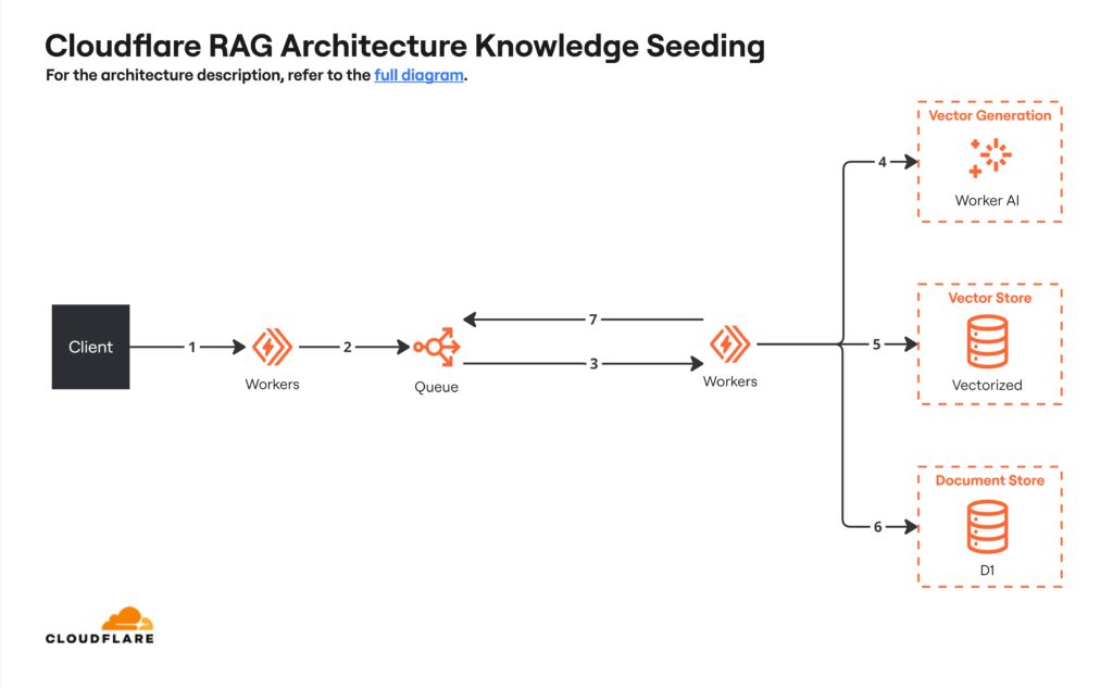
Cloudflare RAG Architecture Knowledge Seeding

This architecture diagram illustrates the process of integrating external data into a system. It shows the steps starting with client uploads and processing inputs, followed by batch progressing, then generating and storing embedding vectors, and finally ending with document storage and acknowledgement mechanisms. This helps prevent system overload and ensure successful data integration.

Cloudflare RAG Architecture Knowledge Seeding (click on image to use template in Miro)

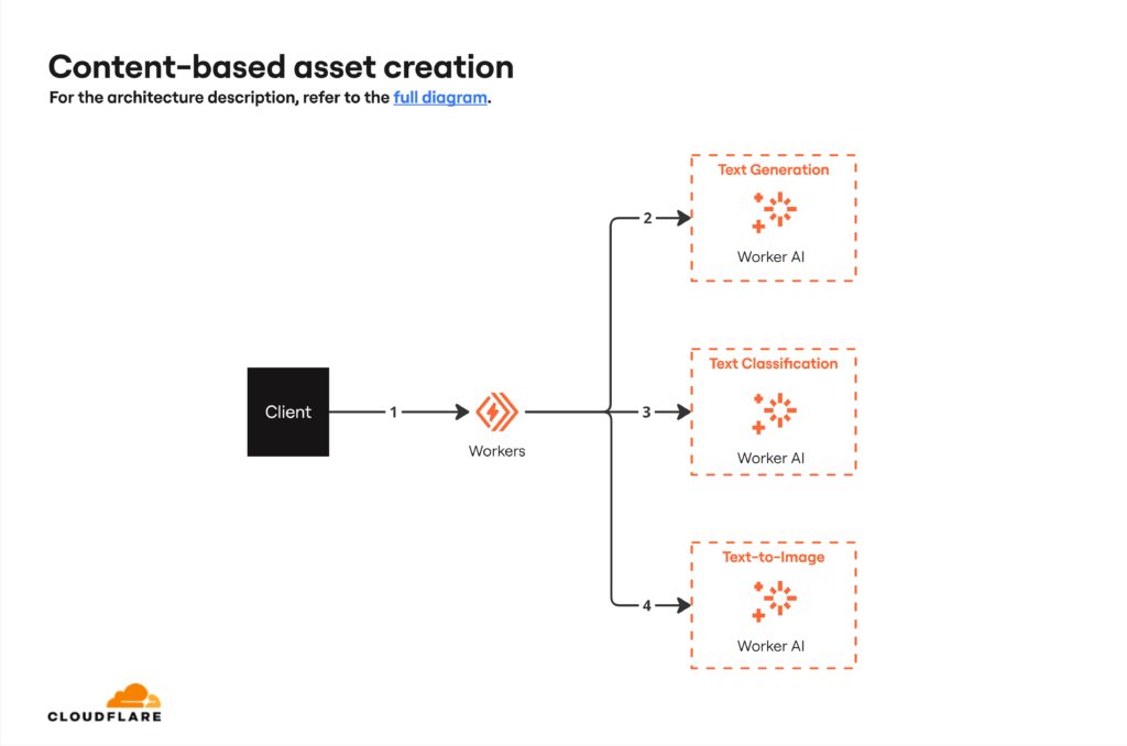
Cloudflare Content-based Asset Creation

This template visualizes the steps in generating visual content from textual input. It involves processing the input text, generating tailored prompts for a text-to-image model, performing safety checks to ensure content compliance, and finally generating the image. This process is facilitated by AI models.

Cloudflare Content-based Asset Creation (click on image to use template in Miro)

Build a Cloudflare architecture diagram in Miro today

As you can see, these templates provide a diagramming framework so you can quickly visualize and document your Cloudflare setup. This means you can iterate and communicate your architecture to the rest of your team and stakeholders.

The result? Smoother planning and decision-making around your Cloudflare implementation.

Organize your thoughts with 7 mind map examples from the Miro community

Software Stack Editor · June 18, 2024 ·

image

A mind map displays information with related ideas branching out from a core concept. It can be helpful for everything from brainstorming and problem solving to decision-making and information sharing. 

One of the best parts about mind mapping is that there’s endless room to be creative. Take a look at these seven different mind map examples from Miroverse and you’ll walk away with plenty of inspiration for your own diagrams. The next time you’re trying to plan for a product launch, learn something new, or even think of a new tagline, you’ll have a trusted resource to jumpstart the process.

Mind map example #1: Understand all aspects of your business

In a small business, every employee wears a lot of hats. Founders are also accountants; executive assistants are also HR reps; marketers are also content producers and social media experts. But as the business grows, departments can take a more traditional form with teams handling specific tasks and responsibilities. That’s a good thing, but it also can be a tricky transition all at once. 

This Business Mindmap template created by the entrepreneurial community, De Brouwerij, helps you see and understand all of the different activities within your business — from finance and operations to sales and marketing. Armed with knowledge about possible departments, roles, and responsibilities within a typical business, you can start to imagine how you’ll transition your own. 

Mind map example #2: Share your worldview

Want to build a better understanding of yourself or your team? This Worldview Mind Map template uses the circle mind mapping method to summarize a person’s assumptions, beliefs, values, and behavior. 

You’ll use ovals to place key terms in each of the circle’s layers and arrows to connect concepts and provide a more well-rounded understanding of your perspective and experiences. You can use it as a team-building exercise or simply as an opportunity to learn more about yourself or your customers.

Mind map example #3: Solve a problem

Mind maps come in especially handy for brainstorming. With this Mindmapping template created by Atlassian, you’ll start by focusing on a specific question or problem. Then, jot down related thoughts or ideas using arrows and labels. This should be free-flowing — don’t pressure yourself into having answers yet.

When you’re ready, look back over your mind map and pick out the ideas or themes worth exploring. You’ll likely be surprised by how much a visual tool can help you think outside the box.

Mind map example #4: Learn the ins and outs of Scrum

Studying is another common use case for mind maps, as the visual format makes even the most complex information easier to process and retain. 

If you need to learn the introductory elements of Scrum, for example, this Scrum Guide Map template created by Chuck Whoeza can help. It displays information from every chapter of the Scrum guide in an easy-to-follow map, so you can visualize and get a handle on the basics. 

Mind map example #5: Design a better website

Building an effective website requires thinking about more than just design. You also need to consider the website’s objectives and user interactions.

You can work through all those aspects — your website’s goal, user profiles, user needs, and must-have functionality — with The Effect Map template from Diana Pottecher. Once you’ve laid out the groundwork, use the bottom section of the template to sketch out your site’s information architecture.

Mind map example #6: Keep track of who’s doing what

Understanding capacity, managing workloads, and juggling team priorities are difficult. That’s especially true for remote or hybrid teams where you don’t have instant visibility into what people are doing.

This Staffing Week Map template created by Huware gives you a quick and intuitive rundown of what project each team is working on, who’s involved, what step in the process they’re on, and how much time that project is expected to take. It’s an easy way for you, your team members, or other stakeholders to understand your staffing levels and focus areas for any given week. 

Mind map example #7: Create an action plan

A goal is meaningless without action, and this Action Map template created by Tim Slade helps you break down goals into actionable steps and activities.

While the template is geared toward instructional designers, it’s easy to adapt to your unique needs. Put your goal in the center and then branch out to related actions that will push you closer to that goal. You can continue expanding outward to practice activities, information or resources, and other related concepts that help you execute those actions and meet your objective. 

Inspired by these mind map examples? Create your own

Whether you want to use mind maps for brainstorming, problem solving, or communicating, use these examples as your inspiration and you’ll create a diagram that’ll help you sort through the clutter and do whatever work needs to be done. 

4 mind mapping methods to spark creativity

Software Stack Editor · June 13, 2024 ·

Reflect on the last time you had to sit down and think through something — whether it was a complex problem, an important project, or a new product feature. 

Your brain was likely a jumble of questions, ideas, tasks, and tangents. And while that buzzy creative energy is a good thing, it can be tough to make sense of all of the random pieces of information spinning in your head. 

That’s exactly where the mind mapping method comes in handy. 

What is mind mapping?

Mind mapping is the process of creating a diagram (often called a mind map, concept map, or spider diagram) to organize information, ideas, and concepts. With a typical mind mapping method, you:

  1. Put your central concept at the center of your map
  2. Create branches (representing subtopics) that radiate from the center
  3. Add branches to your main branches to detail more specific information and ideas

For example, imagine that you’re creating a mind map to think through the details of your employee onboarding process. You’ll end up with something that looks like this:

Why is it helpful to get your thoughts down on paper (or a whiteboard) like this? Creating a mind map offers several benefits including:

  • Clearer thinking: Organizing information on a mind map helps you categorize information, identify gaps, and form connections that you may not have recognized without a visual tool.
  • Shareable reference: From presenting a potential solution to leadership to offering your team insight into your decision-making process, a mind map is a useful resource to share with other people.
  • Easy-to-update: Mind maps are easy to change and update — especially if you create them with a digital tool like Miro. Need to add a new subtopic or piece of information? Create a new branch. Need to delete something that’s no longer relevant? You can do so in just a few clicks and your map will auto-adjust. 

What can you use a mind map for?

Mind mapping is useful for all sorts of processes, including:

  • Brainstorming
  • Decision-making
  • Note-taking
  • Presenting
  • Problem-solving
  • Project planning

You can rely on a mind map whenever you’re struggling to get your thoughts in order. Seeing the information laid out visually will help you make sense of it.

4 mind mapping methods (and when to use them)

All mind maps work relatively the same way: you have a central concept that’s expanded into related ideas and concepts. However, there are several different ways to visually represent that information. Here are some of the most common mind map techniques.

1. Tree map

Use it to: Represent hierarchical relationships and information

With a tree map, you place your core concept at the top of the diagram (rather than at the center). Your branches and subtopics flow down from there. You’ve likely seen this type of map before in the form of an organizational chart. 

Relevant mind map templates: 

2. Bubble map

Use it to: Represent the details and subtopics of a concept

A bubble map uses, you guessed it, bubbles to display your main idea and connected concepts. Typically, this approach is most helpful for breaking a big topic (which goes in the center) into smaller topics or areas. For example, you could put “company values” in the center bubble with branching bubbles to display individual values. Or put “company rebrand” in the center and use the branching bubbles to explore the individual elements like your logo, color scheme, brand identity, and more.

You can use a double bubble map to simultaneously explore two main concepts that share similarities.

Relevant mind map templates:

3. Brace map

Use it to: Represent the component parts of a concept

A brace map is a lot like a tree map, except turned on its side. Your main concept goes on the left side and then expands outwards into its component parts. For example, you could use a brace map to understand your different customer segments and their details. 

Relevant mind map templates:

4. Circle map

Use it to: Represent the context of a subject

A circle map might feel a little less intuitive than the other mind mapping methods, but it’s helpful for understanding the broader context of a subject, such as the competitors in your industry. You place your main idea in the inner circle and then use the outer circle to expand on that concept — whether you list descriptors, examples, related ideas, or anything else. You can continue adding circles to the outer layer to dig deeper if you’d like. 

Relevant mind map templates:

Make the most of the mind mapping method with Miro

Mind mapping is a powerful tool for organizing your thoughts, identifying connections, and sparking more creativity. And there’s even better news: these diagrams are easy to create with Miro. 

Get started with our straightforward mind map template, one of the templates we included above, or with a blank board if you want to start from scratch. Jot down your core concept and then freely explore related ideas and topics, noting them on your map as you go. 

That’s the beauty of this type of diagram: Much like your thoughts, it’s meant to be free flowing. Banish the mind chaos and introduce a mind map for a creative exercise that’ll lead to progress and productivity. 

🚀 New Templates in Miroverse

Software Stack Editor · June 11, 2024 ·

May has been a fantastic month for Miroverse, with almost 190 new templates published by our talented Creators. With these templates, you can streamline operations, reflect on achievements, enhance teamwork, and so much more. In this roundup, we’ll celebrate the most outstanding frameworks and their Creators.

Do you have a Miro board that would make a good template? Submit it now! 

Curious about submitting your first template? Join us for our next How to Become a Creator training on June 25. You’ll learn about the submission process and what makes a good template, and get a Q&A with the submission review team. You can also visit the Creator Toolbox for information and resources to get published on Miroverse.


Dave Westgarth | Most Published Miroverse Creator 🚀

Delivery Manager and seasoned Creator Dave Westgarth continues to impress us with his creativity and innovation. In May alone, he published 20 retrospective templates, making him not only the most-published Creator in May but also the second-most-published Creator in Miroverse ever! Congrats, Dave — you’re an exceptional Creator and we’re honored to have you in the community.

Maarten Dalmijn | Most Copied Miroverse Creator 🚀

Product Management and Agile expert Maarten Dalmijn just joined Miroverse and published his first template. Thanks to its clarity and design, he was nominated for the Miroverse Choice Awards 2024. His Sprint Review template was copied over 300 times and became a user favorite in May. Welcome, Maarten! We’re thrilled to have you on board and look forward to your new creations.

Fredrik Hjorth | Most Liked Miroverse Creator 🚀

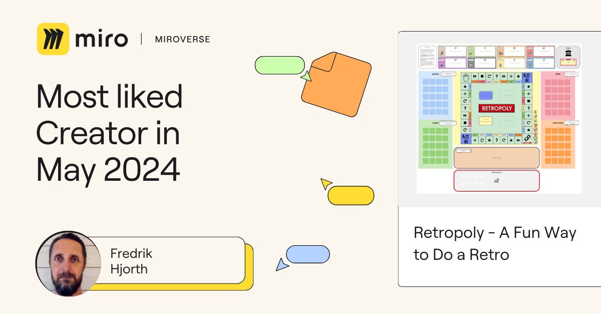
Fredrik Hjorth, an Agile Team Coach at IKEA IT, gamified retros with his Retropoly template. Players roll the dice to move around the board and complete tasks/challenges at each location. This playful twist on the traditional “Start, Stop, Continue” retro earned 45 likes in May alone! Thanks, Fredrik, for making retros enjoyable. We’re eager to see your future submissions.

Velebit | Most Viewed Miroverse Creator 🚀 

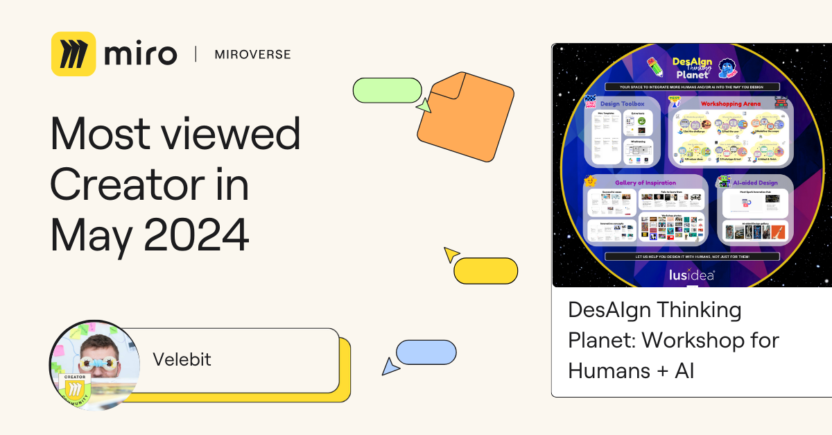
Velebit Miric, Head of Business Design at Lusidea & Spark Innovation Hub, is another seasoned Creator. With years of experience and a passion for Human-centered Design and collaboration, he released his biggest template yet, DesAIgn Thinking Planet: Workshop for Humans + AI, which includes over 6,000 elements! This impressive template garnered more than 1500 views in May. Thank you, Velebit, for your incredible creativity. 

Michael | Professional Spotlight 🚀

Agile Leader at Honest Agile, Michael helps organizations deliver more value, more often. His Relative Estimation With Tee Shirt Sizing template introduces a size-based estimation technique, perfect for Agile teams seeking a straightforward and effective approach to work sizing. Congratulations, Michael! We look forward to your upcoming creations.

Lee Jeffery | Social Impact 🚀

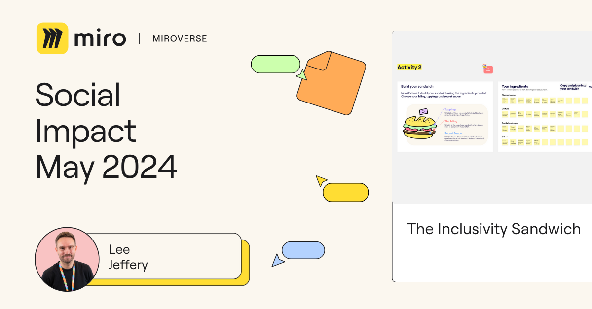
Lee Jeffery, UX Team Lead at Sage, focuses on building an inclusive design culture. His Inclusivity Sandwich template helps teams start conversations about inclusive design, understand their progress, and identify areas for improvement. Thank you, Lee! Your dedication to inclusivity is inspiring.

Muhammad Jaon | Staff Picks 🚀

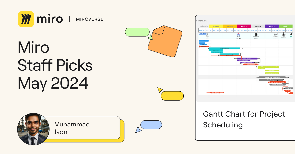
Muhammad Jaon, Designer at Design Pro, created an exceptional Gantt Chart for Project Scheduling template. The thorough and well-structured example helps you quickly onboard to get the most out of this framework. Congratulations, Muhammad! Your detailed and insightful approach is a remarkable addition to Miroverse.

Explore thousands of templates created by and for the Miro community in Miroverse. Discover a new template you loved? Share what you’ve found in the thread below. 👇

If you can’t find the template you’re looking for, submit it in Template Requests.

Feeling inspired? Join our community of Creators and share your ideas with the world.

ServiceRocket extends the power of Miro with a new suite of enterprise-ready integrations

Software Stack Editor · June 10, 2024 ·

image

ServiceRocket’s new apps and integrations provide incredible value to Miro users across Salesforce, GitHub, and Autodesk.

ServiceRocket is a technology solutions partner that helps thousands of enterprises get the most out of their software.

The latest addition to their portfolio of enterprise-ready solutions: a suite of new apps and integrations for Miro’s public App Marketplace. 

By partnering with Miro and leveraging our Partner and Developer Platform, ServiceRocket built three highly requested integrations to provide even more value to our users: Salesforce for Miro, GitHub for Miro, and Autodesk for Miro. Together, these integrations will help teams collaborate, plan, design, and work together better.  

Streamlining enterprise workflows

ServiceRocket’s app development journey on Miro’s Partner and Developer Platform began by identifying gaps in the enterprise user’s workflows, focusing on use cases such as sales enablement and Agile rituals. We worked hand-in-hand as Marketplace Partners to ideate and create around these core use cases, ultimately producing three comprehensive apps to streamline product development for Miro users.  

Salesforce for Miro

[embedded content]

With 70M+ users, Miro caters to users across the product development spectrum and to large sales organizations that need to collaborate in real time for planning, pipeline management, and more. But before working with ServiceRocket, Miro didn’t provide an avenue for people in sales roles to sync their planning in Miro with data in Salesforce. ServiceRocket saw this need for more sales enablement support in Miro and took this product gap from ideation to fruition with their latest app.

The Salesforce for Miro app enables users to interact with Salesforce data from directly within their Miro board. With this new app, you can now use Miro to manage sales activities, account planning, opportunity management, and more, with a direct connection between Salesforce and Miro.

Find Salesforce for Miro on the Marketplace→

GitHub for Miro

Every day, thousands of software engineers and product managers leverage both Miro and GitHub for planning and tracking their work. And now, with the GitHub for Miro app, they’ll have a way to seamlessly sync their GitHub issues and milestones with Miro cards. 

This realtime, bi-directional sync between GitHub and Miro will enhance collaboration across platforms, reduce costs for product and engineering organizations, and increase efficiency. With the GitHub Connector, you can bulk convert GitHub issues to cards in Miro, search and add issues, and more, facilitating better product planning, streamlining agile rituals, and enhancing brainstorming sessions.

Find GitHub for Miro on the Marketplace→ 

Autodesk for Miro

The Autodesk app by ServiceRocket brings the power of Autodesk into Miro, allowing you to import 3D files from your Autodesk account directly onto a Miro board. No longer do designers, engineers, or architects need to switch back and forth between Autodesk and ideating in Miro.

The Autodesk app by ServiceRocket allows users to import files, set different view angles as a widget, instantly capture screenshots, and more. Not to mention, you can bring the complete Forge Viewer experience to your Miro board.

Find Autodesk for Miro on the Marketplace→ 

Explore these apps on the Miro Marketplace

The Miro Marketplace is home to a public collection of hundreds of trusted apps and integrations — including these new launches from ServiceRocket — that help Miro users streamline their workflows and connect their favorite tools. 

Want to learn more about ServiceRocket and their offerings on the Marketplace? Head to their dedicated Marketplace page.

ServiceRocket on the Marketplace→

Database modeling made simple with new ER diagram templates in Miro

Software Stack Editor · June 5, 2024 ·

You might already know that Miro is an intuitive workspace where you and your team can collaborate on work from end to end — from brainstorming and designing to iterating and delivery. But did you know you can also use Miro to build ERD diagrams? In this post, we’ll explore several ready-made ERD templates in Miro that will kickstart your database design process, facilitate effective communication, and ensure data consistency across your organization.

What are Entity Relationship Diagrams?

If you’re a database architect, engineer, or anyone involved in database modeling, you’re likely already familiar with Entity Relationship Diagrams (ERDs). If that’s the case, go ahead and jump to the templates below.

As a recap, these visualizations show the different entities (like objects or concepts) stored in a database, their types, and the relationships between them. ERDs depict how the different entities work together, helping users to pinpoint any gaps in the design.

For example, in a database for an online library , you might have entities like “Book,” “Author,” and “Member,” with relationships like “an Author writes one or more Books” and “a Member can borrow many Books.” ERDs use simple shapes and lines to depict these connections, making it easier to understand the structure of data before building the actual database. 

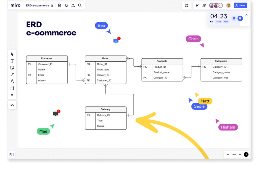
But building ER diagrams can take hours, which is why you need a tool to help you create them efficiently. Even better if you can work with your team to build the diagrams together. That’s why Miro’s collaborative visual workspace is the perfect canvas. Miro also offers crow’s foot notation, in which symbols at either end of the line describe the cardinality of the relationship between the entities.

E-commerce ERD example showing crow's foot notation

How to build ERDs in Miro

There are a few ways to build ERDs quickly in Miro:

  1. Automatically generate ERD diagrams with Miro Assist or use ERD shape packs to get started from scratch. 
  2. Take advantage of Miro Marketplace apps such as Mermaid.
  3. Or you can use one of our templates. 

In this case, let’s focus on templates. With a template, you can add an example of an entity relationship diagram to your Miro board with just a few clicks, then collaborate with your team to customize the diagram, reviewing everything together in one workspace. 

If you’re working from a Miro board, you can choose the template you want via the template picker. Or you can browse different kinds of ERD diagram templates in the template library or via the user-generated template gallery, Miroverse. Miroverse has thousands of templates built by Miro users, including hundreds dedicated to diagramming. 

Whatever method you choose in Miro, your team can rapidly create professional ERD diagrams that can be tailored to fit your specific requirements. Plus, since each Miro boards is a living document, your ERD diagram becomes a centralized place where every stakeholder can brainstorm designs together, leave feedback, and always find the latest version. 

ER diagram examples

We’ve compiled a few examples of ERD templates to help you get started on your next database project.

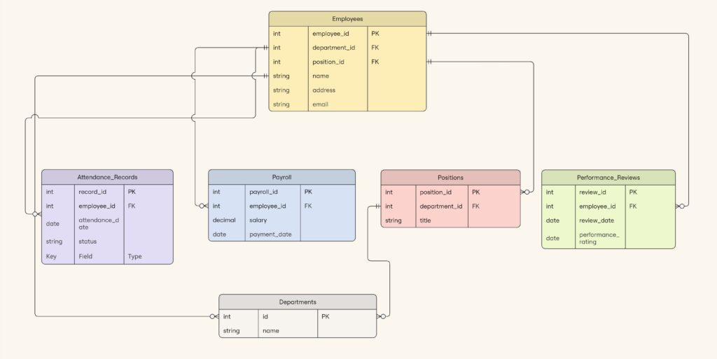
ERD HR Management System

This HR Management System ER diagram depicts the structure of a Human Resources (HR) Management System, which orchestrates employee-related activities. It maps out the relationships between employees, positions, departments, attendance records, payrolls, and performance reviews.

HR Management System template
ERD HR Management System (click on image to use template in Miro)

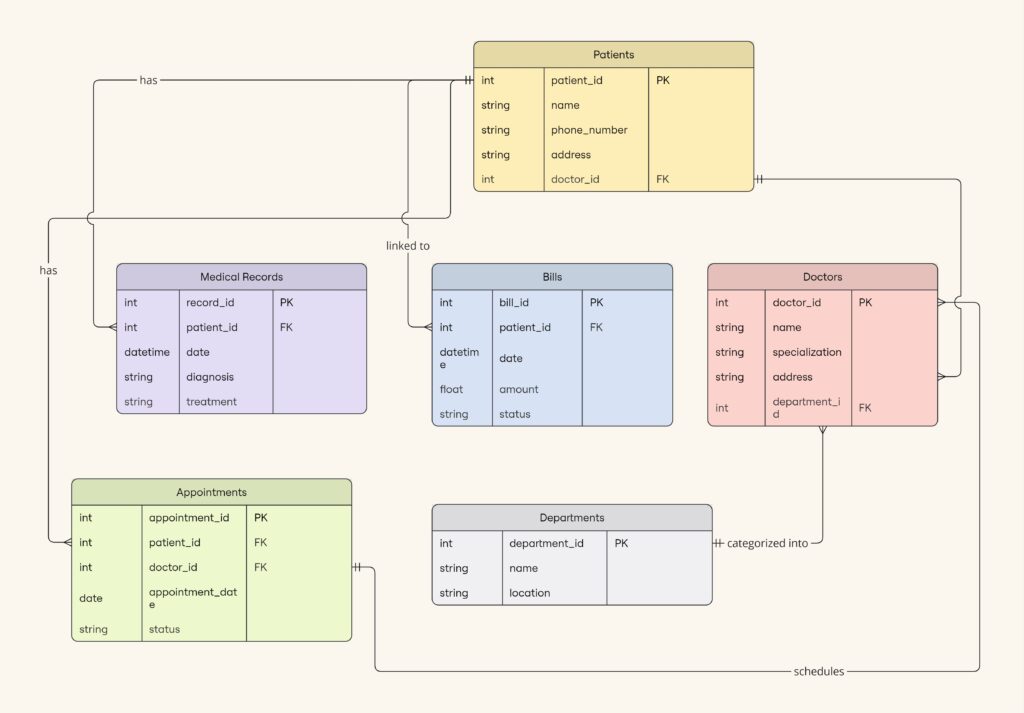
ERD Healthcare Management System

This Healthcare Management diagram helps healthcare organizations manage patient care services. With this template you can track patients and their providers, as well as appointments, medical records, and billing invoices. 

Healthcare Management System template
ERD Healthcare Management System (click on image to use template in Miro)

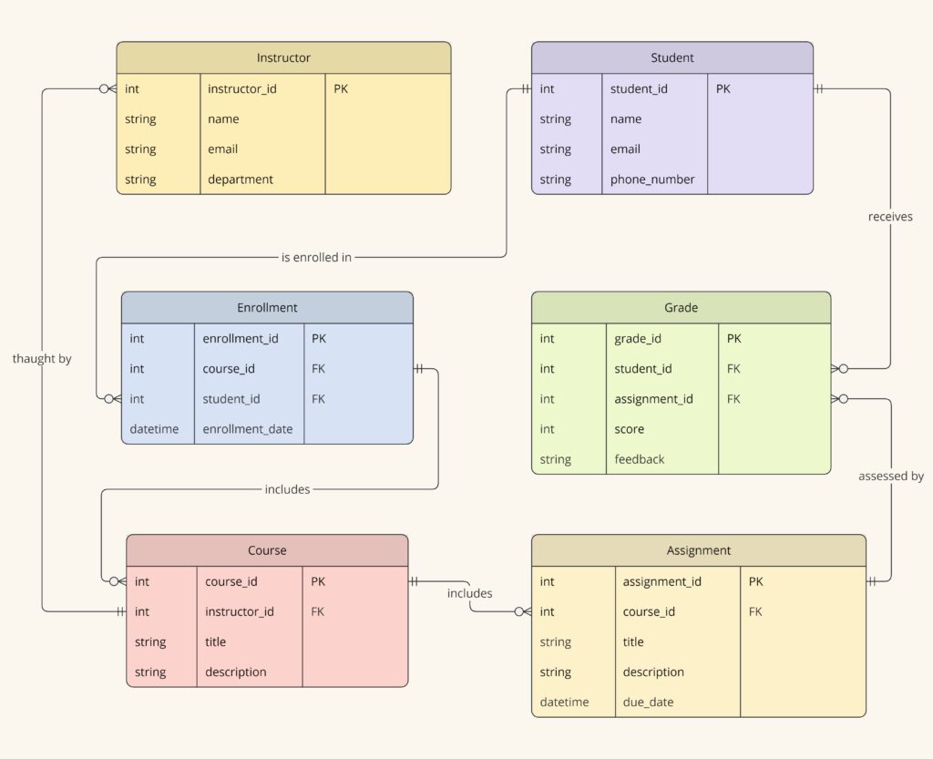
ERD Educational Learning Management System

This LMS example template includes entities like Student, Course, Instructor, Assignment, and Grade. This model helps educators manage course offerings, student enrollments, academic performance, and resource allocation. It’s particularly useful for institutions adapting to various modes of instruction, including online and hybrid classrooms.

Educational Learning Management System template
ERD Educational Learning Management System (click on image to use template in Miro)

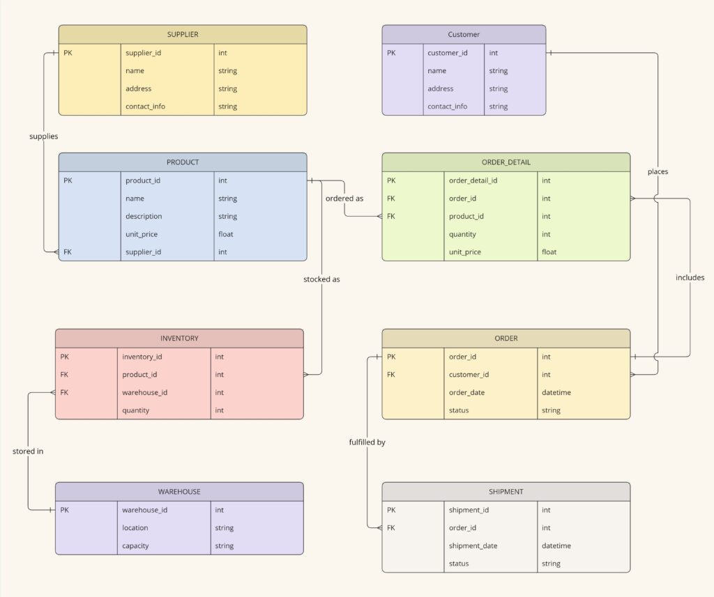
ERD Supply Chain Management System

This SCMS template captures the complexity of supply chain operations and logistics. Key entities include Supplier, Product, Inventory, Order, and Shipment. These elements help organizations manage the flow of goods from suppliers to warehouses and from warehouses to customers, including tracking inventory levels, supplier relationships, and the logistics of shipping and receiving goods.

Supply Chain Management System template
ERD Supply Chain Management System (click on image to use template in Miro)

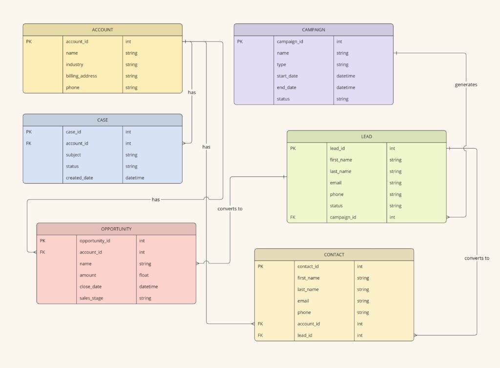
ERD Customer Relationship Management (CRM)

This CRM example template helps organizations manage customer information and interactions. Key entities include Customer, Interaction, Sales Opportunity, Product, and Support Ticket. This diagram facilitates tracking customer relationships, sales funnel activities, product purchases, and customer service interactions, which are critical for enhancing customer satisfaction and optimizing sales strategies.

Customer Relationship Management template
ERD Customer Relationship Management (click on image to use template in Miro)

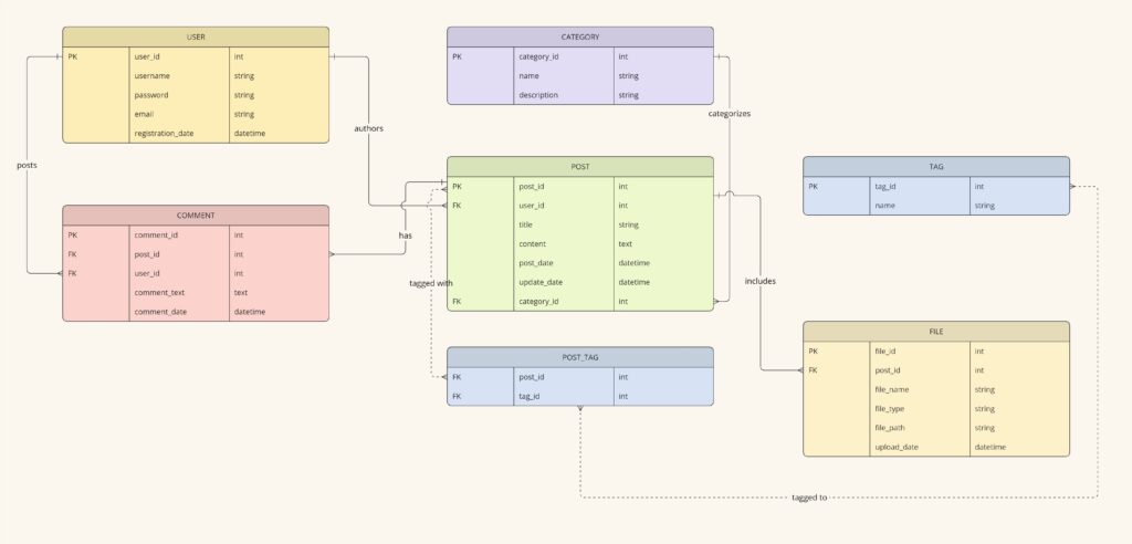
ERD Blogging System

This blogging system ERD diagram is for managing and organizing digital content. Key entities include User, Post, Comment, Category, Tag, and File. With it, users can manage the publication of blog posts, user engagement, and the organization of content via categories and tags. It also handles media attachments through the File entity, which links files to specific posts. This setup is essential for maintaining a dynamic and interactive blogging platform.

Blogging System template
ERD Blogging System (click on image to use template in Miro)

Build an Entity Relationship Diagram in Miro today

As you can see, now you can easily kickstart your database design process and facilitate effective communication and collaboration while doing so.

No need to build entity relationship diagrams from scratch. Miro’s pre-made templates let you quickly spin up the core structure, so you can ensure data consistency across your organization.

Get started in the Miroverse: Here are our most popular templates

Software Stack Editor · May 30, 2024 ·

image

The options for what you can create in Miro are nearly limitless. Wondering where to get started? We’ve rounded up 10 of our best and most popular Miro templates along with related Miro board examples from our community templates gallery, Miroverse.

Check out these templates and examples to see how our users treat templates as launch pads for their own creative, unique, and customized boards.

The best brainstorming sessions are full of bold ideas and free-flowing conversations — with just enough structure to keep people on track. 

That’s where this mind map template comes in. Put your central concept in the middle and use branches to explore related ideas and themes. You’ll have the flexibility to think freely while still maintaining focus on your core idea.

Best Miro board examples: Mind mapping

1. Mindmapping by Atlassian

2. Business mind map by De Brouwerij

Brainwriting is a brainstorming technique where participants use a specified amount of quiet time to independently jot down their ideas before sharing them with the broader team.

Research from Stanford University found that people are most creative when they work on their own. So, brainwriting can often yield more ideas (and better ones) than the typical rapid-fire, shout-out-suggestions-as-they-come-to-you style.

Plus, this quieter and more intentional approach allows space for all employees to meaningfully contribute — not just your most extroverted ones. 

Best Miro board examples: Brainwriting

1. Silent brainstorming by Julia Angilova

2. Canvas brainstorming by Rodrigo Subiabre

3. 4 step critical thinking brainstorm by Mel Khim

Touchpoints are a crucial part of your customer journeys. With this customer touchpoint map template, you can define and map all of your customers’ interactions with your brand. 

Completing this template helps you identify areas you can improve and also lays the necessary groundwork to create a more detailed and valuable customer journey map. 

Best Miro board examples: Customer touchpoint maps

1. Relationships blueprint by Entremission

2. Service blueprint by Sahar Naderi

You can’t improve your customer experience without understanding it first. A customer journey map is a visual representation of how customers experience your brand and company across all its touchpoints.

Use this template to map out the flow of interactions in a timeline. You’ll build a better understanding of what your customers are doing (and feeling) at each stage of the process, so you can make strategic improvements.

Best Miro board examples: Customer journey maps

1. Practical customer journey mapping by Alex Gilev

2. Customer journey map by Columbia Road

3. Journey map to plot the customer experience by Essense

A Kanban board is a simple and intuitive way to track the progress of your work. Each task gets a card, which moves between columns to indicate its status. It’s highly flexible, and the Miro board examples below show how this framework can be applied to different types of work, from sales outreach to daily to-dos. 

While the board can keep your team on track, it’s also a valuable resource to share with other cross-functional teams and stakeholders, so they can get visibility into your work.

Best Miro board examples: Kanban boards

1. Kanban calendar by Ondrej Papanek

2. Agile sales Kanban by Switch to Eleven

3. Featureban by Karl Morgan

During a retrospective, you and your team look back on a previous sprint or project to identify your successes, failures, and ways you can improve. 

While there are plenty of popular retrospective techniques, this quick retrospective template provides a simple framework for your reflection. During your candid conversation, you’ll place sticky notes into four quadrants: 

  • Continue: What helped you move forward?
  • Stop: What held you back?
  • Invent: How could you do things differently?
  • Act: What should you do next?

Best Miro board examples: Retrospectives 

1. Hero retrospective by Yogi Nur Fadilah

2. Sailboat retrospective by Johanna Torstensson

3. Project retrospective by Inktrap

When you think of a diagram, a flowchart is likely the first thing you’ll picture. This series of shapes and arrows is a way to map out your processes visually, helping you boost clarity, spot bottlenecks, and make improvements.

Our flowchart template is straightforward to use and easy to customize. But as the examples show, creativity knows no bounds when building and using flowcharts.

Best Miro board examples: Flowcharts

1. Cross-functional flowchart by Hiro Studio

2. Headcount approval process flowchart by Ben Craig

3. OGSM canvas by Henrik Stahl

Ever wish you could get inside your customers’ heads? This mental model template helps you do just that.

You’ll use research and your user personas to fill out the template. When you’re done, you’ll have a visual representation of what a user wants, needs, and believes about your product or system.

Best Miro board examples: Mental models

1. Deep customer empathy method by Shehab Beram

2. The customer question board by Julia Cowing

3. Brand preferences customer insights tool by Palmer&Co

Your product roadmap gets your entire team — and potentially even your customers and stakeholders — on the same page about your product’s vision and strategy. 

With this product roadmap template, you can collaboratively agree on your strategy before prioritizing requirements and ironing out a timeline for new features.

Best Miro board examples: Product roadmaps

1. Agile product roadmap by HatchWorks

2. Prioritized product roadmap by Jānis Dirveiks

3. Product roadmap by Isa Serpa

10. Timeline template

Time has a way of running together, and milestones and moments can quickly get left behind as you forge on to the next big thing. With this timeline template, you can plot important dates and events in chronological order.

Whether you want to build a timeline for a current project or create a detailed record of all of the major events up to this point, documenting a timeline ensures everybody is on the same page about what’s happening (or what happened) and when. 

Best Miro board examples: Timelines

1. Timeline design by Brigitta Laszlo

2. Year timeline by Ruslan Kildeev

3. Project timeline builder by Project Management GameBoard

Harness your creativity with Miro

While the possibilities are practically endless in Miro, these templates can give you a sense of confidence and direction without limiting your imagination.

After all, as the above examples show, the best templates don’t institute constraints — they inspire creativity. 

Do more with diagramming: Combine the powers of draw.io and Miro

Software Stack Editor · May 29, 2024 ·

image

If your work requires you to create diagrams, you might be familiar with draw.io (also diagrams.net), an open-source, web-based diagramming tool offering complex and niche diagrams: network diagrams, server rack diagrams, floor plans, and more.  

You might also use Miro, an innovation workspace that lets you virtually collaborate with colleagues on a variety of tasks and projects — whether it’s brainstorming, planning, designing, or building the next big thing. It doesn’t matter if you’re mapping out a complex process, visualizing a system or cloud architectures, or just trying to make sense of your thoughts, Miro’s user-friendly interface makes it easy for everyone to contribute.

Miro and draw.io are both powerful diagramming tools, but using them together is even better. 

Why we like draw.io

draw.io offers a wide range of advanced features, such as custom libraries, data linking, and export options. By using draw.io within Miro, teams can leverage these powerful features to collaborate on sophisticated diagrams.

Here is just some of what you can do with draw.io in Miro:

  • Import existing diagrams built in Lucidchart, Gliffy, and Visio. No need to start from scratch. Seamlessly move your existing diagrams from other tools into Drawio to take your work over the finish line — without losing context.
  • Export diagrams as SVG, PDF, VSDX, and more. Easily share your draw.io diagrams with partners, customers, and other stakeholders using a variety of file formats.
  • Leverage thousands of highly technical shapes. draw.io supports niche shapes, plans, electrical circuits, and other visualizations often unavailable in other tools. This includes ArchiMate enterprise architecture modeling language. 

Learn how to get started with the Miro-built draw.io app to build floor plans, electrical circuits, or any number of other diagrams.

Why draw.io and Miro together is awesome

draw.io has been around since 2005, so it’s been battle-tested by longtime users and the open-source community. It’s a popular choice for those seeking a tried-and-true diagramming solution. By using draw.io in Miro, you get even more out of it.

Collaboration

By using draw.io within Miro, teams can collaborate on even more diagram types. After one user builds the draw.io diagram and adds it to a board, the rest of the team can join in to add stickies, comments, and other feedback, fostering a more collaborative and efficient work environment.

Centralized workspace

By using draw.io in Miro, you can keep all project-related content, including diagrams, in one centralized location. This makes it easier for teams to access, share, and reference diagrams alongside other project materials, such as notes, documents, and images. The result? No more silos.

Tool consolidation

The Okta 2024 Businesses at Work report indicates that large companies (those with 2,000 or more employees) use an average of 231 apps. Why not make your life easier and consolidate tools, and get the best of both worlds. 

How to use draw.io in Miro

Using draw.io in Miro is easy. To launch the app, follow these steps:

  1. Navigate to the creation toolbar on the left.
  2. Click the More apps icon (+) and type: draw.io diagrams.
  3. Launch the Draw.io Diagrams app.

Watch this video to see how you can create and collaborate on any type of diagram, including importing from other tools into Miro:

[embedded content]

Build a draw.io diagram in Miro today

As you can see, draw.io is a fantastic diagramming tool offering a wide variety of shapes and a high level of customization, and together with Miro you can bring your diagrams and people together in one workspace.

How I do it in Miro: Networking diagramming with software engineer Andre Mocke

Software Stack Editor · May 28, 2024 ·

Technical diagramming tools help engineers and other IT workers visually represent systems, infrastructures, and complex interactions. These diagrams can help to optimize cloud performance and, in turn, ship products and services more efficiently. But not all diagramming tools were created equal. Some tools have a limited library of shapes and symbols, make it difficult to collaborate or communicate with team members, or require a separate tool for exporting and sharing work.

In this “How I do it in Miro” video, part of a series, we’ll learn from Miro software engineer Andre Mocke how his team solves a lot of its diagramming challenges by using Miro.

[embedded content]

Define the original state

Andre works on the team responsible for the internal networking of Miro. He likes using Miro because it makes it easy for his team to collaborate on network design using diagrams.

In this case, Andre and his team wanted to ensure a third-party integration was compliant with customer data residency requirements. After identifying the problem to solve, they needed to first define the state of the existing architecture. 

Diagramming without the correct shapes and icons can take a long time, but Miro makes it easy to visualize the original state. With a range of shape packs from different cloud platforms and services — AWS, Google Cloud Platform, Azure, to name a few — teams like Andre’s can create diagrams fast.

Screenshot of shape packs module in Miro

Using Miro’s diagramming shapes, they visualized the original architecture as follows:

Diagram depicting the team's original architecture state

Generate a target state

It can be challenging to align everyone’s mental models, but Miro makes it possible for the whole team to visualize what specific changes will be made, and to collaborate directly on the Miro board as they put together the desired final architecture.

Not only that, but everyone is able to express themselves in a variety of mediums — text, visuals, video, or audio — communicating right in this workspace until everyone is aligned.

Most often, Andre’s team uses comment threads, and in more complex diagrams, they use Talktrack recordings.

Working together, Andre’s team was able to generate a rough draft of the target state.

Diagram depicting the team's target architecture state

Implement a new architecture

When moving from abstract agreements to implementation details or examples, the team likes to use code blocks. You can use code blogs for debugging, collaborating programming, and problem solving. When combined with diagramming, they make it easy to review architecture and flows.

In this case, Andre’s team uses code blocks to define interfaces and break down the work when different people are responsible for implementing or consuming parts of the system.

As the team works toward the new architecture, everyone can follow along by referring to a living diagram. The below diagram tracks how the system is changing against the target state.

Diagram depicting the team's current, in-progress architecture state

Align during design pivots

More often than not, you may run into blockers or shifting deadlines. Miro allows the team to track unanticipated changes alongside the original designs, which speeds up alignment during design pivots.

Plus, because of Miro’s real-time, bi-directional integration with Jira, Andre’s team can use Miro to directly update tickets, roadmaps, leaders, and reports into the agile tool. And any issues that arise can be pulled from Miro and turned into Jira cards. 

Miro board visualization showing integration with Jira

Transform your technical diagramming with Miro

Before Miro, Andre often had to export his diagrams, copy and paste them into a presentation tool, and send them to his team in a tedious and time consuming process. But now everything is in one place — part of a unified workspace. He can work with the broader team on designs, embed code and tasks, and share it for feedback.

As you can see, it’s easy to use the same Miro board for all your technical diagramming needs. 

Be sure to watch the video to hear straight from Andre how you can transform your technical diagramming in Miro.

What’s New: What we launched in May 2024

Software Stack Editor · May 27, 2024 ·

image

This month we’re thrilled to share several powerful updates that will amplify your planning, collaboration, and user experience.

An enhanced Planner app, smarter Azure DevOps integration, and AI-powered alt text suggestions: These updates and more were designed to streamline your workflow and boost productivity. Not to mention we have three accessibility updates to improve how assistive technology works with Miro, helping to ensure everyone can experience the Miro magic.

Dive in to explore how these updates can transform your team’s efficiency and creativity.

Product and service innovation

Add assignees to your columns and swimlanes in Planner

Since the launch of the Planner app last year, we’ve been working hard to add more fields and features to make it more horizontal and support more use cases. The latest addition is an assignee field for columns and swimlanes in Planner for Jira — to help support your sprint planning and stand-up needs. 

Estimate more easily with story points on Azure cards

As part of our work to level up the Azure DevOps integration and support Agile practices, we’ve added a story points field to Azure cards in Miro. Now you can select a card and open the story points field directly in Azure DevOps. After editing the field you’ll see the Azure card updated in Miro to reflect the latest estimation.

Diagramming and process design

Introducing Miro’s organizational chart widget

If you’re an enterprise organization, you need an efficient way to visualize and scale your human resources to align with the current state of the business, while looking ahead to future needs. With the new org chart widget, you can simplify organizational chart creation, easily share it, and collaborate in real time. Plus, import data from .CSV files and use auto-layout to arrange your cards fast. And whenever your org changes (which can be often in a dynamic company), rearranging cards is just as fast.

New pre-made diagramming templates to save you time

Speaking of org charts, Miro has just released dozens of new diagramming templates, with more on the way. Check out these new org chart templates to help you document and clarify the dynamic nature of a changing organization. We also recently released a bunch of new UML diagram templates to help your teams map out the structure, behavior, and interactions of complex software systems. 

Canvas and collaboration

Invite visitors to collaborate on Miro mobile app

Now your Miro board visitors — users who haven’t registered with Miro — can join your public Miro board using the Miro mobile app, for on-the-spot collaboration. The tailored mobile-first experience and core sync collaboration features mean all your collaborators can participate and contribute from anywhere.

An inclusive and flexible platform

Miro Assist helps teams become more accessible

Miro Assist, your AI partner for innovation, just got smarter. When adding images to boards, Miro Assist provides suggestions for alt text, making the process easier and more efficient. Not only that, but with the right alt text your boards will be more accessible, too.

Accessibility enhancements for a more inclusive experience 

Lots of exciting updates around assistive technology mean Miro is even more accessible to all users. First, we’ve introduced a board overview or table of contents that can be explored using built-in screen reader commands for navigating headers and buttons. Second, most features can now be accessed using voice control.

And last but certainly not least, users can navigate through diagrams using just their keyboard and assistive technology.

Send objects forward or backward incrementally

Users with editing rights can now move objects on a canvas one layer forward or backward at a time, making it easier to organize boards with multiple layers of content. Arranging objects on Miro has never been easier.

Your next project made easier with AI-ready templates

Miroverse is a gallery of templates made by and for the Miro user community — browse the latest ready-made frameworks added daily. This month we’ve hand-picked three templates that integrate AI to automate and accelerate your work:

  • Mode Team’s Miro AI Storytelling Game is an interactive way to learn how to use Miro Assist to generate sticky notes on a given topic that simplify your routine work.
  • Martin Gleitsmann’s AI-Enhanced Empathy Map is designed to help you save time, eliminate bias, and gain more depth in the outcome of your next empathy map.

Stay tuned for June

We hope these updates help your workflows go more smoothly, your collaboration more inclusive, and your delivery more efficient. Whether you’re organizing sprints, visualizing your company’s structure, or working on the go, these features are designed to get you to the next big thing.

Stay tuned for more exciting updates as we continue to innovate and improve the Miro experience.

5 process map templates to document, streamline, and optimize your processes

Software Stack Editor · May 22, 2024 ·

image

Inefficient processes carry a big price tag for businesses. Formstack’s State of Digital Maturity report found that 51% of U.S. workers spend at least two hours a day on repetitive or inefficient tasks. That translates into an estimated $14,560 per employee per year that could be invested in growth. 

One of the best tools for streamlining efficiencies (and banishing inefficiencies) is a process map. Just like a geographical map helps you orient yourself and find the best route, a process map offers a systematic approach to finding the most efficient path forward.

What are the stages of process mapping?

1. Define the scope

First, identify a process to be mapped. Comb through UX research or internal success metrics to pinpoint a challenge in your business, then narrow your scope down to a single process to optimize. 

Let’s say that you’re a product manager and you’ve noticed more bugs in the code you’ve shipped over the last quarter. Creating a process map for your bug fixes and deployment process might be a logical step. 

Define the process you want to map and analyze. Document any objectives you want to achieve, such as lowering the number of bugs reported or decreasing the time to deploy fixes. Then, determine who needs to be involved in the mapping process. 

How to visualize it: Visualize ongoing user feedback through a UX research repository or user research synthesis, so you can pick up on trends. An action priority matrix or problem prioritization workshop can be valuable to help you choose which priorities to tackle first. 

Use this template

2. Gather information

Once you’ve defined a process to map, it’s time to start gathering information. Connect with teams and individuals that touch each part of the process to explain their role, including which inputs they receive, which actions they perform, and which outputs they send along.

In the bug fix example, you would interview or hold a workshop with developers and the QA team to understand their roles in the process. List the activities involved in sticky notes or an online workspace, like Miro. 

How to visualize it: Create a SIPOC diagram to document all of the steps, inputs, outputs, and roles for a process. A SIPOC (Suppliers, Inputs, Process, Outputs, Customers) diagram is a visual tool that clarifies understanding and supports process standardization. 

3. Create a high-level flowchart

Once you’ve documented all of the roles, inputs, outputs, and action steps, you can begin to put them in order. Use a mapping tool to create a current state or as-is process map documenting your process. 

How to visualize it: Create a basic flowchart like this current state flowchart from Miro. Use symbols and shapes to indicate starting points, steps, decisions, and endpoints.  

Use this template

4. Refine the process map

Once you’ve created the high-level flowchart, engage your stakeholders to strengthen it. Ask teams to confirm its accuracy, provide feedback, and add more detail. This can be done asynchronously or synchronously through a virtual workshop. 

How to visualize it: Refine your initial flowchart with more details. For example, you can add color coding or swimlanes to show each party’s responsibilities. 

5. Analyze the process map for potential improvements 

This next crucial step will open up the doors for progress. Once the current state of the process is documented, look for bottlenecks and areas with frequent delays or inefficiencies. 

It’s also important to identify non-value-added activities or steps that don’t add overall value to the process. These often include unnecessary steps, duplicated efforts, or approvals that slow the process down. Consider which of these you can eliminate or streamline to reach your goals more efficiently. 

How to visualize it: Value stream mapping is a useful exercise to differentiate between value-add streams and non-value-add activities. 

6. Implement and maintain the process map

Once you’ve identified action steps, create a future state process map for your team. Monitor the new process to ensure it works as intended, and make any necessary adjustments to optimize its performance. 

As you do this, monitor any key metrics identified in the first stage to track progress toward your goal. Processes evolve and business needs change, so schedule regular reviews of the process map to keep it updated and relevant. 

How to visualize it: Create a future state process map to document the new process. Use a Kanban board to manage the action steps needed for improvements. 

How to visualize the stages in one collaborative workspace

The best way to manage these stages and your stakeholders is by pooling all of your research, brainstorming, and process mapping into one workspace. That way, participants can refer back to earlier versions and visualizations, and integrate data or information from third-party plugins. 

With Miro’s drag-and-click boards, it’s easy to document, improve, and share your processes. You can run brainstorming sessions and workshops in real-time, and add comments and video walkthroughs to create alignment. 

5 free templates for visualizing process mapping stages

Another benefit of an online workspace for process mapping: You don’t need to start from scratch. Explore hundreds of templates and user-generated workshop examples to suit your needs. 

Process map template

Use this template

At the start of the mapping process, it’s helpful to have a simple linear chart to brainstorm action steps. This Miro template offers just that: columns for each stage, with space to add activities and notes via stickies. This is perfect for the gathering information phase, then you can take all of those steps to order in a flowchart. 

Basic flowchart template

Use this template

This basic flowchart template is simple and uncomplicated for anyone new to process mapping. Use pre-populated shapes to represent entry points, endpoints, and decision points. Arrows show a process flow and relationships. Once you’ve copied the template, you can customize everything from colors to shapes to text to fit your needs. 

SIPOC template

Use this template

This SIPOC template by Leanscape founder Reagan Pannell outlines the SIPOC process with clear labels and descriptions of each section, helping teams understand all the components in a process and identify any gaps. 

Value stream mapping template

Use this template

Value stream mapping can be complex, but it lives up to its name — you’ll gain so much value through seeing a holistic view of your process. This template for value stream mapping guides you through mapping the basic elements (material streams, information streams, cycle time data, etc.) of your process so you can assess what can be cut to reduce waste. 

Use case flowchart

Use this template

This template by Product Manager Manar Alboqami includes swimlanes for multiple users or points of view, which can help build a full picture of all possible flows and paths (both happy and unhappy). There’s enough to start with that a user can easily build on it for many different scenarios, for instance mapping a user flow for a successful account signup versus one that encounters an error message. 

Map your way to process improvement

Broken processes waste time and resources, but a process map can guide you toward increased efficiency and better team alignment. With these process mapping templates, you’ll have a roadmap to follow so you can document and optimize your processes, whether you’re manufacturing products, developing software, or onboarding new employees. Download these templates, customize them to your needs, and start improving today.

Mapping your software: Your guide to essential architecture diagrams

Software Stack Editor · May 21, 2024 ·

Whether a developer is maintaining an existing product or building a new one, they’re likely not doing it in a silo. From teammates to designers and product managers, there can be many stakeholders for even just a small feature change. That’s why it’s so important to have a software architecture diagram: a source of truth that outlines your software’s structure and the relationship between its different components.  

This high-level overview makes it easier for everyone involved — especially the non-coders in the room — to understand and speak to the project, stay aligned on goals, and contribute meaningfully.  

What is a software architecture diagram?

There’s a wide assortment of software architecture diagrams for different purposes, each with varying detail levels. But in general, a software architecture diagram will include the following elements: 

  • Components: Building blocks of the software system representing the various modules, classes, services, or layers.
  • Relationships: Lines or arrows that indicate how the components interact or communicate with each other.
  • External systems: Entities outside the software that interact with the system, such as APIs, databases, or third-party services.
  • Interfaces: Define the “rules” for how one component will provide or consume information from another.
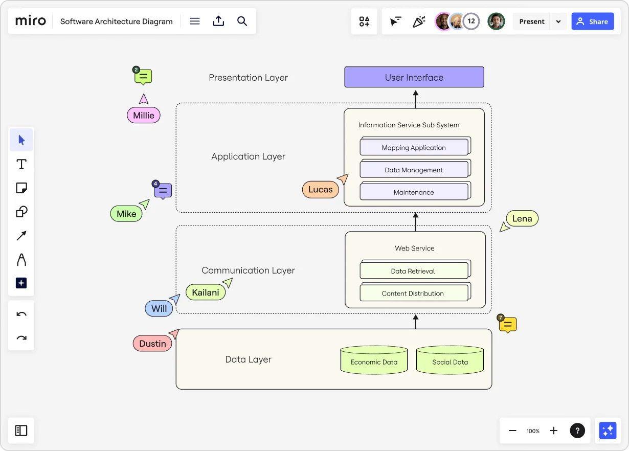
  • Boundaries: Sort related components into groups and distinguish between the subsystems within the architecture (for example, presentation layer, application layer, communication layer, etc.)

Anyone from a software architect or developer to a project manager or product owner can take the lead on building a software architecture diagram. However, these diagrams are the most accurate and helpful when they’re built collaboratively. 

What are the benefits of software architecture diagrams?

The biggest benefit of this type of diagram is that it boosts clarity and understanding, creating a high-level overview that simplifies even the most complex concepts. It also makes it easier to communicate with other stakeholders and team members who might have less technical knowledge of how the software works.

With that in mind, these diagrams offer value at all stages of software development and maintenance — not just during planning. Here’s a quick look at how architecture diagrams are helpful at each stage of the process:

Before software development

  • Planning and design: Diagrams define the high-level structure of the system and guide the development process.
  • Requirements analysis: Diagrams map out how the software system will meet defined requirements and what components are needed to make that happen.

During software development

  • Improvement and refinement: Diagrams can be revisited throughout the development process to iterate and make updates based on insights, feedback, or changes in requirements.
  • Communication: Diagrams are often used to communicate design choices, interfaces, and interactions on the development team and with other stakeholders.
  • Testing: Diagrams are a valuable reference point during testing to ensure the system matches the intended architecture. They also help teams quickly spot areas that need more testing or changes.

After software development

  • Documentation: Diagrams can be saved as part of the system’s documentation so they can be referenced for ongoing maintenance.
  • Review: Diagrams should be reviewed during a team retrospective to evaluate the architecture’s effectiveness. Teams should then use those insights to improve future architecture designs.

8 types of architecture diagrams (and templates to get started)

Software architecture diagrams are generally grouped into three different categories: 

  1. Structure: Shows the software’s components and their relationships
  2. Behavior: Shows how those components interact
  3. Deployment: Shows how software is distributed across devices

Let’s take a closer look at the types of diagrams that fall in each of these categories — along with templates you can use to get started.

Structure diagrams

1. Component diagram

Use this diagram to: Visualize the components and artifacts in a system and the structural relationship between them. 

2. Class diagram

Use this diagram to: Display the building blocks of your code, including different parts (classes), what they contain (properties and methods), and how they relate to each other.

Behavior diagrams

3. Sequence diagram

Use this diagram to: Understand the order of events in a sequence, such as what happens when a user logs into your application.

4. Activity diagram

Use this diagram to: Show the flow of tasks or processes in the system to see how things happen step-by-step, including decision points and parallel processes.

5. State diagram

Use this diagram: The software transitions between various states in response to events like user login, logout, or lockout. This diagram illustrates these states and the transitions between them.

The software transitions between various states in response to events like user login, logout, or lockout. This diagram illustrates these states and the transitions between them.

6. Use case diagram

Use this diagram to: Visualize how your users interact with your software so you can get a deeper understanding of user requirements and build your software accordingly.

7. Data flow diagram

Use this diagram to: See how data moves through the system, including where it comes from, how it changes over time, and where it ends up. 

Deployment diagrams

8. Deployment diagram

Use this diagram to: Understand how the software is set up on different hardware devices and how those devices interact with each other. 

Simplify your software architecture diagram with Miro

Building and maintaining software is complex and teams must develop a shared understanding of how the system works. 

That’s a lot easier with a software architecture diagram, which can boost clarity, simplify communication, and unite your team in creating a winning final product.

Two ways to create collaborative org charts fast in Miro

Software Stack Editor · May 21, 2024 ·

If your organization uses Miro, you might already know that it’s a user-friendly, intuitive workspace where you and your colleagues can collaborate, brainstorm, manage projects, give presentations, and more. But did you know you can also use Miro to build org charts? In this post, we’ll share several ready-made org chart templates that will save your organization time as you plan for the future.

What are org charts?

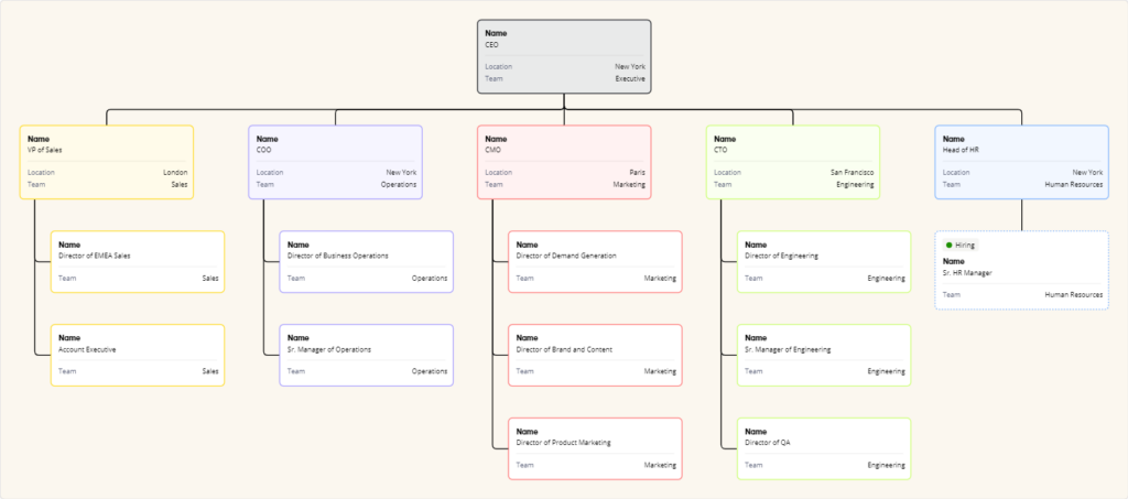
An org chart, short for organizational chart, is a diagram that shows the structure of a company or organization. It lays out people’s different roles and positions and how they’re connected to each other. Org charts clarify who reports to whom and how the hierarchy works.

But visualizing hierarchies is a cumbersome, time-consuming task, and often results in charts that fail to accurately represent the dynamic nature of changing organizations. That’s why you need a tool to help you create org charts efficiently. Even better if you could work with your team to build org charts together.

That’s why Miro’s collaborative visual workspace is the perfect canvas. 

There are two ways to build org charts fast in Miro. You can either use a template or start from scratch using Miro’s new org chart widget. With the new, native widget built in Miro, you can create org charts in no time, no installation required. Simply search for the org chart widget within Miro by clicking the More apps (+) button on the creation toolbar on the left. Immediately a starting point for your org chart is added to your Miro board, with a few boxes — or user cards — pre-populated. 

With the org chart widget, you can:

  • Import data from CSV files to populate your org chart. 
  • Easily update your org chart by uploading new CSV data whenever necessary.
  • Customize your org chart using a single, versatile card that allows users to toggle fields on or off and set open roles.
  • Change the look of your chart with customizable formatting options like colored branches, background colors, and filters to fit your needs.
  • Use auto-layout to streamline card arrangement for efficient org chart creation.  

Try ready-made templates

On the other hand, with a template, you can bring an existing diagram into Miro with just a few clicks. From there, you can collaborate with your team to customize the diagram, reviewing everything together in one workspace. 

If you’re working from a Miro board, you can choose the template you want via the template picker. Or you can browse different kinds of organizational planning templates in the template library or via the user-generated template gallery, Miroverse. Miroverse has thousands of templates built by Miro users, including hundreds dedicated to organizational planning. 

Whatever method you choose in Miro, your team can rapidly create an org chart that makes sense for your company and goals. Plus, since Miro boards update in real-time, your org chart becomes living documentation where HR and other stakeholders can brainstorm designs together, leave feedback, and always find the latest version. 

Miro org chart templates 

Miro offers a variety of templates for your organizational planning needs. We’ve compiled examples of a few different templates to help your organization design org charts faster than ever.

Organizational Chart template

What does the organizational hierarchy look like? Who makes up the team? Who does each person report to? An org chart answers these questions at a glance. Super helpful for onboarding employees, this kind of diagram plots out the company’s chain of command so everyone can see how their role — and others — fits into the broader picture.

With this Organizational Chart template, you can choose your chart structure and easily plot the connections between employees, roles, and departments.

Organizational Chart (click on image to use template in Miro)

The Company Organizational Chart template is similar but can be used to represent the structure of other departments or corporate functions inside the business, while the Business Organizational Chart template can be used to quickly depict the different divisions within a business.

Try any of these org charts to quickly create your diagram, and then change sizes, shapes, and colors to tailor it to your liking. 

Flat Org Chart template

If your organization lacks hierarchy or levels, a flat org chart might be the best option for you. It’s also useful if you want to depict horizontal relationships rather than vertical chains of command. 

One benefit to this kind of chart is it highlights team configurations, making it easier for all team members to see their roles in the larger context. This clarity and transparency fosters a more inclusive and collaborative environment.

Use the Flat Org Chart template to get started fast.

Flat Org Chart (click on image to use template in Miro)

Matrix Org Chart template

A matrix org chart is unique in that it illustrates organizational structures that are both functional and project-based. It visualizes employees’ roles, responsibilities, and relationships within the organization. It’s an essential diagram for businesses that require complex decision-making capabilities and rapid response times.

Use the Matrix Org Chart template to improve alignment and performance faster than ever.

Matrix Org Chart (click on image to use template in Miro)

Partnership Org Chart template

What about illustrating how business partners work together? A partnership org chart can help you understand the different players in an organization and how they relate to each other, providing clarity in a complex business landscape. By simplifying and streamlining the various relationships, you’ll get a better view of the entire ecosystem and help ensure all stakeholders are aligned.

With Miro’s interactive Partnership Org Chart template, you don’t have to start from scratch. Simply add the template to your Miro board and customize it to fit your needs. 

Partnership Org Chart (Click on image to use template in Miro)

Project Organizational Chart template

A project organizational chart is used to visualize all the people supporting a specific project. It can serve as a reference for anyone wanting to see who’s involved, what their role is on the project, and the hierarchy of the participants. It’s useful for clarifying everyone’s responsibilities and setting expectations.

Use the Project Organizational Chart template to illustrate the structure of your next project’s team.

Project Organizational Chart (click on image to use template in Miro)

Build an org chart in Miro today

As you can see, no matter the size your organization is or how it’s structured, there’s an org chart template for you. Plus, the new org chart creator means you can start from scratch and spin up an org chart in no time.

Your business might be complex, but creating your org chart doesn’t have to be. 

Visualization for innovation: How to use flowcharts for smarter problem solving

Software Stack Editor · May 20, 2024 ·

In December 1921, industrial psychologists Lillian Gilbreth and Frank Bunker Gilbreth presented a new model for problem solving to the American Society of Mechanical Engineers in New York City. 

Their “process chart” — known today as a flowchart — is a method of visualizing a process in order to improve it. More than one hundred years later, companies from manufacturing to tech startups use flowcharts to pinpoint bottlenecks, improve efficiency, and enhance decision-making for their biggest challenges. 

Visualizing a problem lets us see it in its entirety and process how different components interact. That’s because, according to the Gestalt Principles, with visual representation, our minds can quickly perceive individual elements as a whole and understand a problem better. 

“Every detail of a process is more or less affected by every other detail,” the Gilbreths theorized. “Therefore, the entire process must be presented in such [a] form that it can be visualized all at once before any changes are made in any of its subdivisions.” 

Once you see how individual elements work together to create a process, you can take steps to modify elements to improve the whole. 

What is a problem-solving flowchart?

A problem-solving flowchart is a flowchart that helps process improvement, troubleshooting, or decision-making. Flowcharts use shapes, symbols, and connecting arrows to map out a problem or flow. This technique illustrates how many steps are in a process, entry and endpoints, the flow of information and materials, and any branches or decision points. 

For example, this problem-solving flowchart template shows how you can use a flowchart to troubleshoot a technical problem. The flow guides users through basic questions and actions to a likely solution. 

Use this template

When to use a flowchart for problem solving

Flowcharts can be useful in several instances:

  1. When you’re aware of a problem, but aren’t sure of the root cause or the best way to solve it. 
  2. When you want to improve a product or service or specific outcomes, like delivery time. 
  3. When you’re entering a new market and want to create solutions that are a market fit for real customer problems. 

The stages of problem solving

To understand how to use flowcharts for problem solving, we’ll use the double diamond design-thinking process. This approach divides problem solving into four stages: discover, define, develop, and deliver. Most people start problem solving in the middle of the diamonds, believing that they know the problem and can start on solutions right away. Instead, you should start even earlier. 

https://www.designcouncil.org.uk/our-resources/the-double-diamond

1. Discover

Starting with research helps people understand, rather than simply assume, the problem. Design Council co-founder Jonathan Ball advises, “Go back and ask, ‘Have I been asked to solve the right problem?’”

Problem-solving requests normally come to product or engineering teams from leadership or customers. Statements like “This isn’t selling well” or “This process takes too long” describe pain points, but they’re too vague to form functional solutions. 

There are multiple ways to explore the root of a problem:

  1. Qualitative user research like user interviews
  2. Quantitative user research like user testing and heatmap tracking
  3. Workshops, like Upwork’s problem-solving workshop with Miro that led participants through brainstorming, discussing, and voting on top problems to solve
  4. Flowcharts to illustrate challenges in the “as-is” process. 

As-is process mapping

Flowcharts can help solve problems by first mapping out the problematic process. If a process map doesn’t exist, isn’t updated, or hasn’t been well communicated, this is the best starting point. 

Ask all teams involved to participate in mapping out the current process. During the process, you may identify bottlenecks or areas of misunderstanding. 

Use this template

2. Define

Next, refine your discovery into a single statement. A problem statement should explain who is affected, their end goal, the challenge, and the impact of the challenge. Here’s an example of a problem statement:

“Users of [software name] encounter frustration when they try to customize a monthly sales report. They are not able to customize the data within the platform reporting, and instead are abandoning the process and exporting raw data to compile outside of the platform. This takes longer, makes it harder for them to reach business goals, and lowers satisfaction with the software.”

You can get to the heart of a problem by asking why solving the problem is important and how the problem originated. Miro’s problem statement template is useful for this exercise. 

Use this template

3. Develop

Once you’ve defined the problem, you’re ready to move to the second diamond — the solution space. Flowcharts are ideal for mapping out potential solutions for testing. Just like an as-is process map, a proposed or to-be process map illustrates how a process should work, showing entry points, decision points, actions, parties, and endpoints.

In the development stage, use testing to reject ideas that don’t work and refine your solution. “The earlier and more often you can prototype and test, the better the outcome will be,” shares Ball. 

It’s important to note that changing a process isn’t always the solution to your problems. Simply visualizing it and addressing misplaced expectations can also be a solution. 

4. Deliver

Once you ship a solution, your work isn’t done. Communicate the update to users, collect feedback, track outcomes, and commit to continuous improvement. 

How to make a visual problem-solving flowchart

Interested in trying your hand at visual problem solving? The specific techniques for visual problem solving are as numerous as there are problems, but below we’ll outline three to get you started. All of them use Miro as their foundation, which allows for collaboration in real time, so you can create effective visuals to guide your process. 

1. Cyclical problem-solving process

This structured problem-solving process by Senior UX Designer Marcos Rezende walks teams through eight steps for tackling organizational challenges. It includes identifying the problem, gathering and analyzing data, generating solutions, and implementing them. Because this process is cyclical, it’s valuable for continuous improvement.  

Use this template

2. Cross-functional flowchart

If you’re attempting to solve internal workflow problems, a cross-functional flowchart can help you pinpoint challenges across silos. This template from Hiro Studio walks teams through outlining process steps and their relationships, identifying unnecessary complexity or duplication, and uncovering opportunities for improvement. 

Consultant John White explains why this technique is effective: “When we document a process flow, we get everyone on the same page by removing assumptions of what we think is happening, and we document what is actually happening.”

Use this template

Embed intro video: https://miro.com/miroverse/cross-functional-flowchart/

3. Problem tree 

Instead of a traditional flowchart, this technique visualizes a problem as a tree. This visualization approach is designed to give a holistic view of a problem (the tree trunk) with its impacts (branches) and root causes (roots). 

Use this template

Frameworks for decision-making

Beyond flowcharts, visualization can help leaders make better decisions by framing decision criteria in visual form. Here are a few ways you can illustrate your thought process in visual form for more effective decisions. 

1. Risk matrix template

This risk matrix template helps leaders visualize the likelihood of adverse events happening by placing them on a matrix from rare to very likely and trivial to extreme.

Use this template

2. Project scope template

How often do you need to argue that a request is “out of scope”? This simple framework helps you define a project scope at the beginning, so you have a touchstone to return to as a project evolves. This helps to manage goals, increase clarity, and keep projects within timeline and budget. 

Use this template

2. Priority matrix template

When you have competing priorities, deciding how to invest your time and budget is difficult. To determine the best outcomes, use this priority matrix template to map out initiatives by urgency and importance. This brings agility to your team and keeps your focus on what matters most. 

Use this template

You can find more decision-making visualization templates here. 

From visualization to optimization: How visual problem solving leads to innovation

Over a century after its birth, the flowchart remains a valuable tool to help companies approach a problem differently, using visual cues to understand all the moving parts. 

With flowcharts and other visual tools, you can:

  • Explore and define the right problem to solve
  • Map out current processes to pinpoint the root cause of problems
  • Propose and test new workflows and solutions
  • Visualize a problem at a high level and work through frameworks for better decisions

Visualizing problems helps our brains “see” problems and solutions where we might have otherwise missed a connection. Using problem-solving flowcharts as a tool, you’ll set your teams up for better communication and innovation, too.

Miro and Microsoft: accelerating AI-powered innovation

Software Stack Editor · May 20, 2024 ·

Today’s business leaders agree that innovation is critical to survival. But fewer than 10% of companies report being satisfied with their innovation performance. If you want the advantage, you have to be speedy and agile. That’s why Miro and Microsoft are joining forces to give users the tools they need to streamline complex workflows and deliver innovative products and services to the global market.

Seamlessly integrated across Microsoft 365 and Microsoft Security, Miro is a workspace that helps Microsoft users connect and collaborate to drive business innovation. The experience spans multiple Microsoft 365 offerings, like Teams, Azure DevOps, EntraID, Intune, Defender, and soon, Copilot. And don’t worry, enterprise-grade security is at the core, so admins can set policies with granular permissions and controls, without compromising their teams’ ability to create the next big thing. 

Speed up innovation with Miro for Microsoft Copilot


We are proud to be an early development partner for Microsoft Copilot, leveraging AI to drive productivity and innovation. We’re introducing a new way to grab the most important context from your Miro workflows without leaving Teams. Starting this summer, you’ll be able to use Copilot to search for relevant Miro boards and manage your board permissions from Copilot’s response.

Ready to use Miro with Microsoft Copilot? Sign up to get notified, and we’ll let you know when the experience is live.

Power up product development in Microsoft Teams

Miro’s collaborative capabilities bring a critical layer of interaction to daily workflows with Microsoft. We’ve tailored these specifically for product development teams. Teams today are managing and executing the full process from discovery to definition and delivery — all in one place with Miro.

Miro Assist in MS Teams

We know what it’s like at the beginning of the product development process. Teams are busy conceptualizing new projects, features, and designs. We’ve got tools for brainstorming and ideation built right in. Templates, voting, and timer are especially useful for this stage and can be used directly in the meeting, when you’re actually sharing and collecting ideas. You can then use Miro Assist’s board summary functionality directly in the Teams meeting, so you can get AI-generated insights in real time.

Search for a Miro board from the Teams chat

It’s often easy to lose track of information across channels, tabs, and tools. That’s why we’re making it easier for users to work with Miro across Teams and Outlook with richer Miro links. Now, you’ll get more context about the boards shared, such as the name, date updated, team name, and owner. You can even easily search and locate Miro boards from the Teams chat. 

Coming soon, you’ll be able to manage access to all content from a single Outlook email or Teams chat, so keep an eye out.

Miro board embedded in MS Teams channel

Once the idea is finalized, it’s time to map the work. With Miro, you can quickly collaborate on a wireframe or user story map, or visualize structures in a diagram with our smart connectors and advanced shapes. These assets can be embedded directly from Miro into Microsoft Teams, letting teammates give feedback in one shared space. With notifications, you’ll receive and be able to act on instant Miro updates, such as board comments, mentions, or access requests — right in Teams. 

Azure Dev Ops integration with Miro

Now your team can come together to run planning events and Agile processes, keeping the entire cross-functional team informed and motivated throughout delivery. With our native Azure DevOps integration, teams can track issues and speed up planning events by visualizing and mapping cards directly on the board. And it’s all synced back to Azure automatically. You can also view Azure story points and create Azure DevOps dependencies between Azure cards directly on Miro.

User management and beyond with Microsoft Security

Miro gives IT and security teams centralized control over user access, permissions, and mobile device management. This simplifies team management and ensures regulatory compliance. Our robust integrations with Microsoft Entra ID and interoperability with Intune can give you peace of mind and seamless governance over user provisioning and access. With our Defender for Cloud Apps integration, Microsoft organizations can gain insights into their Miro users’ activities and correlate signals across apps, identities, endpoints, email, and collaboration.

Soon, Microsoft admins who take advantage of our Enterprise Guard security add-on will benefit from a new Microsoft Purview integration. This lets admins import their Purview sensitivity labels to Miro Enterprise Guard, effectively standardizing their data security processes and minimizing operational overhead. Chat with our sales team to learn more.

Connect Miro to Microsoft products

Get started with Miro and unlock collaboration across your product development teams with seamless, powerful integrations for your existing Microsoft tech stack. Connect your Miro account to Microsoft today and find Miro on AppSource. 

Empowering inclusive collaboration: Miro’s commitment to accessibility

Software Stack Editor · May 16, 2024 ·

image

On this Global Accessibility Awareness Day, we at Miro are proud to reaffirm our commitment to creating a workspace that is not only innovative and collaborative but inclusive and accessible to all. In a world where digital collaboration is key to success, we strive to break down barriers and create a future where everyone has a seat at the table — or, should we say, a spot on the canvas.  

Here are some of the ways that we prioritize the accessibility of our product to ensure that everyone, including people with disabilities, has an easy and enjoyable experience on Miro. 

Our journey toward accessibility is guided by a steadfast commitment to compliance with the Web Content Accessibility Guidelines (WCAG) 2.2 AA. We conduct regular audits and remediation efforts to address any accessibility issues. Upon request, we share our progress through an annual Accessibility Conformance Report (ACR) based on the Voluntary Product Accessibility Template (VPAT).

This is far more than a check-the-box exercise for us. It’s a reflection of one of our company’s core values — through continuous iteration, we learn to serve all of our users more effectively. 
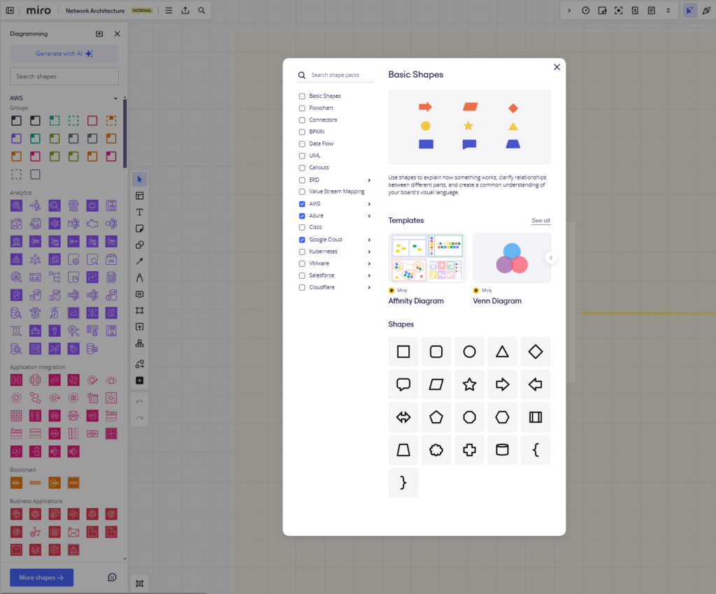
Prevention and education

We understand that preventing accessibility issues is just as important as fixing them, so we’ve integrated accessibility into every stage of our product development lifecycle — from discovery to definition to delivery. In fact, ensuring that “all content and functionality is compliant with Accessibility requirements” is a key component of our pre-release checklist prior to the GA launch of a new or updated feature.

We also prioritize education and training for our team to cultivate an inclusive design mindset that permeates everything we create. For example, we recently launched a Miro Accessibility Ambassador program. This provides Mironeers with a structured path for learning about accessibility and it empowers them to advocate for accessibility within their existing team processes. By taking ownership of accessibility and driving change at the team-level, this network of Ambassadors enhances a strong culture of accessibility across Miro overall. 

Accessibility features and innovations

Our design philosophy is simple: Designing for accessibility improves the experience for everyone. Here are some of the features we’ve introduced to make Miro more accessible:

  • Reduced Motion: For users who experience motion sickness, we offer the option to limit animations.
  • Board Background Color: Users can change board background colors to enhance visibility.
  • Color Labels: We’ve labeled colors in context menus so that all users can more easily identify them.
  • Command Palette: This contextual menu provides quick navigation within Miro.
  • Captions for Talktrack: Our Talktrack feature allows users to record audio or video walkthroughs on boards with captions.

Learn more about Miro’s accessibility features

Keyboard navigation and assistive technology support

We’ve enhanced Miro with robust keyboard navigation capabilities, allowing users to move through UI elements and board objects with ease. We support assistive technologies by providing labels, descriptions, and actions for objects. This ensures that creating, reading, updating, and deleting objects on a Miro board is possible with a keyboard alone or with screen readers and voice recognition software.

Learn more about how to use Miro with Assistive Technologies

Board creators

Accessible experiences often depend on the board creator or meeting facilitator. To assist in this process, we’ve developed features like Alt Text for Images and Miro Assist for Image Alt Text Suggestions. Our Accessibility Checker [Beta] helps identify common issues, and we provide guidance on making Miro boards more accessible.

Our continued commitment to accessibility

As we continue to make Miro’s collaborative canvas as inclusive as possible, we invite you to provide feedback on new and existing features via accessibility@miro.com. Your input is crucial in shaping our accessibility efforts. Together, let’s create a workspace where everyone can collaborate and innovate without limits.

Happy Global Accessibility Awareness Day from all of us at Miro!

3 ways extrovert bias stifles innovation

Software Stack Editor · May 15, 2024 ·

image

In fast-paced workplaces, it’s easy to assume that the loudest, most outgoing voices always have the best ideas. This assumption, however, overlooks the dangers of extrovert bias — the subtle (and often unintentional) tendency to favor the contributions of more vocal team members over those with quieter personalities.

Extrovert bias imperils innovation by creating missed opportunities for breakthroughs. This leads to homogeneous solutions and can drive away valuable talent. By understanding the subtle dynamics of extrovert bias and how it manifests in the workplace, leaders can implement strategies to promote inclusivity, foster collaboration, and tap into the brilliance of their entire team. 

First, let’s start with some background.

What exactly is extrovert bias?

Picture this: a live brainstorming session buzzing with energy. Ideas fly back and forth. A few team members dominate the conversation with their quick wit and bold proposals. Meanwhile, others struggle to get a word in and their more considered thoughts aren’t heard. This common scenario exemplifies extrovert bias — the subtle, often unconscious, tendency to favor extroverted communication styles.

Psychologists define extroversion as “a personality trait typically characterized by outgoingness, high energy, and/or talkativeness. In general, the term refers to a state of being where someone ‘recharges,’ or draws energy, from being with other people; the opposite — drawing energy from being alone — is known as introversion.”

Extroversion at work

Extrovert bias seeps into the way we conduct meetings, evaluate performance, and even design our office spaces. The consequences are far-reaching. When quick thinking is prized above deep and deliberative analysis, we miss out on breakthrough ideas that require careful consideration.

Missed opportunities for breakthroughs

Extrovert bias favors a culture of rapid ideation and quick verbal sparring. While this has its place, it often comes at the expense of the deep, methodical analysis that fosters truly groundbreaking ideas. 

To lower the risk of missing out on breakthroughs, leaders need to actively encourage divergent thinking. Employ techniques like brainwriting, where ideas are first generated independently, then shared, to ensure every voice is heard. Challenge the team to play devil’s advocate to explore solutions from unconventional angles. By fostering a culture where reflective analysis is valued, organizations can unlock the breakthrough potential of their more reserved innovators.

Did you know: two-thirds of knowledge workers are more comfortable sharing ideas with their managers asynchronously, and 59% prefer brainstorming asynchronously, too?

Homogeneous solutions

When teams don’t seek or embrace the full spectrum of their braintrust, they’re saddled with homogeneous solutions.

A team dominated by extroverted thinkers risks developing a groupthink mentality. When individuals feel the pressure to conform to a dominant communication style, dissenting opinions and truly novel solutions may never surface. Solutions then cater to the preferences, experiences, and biases of those who speak the loudest, and ignore the needs of diverse users and potential market segments.

Inclusive innovation means designing products and services that work for everyone, not just the most vocal in the room. Extrovert bias creates blind spots, leading to solutions that lack broad appeal and market penetration.

Anonymous feedback channels can encourage introverts to share concerns without fear of judgment, while surfacing potential flaws or overlooked perspectives. Also, panels composed of customers and colleagues in other departments can provide feedback on early-stage concepts, ensuring solutions don’t solely cater to the biases of those on the development team. 

By prioritizing diverse input throughout the innovation process, organizations can create solutions that they know resonate with a broader audience.

Does this sound like a challenge your team has experienced? Check out this groupthink retrospective Miro template.

Driving away valuable talent

Introverted team members who feel constantly overlooked or dismissed may lose motivation, withdraw their contributions, or even choose to leave the company altogether. This is a tremendous loss for any workplace.

Leaders must proactively champion their introverted employees. Mentorship programs can pair quieter team members with supportive senior colleagues to help them navigate workplace dynamics. Recognition systems that reward thoughtful problem-solving alongside bold idea generation can also boost motivation.

By creating a culture where introspective work styles are celebrated, organizations retain the hidden innovators who are essential to sustained success.

Sometimes introverts need a boost. Here are three tips for leaders to unleash the power of their introverted employees.

Time for change

The good news is that recognizing extrovert bias is a powerful first step in dismantling it. Leaders committed to true innovation must foster workplaces where everyone feels empowered to contribute, regardless of their personality style. Here are some ways to make this happen:

  • Structured meetings: Reduce the chaos of free-form discussions by using methods like timed rounds, written brainstorming, and designated facilitators to ensure equal speaking time.
  • Rethinking performance evaluations: Implement bias training for managers and introduce objective measures of performance to counteract any subconscious preference for self-promotion and extroverted behaviors.
  • Intentional workplace design: Create a range of workspaces, including quiet zones, individual pods, and collaborative areas, to cater to different working styles.

Extroverts: We still love and need you, but this is about everyone

Extrovert bias is not about disliking extroverts. It’s about recognizing that innovation demands the full range of human thinking. By understanding the subtle dynamics of this bias, and actively working to mitigate it, leaders can pave the way for the kind of breakthroughs that come from valuing and collecting all voices. In a workplace where every mind has a chance to shine, the possibilities for innovation are truly limitless.

How to get started with visual thinking: diversify your brainstorm sessions with these visual thinking techniques

Software Stack Editor · May 14, 2024 ·

image

Unlike verbal or word-based thinking, which is sequential and linear, visual thinking uses imagery and spatial representation to organize information. For visual thinkers, this way of laying out information sparks creativity and imagination, as it helps them comprehend concepts, identify new patterns, and make connections. 

In Visual Thinking, Temple Grandin says, “visual thinkers see images in the mind’s eye that allow them to make rapid-fire associations.” Object visualizers, who think in pictures, tend to excel at design and problem-solving, while spatial visualizers, who think in patterns, tend to be mathematically inclined and excel at abstract and systemic thinking. 

Each person falls along a visual-verbal thinking continuum, so incorporating visual thinking tools in the workplace can help you unlock your team’s unique creative superpowers.

How visual thinking can help teams be more creative

Visual thinking is a powerful tool for enhancing creativity, and ultimately innovation. Whether you’re brainstorming new ideas or solving a difficult problem, here are a few ways you can use visual thinking at your next team meeting.

Organize complex ideas to see the big picture

In her book The Extended Mind, Annie Murphy Paul says, “our powers of spatial cognition can help us to think and reason effectively, to achieve insight and solve problems, and to come up with creative ideas.”

She illustrates this concept with an example from the prolific author Robert A. Caro, who extends his thinking into physical space by covering an entire wall in his office with an outline of his current work in progress. By turning a mental map into a physical artifact, he’s able to free up cognitive space, observe how ideas relate to one another, identify gaps in the storyline, and easily follow the narrative flow without getting bogged down in details. 

Teams can take a similar approach by leveraging mind maps or storyboards to visualize complex ideas.

Think outside the box and make new connections

Even something as simple as sticky notes can fuel creativity and innovation by connecting seemingly unrelated ideas to form something completely new. They can easily be rearranged, added, or removed, allowing you to mix and match ideas, and look at problems from different perspectives. 

I once worked with a data-driven team who ran A/B tests and dug into dense spreadsheets to make product decisions. This type of structured, analytical thinking supported incremental improvements, but it wasn’t moving the needle in the way they hoped. So they shifted from “number-crunching mode” to “brainstorming mode.” 

By taking a step back to ideate together with online sticky notes, the team was able to get unstuck. They came up with a new concept that resulted in a 10% revenue gain. While there’s a time and place for data-driven analysis, sticky notes can help you unlock new ideas.

Reframe problems to develop innovative solutions

When approaching a difficult problem, it’s easy to default to the most obvious solution without examining whether you’re solving the right problem in the first place. The famous slow elevator problem illustrates this concept. If you’re practicing linear thinking, you’ll likely jump straight to the question, “How do we speed up the elevator?”

But if you remove narrow constraints and work with visual tools to tackle the problem, like a mind map or prioritization matrix, you’ll see the problem in a new way and will likely come up with more innovative solutions. 

In the case of the slow elevator, it can be reframed not as an issue with the elevator’s mechanics, but as an issue with people being frustrated with the wait. If you think about solving that problem, you can unlock a whole new set of ideas, like installing mirrors or playing music to help people pass the time more quickly.
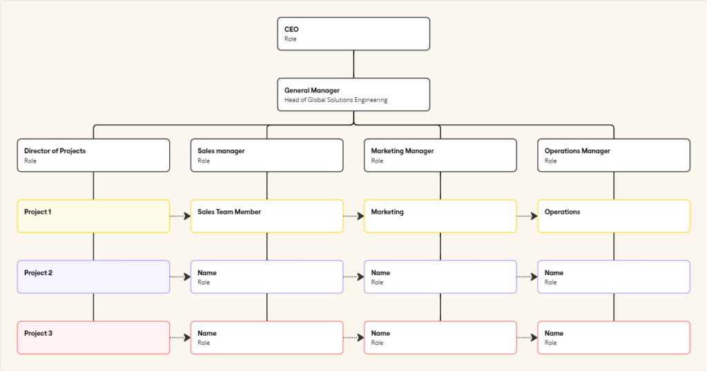
Leverage visual thinking templates to jumpstart creativity

Miro’s vast library of templates can help you use visual thinking to unlock creativity and innovation. Here are a few examples to get you started.

  • Mind Map template: Mind maps allow you to use free association to make new connections between seemingly unrelated concepts. The ability to expand ideas anywhere on the map helps you flesh out and iterate as needed.
  • 2×2 Prioritization Matrix template: This matrix facilitates decision-making and strategic planning. Use sticky notes to jot down ideas or tasks, then use the grid to plot items based on their importance and urgency. Viewing your options mapped out (rather than in a simple list) creates clarity and enables teams to make better decisions.
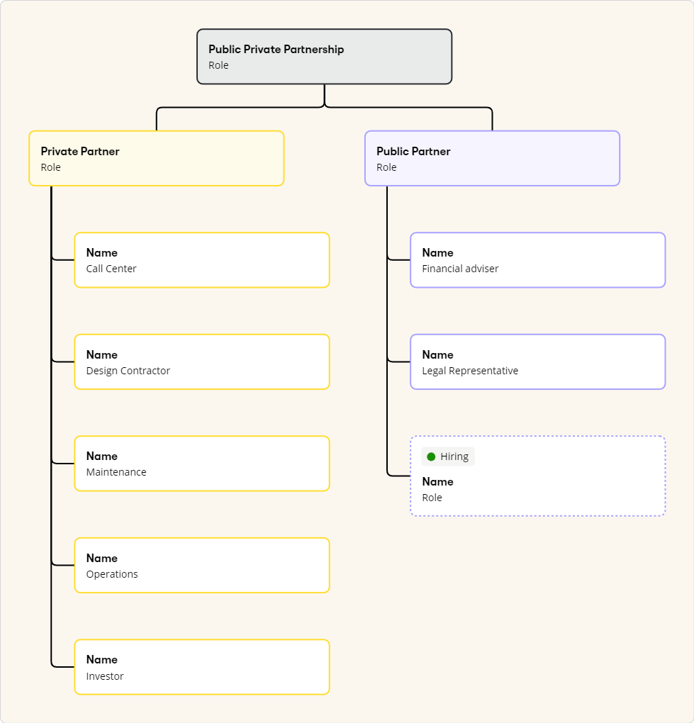
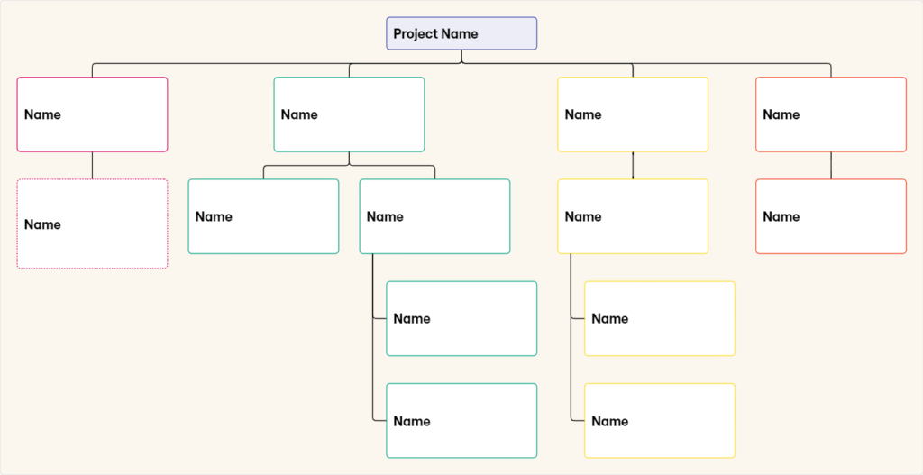
  • Flowchart template: This template visually illustrates how different steps relate and interconnect in a set of processes, which can be especially helpful when organizing complex or abstract concepts.
  • Storyboard template: Storyboards map out different user scenarios and can help you visualize how customers might think, feel, and act. They also break down each step in the customer journey into more manageable elements, so you can better pinpoint opportunities and challenges in the user experience.

The next time your team needs to get their creative juices flowing, consider forgoing note-taking in a document or spreadsheet and instead leverage visual thinking to take your ideas to the next level.

  • « Go to Previous Page
  • Page 1
  • Interim pages omitted …
  • Page 6
  • Page 7
  • Page 8
  • Page 9
  • Page 10
  • Page 11
  • Go to Next Page »

Get your Software Stack together. softwarestack.tech

Software Stack

© 2024–2026 - Software Stack is a trading name of SouthwestCIO Limited ac ompany registered in England & Wales 11319049

  • Knowledgebase
  • Home
  • About Us
  • Contact Us