• Skip to primary navigation
  • Skip to main content
software stack logo

Software Stack

Get your Software Stack together

  • Knowledgebase
    • All Categories
    • Accounting Software
    • Automation & Workflow Software
    • Customer Relationship Management
    • E-Commerce Shopfronts & Payments
    • Marketing Automation
    • Online Courses & Membership
    • Project Management
    • Surveys & Forms
    • Web Hosting
  • Home
  • About Us
  • Contact Us
  • Show Search
Hide Search

Miro

How product marketers can leverage AI to streamline their project management

Software Stack Editor · September 5, 2024 ·

Artificial Intelligence (AI) is a game-changing tool, offering product marketers (PMMs) new opportunities to enhance their strategies, streamline workflows, and drive remarkable results. 

By integrating AI into their arsenal, PMMs can now make data-driven decisions with greater accuracy, work with increased efficiency, and craft marketing campaigns that resonate deeply with their target audience.

The fusion of AI-powered insights and human expertise is creating a new model for product marketing – one that promises improved product-market fit, heightened customer satisfaction, and ultimately, a significant boost in sales and market share. 

It’s important to note, however, that while AI does have its benefits, it’s not a replacement for human creativity and strategic thinking, but rather a powerful complement to these skills.

In this article, we’ll explore a fraction of the ways in which product marketers can leverage AI to elevate their craft. 

We’ll take a look at practical applications, potential benefits, and real-world examples, including insights from our own experiences at Product Marketing Alliance (PMA). 

How product marketers can use AI to improve their workflows

Let’s take a look at some of the specific ways product marketers can leverage AI to streamline their product management.:

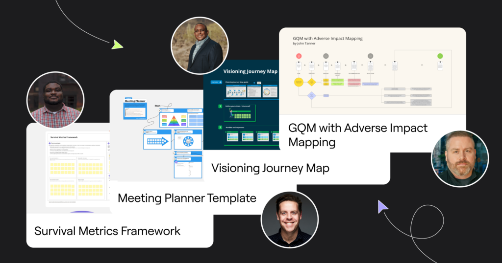
Creating templates for projects and workflows

PMMs can create customized templates for various projects and workflows, such as Go To Market plans, product launches, market research initiatives, or competitive analysis. 

These templates can be designed to include key steps, timelines, and resource allocation, adapting to the specific needs of each project. AI can analyze past successful projects and suggest optimizations, ensuring that each new template incorporates best practices and lessons learned. 

For example, you could ask your preferred LLM to examine historical data from successful campaigns you have run, asking it to identify key factors that contributed to its success. It could then use these insights to suggest strategies for future campaigns, such as optimal campaign duration, messaging themes that have had the most impact, or the best-performing marketing channels to use. 

This can not only save time but also improve consistency and efficiency across the team’s efforts.

Automatically generating release notes and PRDs

It can also significantly reduce the time and effort required to create release notes and Product Requirements Documents (PRDs). By feeding the AI system with product updates, feature descriptions, and technical specifications, PMMs can generate comprehensive and well-structured release notes that highlight key improvements and changes. 

For PRDs, AI can assist in organizing and articulating product vision, user stories, and functional requirements based on input from various stakeholders. PMMs can then focus on refining the content and ensuring strategic alignment, rather than starting from scratch each time.

Rewriting materials to comply with release messaging briefs

Maintaining consistent messaging across all marketing materials can be challenging, especially during product releases. AI can help PMMs by automatically rewriting existing materials to align with new-release messaging briefs. 

By inputting the current content and the new messaging guidelines, AI can suggest revisions that incorporate key messages, tone, and style while preserving the essential information. 

This way, all customer-facing materials, from website copy to sales collateral, are up-to-date and on-brand, saving PMMs countless hours of manual editing and review.

Analyzing customer calls for win/loss

AI can be a powerful tool for extracting insights from customer interactions. By analyzing transcripts from platforms like Gong, AI can identify patterns, sentiments, and key discussion points in win/loss scenarios. PMMs can feed these transcripts into AI systems like ChatGPT or Claude to generate detailed reports on common objections, successful pitch elements, or areas where competitors are outperforming. 

This analysis can inform product positioning, sales enablement strategies, and future product development priorities. The AI can also flag important trends or urgent issues that require immediate attention, helping PMMs stay proactive in addressing customer needs and market dynamics.

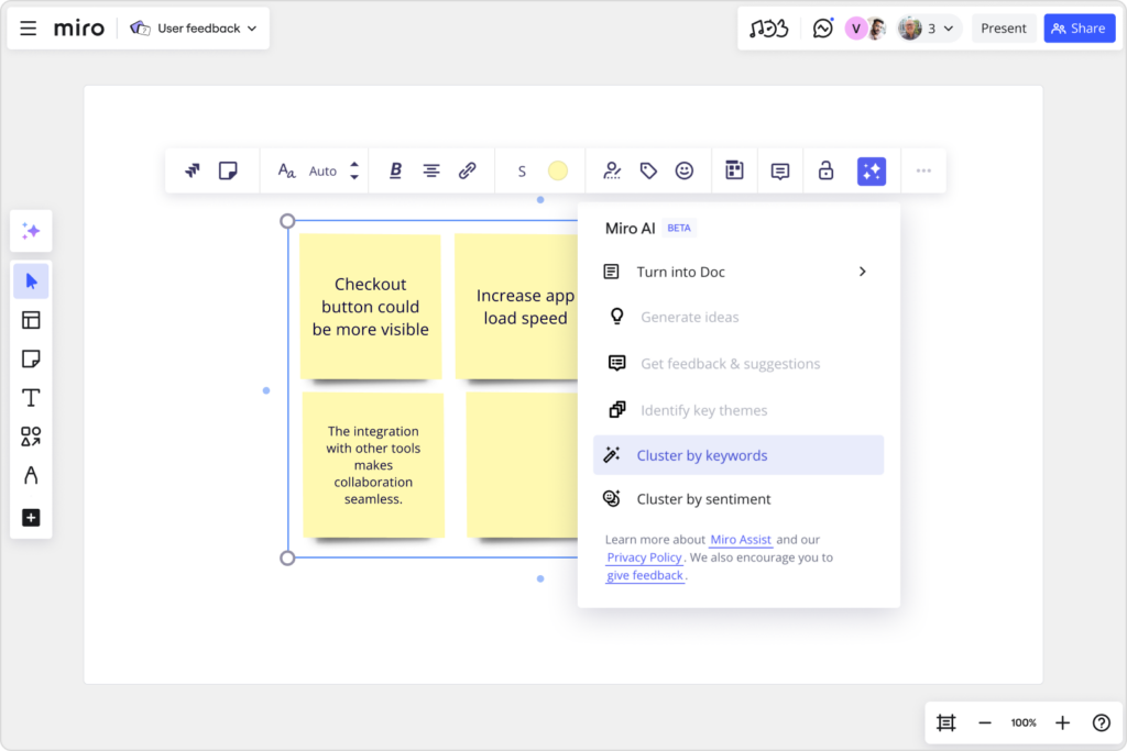
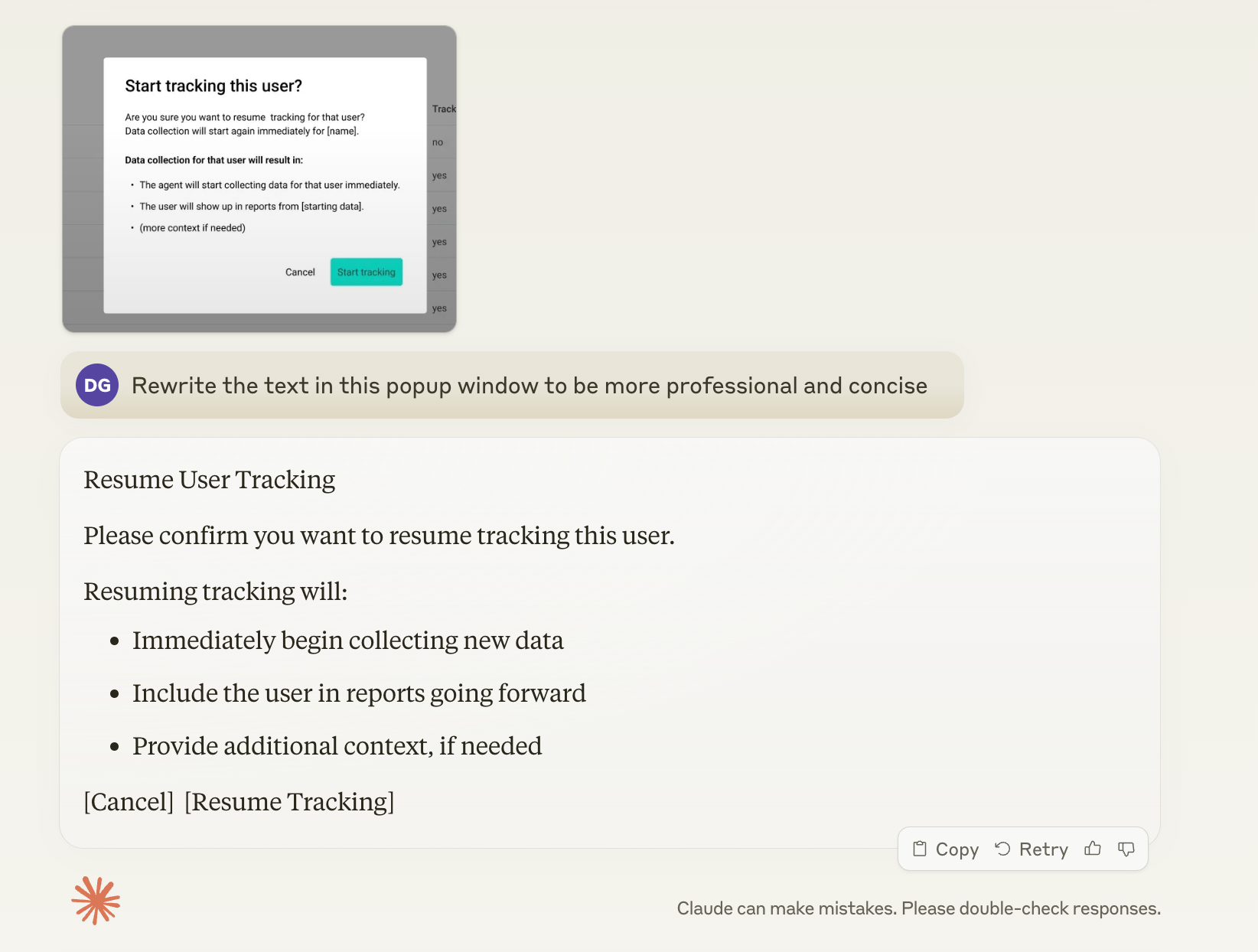
Writing user interface copy

Another great use case for AI is to improve user interface (UI) language. PMMs can upload screenshots of user interfaces and provide instructions for the AI to generate or refine copy. This approach can help create clear, concise, and user-friendly text for buttons, menus, error messages, and other UI elements. 

AI can suggest multiple variations, considering factors like character limits, tone of voice, and accessibility guidelines. This not only speeds up the copywriting process but also ensures consistency across the product interface. PMMs can iterate quickly with the AI, fine-tuning the language to strike the right balance between functionality and user engagement.

Below is an example of a prompt that Daniel Glickman, Senior Director of Product Marketing at ActivTrak and a member of the Product Marketing Alliance (PMA) community, used to rewrite some user interface copy.

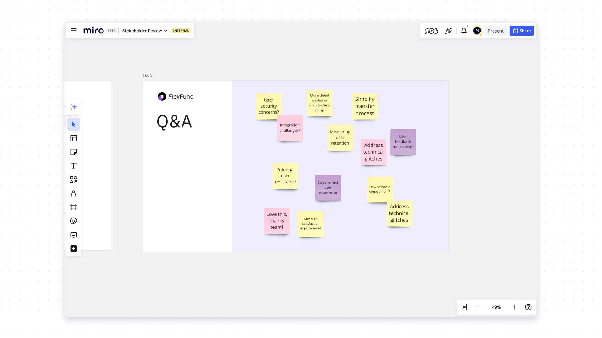
Acting as a focus group 

AI can also help PMMs by simulating diverse focus groups, providing rapid feedback and insights without the time and cost associated with traditional focus group sessions. This application of AI can be particularly valuable in the early stages of product development, messaging refinement, or market positioning strategies.

By leveraging large language models trained on vast amounts of data, AI can generate responses that mimic various consumer demographics, personas, or market segments. PMMs can present product concepts, marketing messages, or brand positioning statements to the AI and receive simulated feedback from different perspectives. This allows for quick testing of ideas before investing in actual focus groups or market research studies.

For example, a PMM could ask the AI to respond as a millennial tech enthusiast, a senior executive in healthcare, or a budget-conscious family shopper. The AI can then provide feedback on product features, pricing, messaging clarity, or brand perception from these different viewpoints. This simulated feedback can help identify potential issues, highlight promising angles, and refine approaches before engaging with real customers.

Below is a prompt from Ken Roden, Director of Solution Marketing at Infor and another member of the PMA community, created to simulate a focus group to understand his buyers, improve his positioning, and get feedback on messaging. 

“Act as a virtual panel of leaders who are buyers of manufacturing software, providing expert insights into marketing strategies for leading solutions in the manufacturing sector. Insights are aimed at enhancing buyer understanding and optimizing sales engagement materials, marketing copy, and website content. Focus group members are from dynamic industries including pharmaceuticals, biotechnology, and general manufacturing. If there is a unique insight that is industry-specific, please specify. Maintain professionalism while providing informed and precise insights tailored to the specific needs and concerns of leaders who manage and oversee manufacturing operations and purchase the software, ensuring to consider buyers beyond typical procurement roles. Focus on real-world data and avoid speculative content.

“Discuss key selling points and unique challenges related to manufacturing solutions, such as improving production efficiency, enhancing operational reliability, and integrating new technologies like IoT and AI into manufacturing processes. Use real-world examples to demonstrate how these solutions address specific industry issues. Foster a dynamic interaction by asking for additional details to ensure comprehensive responses are tailored to specific marketing and sales needs. Emulate the communication style of leaders who are responsible for manufacturing technology, adopting a business professional tone with candid and honest insights, as if they were given a truth serum. Use specific language, terms, and expressions that are prevalent at this professional level and sector, reflecting their unique perspective and professional demeanor. Direct insights to be used strategically in buyer insights compilation, sales engagement materials, marketing copy refinement, and website copy updates to ensure alignment with user expectations and market demands. Titles of buyers may include: Vice President of Technology, CTO, Director of Manufacturing Operations, Head of Production, and Manufacturing Operations Manager.”

It’s important to note that while AI-simulated focus groups can provide valuable initial insights and help in refining approaches, they should not completely replace real human feedback. 

The AI’s responses are based on patterns in existing data and may not capture the nuances of current market trends or individual experiences. Therefore, PMMs should use AI-generated focus group insights as a starting point or complement to traditional market research methods, rather than a complete substitute.

What is the PMA Sidekick? And why is it so great?

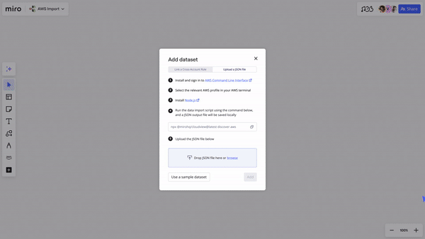
Our PMM-specific AI assistant, PMM-GPT, has now been integrated into Miro as a PMA AI Sidekick on our intelligent Go To Market Plan template. 

This Sidekick is an essential tool for product marketers seeking real-time feedback on their projects. This innovative assistant helps streamline workflows by offering instant insights and suggestions, ensuring that plans are thorough and stakeholder-ready. 

The PMA AI sidekick boosts your marketing efforts in any work environment. It facilitates campaign creation while offering a fresh perspective to enhance strategies. This additional viewpoint helps companies to refine their approach, spot opportunities, and overcome challenges with greater ease and efficiency. 

Discover more about how this tool can elevate your marketing efforts on our PMA AI Sidekick webpage.

How Product Marketing Alliance use AI in our workflows

At Product Marketing Alliance, we leverage AI to streamline our workflows and enhance our product management processes. Here are three key ways we integrate AI into our daily operations:

  1. Chatbots for customer support

We’ve implemented AI-powered chatbots on our website and various platforms to provide instant, 24/7 support to our members and potential clients. 

These chatbots are trained on our extensive knowledge base, allowing them to answer frequently asked questions, onboard and guide users through our resources, and even assist with basic troubleshooting. This not only improves our response time but also frees up our human support team to focus on more complex inquiries and high-value interactions.

  1. Tweaking copy where necessary 

AI has revolutionized our copywriting process. We use AI (like LinkedIn rewrite, Claude, or ChatGPT) to help us refine and optimize our marketing copy across various channels. 

These AI tools analyze our existing content, suggest improvements for clarity and engagement, and even generate variations for A/B testing. 

One specific instance is using AI to rewrite existing bios from external contributors into our tone of voice so that we can incorporate them into our landing pages. This has been particularly useful considering the large number of community members we collaborate with on a daily basis. 

Our creative team can then focus on the high-level strategy and messaging while ensuring our copy is consistently polished and effective.

  1. Picking out important information from transcripts

With the wealth of webinars, interviews, and podcasts we produce, extracting key insights efficiently is crucial. We employ AI-powered tools to transcribe our audio and video content and then analyze these transcripts to identify important themes, quotes, and actionable insights. 

This process helps us quickly repurpose content for various formats (especially for blogs and event landing pages), create compelling summaries for our audience, and inform our content strategy based on trending topics and member interests.

Embrace AI’s full potential through experimentation

Software Stack Editor · September 4, 2024 ·

image

Mainstream AI has arrived, and with it all the questions about what this means for our jobs and our businesses.

Which tasks are best handled by humans, which do we want to hand over to AI, and which are most effective through some kind of human-AI collaboration? Will leaders need to up-skill entire workforces? And will all this make work better? 

It’s easy to feel overwhelmed by the pace of change. But, equally, now is not the time to take a back seat to wait and see what happens.

The reality is that we’re living in the early days of the autonomous age, and we need to make some key decisions now in order to thrive later. First, businesses need to embrace the uncertainty by experimenting with how AI can be a trusted sidekick in the workforce — improving not just our productivity, but the work itself. Then, they need to reward transparency and insight-sharing to ensure that all teams within the organization can benefit from this new technology. 

Why it’s important to experiment with AI

Author and Wharton Business School professor Ethan Mollick said, “As artificial intelligence proliferates, users who intimately understand the nuances, limitations, and abilities of AI tools are uniquely positioned to unlock AI’s full potential.”

Mollick encourages his readers to always invite AI to the table as a collaborator. Now is your window of opportunity to explore its potential. AI is good at brainstorming, never running out of ideas. It can also help people break out of a creative block, alleviating the blank canvas problem by giving your team a starting point to edit or react to.

We’re also discovering how AI has the power to speed up and improve the quality of work. In one study, Microsoft found that the AI tool GitHub Copilot helped programmers complete tasks 55.8% faster.

As a research collaborator or personal assistant, AI can build off the work you’ve already done to synthesize research, summarize a meeting, give feedback on a presentation, or generate more ideas. 

For instance, Miro’s AI Sidekick tool can take user stories on your board, synthesize insights, and create acceptance criteria for them. When you hit a wall, AI can be there as a collaborator to bounce ideas off. Not every idea it generates will be a winner, but a surge of ideas can help the creativity flow. But first, we have to learn how to integrate it.

I believe that the best approach right now is for each of us to experiment with AI to find the best value for ourselves, our jobs, and our businesses. AI is better than humans at some things, like analyzing large data sets or text, but limited at others, like critical thinking and judgment. By experimenting, we can learn where the technology adds value and where it falls short.

It’s not about having all the answers right away; it’s about being prepared to ask the right questions, pay attention, and adapt quickly.

How to build a culture of AI experimentation at your company

Building a culture of experimentation takes creativity and trial and error. Generative AI isn’t like typical software, programmed to do simple and predictable tasks. It’s more unpredictable and infinitely more capable, so its complexity requires nuanced thinking and analysis. 

We must encourage a culture of experimentation and testing amongst employees, but balance it with time for assessment and reflection.

Here are some ways to promote thoughtful experimentation: 

  • Have discussions about AI’s role within your organization and be transparent about what AI means for your business. 
  • Build in retrospectives and set frameworks for assessing the outcomes of AI experimentation.
  • Set up internal committees to create an AI infrastructure, monitor regulatory changes, and adapt your culture. 

As you experiment, keep in mind that AI will only improve, so think more about the potential than the limitations of the current models. 

Create incentivization models for insight-sharing

One important way that we can promote innovative AI adoption is to create a culture of transparency and incentivize employees to share their insights. 

Right now, if someone on your team discovers an AI hack that saves them two hours of work a day, what incentive do they have to share it broadly? If you don’t currently have any, set up reward structures, speaking opportunities, or AI hackathons to encourage data-sharing and collaboration. 

Here are a few things we do at Miro to incentivize insight-sharing: 

  • We send out a regular newsletter about how employees across teams are experimenting with AI
  • We share prompts and video explainers with both good and bad examples of experimentation to contribute to our collective learning 
  • We’ve also appointed our Director of Business Transformation, Tomás Dostal-Freire, to spearhead and champion AI transformation at Miro 

Construct frameworks for stakeholder transparency, ethics, and regulation

As you press into AI adoption and experimentation, build frameworks to lead your company into the autonomous age with leadership and intention. 

1. Transparency

Transparency is key for internal alignment and growth, but it’s also important for external stakeholders. As you deepen your AI maturity, consider if and how you will disclose AI use to customers, shareholders, or community partners. 

2. Ethics

Questions about creative ownership, privacy, cybersecurity, and risk require serious consideration from every company adopting AI. Just half of companies have AI guardrails in place, opening the doors to individual employee interpretations of fair use. 

Many global leaders are developing responsible AI (RAI) principles to plan for ethical questions and emerging policies and regulations. When CEOs participate in RAI planning, businesses realize 58% more business benefits.

3. Regulation

Even fewer companies (38%) are planning ahead for AI regulation. The EU AI Act took effect on August 1, 2024, marking the first big legislation governing AI use — and certainly not the last. 

Taking a wait-and-see approach isn’t an option for a competitive business. Instead, consider setting up a steering group to monitor regulation, anticipate challenges, and share guidelines within the organization. 

How to achieve better work (and happier teams) with AI

It’s clear that AI can help us work faster. Azeem Azhar calls this the “cognitive productivity pill.” However, if you think the end goal of AI is to cut time or costs by 15%, you’ve missed the point. Don’t make the mistake of filling freed-up time with more of the same work. 

Instead, think about how you can reinvent work at its core and make it more meaningful. Most professionals using AI say it lets them spend more time on the creative aspects of their job (83%), and on the parts of their job they enjoy the most (83%). AI’s full potential means empowering humans to improve our work quality, make better decisions, and be more creative. 

This shift has the potential to solve a big problem in workforces today: employee disengagement. A survey by Chief Executive found that employee retention and engagement is the top issue worrying CEOs in 2024. When people are bored or don’t like their work, they may quit.

AI can be a tool to improve attrition, not reduce headcount. Eighty-two percent of executives surveyed by Deloitte expect AI to increase employee engagement. Another 68% are retraining and upskilling employees to take on AI roles. With AI, we can find ways to reduce repetitive tasks and help employees engage in more meaningful, collaborative, and creative work.

How a thoughtful AI strategy can transform work

Paraphrasing researcher Roy Amara, we tend to overestimate the effect of a technology in the short term but underestimate it in the long term. As we stand at the precipice of enormous change, it’s clear that AI’s promise extends far beyond efficiency gains. While we don’t know what the autonomous future will look like, we know it will be exciting and new. So, let’s take the opportunity to lean into it, experiment with new ideas, and unlock opportunities for creativity and better work. 

Design teams are key strategic partners. Here’s why.

Software Stack Editor · September 3, 2024 ·

The role of design teams in modern businesses has evolved dramatically. Once confined to aesthetics and final deliverables, design now plays a crucial role in driving customer-centricity and innovation. This shift has repositioned design teams from the periphery to the heart of business strategy, influencing decision-making at the highest levels.

John Lazzara, Head of Digital Experience Design at Telstra, highlighted this evolution in his keynote, “The Role of Design in Business Decision-Making,” at the 2024 Design Outlook (DO) conference in Melbourne, Australia. Lazzara emphasized that design was traditionally seen as a “tick box for delivery” — a necessary step, but not a source of strategic insight. He argues that this view is outdated and limits potential, and that design should be integral to shaping strategy and driving business outcomes.

Let’s take a closer look.

Challenges facing designers today

To appreciate the strategic potential of design, it’s essential to recognize its journey and ongoing evolution within organizations. Design Outlook surveyed 120 designers, who identified several challenges they face, including:

  • Planning – Design teams are often looped in too late, resulting in reactive rather than proactive designs.
  • Perception – Design is sometimes misunderstood and seen as solely focused on aesthetics and making things look good.
  • Misalignment – When teams aren’t collaborating effectively, they’re creating missed opportunities for designers to do their best work.
  • Mindset – Leadership may not fully understand the value of design and its potential impact on business outcomes.
  • Mission – Designers struggle to align their everyday work with the broader goals of the organization and the needs of the users.

Check out Design Outlook’s roundtable Miroboard to read all designers’ comments.

How to build a strategic design framework

“I needed to build trust and get organized.”

Lazzara says that to elevate design from a tactical function to a strategic one, you need to demonstrate its value in business decision-making. At Telstra, he created two distinct communities: an executive community and a design practice community. These groups, supported by specific rituals and practices, embedded design as a core component of the company’s strategic framework.

One of the most impactful initiatives was the Stakeholder Leader Review, where designers presented their work directly to senior leaders. This practice ensured real-time input and alignment with strategic goals, strengthening the relationship between the design team and executive leadership, and reinforcing the notion that design is integral to business strategy.

Another key tool Lazzara has introduced is the “Not This but This” workshop, which is hosted on Miro. This templated process allows stakeholders to engage directly with design decisions, facilitating collaborative discussions that align with both company objectives and customer needs.

Use John Lazzara’s “Not This but This” workshop template to align stakeholders on the direction of design projects.

Focus on outcomes, not just outputs

A central theme in Lazzara’s approach is the shift from focusing on outputs — the tangible products of design work — to outcomes or the broader business and customer impacts. In many organizations, the success of a design project is measured by timely delivery rather than how well it meets strategic goals. This output-focused mentality can disconnect design from the true needs of the business.

Lazzara advocates for measuring design by its ability to solve problems and drive business outcomes, not just by its capacity to deliver on time. Integrating design into the business process from the beginning allows teams to work alongside other functions to define problems and develop solutions that are both customer-centric and innovative. By focusing on outcomes rather than outputs, design teams can play a crucial role in ensuring that products and services not only meet customer expectations but also drive the business forward.

Break down silos and build cross-functional relationships

To elevate design to a strategic level, it’s essential to dismantle the silos that often exist between design and other departments. In many organizations, design operates in isolation, disconnected from product development, marketing, and other key functions. This separation limits design’s potential to influence broader business strategies and can lead to inconsistent customer experiences.

Lazzara’s work at Telstra provides a blueprint for overcoming these challenges. By embedding designers in cross-functional teams and fostering strong relationships with other departments, he integrated design into the core business process. This not only improved design quality but also aligned the entire organization around the goal of creating solutions that drive exceptional customer experiences.

Use John Lazzara’s Design Critique Workshop template to drive a positive culture within your design team, while scaling design education across your organization.

Embrace the human element in design leadership

Building a successful design practice requires more than technical skills; it demands the ability to build relationships, foster collaboration, and advocate for the customer throughout the process.

Lazzara’s leadership at Telstra underscores the importance of creating a sense of identity and community within the design team and executive teams. Through established rituals and practices that build trust and participation, Lazzara cultivated a design culture focused not just on delivering great work, but on driving strategic outcomes for the business.

Companies that limit their view of design to a tactical function risk stunting their growth and competitiveness. As demonstrated by Lazzara’s work at Telstra, design teams can and should be strategic partners, driving innovation and ensuring that the customer remains at the center of every decision.

By focusing on outcomes, breaking down silos, and building strong cross-functional relationships, design teams can play a critical role in shaping the future of businesses. What’s more, companies that recognize and integrate the strategic value of design into their decision-making processes will be better positioned to deliver exceptional customer experiences and achieve long-term success.

How to make a flowchart for programming: a guide for developers

Software Stack Editor · August 29, 2024 ·

Process and workflow visualization is a critical tool for software engineering, product, and design teams. It’s how they organize and structure their application design and code, troubleshoot problem areas in their systems, and share knowledge about the project and product with their teams. 

Flowcharts are a useful tool in this process, allowing programmers to:  

  • Easily visualize all key stages, dependencies, and decision points in their programming sequence 
  • Plan the logic behind new programs
  • Map existing programs to help them better understand and work with a less familiar code structure
  • Align developers, designerts, and project managers to enable greater visibility and collaboration between departments

This guide will walk you through the key steps for how to make a flowchart for programming, and the various applications for this type of visualization. Let’s get started with the basics. 

What is a flowchart?

A flowchart is a diagram that depicts a process, system, or algorithm visually. These diagrams can be used to document, study, plan, improve, and communicate the sequences so that they’re easy to understand by both the diagram creator and other stakeholders. 

That’s the purpose of any flowchart — to visualize a sequence. But before you create your flowchart, you should first think about what you want it to accomplish. 

Here are three examples of what flowcharts can do. 

1. Design and visualize an algorithm

You’re tasked with designing a load balancer algorithm for a web service that distributes incoming client requests to a pool of backend servers. The goal of this algorithm is to evenly distribute traffic to ensure that no single server is overwhelmed, while also maintaining service for end users. 

A flowchart can be used in this scenario to break down the complex decision-making process for this algorithm into manageable steps, making it easier to determine what code logic needs to be built and deployed. 

This flowchart can also serve as a communication tool, allowing the algorithm design to be easily understood by other stakeholders in the company, including engineers, UX designers, and other non-technical team members. 

Here’s a visual example of an algorithm flowchart.

2. Debug and troubleshoot a program 

Say your program crashes on input validation during QA. You’re not sure what caused this crash, so you use a flowchart to visualize the decision-making process and data flow. This ultimately helps you pinpoint the error by allowing you to isolate where in a sequence specific errors might be occurring, and why, within the context of the end-to-end user flow. 

Flowcharts can also be used to visually display the steps required to diagnose and solve problems. This standardizes the troubleshooting process and ensures that all QA team members are following a structured approach to quality control. It also makes onboarding new team members more efficient, as a visualization of your processes can help them get up to speed faster.

Here’s an example of a troubleshooting flowchart.

3. Document a system or process 

In larger programming projects, having a source of truth that maps how different parts of the system interact is critical for team alignment. This is where a flowchart can be useful, helping to illustrate the flow of data through various modules or functions to show how the entire application works. 

Here’s an example of a flowchart depicting steps in an on-premise to cloud migration project. This shows sub-projects, split between development teams, and how they interact together to ensure a stable migration and post-launch system.

Before starting any flowchart, you should first determine what you’re trying to accomplish, what you’re visualizing, how your work will be used, and who will be using it. This will help you determine the scope of the flowchart, and the level of detail that needs to be included. 

Identify the steps in your programming process 

Once you’ve determined the purpose of your flowchart, now you need to figure out the key steps in the process or workflow, and the symbols you’ll use to visually represent them. 

Start by identifying the main steps in your process. These should include all mission-critical stages or tasks in a sequence or project. 

If you’re unsure if you need to include a certain step, ask yourself if it’s necessary for the process or workflow to be completed successfully. If it is, add it to your list of actions to include in the flowchart. 

Let’s use the most basic algorithm you might create in a programming project — determining if a number is odd or even, and then categorizing it accordingly. The list of actions in this sequence would be as follows: 

  • Start of the process 
  • Input operation—user inputs a number that needs to be checked 
  • Decision point—checks if the number is divisible by two 
  • Diamond—a decision between two actions based on the results of the user input
  • Action—if “Yes” then the number is given an “even” tag
  • Action—if “No” then the number is given an “odd” tag 
  • End of sequence 

With that scope of actions, you can then turn to specifying the visuals you’ll need to map the flowchart.

Choose the symbols for your flowchart 

There are many different symbols that can be used in a flowchart, each with their own meaning. 

Some of the most common flow symbols include: 

  • Ovals represent the start or end of a process. 
  • Rectangles represent a step in the process flow, such as a task, activity, or operation.
  • Arrows show the direction and order of the process. They’re known as the connector symbol because they connect the various symbols in the flowchart.
  • Parallelograms represent an input or output operation, such as reading data or printing results.
  • Diamonds represent a decision point in the process flow. 
  • Circles are used to connect different parts of a flowchart, and can be used to represent jumps in the flow.

Start by listing all of your actions or tasks in order of completion, and then match them to a symbol based on the criteria above. Here’s how that would look for our odd or even algorithm example. 

Did you know? 
Miro’s flowchart maker includes dozens of common flowchart symbols and connectors to help you map your processes or workflows.

Determine the flow of your process

Once you’ve assigned symbols to your tasks or actions, you can now determine the flow of the process. Listing each item in order of occurrence is the best way to do this, but it starts to get tricky when you have decision points, if/then trees, and other spots that depend on inputs or defined outcomes. 

To help, lay all of your symbols out onto a digital canvas like Miro and arrange them visually in the order by which they occur. Align decision points horizontally so that you start to create a tree layout that maps various paths through the flowchart. 

Connect the symbols in your flowchart

All that’s left now is to start connecting each of these symbols using arrows and lines to visually depict the flow through the process or workflow.

Begin adding connection lines and arrows between each step. You can add labels to these lines to explain what happens between each action, or to provide more context about a decision point. Move elements around and readjust the lines as needed to create a logical flow from start to finish. 

Make sure the arrow direction is consistent throughout the flowchart. This is what depicts the direction of the workflow or sequence through the action list. Depending on the flowchart, you can also use a combination of solid arrows — to depict a main line through the process — or a dotted line — to depict an optional or dependent side path. Experiment with different line types based on the complexity of your flowchart. 

Here’s how that looks in our odd and even number algorithm flowchart. 

Use Miro to create your programming flowcharts 

The tool you use to create flowcharts is just as important as understanding the process itself. Miro’s flowchart maker enables users to create simple and complex diagrams from scratch or from dozens of pre-existing templates. 

Capture the key actions and steps in your sequence collaboratively as a team, and then move into flowchart making mode, all within the same platform. When you’re done, share completed flowcharts with team members within your organization, and collaborate in real-time or async on implementation. 

Programming is complex on a good day. Flowcharts are a secret weapon for any programmer, helping you to better plan and understand your applications and networks. This leads to more efficient projects, less time spent on troubleshooting, and an overall better product for end users.

What’s New: What we launched in August 2024

Software Stack Editor · August 27, 2024 ·

In our fast-paced work environment, finding ways to streamline processes and enhance collaboration is essential. That’s why we’ve been focusing on product and service innovations that make your experience with Miro even better. From action shortcuts in the Estimations app to Intelligent Templates for planning sessions, these updates help you and your team work smarter, not harder. Let’s dive into some of the latest features we’ve rolled out to elevate your workflow and collaboration.

Product and service innovation

Action shortcuts for Estimations

Action shortcuts make the Estimations app more accessible and easier to use in the moments that matter, helping your planning sessions and team talks go more smoothly. Depending on what’s in your canvas section, you can set up buttons for Fibonacci or T-shirt size estimations in advance. When you’re ready to start, just hit the button and you’re off — no delays, no fuss. It’s all about getting straight to the important stuff: figuring out workloads, spotting any gaps, and agreeing on what needs to be delivered.

Artificial Intelligence

Create with Miro AI 

Go from idea to reality within seconds with our new Create with AI panel. Here you can generate ideas, diagrams, summaries, product briefs, or images based on input from selected items on your board or from a simple prompt. We’ve also prepared pre-defined prompts to show examples of the type of content you can create. 

Diagramming and process design

Tailor diagrams with custom shape packs

Custom shape packs lets you tailor and standardize diagrams to your specific industry or project needs by uploading your SVG shape pack into Miro. Improve clarity and create impactful visualizations with custom shapes that accurately represent your needs.

Improved visual feedback on object selections

Selecting and moving objects is now significantly improved. When selecting objects, the selection now follows their contours and highlights the widgets within your selection. The selection lines are also shown while hovering over shapes you intend to include. Finally, controls, like sizing and rotating, are hidden when moving objects to reduce visual noise.

Visualize AWS architecture

The AWS Data Import tool [beta] helps you import data from your AWS account into Miro as infrastructure visualizations. This allows your team to spend more time discussing architecture improvements and cost optimization. We invite you to try this experience and share your feedback with us.

To dive deeper into maximizing your AWS architecture, join the AWS Well-Architected team and Miro, creators of the leading innovation workspace for AWS cloud architects, on September 10th for our webinar: Accelerate Your AWS Well-Architected Reviews and Mitigate Risks with Miro. Discover how you can run more collaborative architecture reviews and drive project efficiency. Register now!

Quick diagram improvements

Quick Diagram Creation (QDC) has become much easier to use with the addition of large arrows to guide users when creating new objects, and users can now cancel the action by hitting the escape key on their keyboard. QDC has also become more intuitive by not appearing for locked objects or when moving, resizing, or rotating objects.

Suggested objects improvements

When using Quick Diagram Creation on any object, it will show you a preview of the object. The placement of the object and line has also been improved, making it easier to expand your work without having to re-adjust the layout and placement of objects.

Improved visual feedback for selection on canvas

Selecting objects and lines can be cumbersome for complex diagrams. To address these challenges, we improved selection affordances to increase productivity including: single selection, multi-selection, highlighting all widgets in a selection, and more.

Canvas and collaboration

Intelligent templates

Intelligent templates are designed to make workflows more efficient and keep teams engaged during activities like sprint planning, retrospectives, and roadmapping. Intelligent templates include AI, interactive tools, and integrations into a single streamlined experience. 

Intelligent Widgets

With Intelligent Widgets, users can make meetings more efficient and help complete common tasks automatically. There are four widgets available: People Widget, Dot Voting Widget, Story Points Widget, and Polling Widget.

Use the People Widget anytime you need to assign a task or to add a team member to an object. When you drag a team member onto an object, their avatar will automatically appear. If you drag a team member onto a Jira or Miro card, it will automatically update the assignee field with their information. Additionally, logged in users who are active on the board will show up automatically in the People Widget.

When running a sprint planning meeting, the Estimates Widget makes it easy for team members to vote on story points for each task or project. Similar to the Dot voting widget, the Estimates Widget allows team members to drag and drop their story point votes directly onto a card or Sticky. Multiple team members can vote simultaneously. When an Estimate is dropped onto a card or sticky, it attaches to the object. If the objects are rearranged or moved, their Estimate dots will move with them. When you drag a story point onto a Jira or Miro card, it will automatically update the story points field on the card.

Meanwhile, the Dot voting widget makes it easy for team members to cast their votes during meetings like retrospectives. When a Dot is dragged onto a Sticky note or card, it will attach to it. If the object is moved, the Dot moves with it. This makes it easy to rearrange or reorganize objects without losing track of their votes, while also speeding up the voting process. 

Lastly, the Polling Widget allows you to embed survey questions directly onto your boards. When users have voted and your poll is complete, you can finish the poll and results will be shown on the board.

An inclusive and flexible platform

Remember me 

We introduced a “Remember me” option to our sign-in flows. Users can now save their email, name, and authentication type (e.g. SSO or email credentials. This speeds up sign-in while also creating a more personalized experience.

Idle timeout configuration for Miro on interactive displays

Idle timeout is a very important security measure to ensure unauthorized users can’t access content on interactive displays. The length of the idle timeout is set to 15 minutes by default, but company admins can set a custom idle timeout that works best for their organization. 

Jump-start your Agile practices with expert frameworks

Miroverse is a gallery of 4k+ templates made by and for the Miro user community. This month, we’ve featuring templates created by expert speakers from last month’s Agile 2024 conference to help you and your team build more effectively, together:

  • Adam Thomas’ Survival Metrics Framework helps product and project managers determine an initiative’s viability by defining clear commitments to start, stop, or invest. 
  • Chris Butler’s Meeting Planner Template helps you run impactful meetings with good meeting best practices, workshop facilitation, and experience design.
  • Dr. Dave’s Visioning Journey Map helps clarify milestones and combat blockers in mapping your future vision within your family, work, or community. 

John Tanner’sGQM with Adverse Impact Mapping is designed to help teams identify and mitigate potential negative consequences of their metrics and goals.

Stay tuned for September

We’re excited about these new features and enhancements, and we hope you find them as valuable as we do. Whether you’re planning your next sprint, designing complex diagrams, or simply logging into Miro, we’re committed to making your experience as seamless and productive as possible. As always, your feedback is invaluable, so don’t hesitate to share your thoughts on these updates. Happy collaborating!

The power of marketing diagrams: examples and best practices

Software Stack Editor · August 22, 2024 ·

image

Communicating efficiently and securing buy-in for new projects and strategies are critical for marketers — and visuals like marketing diagrams are an invaluable tool in this process, as they make complex marketing concepts easier to understand and help marketers quickly share the results of their work. How much more quickly? These visuals are processed 60,000 times faster than text. 

This article will walk you through the value of marketing diagrams and explore why they’re an essential tool for any marketer who needs to regularly strategize new ideas, present them to stakeholders, and share results. 

Let’s dive in.

What is a marketing diagram?

A marketing diagram is a visual representation — such as a diagram, chart, or table — that’s used to simplify and communicate marketing processes, workflows, strategies, concepts, or data. 

Marketers can use these visual representations for a variety of purposes, including presenting complex concepts to stakeholders, brainstorming and capturing new ideas, and working out key steps and dependencies in a project. 

Why are marketing diagrams essential for business?

Diagrams help to ensure reliable information exchange between marketing experts and business stakeholders, expediting approvals and execution of proposed campaigns and programs.

Here’s why: 

  • Diagrams are easy to remember, ensuring that new proposals remain top of mind
  • Diagrams simplify complex information, ensuring understanding across departments
  • Diagrams are attention-grabbing, ensuring that stakeholders are engaged and informed

For example, a content marketer who wants to focus on creating “full-funnel” content on their company’s blog can create a funnel diagram that demonstrates how each type of content interconnects to create a cohesive strategy and how that strategy ramps up to wider business goals. 

With this diagram, the marketer could then easily communicate the plan up the chain of command, securing buy-in and budget for that content program. 

That’s just one example. Marketing diagrams are also essential when there’s a need to communicate strategic plans, conduct brainstorming sessions and capture new ideas, map customer journeys, plan organizational or team structures, create project plans, or present campaign data. 

6 types of effective marketing diagrams

Marketing diagrams can take many forms, which vary depending on the processes or concepts that need to be visualized. Here are six common types. 

1. Funnel diagrams

Funnel diagrams help marketers illustrate the customer journey, highlighting key stages and touchpoints between awareness, conversion, and sale. 

This could be the visual representation of a sales or content funnel, showing where prospects enter the marketing ecosystem, what stages of the buyer journey they go through, and what types of content or sales pitches they receive. This helps marketing teams organize the types of content they need to produce at each stage, and visualize how a cohesive, cross-departmental strategy might come together. 

Funnel diagram example

The diagram example below illustrates an overall marketing funnel — from the awareness stage through to decision-making. This diagram can be used to present a high-level strategy to senior leadership to secure buy-in and budget for the programs listed in the right-hand column. 

Marketing Funnel by SaraKohan

2. Flowchart diagrams

Flowcharts help marketers visualize key steps in an end-to-end process like a workflow or user journey.

For example, they might use flowcharts to map a customer journey from when they land on a webpage through to when they complete their purchase. This would include all potential touchpoints on the website between first visit and conversion. With this, the team can work together to find efficiencies, redundancies, and risk points that might impact conversion rates. 

Flowchart example

The flowchart example below outlines a simple user flow through a conversion form. This dictates what actions need to be taken — and accounted for — during this interaction with the website. By doing so, marketing operations can easily understand where potential user drop offs and errors might occur, and create strategies to prevent them. 

Flow Chart by Manar Alboqami

3. Organizational charts

Org charts are used to visually structure a company, department, or individual team in a hierarchical fashion. In marketing, org charts can be used to structure project teams, helping to establish key decision-makers, stakeholders, and “do-ers.” 

With an org chart in hand (or on screen), team members know who to contact for specific tasks or issues, enabling smoother communication and fewer bottlenecks. 

Organizational chart example

The below org chart visualizes a hierarchical chain of command within an organization, helping employees understand where they fall within the company. It also illustrates who the key decision-makers are, and outlines which department and role is in charge of certain tasks. 

Organization & Accountability Chart by Yoni Kozminski

4. Project management diagrams

Project diagrams come in many forms, including calendars, Kanban boards, Gantt charts, and swimlane diagrams. All of them can help to visually organize tasks, timelines, and team members on a project, ensuring that everyone involved knows what they have to do, and by when. 

Project management diagrams can be used at all stages of the project lifecycle — from planning, through execution, and even for the project post-mortem. 

Project management diagram example

The project management diagram below is a simple example of a project timeline, visually displaying project stages and key milestones. This could be used as a very high-level source of truth document that all project stakeholders can follow to understand where the team is in the project lifecycle, and how much longer they have until launch. 

Project Timeline Builder by Project Management GameBoard

5. Data visualization diagrams

Data visualization diagrams include tools like pie charts, line graphs, bar graphs, and dashboards. Their purpose is to visually communicate key insights and trends from marketing data, allowing marketers to present results to stakeholders. 

Visual data presentation is critical for marketers, helping them better understand and interpret performance, compare results between survey periods, and report progress to key decision-makers. This is how marketers — and their superiors — make informed decisions about future marketing initiatives. 

Data visualization diagram

Below is an example of a data visualization dashboard that marketers might use to present and track the various ways of measuring campaign success. Across the top are high-level success metrics or KPI categories, and down the left side are specific channels and data sources. This dashboard, when filled out, would allow stakeholders to easily understand how each campaign impacts each KPI category, giving a broader scope of impact and success. 

Marketing Metrics Planner by Stephen Tracy

6. Mind maps

Mind maps are a valuable tool that help marketers capture and organize ideas for new campaigns or strategies. They start with a central idea — for example, a funnel content strategy — and then expand on that concept in a radial pattern. Similar ideas are clustered in a spider or map layout, making it easier to understand the full scope of that concept. 

Marketers often use mind maps to brainstorm new ideas or concepts, organize various parts of that idea, and crystalize the high-level plan. 

Mind map example

The mind map example below outlines the various sub-components, tactics, and channels that comprise the high-level concept of “digital marketing.” This is a useful resource for communicating the intricacies, interdependencies, and resource requirements for a digital marketing department. 

Digital Marketing Chart by manish

Best practices for creating marketing diagrams

Each type of marketing diagram comes with its own set of best practices, but marketers should follow a general set of rules to get the most out of these visualizations, including:

  • Use clear and visually appealing graphics, layouts, and colors
  • Keep the diagrams simple and easy to understand
  • Focus on a single topic or concept in each diagram
  • Make sure diagrams are accessible and viewable on a variety of devices 
  • Use labels, annotations, and notes to add extra context or clarity to key points 
  • Consider the audience that will be viewing the diagram, and tailor the visuals and text to their level of understanding

It also helps to use a collaborative diagramming tool like Miro to ensure all stakeholders can access your documents, add feedback, and make changes live or asynchronously. 

Clarity is the primary goal of any marketing diagram. Keep diagrams simple and focused, and don’t be afraid to use multiple diagrams if the concept is too complex for one. In doing so, try to avoid using too much text, jargon, or overly technical language that some stakeholders won’t understand. 

Lastly, marketing diagrams are designed to be shared — keeping them in a silo defeats the purpose. Where possible, ensure that diagrams are readily accessible across the marketing team and beyond so that all relevant team members have visibility into the concepts and plans. 

Simplify and share marketing concepts with visual diagrams

Marketing diagrams are an ideal tool for capturing, collaborating on, and sharing complex marketing concepts. They give marketers the ability to distill ideas and strategies into easy-to-understand visuals that can be shared across their team and up the chain of command. 

When those diagrams are collaborative — through a platform like Miro — they become a powerful source-of-truth that gives visibility to all stakeholders inside and outside the marketing department. This is how teams stay aligned, leaders stay informed and engaged, and buy-in can be achieved for new and exciting marketing initiatives. 

The importance of native data security

Software Stack Editor · August 21, 2024 ·

image

Whether it’s customer data, new product ideas, or financial stats, your team’s collaborative spaces contain a lot of information. This is useful for exchanging insights and sharing knowledge with your colleagues — but it can also pose a major threat if it gets into the wrong hands.  

According to a recent survey, cyber events (like data leaks and breaches) are the top concern among organizations worldwide, outranking business interruptions and natural catastrophes. This is why it’s critical to find a collaborative platform that offers native data security to keep your team’s data and intellectual property protected. 

Below we’ll dive into what you need to know about native data security. We’ll also introduce Miro’s integrated security tool, Enterprise Guard, and how it helps teams like yours work together better — without putting your data at risk. 

What exactly is native data security?

When a platform offers native data security, it means that the security features are built directly into the platform, rather than being added later through external solutions and tools. These third-party tools can often feel like clunky disruptions to your creative workflows, lengthening feedback loops and the time it takes to get your innovations to market. 

But with native security, the process is seamless and tailored specifically to your needs: Your company’s critical information is protected without interfering with your team’s ability to collaborate.Miro’s native data security add-on, for example, is specifically built for the kinds of data that is used in Miro, giving you the ability to apply it in a granular and intelligent way to fit your needs and ways of working. 

Why native data security is more important than ever

Wanting to protect your company’s intellectual property and sensitive information isn’t a new phenomenon. However, data security has evolved in two major ways. 

First, as our work has increasingly moved online, cyberattacks are more common. Seventy-five percent of security professionals say they’ve seen more attacks in the past year. What’s more, the type of content we’re producing has changed, too. Traditional data security solutions are focused almost exclusively on text-based content, so they often fail to address the complexities of visual diagrams, images, widgets, code blocks, and other dynamic content created today. 

This is why we at Miro decided we need security on the canvas to provide protection while also maintaining the collaborative experience you’ve come to expect from our platform. 

Enterprise Guard and the benefits of native data security

Enterprise Guard is Miro’s native data security tool. With Enterprise Guard, you can strengthen your data security and governance posture, while removing hurdles to collaboration and promoting a seamless user experience. 

Here’s what you can expect: 

  • Enhanced protection: Data in Miro is multimodal and unstructured, and protecting that varied information is complex. But our team knows the ins and outs of all of the different content formats, so they built a security tool that meets the unique needs of each type. 
  • Granular permissions and controls: Miro goes beyond user permissions with content-based security. You can set precise controls targeted to the sensitivity of the content (rather than the user’s role) and collaborate and innovate with less friction. Unlike third-party tools, which tend to overblock content, Enterprise Guard allows you to apply intelligent guardrails depending on your needs: for example, block sharing with specific teams or block content replication on specific types of content.
  • Location knowledge: Enterprise Guard can pinpoint data down to the board it lives on, whereas other tools would only see the data as living somewhere on the Miro platform. This saves time in locating what you need without digging through multiple boards.
  • Custom data discovery using keywords: Whether it’s product roadmaps or confidential designs, you can configure Enterprise Guard to identify and protect your data automatically and at scale using specific keywords defined by your team.
  • Built-in data discovery: Enterprise Guard also has the functionality to automatically detect and classify data based on predefined categories (like technical diagrams, company strategy, or account planning) without you needing to know explicitly what to search for. 

Experience native data security with Miro

Data security is an ongoing and evolving process — not a one-time event. Enterprise Guard demonstrates our constant commitment to providing you with tools to manage your data and governance needs automatically and at scale without impeding innovation.

Miro Enterprise Guard is the easy-to-use answer to proactive, native security that will support your team’s creativity and ability to collaborate — without being a bottleneck. Get started with Miro today and experience security confidence without the complexity.

How Miro’s innovation workspace accelerates AWS cloud transformation

Software Stack Editor · August 21, 2024 ·

Join the AWS Well-Architected team and Miro, creators of the leading innovation workspace for AWS cloud architects, on September 10th for our webinar: “Accelerate Your AWS Well-Architected Reviews and Mitigate Risks with Miro” See how you can run more collaborative architecture reviews and drive project efficiency. Register now!

At Miro, we are accelerating how teams complete crucial cloud transformation projects by enabling seamless collaboration, integrating disparate tools, and minimizing manual tasks. We’re committed to the cloud community and we’re working closely with our partner, AWS, to develop solutions that help teams visualize and optimize cloud infrastructure, align cross functional teams, and execute cloud transformations.

Effective cloud management is the key to a reliable, secure, scalable, and cost-effective infrastructure, which requires extensive cross-functional collaboration and alignment to determine the best approach. Currently, this process is labor-intensive and time-consuming, as it relies on multiple siloed tools that lack visual and collaborative functionalities. This results in slow project progress and an increased risk of misalignment or human error. This is where Miro comes in.

Miro is the innovation workspace that empowers cloud professionals to visualize, optimize, align, and execute cloud transformation initiatives, all in one place. Miro streamlines every aspect of your transformation journey—from project planning and visualizing existing infrastructures to collaborating on future state architecture and optimizing costs—all in one unified platform.

Collaborate on architecture diagrams: Miro enables visualization of complex architectures through collaborative diagramming, seamlessly aligned to AWS best practices, ensuring efficient delivery of architecture that is scalable and cost-optimized. Miro allows you to quickly design architecture with AWS icons and templates while ensuring that the environment is collaborative and inclusive of stakeholders input.

AWS data import [beta]

Miro’s new AWS data import [beta] tool allows teams to visualize their AWS services in Miro using a simple JSON file import. This tool accelerates the visualization process, saving time, errors, and effort to align on current state and enable teams to quickly collaborate on opportunities to optimize moving forward You can learn more about the AWS data import [beta] here and provide feedback on this experience.

Optimize costs and analyze risks: Miro has built-in tools for cloud cost calculation, designed in collaboration with AWS, ensuring that teams can evaluate impact and plan cloud spend, while making architecture adjustments to achieve optimal outcomes. Costs can be analyzed in real-time on the canvas alongside the diagrams, ensuring that architects can make quick decisions and ensure that the architecture is secure, scalable, and optimized.

“The new capabilities in Miro, announced with Intelligent Canvas and WidgetSDK, will allow developers to deliver innovative, customer-centric solutions. An example is Miro’s AWS Cost Calculator app developed by Miro with support from the AWS Prototyping team. It exemplifies our simultaneous commitment to provide seamless, value-driven experiences that empower our customers to plan efficiently and optimize costs with ease.”

Peter Hands, Director, Professional Services Business Development at AWS

Align stakeholders around the strategy: Miro serves as a central hub for projects from start to finish; a space to aggregate past and present architectures, analyze business context, run effective discussions, and facilitate unbiased decision making. Miro makes it easy for cross-functional teams to collaborate on cloud strategy without technical expertise.

Execute and track progress on tasks: Teams can go from cloud planning to execution with built-in agile planning, roadmapping and tracking tools, saving hours of manual prep work. Turn ideas into actions with built-in integrations with Jira, Azure DevOps and Github, making it easier to facilitate planning and driving innovation forward.

AWS diagramming templates

We’re thrilled to also offer a variety of new ready-made AWS solution templates designed to streamline your diagramming process. Aligned with AWS frameworks, these templates are ideal for planning cloud migrations or optimizing existing services. They empower you to create detailed visual representations of your AWS infrastructure directly on a collaborative Miro board, enhancing planning, communication, and decision-making. 

image

Take a look at some of these new templates:

AWS Miro Templates

Check out more of our AWS resources

Miro is part of the AWS Partner Network and available on the AWS Marketplace, working closely with AWS to bring new solutions to cloud professionals and teams. Miro empowers AWS cloud practitioners to run migration, modernization, and new development projects from initial discovery to delivery and is committed to delivering solutions that shape the future of cloud transformation.

Take a look at Miro’s partnership with AWS and take advantage of 3 month business plan offer exclusive for AWS customers: https://miro.com/integrations/aws/#KUi8Ib7Hv 

Introducing Rory Keddie: Meet Miro’s new evangelist

Software Stack Editor · August 20, 2024 ·

image

I’m excited to welcome my newest colleague, Rory Keddie, who recently joined us as a product evangelist out of London. 

Rory sat down with me virtually to share his journey leading up to Miro, including how he’s used the platform and his thoughts on how to do Agile. He also shared some wins, lessons he’s learned along the way, and where he thinks the future of this work is going — including the role of AI.  

Welcome to the team, Rory! We’re really excited to work with you. So what brought you to Miro, and what were you doing before?

Hello, Dave! It’s been a great first two months at Miro. As you know, I have been a big Miro user and champion of the product for a good while, so I’m very excited to be part of the team.

Before joining Miro, I enjoyed a varied and interesting career in tech startups, consulting, and innovation roles within large multinational companies. The thread that connects it all is my love for bringing new ideas to life, which is a part of what drew me to Miro and its mission to empower teams to build the next big thing.

Previously, I worked on some great projects, including launching Vogue Business for Conde Nast, the Feast app for The Guardian, and building the Innovation Academy at Magnetic, a training program we delivered to clients like PepsiCo — all through Miro.

That’s quite impressive! What kind of teams did you work on, and how did they do Agile?

When I worked at Magnetic, a leading UK innovation and design agency, one of our values was working shoulder to shoulder with clients. We often would work on a specific challenge or opportunity alongside the client team, whilst introducing and embedding new ways of working and methodologies, like Agile, Design Thinking and Lean Startup.

We would set ourselves up as a scrum team from the start of a project, working in two-week sprints, long before anyone started thinking about code. The benefits of Agile ways of working — breaking tasks down into manageable chunks, setting clear goals, and taking time to regularly step back, reflect, and make improvements — extends beyond software development.

Read more: Agile beyond software development: How to empower non-tech teams

So true. Agile can be applied broadly, but it’s also easier said than done. What experience or experiences stand out to you where that rang true?

Following Agile practices, like sprints, standups and retros, does not mean you’re being agile. I worked at a tech startup early in my career that had bold ambitions and brilliant people working there. Unfortunately, we struggled to translate the bold ambitions into manageable tasks, spent too much too quickly, and didn’t have enough time and money to pivot. We had the ambition, the Agile teams and practices, but the culture and business plan was not agile.

That actually happens a lot. It’s never great living through it, but it’s a great lesson to learn. Sooner than later, for sure! On a related note, what were common pain points you experienced on Agile teams, and how were they addressed?

Often in bigger organizations, the reliance on other teams can often be a big blocker or slow things down. What is a priority for your team might not necessarily be for another and this can be frustrating. On one project we needed support from the data science team to build a model, but they were very in demand and it took a lot of influencing and stakeholder support to get our request prioritized. Looking back it would have been useful to have the Miro dependencies app to visualize how we were reliant on other teams to proceed. 

Miss our report on mental blocks? Here’s how to help teams get unstuck.

Absolutely! It saves a lot of time and effort. This is a great tie-in to my next question: What should success look like for Agile teams?

Success always looks different for every team, and it depends how you define it. One part of success will be the success of what you’re building: If it’s a product, you will likely be after engaged, satisfied users and a growing revenue stream. Of course, success will always extend beyond users and revenue to the team. It’s a cliche to say, but a successful team is a happy team. And a happy team tends to be one that collaborates well, in which individual and team needs are met, where people feel comfortable contributing, and are supported and actively bought into the vision for the product and the purpose of the company.

I like that definition! And what about tools? How important would you say they are in Agile teams day-to-day?

Tools are integral to any Agile team, but it’s always worth remembering the first value of the Agile Manifesto: Individuals and interactions over processes and tools. This is what I spoke about at Agile 2024: If tools can’t empower the individuals in teams and facilitate effective interactions, then they’re not doing a very good job. Thankfully, Miro does a great job here, including helping people overcome some of the pains I mentioned earlier by providing a space for them to collaborate visually.

What are some common misconceptions about Agile?

The two biggest ones are that Agile is just for software development teams, and that it doesn’t require any planning. I’ve seen the benefits of Agile extend beyond software teams, and while Agile emphasises flexibility and adaptability, it still requires careful planning. PI planning is a good example of this — bringing teams together to coordinate plans. Miro has some great templates to help with this.

Looking for a PI planning template? Here are three: Kanban Pizza Game, Piggybank Scrum Simulation, Scrum Jeopardy! With Custom Jeopardy! Board. Need something more cut and dry? No problem! (PI Planning Template)

Great call-out! Last question: What do you think the future of Agile will look like? Especially with the rise of AI?

This is a big question! I think many of us are currently grappling with the question of how AI will impact our jobs. 

I’ve recently been reading “Co-Intelligence: Living and Working with AI” by Ethan Mollick, a Professor of Management at Wharton. Mollick shares his vision for co-intelligence, where humans and AI work together as collaborators. I like the idea of AI as a collaborator and I think this is where the challenge lies for Agile teams: finding the most effective ways to leverage AI as a coach or an extra pair of hands on the team. Agile is ultimately about humans working well together. AI as a collaborator should serve to enhance this, by accelerating speed to market and improving the quality of the work. 

This idea of AI as a collaborator is already appearing in Miro with the recent introduction of Sidekicks — nifty AI-assistants that can support all sorts of tasks, from adding more ideas to a brainstorm to giving feedback on a presentation. I’m excited for Miro users to start collaborating with their sidekick!

This has been great, Rory! Thank you for your time. You’re gonna love it here!

Thanks for having me, Dave! I’m looking forward to all my future connections with this community.

The Intelligent Canvas Guide to Agile

Software Stack Editor · August 15, 2024 ·

With the freedom to play, ideate and create, Miro empowers Agile teams to go from idea to structured work more efficiently than ever before. Whether you want a way to connect your distributed team, a faster, more efficient way to brainstorm or need an innovative space to collaborate with stakeholders, Miro is there for you and your team to experiment and get work done, together.

The Intelligent Canvas update is the Miro you know and love, boosted by brand new AI capabilities, interactive experiences and expansive templates that will advance your workflow, whether you use Miro for roadmapping, sprint planning, PI planning, daily standups, retrospectives or all of the above!

So, how does the Intelligent Canvas benefit you and your team when it comes to your Agile practices?

Save time with Miro AI 

Miro AI is here to support you and your Agile team. 

Although adopting AI might feel a little daunting when it comes to product development work, especially if your tech stack is already full, AI-powered tools can actually lighten the load by automating small, tedious tasks. This frees up time for what really matters to your Agile team: creative problem-solving and teamwork.

Create with AI

Save yourself heaps of time by using AI shortcuts to transform board content, so that you can simply move through to the next steps of your project. 

With Miro AI, teams can generate retrospective summaries, product briefs, and meeting notes. Using the content on the board as a prompt, these tasks are automated so that your team can focus on getting the work done rather than preparing for it.

Now, imagine you’ve just wrapped up a retrospective session with your team and want to ensure that the key points stay top of mind for the upcoming sprints. Instead of manually copying and pasting each sticky note content into a document, you can simply select the stickies on the board and, with a single click, convert them into a neatly structured summary to share with the team. It’s that easy!

Get support from AI Sidekicks

Welcome AI Sidekicks (beta)! These sidekicks offer a fresh perspective to your workload, making them invaluable for driving innovation. They act as a quick problem-solver, there for you when you need that little extra help. Almost like pulling in a co-worker, or heading over to their desk, for help, except now you can get the support you need with a Sidekick!

Perhaps you have completed a retrospective with your colleagues, and you need to quickly identify the key themes to move onto the next steps. An Agile Coach Sidekick can jump in and act like a participant on your board, identifying the key themes and next steps in an instant, saving you the time and energy needed to manually organize the content on the board post-retrospective.

AI sidekicks are here to support you in the canvas.

Categorize and organize in seconds

The AI-enhanced capabilities of the Intelligent Canvas don’t stop there. Sometimes Miro users can spend days, or weeks, organizing their sticky notes post-ideation. 

Miro AI can automatically categorize ideas and form themes from sticky notes, ensuring that the momentum of creative discussions is maintained rather than focused on manual organization. Imagine using this during a Sprint Planning session, where you can easily turn these themes into tasks to add to your Kanban.

The AI Creation menu provides options for you to group sticky notes by keyword or sentiment, or even convert to Docs for structured workflows. With the ability to instantly categorize and organize your Miro canvas right at your fingertips, you and your team will save heaps of time, allowing you to focus on doing the work rather than preparing for it.

Miro is your team’s go-to visual platform for connecting, collaborating, and innovating together. Whether you’re resolving Jira issues or running Daily Scrum meetings, Miro has you covered at every step of your Agile journey.

You might already know about some of our handy features like Kanban, Planner, Estimations, and Dependencies, but we’ve recently rolled out brand-new Intelligent widgets to take your workflow to the next level.

Listed below are some of the new Intelligent Widgets, and why they will benefit you and your team:

People: Get interactive with people on the board by dragging and dropping avatars to trigger context-sensitive actions. Particularly useful for Sprint Planning, with this new People widget you can drop an avatar onto a Jira card and it will assign that person to the task. It’s a smooth and speedy experience, helping you to quickly turn ideas and discussion in meetings into actionable tasks.

Story points: Story points allow you to gauge the relative effort required to complete a user story or task by dropping numbers directly onto a card. Story points allow you and your team to super easily and quickly calculate time and resources needed for projects, ultimately saving you time with planning and preparing.

Timeline (beta): Timeline is your new best friend when it comes to creating roadmaps for your project, adding visibility, and hitting milestones on-time. Visualizing tasks and cards into a timeline can be super time consuming, so with this widget, you can easily drag and drop cards to automatically create a timeline for you. You can then edit, manage, and share your timeline directly from a Miro board, keeping all stakeholders well informed.

Action shortcuts: Action Shortcuts allow users to place pre-defined actions on a board so that those actions can be taken with the click of a button during a meeting or presentation. Placing these shortcuts on a specific part of your board makes meeting preparation much more efficient, and allows you to run meetings smoothly. For example, you can instantly trigger a timer, turn on private mode or even play a Talktrack with a click, ideal for retrospectives, standups or planning sessions. 

Keep your team engaged with Intelligent Templates

Ensuring that your team is engaged in team meetings can be difficult, particularly for distributed teams. But with Miro’s Intelligent templates, your team will feel included and engaged from the very beginning.

We have combined the capabilities of Miro AI with Intelligent Widgets and handy integrations like Action Shortcuts to create a seamless team experience. These templates are your one-stop shop to kick off your project with ease, allowing you to bring the team in early, and create a planning schedule and cadence that works for everyone.

To get you started, we have launched PI planning, Daily Standup, Sprint Planning, Roadmapping and Retrospective Intelligent Templates that are customizable, scalable, interactive, and, above all, enjoyable to use!

Sprint planning intelligent widgets

Try the Intelligent Canvas to enhance your workflow

Miro’s Intelligent Canvas can take you from Discovery right through to Delivery, enhancing Agile teamwork by streamlining collaboration, planning, and innovation. With Miro AI, teams can automate tedious tasks, keeping the focus on creative problem-solving. The new Intelligent Widgets simplify workflows by enabling instant task assignments, project estimation, and interactive timelines. And Miro’s customizable Intelligent Templates make planning, roadmapping, standups, retrospectives and every day working more engaging and efficient. 

By offering flexible, user-friendly workflows, Miro empowers Agile teams to work smarter and innovate faster.

Report: How workers really feel about meetings

Software Stack Editor · August 14, 2024 ·

Meetings inspire strong opinions — and they remain divisive even as information workers navigate new ways of working, from the shift to hybrid models to embracing AI. Despite the rise in asynchronous work and new stats indicating that time in meetings is declining, organizations continue to struggle with burnout, disengagement, and feeling spread too thin. Are meetings to blame?

To find out, Miro surveyed 4,073 information workers split evenly across four global markets: the United States, United Kingdom, Germany, and Japan. The findings reveal broad consensus about the state of meetings today, while also illuminating some key differences. In this report, we’ll take a closer look at the U.S. data as a case study of what is and isn’t working.

We know that collaborative work and innovation go hand in hand, so fixing what’s broken with meetings today paves the way for stronger collaborations and innovations moving forward. 

Let’s dive in. 

98% claim to pay attention in meetings, but 71% multitask 

To begin, let’s dispel a popular misconception: People don’t actually hate meetings. In fact, 77% of U.S. information workers agree that meetings are important for collaboration, higher than any other market surveyed. But, while 60% say that their company has the right amount of meetings, four in 10 agree that their company could boost collaboration by cutting back on them.  

Ironically, one of the biggest problems about talking about work is that it interferes with the actual execution: 43% of U.S. information workers say that meetings get in the way of their other work. This creates a cycle in which team members multitask in meetings to cope with their time crunch. Among U.S. information workers, 71% admit to being regular multitaskers and 10% even say they do this in every single meeting — higher than any other market. 

What’s more, among the four countries surveyed, a whopping 98% of U.S. workers say that they typically pay attention in their meetings — again, higher than anywhere else. While people feel confident in their own laser focus, they aren’t so sure about their colleagues: Only 20% believe that their coworkers always pay attention during meetings. 

65% report feeling panicked as calendars stretch to accommodate meeting load

With the average worker spending 37% of their days either in meetings or coordinating them, it’s no wonder that meetings are taking a toll on daily life. 

First, let’s consider how overwork affects physical and emotional wellbeing. We find that 64% of U.S. information workers have skipped meals due to meetings, while 65% report days with zero breaks. Nearly seven in 10 (67%) have felt burnt out, either currently or in the past, due to their meeting schedule, and an alarming 65% report feeling panicked about their meeting load. And, for some, the situation has driven them to tears, crying during (17%) or after (22%) meetings. 

Second, let’s turn to the role of meetings in blurring work-life boundaries — our findings here are startling, both in the U.S. and beyond. Sixty-one percent of U.S. information workers have attended meetings while on PTO or holiday, and 76% report attending meetings outside of their typical workday. Even blocking off time on the calendar can’t keep meetings at bay: 78% have had meetings scheduled during times they marked as unavailable. 

Finally, our findings call into question whether non-obligatory meetings are what they seem: 81% of workers have felt pressured to attend a meeting even if they were marked “optional.” 

Extroverts dramatically overestimate meeting inclusivity 

Although nearly eight in 10 (78%) of U.S. information workers believe that inclusivity is important for meetings, our survey reveals troubling disparities between introverts and extroverts. To start, while an overwhelming majority of extroverts agree that their company (76%) and team (79%) have inclusive meeting cultures, the numbers drop to 56% and 59% (respectively) for introverts. 

The simple truth is that meetings aren’t working equally for everyone. Although a clear majority of extroverts are confident sharing ideas (84%) during meetings, only 30% of introverts say the same. Similarly, just 38% of introverts are usually confident asking questions in meetings, compared to 85% of extroverts. What’s more, introverts are twice as likely to save their questions until after the meeting: 72% do this regularly versus only 36% of extroverts. 

Personality styles also shape perceptions of meetings’ benefits. Eighty-one percent of extroverts agree that meetings help build relationships across teams, but only 53% of introverts agree. Similarly, while 43% of introverts agree that meetings are useful for building relationships with leaders, the number rises to 77% for extroverts. 

The takeaway is clear: Meetings work better for extroverts who, in turn, know how to make them work for them. We find that extroverts are much more likely to agree that speaking up (63%) and presenting (67%) in meetings is important for getting promoted, versus only four in 10 introverts. 

Across the board, extroverts have significantly higher satisfaction with the state of meetings today. Eighty-five percent are satisfied with their level of participation in meetings, compared to less than half (48%) of introverts. Similarly, extroverts report greater satisfaction with the quantity (72% vs. 43%), quality (79% vs. 50%), and outcomes of meetings (78% vs. 48%).

Hybrid workers pay a high price for their flexibility

Recent research shows that hybrid work has influenced how, when, and where workers have meetings, and our survey sheds additional light on how people feel about these shifts. Hybrid workers have an awkward status, sandwiched between the relative clarity of remote versus fully in-office roles — and nowhere is this more evident than in their experiences with meetings.

On the surface, hybrid workers appear to have the best of both worlds. Seventy-six percent are happy with their level of participation in meetings, compared to just 63% of remote workers. What’s more, onsite workers are twice as dissatisfied with meeting outcomes as their hybrid peers. All told, 74% of hybrid respondents are satisfied with overall meeting quality in their company, higher than both in-office (70%) and remote (57%) team members.

However, hybrid workers are paying a price for their flexibility. Over one in four (26%) say they frequently or always struggle to complete their daily work due to meetings, but only 17% of remote and 18% in-office respondents agree. Sixty-two percent of hybrid respondents report regularly having meetings scheduled during unavailable times, higher than their remote (46%) and on-site (43%) peers. And 25% report frequently needing to reschedule meetings due to personal conflicts, while the number drops to 13% for remote. 

More concerning, we find that nearly half of hybrid workers now take meetings while on PTO, either occasionally (25%) or even most of the time (21%). In contrast, almost ¾ (74%) of remote and 67% in-office workers say they never or rarely do this. 

Finally, hybrid workers are helping to build new hybrid work spaces. Nearly half do this occasionally or more, versus 33% in-office and 31% remote. In fact, we find that ¼ of hybrid information workers now regularly take meetings from these so-called third places, such as gyms or cafes. Contrary to popular assumptions, only 11% of remote workers say the same.

When meetings stall, so does innovation

Overall, our survey finds that workers are on board with meetings in theory, but the reality needs a lot of work — and the stakes are high. When workers experience friction around meetings, such as distractions from constant multitasking or the stress of regular after-hours sessions, innovation suffers. 

Taking a closer look at the U.S. data, we see alarming trends around burnout, blurred work-life boundaries, and a need to be “always on” that is untenable in the long run. It’s also getting worse. As our data shows, there’s not a clear one-size-fits-all approach for everyone, with introverts and hybrid workers highlighting unique stressors in the current approaches. 

By honing in on these common pain points, leaders and organizations can begin to rebuild their meeting culture to be more inclusive, efficient, and attuned to the needs of information workers on the ground. Not only will this create better experiences for teams, but it will also turbocharge collaboration and innovation for the future.

Methodology: Miro surveyed 4,073 information workers in April-May 2024 across the following markets: Germany (1,015), Japan (1,021), United Kingdom (1,021), and United States (1,016). All respondents were full-time employees.

Level up your org charts with Miro: Types, tips, and templates

Software Stack Editor · August 13, 2024 ·

image

Can your org chart fit on an 8.5-by-11-inch piece of paper? Chances are, it can’t. Yet, many companies still try to create their org charts in Word or Powerpoint. If your organization is more dynamic than static, it’s time to level up. 

An org chart is a map of relationships. At a basic level, it illustrates who is responsible for what and whom. There are many types of org charts to choose from, depending on your company size, structure, and preferences. Keep reading to discover four types of highly adaptable and scalable org charts — with bonus templates to help you get started.

Why org charts are still the industry standard

While the concept behind org charts is simple, they pack in a lot of information and complexity. Here’s why they’re still so effective.

  1. They’re visual. You can follow reporting lines and see responsibility areas at a glance. 
  2. They’re adaptable. As employees come and go, or as your org structure changes, it’s easy to update your chart with small tweaks. 
  3. They’re scalable. Growing fast? There’s no need to start your org chart over from scratch. You can simply add new branches (especially with an infinite canvas). 

Not all org charts are structured the same. As you begin to work on yours, consider which design will best fit your needs. Let’s take a look at the four primary types of org charts.

4 types of org charts to fit any organizational structure

1. Hierarchical org chart

This is likely the model that comes to mind when someone mentions a traditional org chart. Also called the vertical or top-down org chart, a hierarchical org chart uses connected boxes to show reporting lines from top to bottom. Larger boxes represent leadership positions, then there are smaller boxes for middle management, frontline, or entry-level workers. 

When to use hierarchical org charts

This traditional approach is a good choice for many companies because it’s recognizable, logical, and easy to interpret. It’s ideal for visualizing a divisional organizational structure, where a company organizes departments as self-contained business units. For example, each service line would have its own marketing and sales teams within the unit. 

Hierarchical org chart example

With Miro’s vertical organizational chart, you can outline a hierarchical structure starting with the C-suite at the top. Department heads each start their own branch, with their direct reports linked below. In this template, management levels are color-coded and you can personalize the org chart with photos and names. 

2. Inverted org chart

The inverted org chart is very similar to its top-down twin. But instead of branching hierarchically from top to bottom, it runs from bottom to top. 

When to use inverted org charts

By flipping the traditional org chart on its head, the inverted org gives a more employee-centric view of an organization. This is useful for onboarding and training new employees, and helping them understand how upline communication works within your company. 

Inverted org chart example

This inverted org chart from Miro uses a simple structure to illustrate the chain of command, starting from frontline employees. You can adapt this template to virtually any industry or company. 

3. Circular org chart

The first known org chart dates back to 1855: a circular org chart showing the Erie Railroad’s organizational structure. The chart resembles a sort of flower, with divisions stemming out from the president and board of directors in the center. While modernized, today’s circular org chart follows a similar flow. 

When to use circular org charts

While you can represent a divisional or functional organizational structure in a circular org chart, the best use is illustrating a flat or horizontal structure. A flat organizational structure has few levels of management and emphasizes connected teams without a rigid chain of command. The circular org chart’s round structure visually flattens the hierarchy and lets you show lateral relationships between divisions. 

Circular org chart example

In this circular org chart template, place the company logo or your president or CEO in the middle. From there, leaders branch off, then teams branch off from them. You can use dotted lines as connectors between teams and individuals to show indirect reporting lines. 

4. Matrix org chart

Often, a hierarchical structure doesn’t capture the realities of cross-departmental collaboration. Many companies operate as a matrix organization, where employees receive assignments from multiple people and work on projects under a project manager who isn’t their boss. For them to truly understand their roles and how to navigate multiple reporting lines, you need a matrix org chart. 

When to use matrix org charts

Matrix org charts are useful for showing functional organizational structures and project org structures. For example, say that you have a centralized creative team that reports to the CMO but serves the entire organization, from individual business units to HR. A matrix org chart can visualize this complexity. 

Matrix org chart example

In this example, there are columns for each team with boxes showing each person’s role. There’s also a separate column for Director of Projects, which lists the core projects under their jurisdiction. Then, arrows connect each project with the participating team members. 

Best Miro features for org charting

Now that you’ve seen how rich and diverse org charts can be, it’s time to spring into action and start creating. You already have access to four editable org chart templates. Simply copy one, create an account, and start customizing. 

Unlike in spreadsheets or word processors where you can’t customize much, Miro has an organizational chart maker with a user-friendly, drag-and-click design. Here are five features that make it easy to make a custom org chart. 

  1. Mind map. A mind map is a free-form branching structure that connects concepts — or in the case of an org chart — people. Simply click to create connectors between boxes or sticky notes. 
  2. Shapes and lines. Choose from a library of basic and complex shapes, change the color, and add text. Then, connect shapes with lines. You can use different line styles to signify different things, like solid and dotted lines for direct and indirect reporting. 
  3. Cards. A Miro card is a textbox on your board that represents a task. You can use this to assign projects to users, much like a Jira card (in fact, these integrate with Jira cards). If you keep an org chart in the cloud, you can add cards to request users like HR or managers to update organizational changes as they occur. 
  4. Auto-layout. Trying to manually align lines and boxes is no one’s idea of a good time. Save yourself the hassle with auto-layout, which snaps elements to a grid and automatically aligns space between them.  
  5. Images, icons, and videos. While many label org chart boxes simply with job titles, you can personalize them further with photos or avatars to help new employees get acquainted with the team. You can also use Talktrack to let employees leave a quick video introduction of themselves. Get creative! Just keep in mind that this takes more time and effort to maintain.

Whether you use a divisional, matrix, flat, or functional structure, you can communicate your organizational structure in a way that serves everyone no matter where they fall on the chart.

How I do it in Miro: PI Planning with Becky Juda at CleanChoice Energy

Software Stack Editor · August 8, 2024 ·

PI planning is an essential element of the road to success for many organizations. Taking part in or conducting PI planning sessions provides an opportunity for business stakeholders, project owners and teams to review their program backlog, identify priorities and analyze and determine their goals. 

As part of PI planning, it’s important to get the team together in an engaging and collaborative way. This can be a challenge, particularly for distributed Agile teams who often need a source of truth as well as a place for their own team to take ownership of planning and goals.

In this “How I do it in Miro” video, part of an ongoing series, we’ll learn from CleanChoice Energy’s Senior Agile delivery Manager, Becky Juda, about how she conducts PI planning in a collaborative way using their very own Miro template.

[embedded content]

Watch the PI Planning video with CleanChoice Energy

PI planning with a distributed team

As a renewable energy company, CleanChoice Energy is always reviewing how they can decrease their carbon footprint, and using Miro to facilitate truly collaborative planning sessions is one of their chosen ways to do this. 

As Becky says herself, there is no need to fly in teammates for a meeting, no driving to the office, no writing anything down on paper. Miro has enabled her team to collaborate online, become greener as a company, but also speed up their go-to market and deliver a better customer experience.

But how does Becky use Miro to efficiently and successfully facilitate PI planning?

Use a template to stay organized and accountable

Becky’s team uses the same Miro template every quarter as they plan for the next six sprints.  Having everything in one place allows them to stay organized and accountable, and allows agile teams to share, and contribute to, a combined vision for the quarter ahead.

As part of this template, Becky has outlined the three important elements that allow anybody entering the Miro board to gain context for the planning process.

  • Agenda: a high level overview of the workshops as well as the meetings that occur throughout
  • Calendar: an essential addition to any template that outlines when meetings or workshops are going to occur
  • Resources: a dedicated area with links to other resources that contain more information about the quarter

Start with business priorities

So, what does success look like for CleanChoice Energy? According to Becky, it starts with the company’s business priorities.

In the past, this information was kept on a separate sheet, making it difficult for people to know where it was or how to access it. With Miro’s easy integration capabilities, embedding that sheet in the board provides a centralized location for all PI planning activities.

These priorities inform the teams about their involvement for the quarter, leading to separate working boards for each team. This approach also offers stakeholders an easy way to understand the company’s objectives while also making planning easier for everyone involved.

Allow teams to plan and take ownership

Becky’s template includes specific areas for individual teams to take part in planning. 

Using the Web Experience Team as an example, Becky explains how the product owner or team lead typically fills out this grid to determine the “what,” and then it is turned over to the engineers to determine the “how.”

This is where swimlanes and stickies come into play. Using labels, Becky’s team can indicate whether they are owning, contributing, or following the specific initiative. These labels are used at the beginning of the swimlanes to clarify the team’s involvement with the project.

Another key aspect is the Fibonacci pointing method, which has proven to be very helpful for color coordination. This method allows engineers to think at a high level about dependencies and complexities, and to start laying out the solution across the board.

Risks are called out with red circles. Typically, a comment is added to indicate a dependency on another team, ensuring that it is addressed.

Turn stickies into Jira tickets

Stickies are a super quick and easy way for people to jot down tasks and dependencies. In this template, all tasks are initially represented as sticky notes. 

When the stickies are filled in, they are converted into Jira tickets. This feature allows teams to quickly transform their ideas into tasks, and work async with the tools they use every day. 

Check in with a cross-team project tracker board

With three different teams listed on the board, Becky realized it was important to highlight the larger initiatives from each team and allocate a dedicated space for them.

To achieve this, some of the stickies from the boards are copied and pasted into a cross-team tracker, which is used as a check-in tool during meetings. Apart from in-meeting planning, this Miro board also serves as an excellent one-stop shop for visual updates for those seeking more information about a project.

Workshops at CleanChoice Energy often have around 100 participants. But whether there are 100 or 10 people in your workshops, it can be hard to make sure that everyone actively participates in them.

This is something that Becky observed, noticing that it can be difficult to keep the team engaged. Becky uses an approach of creating templates that include the participants names in shapes, encouraging them to actively provide input for the workshop.

Use Miro Assist to create themes from workshops

However, this approach means that the workshop facilitator will have a large number of post-it notes to read through. Luckily, Miro AI has a solution to streamline this process.

Using Miro AI, Becky is able to select the stickies and organize them quickly into themes, enabling her to digest the general feedback or topics from the workshop. Becky says, “this helps either cluster by keywords or cluster by sentiment. This helps me so much with saving time and is certainly something I would recommend.”

Customize workshop formats

Customization is key when it comes to creating workshops or planning templates. And, according to the CleanChoice Energy team, the biggest advantage of Miro is its customization capability.

Workshops must be crafted to unpack difficult conversations and encourage team-building activities. Partnering a creative theme with thought-provoking questions in Miro has helped build high-performing teams at CleanChoice Energy.

Download the CleanChoice Energy PI Planning template

With Miro, Becky’s team can work together seamlessly, and collaborate efficiently online in a space that is cohesive and integrated with their resources and tools. The result of using Miro for PI planning is that a distributed team can feel truly connected in a flexible and intuitive way, forming successful team planning sessions.

Be sure to watch the video to hear straight from Becky how you can successfully conduct PI planning in Miro. Download the CleanChoice Energy template so that you can enjoy quarterly planning as an agile team.

How to use visual diagramming to unlock better SDLC collaboration

Software Stack Editor · August 7, 2024 ·

Today, software development teams are facing increasing pressure to deliver more, faster—even in the face of increasing technical complexity. In fact, two of the biggest challenges reported in a recent survey of software developers were an inability to keep pace with innovations in developer tools (27.7%) and a struggle to manage workloads (26.2%). 

The software development life cycle is complex, and blends both people and product management and technical work. To manage this—-and increasing demands on time and resources—properly, developers need to maintain close collaboration between product, design, and business teams. They also need the right tools and processes.

The software development lifecycle (SDLC) is a framework that helps to encompass the full scope of this undertaking, and gives teams a roadmap toward success—provided they collaborate effectively throughout the process.

What is SDLC? 

The software development life cycle (SDLC) is the systematic process of planning, developing, launching, and maintaining software applications.

Developing software requires a structured approach to turn concepts into practical applications. The SDLC framework guides this process through each stage of the software production life cycle, ensuring a high quality end product at the lowest cost and shortest timeline possible. 

A typical software development life cycle includes seven stages, including: 

  • Requirements analysis
  • Planning 
  • Design
  • Development
  • Testing
  • Deployment 
  • Maintenance

Development teams will work through each stage sequentially, helping to ensure product quality, project efficiency, and the timely completion of projects. 

Deconstructing the SDLC stages

The SDLC is a sequential workflow that starts with requirements gathering and systematically moves through the production process along a guided track. Each SDLC stage builds on the previous one, ensuring that no critical phase is missed and that project teams remain aligned throughout. 

Collaborative diagramming plays a central role in each SDLC stage, allowing teams to visually detail what’s required at each phase, collaborate on to-dos and planning, and stay aligned as a team throughout the process. 

Here’s a breakdown of each SDLC stage. 

Planning

The planning phase seeks to answer the questions: “what do we want to do?” and “what is feasible within our time and resource constraints?” 

During this stage, you define the project’s scope of work, segment and assign tasks, and create the project management plan. Planning, in this context, also includes cost estimation, resource allocation, project and task scheduling, and defining milestones and stakeholder check ins.

Having a single source of truth is essential during the planning phase. With it, everyone sees the same planning documentation, and is able to adapt their recommendations and inputs according to the same information. 

Did you know? 
Miro has a bi-directional integration with Jira. This allows users to sync their source of truth diagrams built during the SDLC with project and task management features in Jira, so they can move seamlessly from planning to action to execution.

Requirements gathering

The requirements-gathering phase involves gathering as much input as possible to help inform the scope of the production cycle. The goal is to identify current problems, customer demands, competitor threats, and technical considerations that need to be addressed. 

Typically, this will include gathering inputs from the development team, customers, sales and marketing teams, and industry experts to get a full picture of immediate requirements. These requirements are then documented, reviewed, and prioritized to help with the planning stage.

Design

During this phase, the development team converts the requirements list into a design specification for the new product or feature. This outlines system architecture, front end UI, data models, and components integrations for the new software. 

Then, stakeholders and developers collaborate to review and refine the design plan to ensure that it’s both comprehensive and feasible under the existing project plan. Once finalized, the design plan serves as the blueprint for the development phase. 

Development

Now the actual development and coding starts. The development team works through the project plan to build the new product or features. It’s critical that, during this phase, developers stick closely to the agreed product design to ensure that the project remains on track and in scope. 

Testing

At this stage, the QA team begins testing the new product or feature for defects or deficiencies—aka bug squashing. This includes various QA techniques that are designed to uncover issues that might compromise the quality and stability of the end product. 

In addition to squashing bugs, testers also have the critical job of ensuring that the new software meets the specified requirements outlined earlier in the SDLC. 

Deployment

Once the software passes all tests, it’s deployed to the product environment where end-users can access and use it. 

Depending on the complexity of the software, and the company’s production processes, this might be a direct deployment from testing to production, or it might have a few extra steps through a staging environment or beta testing period. 

Maintenance

Post-deployment, the software enters the maintenance phase. This is an ongoing SDLC stage that includes regular updates, bug fixes, performance testing and improvements, and adaptation 

to changes in the market and user requirements.

Documentation remains critical in the ongoing stages of software maintenance, making it easier for team members to track and understand bug fixes, and decisions made around coding, architecture, and user design.  

7 diagrams for software development

Coordination and collaboration are critical to success during the software development life cycle. Software architecture diagrams play a crucial role in maintaining both at all SDLC stages because they provide a visual representation of the complex concepts that exist within a development lifecycle, and allow all stakeholders—regardless of technical knowledge—to understand the plan and contribute to the process. 

Here are seven diagram types that can be used at each stage of the SDLC to keep teams aligned and on track. 

1. Use case diagrams

Use case diagrams illustrate interactions between users and systems, and identify functional requirements from the end-user’s perspective. These are used during the requirements gathering phase to ensure all product considerations are captured, and that stakeholders are aligned on scope. 

2. Swimlane diagrams

Used during project planning, swimlane diagrams are a visual tool to assign responsibilities to teams and departments for each SDLC stage. Swimlane diagrams provide a simple visual representation of how each team member fits into the bigger SDLC picture, and where they’re involved in the production process. 

Project teams may also use Gantt charts alongside swimlane diagrams during the planning phase to map out project tasks, milestones, and dependencies throughout the SDLC. 

3. Sequence diagrams

Sequence diagrams are one of many visual tools that can be used during the design phase to map out software architecture. They show how software objects and features interact in a particular sequence, helping designers and developers understand the dynamic behavior of the system they’re building. 

Other design phase diagrams include entity-relationship diagrams—which help users understand how elements in a database interact with each other—and UML class diagrams—which help users visualize and plan object-oriented software systems. 

4. Activity diagrams

Activity diagrams are another visual tool that help developers visualize and understand the workflow, logic, and sequencing of an application’s features. Developers typically use these diagrams to gain a high-level understanding of the system they’re building, and to ensure that they write code that operates properly in that environment. 

5. Flowcharts

Flowcharts are another way to illustrate intended software processes and workflows. They’re often They can be used during the QA testing phase to design comprehensive test scenarios. This ensures comprehensive test coverage — from a variety of different angles — and clear communication between QA testers and developers. 

6. Deployment diagrams

Deployment diagrams visually represent how the software will be deployed across hardware or cloud servers, along with configurations between nodes and modules. This helps teams both plan and understand the distribution of their software, and the required infrastructure, before deployment begins. 

7. Network diagrams

Network diagrams help to visualize the entire scope of a company’s network architecture, connections, and individual applications. This is critical for ongoing maintenance, allowing teams to troubleshoot issues, plan for system updates and expansions, and understand the impact of changes to their software. 

Enhancing SDLC collaboration with Miro

It’s simply impossible for development teams to be successful throughout an SLDC without strong collaboration, visualization, and documentation. That’s where collaborative diagramming comes in, which can help them visually map out all requirements, dependencies, and relationships within a given workflow or project stage, and visualize the project at both a macro and micro level. 

Miro’s SDLC template, for example, acts as a dashboard that tracks progress toward each stage of the SDLC. It maps the overall process through each stage, breaks down task load by department and team, and helps teams track progress toward timeline and goals. 

By centralizing this information, SDLC teams ensure that all planning materials and documentation are visible throughout the process. And with Miro’s collaborative editing abilities, teams can contribute and expand on project documents in real time or asynchronously. 

This alignment around centralized and collaborative documents is critical for software teams, of course, but it also allows them to reliably communicate with business teams like product, design, sales, and marketing. Ultimately, it enables faster reviews, input, and approvals across the business, making the end-to-end process more transparent and efficient.

Software projects are complex, with many stakeholders involved across the organization.. Collaborative diagramming tools like Miro help to ease this complexity and unlock greater alignment across teams and stakeholders from the early stages of the development lifecycle through to ongoing application maintenance. 

By easing software complexity in favor of clarity and alignment, Miro helps teams build the right products that will delight their customers and drive their businesses toward their strategic goals. 

📣 Announcing the winners of Miro’s Top-Requested Templates Challenge 📣

Software Stack Editor · August 6, 2024 ·

image

We recently challenged Miroverse members to send us their best template designs in the following categories: timelines, Gantt charts, fishbone diagrams, empathy maps, customer journey maps, service blueprints, storyboards, product roadmaps, and diagrams. And you didn’t disappoint! If you shared designs with us or voted on your favorites, thank you. You help make this community a lively and thought-provoking space.

Now, the envelope, please… 

Congratulations to our Community Choice winner, Alex Wolfe, and the Miro Team winner, Johanna Torstensson! 

Tools specialist Alex Wolfe’s Simple Flowchart might have “simple” in its title, but sometimes that’s all it takes to get the job done — and be recognized as the community’s favorite template.

The Simple Flowchart is a template for diagramming things with multiple steps and/or stages, including:

  • A process for new requests and how they get added to sprints
  • Product releases with multiple branches to understand where and when they overlap
  • Customer support tickets and escalations

By the way, this is Alex’s first template in Miroverse. Way to go, Alex!

Miro Team Choice: Johanna Torstensson’s Agile Product Roadmap 🚀🏅

Agile coach Johanna Torstensson’s Agile Product Roadmap was our team’s favorite. Why do we love it? We picked this template because it perfectly encapsulates what we’ve been evangelizing for years.

An Agile Product Roadmap is a visual representation of a product’s strategic plan, aligning a team’s efforts with broader business objectives. It acts as a guiding light, showcasing the evolution of a product over time. This template offers two distinct views: the product backlog view and the product team view.

Johanna’s description goes further by explaining how various individuals and teams benefit from this template. They include:

  • Product owners, who rely on it to prioritize features, communicate the product vision, and align the team’s work with overarching business goals.
  • Scrum masters, who use it to streamline sprint planning, manage workloads effectively, and keep the team focused on delivering tangible value.
  • Development teams, who refer to it to gain a clear understanding of upcoming tasks and how their individual contributions fit into the bigger picture.
  • Stakeholders (including executives, marketing, and sales), who stay informed about the product’s direction and upcoming releases, enabling them to align their own strategies.
  • UX/UI designers, who use it to plan user research and design sprints in harmony with the product roadmap’s timeline.
  • Project managers, who use it to track progress, manage risks, and ensure the development process stays on schedule.

Excellent work, Johanna!

To all entrants: Your talent blew us away!

We were incredibly impressed by the high-quality submissions we received and want to extend a big thank you again to everyone who participated and shared their templates with the community. You can check out all of the fantastic submissions here in the Template Challenge category.

How to unlock innovation with tech stack consolidation

Software Stack Editor · July 31, 2024 ·

image

In my recent discussions with business leaders across various industries, a common thread has emerged: budget cuts and reorganization.

While the COVID-19 pandemic led to a surge in hiring and spending, today’s inflation, interest rate increases, and general economic uncertainty are forcing businesses to cut back. One of the most prevalent cuts I’m seeing is around tech stacks. 

While this might feel nerve-wracking, I see it as a positive: Today’s business climate is giving leaders a much-needed opportunity to rethink their tech — because consolidation isn’t just about budgets, it’s also an important part of building a culture of continuous improvement and innovation.

In this article, I’ll examine what contributes to fragmented tech stacks; the impact it has on business operations, security, and talent; and how making over one department can transform not just tool management but the entire direction of a company.

The problem with fragmented tech stacks

One of the main challenges facing organizations is the proliferation of tools within their tech stacks. This often results from “tool hopping,” where individuals or teams adopt new tools without proper evaluation or consideration of long-term implications.

I’ve seen firsthand how this can happen. Someone discovers a new tool, often through a free trial, and it quickly gains popularity within the team. Before you know it, it’s become a security issue and needs to be integrated into the corporate portfolio. This cycle repeats itself, leaving companies with a legacy of endless tools and a fragmented tech landscape.

Here’s the bigger problem: A fragmented tech stack hinders collaboration and innovation. When teams use different tools that don’t integrate with each other, it creates silos and prevents the seamless flow of information. This approach makes it difficult for people to know where to start, and with what tools. And that adds extra layers of friction that get in the way of work itself.

A recent study by Miro revealed that half of information workers identified “information hunting” as a leading cause of mental blocks, that feeling of being stuck in a project without a clear path forward. And about a quarter of these workers suffer from “tool overload,” which can stunt productivity and creativity.  It’s clear that a fragmented tech stack can have a significant negative impact on employee productivity and well-being.

Security risks

Companies underestimate the risks they run by having all these different tools. They can’t oversee all of the security implications. By consolidating it will be easier to control and work with vendors on security aspects.

Inefficiencies

The lack of clear usage guidelines for all these tools can lead to confusion and inefficiency, as employees struggle to determine which tool is best suited for a given task. This not only wastes valuable time but also leads to frustration and disengagement among employees. When people don’t know which tool to use or how to use it effectively, it can hinder their productivity and creativity. This is where the IT department plays an important role. (More on this point shortly.)

Attrition

In conversations with my peers, I’ve found that when they move to a new company, the first two things they assess are the culture and the way of working, which is inextricably linked to the tech stack. Friction around tool usage can translate into confusion, lack of direction, and unhappiness, which leads to talent attrition, as employees seek out companies that offer a more streamlined and efficient tech environment. Leaders often underestimate this problem. When an employee has to sift through a clutter of tech or endure arduous and disjointed approval processes, it makes the day-to-day aspects of a job more challenging. 

The transformational opportunity of tech stack optimization

Although cost efficiency is often cited as the primary driver for tech stack consolidation, I believe the true value lies in the operational efficiency it unlocks. By streamlining and integrating tech stacks, organizations can achieve a single source of truth, enabling effective collaboration and innovation. This strategic shift from cost reduction to operational transformation is crucial for long-term business success.

Platforms like Miro, which integrate with a wide range of tools, allow teams to access that single source of truth, regardless of their individual tool preferences. By breaking down silos and fostering a culture of collaboration, companies can unlock the full potential of their workforce and drive innovation. The best workforce is supported by the best tech tools, and a streamlined tech stack is essential for attracting and retaining top talent.

This is IT’s big moment

Traditionally, IT has been seen as a reactive function, evaluating tools based on requests from other departments. However, IT should be seen as a  strategic partner to the workforce and anticipate its needs.

This involves aligning to the organization’s goals and teams’ unique challenges, staying abreast of industry trends, and proactively identifying tools that can empower employees to do their best work. By embracing this role, IT departments can become enablers of innovation, productivity, and growth, rather than simply gatekeepers of technology.

Consider a scenario where an employee needs a tool for wireframing. Instead of simply approving the first tool the employee requests, IT could proactively suggest a better alternative that they have researched and vetted. This not only saves the employee time and effort but also ensures that they are using the most effective tool for the job. By taking a consultative approach, IT can build trust with employees and become a valued partner in their success.

Miro’s CIO Robbie Strickland suggests three steps that IT leaders can take to reduce friction around fragmented tech stacks:

  1. Conduct regular technology audits to minimize confusion and costs, and enhance security. Creating an audit checklist that takes both quantitative data (e.g. usage metrics) and qualitative insights (e.g. stakeholder input) into consideration is key.
  1. Create clear usage guidelines that delineate which platforms are best suited for specific types of communication and tasks.
  1. Encourage mindful collaboration by defining applications for asynchronous vs. synchronous work and facilitating employees’ access to both types of tools.

Let’s learn together

Complexity is a hidden threat to a business’s success. By simplifying your tech stack, you can streamline processes, reduce costs, and gain a competitive advantage. And by viewing IT as a strategic partner, companies can unlock the full potential of their technology investments and drive long-term success.

If your organization is already taking a forward-looking approach to tech stack consolidation and sanitation, I would love to hear from you. Let’s share our experiences and learn from each other as we navigate the ever-evolving landscape of technology. Together, we can create a future where technology empowers us to thrive in our organizations and in the market.

Fostering inclusive facilitation: Agile events for all

Software Stack Editor · July 30, 2024 ·

Imagine an Agile event such as a retrospective in its simplest form: placing stickies on a whiteboard in a conference room. Consider how individuals with different disabilities might have barriers to participate. How would someone in a wheelchair add a sticky note? How would someone with a visual impairment see the notes? How would someone with a hearing impairment understand the prompt? How could someone with a cognitive disability who needs more time contribute equitably? 

Accessibility involves removing barriers that prevent people with disabilities from fully participating in collaborative activities — and it’s a moral, business, and legal imperative. It also aligns with Agile principle number five, which says that “projects should be built around motivated individuals who have the environment and support they need to succeed.” It is also important to ensure diverse perspectives and experiences are part of the team dynamic to encourage innovation and high performance. 

For all of these important reasons, accessibility should be an integral part of your planning for all Agile facilitated sessions. The good news is that the same tools that enable hybrid or distributed teams to collaborate can help make Agile rituals more accessible. Online collaboration tools increase accessibility by offering various templates and formats; a range of objects (text, images, diagramming); color options; and support for assistive technology. These tools also offer real-time collaborative features for asynchronous work. These tools also offer real-time collaborative features for asynchronous work. 

Here’s how to leverage technology to ensure everyone can participate in Agile rituals and, in doing so, put the humans at the center of Agile again.

Visual accessibility

Visual disabilities can be permanent (e.g. blindness), temporary (e.g. cataracts), or situational (e.g. a distracted driver) and may include conditions like color blindness, glaucoma, and presbyopia. Accommodations for visual disabilities may include use of screen readers, Braille displays, magnification/zooming, increased font sizes, or dark/high contrast modes.

To improve visual accessibility, avoid using color alone to communicate information, such as categorizing sticky notes only by color (e.g. green for things that went well, red for things that didn’t.) Instead, make sure these categories are labeled or separated, as well as being color coded. 

You should also make sure that you have sufficient color contrast for any items on the screen and provide relevant alt text for images. For AA compliance, WCAG specifies a minimum contrast ratio of:

  • 4.5:1 for normal text
  • 3:1 for large text (18pt, or 14pt and bold)
  • 3:1 for UI elements

If you have a lot of images that need alt text, you can use generative AI such as Miro AI or any LLM tool (such as Astica.ai) to quickly generate alt text so people with visual impairments that use screen readers can benefit from any information contained in images. Likewise, try not to have text embedded in images, as most screen readers won’t pick up on it. 

Physical accessibility

Physical accessibility ensures environments, products, and services can be used by all people. This includes accessible workstations, restrooms, and common areas, as well as accessible digital and communication technologies. Types of physical disabilities can be permanent (e.g. one arm), temporary (e.g. arm injury), or situational (e.g. a new parent).

WCAG 2.2 Guideline 2.2 emphasizes that all content should be operable through a keyboard interface. The most common keyboard navigation include:

  • TAB to move focus 
  • Shift+TAB to move focus backwards
  • Return key to activate elements 
  • Spacebar to check/uncheck checkboxes
  • Arrow keys for selection and scrolling

Spend a little time with your tools or software of choice and make sure these commands will work for keyboard navigation — a poorly designed layout of your collaborative session will make it difficult for those navigating by keyboard instead of a mouse or trackpad and impede their ability to participate fully.

Auditory accessibility

Hearing challenges can be permanent (e.g. deafness), temporary (e.g. ear infection), or situational (e.g. a bartender working in a loud restaurant). Causes include certain drugs, loud noise, disease, inherited conditions, aging, and injury. 

Most tools now feature an easy way to generate closed captions to enhance auditory accessibility including Zoom, Teams, and Miro’s Talktrack. Spend a little time with your tools to determine what features they offer and how well they capture and display speech in different kinds of use cases, so you can see where additional considerations might be needed. Usually, these tools also include speed controls to adjust the rate of speech, which means content can be consumed at the ideal rate for the user.

A Miro board demonstrating use of TalkTrack, which allows users to associate video and audio with a presentation.

Neurodiversity

Neurodiversity values different ways of thinking and processing information, including conditions like ADHD, autism, and dyslexia. Organizations that hire and support neurodivergent employees can boost innovation by bringing new ways of thinking and problem-solving to their teams, in addition to amplifying productivity by 10%1.

Representing information in various ways, such as mind maps, diagrams, and sticky notes, can support different learning styles. Online tools allow for customization and integration with other tools, enhancing collaboration.

Other best practices include making sure there is sufficient color contrast for text and non-textual elements in your displayed tools, not to mention reducing motion can improve accessibility for individuals with motion sensitivity.

Similarly, during any collaborative session the ideation process can be chaotic and hard for those sensitive to jumbled sticky notes and texts without a pattern or logic to follow. To reduce the noise and make it easier to consume this important information, you can use Miro AI features to cluster or group the information in sticky notes by keyword or sentiment or create a summary document with prioritized action items or ideas.  

A Miro board with several sticky notes containing tasks and user feedback. The user is using the Miro AI “Cluster by keywords” feature to cluster the sticky notes.

Accessibility is key to human-centric Agile practices

Many disabilities are invisible and can be multi-layered, making accessibility a crucial consideration. Agile practitioners, as well as facilitators who run any sort of collaborative session, should consider accessibility before, during, and after their meetings, events, and workshops. Be intentional and open about inclusion objectives. If you’re a Miro user, our accessibility checker will perform a variety of checks on your Miro boards to identify areas that may not meet accessibility standards, providing you with actionable insights on how to improve your content for all users.

🚀 New Templates in Miroverse

Software Stack Editor · July 30, 2024 ·

With a blink of an eye, July is over, and we’re ready to celebrate the most outstanding Miroverse templates and their creators. The competition was tough, with over 180 templates published across a variety of use cases, from roadmaps to retrospectives. Below, we’ll lay out the most popular, high-impact frameworks published last month.

Do you have a Miro board that would make a good template? Publish now! 

Curious about submitting your first template? Join us for our next How to Become a Creator training on August 8. Learn about the submission process and what makes a good template with a Q&A with the template review team. You can also visit the Creator Toolbox to learn more.

Rizwan Khawaja | Most Published Miroverse Creator 🚀

Rizwan joined Miroverse in June, and his first template got a staff pick nomination! In July, he became the most published creator with 18 templates. From diagrams to roadmaps to timelines, Rizwan’s work spans various industries, offering tons of inspiration. Thanks, Rizwan, for sharing your expertise – we can’t wait to see what’s next!

Chloe Shih | Most Copied and Liked Miroverse Creator 🚀

Chloe, a Product Manager at Discord, is new to Miroverse but not new to creating content that people love. Her Ultimate Product Manager Career Guide was used over 350 times and liked by 45 users in under 30 days, making her the most copied and liked creator in July. Thank you, Chloe, for sharing your expertise with the community. We’re lucky to have you!

Adam Thomas | Most Viewed Miroverse Creator 🚀

Adam Thomas, a Product Coach from Approaching One, created July’s most-viewed template which he debuted during his presentation at the Agile ‘24 conference last month. His Survival Metrics Template helps Product Managers pivot from thought to reality and beat analysis paralysis by defining clear goals. The framework is designed to guide teams in identifying, prioritizing, and revisiting key metrics to make better project decisions. Adam, your template is a fantastic addition to Miroverse. We’re excited to see what you come up with next!

TemiBJ | Social Impact 🚀

Self-reflection and understanding your true self are trending, and TemiBJ — an Executive Coach and Product Manager at BTDJ INC — has nailed it with a game to help you narrow down a set of personal values. This tool helps you identify your true north to take necessary action and guide your decision making. Thanks, TemiBJ, for this introspective and impactful addition!

Johanna Torstensson | Staff Picks 🚀

Johanna Torstensson is a Miroverse legend. A true Miroverse pioneer, Johanna was the Most Copied Creator of 2022 and authored the all-time most popular template: Sailboat Retrospective. This month, she gave retrospectives a fresh twist with an Olympics theme, just in time for the 2024 Olympic Games in Paris. This retro is meant to offer product teams a chance to flex their courage, focus, commitment, and respect to improve teamwork and performance. Johanna, this month’s Staff Pick gold medal is for you!

Explore thousands of templates created by and for the Miro community in Miroverse. Discover a new template you loved? Share what you’ve found in the thread below. 👇

If you can’t find the template you’re looking for, submit it in Template Requests.

Feeling inspired? Join our community of Creators and share your ideas with the world.

3 ways to beat the summer innovation slump

Software Stack Editor · July 29, 2024 ·

image

Raise your hand if you’re going on vacation this summer or just got back. Hopefully you raised your hand!

June, July, August, and September are the most popular months to take time off. That makes sense; it’s summertime. We’re between our big projects and events. Our customers, clients, and coworkers are all taking time off. It’s the perfect time to step away from work.

While we all need to recharge — and taking PTO is critical to reducing burnout — there’s still work to do. As we know, innovation requires continuous attention to creation, collaboration, and iteration. So what happens when summer gets in the way? 

This article shares three strategies to help keep the innovation spark alive as the temps heat up and energy cools off.

Brainstorm for breakthroughs

Summer comes with some down time, so it’s the perfect opportunity to gather your team for brainstorming sessions focused on specific goals. Whether it’s planning for Q3 and Q4, streamlining existing processes, or realigning with annual goals, brainstorming can unlock a wealth of pulse-checks, new ideas, and solutions. By encouraging open communication and collaboration, these sessions foster a sense of ownership among team members and generate fresh perspectives that can lead to breakthroughs.

Spark insightful discussions and innovative solutions with questions like: 

  • What are our top priorities for the next two quarters?
  • How can we streamline our current workflows?
  • What adjustments do we need to make to achieve our annual goals?

Need more inspiration? → 5 types of brainstorming questions to kick-start ideation.

Learn something new

Summer’s also a great time to upskill. Was there something you or your team leaned on others to do this year that you wish you’d known how to do yourselves? Want to be in a stronger position before pursuing a promotion? There’s no time like the summer to invest in yourself. You and your company will see immediate upside from any new knowledge you attain. It’s a confidence booster and an innovation driver.

According to Miro’s 2023 Soft Skills Report, 97% of knowledge workers agree that learning a new skill can make their jobs “recession-proof.”

Encourage your teams to take advantage of educational opportunities such as online courses, conferences, or workshops relevant to their roles. By acquiring new skills and knowledge, employees not only enhance their individual capabilities but also bring fresh insights and approaches to the workplace. This can lead to increased efficiency, productivity, and ultimately, a more innovative and adaptable team.

Check this out → The future requires new skills: Get your organization ready with learning and development

Start (or resume) passion and side projects

Summer offers a unique opportunity to re-engage with your personal passions and interests. Dust off those projects you’ve been putting off because of more immediate priorities. These endeavors can serve as a valuable source of inspiration and rejuvenation. Whether it’s writing, painting, coding, or volunteering, pursuing passion projects can spark creativity, enhance problem-solving skills, and lead to renewed energy and focus upon returning to work.

Passion or side projects can also introduce you to people, ideas, tools, and resources you otherwise wouldn’t engage with during your day-to-day work. Those experiences can transform your perspective on what you do and how your team creates impact.

Don’t lose your summer

By embracing these three strategies, individuals and companies can effectively combat the summer innovation slump and continue to foster a thriving creative culture. Brainstorming sessions, skill development initiatives, and diving into passion projects all contribute to a more engaged, motivated, and innovative workforce. 

Innovation is a continuous journey, and by proactively nurturing creativity, organizations can ensure they remain at the forefront of their industries year round.

And a reminder: You can do this and still schedule some downtime for yourself. Put in that PTO request!

  • « Go to Previous Page
  • Page 1
  • Interim pages omitted …
  • Page 4
  • Page 5
  • Page 6
  • Page 7
  • Page 8
  • Interim pages omitted …
  • Page 11
  • Go to Next Page »

Get your Software Stack together. softwarestack.tech

Software Stack

© 2024–2026 - Software Stack is a trading name of SouthwestCIO Limited ac ompany registered in England & Wales 11319049

  • Knowledgebase
  • Home
  • About Us
  • Contact Us