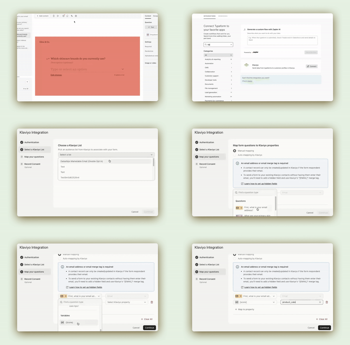
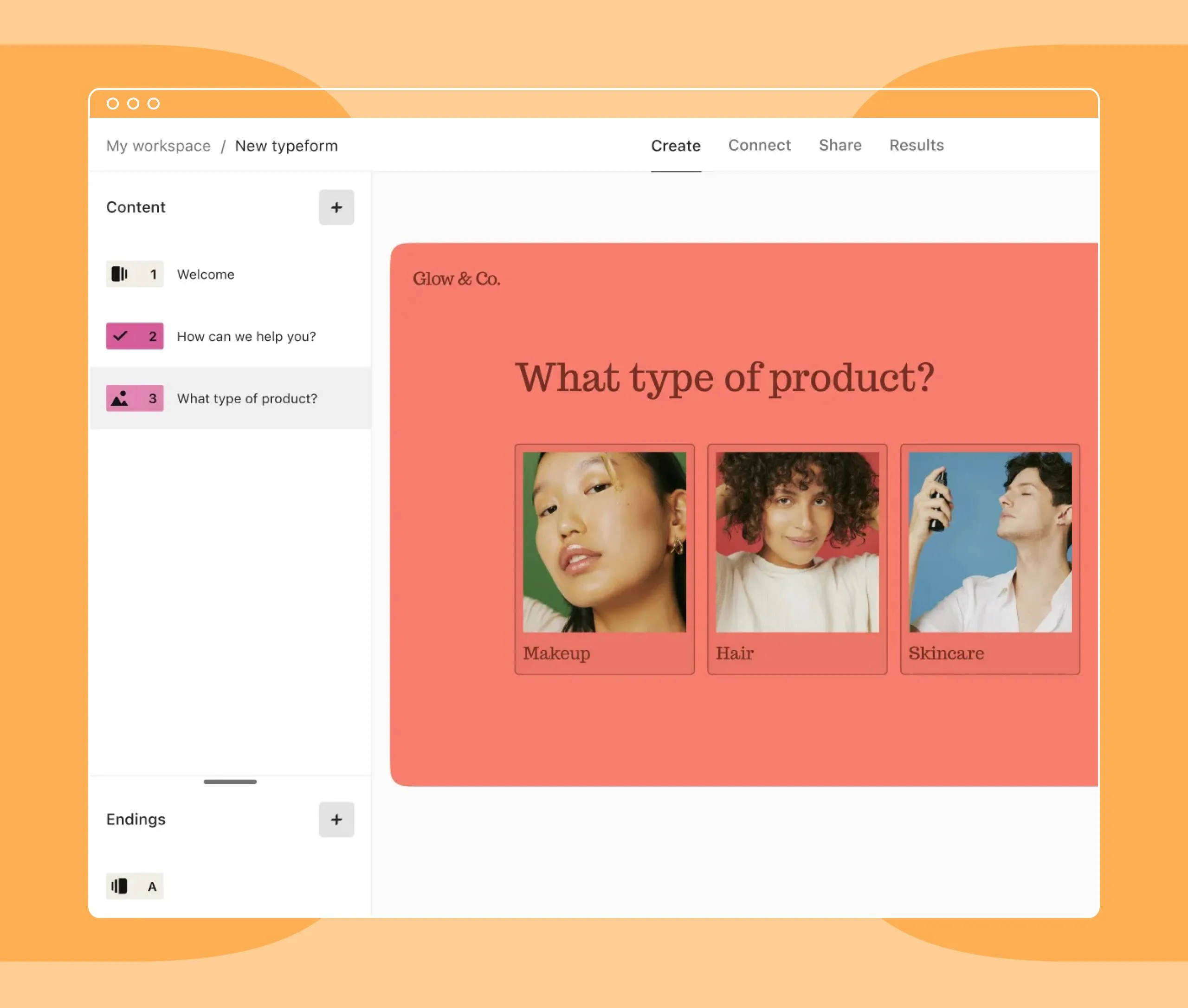
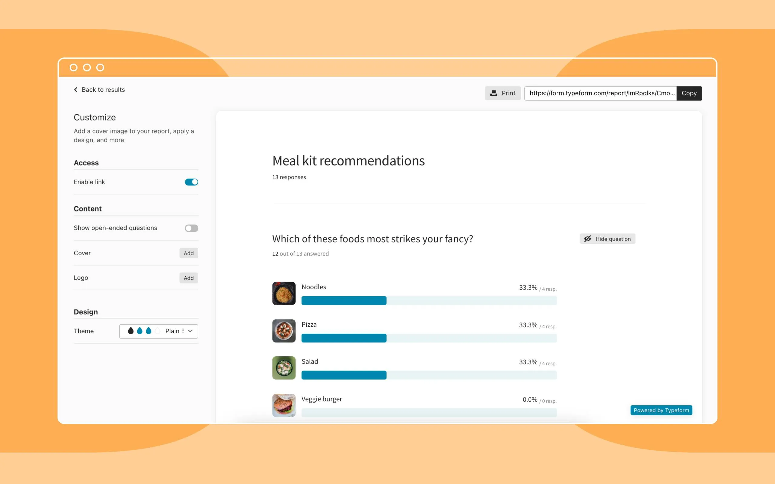
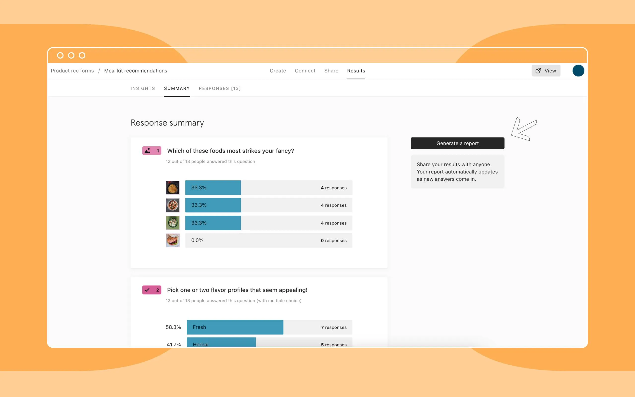
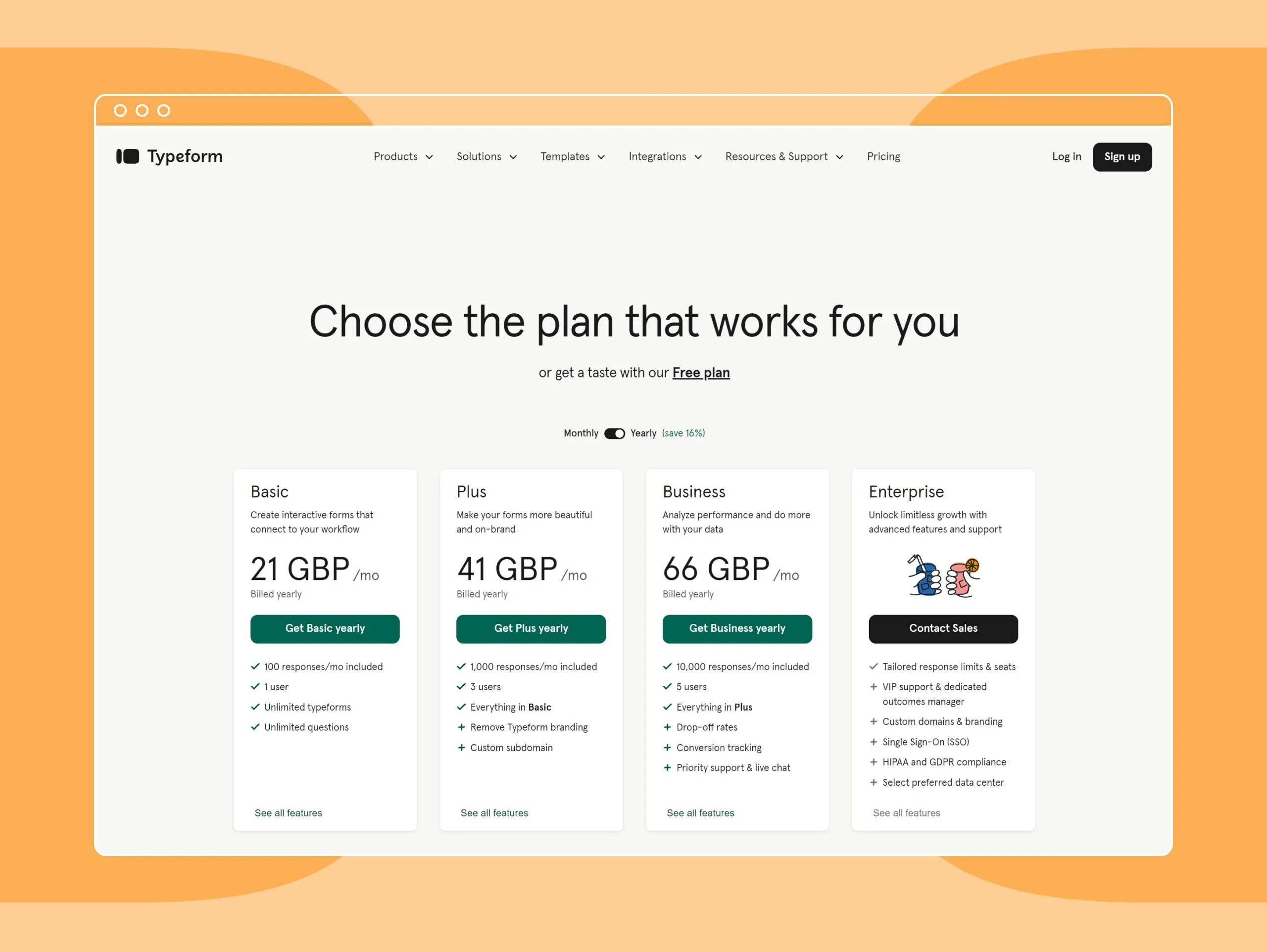
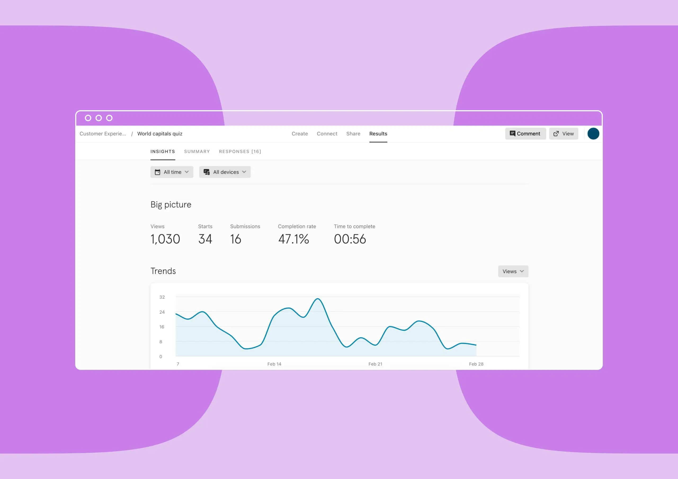
Our view at Stack - Typeform is our go-to software if we need to ask a set of structured questions of a group of customers, prospects or leads. In summary, Typeform combines aesthetics, functionality, and flexibility. User-friendly form builder with interactive design, versatile question types, real-time data collection, 500+ integrations, and diverse templates. Ideal for engaging surveys and lead generation.
The results are in. You’ve written the questions, found the right people to ask, and got your answers back—now what?
Perfect surveys sent to insightful respondents can become entirely useless if the results aren’t coherently and comprehensively analyzed..
So, don’t run and hide.
We know the phrase “survey data analysis” sounds technical and exclusive, but it’s not as scary as it seems. By following a few simple guidelines on how to analyze survey data, you can draw insights from it yourself.
What is survey data analysis?
Survey data analysis is the process of turning survey responses into compelling insights. This includes taking all of your collected data and transforming it into something actionable. Whether it’s open-ended essays, multiple-choice answers, or other questions to ask, you can take this information and uncover patterns and helpful insights.
Some survey data analysis methods include sorting data into categories and using statistical tactics to identify trends and patterns. The goal is to take these raw data responses and turn them into a clear story that answers your research questions to help you make informed decisions.
Getting started with survey data analysis
Before you get started crunching the numbers and performing a survey data analysis, there are a few pieces of information you need to gather.
First, you need to know the number of total respondents. This number will indicate how large your sample is and how much you can rely on your results. It’s always a good idea to gather people’s opinions, but if 5,000 people attended a concert and only five people answered your survey, you can’t really treat those five answers as representative of the whole group.
Secondly, you need to calculate your survey response rate. This is a straightforward percentage—calculate it by dividing the number of responses you received in total by the number of people you asked to fill out the survey. The higher your response rate and the higher your total number of respondents, the more you can trust your survey data to be representative of the sample as a whole.
How to analyze survey data
The first step when analyzing survey data is to turn your individualized responses into aggregated numbers. This sounds complicated, but really, it just means you need to do some counting.
For every question in your survey, you need to know the total number of people who answered with each response. Take a look at this example question:
By aggregating your responses, you’re simply counting how many people answered a, b, c, and d, respectively. If 100 people took your survey, the aggregated results would look something like this:
In the last six months: 30
Six months to a year ago: 40
One to two years ago: 20
Over two years ago: 10
Total: 100
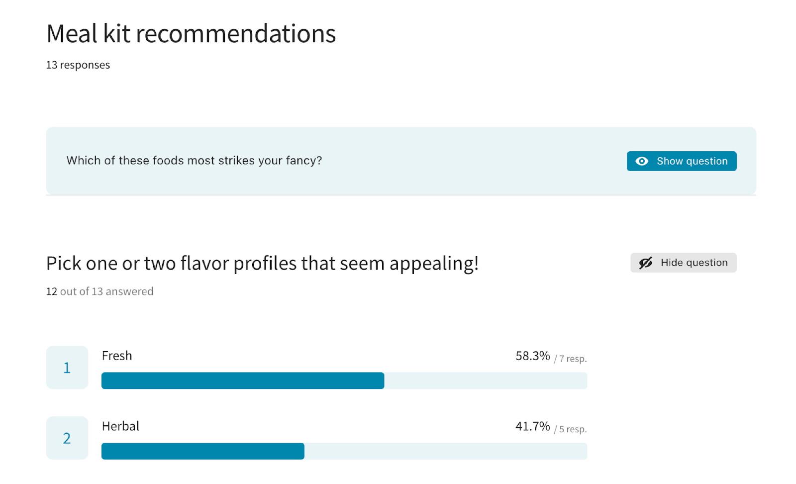
Now, if your survey was conducted through a survey host, your online survey results should be aggregated automatically, so there’ll be no need to add the numbers.
Qualitative vs. quantitative data
Once you have all of your aggregated answers, it’s time to start making some sense of the survey data.
Our brains can make sense of percentages much more quickly and easily than whole numbers. It’s also far easier to compare different percentages rather than whole numbers.
Say you wrote a survey asking 5-year-olds for their favorite colors. Just saying that 67 children chose red as their favorite color means very little. However, saying that 23% of the children chose red as their favorite color, compared to 50% who chose blue, gives you a much clearer indication of the relative popularity of one color.
If you’ve asked people to write feedback or long-form answers, leave these until the end.
You don’t want the qualitative data to bias your quantitative analysis. Focus on the numbers first, and hopefully, once you have a clear idea of what the sentiment is, the qualitative answers will be able to help you understand why that might be the case.
How to cross-tabulate survey data
Cross-tabulating your data is where you can really begin to draw insights from your survey results instead of just statistics. It can help you add context to your numbers and explore how different groups of people behave or how different factors might affect a single outcome.
When you plan your survey, you’ll have considered the different comparisons you’d like to make. For example, maybe you’d like to know if older people are more likely to enjoy eating olives.
Your question might be something like this:
Now, in the first round of your data analysis, you might have already divided the respondents into two groups to work out the split between people who like and don’t like eating olives.
So let’s say the results of this olive question were:
Like olives: 542 people (46%)
Dislike olives: 630 people (54%)
To cross-tabulate your data, you’ll need to map another variable onto this one.
We’re interested in whether tastes change with age, so let’s use that age as our second variable and ask:
With these results, you can plug them into a Google Sheet and start to see if there are any correlations:
Imagine you have a client who is looking at marketing their olive brand directly to people under 35. You could ask these two questions and look at the split between olive lovers and haters just within this subgroup and see how it compares to the overall average splits.
Benchmarking survey data
Data means very little to us without context and meaning. Turning your numbers into percentages makes comparisons easier, but although proportionally, we can recognize exactly what 75% means, how can we know if that is good?
The answer is benchmarks.
Setting benchmarks is key to making sense of the data and working out what those percentages really mean.
Some of the most common benchmarking techniques involve comparisons between this survey’s results and the data from the last time the survey was collected. To do this effectively, you need to make sure that you are comparing the results of the same question from each survey.
Setting a benchmark using last year’s data is easy. You simply take the percentage splits of responses to a certain question and treat these as your starting point. Then, you can easily see if this month’s data is above or below that benchmark.
Year-over-year or month-over-month comparisons are an excellent way of tracking progress. They allow you to see whether trends are emerging or how much responses have changed in a given period. This is known as longitudinal analysis.
If this is your first time collecting data, no worries, you can still set some benchmarks. Instead of comparing your results to last month’s or last year’s data, you can calculate the overall total split between responses for each question and treat this as your benchmark or baseline.
Once you begin to cross-tabulate and break your respondents down into further categories, you can compare their results to your benchmark to place their statistics in context.

If a value is higher than the average, we can say that this category is over-indexing, and if the value is lower, we can say that the category under-indexes. This gives some context to the statistics and starts letting you draw out some real insights from your survey data.
Why you need to analyze survey data
Quantitative data is extremely valuable when interpreting survey results. However, the numbers themselves are unlikely to provide a concrete answer as to why something happened or why people hold a certain opinion.
Understanding why respondents answered in the way that they did is when you can really start to address problems and make changes. This is where the real insight is born.
Sometimes, the “why” will be answered with direct questions in the survey and sometimes with multiple-choice boxes. Other times, it will be up to you as the survey analyst to determine causation, if possible. And this is where we need to be careful.
It’s easy to become sucked into a trap when analyzing survey data and start to see patterns everywhere. This isn’t necessarily a bad thing, as identifying a correlation between two variables is a key part of interpreting survey results. However, the danger is that we often make assumptions instead.
Assumptions about the data can be hopes or expectations, conscious or subconscious. However, realizing when we are making assumptions can help us avoid any problems further down the line and prevent us from wasting time.
Ultimately, no one wants to find out their assumptions were false after the survey analysis is complete. Similarly, you wouldn’t want a critical assumption to be false and never even realized.
Survey data analysis examples
Correlation occurs when two different variables move at the same time.
A classic example is the sale of seasonal products. During the summer, swimming pool and barbecue sales rise. When plotted on a graph, the two variables move in the same direction at the same time. However, there’s no direct connection between these two variables. People buying barbecues isn’t the reason the sales of swimming pools increase.
Causation, on the other hand, occurs when one factor directly causes a change in another factor.
For example, in the case of seasonal products, the weather is a key factor. As the temperature rises in the summer, so do barbecue sales. Barbecue sales here are a variable that’s dependent on the weather, and there’s a key link between them.
When interpreting survey results, it’s easy to mistake correlation for causation. Just because two variables move at the same time, it doesn’t mean that one is directly influencing the other.
This is where qualitative data comes in. If you’ve asked your respondents to fill in longer-form answers to explain why they chose a certain response, analyzing these answers can give you the insight you need to work out why.
How to report back on your survey data
When sharing your survey data analysis, remember that the story is what makes it interesting, not the numbers.
The percentages you’ve calculated are vital evidence for your argument, but your analysis needs a narrative to have a real impact on people’s thinking.
If you can, always provide context with your statistics, either comparing them to the same survey from last year or comparing groups of people in the same year’s data. Benchmark your numbers so that your audience is immediately aware of whether what they are seeing is positive or negative.
If you are unable to provide recommended actions based on your survey data analysis, at least signpost the key areas that need attention so the relevant parties can begin to tackle the problem if necessary.
When you visualize your data, remember that while long reports can be fascinating, most people won’t read them. Whoever you are presenting to is unlikely to want to listen or read as you walk them through your survey analysis methods step-by-step, so don’t feel like you have to include every single calculation you made in your report.
Put yourself in your audience’s shoes and determine their interests and priorities. Only give them the information if it is relevant to them, they will understand it, and there’s something they can do with this new information.

If Typeform is of interest and you'd like more information, please do make contact or take a look in more detail here.
Credit: Original article published here.