Our view at Stack - Simplify growth with an all-in-one platform. Powerful marketing, sales, and support automation. Integrated CMS. Scalable software. Crafted for customer experience.
You know those instantly recognizable logos like Nike’s swoosh? Even though we’ve all seen them hundreds of times, most people don’t truly grasp the full meaning of these designs.
There’s often more to them than meets the eye, and those little details make them even more special.
In this post, I’ll share 30 hidden messages in the logos of well-known brands. Each example will introduce you to a fresh perspective on the artistry and ingenuity behind these iconic symbols. But more importantly, you’ll learn different approaches to thinking about and designing meaningful logos.

Hidden Messages in Popular Logos
Here are some of the most thoughtfully crafted logo designs that convey hidden messages about the brand’s history, values, and vision.
1. FedEx
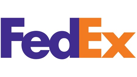
Image Source
FedEx started in 1973 as a package delivery company called Federal Express. Fast forward to 1991, and the company underwent its first significant rebranding, where it introduced a new logo and shortened its name to FedEx. Then, just three short years later, there was another rebrand where the company introduced the iconic FedEx logo we all know and love today.
But what makes FedEx’s current logo so special?
If you look closely between the “E” and the “X,” you‘ll spot a hidden arrow in the negative space. And that little arrow isn’t just a cool design trick.
It symbolizes FedEx’s relentless drive to move forward, commitment to speed, and the promise of efficiency in every delivery.
What I like: The ingenious use of whitespace proves that sometimes, less really is more. Instead of relying on flashy design elements, the designers capitalized on the negative space between the letters to embed a hidden message — a testament to their creativity and attention to detail.
2. Amazon
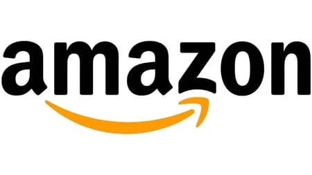
Image Source
Since its founding in 1994, Amazon has transformed from a humble online bookstore into a retail powerhouse. Similarly, the logo has undergone multiple transformations over the years and come a long way from the original combination mark design.
Today, Amazon’s logo features the company name boldly written in a sleek, black font with an arrow/swoosh underneath the text. While this logo may appear simple at first glance, cleverly hidden meanings are embedded within the design.
The connection between the letters “A” and “Z” in the logo is a nod to Amazon’s vast product catalog, suggesting they‘ve got everything “from A to Z”. It implies that whatever you’re looking for, Amazon is the place to find it.
The swoosh also doubles as a subtle representation of a satisfied customer’s smile and a reminder of Amazon’s commitment to delivering those positive shopping experiences.
What I like: Amazon’s logo is centered around the customer. Whether showcasing the breadth of Amazon’s product catalog or the company’s dedication to customer satisfaction, the logo is a visual embodiment of a commitment to meeting customers’ needs.
3. Baskin Robbins
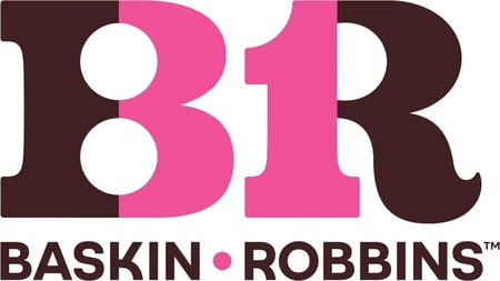
Image Source
Baskin-Robbins was created in 1953 through a merger between Burt Baskin and Irv Robbins. At the time, the company offered 31 ice cream flavors cleverly marketed as “one for each day of the month.” This concept became integral to their brand and featured in the brand logo.
The first three logo iterations saw the number “31” featured as a standalone element. However, in a 2006 brand refresh, this number was integrated into the letters B and R. Subsequent iterations have maintained this design, including a recent 2022 redesign.
While the number 31 may be less prominent in more recent logos, it remains a subtle tribute to the company’s roots.
What I like: Despite changes across various iterations, the logo pays homage to its heritage. But what’s most impressive is how it does it.
Maintaining the number “31” is a simple yet powerful tribute to where and how they started. However, integrating the number into the letters B and R reflects the company’s evolution.
4. Toyota
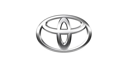 Image Source
Toyota began as Toyota Motor Sales in 1957. However, the current logo wasn’t introduced until 1989 as part of its 50th anniversary celebration. This logo, which took five years to develop, features three ovals, each with its own meaning.
The two interlocking ovals represent the trust and mutual benefit shared between Toyota and its customers, while the outer oval represents the brand’s global reach and impact. Additionally, the the ovals also form a letter “T,” which symbolizes trust or Toyota — depending on who you ask.
The background of the logo holds significance too. The space signifies Toyota’s values, which include a commitment to excellence, value beyond expectation, and the joy of driving.
What I like: Toyota’s logo manages to convey so much meaning with such simplicity. At first glance, it’s just three circles, but each one tells a story. The logo speaks to Toyota’s values and identity without overcomplicating itself.
5. Toblerone
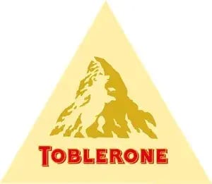
Image Source
Toblerone’s logo is a tribute to its Swiss origins.
The company was founded in 1908 however in 1970, the Matterhorn mountain was added to the packaging as a nod to Switzerland. But what makes this logo unique is the hidden silhouette of a bear on the side of the mountain.
The bear, a symbol synonymous with Bern, also known as the “City of Bears,” is a subtle tribute to the company’s birthplace. Its inclusion is a testament to Toblerone’s dedication to honoring its roots and preserving the traditions that have shaped its identity.
What I like: This is another interesting example of how a logo can be used to preserve and honor a brand’s history. In this case, it’s interesting how Toblerone uses visual elements to depict its Swiss origins.
6. Hyundai
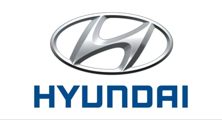
Image Source
Hyundai Motor Company was established in 1967 as part of the Hyundai Group. Since then, it has become a leading automobile manufacturer with one of the most recognizable logos worldwide.
But the Hyundai logo is much more than a sleek design.
At first glance, it looks like a simple slanted “H” inside an oval, but if you take a closer look, you might see two silhouettes shaking hands. These silhouettes represent Hyundai and its customers, symbolizing trust, reliability, and partnership.
The oval shape around the “H” also has a meaning. It is representative of the globe and symbolizes the company’s status as an automotive manufacturer with a strong global presence.
What I like: Recognizing the hidden message in the Hyundai logo requires a bit of imagination. This ambiguity sparks curiosity and invites viewers to engage with the logo on a deeper level.
As a marketer, I like how this provides a unique storytelling opportunity where the logo can become more than just a visual symbol.
7. Cisco
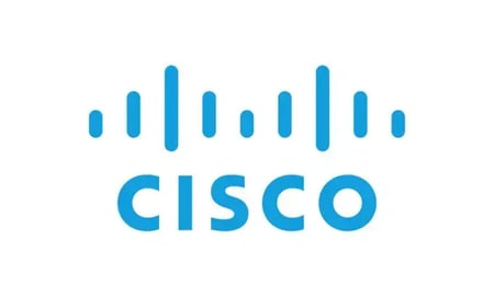
Image Source
This logo currently features a wordmark of the company name alongside a stylized graphical element. But what makes this logo unique is the significance behind its graphics.
The blue stripes in the logo are not just design elements; they represent magnetic waves reflecting Cisco’s business in networking and routing technologies.
But what’s even more interesting is that they also pay homage to the pillars of the Golden Gate Bridge. This landmark inspired Cisco’s first logo and has been consistently used as a central visual motif.
What I like: It‘s interesting to see how a structure has played such a significant role in shaping the design of a global technology company’s logo. The fact that the bridge has remained a central element in the logo‘s design across different iterations over the years speaks volumes about its influence on Cisco’s brand identity.
8. Vaio
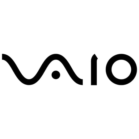
Image Source
VAIO is a personal computer manufacturer that was introduced in the late 90s. It’s also one of the most well-known computer brands recognized for its distinctive logo. But, while the logo may appear to be a simple wordmark spelling out the business name, it actually holds a deeper meaning.
Consider the logo as two distinct parts rather than a single word.
“VA” is designed to resemble a sine wave, symbolizing analog technology. In contrast, “IO” represents digital technology, with its shape resembling the binary code “10.” Then, put together, this logo symbolizes the transition from analog to digital technology.
What I like: Vaio’s logo is more than just a design — it’s a narrative. It cleverly presents two concepts and seamlessly combines them to tell a story — all within the confines of a single wordmark.
9. Beats by Dre
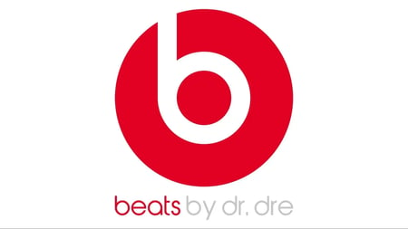
Image Source
Beats by Dre is the brainchild of music legend Dr. Dre and music industry executive Jimmy Iovine. The company has been incredibly successful since its launch in 2006, making it one of the most prominent audio brands on the market.
The company logo, which incorporates a unique graphic element and a bold wordmark, is also one of the most recognizable brands in the world.
But, what many people don’t know is that there’s more to the logo than a “b in a red circle.”
Upon closer inspection, the Beats by Dre logo looks remarkably similar to a person wearing headphones. The red circle in the logo cleverly doubles as the head, while the lowercase b forms the shape of the earphones.
What I like: I find the logo‘s simplicity and directness in representing the brand’s core product refreshing. It‘s also quite obvious, to the point that users who don’t notice it often find it amusing when someone finally points it out to them.
10. Hershey’s Kisses

Image Source
Hershey’s was established in 1890 as the “National Chocolate Tablets.” However, the company was renamed after the founder in 1989. This was also when the “Hershey” name began featuring in the brand’s logo.
The Hershey’s Kisses chocolate line was first introduced in 1907 with a logo that featured the full product name and images of chocolate “kisses”. Over the years, the logo has undergone several changes, with the most recent version introduced in 2010.
Now, while there hasn’t been any official confirmation about the hidden message within this logo, several fans strongly believe that there is a hidden chocolate between the “K” and “I” in the word “KISSES” in the Hershey’s Kisses logo.
Whether this was deliberate or a coincidence of typography, no one can say for certain except the company itself. However, it is a fun detail that adds to the charm of the Hershey’s Kisses brand.
What I like: The hidden meaning behind the Hershey’s Kisses logo is mostly a fun and engaging fan theory — like several on this list. While there might not be an official confirmation from the company, I believe they’re still highly effective because they turn potentially mundane details into opportunities for discovery and intrigue.
11. Unilever
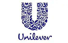
Image Source
Unilever was founded nearly a century ago in 1929. In 2004, the company refreshed its brand and introduced a new logo designed by Wolff Olins.
But this wasn’t just any logo. Instead, it featured 24 icons intricately woven to form the letter “U,” which represents Unilever. Each icon symbolizes a different aspect of Unilever‘s values and embodies various elements of the company’s ethos.
For instance, the chili pepper icon signifies Unilever‘s dedication to sourcing agricultural materials sustainably. And this is just one of the icons representing Unilever’s efforts to “make sustainable living commonplace.”
What I like: Unilever has an incredibly diverse portfolio that spans a range of industries. Creating a cohesive brand image through a single logo is no easy feat.
That’s why this logo is such a great demonstration of how thoughtful design choices can be used to communicate the essence of multifaceted brands.
12. Carrefour
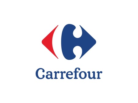
Image Source
Carrefour is a French supermarket chain established in 1958. The first iteration of the company’s logo was introduced in 1960 and featured a graphical representation of Crossroads. This logo’s design was rooted in the brand’s name, which translates to “crossroads” in English.
This concept has continued as a central motif of Carrefour’s logo through every iteration since then, with the current design featuring two arrows pointing in opposing directions.
Besides embodying this idea, these arrows also contain a hidden message within the negative space they create. Upon closer inspection, one can see that the space between the two arrows forms a subtle yet unmistakable “C,” representing the brand’s initial.
What I like: I appreciate brands that can creatively use negative space in their logos.
Carrefour is a great example of how to do this right without overcomplicating things. This element adds a subtle touch that reinforces the brand’s identity without being overt or flashy.
13. Pittsburgh Zoo

Image Source
Pittsburgh Zoo & Aquarium opened to the public in 1898. Since then the zoo has gone from an “animal menagerie” to a conservation-focused institution.
The zoo’s logo currently features the image of a tree above a wordmark of the institution’s name. And while the tree might seem like the focal point of this design, there’s more to it than meets the eye.
On closer look, you can see four animals within the logo — the most obvious being the birds flying above the tree. But, what makes it truly interesting is examining the whitespace in the design.
The spaces to the left and right of the tree form the profiles of a gorilla and a lion. At the base of the tree, you can also see two fishes that appear to be jumping out of water.
These four images symbolize the wildlife found at the Pittsburgh Zoo & Aquarium.
What I like: You don’t get to see white space used this creatively often. I really enjoy how this logo pulls several complex images into a single design without visually overwhelming the viewer.
14. Roxy
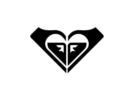
Image Source
Roxy was launched as a female clothing line under the Quicksilver brand, and the company’s logo was designed to reflect its connection, albeit subtly.
At first glance, the logo depicts two hands cupped together to form a heart shape. However, upon closer inspection, eagle-eyed viewers will notice that the logo is two rotated Quicksilver emblems facing each other, creating the illusion of a heart shape.
It’s also interesting to note that the inspiration for the Quicksilver logo, and subsequently Roxy’s, comes from the famous Japanese artwork “The Great Wave off Kanagawa” by Katsushika Hokusai. This iconic image features a towering, cresting wave with Mount Fuji in the background.
Both logos are simply modern interpretations of this artwork.
What I like: Roxy’s logo pays homage to its parent company in an exciting way. That said, how the emblems were incorporated into the logo allows the brand to maintain a unique identity separate from Quicksilver.
15. Tostitos
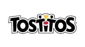
Image Source
Tostitos debuted under the Frito-Lay brand in 1979 and quickly became popular as the snack of choice for many social gatherings and parties. The branding has remained consistent since its inception, with the earliest version featuring a wordmark of the company name “Tostitos.”
Now, while the Tostitos logo has maintained its wordmark style, a redesign in 2003 added an intriguing element to enhance its visual storytelling.
At first glance, the logo appears as a simple wordmark featuring the brand name in a bold, modern font. However, a closer look reveals a clever visual trick embedded within the typography.
The “tit” in the typography forms an image of two people sharing chips and salsa. The two “t’s” represent the people, the “i” likely symbolizes a table, the yellow shape signifies the chips, and the red oval represents the salsa.
What I like: This design cleverly captures how Tostitos is typically enjoyed – within social settings. As the brand describes, “Tostitos are more than just tortilla chips and dips — they’re an invitation to catch up with friends.”
16. Tour De France
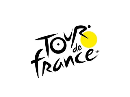
Image Source
The Tour de France has come a long way since its inaugural race in a Parisian suburb in 1903. Likewise, the logo has undergone significant changes, transitioning into a more vibrant design that reflects the race’s energy and excitement.
The current Tour de France logo was designed by Joel Guenoun in 2002. While seemingly simple at first glance, the logo features hidden imagery that adds depth to its design. The letter “R” in the logo, combined with the yellow circle, cleverly resembles a cyclist leaning over a bike.
This subtle yet effective design element not only captures the essence of the Tour de France but also celebrates the spirit of its participants.
What I like: The Tour de France logo incorporates elements of the event and the sport. Adding this creative detail not only represents the race but also captures the excitement and spirit of cycling.
17. NBC
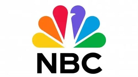
Image Source
NBC was founded in 1926 as America’s first permanent radio network. By the 1930s, the company had started a regularly programmed television service and introduced the country’s first experimental compatible color broadcasts in 1953.
In 1956, NBC debuted the colored peacock design, which has inspired the most recent iterations of the company’s logo.
The current logo features “feathers” arranged in a semi-circle. However, unlike earlier versions, the peacock outline is cleverly hidden within the white space between the two central colors.
While the logo might look like a simple rainbow of colors to unknowing viewers, this stylized peacock represents NBC’s history and legacy.
Fun fact: The peacock was originally chosen as NBC’s logo in 1956 because the network was one of the first to broadcast in color. The peacock symbolizes this transition.
What I like: NBC has experimented with various logo designs. The original peacock logo and its recent iterations stand out to me as some of the most authentic representations of the brand and its legacy.
The modern redesign has allowed the brand to add more visual interest without losing the essence of this iconic design.
18. Audi
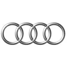
Image Source
Auto Union AG was formed in 1932 and renamed Audi in 1985. Upon its inception, the company introduced a logo featuring four rings, which have since become a fundamental part of the brand identity.
But what exactly do these rings represent?
Most people, except for automobile history buffs, might assume that the rings were simply an elegant design choice. However, they have a much deeper, historic meaning.
Audi was just one of four companies merged to form Auto Union AG. The four rings represent the four automobile manufacturers and the partnership between the four founder companies.
What I like: Audi’s logo is a tribute to the legacy of all the founder companies. It reflects their contributions to the automotive industry and, more importantly, their lasting impact on Audi’s identity.
19. Spartan Golf
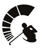
Image Source
The Spartan golf logo was created by a designer called Richard Fonteneau.
At first glance, the logo appears to be a depiction of a golfer mid-swing. However, closer inspection also reveals a hidden image.
If you look closely at the logo, you‘ll notice that the image creates the appearance of a Spartan warrior’s side profile. The golfer‘s body forms the warrior’s face, and the trajectory of the swing mimics the shape of a Spartan helmet.
This logo cleverly integrates the hidden image in a manner that may not be immediately apparent to viewers. However, it becomes a brilliant addition that enhances the overall design once noticed.
What I like: What stands out to me about the hidden image in the Spartan Golf logo is how it beautifully represents the brand’s identity and team spirit. The image is a nod to the brand name “Spartan” and a visual representation that evokes strength, resilience, and the warrior ethos.
20. Goodwill
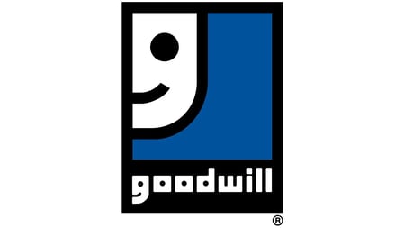
Image Source
Goodwill was established in 1902 by Rev. Edgar J. Helms. In 1968 the company began hunting for a new logo — an updated visual to reflect the institution’s evolution after over 50 years of operation.
The current logo, created by graphic designer Joseph Selam, was designed to “symbolize the many faces of self-sustaining people within Goodwill.” This redesign marked the introduction of the iconic “Smiling G.”
At first glance, Goodwill’s logo is the company name below a stylized ‘g’ graphic representing the brand.
While that is correct, there’s also a hidden image — both lowercase ‘g’s’ double as smiley faces. Joseph deliberately designed the logo to depict “the smile of self-respect and independence” of people who have successfully participated in Goodwill initiatives.
What I like: The logo reflects the organization’s core mission and the transformative effect of Goodwill’s work. It‘s a powerful visual cue that shows that it’s not just about providing jobs or skills but also restoring hope and self-confidence.
21. London Symphony Orchestra

Image Source
The London Symphony Orchestra (LSO) has a long and rich history, dating back to its formation more than a century ago in 1904.
A design agency called The Partners created the current version of the orchestra’s logo in 2004. This design features a stylized depiction of the company’s Acronyms, LSO, and a hidden image.
If you look hard enough, you’ll see that the graphic also doubles as an image of an orchestra conductor’s silhouette. The letters “L” and “O” form the conductor’s left and right hands, while the intersection of the “S” and “O” creates the head and shoulders.
What I like: The hidden image and overall design beautifully reflect the elegance and sophistication synonymous with the brand. The flowing lines of the logo also create a sense of movement and harmony which is a great visual representation of the orchestra’s music.
22. Pinterest
Image Source
Pinterest’s logo has significantly changed since the platform’s creation in 2010. Initially, the company used a black cursive wordmark. However, a few months later, it introduced the now-iconic “P” as part of a refreshed, colored wordmark.
This design element goes beyond simply representing the company name but also references the platform’s core functionality.
If you’ve ever noticed how the tail of the p looks sharpened well, it’s because the “p” in the logo doubles as a map pin. Essentially, by incorporating a visual element reminiscent of a pin, Pinterest directly references the concept of pinning on the platform.
What I like: As a visual platform, it‘s only fitting that Pinterest’s logo is a cleverly designed visual representation of its core functionality. I think this makes the logo memorable and reflects the company’s essence.
23. Adidas
Image Source
Adidas is a unique example of a company that uses several logos for its various sub-brands. However, the “performance logo” is currently its main brand mark.
The signature three stripes on this logo have been a prominent feature since the first Adidas logo design in 1949. Interestingly, there wasn’t any specific reason behind choosing three stripes, other than the fact that three showed up most prominently (amongst contenders) in photography.
The current version of this logo is an element of the “equipment logo,” which reimagined the three stripes as a three-bar arrangement. This design was inspired by sketching how the stripes appeared inside the shoe.
Today, the performance logo is fondly called the “Mountain Logo” due to its resemblance to a mountain peak, which represents the challenges athletes face and the goals they strive to achieve.
What I like: The history behind the logo, with its origins in the three stripes that have been a part of Adidas since its inception, adds depth and heritage to its design.
24. Coca-Cola
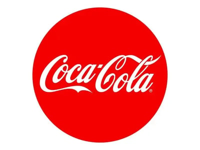
Image Source
Throughout its existence, Coca-Cola‘s logo has consistently featured a wordmark of the company’s name. The current iteration of this design doesn’t deviate from this principle, albeit with adjustments to the script and styling.
But what secret message is hidden in this simplistic logo?
Well, if you look closely at the space between the “O” and “L” in Cola, you’ll see the flag of Denmark. Or at least that’s what people have chosen to believe.
This theory is often debunked as a happy accident rather than an intentional design decision. That said, the company has embraced the association with the “happiest country on earth” through marketing stunts like an interactive airport ad in Denmark some years ago.
What I like: It’s fascinating to see how a logo can take on new meanings and associations through the imagination of its audience. The company’s willingness to lean into this “theory” also demonstrates a responsiveness to the sentiments of its audience.
25. LG
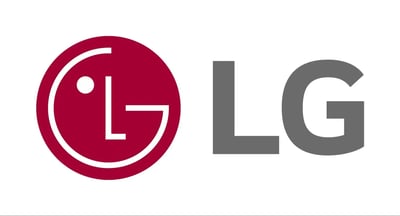
Image Source
According to LG, the company’s logo visualizes five concepts — World, Future, Youth, Human, and Technology. The design, which features the letters “L” and “G” within a circle, also visually signifies that the people “form the center of corporate management.”
Official interpretations aside, LG’s logo also contains a hidden image that some may not have noticed yet: it doubles as a stylized depiction of a human face.
The “G” forms the frame of a winking face, while the “L” represents the nose. The face also appears to be winking and smiling.
What I like: Incorporating a stylized human face adds an unexpected touch of warmth to the design. Additionally, it serves as a reminder of the humanity behind a large corporate entity like LG.
26. Hartford Whalers

Image Source
The Hartford Whalers were a professional ice hockey team based in Hartford, Connecticut, that competed in the National Hockey League (NHL) from 1979 to 1997.
The original logo of the Hartford Whalers was created by graphic designer Peter Good when the team changed its name in 1979. The logo featured a blue whale tail positioned above a green, stylized “W” representing the word “Whalers.” Peter also included a hidden element in the space between the whale’s tail and the “W.”
The negative space takes the shape of the letter “H,” symbolizing Hartford, the city where the team was located. Combined with the “W,” this hidden “H” completes the full team name, Hartford Whalers.
What I like: Typically, I see whitespace used to reveal distinct elements in a design — a great example being the FedEx wordmark, where an arrow is hidden within the negative space. But here, the logo uses one letter to reveal the other.
27. Museum of London
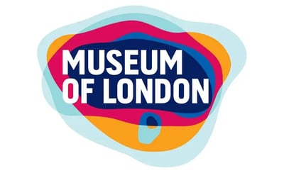
Image Source
The Museum of London introduced a new logo during a 2008 rebranding project — a colorful and innovative design by a UK agency called Coley Porter Bell.
This logo, still used today, features several layers stacked atop each other. But, while visually engaging, the true brilliance lies in the significance behind these layers.
The logo uses each layer as a representation of London‘s ever-changing geography. This hidden image reflects London’s evolution and dynamic nature making it the perfect emblem for the Museum of London‘s mission to safeguard and celebrate the city’s past.
What I like: The logo mirrors the essence of the museum. Much like the museum, the logo serves as an invitation to explore history. Essentially, the logo is a perfect introduction to the Museum of London.
28. Wendy’s
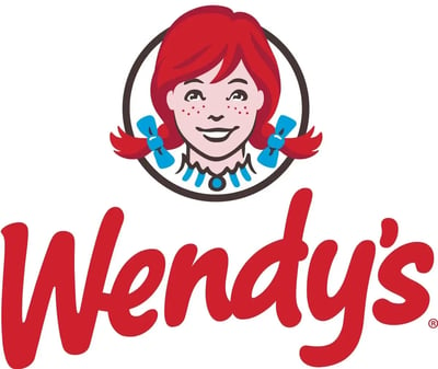
Image Source
Wendy’s was founded by Dave Thomas in 1969 as a quick-service food chain. The company’s first logo featured the likeness of Melinda Lou, Dave’s daughter, and has continued in that tradition ever since.
While this fact alone makes the logo incredibly intriguing, the hidden message within the design adds an extra layer of interest.
For several years, it has been widely believed that the collar on the little girl in the most recent iteration of the logo spells out the word “mom.” However, this has never been officially confirmed.
Like Coca-Cola, Wendy’s is another example of an ‘audience-led’ logo theory.
What I like: Despite the absence of official confirmation, the continued acceptance of this interpretation demonstrates the power of an audience’s perception in shaping the meaning of a logo. It also highlights how viewers can engage with and imbue logos with personal significance.
29. Chick-fil-A
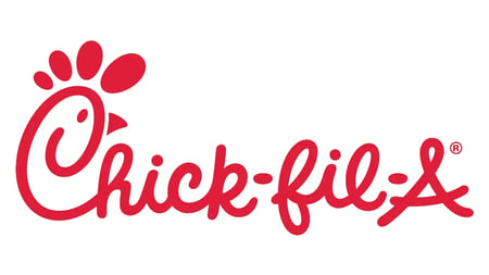
Image Source
Chick-fil-A’s origins date back to 1946, when it started as a restaurant named The Dwarf Grill. Over time, the business rebranded, with the first Chick-fil-A restaurant opening in 1967.
Now, while the hidden meaning in this logo may not be as discreet as some others, it’s still worth noting.
The design of the “C” in Chick is a subtle yet clever nod to the brand’s main offering. Simply put, it’s intentionally shaped to resemble the head of a chicken, the company’s core product.
What I like: While the hidden message may be more obvious than most other logos on this list, its simplicity makes it easy for viewers to spot and quickly associate the imagery with the brand. This immediate recognition strengthens brand association and reinforces the brand‘s identity in consumers’ minds.
30. Kolner Zoo
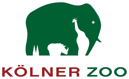
Image Source
The Kölner Zoo was founded in 1860. The primary visual element in the organization’s current logo is the image of an elephant walking forward.
What makes this logo interesting is how, similar to Pittsburgh Zoo, the design also hides the silhouettes of other animals within the image.
In this case, you can see a giraffe between the elephant’s trunk and front leg, a rhino between its front and back legs, and finally, what appears to be a rabbit’s ears between its hind legs.
What I like: The logo uses negative space concentrated at the bottom of a single image to create three separate images. The designer’s ability to achieve this without compromising the integrity or form of the original image is quite impressive.
Designing a multilayered visual experience
Subtle elements not only add depth to designs but also invite viewers to engage in a deeper understanding of the brand’s identity. Whether it’s the clever integration of icons or the strategic use of whitespace, each logo in this post is a testament to the thoughtfulness and creativity behind effective visual communication.
Editor’s note: This post was originally published in November 2014 and has been updated for comprehensiveness.

![]()
If Hubspot is of interest and you'd like more information, please do make contact or take a look in more detail here.
Credit: Original article published here.


![→ Download Now: Free Product Marketing Kit [Free Templates]](https://no-cache.hubspot.com/cta/default/53/08b5e1f4-5d26-405b-b986-29c99bd0cb14.png)
















![→ Click here to download our free guide to hiring and training a team of all-stars [Free Ebook].](https://no-cache.hubspot.com/cta/default/53/c42148d7-13dd-4c38-b907-cff1602ee62f.png)


![Download Now: Free Marketing Plan Template [Get Your Copy]](https://no-cache.hubspot.com/cta/default/53/aacfe6c7-71e6-4f49-979f-76099062afa0.png)




 Image Source
 Image Source

![Download Now: 3 Community Management Templates [Free Kit]](https://no-cache.hubspot.com/cta/default/53/866a5201-b39e-4edb-9e7f-65c0d98a9ea0.png)
 Align targets with your company resources.






![→ Download Now: The Beginner's Guide to Email Marketing [Free Ebook]](https://no-cache.hubspot.com/cta/default/53/53e8428a-29a5-4225-a6ea-bca8ef991c19.png)





![Download Now: Complete Guide to Collaborating at Work [Free Guide + Templates]](https://no-cache.hubspot.com/cta/default/53/7b7e92ee-1d6f-46e1-a984-3c0aa19eb448.png)




![→ Click here to access 5 free cover letter templates [Free Download]](https://no-cache.hubspot.com/cta/default/53/3f347702-d7e9-4e59-9fe4-be4cd7bad191.png)











![Download Now: The State of U.S. Consumer Trends [Free Report]](https://softwarestack.tech/wp-content/uploads/2024/04/ebf9ec8e-a468-455a-943e-80aa4e6be694.png)



![→ Free Download: Social Media Calendar Template [Access Now]](https://no-cache.hubspot.com/cta/default/53/3e56e15d-47bd-46c9-a256-99fde52abfe7.png)
 Image Source
