• Skip to primary navigation
  • Skip to main content
software stack logo

Software Stack

Get your Software Stack together

  • Knowledgebase
    • All Categories
    • Accounting Software
    • Automation & Workflow Software
    • Customer Relationship Management
    • E-Commerce Shopfronts & Payments
    • Marketing Automation
    • Online Courses & Membership
    • Project Management
    • Surveys & Forms
    • Web Hosting
  • Home
  • About Us
  • Contact Us
  • Show Search
Hide Search

automation-software

How CTOs can future-proof their tech stack with a modern CMS

Software Stack Editor · July 17, 2025 ·

image

Even though content is increasingly critical in driving business outcomes, CTOs still don’t treat content management systems (CMSs) as a strategic technical asset.

Without a modern CMS in place, CTOs end up investing significant engineering resources in maintaining existing systems and websites rather than building new capabilities or innovative experiences. Development teams are constantly juggling security patches, plugin updates, server maintenance, compliance requirements, and content performance optimizations — just to keep the lights on. This creates a “maintenance-first” mindset that forces CTOs to be reactive rather than strategic when choosing a CMS. 

To overcome this mindset, CMS providers have introduced new offerings to reduce maintenance overhead, but these often create new trade-offs. For example, headless CMSs and digital experience platforms (DXPs) promise maintenance efficiency through minimal plugin dependencies and modular architecture, but limit marketing agility and creative freedom. This leaves CTOs in a lurch: should they prioritize lower maintenance overhead or operational velocity and flexibility? 

With Webflow’s Website Experience Platform (WXP), CTOs don’t have to choose — they can finally treat their CMS as strategic infrastructure. The platform handles security, performance, and updates automatically, while giving marketing teams the independence to publish or update content without requiring significant engineering resources, freeing up bandwidth for innovation.

What CTOs need from a CMS

For CTOs, a CMS is a critical component of their technical infrastructure, providing marketing agility (e.g., quickly shipping content, viewing campaign analytics) without introducing significant technical risks, resource allocation concerns, and operational overhead (e.g., performance challenges, security breaches). Specifically, they want: 

  • Minimal maintenance overhead: A CMS that’s easy to integrate and maintain saves development time on tech debt or maintenance. This makes it simpler for CTOs to staff against the CMS and manage budgets, creating room for innovation. 
  • Enterprise-grade performance and scalability: As traffic grows, CTOs want a CMS that scales with them, rather than requiring custom database optimizations or hosting management. 
  • Built-in compliance and security: Many teams lack the expertise to handle specialized security and meet standards such as GDPR or SOC2. Therefore, CTOs want a platform that already meets these requirements. 
  • Seamless collaboration: Modern teams need real-time collaboration capabilities to effectively work together and ship more quickly, rather than stringing together other tools. 
  • Developer-friendly APIs: To innovate, development teams need full-featured, developer-friendly APIs to extend CMS functionality and integrate with other key systems. 

Common CMS challenges CTOs face

Unfortunately, most CMSs fail to meet the above requirements. Instead, CTOs must navigate persistent scalability and security concerns, tech debt, cross-functional collaboration friction, and limited integration flexibility. 

Performance and scalability constraints

As traffic increases, many websites encounter performance constraints, leading to slow page loads that negatively impact conversion rates and SEO rankings. There’s also a risk of downtime, which can cost as much as $1 million per hour for large enterprises. 

Some development teams solve this problem by modifying core CMS files or adding performance optimization plugins. However, this patchwork solution requires deep expertise and results in fragile systems that can break during updates (creating more technical overhead) or limit functionality (limiting marketing agility). 

Additionally, as content volume grows, marketing teams might struggle to manage their content pipeline independently. As a result, CTOs need to make staffing tradeoffs between supporting marketing teams or slowing down marketing initiatives (which can have a negative business impact).  

High maintenance overhead and technical debt

Traditional CMSs are often built on legacy systems (like old PHP codebases) and rely heavily on plugins and integrations to extend basic functionality. As a result, the CMS becomes a complex web of patches, plugins, and custom code, forcing development teams to manage compatibility across dozens of components that were not designed to work together. For instance, CMS core upgrades are rarely simple tasks, requiring a backward compatibility audit of all the plugins, themes, and custom integrations, as well as workarounds for any incompatibilities. 

This maintenance overhead also extends to hosting. Traditional CMSs often require development teams to manage their entire hosting stack, including maintaining web servers, databases, and runtime environments, to ensure optimal performance and security. Teams are also responsible for backup and disaster recovery planning, including setting up automatic backup and monitoring (and fixing any issues). 

As a result, CTOs must invest more engineering resources and budget towards servers, premium plugins, and security tooling to keep the existing CMS functional. Over time, this makes seemingly affordable solutions expensive. 

Security and compliance risks

CMS platforms present attractive targets for attackers because a single vulnerability can simultaneously impact thousands of websites. Further, these systems are often built on open-source frameworks, which makes it easy for attackers to study the code and uncover vulnerabilities. This results in a persistent security risk: according to research by Storyblok, 32% of enterprises suffer a CMS-related security breach every single week.

Therefore, CTOs must allocate engineering resources to continually monitor threats across CMS platforms and third-party plug-ins and patch any discovered vulnerabilities. However, many teams lack the expertise or bandwidth to handle all of these responsibilities at onc, creating gaps that increase the likelihood of a security breach. When breaches occur, the consequences are severe. On average, a breach costs $4.88 million while damaging the brand’s reputation (which can take years to rebuild). 

Additionally, traditional CMS platforms weren’t designed with modern regulatory compliance in mind. They lack built-in support for meeting the key requirements of regulations such as GDPR, HIPAA, and SOC2. For example, these platforms can’t typically generate audit trails showing who accessed what data or handle user deletion requests, required by GDPR. 

Limited integration and API support

Marketing teams often want to add third-party integrations (like a CRM, analytics software, and automation tools) to measure outcomes of campaigns and iterate on marketing strategy. However, traditional CMSs have limited plugins and APIs that don’t fully support the marketing integration use case. To bridge this gap, CTOs must allocate significant resources to build and maintain custom integrations, which takes away resources from innovation and core product development. 

For example, let’s say that the marketing team wants to build a personalized experience to show customized content based on visitor attributes (stored in a CRM). This would require custom development to integrate the CRM and CMS, unless the CMS supports content personalization based on CRM data. 

Cross-functional collaboration friction

Modern marketing, design, and development teams must collaborate effectively to ship content quickly. Oftentimes, teams work across multiple tools: Slack for communication, Figma for design handoffs, Google Docs for content review, and email for final approvals. This creates a fragmented workflow where important details get lost between platforms, resulting in inefficient handoffs and miscommunication, which can introduce or deepen cross-collaboration friction. 

To avoid this challenge, teams can use real-time collaboration tools to work together directly in the CMS. However, most traditional CMSs lack in-built support for handoff workflows, version history, or collaborative editing, making it challenging to create streamlined workflows. For CTOs, this results in decreased developer productivity and slower velocity. 

How Webflow solves common CMS challenges

Traditional CMSs force CTOs into an impossible choice: reduce maintenance overhead to free up developer resources for innovation, or enable marketing teams to move quickly and independently. 

Webflow eliminates this tradeoff through an integrated platform that automatically handles security, performance, and compliance while empowering marketing teams to publish or update content independently. As a result, development teams can focus on innovative projects and website experiences in and out of the CMS, treating it more like a strategic asset rather than a burden. Other benefits include: 

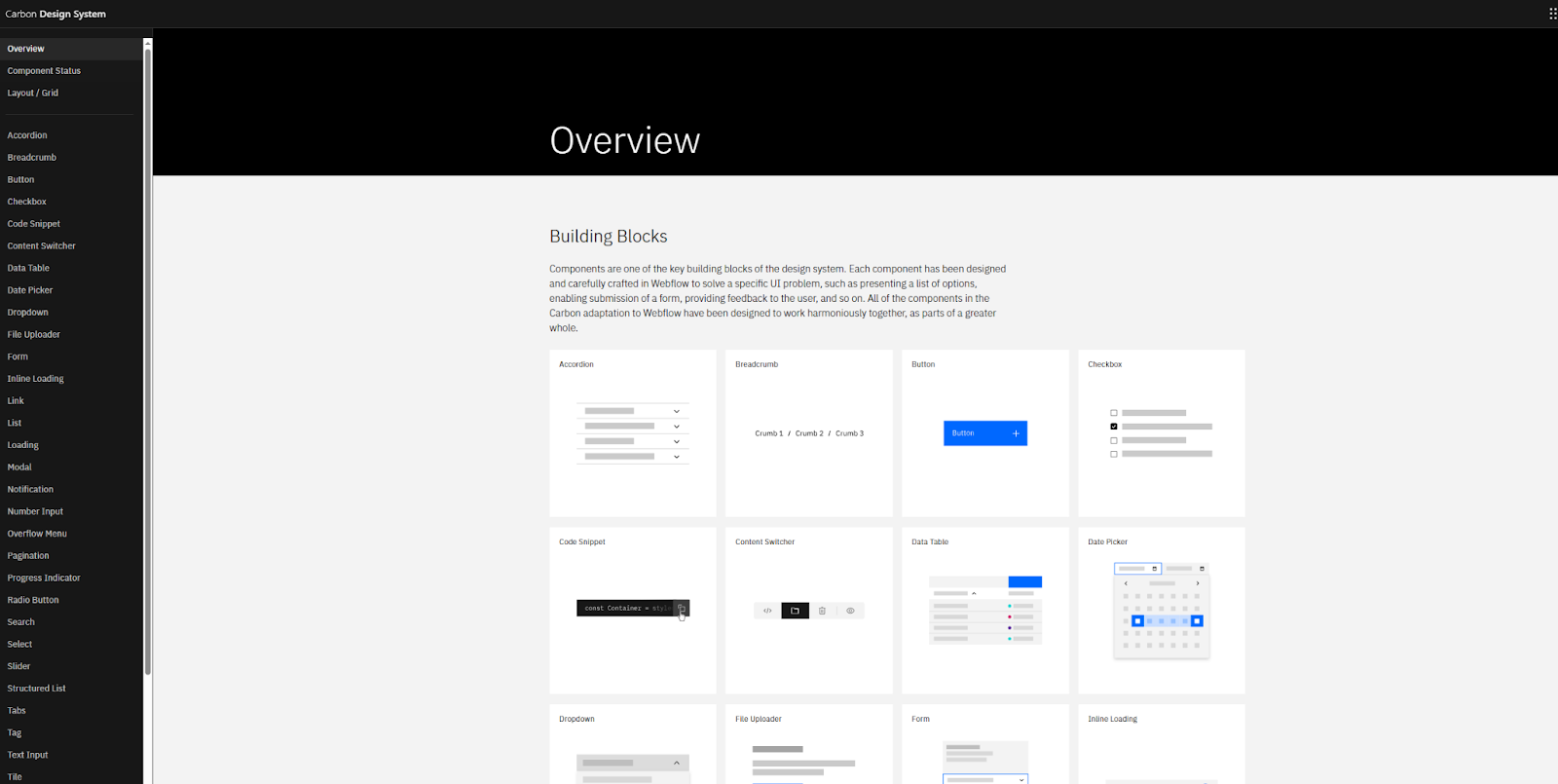
  • Consolidated platform: Everything in Webflow lives in one integrated platform, eliminating the constant cycle of plugin updates, security patches, and compatibility fixes that plague traditional CMSs. The platform simplifies the tech stack, as organizations no longer need subscriptions for other design, CMS, hosting, and optimization tooling. This translates to cost savings with some Webflow customers reporting savings of up to $850,000 by decommissioning outdated systems, eliminating subscription costs, and reallocating resources. 
  • Reduced engineering tickets: Webflow’s visual, composable CMS empowers marketers to create and update content without developer support. As a result, engineering teams can focus on core product development and innovation, leading to faster deployment cycles and measurable business value. 
  • Built-in security and compliance: Webflow is backed by enterprise-grade security, including SSO, advanced DDoS protection, a reliable hosting infrastructure, and more. Additionally, we meet common compliance requirements, like SOC2 Type 2, ISO 27001, and GDPR, making it seamless to meet regulatory requirements. 
  • Enterprise-grade performance and hosting: Webflow manages hosting for your CMS through partnerships with AWS and Cloudflare, ensuring 99.99% uptime and automatic site backups. This optimization extends to performance as well. Webflow Enterprise supports over 100,000 CMS items (along with built-in performance optimizations like lazy loading images and CDN hosting), so your site’s performance scales with your content. 
  • Developer-friendly APIs and integrations: Install an app from the Webflow Apps marketplace or utilize our full-featured headless CMS APIs to build custom integrations. For instance, common actions like creating, reading, updating, and deleting content are optimized for performance. 
  • Streamlined cross-functional workflows: Technical teams can feel secure with Webflow’s built-in version control that allows for quick rollbacks when needed. This way marketers are empowered to own their projects while technical teams know everything will flow smoothly. 

Scale content without scaling technical complexity

A modern CMS like Webflow can uplevel both marketing and development teams. Through real-time collaboration workflows and a visual, composable CMS, technical teams can focus on complex projects while feeling secure in knowing their site is easily managed. Meanwhile, the platform automatically handles security, compliance, and maintenance (without incurring additional fees), freeing up developers to focus on core product development and website innovation. This enhanced marketing agility and streamlined tech stack deliver measurable cost savings, driving business growth.

Ready to transform your team’s workflows? Learn more about Webflow for developers and technical teams.

The 5 app rationalization metrics that matter

Software Stack Editor · July 16, 2025 ·

image

Article summary

App rationalization metrics that resonate with executives focus on business impact, not technical details. The five key metrics are: Time-to-productivity savings (with a potential 3.5 hours/week recovered per employee), risk-adjusted cost avoidance (because 53% of SaaS licenses are inactive), innovation velocity improvement (Miro users report 19% faster project completion), employee engagement impact (96% of employees are dissatisfied with current tools), and strategic agility enhancement. These value-based measurements transform IT from cost center to strategic enabler by demonstrating tangible business outcomes.

Why business impact beats technical info

IT leaders know the pain all too well. You walk into the boardroom with a detailed technical assessment of your app portfolio, complete with utilization rates and integration complexity scores. Twenty minutes later, you’re met with blank stares and the dreaded question: “But what does this mean for the business?”

Here’s the reality: C-suite executives don’t care about your technical metrics. They care about business impact. And if you want to secure buy-in for app rationalization initiatives, you need to speak their language.

According to Forrester, 63% of IT decision makers are planning tool consolidation efforts in the next two years. But here’s what separates successful initiatives from failed ones: the ability to translate technical complexity into business value.

The metrics that move the needle

Forget utilization percentages and system performance benchmarks. The metrics that capture executive attention are the ones that directly impact the bottom line, competitive advantage, and strategic goals. Here are the five that matter most.

1. Time-to-market savings

What it measures: How much faster employees can get work done when you eliminate app switching and streamline workflows.

Why executives care: Time is money, and productivity directly impacts revenue. Harvard Business Review found that employees waste 3.5 hours every week switching between tools. That’s 164 hours per person per year—or six and a half days of lost productivity.

How to measure it: Track the time employees spend context-switching before and after rationalization. Survey teams about workflow friction points and time spent searching for information across multiple platforms.

Miro application: Use Miro’s journey mapping templates to visualize current employee workflows and identify time-wasting touchpoints. Create before-and-after workflow comparisons that show executives exactly where time savings occur.

2. Risk-adjusted cost avoidance

What it measures: The total cost of maintaining your current app sprawl, including licensing, security risks, and integration complexity.

Why executives care: It’s not just about what you’re spending—it’s about what you’re avoiding. Every additional app introduces security vulnerabilities, compliance challenges, and maintenance overhead that compounds over time.

How to measure it: Calculate direct licensing costs for redundant tools, plus the hidden costs of security monitoring, compliance auditing, and integration maintenance. According to one estimate, 53% of SaaS licenses are inactive, representing pure waste.

Miro application: Build a comprehensive cost visualization using Miro’s tables and charts. Map each app to its total cost of ownership, including hidden expenses, to create a compelling financial story.

3. Innovation velocity improvement

What it measures: How much faster teams can move from idea to execution when they have streamlined, integrated tools.

Why executives care: In today’s competitive landscape, speed of innovation determines market leadership. Teams that can collaborate effectively and iterate quickly have a significant competitive advantage.

How to measure it: Track project completion times, time-to-market for new initiatives, and cross-functional collaboration efficiency. Miro users consistently report a 19% reduction in time to project completion after consolidation.

Miro application: Create innovation pipeline dashboards that show how tool consolidation accelerates each stage of product development. Use Miro’s timeline features to demonstrate before-and-after project velocities.

4. Employee engagement and retention impact

What it measures: How tool complexity affects employee satisfaction, productivity, and turnover intentions.

Why executives care: Top talent increasingly evaluates companies based on their tech stack and ways of working. Tool frustration leads to engagement issues, which directly impact retention and hiring costs.

How to measure it: Survey employees about tool satisfaction and workflow efficiency. Recent research shows that 96% of workers are dissatisfied with their workplace tools, with app switching among the biggest complaints. There’s also a direct correlation between IT relationship quality and employee satisfaction—NPS scores jump from -3 to 53 when teams collaborate closely with IT.

Miro application: Use Miro’s survey templates and sentiment analysis to gather and visualize employee feedback. Create engagement dashboards that show the connection between tool consolidation and employee satisfaction.

5. Strategic agility enhancement

What it measures: Your organization’s ability to respond quickly to market changes and new opportunities when technology enables rather than constrains decision-making.

Why executives care: Agility is everything in today’s business environment. Companies that can pivot quickly, launch new initiatives, and adapt their operations have a fundamental competitive advantage.

How to measure it: Track decision-making speed, cross-departmental collaboration efficiency, and time required to launch new strategic initiatives. Measure how quickly teams can access the information they need to make informed decisions.

Miro application: Build strategic planning dashboards that show how consolidated tools enable faster decision-making. Use Miro’s collaboration features to demonstrate improved cross-functional alignment and strategy execution speed.

Making the business case stick

The key to presenting these metrics effectively is storytelling with data. Don’t just show numbers—show the narrative of transformation. Start with the current pain points, demonstrate the path to improvement, and paint a picture of the future state. And remember: executives don’t just want to see what you’ll save, but what you’ll enable.

When Workday’s VP of IT Infrastructure was evaluating visual collaboration tools, the decision wasn’t just about features or cost. “Miro showed up as head and shoulders above the competition in every way,” he said, because it delivered measurable business value across all these dimensions.

The bottom line

App rationalization isn’t just an IT initiative—it’s a business transformation strategy. When you measure the right metrics and present them in terms of business impact, you transform from a cost center into a strategic enabler.

Ready to build your business case? Check out our purpose-built Blueprint for expert templates that’ll help you get started.

Building with AI: How Webflow engineers move faster, think deeper, and ship smarter

Software Stack Editor · July 16, 2025 ·

image

At Webflow, AI isn’t an experiment. It’s how we build. We are designing an environment where engineers partner with AI tools to extend their capabilities, solve problems more creatively, and deliver more value to customers.

Our mission is to create a place where high-leverage thinking meets high-velocity execution, and AI is a key part of how we achieve that. We believe that increasing our pace is a key element in today’s market. That does not mean typing faster, but using the tools to make informed decisions and move faster.

We’ve made a company-wide commitment to bring AI into every engineer’s daily workflow. Every engineer at Webflow is equipped with the most advanced AI tools available, helping them reduce complexity, eliminate repetitive tasks, and build systems that are both elegant and scalable. It’s how we move fast without sacrificing depth or quality.

AI-enhanced engineering from day one

From the moment an engineer joins Webflow, they get access to a complete AI toolkit built to maximize productivity and insight. This includes a ChatGPT Enterprise license for every employee, unlocking shared rules, collaborative discussions, and customized GPTs that reflect the way our teams work. 

We also provide access to Cursor, a context-aware IDE that acts as an engineering co-pilot. Cursor understands the structure of our codebase and can orchestrate sophisticated refactors across hundreds of files. We also leverage Augment Code to bring the best of LLM assisted engineering into VSCode, WebStorm or Cursor. It answers long-context questions, finds bad assumptions developers are making, helps find logic flaws, scaffolds unit tests, highlights regressions, and more.

To work alongside these IDEs, we built a pull request (PR) bot that automatically suggests clear PR descriptions in our preferred format, helping reviewers assess changes faster with less manual effort. Using this bot is optional, the descriptions are editable, and they update automatically as the PR evolves. Developers just need to add the “ai-pr-description” label to their PR, and a suggested description will appear within about a minute. If the developer provides an initial PR description, this is taken into consideration alongside the code changes to generate the PR description.

We also built an opt-in AI-powered PR linting tool that engineers can trigger by tagging a PR with “ai-linter” on GitHub. This starts a GitHub Action to gather internal documentation on best practices and design guidelines. The action then invokes Claude Code to automatically leave an informed code review comment. These tools are not fringe or experimental and are part of our core engineering stack, and nearly everyone uses them daily.

We’re now also using remote agents in combination with tools like Cursor and Augment Code. This setup enables parallelism for our engineers making it possible for them to work on many PRs concurrently as they manage a team of remote agents. We see this integrated approach as a promising and exciting development that opens the door to entirely new ways of working and amplifies what our engineers can accomplish.

These tools are only as good as the context you provide them which is why we’ve invested deeply in maintaining Cursor rules and Augment guidelines versioned within the codebase. We also rely on MCP servers for integrating context outside of our codebase like Confluence and remote documentation. Whether an engineer is writing a tricky regular expression, exploring architectural tradeoffs, or summarizing a design doc, they are never starting from scratch.

These capabilities help engineers spend less time managing complexity and more time building high-impact solutions. They give our team real leverage, and the impact is clear. 

In the last 90 days:

  • Cursor usage is up 80%
  • Cycle Time is down 21%
  • Deployment rates have risen 11% (off an already high baseline)
  • Change failure rate remains below 2%

This is what AI at full scale looks like. Engineering productivity and pace continues to improve week after week.

From prototyping to production, AI at every step

We believe AI should be involved in every stage of the software development lifecycle. That starts with prototyping, analyzing data and user research, doing competitive analysis, and structuring product requirements that are translated directly into working outlines for engineers to review. Engineers can quickly validate assumptions, share early implementations with designers and PMs, and iterate with speed and confidence. The use of AI at each of these steps helps us continue to move at the pace we desire. 

Testing is another area where AI makes a measurable difference. We use AI code generation tools to generate unit, smoke, and functional tests based on recent code changes. These tests are automatically inserted into our CI pipelines and reviewed for coverage and quality. This gives our engineers confidence in every deployment without slowing down release velocity.

In production, we use internal anomaly detection systems powered by machine learning to monitor deployments and system behavior. These systems help us catch issues early, understand their root causes, and respond before they affect customers. AI keeps our systems healthy and our engineers focused on what matters most: building innovative and great products for our customers.

Even as AI plays a growing role in development, we continue to rely on human judgment where it matters. Code reviews remain an essential part of our process. Every change, whether written by a human or generated by AI, is reviewed by an engineer. We treat code review as a core engineering practice and expect everyone to continuously sharpen this skill, including the ability to evaluate AI-generated code with precision and accountability. AI-generated code is held to the same standards as human-authored code. Our philosophy of “you build it, you deploy it, you run it in prod” applies no matter how the code is written.

Accelerating collaboration and knowledge flow

Great engineering isn’t just about code but also about communication, coordination, and shared understanding. At Webflow, AI supports these dimensions as well.

We use AI-powered meeting assistants to automatically capture, summarize, and distribute action items from discussions. This makes every meeting more actionable and dramatically reduces overhead. Engineers stay aligned without having to rewatch calls or dig through scattered notes.

We’re using AI to help with our interviewing process (and candidates can opt-out). This helps us have better interviews by automatically generating timestamped highlights and providing summary transcriptions. The system also creates concise notes, making it easier to review and share key insights from each session. Engineers spend more time actively engaging in the interview instead of focusing on taking notes.

Our documentation and knowledge management systems are augmented by intelligent summarization and enterprise search. With tools that span Slack, Google Docs, Jira, Confluence, and task trackers, engineers can ask a question like “what was decided about the new Designer API?” and instantly find the relevant context, decisions, and implementation plans. This eliminates the cognitive overhead of digging through siloed systems and ensures everyone can move forward with clarity. Finding the relevant document or dashboard or Jira is easy and fast. 

We also rely on AI-driven operational tools to run incident response workflows, streamline coordination during incidents, and automate post-mortem generation. This brings speed and consistency to high-pressure moments, while ensuring every incident becomes a learning opportunity for the entire team.

These capabilities free our teams from friction and create a culture where insight flows naturally. Engineers spend less time looking for information and more time building the future.

A culture of intentional innovation

We don’t view AI as a trend. We see it as a new operating system for how software teams function. At Webflow, innovation is intentional, and AI is a central part of how we design that future. We constantly evaluate and adopt new models, new tools, and new ways of working. This is not passive adoption but an active, deliberate integration of AI into our engineering DNA. 

By creating an environment where experimentation is encouraged and excellence is expected, we help engineers do the best work of their careers. AI doesn’t replace engineers but rather it multiplies what they’re capable of every day.

Why this matters

At Webflow, we are building more than a product. We are building a new standard for how software teams work, collaborate, and scale. The result is faster iteration, clearer thinking, and more ambitious product outcomes.

For engineers who want to shape the future of development, Webflow offers a rare opportunity. Here, you’ll work with cutting-edge tools, build with amazing leverage, and contribute to a culture that values craft and creativity in equal measure. Be prepared to speak to your experience with AI, including how you’ve applied it in your work, what tools or models you’ve used, and how you see it shaping the future of software development.If you’re drawn to deep technical challenges, high-quality systems, and tools that make you better every day, come build with us. This is where engineering moves fast and thinking runs deep. It’s where you can do your best work and level up your career like never before.

Secure by design, fast by default: How we use automation to scale SCA at Webflow

Software Stack Editor · July 15, 2025 ·

In this article, we share how the Application Security (AppSec) team at Webflow successfully implemented a Software Composition Analysis (SCA) program. We’ll walk through the tools and processes we built, how we rolled them out, and the key insights we gained along the way.

Background

Software Composition Analysis (SCA) is a critical security control for managing vulnerabilities introduced through third-party software dependencies. While scanning codebases for known issues is foundational, a mature security program goes further, by operationalizing those findings and enabling teams to act on them efficiently and effectively. Incorporating SCA into a security program often presents significant challenges, including the overwhelming volume of alerts and false positives, inconsistent coverage across diverse tech stacks, and difficulty integrating seamlessly into existing Software Development Lifecycle (SDLC) pipelines, all of which can hinder timely remediation and reduce overall program effectiveness.

We wanted to shift left SCA to allow developers to receive timely, actionable feedback within their existing tools, reducing friction and response times. Shifting SCA left enables greater visibility, faster triage, and alignment with secure-by-design principles. It paves the way for a mature and proactive Application Security program that scales effectively across the organization.

One of the most valuable lessons we learned while implementing SCA was the importance of building a solution that aligned with both engineering needs and company culture. Flexibility was the key. For every control or process we proposed, we offered multiple implementation options and empowered teams to choose what worked best for them.

We also embraced an incremental rollout strategy. Every new initiative started small, targeting one to five teams, repositories, or Jira tickets. We gathered feedback, made adjustments, and only proceeded once we received 100% positive feedback. With that confidence, we gradually expanded the scope, onboarding additional teams, repositories, or issuing broader ticket coverage. Once we achieved full coverage for that phase, we repeated the same measured approach for the next step in the process.

A diagram outlining the six steps of Webflow's software composition analysis, which are detailed in this post.

‍

SCA challenges

Implementing a Software Composition Analysis (SCA) solution brings significant benefits for securing software supply chains, but there are several challenges we had to face. Here are some examples:

  • False positives and noise – Many SCA tools report vulnerabilities that are:
    • Not actually exploitable (e.g., only in test/dev code).
    • Already mitigated by application logic or configuration.
    • This leads to alert fatigue, reducing developer engagement.
  • Vulnerability context and prioritization
    • Not all CVEs are equal. Without context (e.g., reachable code paths, in-use libraries), it’s hard to know what to fix first.
    • Teams need help triaging real vs. theoretical risk.
  • Version conflicts and fixability
    • Even when a vulnerability has a fix, upgrading a library might break other parts of the system.
    • Dependency complexity and tight coupling slow remediation.
  • Developer adoption and workflow integration
    • If the tool isn’t integrated into CI/CD or developer tools (e.g., GitHub, VS Code), adoption suffers.
    • Manual processes for reviewing or suppressing issues create friction.
  • License compliance issues
    • Many teams focus on CVEs but overlook open-source license violations, which can introduce legal risk.
    • Managing license policies (GPL, MIT, BSD, etc.) across dependencies is a separate layer of complexity.
  • Inconsistent policies across teams
    • Without centralized governance, each team may handle vulnerabilities differently, some patch immediately, others ignore or delay.
    • Lack of standard SLOs, suppressions, or exception processes leads to inconsistent results.

In the following section, we walk through how we successfully implemented an SCA program at Webflow, overcoming the key challenges that came with it.

‍

Implementation steps

Step 0: Inventory – you can’t protect what you don’t know

A fundamental starting point for any SCA program is establishing an accurate, continuously updated inventory of repositories. In a fast-moving engineering organization, engineers create and retire repositories regularly, so our SCA solution needed to adapt dynamically to these changes.

To identify which repositories should be covered by SCA, the AppSec team proposed three inventory approaches:

  1. GitHub topics: engineering teams tag their repositories with predefined topics (e.g., business-critical-yes or business-critical-no) at creation time.
  2. Metadata file: each repository maintains a metadata.json file containing fields like “enable SCA scanning”, associated microservice, deployment info, etc.
  3. External database: a centralized spreadsheet, jointly managed by engineering teams, listing all repositories with ownership and SCA-related metadata.

Engineering picked the GitHub topics option. Based on that, we automated this process with a bot that runs weekly and compiles three lists:

  • All repos tagged business-critical-yes
    • These repos are added to our SCA scanning tool if not already scanned.
  • All repos tagged business-critical-no
    • Those Repos are removed from the scanner.
  • New repos with no business-critical topic and inferred ownership (via CODEOWNERS file or repo creator)
    • AppSec reaches out to the owners to have the appropriate topics assigned. We follow a “trust but verify” model, engineering teams are encouraged to tag repos at creation, and AppSec only steps in when tags are missing.

The automation consumes the metadata to also generate an inventory.json config file to be used during the SCA scanning process (More about the inventory.json in the next sections).

Step 0.1: Ownership – knowing who’s responsible

Accurate ownership is essential for effective SCA, particularly when it comes to reporting and remediation. For most repos, ownership can be derived from the CODEOWNERS file or the original creator. However, in monorepos or shared codebases, ownership must be more granular, down to the level of specific third-party dependencies.

We proposed three options for capturing ownership:

  1. CODEOWNERS file
  2. Metadata file
  3. External source of truth (e.g., Google Sheets, Confluence, Renovate)

Our automation was designed to be agnostic to the source of ownership data. No matter which option a team selected, the script would parse and normalize the data before passing it to the reporting module.

By allowing engineering teams to choose the ownership mechanism that best suited their workflow, we significantly increased adoption and accuracy. In our case, the preferred approach was an open source tool called Renovate, that our Developer Productivity teams introduced for automated patching. Our scripts pull the Renovate data (renovate.json) via API to correlate package ownership before issuing any reports.

This flexibility helped establish stronger partnerships between AppSec and engineering, by solving problems together instead of enforcing rigid processes.

Step 1: Onboarding – scanning for vulnerable dependencies

While most modern SCA tools support the necessary API integrations to automate repo onboarding, scan execution, and results retrieval, we ensured our SCA scanner would also provide good value regarding:

  • False positive rate and tuning capabilities
  • Scan result quality
  • Ease of integration and configuration‍

We built our automation layer to be vendor-agnostic, replacing the underlying scanner would simply require updating the API calls within our scripts. The SCA tool scans every new PR looking for dependencies being added to the codebase. On top of that, it also runs a daily full scan with the goal to catch new vulnerabilities that might have been disclosed after the dependency has been added to the codebase. 

Step 2: Integration – bringing scan results into the software development lifecycle (SDLC)

Once repositories are onboarded and scanned regularly (daily full scans and at every PR for new dependencies), the next step is to integrate the results into the engineering workflow in a way that aligns with existing processes and minimizes friction.

At Webflow, engineering teams use Jira for work tracking, organizing items into epics, tasks, bugs, etc. To integrate SCA into their SDLC naturally, we designed our automation to generate findings as Jira tickets, formatted and categorized in a way that matches how teams already operate. The integration lambda will cover every single repo from the inventory.json and run at least one synchronization per month to ensure SCA scanner data and Jira tickets are consistent. 

A flowchart showing AWS lambda integration for jira ticket creation. Invoker Lambda, then read inventory.json. If repos are in the list, call Jira integration lambda, then pull and process findings.

Rather than flooding teams with tickets immediately after onboarding a new repo, we take an incremental and controlled approach to avoid overwhelming them.

Dry run mode by default

When a repo is first onboarded to SCA, it enters a “dry run” mode according to the default config in the inventory.json file. During this phase, scans are executed, but instead of creating tickets, the results are compiled into an internal report. This gives the AppSec team a chance to:

  • Review critical findings before escalating them.
  • Weed out false positives.
  • Adjust severity ratings if needed.
  • Validate the signal-to-noise ratio before handing it off to engineering.

If we confirm any Critical issues, we notify the owning team and issue a ticket immediately. Otherwise, we queue findings for later triage or de-prioritize them accordingly.

Syncing with engineering teams

AppSec maintains monthly syncs with each engineering pillar. These touchpoints serve two purposes:

  1. Hear about upcoming changes on their roadmap (e.g., features needing security input).
  2. Share updates from AppSec, such as new tooling, initiatives, or findings.

We also discuss dry run findings during these meetings. Giving teams a heads-up allows them to plan ahead and allocate resources in upcoming sprints. When the repo is ready to exit dry-run mode, we enable ticket generation, starting only with Critical and High severity issues.

A flowchart showing integrating SCA can results into SDLC. Repository onboarded to SCA, then dry run, then monthly syncs with engineering to discuss upcoming changes, then appsec review of critical findings, then switch from dry run to live scans, then create jira tickets and assign to teams

Once the high-priority backlog is under control, we gradually start surfacing Medium and Low severity findings, helping teams continuously improve without being buried in alerts from day one. We put the settings in place by customizing the inventory.json config file. The snippet below shows a “dry run” config for the Webflow monorepo that is run every second day of the month and only reports P0 and P1 findings (Critical and High).

"jira_dryrun AppSec webflow/webflow:package.json": {
  "input_args": {
    "jira_dryrun": true,
    "min_priority": "P1",
    "project_name": "webflow/webflow:package.json",
    "day_of_month": 2
  }
},

Step 3: Automation – reporting findings at scale

At this stage, we’ve identified the repositories to scan, integrated our SCA software to scan them continuously, and established a review process for findings. Now, the challenge becomes: how do we efficiently report these findings across many teams, while maintaining centralized visibility and control?

The solution was to automate ticket creation in Jira, enriched with custom metadata using labels and custom fields. This allows us to both integrate with engineering teams’ workflows and maintain AppSec oversight.

Metadata-driven tickets

Our automation scripts parse the SCA scanner findings and create Jira tickets with metadata-driven fields. For example:

  • A high-severity issue with a CVSS score of eight automatically gets tagged as sec-sev-high and the due date is set according to the severity.
  • Tickets may also be tagged with the affected package name, repo name, and scan source.
An example of a Jira ticket created by the SCA scanner

This structured tagging and custom fields allows AppSec to:

  • Track vulnerability trends across teams or services.
  • Build dashboards and heatmaps to visualize open issues by severity or location.
  • Monitor remediation progress per team or per vulnerability class.

The AppSec team organizes its work in sprints. After each stand-up, we review Jira linters to track new vulnerabilities identified by SCA scanners, as well as monitor the status of issues already assigned to engineering teams. In addition to these linters, Jira dashboards provide a broader view of trends. If we spot anomalies, such as an unexpected increase in vulnerabilities, we proactively investigate the root cause and take action before the situation escalates.

Routing and workflow control

Instead of immediately assigning tickets to engineering teams’ Jira projects, we first create tickets for all new findings in an intermediary Jira project used for overall Vulnerability Management (eg: VULN jira project). This  step allows for a manual review before pushing bulk tickets into a team’s SDLC.

This review helps ensure accuracy and relevance. For instance:

  • A high-severity issue in a package used only by a service scheduled for deprecation might be downgraded.
  • A finding could be flagged as a false positive or reclassified based on external business context unavailable to the scanner.

Once reviewed and approved, we move the ticket  to the appropriate engineering team’s Jira project, based on metadata or routing rules.

Engineering autonomy

While AppSec owns and controls the security metadata, engineering teams retain full control over their SDLC-specific fields, such as priority, effort estimation, or sprint planning tags. This separation of concerns ensures alignment without stepping on team-specific processes.

This structured automation approach gives AppSec a central view of SCA vulnerabilities while seamlessly embedding remediation workflows into engineering pipelines.

While engineering teams vary, we found that the vast majority consistently resolved SCA findings within the AppSec SLA. This has enabled the AppSec team to bring critical findings down to zero and confidently project similar progress on high-severity issues within the next one or two quarters. For the few outliers unable to meet the SLA, we provide support through follow-up syncs, as detailed in the following sections.

Step 4: Corner cases – can we patch everything?

Most SCA workflows focus on severity, vulnerable versions, and remediation status, but real-world scenarios often introduce edge cases that don’t fit neatly into those categories. At Webflow, we built our program to handle these corner cases effectively, avoiding unnecessary friction with engineering teams while still maintaining a strong security posture.

Reachability: Not all criticals are equal

One key metadata field we leverage is reachability, whether the vulnerable code is actually invoked in the application.

A finding marked Critical by the SCA scanner would typically trigger a high-priority response, possibly even a security incident. But if reachability is marked as false, we treat it as a non-exploitable vulnerability. In that case, we may downgrade the severity to High, allowing it to remain urgent but avoiding disruption to team workflows.

This approach helps us balance risk with pragmatism, ensuring we focus incident-level urgency only on exploitable issues.

Third party licenses and end of life

Even if a third-party package has no known vulnerabilities, that doesn’t mean it’s automatically approved for use. To address this, the AppSec team collaborated with Webflow’s Legal team to define a standard for third-party library usage. Our automation also creates Jira tickets for packages that use unauthorized licenses, as well as those flagged by Renovate as end-of-life or unmaintained. This process enables the AppSec team to review these edge cases and partner with Engineering to ensure only approved third-party packages are adopted.

No fix available: don’t spin wheels

Another important field is “Is fix available”. If a confirmed Critical vulnerability has no available fix, that’s an immediate concern. AppSec and the owning engineering team work together on mitigation strategies, such as replacing the dependency, implementing compensating controls, or isolating affected components.

However, if the issue is non-critical and unpatchable, it doesn’t make sense to create noise. These are tagged as sec-no-fix and tracked as inactive Jira tickets in the VULN project.

Our automation re-checks these findings regularly. If a patch becomes available, the script updates the ticket with the fix version and a sec-new-fix tag and reactivates it for review.

Linter-drive triage for late fixes

We also maintain Jira linters that monitor for tickets tagged with sec-new-fix. These represent previously unfixable vulnerabilities that now have a patch available, meaning the window of exposure is finally closable.

During AppSec sprint standups, we review these flagged tickets multiple times a week. Once verified, we triage and assign them immediately to the correct engineering team for remediation.

Why this matters

SCA tools will always surface edge cases. If not handled carefully, these can:

  • Generate friction between AppSec and Eng Teams.
  • Lead to unnecessary back-and-forth.
  • Cause delays in remediation or weaken engagement.

‍SCA findings – corner case triaging

Flowchart for triaging corner cases. Is the SCA finding critical and reachable? If yes, check if fix is available and label as sec-no-fix. If no, downgrade the finding to high. If fix is available, create Jira ticket. If no, label sec-no-fix.
if fix released, update ticket label to sec-new-fix. Jira linter detects this fix, AppSec team triages it, then assign triage ticket to engineering team. If fix is not released, continue to label sec-no-fix.

By combining smart process design with custom automation, we’ve created a system that accounts for these nuances, filtering out noise and ensuring only actionable findings make it to engineering.

Step 5: Supporting the eng team – be a partner, not a blocker

Once SCA findings are flowing into engineering teams’ Jira pipelines through automation, the real work begins. A mature AppSec program doesn’t stop at ticket creation. Security isn’t just about identifying issues, it’s about enabling teams to fix them effectively.

Findings are the start, not the end

Expecting engineering teams to handle every vulnerability on their own is unrealistic. Even with good tooling and clear severity tags, real-world development introduces complexity:

  • Upgrading a package may cause breaking changes.
  • The vulnerable dependency might be scheduled for deprecation in an upcoming roadmap item.
  • Fixing a vulnerability immediately might delay a larger refactor that would eliminate it entirely.

If AppSec wants to raise the security bar, it must be ready to engage beyond detection.

Shift the mindset: enable the mission

The AppSec mindset should be:

“We’re here to protect the company’s mission and its customers, not to patch everything blindly.”

This means understanding the context behind each issue. Security must align with business and engineering goals, not disrupt them.

What support looks like in practice

AppSec teams should be prepared to:

  • Collaborate on prioritization when a fix isn’t feasible right away.
  • Propose alternatives, like safer libraries, or recommend compensating controls (e.g., Web Application Firewalls, HTTP headers, etc.) to reduce risk while buying time.
  • Contribute directly to the codebase by helping write PRs, or offering guidance on implementation challenges for shared packages.

Being willing to dive deep, whether that’s joining an engineering planning session or helping troubleshoot a failing build, transforms AppSec from a policy enforcer to a trusted partner.

Why it’s worth the effort

Yes, this model adds more responsibility and pressure to the AppSec team. That’s why it’s so important to tune the earlier steps, especially filtering out noise, so that only the most meaningful and actionable vulnerabilities reach engineering.

But the payoff is huge: engineering teams will start to see AppSec not as a bottleneck, but as a valuable ally, a team that doesn’t just flag problems, but helps solve them.

Over time, this trust leads to stronger security culture, faster response times, and better adoption of secure development practices across the organization.

Step 6: Closing the loop – validating fixes and strengthening Webflow’s security posture

One more thing before we can call the SCA work done. We need to validate that reported issues were actually resolved, and use it to drive continuous improvement. This approach has strengthened the SCA program, reducing critical findings to zero and ensuring any new ones are addressed within days. It also sets the stage for achieving the same level of control over high and medium findings. We estimate this will be accomplished in the next 3 to 6 months.

Automated validation after ticket closure

A new validation ticket is automatically issued to AppSec once the original Engineering ticket is closed whenever the severity is high or critical. This ticket prompts the AppSec team to verify the fix, checking that the patch fully mitigates the reported vulnerability and that the repo’s next scan reflects a clean result.

Proactive monitoring of SLA and stale tickets

The same automation also tracks SCA tickets that are approaching or exceeding SLA thresholds, or are marked as open but show no recent activity.

Rather than letting these issues linger, we proactively surface them in our regular check-ins with engineering teams. The check-ins are performed monthly between AppSec and engineering team leadership. Among several routine topics in the agenda, we go over a Jira linter and discuss all tickets that need attention due to their due dates. 

This final step ensures accountability and follow-through, preventing critical issues from falling through the cracks. Most importantly, it reinforces that SCA is not just a compliance checkbox, it’s a collaborative, continuous process that raises the organization’s security posture over time.

Conclusion: building a sustainable SCA program that engineers will actually use

Implementing a successful Software Composition Analysis (SCA) program is not about pushing tools into the pipeline and hoping for the best. It’s about building trust, creating flexibility, and embedding security into the way engineering teams already work.

At Webflow, we approached SCA not as a one-size-fits-all mandate, but as a collaborative effort. By designing processes that were incremental, customizable, and automation-friendly, we enabled security at scale, without disrupting developer velocity. Every step in the workflow, from repo inventory and ownership mapping, to ticket triage, validation, and follow-up, was crafted to reflect a single principle: security should be an enabler, not a blocker.

The payoff? Engineering teams are more responsive to security issues, more confident in the tools and processes we’ve built together, and more open to working with AppSec as a strategic partner. And that, more than any dashboard metric or vulnerability count, is what real AppSec maturity looks like.

If you’re building or scaling your own SCA program, start with the people, then build the automation. Empower engineers with context and support. And always aim for meaningful, actionable findings, not noise.

Special thanks

This project succeeded thanks to the support and collaboration of many individuals and teams who not only helped build the solution, but also adopted it, provided feedback, and reported issues along the way. I’m especially grateful to the Webflow Engineering teams for embracing our SCA program and strengthening our security posture.

Special thanks to Topher Chung, Ankit Agrawal, Albert Chang, and Matias Altman for leveling up the SCA efforts at Webflow.

Brand design: Craft an iconic visual identity

Software Stack Editor · July 15, 2025 ·

image

Design speaks before your brand does — and leaves a longer impression.

Brand design is the face your company shows to the world. It’s the combination of visual elements, from your logo to your color palette, that makes your brand instantly recognizable and, ideally, unforgettable.

For in-house designers, brand design sets the foundation for consistent and compelling marketing across your website, social channels, packaging, and beyond. Read on to learn how to create a cohesive brand design that reflects your business and leaves a lasting impression.

What is brand design?

Brand design is a visual representation of your company’s identity, including your objectives, values, and products. Every design element, from the fonts to the colors in your advertisements, must align with and underscore the company’s mission.

Why is brand design important?

Translating a company’s identity and mission into visuals may sound challenging, but with the right approach, you can accurately communicate your brand without words. When brand design is executed successfully, the results are marketing touchpoints — a website, social media presence, and traditional offline advertising — that people instantly recognize as belonging to your brand.

Branding vs. brand identity vs. brand design

While closely connected, brand design, brand identity, and branding each serve a different purpose regarding how people perceive your company.

Branding

Branding is the strategy of shaping perceptions about your business. It’s the intentional work your company does to define its public image through a mission statement, values, voice, positioning, and the emotional response you aim to evoke through visual design.

Brand identity

Brand identity is a system of visual and verbal elements that represent your brand, guided by your mission and values. It includes your logo, typography, color palette, and tone of voice.

Brand design

Brand design is the visual execution of your identity. While brand identity defines the system — your logo, typography, color palette, and tone of voice — brand design is how you apply those elements across real-world touchpoints.

Brand design is the process of translating your brand identity into a consistent set of visuals that people see and interact with, like your website, social media, packaging, and marketing materials. Brand identity is like a blueprint, while brand design is the execution of that blueprint.

The elements of brand design

Strong branding is the foundation of every successful company, regardless of industry, and it starts with smart, intentional brand design. These elements are must-haves for building a unique, consistent, and memorable brand identity:

Logo

A brand logo is a meaningful artwork or design that conveys your company’s essence to those looking at it. Aside from the name, the logo is often the most identifiable visual element of a brand. It appears everywhere, including your website, social media platforms, and advertisements.

A logo design should have an aesthetic that fits your brand. For example, a sustainable coffee brand might avoid bright, neon colors and sharp edges, opting instead for organic shapes and earthy tones, such as brown and olive, which evoke the brand’s commitment to the environment.

Typography

Typography is the process of creating and arranging text that’s both readable and visually appealing. Fonts are an essential aspect of typography, so it’s important to choose ones that suit your brand.

Every font has design elements that contribute to a different aesthetic; different fonts evoke distinctive personalities. For example, script-style fonts add a homemade, personal feel to a brand, while serif fonts appear crisp and professional. You can find a free diverse collection of fonts to mix and match before settling on the right combination for your brand.

Colors

Like fonts, each color evokes different feelings and impressions. For example, green symbolizes growth, health, and tranquility, and may inspire feelings of calmness or thoughts about nature.

It’s important to consider how colors appeal to your target audience. An older demographic may prefer neutrals and trustworthy classics, while millennials gravitate toward more vibrant colors. Tailor your palette to the people you want to connect with.

You can choose your brand’s colors based on your preferences, but it’s worth learning color theory before finalizing your palette. That way, you can feel confident you’ve made an informed and effective choice.

Iconography

Iconography is the art of creating icons. It involves using simple graphic designs to convey complex information by condensing a concept into a format everyone can understand.

For example, a shopping cart icon on an e-commerce website doesn’t need the words “shopping cart” next to it. The icon itself is enough to let a customer know what it represents — a link to a place where you can view items before checkout.

You can create icons unique to your brand, but be sure they’re easy to understand. Consider how icons will appear in your website’s visual hierarchy and on social media, as well as how they’ll add to your brand’s aesthetic.

A news blog with a minimalist design might have an envelope-shaped icon made of simple linework to link to their newsletter, while a modern jewelry company might use a playful, full-color illustration for the same purpose.

Illustrations

Illustrations are graphic interpretations of text, processes, messages, or concepts. They add context and a unique personality to your brand, especially if you have iconic illustrations, such as a mascot or a logo rendition.

A consistent illustration style that complements your brand goes a long way toward developing identity and creating a cohesive design. As with icons, be thoughtful about how the style of your illustrations conveys your brand. For instance, abstract human shapes work well for a fashion blog but might appear unprofessional on a medical site.

How to design a brand identity: 4 steps

A strong brand identity goes beyond visuals; it’s also strategic. It should communicate who you are, who you serve, and why your target audience should take notice. Here are four best practices to help you create a winning brand design:

1. Understand your audience and competitors

Before making any design decisions, you need a clear picture of your target audience — who you’re designing for — and what already exists in your space.

Understanding your audience helps you develop a brand personality that speaks their language. And competitor content can reveal how to differentiate your brand and avoid a design that blends into a crowded market. Without well-researched context, your brand identity risks missing the mark or being easily forgotten.

Talk to your users or recurring website visitors through pop-up forms and surveys. Review their feedback, stay current with visual design trends, and run competitor analyses. Look for gaps or patterns in overused elements to determine where your brand can stand out.

2. Define your mission and brand purpose

A clear mission statement is the “why” behind what you do. It sets the tone for how your brand looks as well as its messaging, behavior, and how it scales across online and offline platforms.

Purpose-driven brands tend to have stronger positioning and more consistent messaging across their identity and marketing. That clarity of purpose creates the foundation for your visual elements and the story they tell. And that helps you connect emotionally with your audience and build a loyal, long-term customer base.

First, create a simple, focused mission statement. Define your core values and what makes your brand different. That sense of purpose will guide every design and messaging decision you make.

3. Build your visual identity

This is where your brand starts taking shape in the real world. Your visual identity includes your logo, color palette, typography, iconography, and supporting illustrations or graphic design elements.

Design a versatile logo with variations that are recognizable across different formats and screen sizes. Choose colors and typefaces that reflect your brand personality and work well together. For example, a clean sans-serif font might suit a minimalist, modern brand, while a serif font could suggest heritage or formality.

Also, prioritize a responsive user experience. Whatever elements you choose, make sure your visual identity feels cohesive and adaptable across web, mobile, and print.

4. Establish brand guidelines

Once you’ve designed your visual and verbal identity, document it in a clear set of brand guidelines. This ensures that everyone, from internal teams to external partners, presents your company consistently and understands how to apply your visual identity correctly.

Include specifications for logo usage, hex color codes, font styles, imagery, tone of voice, and layout rules. Make it easy to follow, with real-world examples that show the identity in context. You might also make dedicated style guides for your website and social media, leaving no room for confusion.

Create a memorable brand identity with Webflow

Strong brand design starts with a clear system that captures your company’s purpose and personality to create a lasting impression across every touchpoint. From foundational elements like logo and typography to broader identity systems and guidelines, the right design choices shape how people recognize and remember your brand.

With Webflow, you can turn that identity into a fully realized online experience. Use our visual design platform as your canvas, and build a scalable visual language that connects your business to the right audience.

Blending content and ecommerce: How Webflow Apps help businesses deliver powerful digital experiences

Software Stack Editor · July 14, 2025 ·

Businesses selling products or services need powerful tools to help them sell online — from product pages and inventory management to checkout and fulfillment.

But many dedicated ecommerce platforms fall short when it comes to storytelling. Products get boxed into cookie-cutter templates, and brands lose the chance to stand out. That’s why modern businesses are turning to platforms like Webflow, where they can combine best-in-class ecommerce tools with rich, expressive content experiences.

With Webflow, businesses can craft websites that don’t just captivate, but convert. And thanks to our ecosystem of top-tier ecommerce Apps like Shopyflow, CartGenie, Stripe, and Smootify, marketers can scale sophisticated ecommerce experiences without complexity.

Here’s how four innovative brands are leveraging ecommerce Webflow Apps to blend content and ecommerce, accelerate time-to-market, and deliver more powerful, conversion-driving experiences.

Bond & Grace x Shopyflow: Pairing the art of storytelling with ecommerce design and development

Bond & Grace isn’t your typical publisher. It’s a lifestyle brand redefining what it means to engage with classic fiction with a delightfully unique business model. Customers can take a beloved public domain novel, like The Secret Garden, commission original artwork inspired by the text, and produce a coffee-table-worthy Art Novel that pairs timeless storytelling with high-end design. Each title also inspires a broader collection of products — think candles, prints, and curated gifts — transforming literature into a sensory, shoppable experience.

A Bond & Grace product page featuring the Shopyflow app UI mocked up over it to display how CMS syncing looks.
Bond & Grace provides helpful information on their product page, drawing from their Shopify backend.

For a brand so rooted in visual storytelling, Webflow was the obvious choice. “Previously we were running a headless setup, but it was too rigid,” says Ana, Head of Operations, and lead developer. “Now I can build a new product showcase in a day. The flexibility has been game-changing.” Webflow lets them highlight product nuances — like the texture of a book’s cover or the glow of a candle — in immersive, editorial ways that static platforms can’t replicate.

To power ecommerce experiences, Bond & Grace integrated Webflow App, Shopyflow, which bridges Webflow with Shopify’s backend. With real-time data sync, Shopify data is imported into Webflow CMS collections, and ecommerce components, like “buy now” buttons, are available as native Webflow elements. 

For teams like Bond & Grace who work in Webflow every day, Shopyflow feels instantly familiar — giving them the tools and confidence to build, manage, and scale rich ecommerce experiences with ease, and since integrating it with their website, they’ve cut their time-to-launch in half.

“Shopyflow’s documentation is great, but what really impressed us was the team. We collaborated closely to create custom filters, improve product search, and manage complex syncs between platforms.”

‍— Ana Garza, Head of Operations and lead developer, Bond & Grace

As Bond & Grace expand their product offerings,, they’re exploring which Webflow features can help them better showcase premium inventory. “We’re excited to build more immersive pages that bring a tactile experience and help customers feel products, and we’re exploring GSAP animations, user reviews, and even VR,” Ana explains.

Zip Running x CartGenie: Streamlining the path to purchase 

Zip Running was born out of a simple insight: there are people who want to run to work, but lack the gear to do it. An industrial designer by trade, founder John Swain spent four years perfecting a run-commute backpack that’s as refined as it is rugged. Now, with the brand finally scaling, the website plays a vital role: it’s the product showroom, the conversion funnel, and the brand’s emotional handshake with new customers.

Zip Running’s audience is urban professionals who care deeply about performance, design, and sustainability. These are not impulse buyers, but rather detail-oriented, values-driven consumers who expect premium experiences, which is why the brand needed a platform that could match the product’s ambition.

John chose Webflow for its professional-grade design control and responsive flexibility. “I’m not a web designer,” he says, “but I knew what I needed: a site that looks amazing on every device, loads fast, and builds trust instantly.” With Webflow, he was able to translate the product’s story into an online experience that communicates its value clearly and convincingly.

The Zip Running site with the CartGenie app running on it.
With CartGenie, Zip Running doesn’t only add ecommerce functionality; it also improves the brand experience.

The Zip Running website is highly visual and designed to tell a story, showcasing well-known community members such as Harvey Lewis, an ultra-runner who has run to work as a school teacher every day for over ten years. Activations drive visitors to the website, which must engage them and direct them to the product page for checkout.

For its ecommerce engine, Zip Running uses CartGenie to fine-tune every touchpoint. It ensures every buyer has a smooth, confidence-building path to purchase and offers a number of features. CartGenie supports a variety of payment options, including credit card, Klarna, and offline payments, as well as custom checkout fields and address validation for international customers, and even enables embedded reviews. 

“Moving to CartGenie cut my time spent on order fulfillment in half. Their shipping integration is more advanced than competitors, plus the ability to collect custom information at checkout streamlined our entire ecommerce process. Ecommerce isn’t just functionality — it’s part of the brand experience, and CartGenie helped us make it ours.” 

— John Swain, founder of Zip Running

SportsVisio x Stripe: Transforming highlights into high-converting content

SportsVisio brings computer vision technology to sports, transforming raw game footage into highlight reels, advanced stats, and coaching insights. Their customers include leagues, tournaments, coaches, and players — some chasing scholarships, others just celebrating a child’s passion. Spanning basketball, volleyball, and baseball, their now 200+ customers across 16 countries need clarity, ease, and trust from the insights generated.

That’s why the website is so central to SportsVisio’s strategy. “It has to educate, inspire, and sell  — sometimes all at once,” says Seán O’Connor, Chief Revenue Officer. Their previous site on their legacy CMS couldn’t keep up, but with Webflow, they’ve been able to build a modular, design-friendly platform that works for everyone: from sales-led enterprise prospects to solo-coach parents.

Offering one-off purchases and subscriptions, SportsVisio needed the ability to easily create and update flexible offers, as well as provide information to help customers understand pricing and complete a purchase.

The SportsVisio homepage with the Stripe Webflow App in view to manage payments and ecommerce functionalities..
With Stripe, SportsVisio offers one-off purchases and subscriptions for a range of sporting league services.

At the heart of their ecommerce setup is the Stripe App for Webflow, enabling instant and secure self-serve purchases through embedded links and landing pages. But this isn’t just about payment; it’s about conversion. “We’re creating pages tailored to very specific personas, high school basketball coaches, so we needed something flexible and fast to iterate,” the team says. Webflow’s visual canvas and Stripe’s global-ready infrastructure made it happen.

With Webflow, SportsVisio can spin up new product flows in hours — not weeks — and tell a brand story that evolves with every highlight reel, and as a result, SportsVisio has boosted conversion rates by 150%.

Wizard Pi and Alcester Schoolwear x Smootify: Ecommerce that fits just right

Webflow Certified Partner Wizard Pi is a UK-based design and marketing agency that builds exclusively with Webflow. When they teamed up with Alcester Schoolwear, they saw an opportunity to transform a utilitarian and sometimes complex shopping task — buying school uniforms — into something intuitive and even delightful.

Alcester Schoolwear serves busy parents across dozens of schools, helping them find exactly what their child needs, fast, and the ideal customer journey starts with one question: which school does your child attend? 

From there, the experience becomes completely personalized thanks to Webflow’s flexible CMS and a front-end, designed with GSAP animations and a thoughtful UX. “This was about creating a site that feels helpful, not transactional,” Alex Williams, Lead Designer for the project, explains.

The Smootify app running on the Alcester Schoolwear site, highlighlight how products and collections are managed through the CMS.
The Smootify App for Webflow makes it easy for Alcester’s team to add and edit their school uniform collections.

To handle inventory, checkout, and logistics, the site uses the Smootify App, which bridges Shopify and Webflow seamlessly. Products and collections live in Shopify but are surfaced and styled through Webflow, enabling full creative control without the usual synchronization headaches. Smootify’s library contains over 150 pre-configured components that are fully customizable in Webflow and integrate seamlessly with Shopify.

“The best part is how easy it is to update. Adding a new school is done by creating a new collection in Shopify. Once added, it automatically syncs with Webflow and adds the school as a new CMS item. This takes just a few minutes, not hours.”

— Helen Sharkey, Head of Digital Design, Wizard Pi

Alcester Schoolwear also benefits from Shopify’s point-of-sale (POS) system in-store, connecting their online and offline experiences. This makes stock management and customer experience fully unified across channels. 

By leveraging custom metafields and real-time syncing via Smootify, Wizard Pi eliminated the need for manual updates, giving the client greater autonomy and accelerating time-to-launch. The result is a storefront that evolves as fast as the academic year progresses — without sacrificing design or performance.

Unlock greater ecommerce potential with Webflow Apps

When content and ecommerce are seamlessly integrated, brands are able to achieve more than just clicks. They are able to design ecommerce websites with more intention, build more engaging digital experiences, and scale in a fraction of the time.

Webflow and our ecosystem of ecommerce Apps unlock that advantage. Whether you’re selling art books, performance backpacks, AI sports analytics, school uniforms, or any other product, service or subscription, you don’t have to compromise between storytelling and scalability. You can have both. And in today’s market? That’s a major win.

To get started with Webflow Apps today, visit our App Marketplace.

Celebrating Disability Pride Month: Building for everyone, by everyone

Software Stack Editor · July 10, 2025 ·

July is Disability Pride Month, a time to celebrate the strength and contributions of the disabled community. At Webflow, this is also a time to reaffirm our commitment to building an accessible web.

Our platform empowers people to create for the internet without needing to write code. Behind the scenes, our engineering team works every day to ensure what we — and our customers — build is perceivable, operable, and understandable for people with any permanent, temporary, or situational disability (WCAG 2.2 principle).

Accessibility is not a feature toggle or compliance checklist. It’s a core engineering requirement that influences our platform architecture, UI design systems, and frontend frameworks and necessitates ownership, responsibility, and empathy in the software we ship.

Engineering accessibility into Webflow

Our engineering team integrates accessibility directly into Webflow and Webflow’s generated site code and embodies a culture of continuous education and improvement. 

Semantic HTML and structural landmarks

Webflow generates semantic HTML5 tags based on the element type selected. Headers are mapped to

through

, containers can use

,

, or

, and dynamic elements are accessible via proper ARIA roles. Users can assign landmark roles (

,

,

,

,

) via the HTML Tag dropdown. This ensures screen readers and other assistive devices can accurately interpret the structure and meaning of content.

Built-in keyboard navigation support

Every interactive primitive that Webflow renders is keyboard-navigable out of the box (using Tab, Enter/Space, and Arrow keys where applicable). When you build advanced widgets (e.g., custom modals, multi-level dropdowns, or composite menus), you can hook into our event system to maintain the same Tab/Shift-Tab order and to expose Escape-to-close behavior. 

Where a stricter focus model is required, you can use custom attributes to set tabindex, add aria-haspopup, or implement a managed focus trap to ensure keyboard users never lose context.

ARIA labels and roles

You can set custom aria-label, aria-labelledby, and aria-describedby attributes on any element. This is essential for dynamic components like sliders or tabs that need descriptive labeling for screen readers. These attributes persist in both preview and exported code to support consistent accessibility across build and production environments.

Color contrast checker

Our color contrast checker appears in the Style panel’s color picker while editing text or background colors. Using relative-luminance math (ISO 9241-3), the checker computes and measures contrast against WCAG 2.2 AA/AAA thresholds and provides real-time feedback. The tool flags failures so you can make design choices that improve readability for users with low vision or color blindness without the need for external tooling. 

Focus indicators and visual states

Focus states are automatically applied to interactive elements like links, buttons, and form inputs. Designers and developers can customize the Focused and Focused (keyboard) states in the Style panel. The CSS also includes a :focus-visible fallback polyfill, so high-contrast focus rings remain visible in all evergreen browsers for users navigating with a keyboard or alternative input device.

Accessible components and templates

Our library of components includes accessible templates and pre-configured widgets that follow ARIA best practices. Engineers working on product surfaces can leverage these internally for speed and consistency, while users creating in Webflow or visitors to sites created in Webflow benefit from elements that are usable out of the box. This includes accessible form elements with proper labels, programmatically understandable error messages, and validation feedback — all of which are critical for users relying on assistive technologies to navigate the web.

Responsiveness and mobile accessibility

Webflow’s responsive design breakpoints allow designers to build layouts that adapt to various screen sizes and device types — for example, to resize text for readability or ensure tap targets are large enough at smaller viewport sizes.

Inclusive teams build inclusive products

Accessibility starts with empathy, but it scales with process. Our engineering culture supports a wide spectrum of abilities and working styles. This is reflected across our tooling choices, onboarding practices, and communication norms. Our documentation and technical specs are written for clarity, using accessible language and consistent structures that support diverse neurotypes. Async communication and flexible working hours make room for people with disabilities and chronic health conditions to contribute effectively. Engineers with lived experience of disability help shape our accessibility roadmap, tooling, and internal guidelines.

We also conduct internal training sessions and provide educational resources to our teams to ensure awareness of current accessibility guidelines and best practices. Feedback from disabled users — gathered through usability testing and community forums — plays an integral role in shaping how we prioritize and validate accessibility improvements. These practices help ensure that we’re solving real problems for real users.

By investing in a team that reflects the people we’re building for, we increase our capacity to solve complex, nuanced problems that a homogenous team might overlook.

What’s next

Accessibility is not static. It evolves with user needs, browser capabilities, and regulatory standards. Our engineering team is actively exploring support for reduced motion preferences, accessible data visualizations, and accessibility audits in our automated CI pipeline.

If you are building with Webflow or contributing to our ecosystem, check out our accessibility checklist, learn how to make your Webflow sites more accessible, explore our developer forums, and join our thriving Webflow community to share your insights and needs.

Disability Pride Month is about more than awareness. It’s about action. At Webflow, we’re proud to be engineering with empathy and contributing to a more inclusive web for everyone.

‍

Unlock GSAP-powered motion — visually in Webflow

Software Stack Editor · July 10, 2025 ·

image

Beginning today, we’re rolling out the newest version of Webflow Interactions, unlocking GSAP-powered motion, a brand new horizontal timeline, and much more — at no additional cost to Webflow users.

We’ve been busy since announcing the acquisition of GSAP last fall. At the end of April, we were thrilled to make GSAP 100% free for the entire web community. And today, we’re excited to begin rolling out a new version of Webflow Interactions, replatformed on GSAP. This empowers all Webflow designers and developers to visually build smooth, expressive, and performant animations powered by the best animation engine on the web.

Webflow was one of the first platforms in the world to make it possible for anyone to build robust web interactions and animations — visually. Now, with GSAP directly built into Webflow, we’re delivering unprecedented power and creative control without requiring the use of code. You can achieve complex, custom animations like stagger effects and granular text splitting more easily than ever before — and on an intuitive horizontal timeline that sets a new standard for visual-first motion development. Webflow Interactions with GSAP empowers our customers to build top-tier animations without sacrificing creation speed, and we’re just getting started!

Thoughtful motion is the pinnacle of creative and brand differentiation 

As visuals continue to flood digital channels, static experiences often fall short of building fast, meaningful connections with users. Coupled with the rising popularity of homogeneous AI design in web development and shrinking online user attention spans, businesses are feeling the pressure to stand out. 

Strategic motion and interactive elements are no longer optional; they’re fundamental to how brands tell their stories, convert visitors, and create lasting connections. When a visual storyteller hand-crafts these interactions, they offer an unmistakable quality that stems from human intention and care — something no AI can authentically reproduce. While AI excels at speed, only human creators can bring the nuanced judgment needed to craft motion that feels purposeful, guides visitors intuitively, and creates the kind of elevated experience that turns casual browsers into engaged customers.

This is why together, Webflow and GSAP are democratizing sophisticated, visual-first motion development. And today, we’re laying the groundwork for the next generation of Webflow Interactions with a major first release that will serve designers, developers, and agencies alike. 

What’s launching today

[embedded content]

In this initial release of Webflow’s new Interactions with GSAP, we’re delivering:

  • The ability to craft sophisticated and performant animations powered by GSAP — without writing a single line of code.
  • A completely reimagined workflow featuring a horizontal timeline and purpose-built controls that give designers and developers surgical precision over their animations — without compromising speed. 
  • The ability to reuse interactions across your entire site, eliminating repetitive work and driving consistency. 

For more details and to see what our customers and partners are already saying about Interactions with GSAP, read on.

Visually build GSAP-powered interactions

Webflow designers and developers can now visually build smooth, reliable, and performant interactions with the confidence that best-in-class GSAP code is running under the hood for all of them. And with this first release, you’ll be able to animate with some of GSAP’s most in-demand capabilities without writing a single line of code, including:

  • SplitText, letting you precisely animate each character, word, or line independently, such as gradually revealing content to build suspense, or drawing the reader into key words or phrases for emphasis. 
  • Staggers, enabling you to effortlessly animate groups of elements (like cards or nav links) with a delayed, sequential effect, creating a sophisticated entrance and guiding the visitor’s eye.
  • ScrollTrigger, empowering you to transform even the most static page into a dynamic experience, unfolding and intuitively controlled by your visitor’s scroll. 

Check out what Joseph Berry, a Certified Webflow Partner, built using Interactions powered by GSAP, leveraging all of the aforementioned features! 

“GSAP and Webflow coming together feels like a dream I’ve had for years finally becoming a reality. Right out of the box, this latest version of Webflow Interactions is a total game-changer; nothing else even comes close. It completely shifts our workflow, allowing us to focus on delivering next-level animations for our clients faster and more creatively, without diving deep into complex custom development. The possibilities feel endless, and it’s truly just the beginning.”

‍ — Joseph Berry, Founder of JB Studio and SkinGame Media

Animate faster on a new horizontal timeline with intuitive, advanced controls

We’ve completely transformed the user experience for building interactions, featuring a horizontal timeline for creating extended interactions and sequences — an industry standard for motion design experts. With this more intuitive interface, users have a clear visual representation of animation sequences, timings, and easing curves. Here’s what it unlocks:

  • Intuitive visual sequencing: A horizontal timeline with action blocks makes it easier than ever to sequence and orchestrate complex animations, whether in parallel or series.
  • Precision timing & control: Gain precise control over animation timing, playback, and scrubbing directly on the timeline, with easy drag-and-resize of action blocks and numerous keyboard shortcuts for efficiency and accessibility.
  • Effortless exploration & refinement: Navigate complex animation sequences with fluid zoom, pan, and drag functionalities, enabling rapid iteration and refinement of motion effects.

Within this new experience, we’re also introducing a number of powerful new capabilities.

  • Fine-tuned interaction triggers: Get your interactions just right with robust, event-type-specific configuration for click, hover, page load, and scroll triggers. And for even more creative control, after visually crafting an animation, developers can programmatically trigger it in custom code. 
  • Advanced element targeting: Target elements with CSS combinators to animate specific descendants, ancestors, or siblings in complex layouts — allowing for highly sophisticated and nuanced interactions. 
  • Purpose-built controls for repeating and staggering animations: Easily create engaging, repetitive animations or sequential reveals in just a few clicks, like a pulsating arrow or cards unveiling one by one.
  • Class-based animations: Trigger entire style changes with a single interaction by adding, removing, or toggling classes — making it fast and scalable to apply custom states or themes.

Reuse pre-built interactions across your site

You spoke, we listened. Interactions are now reusable across your Webflow site. With this newest version of Interactions, you’ll be able to define an interaction once, then apply it to various elements or classes across your website — saving valuable time and helping you maintain design consistency.

But that’s not all! You can now save your own custom actions as reusable presets through the Interactions panel. This means you won’t be limited to triggering or targeting a single interaction on multiple elements; you have the flexibility to apply the very same animation effect across entirely different interactions. Imagine designing a unique fade effect just once. Now, you can seamlessly reuse that exact preset for a page scroll animation, a hover interaction, or any other dynamic element on your site. 

We’re excited to start getting this initial launch into your hands and hearing what you think. Your feedback will directly shape how we continue expanding these GSAP-powered capabilities — always with a focus on performance, scalability, and reusability. We want great web animation to be your competitive advantage, not a technical burden.

“Integrating GSAP directly in Webflow is a revolutionary leap that feels like a cheat code: the GSAP ecosystem is just one click away, in a delightful visual and code-free interface. I can prototype next-level animations in minutes, preview everything live in the viewport — no republishing needed — and spin up reusable interactions that power hundreds of pages in an instant. It’s a massive productivity and creativity boost that has reshaped our entire workflow.”

‍— Thomas Bosc, Lead Webflow Developer at Lattice

What’s next

This launch lays the foundation for the next generation of Webflow Interactions, which will unlock visual-first animation superpowers for all — whether you’re a designer, marketer, developer, or agency. By the end of July, it will be available to all users, and in the coming months, we’ll continue to expand on Interactions with more GSAP features and strengthen integrations with both Webflow’s Website Experience Platform and third party design tools. This includes:

  • Inclusive motion design: Support accessibility and honor your site visitors’ motion preferences —like “reduced motion”— from directly within the Interactions panel.
  • Ability to enable/disable interactions based on different design contexts — such as specific breakpoints.
  • Deeper interoperability with Webflow’s scalable design systems, such as the ability to set individual component instances as animation triggers or targets, set a variable value on an interaction, Shared Libraries support, and more.
  • Compatibility with advanced collaboration workflows like page branching and site activity logs. 
  • Integration with popular third-party design tools like Spline, Lottie, and Rive. 
  • Support for additional in-demand GSAP tools like ScrambleText, Text, ScrollSmoother, ScrollTo — with much more to come.

Webflow and GSAP have joined forces to revolutionize web animation, empowering everyone with the tools to bring their most creative visions to life. Today’s launch is just the beginning, and we have many more exciting updates planned for Webflow Interactions in the coming months. Stay tuned!

Get started today

Webflow Interactions with GSAP has begun rolling out to Webflow users today and will be available to all users by the end of July at no additional cost from Starter through Enterprise plans. If you have access, you’ll see a Versions dropdown at the bottom of your Interactions panel and have the ability to select Interactions with GSAP (new). To learn how to get started animating with this new version of Interactions, visit our Help Center.

How to improve your website’s performance: Best practices and tips

Software Stack Editor · July 10, 2025 ·

image

For businesses to compete online, optimum website performance is no longer nice to have — it’s non-negotiable.

If visitors encounter slow-loading pages or laggy interactions, they won’t hesitate to leave your website. This poor experience leads to high bounce rates, which harm your search engine optimization (SEO) efforts and negatively affect your brand’s reputation, causing potential customers to turn to competitor platforms.

To maintain user trust and stay ahead of competitors, focus on improving website performance to deliver experiences visitors expect. Here’s how to identify common site issues and five strategies to fix them.

Why is website speed optimization important?

Performance optimization helps you retain customers and boost your reputation by increasing site efficiency and reducing user frustration. Optimal website performance:

Improves customer satisfaction

Fast-loading websites keep users engaged and satisfied by allowing them to interact with content immediately, minimizing wait times and frustration. The stakes are high — research reveals that when pages take longer than three seconds to load, you’ll lose a staggering 53% of visitors. This shows exactly why optimizing load times isn’t just technical housekeeping — it’s essential for keeping your audience engaged.

When a website loads quickly, it signals reliability and professionalism, showing users you respect their time.

To reduce page load times and retain users, focus on areas like image optimization, server responsiveness, and browser caching. Optimizing these elements helps you deliver a smoother user experience.

Reduces bounce rates

To combat high bounce rates, prioritize essential content to appear above the fold to capture visitor attention and encourage further engagement, guiding visitors deeper into your site. You can also use browser optimization techniques, such as lazy loading, to delay loading non-critical resources until they’re needed, speeding up initial page times. To gauge effectiveness, regularly review bounce rate metrics in your analytics tool before and after implementing changes and refine your strategies accordingly.

Boosts search engine rankings

Google and other search engines determine your search engine results page (SERP) ranking based on the quality and relevance of your site’s content and performance. Additionally, core web vitals serve as performance signals, factoring into search results. Websites that appear higher have more visibility, translating to increased clicks and organic traffic.

Increases conversion rates

Smooth and snappy site experiences prompt users to take desired actions, such as check out or sign up, by minimizing distractions and eliminating navigation barriers. For every second you reduce page load times, you potentially increase conversion rates by 17%.

You can also optimize checkout pages and use browser caching to accelerate loading. Meanwhile, A/B testing helps you compare design tweaks and see which approach yields higher conversions.

How to measure your website’s performance

Use these tools to diagnose and improve site speed:

  • Google PageSpeed Insights highlights areas like image optimization, server responsiveness, and browser caching that need attention.
  • Google’s Core Web Vitals report tracks your essential performance metrics like load speed, interactivity, and visual stability.
  • Pingdom provides a quick way to gauge overall website performance and pinpoint bottlenecks.
  • GTmetrix offers in-depth performance analysis with a waterfall breakdown of your site’s loading process.

What are the main factors affecting website performance?

A business website must have top-notch performance; even a slight bottleneck can affect the entire website’s usability. Here are a few factors to consider:

Server quality

A server’s hardware and location directly determine its performance. Commercial servers, designed to handle high demand, often provide more reliability and uptime than DIY hosting options. Opting for servers closer to most of your users can drastically reduce latency, delivering smoother and faster browsing experiences and improving site responsiveness.

Network latency

Internet connections vary depending on user location. While you can’t control internet speeds, you can use Content Delivery Networks (CDNs) to deliver content faster, storing copies of your site’s resources on servers closer to your users. This reduces the distance data travels, speeding up page loads and improving the user experience.

Code efficiency

Bloated code, such as redundant CSS styles, excessive JavaScript libraries, and improperly structured HTML, can slow page speeds. The more unnecessary or heavy elements servers and browsers must process, the slower they respond to user requests. Optimizing your code delivers a smoother and more responsive experience, increasing user engagement.

Third-party scripts

While third-party scripts and plugins — such as comment systems, social media widgets, and embedded content — enhance your site’s features, they can also introduce lag. Each script adds extra resources to fetch, download, and execute, slowing load time. Limiting these scripts preserves functionality while minimizing performance impacts so you strike a balance between features and speed.

5 ways to improve your website’s speed and performance

Here’s how to speed up your website with five essential practices to enhance speed and performance:

1. Minify HTTP requests, CSS, and JavaScript

When browsers request resources from servers via HTTP requests, multiple stages in the process can introduce latency. You can streamline this loading process by minifying HTTP requests through tools like cssnano for CSS and UglifyJS for JavaScript. By consolidating files, eliminating redundant code, and removing script comments, you reduce the total number of HTTP requests, boosting your site’s performance.

2. Optimize images

Large, uncompressed images can significantly reduce page load speeds by requiring servers to transfer more data to browsers. When a user visits a web page, the browser downloads all the content, including images, from the server. The larger the file size, the more time browsers need to render them.

You can use software such as Adobe Photoshop and TinyPNG to compress images without compromising quality. Photoshop offers “Save for Web” options for precise control over image quality and format, while TinyPNG automatically compresses images while preserving clarity. You can also use WebP images instead of PNGs and JPEGs to further reduce file sizes.

3. Set custom browser caching limits

When visitors download assets such as images and files, browsers temporarily save these resources locally. If they return to the site, the browser uses saved assets instead of redownloading them, speeding up the experience.

Content management systems (CMS) like Webflow enable custom cache duration settings, letting you strike a balance between quick load times and fresh content. Longer cache durations generally offer faster load times but delay displaying updated material. Regularly review and fine-tune these settings to deliver optimal browsing experiences and ensure visitors receive timely updates.

4. Leverage Content Delivery Networks

Content Delivery Networks (CDN) spread content across global servers to provide faster delivery to website visitors. By serving content from the nearest server to a user, CDNs reduce latency and speed up access.

Streaming companies like Netflix and Amazon Prime Video often use CDN to rapidly deliver shows and movies worldwide. CDN providers like Cloudflare, Fastly, and KeyCDN can enhance your site’s loading speeds if you’re aiming for similar reach.

5. Choose reliable web hosting providers

Reliable providers host your website on high-performance servers optimized for speed, uptime, and security. These providers invest in infrastructure and technologies that reduce server response times, handle high traffic efficiently, and prioritize content delivery, leading to faster website loading and smoother user experiences.

For example, Webflow’s hosting solution handles 10 billion web pages across six continents, providing features such as global CDN, image compression, Secure Sockets Layer (SSL) certificates, and advanced Distributed Denial of Service (DDoS) protection.

With Webflow’s visual development approach, you can streamline design while tapping into built-in performance tools like global hosting and responsive image handling.

Discover more optimization techniques on Webflow

By implementing best practices and using the right resources in your design process, you can provide visitors with a smooth and speedy user experience that meets their preferences.

Ready to supercharge your site performance? Webflow offers a powerful suite of built-in optimization tools to help you measure website performance and implement data-driven improvements without writing a single line of code.

Take your web presence to the next level with Webflow’s visual canvas, craft compelling content with our flexible CMS, and scale seamlessly as your business grows — all on our enterprise-grade visual development platform. Dive into expert-crafted tutorials at Webflow University and explore our comprehensive resource library to create lightning-fast, visually stunning experiences that transform visitors into loyal customers.

10 best website design systems, plus cloneable examples

Software Stack Editor · July 9, 2025 ·

Optimize for consistency with a website design system that organizes your UI elements, typography, and style guide in one place.

A great design process prioritizes consistency, accessibility, and a cohesive user experience, and there’s no better way to achieve that than with a robust website design system. 

A website design system is the best way to lay out all the components you need to assemble in your layouts, from UI elements like icons and buttons to typography styles for headings and body text. It creates a library of building blocks you can use to piece together your UI design.

Below are several examples of popular design systems like Google’s Material Design and IBM’s Carbon Design System. These established systems help these companies maintain a consistent design pattern for their brands’ digital products. And when you’re ready to make your own, you can start with any of the cloneable design systems we’ve provided.

What’s a design system?

A design system is a library of components you plan to use when building your website. Designers generally organize them into UI elements, typography, and a style guide, so they can quickly access these elements whenever they need to create a new web page. 

For example, if you need to make a landing page for a new feature, you’d open your design system, then copy and paste all needed UI elements from it, such as icons, buttons, and menus. You’d also do the same with heading styles, containers, and even code snippets if necessary.

Since you already pre-configured these components, they should work together seamlessly. If you use the same design system for your whole website, you’ll achieve a cohesive user experience with a UI that follows the same consistent design pattern.

Key components of a website design system

Website design systems generally follow the atomic design methodology, where designers break down every needed component into its smallest parts. That way, they can assemble those pieces in any way they see fit without diverging from established design patterns.

Here are some of the high-level categories most designers use in their website design systems:

  • UI elements: Reusable items like buttons and icons that designers can drag and drop into their layouts, organized by size, platform, and color scheme.
  • Typography: Text styles for headings, body text, and UI text, with variations for different platforms and content types.
  • Modals: Complete windows, such as contact forms, that combine UI elements and text styles to create pre-assembled, reusable assets.
  • Style guide: A list of UX/UI design principles that designers should follow, such as accessibility guidelines.

Why use a design system?

It might seem like a hassle to create a design system, especially for a smaller website, but it’s well worth the effort. Doing so provides the following benefits:

  • Faster design and development: With pre-configured building blocks, you can create or update layouts in less time than it would take to recreate UI elements from scratch.
  • Consistency across pages and teams: Having a single source for all reusable components ensures that your layouts follow consistent design principles.
  • Better UX: A design system with a clear visual hierarchy enhances the user experience and creates more intuitive navigation.
  • Improved collaboration and reference: Designers can show developers precisely how each component in the finished product design should look.
  • Scalability for future growth: The design system grows as you add new components and guidelines, steadily supporting your website as it scales up in size and complexity.

10 popular website design system examples

Before you start building your own design system or UI kit, it’s smart to review examples of systems from other digital products. Your design system likely won’t need to be as complex as all these examples, but it’s helpful to know what you’re building toward.

1. Webflow

The Webflow brand homepage begins with the headline, “Crafted for creators. Powered by code. Driven by innovation.”
Source: Webflow

Webflow’s brand design system offers design guidelines and user interface components that establish how Webflow branding works. It’s a library that uses visual examples and concise descriptions to demonstrate how to make digital experiences that accurately convey Webflow’s style.

You don’t need to be a Webflow developer to understand it; anyone with a passing interest in UI/UX design can use Webflow’s tools. That makes it a great resource for onboarding new designers and teaching veterans design trends.

2. Google’s Material Design

A screenshot of Google’s Material Design system showcasing a section for UI components.
Source: Google

Google’s Material Design system is an open-source design library that’s optimized for accessibility and versatility. It takes atomic design to the extreme, with reusable components for everything from UI elements like sliders and buttons to text styles for headings and code snippets.

Google built its Material Design system over several years, making it the most comprehensive one on this list. Yours will likely never need to get as complex, but Google demonstrates how far you can take a project when designing it for a massive audience.

3. The Atlassian Design System

A screenshot of the Atlassian Design System showcasing a section for all of their design tokens.
Source: Atlassian

Keeping with the theme of massive, comprehensive design libraries is the Atlassian Design System. It’s a vast collection of components and features you can use on apps and websites.

While it offers a great deal of versatility, it’s also very dense, with every page presenting over a dozen code snippets for different variations. Its saving grace is the search function at the top, which you should include in your design system to help users find precisely what they’re looking for.

4. IBM’s Carbon Design System

The IBM Carbon Design System is broken into three categories: Design, Develop, and Migrate.
Source: IBM

The standout feature of IBM’s Carbon Design System is its intuitive navigation. The homepage showcases high-level categories you might be looking for, like migration guidelines, UI kits, and design principles. This streamlined user experience helps designers quickly navigate the design system. If anyone aside from yourself will be using your design system, consider creating a UX like this.

5. Apple’s Human Interface Guidelines

Apple’s Human Interface Guidelines page begins with definitions of three design principles: Hierarchy, Harmony, and Consistency.
Source: Apple

Apple’s Human Interface Guidelines are a design library for all things Apple. They demonstrate what makes the Apple software ecosystem a well-kept garden: unique design choices, a strong visual style, and all the documentation you could ever need.

With such clear guidelines and an inviting, action-oriented tone, it’s very approachable and gives designers the confidence to deliver on Apple’s design patterns.

6. Salesforce’s Lightning Design System

A screenshot of Salesforce’s Lightning Design System showing a section about visual design principles.
Source: Salesforce

Salesforce’s Lightning Design System provides a wealth of guidelines to maintain a consistent, accessible, and visual-first user experience. Every example offers useful visuals that show how components fit into the user interface, adding valuable context for everything designers and developers do.

This level of detail is harder to scale, but it’s well worth it to create an enterprise design system, which is a single source of truth for all the visual design principles that a large product design team should understand.

7. eBay Playbook

The eBay Playbook design system is divided into three categories: Tokens, Components, and Patterns.
Source: eBay

With a brand history as extensive as eBay’s, it’s a great idea to treat a design system as a living document. The eBay Playbook design system is just that, helping usher designers and developers into a new future for the brand. In 2024, they radically updated their brand guidelines, and their new design system provides all the documentation needed to transform their existing digital experiences. 

Treating your design system as a living, flexible document is important even when you’re not fully re-branding. Set an audit schedule for approximately every six months to make sure all your guidelines are up to date.

8. Dropbox Brand Guidelines

The Dropbox design system is divided into several categories, like Typography, Motion, Imagery, and more.
Source: Dropbox

The Dropbox Brand Guidelines website provides an inviting user experience that guides designers and developers through all the components of their design system. However, it can be a little convoluted and doesn’t earn high marks for accessibility; there’s no search bar, too much motion, and not enough content.

Still, they deserve credit for thinking outside the box to create something unique and memorable that readers want to explore. It’s a good example of how to incorporate brand design into the system itself.

9. Adobe’s Spectrum

Adobe’s Spectrum design system is broken into three categories: Principles, Resources, and Implementations.
Source: Adobe

Adobe built its Spectrum design system for advanced designers and developers, offering guidelines and documentation for visual and backend features. Everything comes with screenshots and diagrams that show how a finished interface should look and where each component should live.

Scaling this amount of documentation presents a significant challenge. To make this smoother, Adobe included changelogs and known issue pages that keep everything current and help with troubleshooting. You should do the same if you intend to add highly detailed documentation.

10. GitLab’s Pajamas Design System

A screenshot of GitLab’s Pajamas Design System showcasing a section describing how to use their design tokens.
Source: GitLab

Pajamas is GitLab’s open-source design system, which contains all the patterns, components, and brand guidelines they use. It’s helpful for both internal and external developers who need a single source of truth for design decisions, as well as GitHub enthusiasts interested in their code.

By writing it for a broad audience, GitLab created a versatile design system that adds to their brand appeal and recognition, inviting third-party developers and fans alike.

Why clone an existing design system?

While it’s great to have guidelines to follow, not every design system warrants the complexity of the above examples. But as you’re building, you can clone an existing design system that provides a strong foundation. It should come prepared with UI elements, design tokens, and text styles optimized for accessibility and visual cohesion.

Of course, you can also change everything about the design system you clone. But starting with a pre-made template means you won’t miss any crucial components, like a navigation menu or content guidelines, when adding customization.

5 cloneable design systems for your next Webflow project

Here are five cloneable design systems that include all the design tokens, text styles, and reusable components you need to begin a website design project. Explore them all to find one that closely resembles your site’s visual style.

1. Carbon Design System

The homepage for the Carbon Design System begins with a section listing all its building blocks.
Source: Carbon Design System

The Carbon Design System from CJ Hersh provides a comprehensive design library for Webflow designers. The components are rather plain, but they’d work well for a minimalist site with few embellishments.

What’s especially impressive is the breadth of what CJ has baked into this design system example: a UI kit, style guide, changelog, grid examples, and all the reusable components you might need.

2. Simple Design System

The Simple Design System page opens with a section providing typography styles.
Source: Simple Design System

This Simple Design System by Benjamin Prigent offers an excellent starting point for a colorful, visual design that’s still optimized for accessibility. Striking this balance is tricky, but the color contrasts and text styles found here are all pre-configured for maximum usability. It’s a great design system to start with if you want a shortcut to a highly usable toolset right out of the box.

3. Starter Design System

The Starter Design System begins with a welcome page that lists branding components.
Source: Starter Design System

The Starter Design System from Yuriy Sharunov is a versatile and consistent UI kit for mobile apps and websites. It includes platform-agnostic design tokens that you can quickly adapt for many use cases. Best of all, it comes with downloadable component files that’ll immediately set you up for success.

4. Startr Style Guide

The Startr Style Guide begins with a list of typography styles.
Source: Startr Style Guide

The Startr Style Guide, created by Nikolai Bain, is lightweight but well-curated. It’s a tight library of compatible visual styles and components that prioritize consistency and accessibility.

The text styles are readable, the color contrasts pass WCAG tests with flying colors, and the patterns are recognizable. This sturdy foundation makes it a great starting point for building your own design system.

5. basicsam Style Guide

The basicsam Style Guide includes four possible color palettes.
Source: basicsam

Sam Basic created a Webflow Style Guide that’s more than a simple design system — it also includes guidelines about rich text and CSS classes with sources for more components. However, you’ll likely want to trim it down once you decide on a direction, since many of the components offer competing styles and patterns. Everything you need is there; select what you want to keep and get rid of the rest.

Build smarter and scale faster with Webflow

Cloneable designs help whether you’re building something as complex as the Atlassian Design System or a small-scale library of interface components. Whatever your goal, a strong starting point and the right design tools let you establish and maintain the design patterns you intend to follow.

As you discover the need for new icons, text styles, and other UI elements, you’ll want a platform that lets you scale up your design system. Webflow’s reusable components provide modular additions to any web design style, and its Shared Libraries let you carry those components over to all your sites.

Check out Webflow University to explore more resources on creating an effective design system.

How to create visual user flows for your website

Software Stack Editor · July 9, 2025 ·

User flows chart how visitors navigate your site to uncover opportunities to reduce friction.

All well-structured websites have one thing in common: Their design process considers flow as much as visual detail. But to do that, you must first understand how people experience your site as a whole.

User journeys provide a high-level view of how visitors move through the interface, while user flow diagrams highlight key decision points and interactions along the way. When you understand how users navigate your website, you’re better set to fine-tune each step and optimize the overall experience.

What’s a user flow?

A user flow is a visual representation of the precise steps people take as they journey through your website. It includes important decision points, like signing up for a newsletter or completing an onboarding sequence, and reveals how users interact with your site along the way. It’s more of a diagram than a document, but not as fully fleshed out as a UX wireframe. 

Including user flows early in the design process gives you the context to define how small-scale interactions should occur, before you begin creating other elements, such as the layout or visual hierarchy.

User journey vs. user flow

User journeys and user flows serve similar, yet subtly distinct, purposes in UX design:

  • User journeys (or customer journeys) capture the big picture. They illustrate the full experience, from a visitor’s entry point to exit, and often include emotions, touchpoints, and areas of friction users may encounter along the way.
  • User flows focus on the step-by-step actions visitors take, the specific paths they follow as they interact with your site. They’re more detailed and task-oriented than experiential, and ideal for charting specific routes and user choices.

Together, user journeys and user flows give perspective and precision to designing web experiences that make sense at every level.

Why are user flows important?

User flows help designers turn a tech specs document into a real, actionable UX design process. For example, you might plan to make a homepage that “excites users about the product and invites them to create an account.” A user flow diagrams how to make that happen by mapping the actions they’ll take, the decision points they’ll encounter, and the UI interactions that guide them toward creating an account.

Well-structured user flows set the foundation for better UX and lead to several benefits, such as:

  • Stronger collaboration: A visual map offers a shared reference for discussing and refining decisions as a team.
  • Smarter wireframing: When building a wireflow, your user flow serves as the outline for each screen and state along the path.
  • Clearer communication: User flows are a great way to show what you’re building and why, which is especially helpful when presenting to non-design teams or stakeholders.
  • Better user research assets: User flows can guide early prototypes for card sorting and tree testing to validate your design decisions with real users.

How to create a user flow

User flows happen early in the design process, before wireframes, UI elements, or mockups. The challenge is to turn abstract ideas into a visual sequence of screens, actions, and decision points. It may feel daunting to imagine how your finished website will work, but remember, a user flow is meant to evolve — you can always revise it as your design takes shape.

To get started, choose one interaction with a clear entry point and objective, like signing up for an account or navigating from the homepage to account settings, and follow this process to turn it into a visual user flow diagram:

1. Set up a simple design system

Choose a digital whiteboard or diagramming tool like Figma or LucidChart, and create a dedicated page for your flow elements. Define reusable components, like rectangles for screens, diamonds for interactions, and arrows for direction. A consistent system makes every new flow faster to build and easier to follow.

2. Define the user’s objective and main path

Create a new page and add a brief description of the task your flow represents, such as “onboarding new customers” or “navigating to privacy settings.” Next, drag in your prebuilt shapes and label them (for example, “homepage,” “sign-up modal,” and “email verification”).

3. Add interactions

Place interaction shapes between your screens to represent user actions, like “click sign-up button” or “enter email address.” Many designers use diamonds, but you can use whatever shapes make the interaction clear to you. You can also color-code them to distinguish between on-site actions and external tasks, like confirming an email.

4. Connect the steps 

Use arrows to connect the interaction shapes in the intended order. If there are optional paths or skips, draw separate lines to show those possible routes. Label each variation clearly so it’s easy to understand where and how the user’s path might change.

User flow diagram examples

Below are three user flow examples by UX writer Rob Harper. They’re slightly more developed than typical flow diagrams, but the core structure is the same. If you have design assets ready, you can achieve a similar level of detail. If not, a simpler diagram still maps paths and decision points well enough to guide early planning.

1. Approving an access request

A website user flowchart showing how a manager grants another user the manager role in the ArmorLock app.
Source: Figma

ArmorLock is a firmware-locked storage device that HBO and Disney film crews use to securely store raw footage. Its companion app lets managers approve access requests and assign permissions.

In this user flow, a manager authorizes another user’s request to access a drive. The flow includes several decision points, such as whether the user has already been approved, whether biometric authentication is enabled, and if the drive is connected. Color-coded markers and connected screens visually map the steps needed to grant access successfully.

2. Connecting a device

A user flow mapping out how users move from the pre-welcome screen to the sign-in screen in My Cloud.
Source: Figma

This user flow maps how to sign in to My Cloud, a home server that connects to users’ devices via the cloud. It shows the ideal entry point for the best user experience and what happens when users stray from that path. For example, closing the pre-welcome screen before the device reaches “ready” status disables the sign-in CTA, preventing access until setup is complete.

3. Onboarding

Two screens from an onboarding user flow for EdgeRover, with several lines connecting interface options.
Source: Figma

EdgeRover consolidates media libraries across cloud storage platforms, with a personalized onboarding flow as one of its standout features.

These screens show part of that experience, where users select how they use their devices and what they want help with, such as backing up data, editing content, or organizing photos. Based on their responses, each branching line leads to a screen where the interface adjusts to match the user’s goals, creating a customized experience from the start.

Design journeys that keep users moving

You can create user flows with almost any tool that lets you draw shapes, add text, and apply color. For apps, digital whiteboards like Figma or Sketch are a solid choice. In Webflow, you can design user flows directly on the visual canvas, using the same components and text styles you’ll carry through to your final UX.

Already have a user flow in Figma? You can easily import it with the Figma to Webflow plugin. 

Turn your user flows into functional sites with Webflow.

How Miro boosts speed to delivery for cloud-based platforms at Centrica

Software Stack Editor · July 8, 2025 ·

Centrica has been keeping the lights on at UK homes since the industrial revolution. But its challenge today is keeping pace with the technological revolution. Customers may still value a visit from an engineer, but they also want faster, easier, and better ways to solve their day-to-day energy issues.

Delivering these solutions is the job of Centrica’s internal technology team, whose primary focus is increasing the speed with which Centrica delivers innovative products by creating repeatable and scalable processes.

By putting Miro at the heart of their cloud-based projects, Centrica was able to:

  • Increase the speed of decision making by sharing knowledge in a single Miro board rather than multiple repositories
  • Enable rapid design and prototyping by replacing their traditional diagramming tool with Miro for technical diagramming
  • Understand the cost implications of various designs using Miro’s integrated AWS cost calculator

Story highlights

  • Fragmented tools: Centrica’s business units have their own tools and ways of working, leading to slow and frustrating communication and collaboration on complex projects
  • Unified platform: Miro replaced multiple fragmented tools with a single workspace for stand-ups, technical diagramming, and cost calculations
  • Accelerated delivery: With improved access, knowledge sharing and collaboration, Centrica can now deliver products faster with a repeatable blueprint for innovation

The problem: Legacy technology slowed collaboration

The biggest challenge within Centrica’s engineering teams was the fragmentation of tools across the product delivery lifecycle. This made it difficult to maintain an easily accessible and unified view of their work. Teams would brainstorm an idea in one place, design a solution in another, and share prototypes somewhere else entirely. It was like trying to work on the same jigsaw puzzle in three different places at the same time.

Even something as simple as gathering feedback on a design became an arduous task. Team members could find themselves trawling through multiple repositories, downloading a diagramming file, leaving a comment, re-versioning it, and uploading it again, and then crossing their fingers that designs hadn’t been changed in the meantime. Each new version was created in a silo with little communication or coordination between designers, developers and stakeholders.

“Back then, designs weren’t stored in one place where everybody could see and work on them together. It wasn’t collaborative. If two people wanted to work on different aspects of the same diagram at the same time, it just wasn’t possible,”

Titu Joseph Rajan, Head of Integration, Centrica

This uneven collaboration and slow decision-making hindered innovation. With winter around the corner and the technology team racing to launch a new customer facing platform enabling customers to perform guided fixes to their boilers, it was clear that drastic changes were needed to keep up with the demands of the business and deliver timely solutions.

The solution: A single workspace to bring people and prototypes together

Initially, Titu Joseph Rajan, Centrica’s Head of Integration, viewed Miro as a great tool for team-day exercises like brainstorming or high-level ideation. However, when he realized Miro was also deeply integrated into AWS and Microsoft, a lightbulb went off, and they started using it for technical design and diagramming.

With Miro, his team no longer needed to open multiple tools or browser windows to find what they were looking for. Instead, they could access everything they needed – from technical designs to architecture diagrams, data models, and more – on a single Miro board.

This led to a dramatic increase in developer efficiency. “There’s a noticeable difference in how quickly you can access the data,” says Rajan. “But it’s not just about accessing that information today. One year from now, if you want to see how you built everything, it’s still sitting in a Miro board for you to edit if needed. You can go back to the reasons you did something, to the ‘why’.”

This has seen Miro become the primary tool for navigating and collaborating across different projects and resources, facilitating seamless teamwork and efficient product delivery.

The impact: Accelerating value delivery

Centrica has been tapping the full power of Miro for just over two years, and has experienced exponential improvements in knowledge sharing, decision making and prototyping.

“What Miro gives us is a repeatable, scalable process for innovation that we can use in all our future programs. Without it, we’d be moving much slower and introducing more risk into our end-to-end delivery. This speed is absolutely important for us, and it can benefit any organization looking to improve their workflows and deliver better results, faster,” said Rajan.

This newfound speed has been crucial for Centrica, particularly in a competitive energy market  where responsiveness is key. By harnessing Miro’s capabilities, Centrica is not only streamlining current projects but also laying the groundwork for future innovations that can drive greater customer satisfaction and operational efficiency.

Miro for technical diagramming

Rajan’s team has built a new service that allows customers to diagnose and perform self-guided fixes to their boilers, reducing the need for engineer visits. This platform has already reduced pressure on field engineering resources by 2% since its launch in January 2025, and currently supports solutions for 35% of boiler types.

Once all the commonly used boiler models are included and the feature is made available across all customer-facing channels, it is projected to avoid approximately 60,000 engineer visits annually – a significant saving, considering British Gas conducts nearly 2 million engineer repair visits each year. 

In addition, enhanced data collection enables large-scale pre-diagnosis of issues, improving engineers’ ability to resolve problems on the first visit. This not only boosts first-time fix rates but also increases engineer availability, allowing them to focus on more complex and urgent cases that require immediate expert help, ultimately reducing operational costs and improving customer experience.

The service is underpinned by a Decision Engine Platform (DEP), which is a decision tree implementation utilizing a distributed systems architecture based on AWS Serverless services such as AWS Lambda, AWS API Gateway, and AWS DynamoDB.

Rajan’s team used a single Miro board with multiple frames to document various aspects of the implementation lifecycle including ideation and brainstorming, cloud architecture, database modelling, delivery plans, and sprints. This approach facilitated efficient collaboration, kept the team focused on delivering value to customers, and ensured that milestones were tracked while providing a centralised reference for cloud architecture and designs.

Initially, Rajan’s team was using Draw.io to recreate the technical diagrams but these have now been imported into Miro. “If it’s on a collaborative board, more people can contribute to the same problem,” he explains. “And Miro is much easier – you’re not spending time actually importing and exporting, opening it up, etc. It’s all within a single space.”

The team started documenting all their cloud architecture diagrams in Miro. They needed to assess whether to use a SQL database like AWS RDS PostgreSQL or a NoSQL database like AWS DynamoDB as their data layer. The team used Miro AWS shape packs to document the various cloud architecture designs as well as collaborate on the pros and cons of either approach, which helped with faster decision making. They were able to document the database entity relationship diagrams on the same Miro board.

“We worked on various iterations of the database schema,” explains Rajan, “and we also built a swim lane to map the flow of data across various systems and platforms within the end to end architecture. This helped us determine the effort required to build the MVP.”

Once they landed on the NoSQL option, the diagrams quickly became more elaborate. But even as the DEP implementation progressed, all the work remained centralized in one place. Once they’d polished the database design, they had more than enough to kick off the implementation. They put the final design artifacts on another frame on the same board, then started putting together the delivery roadmap across each of their sprints to build an MVP product. After that, they added the next set of iterations and releases to build more features into the platform.

The fact that Rajan’s stakeholders could see all these things in one place helped them link design decisions to business impact, which made the workflow very efficient and transparent.

The end result is speed to value. Being able to prototype quickly, extract code and deploy into an environment in AWS improves the speed at which Centrica can get prototypes out to customers.

Miro for cost calculation

Calculating cloud costs is a crucial part of the decision-making process for the platform. Initially, the team used AWS’s cost calculator, which required visiting a separate website to configure different AWS services and estimate usage. This approach meant the final cost estimates were not integrated with the designs.

Switching to Miro’s integrated AWS cost calculator eliminated the need for separate inputs or edits. Now, any changes to the diagram automatically update the costs in real time.

“It’s fantastic that the cost is integrated within the diagrams themselves. It provides additional context and helps us figure out what attributes to consider before we decide on a final option.”

Titu Joseph Rajan, Head of Integration, Centrica

The tool is extremely collaborative, making it easily accessible to anyone working on the platform. By embedding cost information directly within the design, it eliminates the need for context switching and opening separate links or web pages. Most importantly, it ensures that the cost estimate remains in sync with the actual prototype and provides a history of why Rajan’s team chose certain options, ensuring transparency and clarity in their decisions.

This integration makes decision making faster and more informed, leading to faster and more efficient delivery of valuable and impactful products and features to customers.

Miro for cloud optimization

The Decision Engine Platform is just one of many platforms that Rajan’s team hosts on AWS. Sometimes, multiple platforms are hosted within a single AWS account, which is why they are particularly excited about Miro’s CloudView tool. This tool pulls all the AWS services deployed within the account directly into Miro. It also provides options to select specific services or filter by tags, allowing Rajan’s team to narrow down all services connected to a given platform.

According to Rajan, this feature is incredibly useful for reviewing and improving the service after launch. Since AWS CloudView offers a view of the architecture design post-implementation, the team can now compare the original design with the actual implementation on the same Miro board. This capability helps the team discuss specific sections of the architecture collaboratively, and iteratively improve and optimize the service over time.

Looking ahead

With the success of the Decision Engine Platform, Miro has become an integral part of Centrica’s technology workflow, instilling confidence in their teams about the direction they’re heading.

“I can confidently describe Miro as being the go-to collaboration tool that engineering teams within Centrica can use to speed up delivery and efficiency.”

Alan Fairhurst, Enterprise Agile Coach, Centrica

Across Centrica, Miro has gained significant traction, with nearly 3,000 users utilizing the platform for everything from product management and project planning to agile team management, process design, and technical solution design.

The intuitive interface has been particularly valuable for Centrica’s hybrid workforce, allowing teams to quickly set up boards to brainstorm, design, and implement solutions regardless of location. As the company continues to evolve its digital offerings, new capabilities like Blueprints and AI-driven boards and templates are further enhancing team capabilities.

“What started as a tool for remote collaboration has transformed into the foundation of how we innovate,” says Alan Fairhurst, Centrica’s Enterprise Agile Coach. “The speed and transparency Miro brings to our technical processes mean we can respond to market demands faster than ever before—which is exactly what our customers expect from us today.”

As Centrica continues its digital transformation journey, Miro’s collaborative platform will remain a key enabler to deliver innovative solutions that meet the evolving needs of their customers.

How we built Slides

Software Stack Editor · July 8, 2025 ·

image

We’re taking you behind the canvas to meet the people who actually make Miro. We’ve already taken a look at Tables & Timelines and Diagramming. Next up: Slides.

With Slides, you can transform any content on your canvas into an interactive presentation just by hitting a button. You can drop in formats like diagrams and tables, use engaging widgets like dot voting and sliders, or easily import from Google Slides or PowerPoint. It’s a great way to grab people’s attention and keep them glued to the screen

The ‘perfect tension’ behind product innovation

But Slides is also proof that when it comes to product upgrades, timing is everything. Pieter Overgoor is one of the Product Designers responsible for Slides. He jokes that his job is to “talk to people using Miro, understand what annoys them, and what they’d like to achieve but isn’t possible yet.” From the outset, Slides was designed to solve one of these critical issues.

“People are already doing their work in Miro so presenting is a very natural thing to do on top of that. But there wasn’t an easy way to do it,” he admits. Presenting means turning messy, complex content like brainstorms into a linear narrative. With no obvious way to do it, people were forced to go elsewhere. “We learned that more than 70% of people using Miro who want to present actually export their content into other tools because they’re better optimized for the job. We wanted to make the lives of those people easier so they don’t have to duplicate all their work and put it in some other tool and restyle it all over again.”

“People are already doing their work in Miro so presenting is a very natural thing to do on top of that… We wanted to make their lives easier.” – Pieter Overgoor, Product Designer

The very earliest version of Slides was actually an interactive presentation mode, which hid all the unnecessary buttons and made content more, well, presentable. It was a big improvement, but still didn’t quite make the process as simple as people wanted. There was no dedicated slide creation view, which meant the exact order of slides could be a little hit and miss.

Further iterations were planned, but the path to product perfection isn’t always straightforward. “We had a concept maybe one and a half years ago,” Pieter reveals, “but at that time there were many other competing priorities so we put it in the parking lot.” This, he says, is the “perfect tension” behind almost all product innovations. It’s the balance between creating something that people want and prioritizing company resources against the biggest strategic bets.

“The bigger the company grows the more work you have to do with your stakeholders to convince people that this is a good idea,” he continues. Eventually, the time was right. “We started to introduce formats like Docs and Tables & Timelines. Slides fitted very naturally into this vision of structuring things more. So we picked up the idea again and now we’re completely focused on making Slides a structured format on the canvas.”

Why bigger isn’t always better

Which is where Gui Barbosa enters the picture. As a software engineer, it’s Gui’s job to “translate Pieter’s design into code.” A lot of it is practical. It’s up to Gui to run the rule over the idea’s feasibility – how complex is it? How much time will it take? How many people will be needed? After that, it’s all about speed.

“The way we do it at Miro is to hack something that we’re not shipping. So it’s like, ‘Let’s play with this idea to see how complicated it is.’ Then we come up with a larger plan. What are the minimum requirements? What are the essential parts? When do we plan to release it?”

One of the most important aspects of any sprint is deciding the overall scope of the product. How big should Slides be? What should it aspire to do? Here, too, there’s a system of balances and trade-offs.

“We are on Miro every day, every meeting, we use it to create diagrams, to brainstorm engineering ideas, even for documentation. It makes things much easier.”

“We’re never really trying to replicate all the features of the competition, especially when it’s something that’s very specific like Google Slides,” explains Gui. “We always try to see where we are unique in the space. We’ll be lacking some features that Google Slides has but they don’t have the collaborative aspect that Miro has, or that your slides are living with your other content, or that you can just run a brainstorm with your team and in the same space take slides from that. The content is much closer to you.”

Pieter continues: “It’s always a bit of a bet. We try to make a vision backed up by data – what is the market? What do we think is realistic in terms of user numbers? We try to make the feature as great as possible then after a while we evaluate. If Slides becomes a huge success then we can continue to build on it and make it a bigger thing.”

Using Miro for faster collaboration

There were certainly challenges when it came to making Slides a ‘bigger thing’. As Gui explains: “Miro is an extremely agile company, which means we’re shipping things every day. What happens sometimes is that we’re working on Slides but there is another team changing something that overlaps with what we’re doing. Like, there is a change in the backend or the sidebar UI. It requires very good collaboration and communication with the other engineering teams.”

The good news? That’s where Miro excels. “We are on Miro every day, every meeting, we use it to create diagrams, to brainstorm engineering ideas, even for documentation. We use it extensively,” says Gui. “It’s nice that you can ship a new change where maybe there’s some risk involved and because we’re always the alpha testers of everything we do we can find bugs and gather feedback before it reaches customers. It makes things much easier.”

With Slides now firmly established as one of Miro’s most important formats, Pieter is able to reflect on the achievement. “Knowing that it’s being used by thousands of people is really cool,” he says. “But just so you know, there’s a lot more to come.” Watch this space.

Visual analytics: Now available in Webflow Analyze

Software Stack Editor · July 8, 2025 ·

Powerful performance insights directly in the canvas, where you’re already working.

As websites grow more essential to business success, the pressure to understand what’s working (and what’s not) has grown too. But getting those insights still proves to be difficult.

Most analytics tools live outside the creative workflow, in separate dashboards (and sometimes separate teams), built for postmortems, not real-time decisions. The result? Teams miss key windows of opportunity for adjustments or worse — they miss optimization opportunities entirely.

With the launch of visual analytics, now available in Webflow Analyze, we’re changing that.

What are visual analytics?

Visual analytics bring behavioral data to life, by layering it directly onto your site. Instead of digging through dashboards or interpreting abstract metrics, you get a clear, visual understanding of how people interact with your pages.

At its core, visual analytics are a way to see user behavior in context. Clickmaps show you exactly where visitors are clicking, revealing what’s attracting attention, what’s being ignored, and if visitors are taking the actions you intended. Scrollmaps, on the other hand, indicate how far down the page visitors are scrolling. They help answer questions like: Is important content visible? Are visitors dropping off before reaching a critical call to action?

Together, these tools offer an intuitive, real-time look at performance directly in the Webflow canvas. It’s analytics that speaks the same visual language as your design.

Your site, from their perspective

Visual analytics are now live in Webflow Analyze. They include:

  • Clickmaps to highlight exactly where visitors are clicking on your site‍
  • Scrollmaps to understand how far visitors scroll down a page before leaving
a website mockup showing on page clickmap and scrollmap data to visualize where visitors are engaging with the page
Clickmap and scrollmap data available directly on the Webflow canvas with Webflow Analyze

From guesswork to growth

For years, Webflow has helped teams visually build and launch sites with speed and flexibility. Visual analytics expands on that foundation, unlocking performance insights that were out of reach for the teams closest to the actual website work. 

Teams can now see key behavior data — like where people are clicking or how far they’re scrolling — in the context of their design, right on the page. There’s no tagging or setup required, just direct visual feedback that helps answer questions like:

  • Are visitors reaching the content we expect?
  • Are certain elements being ignored?
  • Where are visitors dropping off?
  • Is a certain button placement getting more clicks than another?
  • What are points of friction we can address?

Example: After launching a new mid-page feature section, a team noticed 70% of visitors dropped off just before reaching it. With scrollmaps, they identified and fixed the issue by repositioning the content for better visibility.

The result is less guesswork and fewer delays, plus a tighter connection between what you’re building, how it’s performing, and how it’s meeting (or not meeting) your audiences’ needs.

Made for teams who ship fast

We built visual analytics for designers, content editors, and marketers who care about performance but may lack a dedicated analytics function or easy access to the data they need. It empowers these teams to move fast and measure performance at a granular level — understanding engagement with individual components, navigation elements, and content blocks — so they can make real-time, data-backed decisions.

With visual analytics there is:

  • No learning curve: Insights are embedded in the canvas and mapped to real elements.
  • No setup required: It works out of the box without tagging or scripting.
  • No invasive tracking: Privacy-conscious by design, with no session replay. 

It’s analytics built to match your speed, work with your tools, and align with your goals.

Launch, learn, ideate, iterate.

For many teams, shipping a site is just the beginning. The real work is what comes next — understanding how the site is performing and optimizing for the outcomes that matter.

Visual analytics make optimization a continuous part of your workflow. Track how a new layout performs, test different button placements, or fix a friction point as soon as it appears.

It’s a faster feedback loop with fewer blockers. No more waiting for reports, translating data across teams or context switching from different tools. Just actionable insight, in context, as part of your design process.

And because it surfaces behavior visually, like where visitors are clicking, pausing, or dropping off, it sparks instant ideas for what to try next, helping teams see their site from a visitor’s perspective. Let’s explore how this situation played out on our own site, where visual analytics uncovered a friction point and unlocked a substantial lift in conversions:

How visual analytics drove a 10% lift in signups on our pricing page

Insight

Using visual analytics on our own site, our Growth team discovered that visitors weren’t engaging with our plan CTAs as expected. After digging in, they noticed that a long header was pushing CTAs too far down the page, placing them below the fold for most visitors.

Change

They shortened the header copy to reduce the vertical space and pull the CTAs higher up on the page.

Result

This quick adjustment led to a 10% lift in signups — no A/B testing or complex analysis. Just a fast, impactful change driven by clear visual behavior data. 

the webflow pricing page featuring five pricing columns and corresponding ctas to buy or sign up
Webflow pricing plans now clearly visible above the fold

The future of data is visual

Visual analytics from Webflow is the first step in reimagining how data insight fits into the creative process. It’s analytics that speak your language, built into the environment where you already work. 

And we’re just getting started. Watch this space for more news — including deeper insights (right on the canvas) into how visitors are interacting with your site, and AI-powered recommendations to help you identify what to improve next.

Sites with the Analyze add-on can now access clickmaps and scrollmaps. If you’re new to Analyze, you can get started or learn more here.

Behind the build: Inside the minds of our Webflow x GSAP Community Challenge winners

Software Stack Editor · July 8, 2025 ·

We recently acquired GreenSock Animation Platform (GSAP) and made it completely free for everyone to use, unleashing new inspiration and creativity.

To build on this momentum, we launched the Webflow x GSAP Community Challenge, which encouraged designers to build with GSAP, take creative liberties, and push the limits of what the tool can do for them. 

Over four weeks, we gave designers four prompts to challenge their skills and push the boundaries of animation. Let’s take a look at some of the standout creative on display from our winners and finalists.

Prompt 1: Breaking typography boundaries

The first prompt challenged designers to create a creative animation that breaks apart or reveals text — think typewriter effects or scrambled poetry. 

Thomas Carré, a freelance creative developer specializing in frontend interactions and animations, won this prompt and brought humor to his creation, Hover Killer. It’s a play on the death of hover effects, where users enter text that they “kill” by hovering over it, complete with sound effects. 

When approaching the challenge, Thomas focused on GSAP’s SplitText feature in a new creative direction. To make this come to life, he built the full structure and styling in Webflow over the course of a single day, and added a loader to guide users through the experience. 

The loader experience was especially important to hook users right from the start. Thomas adds: “I’m proud of the little storytelling moment that helps keep people engaged right from the start. It sets the tone, builds some anticipation, and then I just went all in with the endless private jokes.”

Here’s a look into how he created Hover Killer:

A few other submissions worth checking out came from Isaac Farrow with Black Terminal and Kabarza with Nothing Is Original!

Prompt 2: Playing with interactivity and dragging

For the second prompt, we asked designers to create an experience that involves flicking, spinning, snapping, or dragging something across the screen. Ilja van Eck, the co-founder of design platform Osmo and a freelance designer and Webflow developer, won the prompt by combining the Draggable and Inertia plugins with their engaging cannonball game, Osmo Alt Text Minigame.

In the game, the user’s objective is to match the alt texts to empty image boxes, but there’s a twist — they have to use a cannonball launcher to fire alt text into boxes, revealing the corresponding images. The game shows how designers can creatively use technology to get people to care about important topics, like web accessibility. This submission won for its technical competency and the idea itself. Triggering actions when elements intersect requires clever logic. 

Honorable mentions for this prompt to view are from Filip Zrnzevic with Audio Visualizer Experiment and Dennis Snellenberg with 404 Error Minigame

Prompt 3: Transforming visuals into something new

The third challenge required designers to morph shapes or bring line drawings to life using DrawSVG and MorphSVG. Youness Benammou, a freelance Webflow developer, and his 16-year-old daughter Ambreen worked together on their project to reimagine a typical memory/match game with his Mini Memory Game. In the game, users must match cards of custom objects (like a four-leaf clover), animated with MorphSVG. Users can flip cards to reveal and match them.

“This win feels especially meaningful because I worked on the project with my 16yo daughter, who’s aspiring to become a web designer,” says Youness. “Sharing this moment with her makes it truly special.”

This project uses smooth morphing which requires careful asset preparation. The morph from the Webflow logo to the GSAP flair shapes flow smoothly. 

More submissions for this prompt came from Maria Karava with The core and Dennis Snellenberg with Logo Quiz

Prompt 4: Building momentum with animation

The last prompt encouraged designers to animate using velocity, acceleration, and friction. We really wanted them to go beyond the traditional exploding confetti!  

Dave Post, a DevOps director at creative and digital agency Junction, built a fun, interactive Pong-style CTRL ALT DELETE game. To save time, he leveraged Cursor’s Agent mode and built a simple playable prototype within a few hours. Then he created interactions with GSAP’s Physics2D plugin, reworked the color-shifting grids, calibrated hand tracking, and made the gameplay feel responsive and crisp with acceleration curves. 

Dave is most proud of the dynamic pixel-grid animation and the hand-tracking paddle control. These two features, one visual and one experimental, represent what excites him most about web animation: marrying bold design with novel interactivity to create a memorable and fun experience. 

This is especially true for the dynamic pixel-grade animation, which gives the game its personality. He adds, “Every time the ball makes contact or a bonus is triggered, the grid ‘detonates’ in a burst of colour and motion. Because those reactions are driven by live game events, the screen never looks the same twice, and the feedback makes each rally feel more dramatic.”

When asked about the hand-tracking paddle control, he admits it took the longest time to get right. “Turning a webcam feed into precise, low-latency paddle movement, complete with a quick-start calibration step, lets players ditch the keyboard and control the game with subtle wrist motions. It’s an unusual interaction for a browser-based Pong clone, and pulling it off in such a short timeframe felt like a real win.”

You can see an example of CTRL ALT DELETE here

More honorable mention submissions for this prompt came from Filip Zrnzevic with 8-Bit Snake Exploding Game and James Vreeken with PageInvader

Continuing to explore creative GSAP projects

Beyond individual winners, this challenge showcased our community’s incredible depth of talent. From accessibility-focused games to hand-tracking experiments, creators proved that GSAP isn’t just an animation library. It’s a platform for innovation.

This challenge marks just the beginning. Stay tuned for the next GSAP challenge, and in the meantime, see all the submissions and explore GSAP websites by the Webflow community.

SAI360 Pricing: Is It Worth It In 2025?

Software Stack Editor · July 4, 2025 ·

Even though SAI360 does not publicly disclose its pricing on its website, I was still able to find some reported pricing numbers for its costs to help you determine if the tool is the right GRC software for your needs.

In this guide, I’ll cover everything that is known about SAI360’s pricing structure, including how they calculate their pricing and reported numbers.

I even dug out a trial license agreement to show you that there’s a trial of the platform, despite other reviewers claiming otherwise.

➡️ I’ll also introduce you to a SAI360 alternative that has a more affordable pricing structure, is quick to set up, and comes with premium customer support without paying 6 figures a year.

How Does SAI360 Calculate Its Pricing?

SAI360 calculates its pricing based on your organization’s size, complexity, and selected modules.

The platform divides its GRC platform into modules (Risk, Compliance, Audit, Continuity, Training, etc.), each of which may be licensed separately. 

For example, the Whistleblower Hotline module is offered in three tiers – Essentials, Professional, and Enterprise – but no prices are shown for these editions.

➡️ All pricing is annual and contract-based, so you should expect an enterprise-style licensing model (likely per user and per module) with multi-year contracts, not a simple per-seat subscription you can self-serve.

All evidence suggests SAI360 scales prices by the number of users/seats, modules licensed, and whether the client uses cloud SaaS or on-premises deployment.

Does SAI360 Offer a Free Plan Or A Free Trial?

SAI360 does not offer a public free tier as of July 2025. There’s no self-service trial account or free plan available on the website.

However, an official Trial License Agreement exists for evaluation as a ‘’free trial’’, granting up to 90 days of use, but this is arranged privately with SAI Global rather than a one-click signup. 

In other words, there is no easily accessible free plan or open trial – you must contact SAI360/S&P Global for a demo and quote.

How Much Does SAI360 Really Cost?

There are a few concrete price figures available, as published reports and reviews give us some clues on how much SAI360’s GRC solution really costs:

  • SelectHub analysis (2025) reports SAI360 “pricing starts in the range of $500–$1,000”. It is unclear if this is per user, per month, or per module; in any case.
  • A 2019 technology review noted that SAI360’s Business Continuity module “Starting price is $24,000 per year for 500 users” (about $48 per user per year). This implies small-enterprise licensing costs on the order of tens of thousands annually.

➡️ If I were to contact them right now, I’d expect annual licensing in the low tens of thousands for modest deployments, scaling up into high tens or hundreds of thousands for mid-size to large companies. 

Does SAI360 Provide Good Value for Money?

G2 reviews (106 reviews, avg. 4.1/5) praise SAI360’s comprehensive feature set and configurability but frequently cite complexity and cost issues. 

One enterprise reviewer noted the UI is “very user-friendly” and the platform allows “almost unlimited configuration” and regular feature updates.

‘’UI is very user-friendly and pleasing to the eye. Configuration possibilities are very open-ended and allow for heavy customization. Client partnership allows access to the development team and gives us input on the platform’s future. Multiple use cases available make it a true risk management platform. New features and capabilities are constantly being released.’’ – G2 Review.

Another small-company user praised the visualization tools (“customizable widgets”).

‘’The customizable widgets or the visualization tools it provides.’’ – G2 Review.

However, common complaints are a steep learning curve and heavy reliance on professional services. 

For instance, one user said, “Backend configuration is a bit of a learning curve”, and that “advanced customization sometimes requires paying for professional services.”

‘’Backend configuration is a bit of a learning curve. Advanced customization sometimes requires paying for professional services.’’ – G2 Review.

Several reviews mention an outdated interface and difficulty administering the system: e.g. admins “are not able to easily modify fields or workflows,” making some users frustrated.

‘’It seems a little bit outdated, mostly at the end of its UI and UX. Workflow configurations can be impacted, especially when dealing with external data feeds and transporting mechanisms within the integration process.’’ – G2 Review.

Regarding price/value, G2 rates SAI360’s “Perceived Cost” at the almost maximum level ($$$$ – 4/5), and it takes 30 months to see a return on investment.

One PeerSpot review asked, “What is your experience with SAI360 pricing?” and the answer was “I rate the product’s price an eight” out of 10.

‘’On a scale of one to ten, where one is cheap and ten is expensive, I rate the product’s price an eight.’’ – PeerSpot Review.

The consensus is clear: SAI360 is feature-rich but costly and with an outdated user interface.

Looking For an SAI360 Alternative?

SmartSuite offers the best SAI360 alternative for governance, risk, and compliance in 2025 with our modern, no-code work management solution that simplifies complex regulatory requirements.

Built with Banks and Credit Unions in mind, our GRC solution helps you streamline policy creation, approval, and control assessments.

SmartSuite helps compliance teams move faster, manage smarter, and adapt easily, without having to hire expensive consultants or spend hours learning how the platform works.

Let’s go over the features that make SmartSuite the best choice for banks and credit unions looking for a detailed SAI360 alternative: 👇

A No-Code, Modern Risk Management Platform

We believe compliance should be simple, automated, and accessible to all financial institutions, regardless of their size.

Our no-code, easy-to-use software empowers compliance managers and CISOs to automate all GRC processes with ease.

Teams can use SmartSuite for:

  • Risk Management: Identify, assess, score, and monitor enterprise risks.
  • Compliance Management: Track regulatory requirements, controls, and evidence.
  • Audit Management: Manage audits, findings, and remediation workflows.
  • Policy Management: Publish, distribute, and track acknowledgement of policies.
  • Third-Party Risk: Evaluate and monitor vendors’ risk and compliance posture.
  • Incident Management: Log, triage, and resolve compliance and risk events.

SmartSuite helps enterprises achieve and maintain compliance without the expense and complexity of adapting legacy GRC solutions like SAI360 to accommodate new compliance requirements.

Here are the features and use cases that you’ll get with SmartSuite:

  • Create reports and dynamic dashboards: Your team can monitor executive views into your company’s overall risk profile with powerful charting and metrics widgets. 
  • Collaborate and respond to risks in real-time: Instantly engage key stakeholders in real-time discussion of potential threats or vulnerabilities.

Our solution will also let you get immediate updates when critical information is available.

  • Streamline policy creation, real-time approval, and control assessments: You can optimize risk management by building an integrated program on a single platform.
  • Keep risk and compliance data secure: You’ll be able to define your teams and manage access to information across all GRC practice areas.
  • Integrate with your existing systems: Our GRC software lets you integrate with existing systems and data to consolidate and centralize your data. 
  • Automate for accuracy and efficiency: You can remove inefficiency and the chance for human error by automating repeatable workflows.

SmartSuite’s no-code automation builder provides organizations with a visual interface that makes it easy to respond to events and take action. That means you can customize your GRC workflows without technical resources.

  • Monitor, measure and score: You’ll be able to create your own risk calculations and metrics to evaluate every aspect of organizational risk.

It’s possible to generate risk scores and evaluate key indicators with SmartSuite’s powerful calculation capabilities.

  • Policy management: Your organization will be able to establish a strong foundation with streamlined and flexible policy management. Simplify the entire process, from authoring to review and release.

You can assign ownership, manage revisions, and ensure your policies consistently align with key business initiatives and regulatory requirements.

  • PSTOS Compliance Tracker: Our custom product is designed for regulatory compliance and built on SmartSuite.

This solution focuses on data security as the core of compliance frameworks with services such as compliance readiness, virtual CISO, and IT security implementation.

Learn more about it from our CEO, Jon Darbyshire, who held a webinar on the topic:

[embedded content]

Prioritize & Mitigate Risks With a Centralized Risk Register

SmartSuite lets you create a centralized Risk Register to help you identify potential risks to your organization.

Your team will be able to efficiently assess threats and establish risk mitigation strategies inside SmartSuite.

What’s more, you can ensure that the appropriate controls are in place and measure their effectiveness by evaluating risk indicators and displaying results in SmartSuite’s rollup reports and dashboards.

💡 Pro Tip: You can also use automation to move tasks through defined workflow stages that comply with your policies and procedures.

I know from experience how important threat management is and the need to respond quickly to incidents.

SmartSuite lets you centralize incident response and threat mitigation by linking incidents to assets and organizational data to offer context during your investigations.

Your team can also set up automation with our no-code automation builder to escalate critical events to make sure that your team is aware of active risks to your organization.

Ready-to-use GRC Templates

Our team has prepared GRC templates for different use cases for teams looking to get started right away, instead of spending hours learning how the tool works.

SmartSuite’s general risk management template includes a:

  • Risk register, where you can break down the risks, the risk owner, the annual loss expectancy, risk event category, risk type, volatility, and status.
  • Issue assessments, where you’ll be able to see a comprehensive breakdown of each risk.
  • Action plans, where you can describe the actions (best practices) to mitigate the risks.
  • A separate tab for control standards, your findings, exception requests, risk assessment by type, and risk assessment issues.

You can customize our risk management template here.

Alternatively, check out and customize our 14 other risk management templates for various use cases, such as contract management, policy management, and incident management.

How is SmartSuite’s solution different from SAI360?

Unlike SAI360, our platform:

  • Offers a modern solution with an intuitive interface that does not confuse your team.
  • Has an affordable and transparent pricing model, as well as a generous free plan to help you get started.
  • Offers customizable dashboards and reporting capabilities.
  • Has automated workflows that can help you build multi-step automation to trigger actions at the right time.
  • Includes best-in-class customer support and account management that will help you with setting up the automation inside the platform.

➡️ SmartSuite is better for agile teams or mid-sized organizations that want to embed GRC into day-to-day operations without the overhead of a legacy system.

➡️ SAI360 is better for large enterprises with mature compliance programs and complex regulatory demands across multiple jurisdictions.

💡 Case Study: Find out how MediaLab transformed operations, minimized risk, and saved $40,000+ per year by cutting software costs.

How is SmartSuite’s Pricing Different From SAI360’s?

Unlike SAI360, SmartSuite offers a free plan with access to 250+ automation actions, team collaboration, multi-dashboard views, and more.

There are four paid plans with a 14-day free trial (no CC required):

  • Team: Starts at $12/user per month, including Gantt charts, timeline views, 5000 automation runs, and native time tracking.
  • Professional: Starts at $30/user per month and adds two-factor authentication, Gmail & Outlook integrations, and unlimited editors.
  • Enterprise: Starts at $45/user/month and includes access to audit logs, data loss prevention, and 50,000 monthly API calls.
  • Signature: A customized plan tailored to your organization’s needs and team size with no predefined limits.

Next Steps For Compliance Teams: Get Started With SmartSuite & Our Templates For Free

If you’re looking to build GRC workstreams and prioritize and mitigate risks, you can give SmartSuite a chance with our free plan and ready-to-use GRC templates.

SmartSuite’s platform offers just the right customization, native collaboration capabilities and a library of 200+ project management templates to help compliance teams create and maintain a project management workflow.

Here’s what’s in it for your team when you try SmartSuite:

  • Access to a generous free plan with features including multi-board views (Kanban, Chart, Map, Timeline, Card, and Calendar), 100 automation/month, and 40+ field types, including formula and linked record fields.
  • No-code automation builder to set up to 500,000 trigger/action workflows.
  • Built-in productivity tools, including time tracking, status tracking, and checklists.
  • Team collaboration and planning tools such as whiteboards and SmartSuite docs.
  • Resource management across projects and teams.
  • 40+ field types, including the option to add your custom fields.

Sign up for a free plan to test the water or get a 14-day free trial to explore all its amazing features.

Or, if you’d like to talk to our experts, schedule a demo.

Read More

‍

How AI-powered prototyping is changing design at Webflow

Software Stack Editor · July 2, 2025 ·

image

I’ve been building prototypes for as long as I’ve been a designer.

Over the years, I’ve learned Swift to build real iOS apps at Airbnb, created Chrome extensions to test new interfaces at Google, and constantly pushed Figma to its limits trying to communicate complex interactions — creating enough prototype spaghetti to feed a small Italian village. 

I believe that while a picture is worth a thousand words, a prototype is worth a thousand meetings. There’s something magical about building and showing how things actually feel, rather than just talking about them.

But traditional prototyping always had limits. Testing complex enterprise scenarios with multiple user roles and system states required enormous setup. Dialing in fine-grained interaction details that bring ideas to life meant weeks of development work. Validating usability across realistic end-to-end flows was time-consuming and often came too late in the process. These constraints meant we often had to imagine how experiences would work rather than actually experiencing them.

Over the past few months, we’ve been experimenting with AI coding tools like Cursor, Augment, and Copilot for prototyping. The results convinced us to build something more systematic: a prototyping platform that transforms how our entire design team works.

What we built (and why)

We created a dedicated prototyping platform that bridges the gap between design ideas and functional prototypes. At its core, it’s a GitHub repository that packages our Spring design system into AI-friendly conventions, complete with educational materials and Webflow Cloud deployment infrastructure. The vision was simple: enable any designer to go from concept to shareable prototype in under an hour.

Rather than using our existing production codebase to start, we built this as a separate repository partly for speed (no complex build processes slowing down experimentation), and partly for AI optimization given the current performance expectations of frontier models. Modern models excel at commonly used web patterns like Next.js, React, and Tailwind, while our custom design system conventions require additional fine tuning.

The prototyping platform itself is deceptively simple but strategically designed:

  • Pre-configured foundation: A Next.js app with our Spring design system components, already styled with Tailwind classes that AI understands. No more explaining custom CSS conventions. The AI can immediately use familiar patterns that it has been pre-trained on.
  • Smart constraints: Cursor Rules that guide AI toward good design system usage. The AI knows to use our icon library, follows our spacing conventions, and structures layouts according to our patterns.
  • Basic app structure: Pre-built navbar, canvas area, left sidebar, and right panels that mirror our product structure for Design and Dashboard experiences. Designers can focus on their specific feature without rebuilding UI chrome from scratch every time. It also allows designers to contribute to improvements to the base structure for others to reuse similar to our design templates.
  • Deployment pipeline: Integrated with Webflow Cloud so prototypes can be shared with a URL instantly. No more screen recordings or static screenshots. Stakeholders, colleagues, and research participants can get a real feel for the software by interacting with the actual prototype. We’ve also taken the opportunity to “eat our own ice cream” and give feedback to the engineering team about ways to improve Webflow Cloud deployment workflows.
  • Educational materials: Step-by-step setup guides, prompting best practices, and video walkthroughs were published to ramp the team smoothly. We discovered that the setup process is as important as the platform itself. We organized a Build Day to encourage the whole team to onboard and create their ideas. We plan to continue hosting full day sessions with more team members on Design and beyond.

The entire workflow is: Clone repo → Open in Cursor (or other IDE) → Start prompting → Deploy and share.

Real examples from our team

The best way to understand this approach is through the prototypes we’ve actually built. Each one solved a different design challenge and taught us something new about what’s possible when you can build functional experiences instead of describing them.

AI Assistant state management

How do you communicate a complex, multi-surface assistant experience to stakeholders? We built a working prototype with real Anthropic API integration, conversation state management, and contextual entry points. Instead of explaining how an AI Assistant might work across our platform, we could show it and build it faster than creating static screens in Figma.

Interactions timeline behavior

We needed to validate complex animation controls for our new interactions timeline. We built a working version with sophisticated multi-track controls that looked like basic wireframes. This taught us that interaction fidelity can be independent of visual fidelity. We could validate the interaction model without getting distracted by visual details. Those patterns are now shipping in production.

Access control simulation

Testing granular permission states in our CMS seemed impossible to document clearly. One team member built a working simulation that let us experience how complex permission hierarchies would actually feel to users. We discovered UX issues that would have been invisible in written specs—this was functional exploration of complex product concepts, not just interface mockups.

Scrollmaps

How do you validate whether a complex analytics visualization will actually be useful to designers? We needed to test scrollmaps— a visual, page-by-page view of how far visitors scroll with heat-style gradients and dynamic overlays. We built a working prototype that let us experience the actual interaction patterns, test the visual clarity of different gradient approaches, and validate whether the persistent scroll ruler would feel helpful or intrusive. This helped us dial in the interactions and experience of such a visual feature before committing to the full implementation.

Each prototype taught us something new about this approach and gave us some great demos for design crits and org level show-and-tell meetings.

Getting started: What we’ve learned

Start with setup 

The technical setup is crucial but often overlooked. Invest time in creating a smooth onboarding experience because friction can kill adoption. You’ll need to help your team get comfortable with using the terminal and some basic git commands.

Design system integration 

AI needs consistent patterns. Teach it about your design system, add components, typography, and color rules. You will find yourself experimenting and updating the rules and system prompts to get better results with fewer shots. 

Prompting is a skill 

Good prompting requires understanding both the design problem and how AI models processes context. We’ve developed internal best practices and share them through training. For example:

  • Avoid: “Build a commenting system,” that’s like ordering ‘coffee’ when you actually want a ‘venti-iced-brown-sugar-oatmilk-shaken-espresso with extra cinnamon.’ 
  • Try: “Create a commenting feature with a toggle in the nav bar that switches to comment mode, hides the left toolbar, replaces the right panel with a comments list, and lets users click canvas elements to add threaded comments with timestamps.” Planning the interaction details upfront — state changes, UI behavior, data structure — leads to much better results than iterating through vague requests.

Think interactive-first

The biggest mindset shift is starting with behavior rather than appearance. What should this feel like? How should it respond? Visual polish can come later (nothing wins over a skeptical PM like a prototype that actually responds to their clicks).

Encourage sharing 

We created a dedicated Slack channel where team members share their prototypes, techniques, and learnings. This motivates others to get over the initial setup hurdle, teaches effective prompting strategies, and gets everyone excited about what’s possible. Seeing colleagues build impressive prototypes is the best advertisement for the platform.

The bigger picture

We’re sharing this approach because we believe it represents a fundamental shift in how digital products get built. As AI makes execution easier, ideas become more valuable—but not just any ideas. The Designers and Builders who can rapidly translate user-centered concepts into working prototypes, then validate them with real user interactions, will have an enormous advantage.

This isn’t about replacing traditional design tools either. It’s about adding a new capability to our ever expanding, always evolving, toolkit. Figma remains essential for visual design, design systems, and collaboration. But when we need to validate complex user flows, test how customers will actually experience new features, or communicate sophisticated interactions, our prototyping platform has become indispensable.

The lines between design and development are blurring, and that creates opportunities for designers willing to expand their toolkit. We’re not becoming developers. We’re becoming builders who can combine design thinking with technical capability while maintaining our focus on user needs to create better products for the people who use them.

What’s next

We’re continuing to evolve the platform based on team feedback and exploring ways to share our learnings with the broader design community. We’re also investigating how to better connect our prototyping platform with production development, creating stronger pathways from validated prototype to shipped feature leveraging our product design system. The future of design is interactive, collaborative, and built on the foundation of rapid experimentation. 

The question isn’t whether AI will change how we design — it’s whether we’ll embrace that change to amplify our creative capabilities or watch the world move forward without us. At Webflow, we’re choosing to build the future. What about you?

‍

How we built Diagramming

Software Stack Editor · July 1, 2025 ·

We’re taking you behind the canvas to meet the people who actually make Miro. We’ve already taken a look at Tables & Timelines. Next up: Diagramming.

Miro helps teams visualize complex diagrams, processes and systems super fast. It includes over 2,500 diagramming shapes and hundreds of templates to support everything from optimizing cloud costs to mapping your organization.

Same diagramming, different context

Of course, it’s not exactly news that diagramming is one of the most popular uses of Miro. “Diagramming is already as old as software engineering itself, right?” says David Grabner, a Product Manager who leads the Diagramming team at Miro. “And people have always done it on Miro,” he adds, “it just used to be a bit more primitive.”

Before Miro even launched a diagramming format, engineers or product designers would use sticky notes to visualize different parts of the solution they were trying to build. It was an obvious opportunity for Miro – not least because it aligned so well with the company’s mission. “It was very natural for us to come in and start thinking about diagramming use cases,” agrees David. “Based on demand but also based on how adjacent it is to what Miro does best, which is visual collaboration.” 

“It was very natural for us to come in and start thinking about diagramming use cases based on how adjacent it is to what Miro does best, which is visual collaboration.”

You might think that building a tool for an established use case like diagramming is pretty straightforward. People know what they want – all you have to do is give them something better. But for Product Designer Carlos de Miguel, that familiarity actually presented a challenge. 

“You’re trying to create a new experience but you can’t change the whole system overnight,” he explains. “You want to preserve some of the UI and the architecture so it resembles the tools people already use, but we also want to put it into a new context, which is this collaborative canvas environment. So you’re trying to find the balance between how innovative you can be without breaking people’s mental model. Because they don’t necessarily want to learn more things.”

In that respect, it helped that the team building Miro’s diagramming solutions were already big users of these kinds of tools themselves. As Aleksei Filippov, one of the team’s software engineers, puts it: “We as developers are one of the key demographics that would be using this diagram format. So we’re able to look at it critically and say, ‘This bit is fine, this is working for us.’ Then we just have to make it happen.”

Moving faster with Miro

‘Making it happen’ meant making it on Miro, which was used at every stage of development. “Our first reaction when we start anything is to create a new Miro board,” says Carlos. “It always starts by dragging and dropping sticky notes. That’s the most universal way to collaborate and start thinking about the problem, the value, and the opportunity. It’s very easy to see what everybody is thinking in a very visual way.”

David picks up the thread: “I take my context, like a snapshot of my brain, and put it on the board. Aleksei and the other team members do this, too. This is where Miro really helps us make sense of very complex problems and move faster towards a solution. We can have our design mockups and ideation on the same board, and by the time we’ve connected those dots there’s somebody who’s already saying, ‘Hey, I built this prototype.’ This is when the magic happens – everyone goes away like, ‘Yeah, this is the kind of product we want to build.’ It’s super fast.”

Miro helps us make sense of very complex problems and move faster towards a solution.

That’s not to say there weren’t teething problems. For instance, Aleksei found that using Miro meant taking a more collaborative approach than he was used to. “When I joined Miro, I had to push myself. Like, ‘Okay, I need to stop now and not just write code. I need to put some thoughts on the board first.’” While that was a challenge, it was also worth the effort. “It helped immensely,” he says. “I started putting my ideas on Miro, not just working on my own. Then on top of this I can build something that I can share with the whole team, and this is so natural for me now.”

Disrupting diagramming with AI

Miro’s diagramming capabilities evolved quickly. In the last 12 months, the team have added layers, custom shape packs, and a focus mode that removes non-essential elements from the interface. “People already knew how to do diagramming, but we really wanted to make it 10 times as fast,” explains David. But there’s an even bigger change ahead with AI about to kick off a totally new way to think about diagramming. 

“That’s definitely something where we need to disrupt our own product,” agrees David. The vision is to use AI to speed up entire workflows and massively accelerate the time to market for new ideas. “We see people using AI to take a bunch of sticky notes and say, ‘What’s the new user flow that we have in mind? Right, create a flowchart of that.’ Then we can take this flowchart and say, ‘Okay, here’s an example prototype or example UI that we had in mind. Now create a clickable prototype so I can bring it to users.’ Within two days we could test something with users that almost feels real.”

But it doesn’t stop there. “AI will also help us to create diagrams from any sort of small context that people might have,” David continues. “It could be a sticky note or a photo of a flip chart. We’ll be able to digitize it so you can bring it to your team and they can iterate on it.”

“All of us are a little bit dreamers,” admits Aleksei. True, but they’re dreamers with a plan. Even better, they’re dreamers with a Miro board. So watch this space to see those dreams come to life.

Working with Cloudflare to give website owners more control over AI bots

Software Stack Editor · July 1, 2025 ·

With millions of sites built on Webflow, we’ve had a unique vantage point into the rapid rise of AI crawlers and how they are transforming the way websites are discovered and indexed. Over the past few months, we’ve seen firsthand how this surge in bot traffic is challenging the limits of the traditional tools that were not designed for the scale and complexity of today’s AI systems in mind.

In the first part of this year, AI and LLM crawler traffic to our hosted websites surged by over 125%, quickly becoming the second-largest category of bot traffic behind traditional SEO crawlers–highlighting a significant change in the nature of web traffic across the Internet.

As AI agents become increasingly sophisticated at crawling, understanding, and summarizing web content, businesses need to rethink how they structure and present information. The good news is that the fundamentals of creating useful, well-organized content remain just as important. The difference is that, now more than ever, you’re optimizing for both human visitors and AI agents at the same time. 

That is why Webflow has provided clear guidance to help customers manage how AI crawlers and modern search engines interact with their sites. Whether you want to block specific bots, or improve how your content appears in AI-driven experiences, we are making it easier to take control. 

This is an exciting time for the future of the web, and while Webflow’s priority is to help you stay ahead, stay visible, and succeed in this new landscape–we are not tackling this challenge alone. Recently, our partner Cloudflare, the leading connectivity cloud company, announced a new evolution in how website owners can manage AI crawler access to their site content and determine how this information is used. 

Going forward, AI companies working with Cloudflare will verify their crawler activities and specify whether they are crawling content for training, content generation, search purposes, or assistant-related operations. This is a significant step forward in transparency and control over AI crawler access to websites and will be a key strategic lever for all website owners in the near future.

While there are no immediate changes for Webflow sites, we’re collaborating with Cloudflare to develop new functionality that will soon give our customers advanced control over how their work is accessed and reused online. This reinforces our commitment to providing best-in-class tools that help teams build, manage, and optimize their web experiences.

Managing search engines crawlers and AI bots in Webflow

Given all that is changing on the web with this announcement, it felt like an opportune moment to resurface some details about how Webflow customers can effectively manage access to, and usage of, their site content by AI bots today.

Webflow gives you direct control over how your content is indexed by both traditional search engines and AI crawlers and our SEO tools as well as our marketplace of AI SEO apps and partners give you a number of ways to prevent search engines and AI bots from indexing pages, folders, your entire site, CMS items, or just your webflow.io subdomain. This can be useful for hiding pages, like your site’s 404 page, from being indexed and listed in search results, or controlling which parts of your site an AI bot can use, and for which purpose.

Webflow provides control over how content is indexed by both traditional search egnines and AI crawlers

For example, you can block your entire site from being indexed by enabling “Disable Webflow subdomain indexing” in the SEO section of your Site Settings on the Webflow Dashboard. Or you can get more targeted and disable indexing on specific pages by unchecking “Index this page” in the SEO section of your Page Settings. You can learn more about configuring your site’s settings here. 

Webflow also lets you define a custom robots.txt file under Site Settings > SEO, giving you the ability to block specific bots by user-agent. Your `robots.txt` file is crucial for controlling how AI tools interact with your website. It allows you to protect sensitive content, manage bandwidth, and guide the ethical use of your content by automated systems.

For example, to request that OpenAI’s GPTBot doesn’t crawl your any page on your site:

User-agent: GPTBot
Disallow: /

Another example would be if you want to prevent Google’s Gemini and AI model training services (not the traditional Search or Ads products that use User-agent: Googlebot) from crawling a specific part of your site, such as the /drafts/ directory: 

User-agent: Google-Extended
Disallow: /drafts/

These rules are respected by most well-behaved crawlers, including search engines and leading AI agents. While they don’t remove previously indexed content immediately, they are standard signals that prevent future indexing. 

With Webflow’s SEO and bot control tools, you have the flexibility to protect sensitive content, manage search visibility, and control how AI systems interact with your site. You can learn more about customizing your robots.txt rules in our user docs.

Looking forward

We are thrilled to continue working alongside Cloudflare to provide our customers with the tools and control they need as the web continues to evolve faster than ever before – so keep your eyes peeled for more updates as we continue shipping the features your team needs to excel in an increasingly AI-driven digital landscape. 

Smart B2B personalization: How to focus your efforts where they matter most

Software Stack Editor · July 1, 2025 ·

As a demand gen marketer, I’m always thinking about ways I can make the journey smoother and more intuitive for my target audiences.

My ultimate goal is to hand off high-quality leads in our ideal customer profile (ICP) to Sales. To do this, I spend a lot of time understanding the needs and pain points of buyers at our target accounts so we can develop content and messaging that resonates with them. If we’re successful, these things work together to bring the right buyers to our website. 

But the work doesn’t stop when a buyer arrives on our website. Personalization is the strategy I use to make sure the journey continues once they’re there. 

Website personalization gives you more control — and influence — over the buyer experience

For enterprise marketers who are used to waiting weeks for site changes, personalization with Webflow Optimize is a dream come true. It lets you have more control over the experience specific buyers have — even when they’re unknown to you. It’s also a scalable way to tune a single page to multiple segments. 

If you’re not used to this agility, figuring out where to start can be daunting. At Iron Horse, the question we hear most from our enterprise clients is, “How can I make sure we’re using personalization effectively?”

In this article, I’ll walk you through a 3-step framework for incorporating personalization in a meaningful and impactful way. Then I’ll show you a concrete example of how it works.

A framework for creating a high-impact personalization strategy

The easiest way to get started with website personalization is to look for opportunities in your existing buyer’s journey and campaigns.

1. Identify campaign gaps and journey drop-offs 

Look at your current marketing efforts and find the places where you’re not seeing the results you expect. This could be:

  • Low conversion rates on high-traffic landing pages. This usually means the initial pieces of your campaign are working, but something on the landing page isn’t connecting with your audience. In this scenario, it’s important to A/B test messaging, CTA placement, and other aspects of the page structure, but it’s also a prime opportunity to create a more tailored experience for different audience segments.
  • High bounce rates from specific traffic sources. Social media’s driving a lot of traffic, but the LinkedIn audience isn’t converting as well as your email audience. Activating those folks can have a big impact on your bottom line.
  • Drop-offs at specific points in your buyer journey. Is there a clear point in your funnel where your audience disconnects? Turning a one-size-fits-all experience into something more targeted may make the difference.
  • Content that gets consumed but doesn’t drive next steps. Making it easy for buyers to find and take the next action after consuming a piece of content can really make a difference in how fast they move down the funnel. 
    2. Ask whether personalization can help

Webflow’s integrations mean you can think creatively about audience segmentation. For example, you might segment visitors based on intent from your ABM platform, previous engagement from your adtech platform, traffic source, or a specific UTM. 

For each opportunity you’ve identified, ask yourself:

  • Could segmenting visitors and serving different experiences help improve this metric? 
  • What visitor segments could benefit from a different experience here?
  • Do I have the data in my martech stack to identify and target these segments?

If you can’t answer these questions with confidence, the opportunity might not be right for personalization.

3. Prioritize based on impact and effort

Now that you’re armed with a list of areas where personalization could help, evaluate the ideas in these three areas:  

  • Impact: Will this directly move the needle on your campaign or company goals? 
  • Reach: Will this personalization be seen by a significant portion of your target audience?
  • Effort: Do you have the data in your martech stack to identify and target the audience segments that will benefit most? How much work will this require from your team and other departments?

The best personalization projects are high-impact, high-reach, and relatively low-effort. After you’ve identified where you want to start, it’s time to get to work. 

Putting the personalization framework into practice

Here is an example of how to use this framework to address a common challenge and  increase pipeline velocity. 

The challenge: High-value deals going silent

There’s nothing more frustrating than a promising high-value deal that starts with momentum but suddenly hits a wall. When decision makers stop responding to emails and calls, those opportunities can languish in your CRM for weeks or months. These stalled opportunities represent significant untapped revenue potential.

Passive nurture sequences often fall short in these situations. Generic follow-up emails lack the relevance and urgency needed to break through the silence and re-engage dormant prospects.

The solution: Leverage anonymous website activity

Silence doesn’t mean disinterest. Even when prospects stop responding directly, they often continue researching your solution behind the scenes. They visit your site, browse your resources, and continue to evaluate your offerings — they’re just staying anonymous while they do it.

This presents a unique opportunity to re-engage at exactly the right moment when they’re actively consuming your content. By leveraging CRM data in Webflow Optimize, you can create targeted interventions that feel timely and relevant rather than pushy or generic.

How to implement it

Here’s how to identify and reactivate these stalled opportunities:

Step 1: Create the segment. Start by creating a segment within Webflow Optimize of the stalled opportunities in your CRM that have been open for 30 days. (Or whatever length of time works for you.) Then layer in return visitors from these accounts.

Step 2: Create the experiment. Decide what experience you will use to target these visitors and set it up using the page editor. When we did this on our own site, we chose to edit our Hello Bar, but a modal or banner could work as well. You can see the copy we used in the image below. The key is to come up with something that feels right for the user — without being creepy. 

Iron Horse's homepage featuring a banner message reminding visitors to book time with the sales team
Example of a re-engagement personalization play in action.

‍Step 3: Run the experiment. Give it enough time to see trends. KPIs to look for include a lift in the reactivation rate for stalled opportunities and an increase in account velocity to the next stage. Based on what you see, consider these optimizations:

  • Try out different copy, button text or colors.
  • Use a different personalization experience. If the Hello Bar didn’t produce the results you wanted, a modal or banner still might. 
  • Experiment with a different CTA. If they’re still not ready to talk to Sales, maybe surfacing a sales enablement asset like a case study, ROI calculator or buying guide, or pointing them to an FAQ,  would encourage forward movement.

The results

This strategy delivered measurable impact in two critical areas. First, we saw significant reactivation for opportunities that had been dormant for months, bringing them back into active sales conversations. Second, we accelerated the movement of existing opportunities through our pipeline stages, reducing overall sales cycle time.

This worked because we were treating website personalization not just as a tool for generating clicks, but as a strategic method for reigniting genuine sales momentum. By timing our outreach to coincide with demonstrated interest, we were able to restart conversations that might otherwise have been lost forever.

The bottom line

As you get more comfortable with personalization, you’ll begin to incorporate it more into your campaign planning, the same way you think about ads, nurtures, and other tactics. The goal isn’t to personalize everything; it’s to personalize the right things in service of the real business outcomes that matter most to you. When you take that approach, personalization becomes a strategic advantage.

If you’re ready to do more with personalization, check out the B2B Website Personalization Playbook for 9 more proven plays for improving marketing ROI and driving sales.

  • « Go to Previous Page
  • Page 1
  • Interim pages omitted …
  • Page 3
  • Page 4
  • Page 5
  • Page 6
  • Page 7
  • Interim pages omitted …
  • Page 44
  • Go to Next Page »

Get your Software Stack together. softwarestack.tech

Software Stack

© 2024–2026 - Software Stack is a trading name of SouthwestCIO Limited ac ompany registered in England & Wales 11319049

  • Knowledgebase
  • Home
  • About Us
  • Contact Us