• Skip to primary navigation
  • Skip to main content
software stack logo

Software Stack

Get your Software Stack together

  • Knowledgebase
    • All Categories
    • Accounting Software
    • Automation & Workflow Software
    • Customer Relationship Management
    • E-Commerce Shopfronts & Payments
    • Marketing Automation
    • Online Courses & Membership
    • Project Management
    • Surveys & Forms
    • Web Hosting
  • Home
  • About Us
  • Contact Us
  • Show Search
Hide Search

automation-software

Honoring Tara Darbyshire: A Trailblazer in GRC and a True Leader

Software Stack Editor · March 20, 2025 ·

I couldn’t be more excited to share that my wife, business partner, and SmartSuite co-founder, Tara Darbyshire, has been named to Michael Rasmussen’s GRC All-Star Dream Team—an honor that highlights the very best in the governance, risk, and compliance (GRC) space.

Michael, one of the most respected voices in GRC, recognizes top professionals who have shaped the industry, and Tara’s selection as Chief Revenue Officer of his Dream Team is a testament to her legacy and influence.

A Legacy in GRC: From Archer to SmartSuite

Tara’s journey in GRC started 25 years ago when we co-founded Archer Integrated Risk Management. At a time when risk and compliance were managed through spreadsheets and fragmented systems, we saw an opportunity to redefine how organizations approached risk, governance, and compliance. 

Together, we built Archer into the leading GRC platform, which was later acquired by RSA Security and eventually became an independent company once again.

But her impact didn’t stop there. Tara has always had an unmatched ability to understand customer challenges, build lasting relationships, and drive growth in a way that fosters true partnerships. These qualities made her instrumental in Archer’s success—and now, she’s doing the same at SmartSuite.

As co-founder of SmartSuite, Tara is bringing innovation and modern technology to businesses looking to streamline processes, including GRC workflows. She’s helping companies rethink how they manage governance, risk, and compliance, making it more intuitive, collaborative, and accessible than ever before.

A Champion for Women in GRC

Tara has also been a pioneer for women in the GRC space—a field historically dominated by men. She has led by example, proving that strong leadership, industry expertise, and an ability to build deep client relationships are what truly define success.

Throughout her career, she has mentored and supported other women in the field, ensuring that the next generation of women leaders in GRC have the guidance, encouragement, and opportunities they need to thrive. Her selection as a GRC All-Star is more than just an individual honor—it’s a recognition of the growing influence of women in leadership roles within the GRC industry.

Congratulations, Tara—A Well-Deserved Honor!

Seeing Tara recognized for her contributions to GRC is incredibly special—not just as her husband and business partner, but as someone who has witnessed firsthand the dedication, passion, and impact she brings to every challenge she takes on.

Michael Rasmussen’s words say it best:

 “Tara is a powerhouse in leadership, sales, and engagement. I have always been impressed with her ability to network and build long-lasting client relationships.”

Tara, I couldn’t be prouder of you. You’ve shaped the GRC space in ways that will have a lasting impact, and this recognition is so well deserved.

If you’d like to read Michael’s full post, check it out here.

Let’s celebrate Tara and all the incredible women in GRC who are shaping the future of this industry!

Codemods and large-scale refactors at Webflow

Software Stack Editor · March 19, 2025 ·

As our codebase evolves, we sometimes need to modify hundreds or thousands of components to follow new patterns, add new functionality, or clean up legacy code.

These refactors can be tedious, time consuming, and error prone. To mitigate these problems, we often use codemods to handle our large-scale refactors.

In this blog post, we’ll walk you through what codemods are, why you should use them, and how we’ve successfully used them at Webflow.

What are codemods?

“Codemod” is an abbreviation for “code modification.” So, a codemod is just a script that you can run to modify code in your codebase.

At its simplest, a codemod could be a straightforward “search and replace” to rename functions. Frontend engineers who started with React 15 or earlier may remember when a few class component lifecycle methods were deprecated in React 16.3. The React team recommended that you rename methods like componentWillMount to UNSAFE_componentWillMount so that they would still work in future major versions of React. You could easily make this change with a “search and replace” in your IDE, but the React team also wrote a codemod for you that you could run instead. This codemod ran through your codebase and made the changes for you.

Codemods can do more than just rename things though. You could also use codemods to change import paths, change syntax use (like moving from regular functions to arrow functions, or vice versa), or sort the order of variables in a file.

You can even think of ESLint (with the --fix flag) and Prettier as using codemods, because both of those are tools that modify your code according to whatever rules you’ve configured. The main difference between ESLint and Prettier and a codemod script is that ESLint and Prettier are generally run as part of your continuous integration (CI) process, so they’re a constant part of your development lifecycle and get run on every commit or pull request. Codemods, on the other hand, are typically scripts that you invoke manually and run just once, and then you don’t need them anymore after that.

Why codemods?

So why would you want to use a codemod? After all, everything that we’ve described above is also something that you could do by hand without the use of an automated tool. You could just refactor all the code yourself and call it good.

Codemods can be helpful for several reasons.

Maybe you’re working in not just one monorepo, but hundreds of repos, and the changes need to be made in each one. And maybe you won’t be the only person making the changes, and you need to enlist the help of dozens of other engineers. Writing a codemod that other engineers can use greatly simplifies the task for them. Now you don’t have to explain and re-explain what steps need to be taken and what changes need to be made. Instead, you can have each engineer run the codemod in their assigned repos, and the codemod will take care of the heavy lifting for them.

Or, what if there are multiple steps needed for this refactor? Let’s imagine it’s not just a “search and replace”, but rather you need to add an import for a new component, remove the import for the old component, replace any instances where the old component was used to now reference the new component, and also adjust some of the props that have different names and different values. That’s a lot of steps, and there’s room for error to miss something, especially if you have to do this in hundreds of files. We are human after all.

Finally, even simple “search and replace” tasks can be deceptively complex. Maybe you need to replace OldComponent with NewComponent. You could do a global search for OldComponent and replace it with NewComponent for every instance found. But what if OldComponent is a default export from a file, and someone imported it under a different name? Or what if it’s a named export, but someone aliased it in their import to use a new name? What if there happens to be another component called OldComponent, but the naming is just a coincidence, and that component shouldn’t be changed?

As you can see, refactors can be tedious, they can be error prone, they can involve multiple steps, and they can involve multiple people. Wouldn’t it be nice if we could automate part of this process to make it easier for everyone involved?

A word of caution

Before we go further, just to be clear, it can take time to write a codemod! The tradeoff to consider is how long it would take you to write the codemod vs. just doing the refactors manually. Take into consideration how many places you need to modify, how many steps there are, how error prone the refactor might be, and how many other people will need to be involved.

If it’s a small refactor that’s fairly straightforward, and you’re the only engineer working on it, it may be best to not use a codemod in this scenario.

Meme. When there's a ask that can be done manually in 10 minutes but you find a way to automate it in 10 days. I'm gonna do what's called a programmer move.
Don’t be like this guy!

Example use case

Alright, enough background and theory! Let’s look at an actual example.

At Webflow Conf 2023, we unveiled a brand new UI for our Designer and Dashboard product surfaces. All of the UI changes were behind a feature flag so that we could easily toggle between the old UI and the new UI during testing and just flip the switch to turn it on for the big release.

To facilitate this, we wrote a higher order component (HoC) called pickComponent that allowed us to swap between the old and new components in the UI.

A contrived example might look something like this:

// Input component definition
const InputD1 = emotionStyled('input')({
  padding: '$2 $5',
});

const InputD2 = emotionStyled('input')({
  padding: '$1 $5',
});

const Input = pickComponent(InputD1, InputD2);

// Input component usage
const CommercePriceInput = (props) => {
  // additional component setup here

  return <Input {...props} />;
};

In the code snippet above, we have an Input component with both an old version (InputD1) and a new version (InputD2). The pickComponent HoC contains some logic to render InputD1 when the feature flag is off and to render InputD2 when the feature flag is on. Then, anywhere this component is used in the app, it can be referenced as just Input. This way the feature flag logic and toggling behavior is contained within the single instance of the component and not spread out in dozens of different callsites where the component is used.

After Webflow Conf 2023 and the release of the new UI, it was time for us to clean up the legacy code. We no longer needed to use the pickComponent HoC, and we didn’t need the old component definitions. So, that code snippet above could be cleaned up to be:

// Input component definition
const Input = emotionStyled('input')({
  padding: '$1 $5',
});

// Input component usage
const CommercePriceInput = (props) => {
  // additional component setup here

  return ;
};

Make sense? Now imagine this, but in hundreds of places. That was a lot of cleanup to do!

How do we clean up all this code without causing regressions in our app and without dying of boredom? We turned this into a fun challenge – what if we could write a codemod to do the work for us?

We decided to use jscodeshift, which is “a toolkit for running codemods over multiple JavaScript or TypeScript files.”

Unit tests

One benefit of using jscodeshift is that it’s possible to write unit tests to test your codemod. To do this, you create test fixtures of your input and expected output. You can create as many test fixtures as you’d like so that you’re confident your codemod will work as expected for a variety of use cases. Then, the tests simply take the input, execute the codemod, and compare the actual output to the expected output. If the outputs match, the test passes; if the outputs don’t match, the test fails.

For engineers who love test-driven development (TDD), a lightbulb may be going off in your head right now – this is a perfect time to use TDD! We can first write a bunch of inputs and expected outputs and then write our codemod to make the tests pass – and that’s exactly what we did.

We ended up writing 21 test cases for this pickComponent cleanup codemod. We’ve already shown you one example in the two code snippets above. Let’s look at a couple more.

Example input 2:

const HintD2 = emotionStyled(HintButton)({
  height: '16px',
});

const Hint = pickComponent(HintButton, HintD2);

const BranchConflictsContent = () => {
  return (
    <div>
      <Hint hint="Hint text here" />
    div>
  );
};

export default BranchConflictsContent;

Example output 2:

const Hint = emotionStyled(HintButton)({
  height: '16px',
});

const BranchConflictsContent = () => {
  return (
    <div>
      <Hint hint="Hint text here" />
    div>
  );
};

export default BranchConflictsContent;

Example input 3:

const SectionLabelContainerD1 = styled(FlexRow)(({theme: {gutters}}) => ({
  paddingRight: gutters.x8,
}));

const SectionLabelContainer = pickComponent(SectionLabelContainerD1, FlexRow);

const StyledIslandD1 = styledDiv(
  ({isFirst, isLast, nextIsExpanded, expanded, theme: {colors}}) => ({
    borderTop: !isFirst && expanded && `1px solid ${colors.borderDeep}`,
    borderBottom:
      isLast || nextIsExpanded ? null : `1px solid ${colors.borderDeep}`,
  })
);

const StyledIsland = pickComponent(StyledIslandD1, 'div');

Example output 3:

// @SPRING_CLEANING: D2 cleanup. Consolidate component usage.
const SectionLabelContainer = FlexRow;

// @SPRING_CLEANING: D2 cleanup. Consolidate component usage.
const StyledIsland = 'div';

After we defined all of those test fixtures for our inputs and outputs, we ran them in a test file like this:

const defineTest = require('jscodeshift/dist/testUtils').defineTest;

describe('Codemod', () => {
  const tests = [
    'example1',
    'example2',
    // ...example3 through example20
    'example21',
  ];

  tests.forEach((test) => {
    describe(test, () => {
      defineTest(
        __dirname,
        'pickComponentCleanup',
        {},
        `pickComponentCleanup/${test}`
      );
    });
  });
});

The defineTest method comes from jscodeshift, and the arguments you provide tell it where to find the codemod to run and the inputs and outputs to test.

AST explorer

At this point, we had a barebones codemod in place along with failing tests for various code samples we’d need to handle. Now it was time to actually write the codemod!

In order to write a codemod, it’s helpful to have a basic understanding of how they work. Codemods don’t just work directly on the input code that you give it. First they convert your input code into an abstract syntax tree (AST), which is an abstract representation of your code based on the syntax and tokens used. The codemod then traverses the AST and makes modifications to the nodes in the tree. Finally, the codemod compiles the AST back into the normal JavaScript or TypeScript that we’re used to writing and working with.

The AST isn’t a concept most engineers encounter on a daily basis outside of working on codemods or compilers. To help you understand what an AST looks like, you can check out the AST explorer, which is a free online tool that allows you to paste code into the left side and then display that code as an AST on the right side. You can also write codemods directly in this explorer to see the output it creates.

The AST explorer effectively creates a playground you can use to experiment with making changes to your codemod. Let’s look at an example:

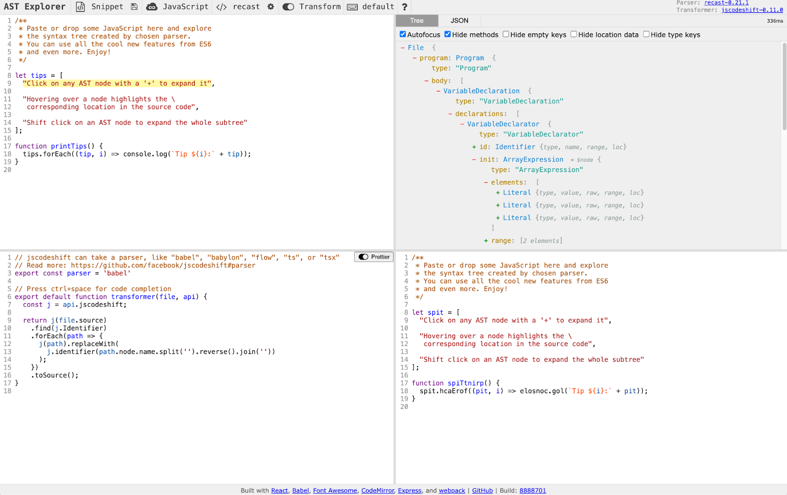
The AST explorer contains four panels. Top-left is the input code, top-right is the AST, bottom-left is the codemod and bottom-right is the output.
The AST explorer

In the top-left corner, we have our input code. It contains an array called tips, and a function called printTips.

In the top-right corner, we see the AST for this code. As you hover over parts of the tree on the right, you’ll see the relevant code on the left be highlighted. In the AST, you’ll see keywords like VariableDeclaration, ArrayExpression, Literal, FunctionDeclaration, Identifier, and more.

In the bottom-left corner, we see an example codemod that reverses the names of any functions or variables in the code. The input code is transformed into an AST on line 9, the AST is traversed and modified on lines 10-15, and then the AST is converted back into output code on line 16.

In the bottom-right corner, we see the output code that the codemod creates. Since this codemod reverses the function and variable names, we see that tips has become spit, and printTips has become spiTtnirp. Even built-in functions like forEach and console.log were reversed!

Now, if you were writing your own codemod, you could paste in your input code, check out what that looks like as an AST, and then begin to write your codemod until the output matches what you want it to be.

This is exactly what we did at Webflow. We took our failing unit tests from before, pasted one of the input examples into the AST explorer, wrote the codemod to get the correct output, and then repeated with our second input example. The codemod continued to grow in size and complexity, and our unit tests ensured that we didn’t break previous test cases that we had solved for earlier. It was a fun game of experimentation and TDD!

Results

So, how did everything shake out? For this UI reskin cleanup, we wrote two codemods – one for our pickComponent HoC that we’ve previously discussed, and one for a hook called useIsD2 that was a hook for checking if the feature flag was on or off, often used in conditional logic. It took about a week to write these two codemods.

We ran these codemods on most of our codebase shortly after Webflow Conf 2023, and the updates went smoothly. There were various other parts of our codebase that hadn’t migrated to the new UI yet, so we couldn’t clean up everything just yet and had to save some for later. In fact, it wasn’t until November 2024 that everything was officially on the new UI and we could finish the cleanup. At that point we ran the codemods again on the remainder of the codebase, and they worked flawlessly. Having those codemods available to use a year later saved a lot of time! Perhaps most excitingly, in that year between the first and second run, we had migrated our entire codebase from Flow to TypeScript, and the original codemods happily worked again with us only needing to specify that the parser was now tsx and not flow.

In the end, the codemods modified over 20,000 lines of code, and we were able to merge and deploy the changes without any major visual regressions. That’s a big win!

Codemods aren’t the answer for everything, but they’re definitely a useful tool to have in your toolbox, especially as your repo, engineering organization, and codebase complexity grow.

Thanks for reading, and happy coding!

6 must-have pages on a website: What to include in yours

Software Stack Editor · March 19, 2025 ·

While effective websites can have just a single page or dozens of pages, the vast majority of sites are four to 10 webpages. This number isn’t a coincidence — it represents the most efficient way to organize and present relevant information.

While effective websites can have just a single page or dozens of pages, the vast majority of sites are four to 10 webpages. This number isn’t a coincidence — it represents the most efficient way to organize and present relevant information.

Our list of the six most important pages on a website covers the essentials of any basic business-oriented website design. Read on to find out which pages you need, what content to include on each, and how to optimize them for best results.

Website structure matters: Here’s why

A website with a well-organized structure holds two distinct advantages over its disorganized counterparts. Firstly, organization enhances the user experience (UX), allowing visitors to navigate the site effortlessly between pages to find the information they need quickly.

Secondly, user experience and search engine optimization (SEO) go hand in hand. When a site offers a great user experience (by making navigation seamless, for example), search engines crawl and index it more efficiently, leading to higher placement in search engine rankings and more search visibility, which increases organic traffic.

Since search engines prioritize metrics such as relevance, quality, and usability, a stellar site UX directly enhances SEO.

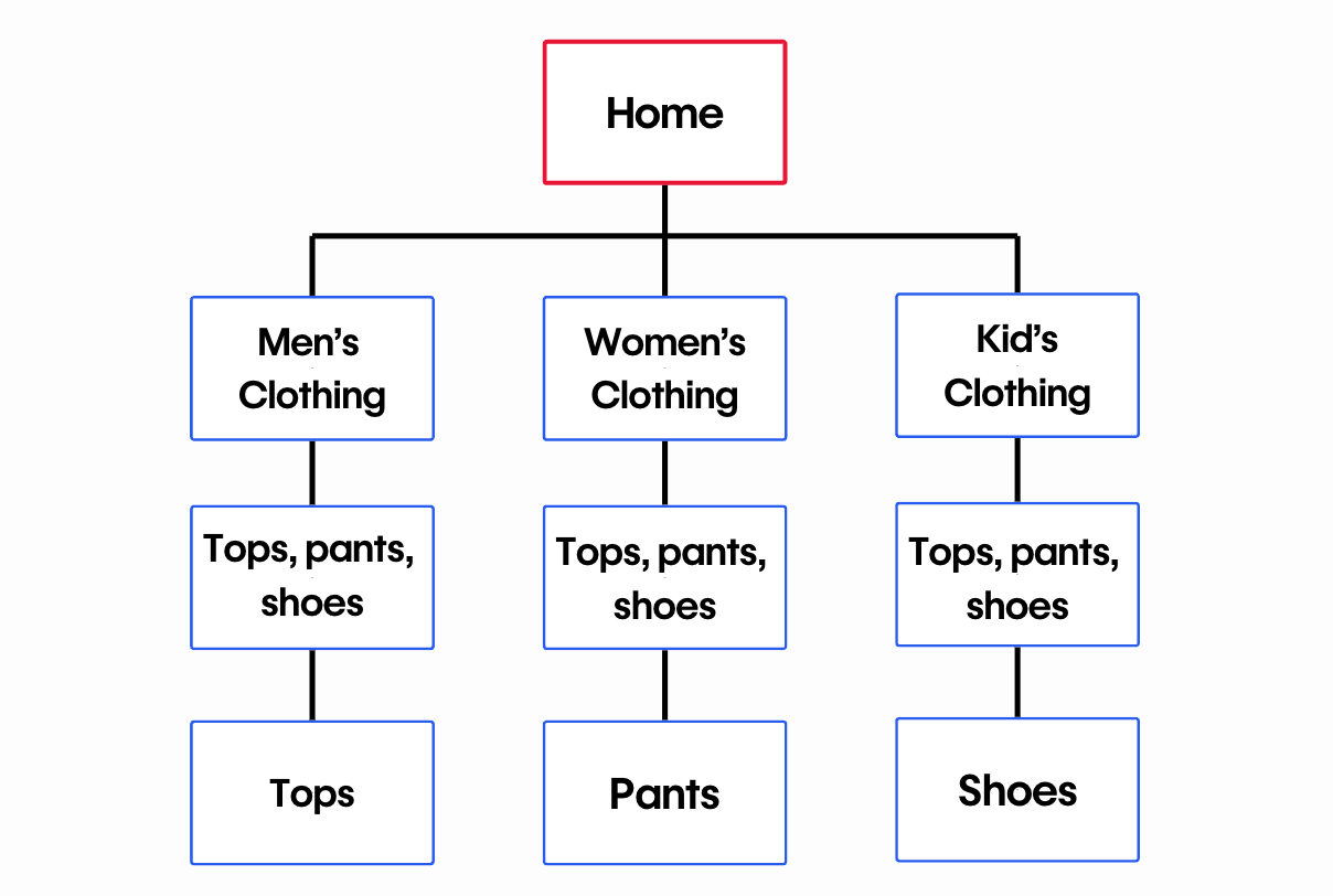
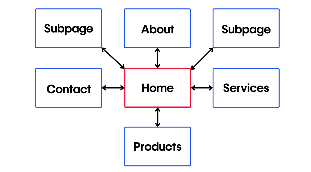
In the design phase, it’s important to use content mapping to ensure all vital information is both present and intuitively placed. Equally important is structuring page URLs into a logical hierarchy to effectively communicate the site’s architecture to human users and search engines. And when it’s time to launch, create (or autogenerate) a sitemap that captures your website architecture and submit it to Google to expedite the indexing of your site.

The 6 pages every website needs

This list of website pages outlines the foundational structure for common smaller websites, like those for freelancers and small businesses. Larger entities — such as major corporations and ecommerce businesses offering a broader range of products, services, or information — require more pages and complex layouts. Regardless of the scale of the project, this list is an excellent starting point for building and organizing a website.

1. Homepage

The homepage must engage visitors immediately. While homepage design varies, the most common components include a hero image, a unique header, and a call to action (CTA) “above the fold” — meaning visitors can see it before scrolling further down. These elements offer a quick insight into what the business or site offers, enticing visitors to explore further.

As visitors scroll below the fold, homepages typically present essential information about the product, service, and company organized under distinct headings. This placement strategy capitalizes on users’ initial interest captured above the fold with appealing images and compelling headers.

LEGIT Coffee Co homepage with text saying “Legitimately great coffee and food” next to an image of a latte. A button with a link to the menu is beneath the text.
Source: LEGIT Coffee Co

Take Aidan Quigley’s homepage design for LEGIT Coffee Co as an example — a beautiful hero image, a header in the evocative Voyage typeface that reads “Legitimately great coffee and food,” and a gentle CTA to view the menu come together to invite visitors to engage further. More in-depth details are placed farther down the page so the homepage isn’t overwhelming at first glance. This approach provides a structured user journey that starts with a captivating hook and gradually offers more information for those who’d like to learn more.

2. Products or services page

The products or services page showcases the business’s offerings by detailing each option and its advantages. If prices are standardized, include them for transparency — that’s a detail visitors often appreciate. When standard pricing isn’t applicable, provide a clear path for users to request a quote.

For ecommerce sites, this page might transform into an online store, complete with search functionality so visitors can quickly find what they’re interested in. If you’re marketing a service, consider laying out a step-by-step description of the process on this page. It’ll demystify what you offer, instill confidence in potential customers, and help them understand what to expect. Ultimately, this approach builds trust and makes it easier for visitors to make a decision.

Services page of The High Rise Guys website describing rope access window cleaning, water-fed window cleaning, aerial lift window cleaning, and interior window cleaning services.
Source: The High Rise Guys

‍Cathy Matovu’s services page for industrial window cleaners The High Rise Guys sets out the available services clearly, using icons to visually break up the description and help visitors remember the content. The explanations go beyond the basics by offering reassurance about privacy and safety concerns to address any doubts visitors might have in booking the service.

3. About page

The about us page is one of the most frequently visited website pages. It’s important for differentiating the business from competitors, as users often consult this page to understand what sets a business apart. Highlighting aspects that make the business unique — including the team’s background, values, and principles — showcases what qualifies the business in its field or industry.

Always ensure the copy is customer-centric. Instead of adopting a boastful tone, emphasize how the background and expertise of the team or individual ideally position them to address and fulfill the customer’s needs. By doing so, you not only build trust but also demonstrate dedication to solutions-oriented service rather than just self-promotion.

Yoga by Nina’s about me page.
Source: Yoga by Nina

An excellent example is Ocrism Studio’s about page design for Yoga by Nina. The copy sparks curiosity about Nina’s classes and thoughtfully conveys her extraordinary background as a taekwondo champion, actress, K-pop artist, and reality TV star. By explaining what drew Nina to yoga and how her background informs her teaching approach, this about page offers a compelling narrative that connects with potential clients, letting them know why her experience enhances her yoga teaching.

4. Contact page

If site visitors are intrigued by the business’s services but find it challenging to reach out, they may opt for a competitor’s site instead. Keeping the contact page accurate and current is paramount to avert this. Offering a variety of contact channels is ideal to cater to different customer preferences.

For effective communication, consider including:

  • An email address: Caters to those who value a written record of their correspondence
  • A phone number: Useful for those seeking an immediate, direct conversation
  • A physical location and/or mailing address, plus business hours: Promotes transparency and aids those interested in visiting in-person or sending mail
  • An online contact form: Allows visitors an uncomplicated method to initiate contact directly from the website
Punctuate Design contact page showing a smiling photo of Thibault Lerailler.
Source: Punctuate Design

Thibault Lerailler’s design studio website, Punctuate Design, exemplifies this approach. It features a welcoming contact form, letting visitors communicate freely, and a friendly photo of Thibault that adds a personal touch. The site also includes easy-to-access contact information in a footer section on every page, along with a “get in touch” CTA, phone number, and physical address. This comprehensive approach ensures visitors feel valued and have multiple ways to reach out, enhancing their overall experience with the business.

Punctuate Design footer showing Instagram and Pinterest buttons, navigation links, and a “Get in touch” button.

5. Privacy policy page

If you gather names, addresses, or any personal details from your visitors, you’re legally required to include a privacy policy on your website. It should clearly explain how you’re collecting, storing, and using that data, and it should be written in plain, easy-to-understand language.

Raglan Community House privacy policy.
Source: Raglan Community House

Creative studio HNDRX’s privacy policy for the New Zealand community organization Raglan Community House is written in clear, nontechnical language. It concisely describes the types of personal information the site collects, the purposes for collection, and how users can request a copy of the stored data. By maintaining clarity and accessibility, the privacy policy page reassures visitors and demonstrates responsible handling of confidential information.

6. Terms and conditions page

While terms and conditions pages aren’t legally required like privacy policies, they’re crucial for business websites. Including one can help businesses prevent disputes and legal trouble. Irrespective of user traffic, it’s a good idea to maintain a terms and conditions page to serve as an insurance policy against potential problems.

New York Jazz Bands terms and conditions page listing out their procedures for hiring a band and a refund policy.
Source: New York Jazz Bands

The terms and conditions page for New York Jazz Bands clearly sets out the hiring procedure, cancellation policy, refund policy, and privacy policy in clear, nontechnical terms. Designed by Organic Web Design, this page on the site serves as a document that the band can use to educate customers about their responsibilities ahead of time and protect the band against financial losses from last-minute cancellations.

Other helpful pages to consider

The six pages outlined above are essential for most small and medium-sized businesses. However, expanding your site with additional pages, like a blog page, can be beneficial. A blog informs your clients about product innovations, events, and offers and bolsters your SEO efforts.

Two additional pages can increase conversions. An FAQ page addresses common questions, easing potential customers’ concerns, while a testimonials page offers social proof, reinforcing purchase decisions.

Presenting case studies from successful collaborations with previous clients also builds credibility. Showcasing a portfolio page further highlights your work and helps you stand out. For businesses running digital marketing campaigns, special landing pages can enhance digital marketing efforts by providing targeted information.

A dedicated 404 page is also worth highlighting. It can help keep visitors on your site by guiding them back to relevant content if they land on a missing or inactive page, turning a potential dead end into a chance to engage further.

Create an organized website with Webflow

Designing in Webflow helps you create beautifully structured and visually stunning websites. By dividing content into page folders, you can ensure even the most complex sites stay neatly arranged and follow a clear hierarchy. Webflow’s visual canvas makes this organization intuitive and seamless.

If you’re looking for more examples of core website pages, browse our selection of industry-specific templates. Each template includes the essential components every business site needs to succeed, enabling you to create a tailored and cohesive design.

Webflow University’s tutorials are always available to help you learn more about optimal website structure and bring your web design ideas to life on the screen. These guides assist you in creating comprehensive, user-friendly sites, providing you with practical knowledge to turn your website vision into reality with Webflow.

8 navigation bar design best practices for websites

Software Stack Editor · March 19, 2025 ·

Navigation bar design sets the stage for a user-friendly experience across your website.

Navigation bars, or menus, are one of the key elements of usable web design. A navigation bar (navbar) or menu is an organized way of linking other (usually internal) webpages, and they help us move along smoothly within a website. Navbars can be hidden or be easy to access, allowing site visitors to navigate to the pages that are most useful or interesting to them.

If you have a poorly designed navbar, no matter how great your content is, your site visitors could struggle to find it. So, if you’re a newbie web designer or just a beginner looking for navigation bar design best practices, you’ve come to the right place. It’s perhaps the most important design element on a website, and we’re giving you tips and tricks to create user-friendly and effective navbars.

Types of navigation bars

Navigation bars design best practices involve focusing on functionality. It’s best to make sure login, search toolbars, brand logos, and key content are easily accessible for users. Different navigation menu structures may have distinct uses based on their designs and placements.

Here’s a quick overview of three popular navigation styles: the horizontal navigation bar, the scroll menu, and the vertical sidebar. Each approach offers unique advantages for user journeys and site aesthetics.

Standard horizontal navigation bar

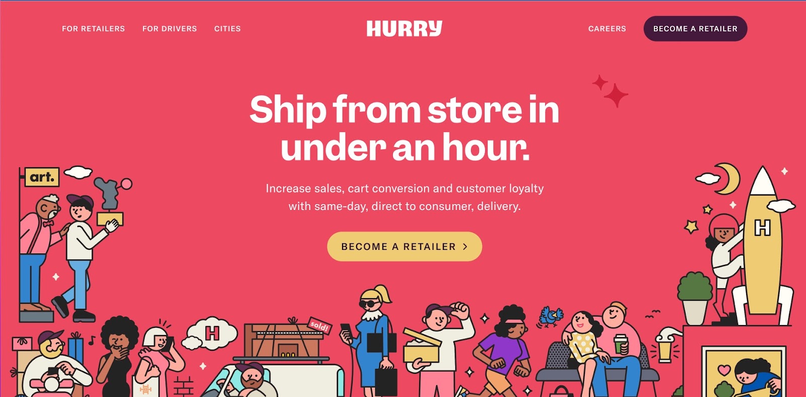
The most common type of menu style is a horizontal text-based navigation bar. Usually, they include a list of important site pages or sections, which can be nested within each other. The labels often consist of one or two words to briefly describe the section. In the example below, you can see six menu items, including the “Hurry” logo which brings visitors back to the homepage when clicked from other pages.

Hurry's candy red background color site, with the words
Hurry – Local Delivery Network template

Horizontal navigation bars are often sticky or fixed menus, meaning they stick to the top of the page as users scroll. This style is useful when the main CTAs — such as “log in” or “contact us” — are located directly on the bar because no matter where the user is on the site, they’ll have a CTA to click into for next steps.

Hamburger menu

Hamburger menus involve a compact, three-line button that consolidates a list of links. It’s a very popular menu style, particularly on mobile apps and sites due to its efficient use of space. However, this type of navigation bar can be inaccessible to screen readers, so make sure you build hamburger menus with accessibility in mind.

Mega menu

Mega menus are common in many ecommerce websites like Amazon or other similar retailers. The design features a large panel that contains every category and subcategory on the site. This format helps people understand  the contents of the website at a glance and quickly find their preferred category.

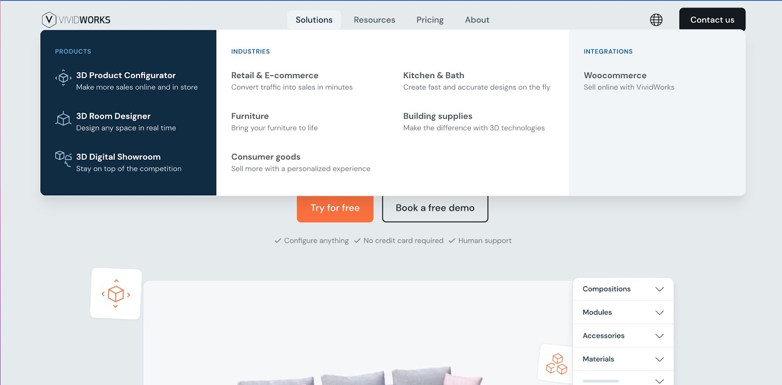
The disadvantage of mega menus is that they can overwhelm site visitors with too many options at once. Mega menus can also become crowded, particularly on mobile devices, making them less visually appealing. One way to avoid this is to build mega menus under a category of your site, like the example below.

The vividworks site, featuring an all grey/blue background with the drop down mega menu open below
VividWorks has a sleek mega menu under solutions, which showcases all the offerings of the company in a well-defined manner.

Hover-based dropdown menu

The mega menu is often nestled under this type of navigation bar. As you hover over an option in the navbar, a menu drops down via animation and lets you see more second-level categories and sections.

While this is a great way to get more direct links to site pages in the menu, it can be a controversial choice for user experience. The dropdown function assumes visitors will want to interact with every option they hover over — which may or may not be true. This style of navigation can also be tricky to design responsively, as the drop-downs don’t always work as well on mobile devices.

Scroll menu

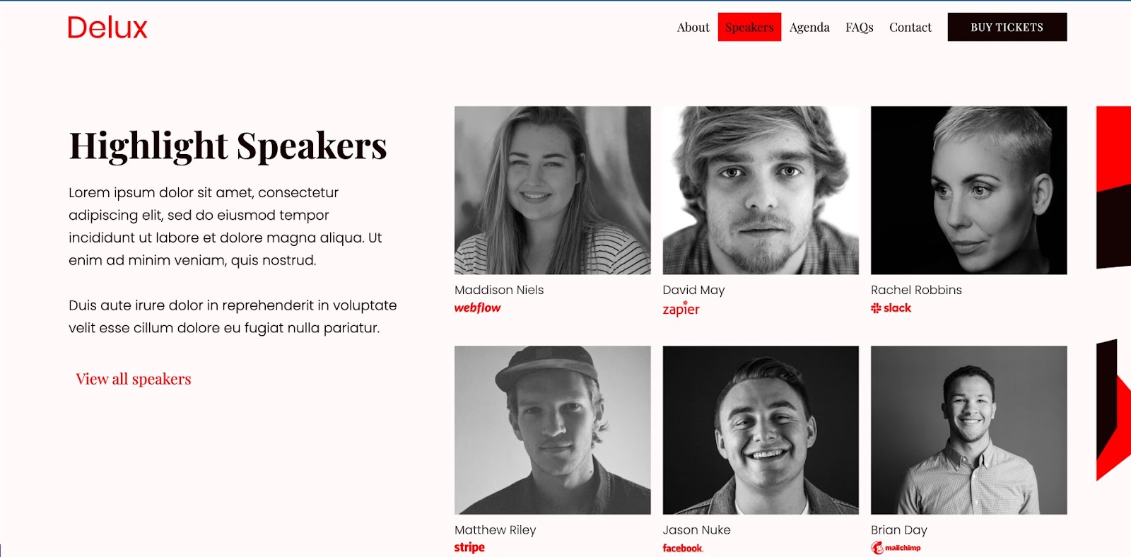
Scroll menus stray from the traditional layout, but are becoming a popular choice for one-page website designs. Often, scroll menus mimic the look of a top navigation bar, but instead of routing visitors to a separate page when they click on an option, the page will auto scroll to the selected section.

The Delux website, with a light pink background, red accents, and cllicked onto the Speakers menu item, displaying 6 Highlighted Speakers in black and white.
Delux – Conference Website Template, showing a scroll menu.

This form of viewing a website can make a single-page website feel more immersive and organized.

Vertical sidebar

Vertical sidebars involve menus that expand from the side of the page on click, stacking menu items on top of each other in list form. Keeping the menu hidden until the site visitor opens it offers a few advantages. First, the menu is available at any time, but doesn’t crowd the design with all the options at once. Second, because the menu only opens when the user wants it to, you’ll be able to use longer text and take up more menu space. These advantages make it a popular choice for agency websites and portfolios.

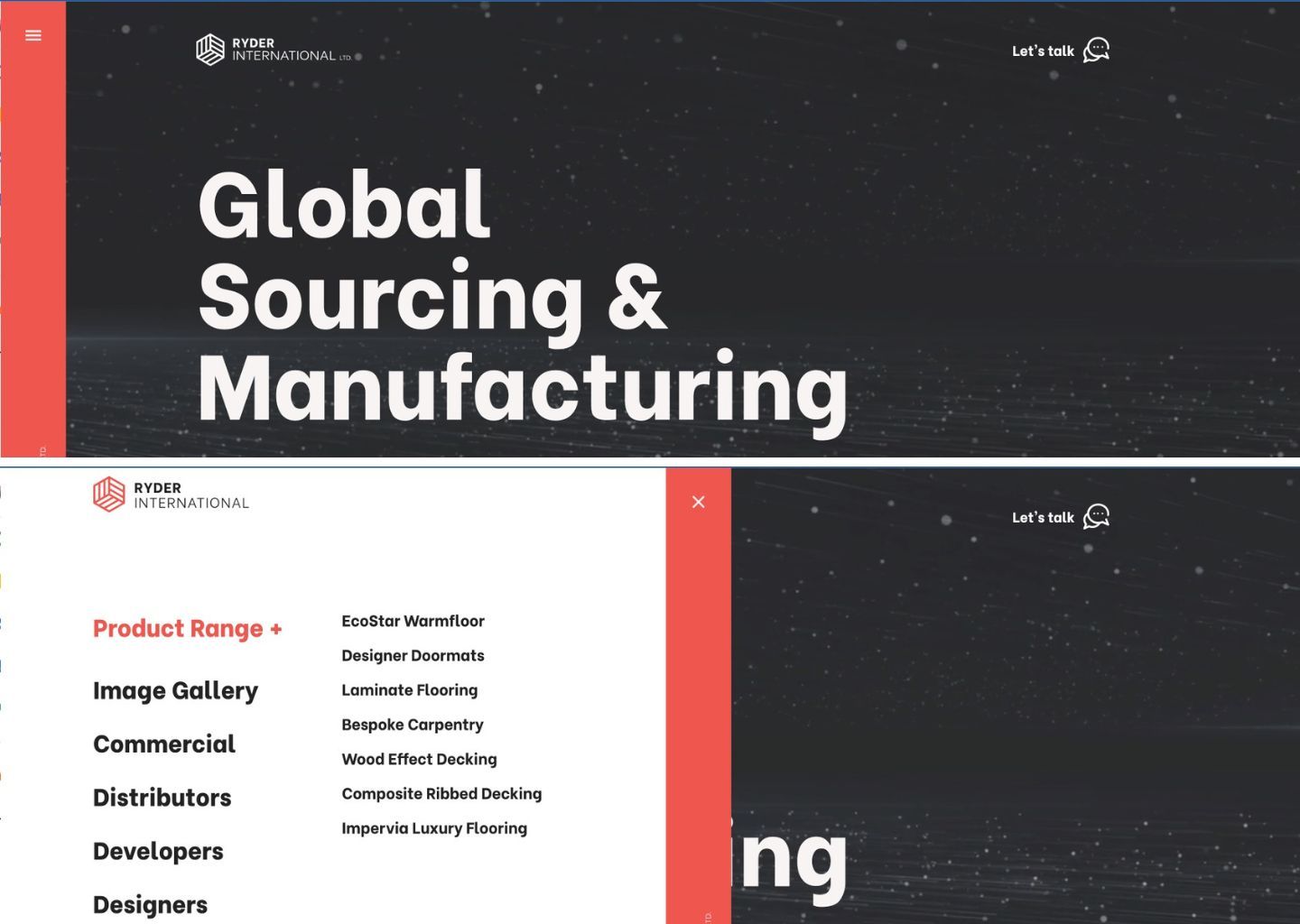
Ryder International’s site has a fresh take on the vertical sidebar. When collapsed, the menu takes up only a fraction of the page. But when expanded, the menu can take over half the page, so options and text are not limited by space constraints.

Ryder International's website, featuring an all black background and a red, vertical menu bar. The second half of the image displays the menu bar when clicked, which opens by sliding half way across the site toward the right and exposes a number of menu items.

Footer navigation and SEO benefits

Many websites make the most of their footer design by including an extended list of shortcut links within the footer. The footer is valuable real estate because it’s available from any page of the site. And because it’s at the bottom of the page, space constraints are not a major concern. Footer menus often contain a large number of shortcut links — more than than top menus — and give websites a nice SEO boost thanks to the amount of information stored within them.

Navigation bar design best practices for beginners

When building a navigation bar, it’s a must to put a heavy emphasis on great UX, which means focusing on usability, learnability, and accessibility. Using these three lenses as a framework can help you create navigation bar designs that cater to site visitors with ease and speed.

  • Usability helps users achieve their goals effectively and efficiently. It’s also a measure of a good overall experience.
  • Learnability is how easily users accomplish a task the first time, and how quickly they can do it again.
  • Accessibility is the first step to inclusive design. Making sure your website is accessible to all kinds of users adds that extra *chef’s kiss* to your work as a designer.

Here are 8 navbar design best practices that incorporate this framework.

1. Use breadcrumb navigation

Breadcrumb navigation is the cornerstone of wayfinding online. It’s the easiest way to find your way back home (literally and metaphorically). As designers, it’s our job to make sure that users can retrace their steps back to the beginning, preferably without hitting the back button countless times.

Breadcrumbs allow users to visualize the path they have taken so far by building upon the URL structure. You often see this in complex ecommerce websites with many different categories, like the example below.

An example of a breadcrumb menu leading you to Assorted Candy Mix on an eCommerce site.

This cloneable project was designed to create breadcrumbs for different categories and subcategories of foods. Check out Baymard’s extensive resource on making ecommerce websites usable.

A breadcrumb navigation is typically made up of text links interspersed with the ‘greater than’ symbol (>). It can look somewhat like this: Page viewed > Page viewed > Current page. This is the easiest and most accurate way to improve and smooth out navigation.

2. Use familiar language and intuitive navigation

Don’t crack open a thesaurus for menu options — keep language as simple and universal as possible. Save your puns and quirky copy for body text and keep the menu straightforward and intuitive.

Information architecture and hierarchy must support good navigation through a flat organization of navigation buttons. Within one or two clicks, the user should be able to find what they need, no matter how deep the link goes.

As the Nielsen Norman Group states, the aim is for people to “rely on recognition rather than recall,” meaning menus should be short and scannable, but also focus on clarity. We can do this by limiting the number of levels to a maximum of three to four. The more the levels, the easier it is for the users to lose themselves in a maze of pages. Nielsen Norman Group also has a great library on understanding wayfinding and navigation.

3. Order your navigation strategically

The goal that you want to achieve through your website must be reflected in the navigation bar. Navigation bar design best practices also include adding a CTA so that you can lead users to fulfill those goals. And this aspect must be considered before you even begin building your website.

For example, if you have an ecommerce website that provides updates to the user, then adding a bell icon or a notification panel can be useful. This directs return-users to the most important information for them.

4. Be consistent in structure and style

Inconsistencies usually show up when we aren’t sure where something goes. Or other times, Google reports show that users search for certain pages and the designer feels compelled to add quick links that don’t fit into the existing navigation menu.

Unfortunately, consistency is all about making difficult choices. Either something makes logical sense or it doesn’t. Either all categories have subcategories or none at all. Thus, primary and secondary navigation must have the same user experience.

Style is also an important part of consistent design. Commonly recognized design patterns help users identify menu items and help with discoverability and ease overall. For example, using an underline under text signals to the user that it’s a link and can be clicked on. Something as simple as that can make your user’s journey smoother.

5. Design responsively

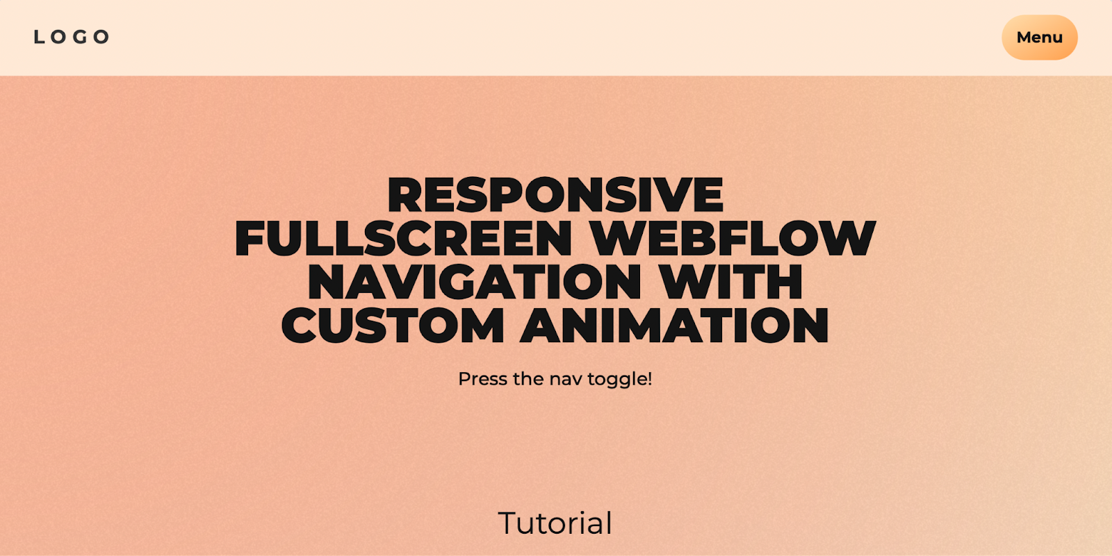
Navigation bars must be designed for both desktop and mobile, including all screen sizes. This helps readers who are using non-standard screen sizes. Here’s a really great project with a tutorial to create a responsive navbar.

An all orange template site with the words

6. Check color contrast

Since navigation menus reflect the underlying structure of the websites, having them follow the color contrast and screen reading best practices set up by WCAG is crucial.

It’s best to test color contrast ratios to make sure that content is accessible to people with color blindness or other visual impairments. You can use a contrast checker to make sure that people with moderately low vision and who aren’t using contrast-assisting technology can access your content.

7. Consider accessibility in navigation

When you’re designing your navigation, it’s best to think about how all users will interact with your menus. Consider color contrast, keyboard navigation, and responsive elements to provide an inclusive experience.

Making sure that drop-down menus can be appropriately used by mouse and keyboard allows keyboard users to access submenus. Adding markup and keyboard behavior can help assist with keyboard operability and help operate menus in different ways.

8. Make sure menus are legible and functional across devices

When designing and developing navigation bars, it’s important to also keep in mind users who use touch screens, often on smaller devices like smartphones, as well as users with fine motor limitations. For example, some people need a larger target area to tap on and lag in time to use drop-down menus efficiently. Menus disappearing too quickly can be a bad experience for any user.

Of course, there’s a lot more you can do to increase the accessibility of your website — our accessibility checklist is a good starting point.

Build effective user journeys

We know that this might be a lot to keep in mind. However, if you listen to your users and build what feels most intuitive to them, you’ll be well on your way to creating a navigation bar that will not only wow your users but make it easy for them to peruse your site.

Survey report: How knowledge workers really feel about AI

Software Stack Editor · March 19, 2025 ·

From excitement over the latest tools to speculation about job security and debates over potential benefits and risks, we hear a lot about AI from leaders. But despite AI’s omnipresence in the news and at work, we haven’t heard much about what it means for today’s knowledge workers. What have their experiences with AI been like so far, what challenges have they encountered, and how has AI shaped their hopes, worries, and goals for the future? 

To find out, we surveyed over 8,000 knowledge workers across seven global markets. Our survey finds that their views of AI often diverge from assumptions and headlines, and offer important insights for leaders as they navigate an increasingly AI world. Let’s dive in.

AI usage lags, with 35% of workers citing “nonexistent” skills

Given all the excitement about AI in the workplace, it’s easy to assume that knowledge workers have fully embraced these tools. However, our survey uncovers surprising gaps in usage: 35% of workers describe their AI skills as “nonexistent.” This trend is consistent across each market surveyed, with 34% of U.S. workers saying the same. 

Furthermore, we find that over half (54%) of global workers say they do not have the time or resources needed to learn how to maximize AI’s potential for their role. One-third of global knowledge workers say they don’t use AI at all, with some differences across markets: only 31% in the U.K. and 35% in the U.S. agree, compared to 41% in France and 44% in Japan. 

As employees struggle to find their footing, AI imposter syndrome is taking hold: Workers are 75% more likely to rate their own skills as “nonexistent” than to say the same about their teammates. Indeed, across all markets we find that workers believe their AI skill level is lower than that of their team, manager, colleagues on other teams, and company leaders. 

We find that AI etiquette is a moving target in this time of ongoing change. Twenty-five percent of global workers admit to exaggerating their AI abilities, while 30% downplay how much they use AI at work. And one in five workers can’t shake the feeling that it feels like “cheating” to use AI, although there is some regional variation: while 25% of Australians agreed with this, the number drops to 21% in the U.S. and only 13% in Japan.

Half of workers are still unsure of when to use AI

Although workers are optimistic about AI’s potential, they are still sorting out what this means for their roles — and even for their organization overall. Seventy-six percent of global knowledge workers believe that AI could benefit their role, yet 54% struggle to know when to use it. Once again, we find these trends to be consistent across markets. 

Adding to the confusion, workers are getting mixed signals from their organizations. Thirty-nine percent report that their company often abandons AI efforts, and 46% agree that there is more talk than action when it comes to AI at their organization. 

That being said, there are steps companies can take now to ease the AI transition. Here are the top three things workers report that leaders can do to help them feel more confident about adopting AI:

  1. Offer formal trainings (45%)
  2. Clarify the company’s strategy for AI adoption (37%)
  3. Communicate the business benefits of AI (35%)

Workers say AI can boost wellbeing, collaboration, creativity

It’s time to move past the idea that workers are scared of AI — if anything, they’re enthusiastic about its potential. While 33% of workers report feeling anxious or stressed out about AI, 61% say that it makes them feel excited and energized. So what do they think AI can do for them?

For all the talk about AI’s ability to offload repetitive tasks and boost efficiency, many workers are just as excited about the emotional impact. A majority of workers agree that AI can improve wellbeing (61%) and job satisfaction (62%) — which, in turn, can bolster productivity and innovation. 

Here are the biggest benefits of AI so far, according to global workers:

  1. Improved productivity (44%)
  2. Enhanced creativity (34%)
  3. Better communication (29%)

Moving forward, workers predict that AI can help support collaboration (32%), as well as reduce stress and burnout (29%). 

42% of workers plan to use their AI skills to get a new job

Forget the idea that AI is coming for jobs: Today’s knowledge workers see it as a potential career catapult. Fifty-six percent say they are already better off today than one year ago due to their new AI abilities, and 69% plan to upskill on AI in 2025. To workers, the need for AI will only rise: globally, 73% predict that they will use AI more this year, particularly workers in the U.K. (79%), the Netherlands (75%), and U.S. (74%).

But make no mistake: These workers are also looking out for themselves. In today’s tight job market, workers are eager to stand out — and 66% believe their AI skills will make them more competitive. Four in 10 say they will reconsider their career plans because of AI this year, and 44% intend to leverage their AI skills to find a new job. 

Gen Z remains skeptical, while Millennials embrace AI

Despite being digital natives, Gen Z emerges as the most hesitant generation with AI. Globally, 46% of Gen Z knowledge workers don’t use it at all, compared to only 33% of Millennials. Similarly, 43% Gen Z workers describe their AI skills as “nonexistent” — more than any other age group. They are also the most likely to disagree that AI can benefit their role: 30% agree with this, compared to 21% of Millennials. 

In fact, across a variety of measures we find that Gen Z is more negative than their Millennial colleagues: They are less likely to say AI has made them better off professionally, improved the quality and speed of their work, or to agree that their company provides adequate training in AI. 

This pattern applies to the effective impact of AI. While 56% of Gen Z says AI makes them feel excited and can boost wellbeing, the numbers jump to 65% among Millennials. Overall, Gen Z reports weaker gains from AI, from improved productivity to creativity, communication, collaboration and focus. 

Is the youngest generation of workers waiting for AI to prove its mettle or do they need companies to take action? It’s too early to tell, but leaders should be mindful of this emerging generational divide.

Workers are poised for AI, but leaders need to guide the way

Our survey leaves no doubt that global knowledge workers are ready and willing to embrace AI, but they can’t do it alone. 

Even though it seems like AI is everywhere, usage lags among a significant minority of workers — and many aren’t touching AI at all. This isn’t a case of luddite holdouts, however. We find that the majority of workers believe they are better off because of AI and are excited to continue building their skills in 2025. Indeed, they are bullish about AI’s ability to boost everything from productivity, creativity, and collaboration to wellbeing and job satisfaction. And, significantly, many have caught onto the fact that AI skills will make them even more competitive in today’s job market.

Interestingly, we find clear evidence of a generational divide between Gen Z and Millennials. While Gen Z is less positive about AI on multiple measures, Millennials are embracing it head-on. As the year continues, this is a division to watch.

We believe that this survey offers key learnings for leaders as they navigate the next stage of AI adoption. Workers are excited by what they’ve seen, but want to be part of what comes next. This means moving from ad hoc AI adoption to formal opportunities for training, deeper insights into organizational plans for AI, and a closer look at the potential business benefits. 

And when knowledge workers and leaders come to embrace these new AI tools, anything is possible.

Methodology: In January-February 2025, Miro surveyed 8,094 full-time employed knowledge workers across diverse industries and company sizes, and from seven global markets (N=1,000 for Australia, France, Germany, Japan, The Netherlands, and the United Kingdom, and N=2,000 for United States).

Agile visual management: How to stay aligned and efficient as an Agile team

Software Stack Editor · March 18, 2025 ·

Successful Agile projects rely on clarity and collaboration between team members — so to facilitate planning, execution, and retrospectives, product teams assign roles and responsibilities and use structured Scrum events. Teams also practice Agile visual management, a principle that uses visual tools to further improve Agile workflow efficiencies and alignment.

Below, we’ll explore the concept of Agile visual management, and the tools behind it.

The basics of Agile visual management 

To boost cross-team transparency, communication, and collaboration, Agile teams turn to visual Agile management. This means using visual tools—like Kanban and Scrum boards, burndown charts, and digital whiteboards—to make workflows, tasks, and project statuses immediately visible to all stakeholders, ensuring better progress tracking and adaptability.

For example, a software team working in Sprints begins backlog planning with a digital whiteboard to define key goals and priority tasks. They then use a Kanban board to track backlog items through each development stage. As work progresses, team members update statuses in real time, helping the team balance and adjust priorities and keeping stakeholders aligned on the big picture.

Key benefits of Agile visual management include: 

  • A clear, shared understanding of work in progress
  • The ability to catch bottlenecks and inefficiencies in real-time 
  • Increased collaboration and accountability among team members
  • The data to make smarter decisions faster 

Core principles of visual management in Agile 

Effective Agile visual management is rooted in five core principles to keep teams working efficiently and collaboratively. 

1. Transparency through a shared view of work

Transparency in Agile means making work visible, accessible, and easy to understand for all. This ensures that team members, stakeholders, and decision-makers have a clear, real-time view of project progress, priorities, and roadblocks.

Visual tools like Kanban boards, Scrum boards, and dashboards help teams see what’s in progress, what’s blocked, and what’s completed, eliminating guesswork and improving alignment. With full visibility into workflows, teams can identify issues early, make informed decisions, and stay focused on delivering value.

2. Simplicity through easy-to-understand visualizations  

Agile visual management tools should be easy to interpret at a glance, and easy to work with throughout the Sprint cycle. 

Overloading boards with too much detail can lead to confusion rather than clarity. To simplify visual project documents, Agile teams can use color coding, task icons, and clear labels to minimize cognitive load.

3. Real-time updates to keep teams in sync

Agile thrives on adaptability. Real-time updates ensure that teams can respond quickly to changes as they occur, and not get bogged down with back-and-forth questions and realignment. 

Agile visualization tools like digital whiteboards, flowcharts, and Kanban boards allow for live updates on task progress and backlog changes, ensuring that everyone is working with the latest information.

4. Collaboration as the driver of project success

Visual management provides a centralized space for collaboration, helping cross-functional teams stay aligned. Shared boards, virtual sticky notes, and workflow diagrams foster teamwork, enabling faster decision-making and problem-solving. 

Of course, visualization tools are just one part of effective collaboration. The Agile team themselves should also take steps to ensure close collaboration and communication throughout the process, ideally by holding regular team meetings, Scrum planning and retrospectives, and using remote collaboration tools like Slack or MS Teams. Great visualization tools enable great collaboration, but they don’t guarantee it. 

5. Adaptability that enables continuous improvement

Lastly, Agile teams must remain, well, Agile. They need to be able to adapt task priorities and workflows quickly as the project progresses and requirements evolve. 

Visual management tools must also be adaptable, allowing teams to quickly adjust backlogs, capture new requirements, and assign adjusted tasks without having to halt the product process. 

While we mentioned a few tools above that facilitate Agile visual management, here’s a deeper dive into specific tools that can improve efficiency, communication, and adaptability within Agile teams, and across the organization.

Here are four main categories of visual Agile management tools that can come into play. 

1. Visual boards (like Kanban and Scrum boards)

Visual boards, such as Kanban and Scrum boards, provide a structured way to track tasks from start to completion. These boards break work into columns—Backlog, In Progress, Done—to give teams real-time visibility into progress, and to enable individual contributors to track and update tasks as they are worked on and completed. 

Did you know? Miro offers digital Kanban and Agile boards that teams can customize to fit their needs.

2. Digital productivity and collaboration tools

Many remote and hybrid Agile teams rely on digital collaboration tools like virtual whiteboards, task managers, and workflow trackers to stay aligned. 

These tools enable real-time updates, async communication, and remote brainstorming. Combined with digital collaboration platforms like Google Meet or MS Teams, they keep teams aligned before, during, and after Agile work cycles. 

Did you know? Miro is an online collaborative whiteboard with features like sticky notes, task trackers, and workflow mapping. This whiteboard can be used to brainstorm product features, prioritize tasks, and manage end-to-end Sprint cycles remotely. 

3. Purpose-built visual templates

Agile teams may also use pre-built templates for daily stand-ups, sprint planning, and retrospectives to streamline meetings and improve communication.

Miro, for example, offers hundreds of Agile-specific templates, including: 

These templates, combined with the collaboration and digital productivity tools found in a digital whiteboard, give teams purpose-built tools that boost alignment and adaptability at all stages of Agile production. 

5 Agile visual management challenges (and how to solve them)

Even with the best tools, Agile visual management can present challenges that hinder productivity and collaboration. Here are five common challenges, and how to overcome them.

  1. Resistance to change. Individuals or teams may hesitate to adopt new visual management methods or tools, leading to poor engagement and a failure to realize efficiency potential. It’s essential to manage this change proactively. Involve the team in selecting tools, provide hands-on training, and emphasize efficiency improvements from these new tools to encourage adoption. 
  2. Lack of visibility and understanding. Boards that are overly complex, hard to find, or simply unclear can create confusion and misalignment. Use real-time Agile boards that offer simple and clear visualizations. 
  3. Information overload. Using too many different visualization tools, or trying to cram too much information into a single tool, makes it difficult to extract meaningful insights. This stalls productivity and collaboration. To solve this, focus on key performance and tasks, use color coding, and simplify board layouts to improve clarity. Only visualize what needs to be visualized. 
  4. Be consistent. Without regular upkeep, visual management boards can become outdated. Schedule weekly reviews to refine workflows, remove outdated tasks, and keep boards relevant. The more consistent you are with updating and using your visualization tools, the more impactful they will be. 
  5. Bridge collaboration gaps. Distributed or hybrid teams may struggle with communication and alignment. That makes true collaboration difficult. Use visual Agile tools that also enable remote collaboration—both live and async. This ensures that all members can use and update these tools, regardless of physical location or time zone. 

By proactively addressing these challenges, Agile teams can optimize efficiency, enhance collaboration, and keep workflows running smoothly.

Stay aligned and efficient with visual Agile management

No tool guarantees success. Even the most feature-rich platform or template is only as good as the user behind it. That’s why it’s so important to pair great visual Agile management tools with the foundational principles and best practices outlined in this article. When you do, Agile teams become more aligned, more efficient, and ultimately create better products for their customers and companies.

Scale your design system to multiple sites with Shared Libraries

Software Stack Editor · March 17, 2025 ·

Meet Webflow Shared Libraries, a centralized design system letting teams access shared components, variables, and assets across every site within a Workspace.

Big picture 

The modern digital strategy extends beyond a single website. Catering to different audiences and business goals often requires multiple web properties, and in fact, thousands of Webflow customers have multiple sites in their Workspace. In addition to the primary website, brands are often maintaining blogs, product or industry-specific microsites, and dedicated campaign landing pages. 

The problem 

However, when teams are managing multiple sites, maintaining brand consistency can be extremely challenging — often resulting in out-of-sync designs and time-consuming, repetitive workflows that are prone to error and take designers away from true creative work. Even subtle discrepancies in button style or typography can accumulate and eventually dilute your brand’s visual identity. And when a brand evolves — whether it’s a small logo update or a full system-wide revamp — changes can be painful and costly without an effective, streamlined way of deploying them.

Our solution

This is why we built Webflow Shared Libraries, a centralized design system making it easy to share, discover, and leverage existing building blocks throughout your organization. It dramatically simplifies design workflows, empowering teams to ship faster and reclaim valuable time for more creative initiatives. Brands are able to ensure a consistent visual identity across all sites, and maintain it as the designs evolve or the business expands its digital footprint. Let’s dig into what this looks like in practice.

Drive consistency by giving your team the right building blocks

Libraries keep all of your sites consistent and brand-aligned by providing a shareable source of truth for your reusable design resources.

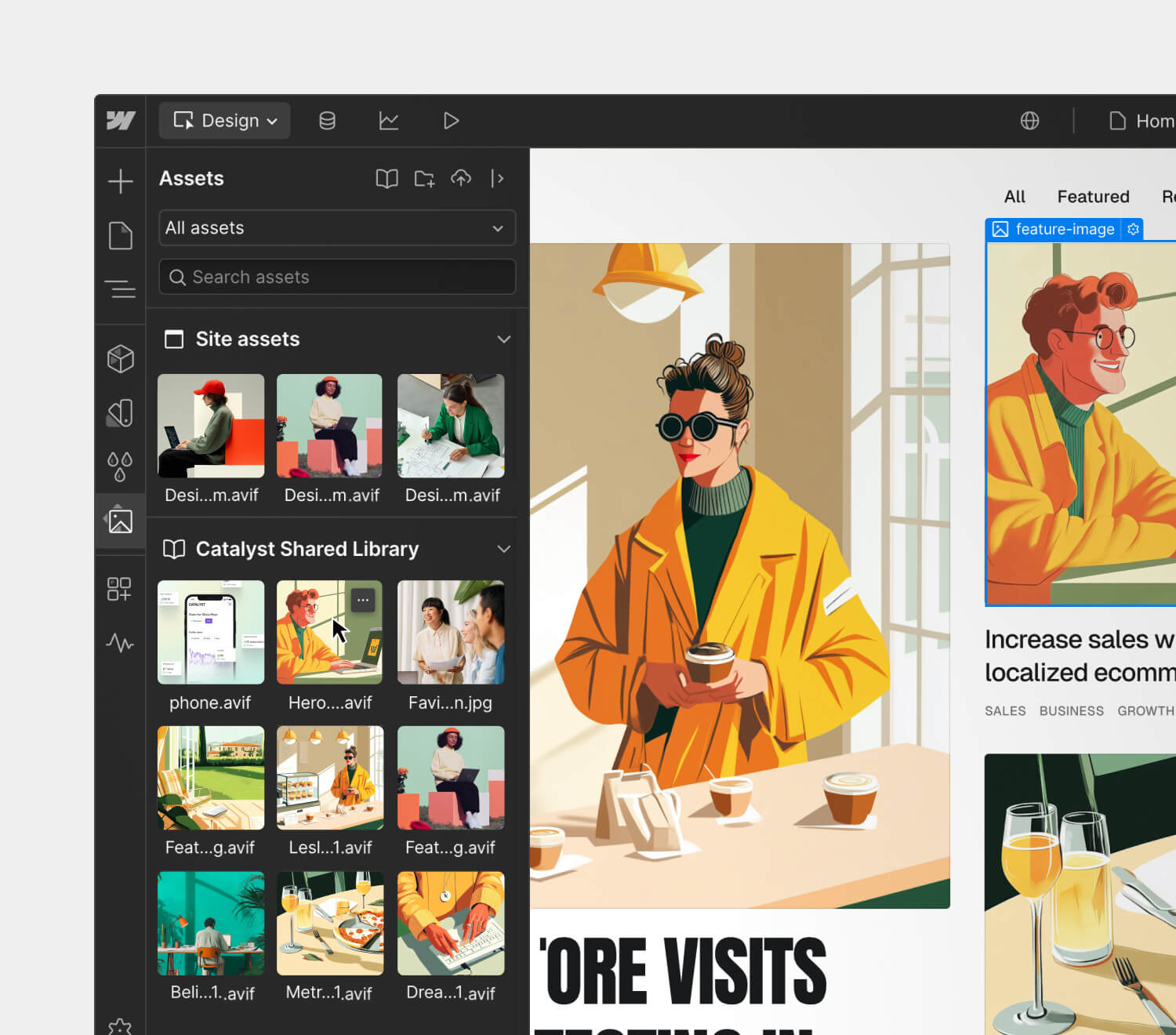
Webflow’s design interface displaying an assets panel with site and shared library images. A featured illustration of a stylish woman in a yellow coat holding a coffee cup is selected, with a blog layout preview on the right
  • Shared variables: Keep styles on brand with shared variables for color, typography, spacing, and more. Plus, facilitate easy theme updates and scale multi-brand design systems with variable modes.
  • Shared components: Share pre-built components like navbars, sections, buttons, and cards for a consistent look and feel — while also leveraging props, slots, and variants to allow for customization within guardrails.‍
  • Shared assets: Provide a centralized repository for recurring, brand-approved assets — like logos, icons, hero images, and more — that your team can easily apply to multiple sites.

Streamline changes as your design system evolves

Whether you’re making a small style tweak or executing a major rebrand, Libraries provides governance and scalable change management workflows for when your design system evolves.

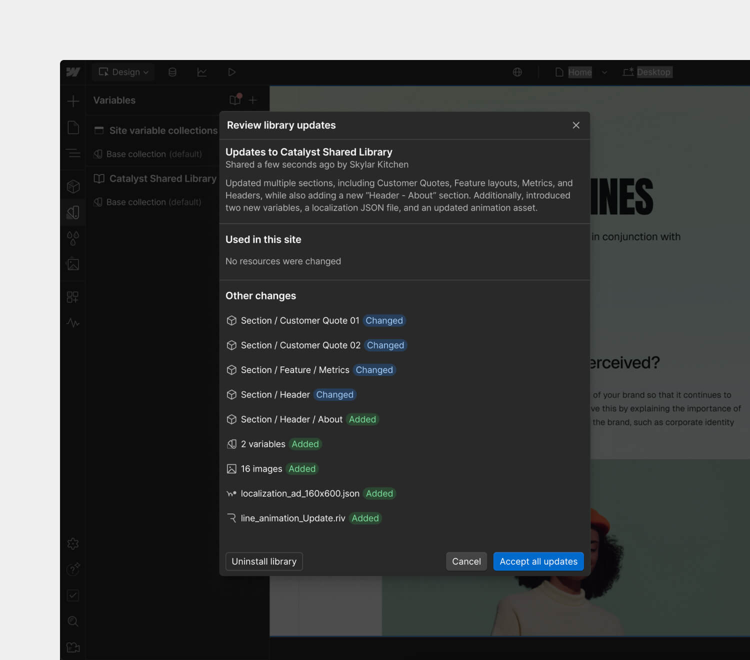
Webflow interface displaying a 'Review library updates' modal for the Catalyst Shared Library. The update log lists changes to sections, variables, images, and files, with options to accept updates or uninstall the library.
  • Review updates before pushing them live: Review and accept updates to Shared Libraries on your own time, allowing each designer to implement changes when ready — ensuring a smooth and stable deployment.
  • Seamlessly update designs across sites: Update your Shared Library just once — after the changes are accepted, Webflow will cascade them across all of your sites.‍
  • Manage Library permissions: Leverage site roles and permissions to control who can share, install, and manage Libraries.

How Shared Libraries accelerate build time and drive consistency for customers

Shared Libraries have been a game-changer for Australian brand Healius, the country’s second-largest provider of pathology services. With ten sites to manage and maintain, their small team of two is able to efficiently manage branding and design consistency across all of these sites when implementing design changes, large or small.

“Before Webflow, we relied on WordPress, which required us to manually update each site individually. Even minor design changes meant jumping into every website and replicating updates one by one — a process that could take days, especially when dealing with technical adjustments beyond simple CSS tweaks.

Now, with Webflow, we can implement design updates across all of our sites in just a few minutes, ensuring complete consistency with minimal effort. The ability to use properties to control whether content is identical across all pages — such as for a navbar or footer — or customized on a page-by-page basis adds another layer of flexibility. It’s an incredibly powerful feature that streamlines both design and content management, allowing us to focus on more important tasks.”

– Stéphane Recouvreur, Product Manager, Healius”

Our agency partners are also marveling at the flexibility and efficiency that Shared Libraries unlocks. Jysk Webbureau, a creative web design agency based out of Denmark, has saved 10-15% on build time for new projects using their own Shared Library of standard components. They are able to streamline their workflows to maintain consistency, delivering a much better experience to their clients with fewer errors.

“Previously, we cluttered our boilerplate with countless components just to speed up new builds—but that made things difficult to manage. Now, whenever we create a high-quality, flexible, and fully responsive component for a project, we immediately add it to our Shared Library. We look like superstars to our clients in terms of having everything under control and consistently delivering high quality output.”

-Daniel Høiberg Lambrecht, Founder and CEO, Jysk Webbureau

Whether you’re an in-house design team managing multiple sites for your own brand or an agency running projects for separate clients, Shared Libraries provide teams with the tools to scale design systems with efficiency and consistency. With streamlined workflows, you can focus on creating visually stunning, content-rich experiences that convert.

Get started with Shared Libraries today

The best part? We launched Shared Libraries in July 2024, so it’s already available for all customers on Growth, Agency, and Enterprise Workspace plans! Learn more about pricing and packaging here.

To learn how to start leveraging Shared Libraries today, visit our Help Center.

Accelerate brand growth with a unique product launch strategy

Software Stack Editor · March 17, 2025 ·

Make the most of your product development efforts with an effective product launch strategy.

By the time you reach the product launch stage, you’ve already spent considerable time and money developing the product, so you want it to succeed in the market. But without a product launch strategy, your marketing efforts might not lead to enough interest. A clear strategy outlines how marketers will promote new products to ensure content reaches the intended audience and generates leads.

Discover how to launch a new product with the help of research, forward thinking, and creativity.

What’s a product launch strategy?

A product launch strategy is a general blueprint for marketing a new product and measuring its success. This outline establishes big-picture goals like launch guidelines, key performance indicators, and competition evaluations.

But this strategy doesn’t get into the specific actions marketers will take when launching a new product — that’s usually captured in a product launch plan. Instead, the product launch marketing strategy focuses on setting the overall direction and framework for the launch campaign.

6 things every product launch strategy needs

Make the most of this blueprint by including these six must-have sections in your product launch strategy.

1. Market research

As with most marketing strategies, research is essential because it provides valuable context for the rest of the strategy.

Your market research should include the following details:

  • Relevant markets. Find data about the people who might use this new product and what they need from it. For example, if you’re launching a customer relationship management (CRM) platform, your research might focus on how healthcare workers and salespeople would use it to do their jobs.
  • Competitors. Collect data on products competing with yours. Include a list of their features and discover how your marketing can differentiate your product by demonstrating how it fills gaps, offers better prices, or satisfies more customers.
  • Trends. Include industry-specific examples from blog articles, customer feedback, and news stories that demonstrate which branding choices are popular. And if you’re into viral marketing, mention industry influencers and the trends they’re following.

2. Target audience

Before, you broadly defined your product’s relevant markets. This information is helpful in case you need to pivot to a different market or you want general context regarding your audience. 

Now, hone in on the audience you want to target with this specific product launch strategy. Use psychographics and demographics to develop that target audience into distinct buyer personas that clearly describe who you’re marketing to.

For example, a time-tracking app might be helpful for freelance writers, design studios, and staffing agencies. A target audience from all three is busy professionals who track their billable hours. Refine that audience into two or three buyer personas that identify psychographic details like tech-savviness, purchasing motivations, and lifestyles so you know which pain points to target in your advertising.

3. Marketing channel strategies

Offer a general overview of the lead generation strategies you’ll use, and state the marketing asset guidelines your team will follow. Use this information to sketch the general shape of your lead funnel and support it by describing how you’ll encourage potential customers to engage with your marketing efforts.

For instance, if you’re launching a new project management tool, your strategies might include creating a product launch page and publishing LinkedIn ads that point to it.

4. A value proposition

Define what your product offers the target audience. Choose a value proposition that’ll resonate with potential customers by fulfilling their needs, supporting their goals, or solving a pain point. Then, find ways to frame that proposition in different taglines for each buyer persona. For the time-tracking app, a tagline aimed at freelance writers might read, “Spend more time writing and less time tracking.”

5. A sample advertisement

Present a marketing material mock-up that showcases the product and its value propositions. Include your taglines to create a draft that highlights your product’s features and brand messaging. It doesn’t need to be a finished ad, just something that provides a helpful visualization of your strategy. Your team will refine it later.

6. Goals and metrics

Set attainable, realistic goals for the product’s launch. Leveraging the insights you’ve gathered in previous steps, explain why these goals are attainable when considering your brand’s current market position.

Suppose you’re breaking into a well-established industry like mobile game development. In that case, your first goal might focus solely on increasing download volume or offering free trials of your app. These initial steps could help your brand get a much-needed foothold in the market.

After describing attainable milestones, explain how you’ll measure progress toward them. One common way to track key metrics is using CRMs like Salesforce to monitor sales performance and customer interactions. 

Measuring the success of the product launch strategy

When the product launches, your initial product strategy becomes integral to the ongoing marketing process. You’ll need it to measure success and tackle obstacles as they occur.

Evaluate the success of your product launch

After the launch, reference the metrics and goals outlined in your strategy to determine whether you’re meeting those objectives. If you’re falling short of your goals, the research and guidelines you already established can help you formulate new marketing tactics.

Say you launch a project management tool and don’t reach your sign-up goals. You can create a free tier with limited capabilities to encourage people to try your software.

Assess and overcome obstacles

If you encounter roadblocks during or after launch, use the product launch strategy to devise plans to overcome issues. Say you’re going to advertise a financial website’s new app, but development stalls. In that case, adjust buyer personas and value propositions to center around a desktop-driven audience. With these new variables, you can formulate different marketing tactics that are just as promising.

Excellent product launch landing pages: 3 examples

Product launch landing pages are often a vital component of a launch strategy. They provide the product details that potential customers need to make a purchasing decision, and you can use various marketing tactics — like social media posts and email campaigns — to send viewers to these landing pages. 

Here are three great examples of product launch pages.

1. LOOK Cycle

An image of LOOK Cycle’s 795 Blade RS, a premier racing bicycle.
Source: LOOK Cycle

Bicycle manufacturer LOOK Cycle’s 795 Blade RS is a racing bike, and the brand’s website targets competitive athletes. Their product launch page for the 795 Blade RS clearly shows their commitment to this audience by highlighting the bike’s lightweight frame, aerodynamic design, and uncompromising durability. And the page’s many images and interactable elements give the site a high-tech feel while offering visitors a hands-on impression of the bike’s impeccable value.

2. Seen

The Seen landing page starts with a large image of a plain blue Seen card. Following that is a headline that reads, “Introducing Seen Mastercard credit card.”
Source: Seen

Seen is a virtual or physical credit card aimed at customers who want an easy-to-use account. The landing page uses a few value propositions that resonate with that message, such as instant approval decisions, zero hidden fees, and immediate digital delivery. Paired with a straightforward app that allows users to quickly manage their money, Seen’s landing page effectively sells their product as fast and reliable.

3. Dropbox Dash

The Dropbox Dash landing page shows a demo of the UI under the headline “AI-powered universal search for work.”
Source: Dropbox Dash

Dropbox Dash is an enterprise-focused product that promises to improve how people find, organize, and share the digital content they use in their work. The product launch page shows off a clean, user-friendly user interface (UI) and some basic features like meeting schedules, file suggestions, and project organization. All these tools resonate with customers who already use Dropbox and might be interested in leveraging this new product to replace other software.

Build engaging launch pages with Webflow

Launching a new product can be intimidating — if the marketing flops, so do sales. But by creating a clear product launch strategy, teams can outline actionable goals and plan for obstacles. This method doesn’t guarantee success, but it does give brands a stronger chance.

All the effort you put into marketing a new product needs the support of a memorable launch page, which is where Webflow comes in. With Webflow, you can collaborate quickly and securely to launch new landing pages — without relying on developers. 

To learn more, check out how Webflow enables teams to build and launch landing pages and microsites that can support your next product launch.

How to Track Form Submission Sources Automatically in SmartSuite

Software Stack Editor · March 14, 2025 ·

How to Automatically Track Submission Sources with Forms in SmartSuite

[embedded content]

‍

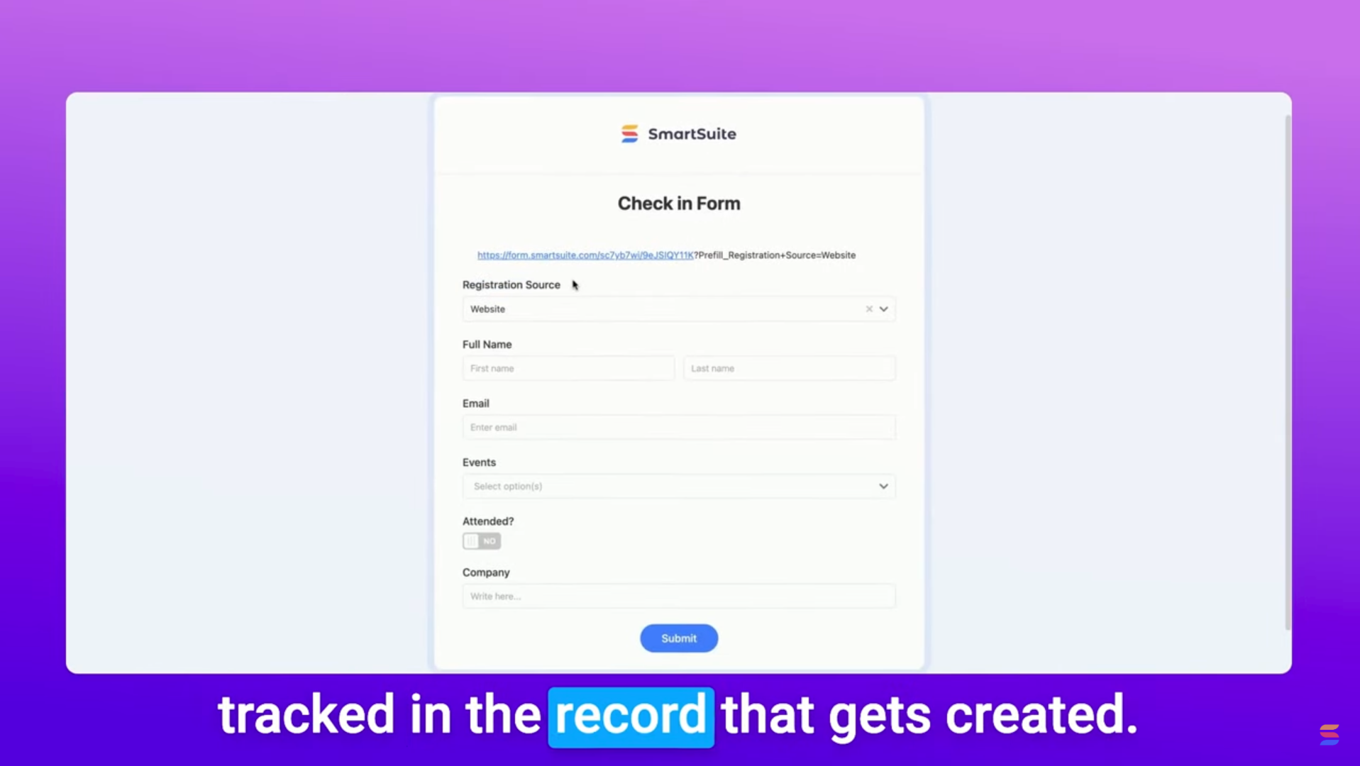
Tracking where your form submissions come from is essential for event planning, sales CRMs, and lead tracking. Without it, you won’t know whether a user accessed your form from an email, website, QR code, or social media.

Fortunately, SmartSuite’s prefilled forms make it easy to track submission sources—automatically! In this guide, we’ll walk through how to set this up, ensuring you always know where each form submission originated.

Why Track Form Submission Sources?

When you send out a form, SmartSuite tracks that a submission was made but doesn’t specify how the form was accessed. With this method, you can:

  • Identify which marketing channels drive the most engagement.
  • Improve your event planning strategies by knowing how attendees register.
  • Streamline lead tracking in Sales CRMs.

Step-by-Step Guide to Tracking Form Sources

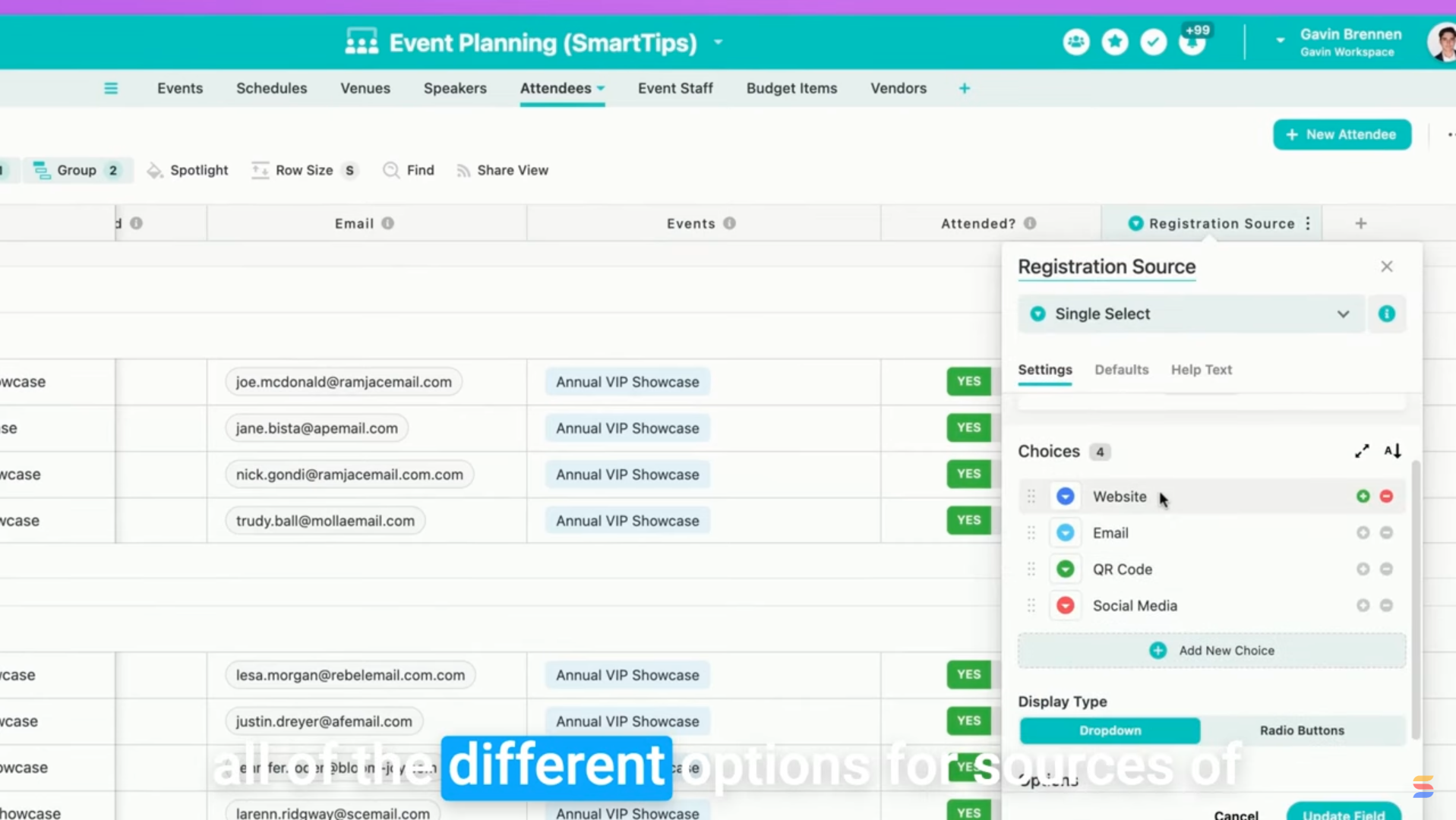
1. Add a Registration Source Field

First, you’ll need a field to store the submission source:

  • Navigate to your Attendees Table (or relevant database).
  • Add a Single Select field.
  • Name it Registration Source.
  • List all possible form sources (e.g., Website, Email, QR Code, Social Media).

2. Hide the Registration Source Field in the Form

Since we don’t want users selecting their own registration source, we’ll hide this field:

  • Open your form settings.
  • Find the Registration Source field.
  • Select Hide Field from Users.

Now, the field remains in the form but is invisible to users.

3. Use a Prefilled Form URL

Now, let’s ensure SmartSuite automatically fills in the Registration Source field based on how users access the form.

How to Modify the Form URL:
  1. Get your SmartSuite form link (via the Share View option).
  2. Append ?Prefill_Registration+Source= followed by the source name.

For example:

  • Website Link: https://yourform.com?Prefill_Registration+Source=Website
  • Email Link: https://yourform.com?Prefill_Registration+Source=Email
  • QR Code Link: https://yourform.com?Prefill_Registration+Source=QR+Code

Important: Ensure Prefill_ is capitalized, and replaces spaces with the + in the field names.

4. Test the Prefilled Form

To verify that the tracking works:

  • Copy your modified URL into a browser.
  • Check if the Registration Source field is prefilled correctly.
  • Submit the form.
  • In SmartSuite, confirm that the Registration Source is recorded in the new submission.

Real-World Applications

This technique isn’t just for event registration! You can also use it to:

  • Track lead sources in Sales CRMs.
  • Monitor survey responses by distribution channel.
  • Evaluate marketing campaign effectiveness.

Final Thoughts

By using SmartSuite’s prefilled form feature, you gain valuable insights into where your submissions come from—without extra coding or formulas!

Try this out in your own solutions, and let us know in the comments how you’re using prefilled forms. Got other creative use cases? Share them below!

Until next time, keep on enjoying SmartSuite! 🚀

‍

How to structure your website (and why it’s important)

Software Stack Editor · March 13, 2025 ·

An intuitive website structure paves the way for a smooth visitor experience.

A user-friendly website structure guides visitors through logical pathways so they quickly find what they need, boosting satisfaction and conversions. Think of your navigation menu as a map — if it isn’t well-structured, people get lost and leave your site.

In this article, you’ll learn how to create a clear, intuitive structure that keeps visitors engaged and helps them explore your content seamlessly.

What’s a website structure?

Website structure is the organizational design of your site’s pages. It involves categorizing content into a layout that’s understandable, accessible, and predictable. Navigation should be intuitive so visitors can find what they’re looking for quickly.

Imagine walking into a bookstore and seeing all the books piled into a corner—it’s tempting to leave instead of sifting through titles. Your experience is smoother if they’re organized alphabetically or by genre.

A site without a clear structure creates the same issue. Poor structure is the reason 34% of visitors leave a page, so set a clear layout to help people find what they need easily.

Key components of website structure

Think about navigation menus, content hierarchy, and internal linking as the foundation of your site. Focusing on these components helps ensure visitors can find what they’re looking for and your content remains well-organized.

The 3 most common types of website structures

Part of the beauty of web design is that there’s no one-size-fits-all structure. But if you’re looking for inspiration, these are the three most common structures.

Linear model

The linear navigation structure (or sequential model) places webpages in a single logical sequence, one page or step after the other. This model works well for creators who want to showcase a brand, product, or service with minimal content.

In a linear structure, the site visitor can go straight to the next step when they’ve learned what they need to know from the previous one. Once they’ve chosen an offering from the home page they can learn more about it on a secondary page and then convert on the next. They only move on once they’ve found what they need.

Linear structure

Hierarchical model

The hierarchical structure, aka the tree model, takes a top-down approach to guide visitors from a general page, like a homepage, to more content. General pages are also called top pages, while pages with specific content are subpages or child pages.

This model works best for content-heavy websites. The hierarchy for many ecommerce websites, for example, becomes more specific from the top page down. You’ll find increasingly specific products as you move down the hierarchy. A clothing store, for example, likely has several categories, each with unique subcategories.

Hierarchical structure example

Webbed model

The webbed model’s name comes from its net-like structure. It connects the landing page or homepage to subpages through internal links. The difference is these links aren’t hierarchical or nested — each internal link is available at all times. In the webbed model, site visitors can access any other page from the page they’re currently on.

This model is best for smaller websites with fewer pages. A portfolio with a couple categories and a minimal navigation bar is a good example. With the navigation at the top of every page, visitors can move between information at any point.

Webbed structure example

5 tips for building a good website structure

Regardless of the structural model, well-designed websites have a smooth and intuitive user flow. Here’s how to plan a website structure that delivers this experience:

1. Research the competition

Find websites with a similar function and target audience. Put yourself in a casual user’s shoes and note what they do right and wrong.

You’ll find most competitors in your niche using the same structure. For instance, online portfolios often use webbed models, letting you see how visitors move through the site so you can build a user-centric layout.

2. Identify your structure

List the main categories and subcategories your site needs. Once you see everything, pick a structure that fits the number of pages you’ll have.

For a single-product ecommerce business, a linear model keeps visitors focused on your offering. If you have multiple categories and samples, a hierarchical model can guide users to specific sections.

3. Build a user flow diagram

A user flow is a diagram of the experience from start to finish. Decide if you want users to make a purchase or sign up for a newsletter, then map each step they’ll take to get there.

This step-by-step view ensures you won’t miss anything when you create your website structure.

4. Use internal linking

After you set your structure, give users a clear way to navigate your site. Along with a navigation bar, add helpful links on subpages that guide people to relevant information, like connecting an “About” page to your portfolio or linking similar products on product pages.

When you anticipate where visitors want to go, you build a stronger network of links throughout your site. Include internal links on high-value pages like “About” or “Services” to point users to related content.

5. Create a sitemap

An HTML sitemap is a visual representation of every page on your site, like a table of contents. It shows where each page belongs, making it easier to see what should be most accessible.

If you publish your sitemap, visitors can also use it to move through your site more efficiently.

Identifying common issues

Watch out for broken links, confusing category names, or pages that can’t be reached from your main navigation. Spotting these problems early helps you fix them before they frustrate your visitors.

Website structure examples to inspire you

We’ve compiled examples of logical, hierarchical, and webbed models to help you map a website structure for your project.

Linear structure: James Williams

A headline reading “James Williams” is featured at the top of the page below a black and white image of themselves.
Source

‍James’s online portfolio is a great example of a linear website structure. The website guides visitors through the most recent work. A “Get in touch” button subtly exists in the header, and they close the homepage with a more prominent call-out, encouraging visitors to reach out without overwhelming the site with CTA buttons. 

The linear model works for this portfolio website because potential customers can only take one action: getting in touch. This makes the linear model a good choice for new businesses and service providers that have a single function.

Hierarchical structure: Meau.co

Meau.co

Meau.co’s store uses a hierarchical model to sell their skincare products. The main navigation bar leads to three site sections: Shop, About, and News.

Once someone starts browsing through products, they can navigate to a product details page — another layer in the hierarchy. Meau.co’s online store is a prime example of basic hierarchical navigation.

Webbed structure: Daniel Gamble

A screenshot of Daniel Gamble’s website, with black text on a white background and a menu button in the top-right corner.

‍Daniel Gamble’s portfolio has a minimalist design and a navigation menu to match, with only five options: “About,” “Process,” “Work,” “Services,” and “Contact.” The site is a single landing page that displays the categories in order as the user scrolls down. It might seem like a linear model, but the main menu in the top-right corner makes this a webbed model.

The menu button is always on the page, so visitors can navigate to different sections to learn more. With a modest menu of a few internal links, visitors are never more than a click away from something new. This simple portfolio displays everything you’d need to know about Daniel’s work.

Enhance your site’s structure

An organized structure makes your website more intuitive for first-time visitors. They’ll find sought-after information even if you have hundreds of pages.

With Webflow, discover resources and templates to help you build stunning websites with optimized structures. Plus, you can find examples of successful designs from other creators to inspire you.

Start from scratch or improve your current design — whatever the case, we’ve got you covered.

How to craft meta tags to drive clicks and improve your SEO

Software Stack Editor · March 13, 2025 ·

image

Use meta tags to optimize your site’s organic performance.

When planning a search engine optimization (SEO) strategy, keywords and content quality are probably the first things that come to mind. But hidden technical elements also affect your site’s visibility and reach.

Enter meta tags, which outline valuable information about an HTML document. They help search engines populate search engine results pages (SERPs) and browsers render pages responsively on different devices.

Let’s explore the most commonly used attributes and how to use meta tags for SEO.

Understanding meta tags: What are they?

Meta tags are self-closing HTML elements in a webpage’s section that label specific characteristics, such as its title and description. Website visitors rarely see what you put in these tags, but search engines rely heavily on them. Their web crawlers use this metadata to index a page, and this indexing informs search results.

Meta tags consistently use the same element () with “name” and “content” attributes. What makes each meta tag unique is the specific values you assign to these attributes. For example, here’s the meta title tag and meta description tag for this page:

Do meta tags boost SEO?

Including meta tags in your element doesn’t immediately impact your SEO — search engines don’t reward you for simply adding them. Instead, it’s what you put in them that matters.

Google’s web crawler evaluates factors like the uniqueness of your meta descriptions when determining search rankings in their SERP. To optimize your meta tags, make sure you’re following best practices for selecting relevant keywords and include the right types of meta tags for your content.

The 4 most relevant meta tags

Meta tags have undergone several evolutions over the years, but below are the four most important ones to include in your code.

1. Meta and header title tags

Page title tags define what appears in the browser tab and search engine results. This title tag can differ from a page’s header, which you’d indicate using the

tag. These two attributes are similar but serve slightly different purposes.

Think of a title tag as a call to action — this language tries to convince people to click on your website instead of competitors’ sites. Headers focus on describing the page’s content, often going into more detail than the title tag.

For example, here’s how the HTML for this page identifies the titles:

  • How to write meta tags and why they matter for SEO
  • How to select meta tags that improve your SEO strategy

Search engines are supposed to use either your meta title tag or tag to create search results, but a 2023 study from Zyppy discovered that Google rewrites 61% of page titles in search results. To do this, they mash up your meta title, <title> tag, and </p> <h1>, then sprinkle in a few target keywords to create a new title tailored to a specific search intent.</h1> <p>

Initially, these rewrites may not seem like an issue, since Google is trying to reach more readers. But their rewrites may be too short, less descriptive, and unbranded, creating a weaker perception of your page.

Here are some best practices to prevent search engines from rewriting your title tags:

  • Keep titles between 51–70 characters. According to the same Zyppy study, Google is more likely to rewrite titles that fall outside these limits.
  • Follow meta keyword best practices. Use primary keywords to summarize the main topic — but avoid keyword repetition.
  • Write similar titles for the same page. Your meta title tag, , and<br /> <h1> should all be similar to ensure Google can identify the page topic accurately.</h1> <p>
  • Include your site name. After the title, insert a vertical pipe (“|”) followed by the site name, just like in the example above that includes “ | Webflow Blog.” This practice increases the title’s readability, reducing the likelihood of a rewrite.
  • Avoid boilerplate language. A primary aspect Google uses to determine a title’s quality is uniqueness. If too many of your pages use the same word structure, like “10 ways to do X,” Google will likely rewrite the titles in search results.
  • Use parentheses ( ), not brackets [ ]. Google tends to remove brackets entirely, sometimes even the content within them. The reason is unclear, but if you need to add a note to your title, use parentheses, which get rewritten or removed far less often.

2. Meta description tags

Meta description tags summarize articles so search engines can provide a brief synopsis, called a snippet, after the title in search results. For example, the meta description tag for this page looks like this:

With any luck, search engines will use that description to create the search result snippet, but the meta description tag is another one that search engines often rewrite or ignore.

Here’s how you can write descriptions that are strong enough that search engines will use them:

  • Aim for 145 to 160 characters. When Google rewrites descriptions, they keep the character count in this range, so make sure your meta descriptions stay within that limit so they don’t get truncated or ignored.
  • Make them unique and high-quality. Search engines can detect when your descriptions overuse keywords, so write in complete sentences that use natural language and proper grammar. Use sentence case. And don’t duplicate meta descriptions on different pages.
  • Use relevant information. Descriptions should accurately summarize your content. Otherwise, search engines are more likely to pull something from your content, like a sentence in your intro.

3. Meta robots tag

Developers use the meta robots tag to tell search engines how to crawl the page. Here are the two most common instructions:

  • “index”/“noindex” tells web crawlers whether to add the page to their index, which is the database search engines use to create results. If you use “noindex,” the crawler will still explore your page to look for links, but the page won’t appear in search results.
  • “follow”/“nofollow” tells web crawlers whether to follow links on the page.

The default setting for web crawlers is to index pages and follow all their links. You don’t need a meta robots tag if you want them to do that, but to reverse either instruction, you use “nofollow” or “noindex.”

For example, here’s how a meta robots tag looks when you’re telling web crawlers to index a page but not follow any links in it:

You can use meta robots tags in the following ways:

  • Use “noindex” for pages you want search engines to see but not surface in search results, such as top-level navigation pages that are just a list of links.
  • Use “nofollow” when you don’t want the links on a page to be associated with your site, such as lists of user-generated content where links could point to sites you can’t vouch for.
  • Use both on pages you hope no one will see, like error pages. They make poor search results and usually only include links for redirects or exporting error logs.

4. Meta viewport tag

The viewport tag instructs browsers how to handle a page’s width and scale. It also tells search engines that you probably optimized for mobile devices. Here’s what a standard viewport tag looks like:

“Device-width” refers to the screen resolution the browser is rendering on. When you tell it to scale the page to that width, it sizes elements accordingly, which is essential if you use Flexboxes or CSS grids. Visitors won’t need to zoom out or scroll horizontally to see everything on a page, and this improves the user experience on every device.

Optimize your website with Webflow

Crafting targeted meta tags for your pages helps improve website indexing and search visibility, allowing you to reach a wider audience. And once you’re ready to implement, you need a robust web platform that makes optimization intuitive with built-in tools.

With Webflow’s native SEO tools, you have complete control over meta tag optimization, without relying on developers or writing code. Customize meta tags for each page, or automatically generate meta tags with dynamic SEO settings for collection pages — perfect for blogs, product listings, or any template-based pages.

Build, optimize, and launch search engine-friendly websites with Webflow today.

How to build a services website: Best practices and 5 examples

Software Stack Editor · March 13, 2025 ·

Showcase your expertise and attract clients around the clock with a service website.

No matter your industry, a well-designed service website gives your business credibility, shows what you do best, and attracts clients. Even if you have a physical location, a service website is a 24/7 hub where potential customers can learn about your offerings and quickly connect with you.

Read on to learn how to create a website for your service business and explore examples from successful companies.

What’s a service-based website?

A service website promotes offerings for an individual, small business, or enterprise. Unlike ecommerce sites that focus on selling physical products, a service-based website provides information about your expertise (be it in graphic design, project management, or accounting), explains how potential customers can benefit from your services, and facilitates inquiries or bookings.

How to create a service website for your business

Follow these best practices to create a high-converting site that sets you apart from competitors.

Choose a website platform

First, select a website builder with a built-in content management system, security features, and support resources. For example, Webflow has all these tools and more, so you can create and manage sites with or without relying on developers.

You can design from scratch or choose from our vast collection of templates to get a head start on your web design. These templates are fully customizable, so you can change them based on your brand and service offerings.

And if you don’t have the time or expertise to manage the build, consider hiring one of Webflow’s Certified Partners to help you build a professional, high-performing business website.

Customize the website design to reflect your brand

Your website is an extension of your brand and must align with your visual identity. Customize your site’s layout, color scheme, fonts, and images to create a cohesive brand identity that represents you and your services.

Consider the color palette, typography, and psychology of shapes to subtly communicate your company’s personality. For example, a financial consultancy might lean toward a minimalist design with cool tones to convey professionalism, while a creative agency might choose bold colors and interactive elements to show innovation.

Obtain a domain name for your website

A strong domain adds credibility to your brand and helps people find you online. Choose a domain name that’s easy to remember and reflects your services. Avoid confusing visitors with complicated names, numbers, or hyphens, and secure variations of your domain name to protect your brand from competitors.

Webflow offers a free staging subdomain (yoursite.webflow.io) at any plan level. You can also connect your site automatically or manually to a custom domain or subdomain you already own. 

Add essential webpages to your site

No matter the type of services you provide, there are key pages your website should have. Each should serve a purpose and provide valuable information that encourages visitors to convert.

Here are a few essential webpages to include:

  • Homepage. This is the first impression visitors have of your business website. Keep it clean and visually engaging by highlighting your main services and establishing a brand identity. To guide people toward your services, add strong calls to action (CTAs) like “Schedule a call” or “Learn more” to your homepage design.
  • About us page. Tell your story, introduce your team, and explain your mission and vision statement on the about us page. Brands that share details about the people behind them foster a human connection, making potential customers more likely to trust them.
  • Services page. List your services on a services page with short descriptions, packages, and pricing. Include FAQs to clarify common questions and help potential clients quickly decide if your offering suits their needs.
  • Contact page. Make it easy for visitors to reach you by providing contact forms, phone numbers, email addresses, and social media links on your contact page. And if you have a physical location, add a map as well.

If relevant to your niche, consider including a blog or portfolio page on your website. A blog demonstrates your expertise, boosts search engine optimization (SEO), and shares knowledge with your audience. And a portfolio showcases the quality of your work and helps convert visitors into clients.

Optimize your website

No matter how visually appealing or functional your site is, it won’t attract more traffic if people can’t find it. Search engine optimization makes it more discoverable by helping it rank higher in search engine results pages. When people look for related services, they’ll find your site toward the top of Google’s results.

When working on your SEO strategy, perform keyword research to identify the terms potential clients and customers search for. Integrate these keywords naturally into your content, especially on your blog. And if your services are location-based, optimize for local SEO by including your city or region in titles, meta descriptions, and body content.

With Webflow’s SEO tools, you can customize metadata, optimize URLs, and improve loading speeds, driving more organic traffic to your business.

The 5 best service company website examples to inspire you

When creating your service website, it helps to look at successful examples for inspiration. Here are five standout website designs for service businesses.

1. Dove Cleaning

Dove Cleaning’s website shows the text “Professional cleaning services for businesses & organisations based around Manchester” next to an image of a branded company van.
Source: Dove Cleaning

Dove Cleaning is a Manchester, U.K.-based company that provides professional cleaning services for businesses, and Riot & Rebel designed their website. The homepage communicates the company’s offering immediately with a large header and a relevant image of a branded vehicle ready for deployment.

To build credibility, an animated carousel featuring existing clients moves from right to left. Below this, a grid-style layout clearly lists specific services, including commercial cleaning, waste management, and school cleaning. And a list of accreditations tells visitors that Dove Cleaning is an industry expert, encouraging more people to convert to customers.

Scrolling reveals a graphic emphasizing the company’s 10+ years of experience, and glowing testimonials continue instilling trust in the brand. At the bottom of the page, an “Insights & News” section highlights the company’s presence in the community to showcase their dedication to their clients.

2. Swampscott Massage Spa

Swampscott Massage Spa’s website shows the text “Making the World Look and Feel Better, One Client at a Time” against a full-screen background image with CTA buttons.
Source: Swampscott Massage Spa

The Swampscott Massage Spa website, designed by Scaler Marketing, strategically uses color and imagery to create a luxurious feel. The soothing blue tones with pictures of clients receiving spa services emphasize relaxation and well-being.

Clicking the “View services” CTA button reveals a neatly categorized services section with high-quality images and concise descriptions that helps people quickly understand the spa’s offering. Another CTA banner tells visitors about the spa’s limited availability, urging them to book so they don’t miss out.

The “Our trusted team” section highlights Swampscott’s employees’ combined 50 years of experience, and a group selfie of smiling team members offers a human touch. And another banner has testimonials with positive reviews to build trust. These elements all work together to make readers feel like they’re in good hands.

3. Koox Agency

Koox Agency’s homepage shows the text “Making your business look amazing” in white against a background image of leaves.
Source: Koox Agency

Koox Agency is a female-led marketing agency. Their website, made by Boombox, has a clean, sophisticated aesthetic that aligns with their specialty: creating unique identities for luxury brands.

The services page offers short highlights of their offerings, including branding, digital strategy, and social media. Clicking “Learn more” reveals further expertise for each element, showcasing Koox’s skill sets in-depth. This level of detail aims to convince readers that the agency can handle any marketing needs.

Throughout the site, ample white space ensures each paragraph, image, and CTA button stands out to increase readability and encourage action. And trust-building elements, like clients featured in high-end publications and detailed methodologies, position Koox Agency as an expert in their industry.

4. Off Menu

Off Menus website reads, “Full-service creative partner for fast moving teams.” The page has a gray background with CTA buttons and abstract 3D shapes.
Source: Off Menu

Off Menu’s website opens with a strong value proposition that establishes the brand’s core services: “Full-service creative partner for fast moving teams.” The modern web design, abstract visuals, and clean typography keep the site visually engaging without overwhelming visitors.

The minimal layout means negative spacing allows essential information like services, pricing, and client testimonials to be highly legible. This is especially important since Off Menu lists transparency as one of their core values.

Off Menu also emphasizes a user-friendly, client-centric approach through phrases like “No contracts” and “No headaches.” These messages promote the digital marketing agency’s efficiency and quality of service.

5. Artistic Landscapes

Artistic Landscapes’ business website shows an image carousel with pictures of landscaping projects.
Source: Artistic Landscapes

The Artistic Landscapes website is another creation from Scaler Marketing’s designers. The site positions the company as a premium landscaping service provider by saying, “Proudly serving clients on the North Shore who love natural landscaping as much as we do.” High-resolution images show past projects to give potential customers an insight into the company’s landscaping expertise.

A strategically placed free consultation CTA banner divides sections throughout the page, giving visitors a break from new information while encouraging them to call for a quote. Artistic Landscapes also guarantees up to five years of specific services to foster trust, while testimonials and detailed service breakdowns reinforce transparency and credibility.

In the footer, quick links to social media profiles, services, and contact details let visitors navigate back to any part of the site to continue learning about the brand.

Build a service website that converts with Webflow

Creating a service site that’s right for your needs requires relevant messaging, strategic design, and a user-friendly experience. With Webflow, you can create and customize a site that captures your brand’s identity while driving results.

With a collaborative visual editor and built-in SEO features, Webflow offers several tools to help you attract visitors and convert them into customers — with or without relying on developers.

Learn more about Webflow and explore other service websites made in Webflow for inspiration.

9 common website security vulnerabilities and how to fix them

Software Stack Editor · March 12, 2025 ·

Understanding website security issues helps protect your site and maintain visitor trust.

Many WordPress sites use a combination of themes and plugins to extend the platform’s functionality. While these offer helpful features and design tools, they also can introduce potential entry points for third parties determined to gather customer data.

Bad actors can gain unauthorized access to this information in many ways, such as cross-site scripting (XSS) and simple phishing scams. And if third parties are especially malicious, they can shut down your whole site with malware or distributed denial-of-service (DDoS) attacks.

That’s why you need to run regular security checks on your website — to ensure you aren’t leaving potential WordPress website vulnerabilities open to breaches.

The importance of having a secure site

There’s no shortage of ways to infiltrate a site’s security: XSS, structured query language (SQL) injections, and brute force attacks, just to name a few. If your site is compromised by one breach, customers might assume it could be open to others, too. That loss of trust and the time required to address it both add to the real cost of using WordPress.

Your customers’ data and your company’s reputation rely on you securing your site. Any data breach could affect your brand image for years to come. To prevent that from happening, consider migrating to a secure platform like Webflow.

Why are WordPress sites more vulnerable?

One of the main security challenges with extensible platforms, like WordPress, is relying on third-party plugins. You must update them frequently to access new security frameworks and patches. If you fail to update a plugin, you might leave an issue unaddressed, which unauthorized users can exploit.

The same goes for platform updates and themes, where scripts can offer openings for SQL injections and XSS. Once your site’s security is compromised, you’re open to several other types of attacks, like unauthorized admin accounts and malware.

To lower your risk:

  • Set plugins to update automatically.
  • Check plugins regularly to detect errors.
  • Find plugins that do multiple tasks — every plugin you add has the potential to introduce a vulnerability, so the fewer, the better.
  • Delete plugins that you aren’t using because even inactive downloads can be vulnerable to attacks.

9 common web security issues

While any website may be susceptible to security issues, WordPress’s plugins and themes may make your site more vulnerable. Here are some common types of threats and intrusions and how to protect against them.

1. Brute force attacks

Even the least tech-savvy third parties can get into your site through simple trial and error. Some will pull up lists of common passwords and try them all, or they’ll set up bots that’ll roll through thousands of combinations. Older versions of WordPress plugins can exacerbate this issue, leaving loopholes open that allow unauthorized users to skirt security updates that prevent brute force attacks.

Solution:

If you use a common password like 123456 or qwerty, it’s time to change it. When you set up a password for your admin account, use a generator to create a complex string of random numbers, letters, and symbols. Then, set up two-factor authentication. That way, if someone does find your password, you’ll get a notification on a second device and can prevent others from logging in.

2. Unauthorized admins

If a particularly subtle bad actor manages to get into your site through brute force attacks or phishing, they’ll set up a new admin account for themselves. This is less noticeable than if they took over your account and started making changes that would show up in your activity logs.

Instead, their profile will appear somewhere further down the list of admin accounts, sitting around doing seemingly nothing. In reality, they’re accessing your logs, customer data, and files without alerting your system to an intruder.

Some WordPress plugins may contain vulnerabilities that allow unauthorized users to gain admin privileges, and others might inadvertently create backdoor access to your site.

Solution:

Maintain an updated record of all your approved admin accounts and their privileges. Store this record outside your site, like in a spreadsheet or document in a separate cloud folder. Then, regularly audit your list of admin accounts to ensure it matches that record.

3. Malware

Malicious software is a program that’s introduced into your site’s servers and can spread across your entire infrastructure. Like unauthorized admin accounts, bad actors can disguise malware as harmless plugins or even helpful updates. And some code can exploit multiple plugins at once.

Bad actors can design malware to do any number of things, such as sending files, editing access restrictions, and altering content. Ransomware, for example, can encrypt all of the site’s files. The unauthorized user will then demand a substantial ransom for the encryption key that you’ll need to unlock them.

Solution:

Use layered web application firewalls that check the certificate of any software that tries to run on your servers. Then, set up regular backups you can always roll back to if malware is detected. You might lose some recent data during a rollback, but it’s far preferable to allowing malware to run rampant through your infrastructure.

4. Stored XSS

During stored XSS (cross-site scripting) attacks, bad actors submit malicious code to user input fields, such as comments or forum responses. Your server saves this script, and browsers automatically run it any time users visit the page.

This code can instruct your web server to send unauthorized third parties information about your users’ cookies, credentials, or account details. They can then use these details to take over peoples’ accounts and steal their data.

Sites built on open-source platforms may face particular XSS challenges as the publicly available code can sometimes provide attackers with more opportunities to identify and exploit vulnerabilities.

Solution:

You can prevent most XSS attacks with high-grade encryption that garbles all the data going into and out of the site. Any data the unauthorized user gets is unreadable to them without the proper decryption key.

5. DDoS attacks

Exceptionally organized bad actors can swarm your web server with more traffic than it can handle, slowing it to a crawl or causing it to shut down completely. It takes several devices working in unison to pull off a distributed denial-of-service, or DDoS, attack, usually with automated bots that all ping your servers simultaneously and repeatedly.

People do this for various reasons, such as disrupting a business’s services, demanding a ransom, or using it as a diversion for other malicious activities.

Third parties can use WordPress’s open source application programming interfaces (APIs) to send multiple requests to your servers at once.

Solution:

You can’t prevent DDoS attacks, but you can put systems in place that shut them down when they happen. Services like Webflow’s advanced DDoS protection will monitor your site traffic and look for sharp spikes. They can then turn away suspicious traffic before it becomes problematic.

6. SQL injections

SQL, short for structured query language, is a programming language used to manage and manipulate databases. It lets you find, update, and organize information stored in tables.

In an SQL injection attack, bad actors find input fields (like email forms) on your website and insert malicious code asking for customer data. If your website doesn’t filter out these responses, it may run a harmful query and reveal sensitive information like login credentials and contact details.

All outdated plugins can leave sites vulnerable to SQL attacks, but the main issue is writing custom plugin code that doesn’t properly filter out malicious data requests.

Solution:

The trick to preventing an SQL injection is to parameterize your database queries. This means any field submissions pass through an extra level of scrutiny. Most database services do this automatically, but if you’re hosting your website yourself, you must set it up manually.

7. Cross-site request forgery

A cross-site request forgery (CSRF) attack tricks someone into submitting an unintentional website request that the browser and web server can’t detect. Bad actors usually do this by posing as employees and sending users links, emails, or chats. They instruct the user to click a link or button to perform some seemingly innocuous action, but it will instead do something much more malicious, like transfer funds or change their credentials.

Many content management systems can be susceptible to CSRF attacks if they don’t implement proper validation tokens for user actions like posting comments or updating settings.

Solution:

Unfortunately, there are few ways to block third parties from sending a CSRF attack to your users. While tokens and certificates help authenticate valid actions, they don’t prevent people from clicking links. Instead, you’ll need to educate users by sending emails warning them of potential security vulnerabilities and telling them which email addresses they can trust.

8. Insecure HTTP website

HTTP is an old protocol that transmits data to and from web servers as plain text, meaning it’s unencrypted and could be intercepted. It’s largely been replaced by HTTPS, a far more secure version that encrypts information and requires a key to make it readable. Most websites use HTTPS these days, but older WordPress sites may still run on HTTP, which can leave data vulnerable.

Solution:

Select a hosting provider that encrypts data using a secure sockets layer (SSL) or transport layer security (TLS) certificate. This certificate should follow the latest standards to ensure its encryption key is complex enough.

9. Phishing

While CSRF attacks convince users to take an action directly on the website, phishing uses social engineering to obtain personal information.

Bad actors send messages that closely resemble official communications from a specific company. For example, they can pose as a WordPress security expert asking for your account information to solve a made-up problem. They’ll then use these details to access your profile and steal sensitive data.

Users are the core concern when it comes to phishing attacks — clicking on malicious links or giving out personal details comes down to individual decisions. But once unauthorized users have access to sensitive information, they can use plugin vulnerabilities to exploit this data further.

Solution:

Whenever a user signs up for an account on your site, send them an onboarding packet that lists the email addresses they should trust. Likewise, verify that any email you receive from your platform provider is sent from a trustworthy address.

A modern, secure alternative: Webflow

When building websites, it’s important to consider platforms that prioritize security from the ground up. Modern website platforms like Webflow are designed to reduce common security vulnerabilities that WordPress sites suffer from. 

As an all in one content management system, Webflow eliminates the need for plugins, removing the most common attack vector for most bad actors. Also, every Webflow site receives free SSL/TLS encryption, two-factor authentication, and DDoS protection, including sites that migrate from WordPress.

Build safer websites with Webflow

If you’ve experienced a security breach on your website, you understand how frustrating and time-consuming recovery can be. Webflow offers comprehensive security features that can help protect against XSS, SQL injections, and DDoS attacks without requiring constant vigilance or technical expertise.

With built-in security features, consolidated tools, and hassle-free maintenance, Webflow is a great choice for securely hosting and building your website. Explore Webflow today.

WordPress vs. Shopify: Which is best for online businesses? Plus an alternative

Software Stack Editor · March 11, 2025 ·

image

Choosing the right platform can transform your online store from functional to exceptional.

The website platform you choose can impact everything from your daily operations to your customer experience. WordPress and Shopify both offer payment processing, templates, and search engine optimization (SEO) tools that help new ecommerce sites launch quickly. But despite some similarities, there are several differences between Shopify and WordPress that may make one ecommerce website builder better for your online store.
Let’s explore the different features of Shopify and WordPress — plus an alternative platform — so you can determine which is best for your needs.

Shopify vs. WordPress: A full comparison

While Shopify and WordPress offer similar features, they’re distinct platforms:

  • Shopify lets you create an online store, track inventory, and even accept in-person payments. This platform is tailored specifically to running an ecommerce business.
  • WordPress is a content management system (CMS) you can use to set up an online store, but only with the right plugins. WordPress is a website builder, so it doesn’t natively offer all the business management features Shopify does.

Your choice depends on your budget, design needs, and how much control you want over your customer experience.

Here are several more differences worth considering before choosing a platform.

Ease of use

Because Shopify specializes in ecommerce stores, all the features you need to run an online business are built into the platform. This means you don’t need to spend extra time tailoring your site to sell products — essentially, it’s a turnkey experience.

WordPress is a website builder that serves a broad audience, so its features cater to many use cases. If you want to launch an ecommerce page, you’ll have to search for themes, plugins, and customization options related to online stores. That additional setup and all the work needed to maintain it makes WordPress slightly more time consuming than Shopify.

Ecommerce functionality

Shopify lets you natively create product descriptions, test SEO strategies, and customize payment flows. All the tools and themes used to make Shopify stores come from the same place, so they work together effectively.

WordPress’s ecommerce capabilities depend entirely on plugins. You’ll need WooCommerce for your storefront, Yoast SEO for optimization, and MemberPress for customer accounts. Many WordPress plugins are also free or low-cost, potentially saving you money compared to Shopify’s all-in-one pricing. However, this patchwork approach can create inconsistencies in both website management and your customer journey.

Store management

Shopify lets you track shipping, payments, and inventory, giving you clear insight into your operations.

WordPress doesn’t offer these same features out of the box, so you’ll need third-party plugins to manage your digital storefront. But, while it won’t help you track your online store’s financials or inventory, WordPress can help you create and organize highly detailed product listings. If you can handle the rest with other tools, WordPress remains a viable option.

Web hosting

Both WordPress and Shopify offer web hosting with their site plans. By default, Shopify uses a content delivery network (CDN) to increase loading speeds. The platform also offers unlimited bandwidth so your website can keep pace with your growing business.

WordPress.com is the hosted version of this software, and it also offers a global CDN and traffic management. If you’d rather use the free, open source version of WordPress (.org), you’ll need to host your WordPress site on another platform, such as Pressable or Bluehost.

Design

Both platforms offer design tools and themes to jumpstart your website creation, but they differ significantly in their approach to customization.

Shopify’s straightforward user interface makes creating your website a faster, more intuitive experience. The platform has a drag-and-drop editor that allows you to quickly assemble a product description or landing page.

WordPress offers a code editor for precise customization, and with page builders like Elementor, you can achieve the same level of creative control without needing to code. This flexibility means you can build more creative website layouts with WordPress.

SEO features

When deciding whether WordPress or Shopify is better for SEO, keep in mind that both platforms supplement their SEO features with plugins.

Shopify includes basic SEO tools out of the box, with additional apps available for more advanced keyword research and search intent optimization. WordPress relies on plugins like Yoast or Rank Math for comprehensive SEO functionality. 

While both platforms can help you improve search rankings, remember that each additional plugin requires maintenance and may add to your overall costs.

Security

Security is a significant concern for online stores because they must handle sensitive customer information and process payments to sell products.

According to data from CVE, both Shopify and WordPress have recently encountered cross-site scripting (XSS) attacks. Shopify has fewer vulnerabilities, but these issues affect the core platform, making them harder to avoid. WordPress has more openings reported, most of which are attributed to outdated plugins.

Pricing

WordPress and Shopify use very different pricing models for ecommerce stores.

Shopify’s higher price point includes valuable business tools like shipping discounts, insurance options, and a complete point-of-sale system. For growing businesses, these integrated features often justify the investment.

WordPress ecommerce plans are cheaper, and some offer 0% transaction fees, but you don’t get as many built-in features for running an online store.

A better alternative: Webflow

If you’re torn between Shopify’s ecommerce tools and WordPress’s flexibility, there’s a better solution that combines the strengths of both approaches.

With Webflow, you can use a flexible design system to create a custom, reliable digital storefront. Here are just some of the reasons to use Webflow:

  • No need to juggle dozens of plugins — or code. Use a single app like Shopyflow to build a headless Shopify storefront. You can design and build your store from the ground up on Webflow without writing a single line of code.
  • Built-in SEO tools boost organic traffic. Webflow’s native SEO features — like 301 redirects and automated meta titles — help increase your site ranking.
  • Your user experience is fully customizable. With Webflow, you can fully customize your cart and checkout experiences to cater to user needs.
  • Customer information is secure. Webflow automatically updates features and isn’t vulnerable to the same security issues as outdated WordPress plugins. Our platform is also SOC 2 Type II certified, so you can be confident that we’ll protect shoppers’ personal details.

Webflow combines powerful business solutions with unmatched design freedom, giving you the best of both worlds.

Transform your website with Webflow

Webflow’s visual design platform and customizable CMS empower you to create a truly distinctive online store without technical limitations. And with our global CDN, your customers enjoy lightning-fast loading speeds and a reliable shopping experience, no matter where they’re browsing from.

Build, launch, and manage your site with Webflow.

SEO for voice search: How to improve voice search optimization

Software Stack Editor · March 11, 2025 ·

image

With more people using voice-enabled devices, optimizing your content for voice search helps you stay competitive and grow your online presence.

Imagine asking your phone’s virtual assistant, “What is voice search?” instead of typing “voice search definition.” This conversational search style is different from traditional text-based queries and requires a fresh approach to search engine optimization (SEO).

Unlike traditional text-based searches, voice queries are more conversational and specific, so they require brands to adopt a different SEO approach. That’s where voice search optimization steps in — tailoring your content to match how people speak and search aloud.

What’s voice search optimization?

Voice search optimization is the process of tailoring your website’s content and structure to improve its visibility and ranking in search engine results for longer queries. When people ask Google Assistant, Apple’s Siri, and Amazon’s Alexa questions, these tools read the highest-ranking content aloud.

For example, instead of typing “coffee shop near me” into Google, folks can ask their virtual assistants, “Where can I find a coffee shop in my area that’s open right now?” To attract these customers, a nearby coffee shop would include their address, hours, and conversational phrases on their Google Business Profile and website. Adding these elements helps the site appear in voice search results, driving more traffic.

Voice search vs. text search: What’s the difference?

Voice and text search primarily differ in the way people phrase their queries and the nature of the questions themselves.

In text search, you’ll typically type concise phrases into Google, like “weather today” or “best pizza shop near me.” But voice searches are more conversational, resembling everyday speech. For example, you might say, “Hey Google, where’s the nearest coffee shop to my coworking space?” instead of typing “coffee shop near me” into a search bar. This is why optimizing for voice search helps — voice queries are more conversational and specific, which means websites must adapt their content to align with natural language and local intent.

Voice queries also often reflect micro-moments or local intent for quick answers, directions, or regional business information. That means voice search optimization involves using long-tail keywords, natural language, and local SEO best practices to address these queries’ specific and instant nature.

Benefits of voice search optimization

Incorporating voice search optimization into your SEO strategy offers several advantages, including:

  • Establishes your business as credible and reliable. Voice search optimization positions your brand as a trustworthy and authoritative source. When virtual assistants like Google Assistant and Siri choose your content, it signals that your information is reliable, in turn boosting your credibility.
  • Enhances the user experience. Voice search optimization requires you to create conversational, user-friendly content crafted in everyday language. This improves the user experience by catering to those who prefer to search your site hands-free. Providing clear, concise, and relevant information helps people find what they want quickly.
  • Boosts brand awareness. As voice search grows in popularity, featuring in search results increases your brand’s visibility. When virtual assistants read your content aloud and direct people to your website, this introduces your brand to new audiences and reinforces your presence among existing consumers.
  • Keeps you competitive. Implementing voice search optimization helps you stay ahead of competitors. Thousands of businesses compete for limited high-visibility slots on Google rankings. Adopting this strategy helps you gain a competitive advantage over companies that haven’t optimized for longer queries.
  • Prepares for the future. As voice-enabled and artificial intelligence (AI)-powered smart devices become more common, people will use voice search more often. Optimizing for this search style as early as possible allows you to future-proof your SEO strategy so your online presence and business remain relevant and adaptable to emerging trends.

How to optimize for voice search: 5 best practices

Here are five tips to ensure your site’s content addresses your target audience’s queries.

1. Research keywords for voice search

Traditional SEO practices focus on short queries like “best running shoes” or “time-tracking tool.” When optimizing for voice, add longer phrases to your content like “What are the best running shoes for beginners?” or “What are the best time-tracking tools for enterprise organizations?”

Conduct keyword research to identify natural language phrases and common questions people ask their virtual assistants. Voice search optimization services like Google Keyword Planner and Google Search Console provide insights on keyword search volume, competition, and new terms. To speed up the research process, use AI tools to track SEO metrics and integrations to monitor your site and suggest improvements.

2. Focus on local SEO

Many voice searches have local intent, with people quickly asking their virtual assistants to point them to nearby businesses like gas stations and restaurants. When optimizing, ensure your information is up to date on Google Business Profile. Include local keywords and phrases from research done in the previous step to add relevant content for nearby audiences.

A global business consultancy can enhance their visibility by targeting local queries like “Where can I find a business consultant in New York?” Their website and Google Business Profile should include up-to-date details about their office locations, hours, and contact numbers to make it easier for voice assistants to surface their services for geographically specific searches.

3. Optimize your website content to answer longer queries

Structure and scale your content to answer queries directly and concisely. At the same time, it should be in a conversational tone that mirrors natural speech patterns. This aligns your copy with how people perform voice searches. For example, an ecommerce website might create an FAQ section addressing common questions like “What’s your return policy?” and “How do I track my order?”

On the rest of your site, use a conversational tone for headings, bullet points, and body paragraphs to help the content flow more naturally and improve readability. More importantly, this style encourages virtual assistants to pull useful snippets from your website.

4. Implement schema markup

Schema markup is on-page code that uses a shared vocabulary to provide search engines data about your business, including its location, hours, reviews, ratings, and contact information. Including schema and metadata in your content helps search engines and audiences find and view content at a glance. Using this code also increases the likelihood that search engines will feature your site in rich snippets and search engine results pages (SERPs) because web crawlers will have a better understanding of your content.

A software company can use schema markup to display organization details, client testimonials, support contact information, and office locations in search results. This helps digital assistants quickly access and present this information for voice queries like “What software solutions does [company name] offer?” or “Where is the nearest office of [company name]?”

5. Improve your site’s technical SEO

Most mobile devices and smart speakers have voice assistants. With global mobile usage increasing, you must use responsive design to ensure your site is mobile friendly. This means layouts automatically adjust to any screen size, and images and videos load quickly for smooth performance.

For example, a SaaS website’s product and service pages must have fast-loading images, straightforward navigation, and concise descriptions. Slow and confusing websites frustrate people, which increases bounce rates. To avoid this, compress images, cache your browser, and use a content delivery network (CDN) to reduce the burden on hosting servers.

The future of voice search optimization

As voice recognition and natural language processing evolve, search engines will better understand complex questions and return precise, conversational answers. Voice search is convenient and accurate, making it more likely that customers will rely on it to find businesses like yours.

In the U.S. alone, about 142 million people — nearly half the country’s population — use voice-assisted tech. Experts expect this number to grow to 157.1 million by 2026. To rank well in these results, your content must be optimized for different search styles.

Transform your SEO strategy with Webflow

Voice search optimization is crucial to effective website SEO. As voice-related technologies advance, leverage SEO best practices to boost your visibility and meet changing search trends head-on.

With Webflow, you can improve your website’s SEO and stay ahead of search trends. Automate SEO updates, edit schema markups, and manage your content — all with Webflow’s built-in SEO features.

Typeface vs. font: The differences explained

Software Stack Editor · March 11, 2025 ·

Familiarizing yourself with the typeface versus font distinction helps avoid misusing these terms. People often use them interchangeably, but there are critical differences between the two.

Arial, Helvetica, Courier New: Are they fonts or typefaces? If you ask a typographer and a developer this question, they’ll most likely give you different answers. To untangle the meanings of “font” and “typeface,” we must closely examine how professionals in relevant fields use them.

Web designers straddle the worlds of graphic design and computing, so understanding how professionals from both worlds understand the difference between a typeface and a font opens the door to more effective website design and development.

Key differences at a glance:

  • A typeface is a complete family of designs (regular, bold, italic, etc.).
  • A font is a specific weight or style within that family.
  • In computing, a font is also a digital file containing style information.

What is a typeface?

A typeface is a collection of characters (often called type families)that share distinctive design features like spacing, height, angles, or serifs.

Each typeface has a unifying concept or design goal — designers who create a typeface for body text aim to maximize legibility. When designing a typeface for headings, they focus more on conveying a particular feeling or impression than optimizing readability because headings add visual interest and capture attention.

The text “Courier is a monospaced typeface that was originally designed for typewriters” in Courier typeface and “Sophia is a display typeface with multiple options (alternates) for each letter” in Sophia typeface.
Courier and Sophia typefaces

The Courier typeface served several goals. It was embraced by programmers for monospacing and is now standard for screenplays. Sophia, in contrast, adds a decorative flair for headings rather than body text.

Serif typefaces

The first typefaces designed for the printing press had serifs, or small decorative lines or strokes, added to the ends of characters. Serifs aim to increase legibility, especially in print and at smaller sizes, though it’s unclear whether they make a significant difference in practice. Because of their historical association with books, serif typefaces communicate trustworthiness, authority, and formality.

Three typeface names written in their respective typefaces: Times New Roman, Bodoni, and Rockwell.
Serif typefaces

Serif typefaces come in a few different styles. Old-style typefaces, like Times New Roman, have bracketed serifs with a gradual transition between the serif and the character. Didone typefaces, like Bodoni, have characteristically thin and unbracketed serifs that contrast with the heavy vertical strokes of the characters. And slab serif typefaces, like Rockwell, have thick, unbracketed serifs.

Sans-serif typefaces

The first typefaces without (sans) serifs emerged in printing in the early 1800s, but sans-serifs weren’t popular in body text until around the 1950s. In the early stages of sans-serifs, they were all bold and condensed uppercase letters that many people considered ugly or malformed — that’s why when you see typeface names like “gothic” or “grotesque,” you know they’ll be sans-serifs.

Four typeface names written in their respective typefaces: Arial, Impact, Franklin Gothic, and Biome.
Sans-serif typefaces

Display typefaces

Typeface designers develop display typefaces for logos, headings, and other eye-catching text elements. These decorative typefaces aim to capture the look and feel of the brand they’re working with.

The typeface names Another Tag, Baguet Script, and Nosifer written in their respective typefaces.
Another Tag, Baguet Script, and Nosifer are examples of display typefaces

Wall-scrawl typeface Another Tag, script typeface Baguet Script, and all-caps typeface Nosifer are examples of display fonts. When used sparingly, these typefaces impart a distinctive look to designs that give them a unique visual impact. For example, integrating a graffiti typeface can lend a street-art aesthetic to urban-themed designs.

Typefaces designed for accessibility

These typefaces aim to help more readers and viewers engage comfortably, whether they have visual differences, reading challenges, or other needs.

The typeface names Atkinson Hyperlegible, Lexend, and OpenDyslexic written in their respective typefaces.
Accessible typefaces Atkinson Hyperlegible, Lexend, and OpenDyslexic.

Atkinson Hyperlegible, Lexend, and OpenDyslexic are typefaces striving to improve accessibility.

The creators of Atkinson Hyperlegible designed it specifically for people with visual impairments, incorporating features such as increased spacing between letters, exaggerated letterforms, and selective serifs. For example, the serifs are visible on the “i” and “l,” but not the other letters.

Lexend comes in several versions with different degrees of spacing between the characters and was designed to help struggling readers. And the OpenDyslexic letterforms have a gravity effect that prevents dyslexic readers’ brains from mentally flipping around the letters.

So we know that typefaces are families of characters with a unifying design concept that might include legibility, decoration, and accessibility. Now let’s talk about fonts.

What is a font?

The word “font” has two different meanings. In typography and graphic design, a font is a specific size and style of a typeface. In computing, it’s a type of digital file. Understanding where these definitions come from will help you keep them straight.

Fonts in typography and graphic design

For typographers, a typeface is a family of different sized and weighted fonts. For example, Congenial is a typeface, while Congenial Medium 34 point is a font. Typefaces are often called type families or font families.

Fonts in the Congenial typeface: Congenial Black 34 point, Congenial Medium 34 point, and Congenial 34 point, 24 point, 16 point, 10 point, and 6 point.
Different fonts in the Congenial typeface.

To understand this terminology, it helps to think back to manual typesetting. Typesetters couldn’t scale up the size of letters with the click of a button as we can today. Instead, they had to swap out one set of letters for another larger or smaller than the original.

The word “font” is based on the French word “fonte,” meaning “casting,” because type founders cast each set of letters from melted metal. Manual typesetting also gave us the words “uppercase” and “lowercase”: Typesetters kept the uppercase and lowercase letters in separate wooden cases, usually storing the capitals in the upper case.

Fonts in computing

In computing, a font is a file that holds the data required to represent the typeface on a screen or in desktop publishing. If you download a font and store it locally, it’s usually an OTF or a TTF file.

If you’re a web designer, downloaded font files aren’t all that useful. You might download a beautiful display font to your device, but if your users haven’t downloaded the same font, it won’t show up for them.

Instead, you have two choices. You can work with web safe fonts installed by default on most devices, like Arial, Georgia, Impact, and Times New Roman. Or you can use a web font — one hosted on the web, either on your site or a third-party hosting service like Google Fonts or Adobe Fonts. Web fonts are usually in WOFF or WOFF2 format.

Many foundries charge a monthly or annual fee, or link costs to page views. Always check license details so you understand your usage rights.

Some fonts go beyond preset regular, bold, and italic letter shapes. Variable fonts allow almost complete flexibility in weight, width, slant, and other features. That means you can create your glyphs as bold, italic, or both.

When choosing a typeface family in your design tool, you’ll select fonts (like “Arial Bold” or “Arial Italic”) to convey different emphasis. If you’re coding, you might reference those fonts in CSS, ensuring style consistency across your site.

Do the differences matter?

Many designers and developers use these terms interchangeably, but paying attention to what “typeface” and “font” each refers to can shape your design clarity. This clarity helps you communicate effectively with clients, co‑workers, and even automated systems.

Using fonts and typefaces in your designs

While knowing the precise meanings of font and typeface won’t necessarily affect your web and graphic designs, it can help you work more effectively with people in different technical fields.

If you’re new to typography basics, start by identifying the visual goals of your site or brand. Once that’s clear, choose a typeface family that aligns with those goals. Then, experiment with specific fonts to reinforce your message.

To check out other designers’ typographic design choices, browse our list of the 11 most popular fonts for web design. If you’re feeling inspired, you could even design your own typeface — all you need is a font generator and a great design concept.

7 tips for building customer trust with your website

Software Stack Editor · March 10, 2025 ·

image

Trust makes or breaks your website.

When someone lands on your site, they’re making snap judgments about your credibility before they’ve read a single word about what you offer.

The numbers back this up. Research shows that over 81% of consumers need to trust a brand before they’ll consider buying anything. And more than 9 out of 10 people check online reviews before making decisions (a number that keeps climbing year after year).

Trust isn’t built with a single grand gesture, though. It’s a wall that’s built brick by brick, interaction by interaction. It’s cultivated through dozens of small, thoughtful choices throughout your site. It’s a non-stop conversation with your visitors where everything from your security setup to your font choices says, “You can trust us.”

Below, we’ll walk you through 7 practical ways you can build customer trust with your website. No complicated design theories or impossible-to-reach standards—just simple approaches that earn trust.

How to build customer trust with your website

Now, there’s no one-size-fits-all approach to building trust with your audience. The strategies you use (from the way you talk to the navigation menu you choose) will ultimately depend on your customers and their preferences. 

And that’s going to change across industries, demographics, and followings. 

While we can’t give you a trust template (wouldn’t that be nice?), we can give you tried-and-tested ways to earn trust with your market. 

1. Get your website security right

Nothing kills trust faster than making visitors worry about their data.

Start with the basics: HTTPS encryption. That little padlock in the address bar isn’t optional anymore. Most browsers now actively warn visitors when they’re on non-secure sites, essentially telling them “be careful here.” 

Not exactly the welcome message you want.

Security goes beyond just having an SSL certificate. Make sure you’re:

  • Keeping your site and all plugins updated (outdated software is like leaving your digital windows unlocked)
  • Using strong password policies if you have user accounts
  • Including clear privacy policies that explain what data you collect and why
  • Adding visible trust badges if you’re processing payments

Aim for quiet confidence. When security feels like a natural part of your site rather than an afterthought, visitors can focus on what you offer instead of worrying about risks.

2. Focus on accessibility

Accessibility isn’t just about compliance or avoiding lawsuits—it’s showing every visitor that they matter to you. When your website works well for people with disabilities, you’re sending a powerful message about your values.

Roughly one in four U.S. adults lives with some type of disability. If your site isn’t accessible, you’re essentially telling a quarter of potential customers, “We didn’t design this with you in mind.”

Here are a few ways to make your site more accessible:

  • Use sufficient color contrast so text is readable for people with visual impairments
  • Add alt text to images so screen readers can describe them to blind users
  • Make sure your site can be navigated using just a keyboard for those who can’t use a mouse
  • Structure your content with proper headings to help everyone navigate more easily
  • Avoid flashing content—or provide a warning—that could trigger seizures
  • Caption your videos for deaf or hard-of-hearing visitors

Webflow comes with tools like an accessibility checker and vision preview features that make this much easier. You can preview your site as it would appear to someone with different types of color blindness or check for missing alt text with a few clicks.

This doesn’t just help people with disabilities. Clearer structure, better contrast, and thoughtful design is good for everyone. 

3. Design for the user experience

Good design creates an experience that feels intuitive and respectful of your visitors’ time and attention. Think of your website design as a friendly guide (not a showoff). The best design doesn’t call attention to itself but instead makes the visitor’s journey silky smooth and enjoyable. 

Here are a few ways to design with trust in mind:

  • Create clear navigation that helps visitors understand where they are and how to get where they want to go
  • Use a visual hierarchy that guides the eye to important information first
  • Guarantee your site loads quickly (each millisecond of delay increases the chance of someone leaving)
  • Make your site responsive so it works beautifully on any device (mobile users shouldn’t feel like second-class visitors)
  • Use consistent layouts across pages so visitors don’t need to reorient themselves
  • Include adequate white space to prevent overwhelming visuals
  • Make buttons and clickable elements obvious

When people leave your site thinking, “That was easy,” you’ve done your job right. And you’ve built trust in the process. Learn how to build better user experiences, starting with your UX design.

4. Write clear, jargon-free content

Your words matter—maybe more than anything else on your site. Clear, straightforward content shows respect for your visitors and builds instant credibility.

Here’s how to write content that better builds trust:

  • Use plain language that’s accessible to newcomers while still respecting expert knowledge
  • Break up long paragraphs into digestible chunks
  • Lead with benefits, not features
  • Be specific rather than making vague claims (“increases conversions by 27%” beats “boosts results”)
  • Use active voice to create clarity about who does what
  • Include specific examples that help visitors visualize working with you
  • Proofread everything (typos and grammar mistakes chip away at credibility)

Industry jargon might make you sound smart in a boardroom, but on your website, it creates distance. When visitors have to Google words to understand what you’re saying, they start wondering if you’re being deliberately confusing or if you simply don’t understand them.

5. Find (or request) third-party validation

Third-party validation is powerful because it’s not coming from you. It’s coming from people who’ve already taken the leap of working with you. Think of it as social proof that helps potential customers feel more confident about their decisions. After all, if others had a good experience, they probably will too. Right?

Right.

Here are some different ways you can use third-party validation on your website:

  • Showcase authentic customer testimonials with real names and photos when possible
  • Display ratings and reviews from trusted platforms like Google, Trustpilot, or industry-specific review sites
  • Feature case studies that tell the complete story of how you’ve helped specific clients
  • Include logos of notable clients or publications that have featured your work
  • Add industry certifications, awards, or badges that demonstrate your credibility
  • Share user-generated content that shows real people using and loving your products

Don’t have much validation yet? Well, you’ve got to start somewhere. Start asking for it. Reach out to happy customers and ask if they’d be willing to share their experience. Most people are happy to help if you’ve provided value to them.

Visitors can spot fake testimonials from a mile away, so never manufacture social proof. One genuine, specific testimonial is worth more than a dozen vague, generic ones.

6. Nail your SEO strategy

SEO isn’t just about climbing search rankings. It’s about building authority and trust before visitors even click on your site.

When your website consistently appears in search results for topics in your field, Google is essentially vouching for you. It’s telling potential visitors, “This site knows what they’re talking about.” That implicit endorsement carries weight.

Here’s how to use SEO to build trust:

  • Create genuinely helpful content that answers the questions your audience is actually asking
  • Focus on expertise-demonstrating keywords rather than just high-volume terms
  • Build a content structure that shows the depth and breadth of your knowledge
  • Earn quality backlinks from respected sites in your industry
  • Make sure your site loads quickly and works well on mobile devices
  • Craft compelling meta titles and descriptions that set accurate expectations
  • Use structured data to help search engines understand your content better

Good SEO practices align perfectly with good user experience. Clear headers, logical content structure, and fast-loading pages don’t just please search engines—they help human visitors too.

7. Keep your branding consistent

Think of your brand like a person. If someone acts differently every time you meet them, you start to question who they really are. The same goes for your website and broader online presence.

Consistency doesn’t mean boring and it doesn’t mean it’s not personalized. You can still be creative while maintaining a recognizable brand identity that reaches your target audience. Think of it as variations on a theme rather than starting from scratch with each page.

Here’s how you can do it:

  • Use the same logo, colors, and typography across all pages of your site
  • Maintain a consistent voice and tone in all your content
  • Guarantee your messaging aligns with your brand values throughout
  • Extend this consistency to your social media accounts, emails, and other touchpoints
  • Apply the same design principles to your visual content, from photos to illustrations
  • Make sure product photography follows a cohesive style
  • Keep your navigation and page layouts consistent to avoid confusing visitors

The goal is to make your brand instantly recognizable regardless of where someone encounters it. When a visitor jumps from your Instagram post to your website and feels at home, you’ve built another layer of trust.

Start building trust by design with Webflow

Usually, with a list like this, we might say to pick and choose a few tactics and see what works, but that’s not going to cut it here. To build long-term sustainable trust, you’ll eventually need to incorporate all of these strategies. 

Don’t try to boil the ocean, though. Start small. See what works, and scale from there. 

Ready to put these trust-building strategies into action? Webflow makes it easier to implement most of these principles right from the start.

Webflow gives you a head start on creating a trustworthy website experience with built-in SSL security, responsive design capabilities, and accessibility tools like contrast checkers and vision preview features.

Our platform combines design freedom with the guardrails you need to maintain consistency, performance, and user-friendly experiences. Whether you’re starting from scratch or looking to improve an existing site, Webflow provides the tools to build trust by design.

Get started with Webflow today to build websites that foster confidence from the first click.

How composable architecture makes enterprise websites more adaptable

Software Stack Editor · March 10, 2025 ·

image

Focus on building innovative, modular websites rather than reinventing the wheel for every new project.

Composable architecture offers a modern approach to building websites by dividing traditionally rigid systems into flexible, reusable components.

Without a composable content management system (CMS), development teams are often stuck with traditional site-building methods, using resources that could go toward building product features and innovation. Instead, adopting a modern, composable approach helps your company stay competitive in a changing market.

Learn about composable architecture, how it benefits your enterprise, and the challenges to consider before integrating it into your workflow.

What’s composable architecture?

Composable architecture is a system that uses modular components, allowing you to create websites that can adapt seamlessly to evolving business needs. By adopting composable systems, organizations can integrate interoperable components that align with their operations and scale as needed.

Instead of relying on a single, monolithic system, a composable enterprise relies on reusable component slots, such as content management, user authentication, and payment processing. These slots are independent of each other, letting you integrate and reconfigure them without affecting other elements or relying on the entire framework.

Composable technologies enhance website performance by relying on tools and platforms, such as application programming interfaces (APIs), to ensure seamless integration among components. APIs and other connective technologies help enterprises conveniently build, scale, and modify websites to meet industry demands and increase conversions.

Composable architecture vs. monolithic architecture

Monolithic architecture refers to a unified system where all components — the front-end, back-end, and business logic — are tightly integrated into a single codebase.

While monolithic systems were widely used during the early days of digitization, their rigid structure now limits scalability and responsiveness in today’s dynamic environments.

For instance, monolithic websites lack flexibility. All the components are interconnected, so making changes to one part of the framework requires extensive updates across the entire database. This made scaling slow, costly, and error-prone. Monolithic systems also struggled to meet growing companies’ digital needs, leading to longer development cycles and higher expenses.

These limitations paved the way for a more flexible and modular approach to web development: composable architecture. Unlike monolithic architecture, which has a rigid structure, composable frameworks let you build your website using independent components. A modular system makes development, updates, and scaling of specific parts faster without affecting the whole.

Why composable websites are the next big thing

Composable systems are gaining traction among enterprises due to key benefits:

  • Flexibility and adaptability — Since composable architecture comprises modular components, you can quickly adapt your website to changing industry requirements, new technologies, and target audience preferences. This adaptability ensures your online presence evolves at the pace of your business.
  • Development speed — Composable architecture accelerates website building by helping your development and design teams build, test, and ship components separately. A modular approach makes iterations and updates faster, reducing the time to market for adding new features.
  • Component reusability — Composable components can be reused across projects, saving time and ensuring consistency. For example, a payment processing module can be reused for multiple areas of the same or different projects.
  • Cross-functional collaboration — With modular components, teams like developers, designers, and marketers can work on different site sections simultaneously without interfering with each other’s progress.
  • Cost reduction — Instead of relying on time-consuming, expensive monolithic platforms, you can invest in composable architecture with modular features tailored to specific functionalities. Scaling only the necessary components within your framework helps you allocate resources more effectively and reduces operational costs.
  • Security — Composable architecture improves your website security by isolating individual components and limiting the potential impact of a security breach. Since each part operates independently, a vulnerability in one area won’t necessarily compromise the entire website. Compartmentalizing the site also makes it more convenient to manage security risks and implement patches without disrupting the rest of the system.
  • Scalability — Your website’s requirements will increase as your company grows. A composable system means you can scale individual components as needed without overhauling the whole website, letting your site handle increased traffic without sacrificing performance.

Challenges of adopting composable CMS platforms

While composable CMS platforms offer many advantages, they also present challenges that are important to consider.

Diverse data sources

Composable CMS platforms often integrate data from third-party sources like plugins and extensions. When each component or service pulls data from external sources, it can be challenging to ensure the data is up-to-date, accurate, and consistent across the entire ecosystem.

For example, composable architecture might use separate components for content delivery, user data, and payment gateways. Trying to synchronize data across these systems could lead to inconsistencies in the user experience.

More components to manage

Composable CMS platforms require you to manage a higher number of components. Whether an ecommerce module or an authentication portal, each part requires individual oversight and regular maintenance. 

For instance, you’ll have to track security updates and patches for multiple third-party integrations, which can be time-consuming and resource-intensive.

Lack of standardization

Using components sourced from a variety of vendors can result in diverse standards and protocols, which may impact their ability to integrate seamlessly.

Custom code or middleware is sometimes required to address compatibility gaps, especially with critical tools such as payment gateways or analytics platforms — which can lead to increased costs and delays.

Added complexity

Some composable CMS platforms can often introduce frustrating complexities compared to centralized monolithic systems. Coordinating between multiple components, making sure they communicate effectively, and troubleshooting bottlenecks across the website can be overwhelming and time-consuming.

Embrace composability with Webflow

Composable architecture gives enterprises flexibility that allows them to stay agile, competitive, and responsive to changing market demands. However, these advantages often come with challenges such as managing numerous components, ensuring consistent data, and tackling interoperability issues.

Webflow’s visual-first composable CMS simplifies composable architecture. Our visual interface allows teams to build and manage sites efficiently — even without extensive technical expertise. Webflow makes composability accessible and removes technical barriers, all while autogenerating clean, semantic code. 

Discover how Webflow offers the flexibility of composable architecture without the usual technical burdens, empowering your teams to collaborate and scale faster. 

Understanding Visual Trends with AI: How We Analyze Web Design at scale

Software Stack Editor · March 9, 2025 ·

At Webflow, we’re committed to continually enhancing how we support our users and help them succeed. With millions of sites hosted on our platform, gaining a deeper understanding of design trends and user preferences across such a vast and visually diverse ecosystem is both a challenge and an exciting opportunity. 

To address this at scale, we developed an in-house AI-powered system based on open source technologies that analyzes and interprets visual design elements, uncovering actionable insights to better inform our platform offerings and future innovation.

Why In-House and Open Source?

One might wonder why we decided to rely on open source tools to build this system from the ground up:

Privacy and Compliance

We opted for an in-house approach to ensure that we fully comply with Webflow’s Terms & Services and privacy guidelines and that we maintain strict control over how and where the data is processed. 

Cost Efficiency

As of this writing (2025-01-15), using third-party vendors like OpenAI or Anthropic to process visual content would have been prohibitively expensive. By leveraging open-source tools and hosting the infrastructure ourselves, we achieved a remarkable 17x reduction in cost, making large-scale analysis both feasible and highly efficient.

Full Control and Customization

Developing the system internally gave us complete control over the pipeline, enabling us to seamlessly integrate with our infrastructure and tailor the system to Webflow’s unique requirements.

To bring this in-house solution to life, we designed a robust system that combines state-of-the-art AI models with scalable infrastructure, capable of analyzing website sites efficiently. Here’s how the pieces come together:

Vision-Language Model

Model choice

At the heart of our entire system is the vision-language model, tasked with analyzing the visual design and content of websites to extract meaningful insights.

For this critical role, we selected Qwen2-VL-7B-Instruct, an Apache 2.0-licensed open-source model, which, as of November 2024, was not only one of the most advanced models available, balancing cutting-edge performance with scalability and cost-efficiency, but also outperformed GPT-4 Vision Mini on multiple benchmarks.

Moreover, with 7 billion parameters, it strikes an ideal balance between capability and resource efficiency, making it suitable for large-scale applications like ours.

Model Characteristics

Vision Transformer (ViT) Integration

The model incorporates a Vision Transformer (ViT) as its vision encoder, and uses SwiGLU activation functions and RMSNorm layers. These enhancements align the ViT with the structure of the Qwen2.5 language model, which improves inference speed.

Dynamic Resolution Handling

Qwen2-VL-7B-Instruct supports dynamic resolution, enabling it to process images of various sizes and aspect ratios without compromising performance. This flexibility is essential for analyzing diverse website designs. 

Multilingual Processing

Webflow powers websites from all over the world, supporting businesses, freelancers, and enterprises across diverse regions and languages. With our Localization product, users can seamlessly translate their sites into multiple languages, ensuring accessibility for different audiences. To align with this global reach, our Site Analyzer needed to handle multilingual text analysis without compromising accuracy.

Instruction-Tuning

The instruction-tuned variant of Qwen2-VL-7B is specifically designed to handle tasks that require understanding and generating responses based on given instructions. This tuning makes it adept at producing consistent and structured outputs, such as JSON-formatted data, which is crucial to save the information in our database.

Scalable Text Generation with vLLM

To power the text generation, we leveraged vLLM, a high-performance library optimized for efficient, scalable, and flexible LLM inference. This library was an ideal fit for our system due to its advanced features:

  • PagedAttention Mechanism: vLLM optimizes memory usage by reducing fragmentation, resulting in higher throughput and better resource efficiency.
  • Multi-GPU Parallel Processing: It supports tensor parallelization, enabling workloads to be distributed across GPUs, significantly reducing processing time.
  • Flexibility for Multi-Modal Inputs: It can seamlessly handle both text and image data, aligning perfectly with our need for vision-language processing.

Deployment with SkyPilot on AWS

To efficiently manage and scale our AI workloads, we utilized SkyPilot, an open-source framework that seamlessly integrates with AWS to orchestrate and balance workloads across multiple GPUs. SkyPilot dynamically distributes tasks, minimizes idle time, and queues requests when GPUs are busy, ensuring optimal resource utilization.

For this specific system, we deployed an 8-GPU cluster with NVIDIA L40 GPUs, enabling parallel processing of multiple vLLM instances.

Integrating the Components

Here’s how we integrated all the components to create a seamless site analysis pipeline

API Endpoint and Input Handling

We set up a Dockerized FastAPI application deployed on Amazon Elastic Container Service (ECS), through which the analysis gets initiated by making an API call using the unique identifier of the site (site_id) as argument.

Asynchronous Insight Agents

Upon receiving site_id, the FastAPI app fetches the visual components of the site from our database and orchestrates the analysis by dispatching multiple specialized agents, each responsible for a distinct aspect of the site’s design and functionality. For example, separate agents handle Color Analysis, Audience Targeting, Call-To-Actions analysis, and other key insights. These agents operate asynchronously, enabling parallel processing and significantly reducing the overall response time.

Request Routing with SkyPilot

Each insight agent sends a GET request to SkyPilot, our chosen orchestration layer, which efficiently manages load balancing across our GPU-powered instances. SkyPilot dynamically routes each request to the appropriate GPU instance within our 8-GPU NVIDIA L40 cluster, leveraging its ability to minimize idle time and maximize resource utilization. This ensures that each agent receives the necessary computational power to perform complex vision-language tasks without bottlenecks.

Vision-Language Model Processing

Once routed, the Qwen2-VL-7B-Instruct model processes the specific piece of information required by the agent.

Aggregation and Response Construction

As each agent completes its analysis, the results are sent back to the FastAPI application, which will await all incoming insights. Once all agents have returned their findings, the FastAPI app aggregates the data, merging the individual insights into a unified response structure. This aggregated data is then sent back to the user, providing a holistic view of the site’s design and performance metrics.

Structured Output Format

To ensure consistency and reliability across all analysis agents, we enforce a structured JSON format for every output. Each agent—whether analyzing color schemes, CTAs, or audience targeting — returns data in a standardized schema. This structured approach makes it easy to store, query, and aggregate insights at scale.

Here’s an example of a “mock” website we created to demonstrate the power of our AI site analyzer.

The system provided the corresponding JSON output

{
  "site_id": "621f-f7af-0429-2620-3zec",
  "categories": ["banking & investing", "finance & accounting"],
  "audience_targeting": {
    "audiences": ["Tech-savvy individuals", "Budget-conscious consumers"],
    "explanations": [
      "The app targets users who are both budget-conscious and tech-savvy.",
      "It offers a user-friendly mobile interface to manage finances."
    ]
  },
  "color_analysis": {
    "elements": [
      {
        "color_name": "White",
        "category": "Background",
        "emotions": ["Clean", "Minimalistic"]
      },
      {
        "color_name": "Purple",
        "category": "Accent",
        "emotions": ["Innovative", "Bold"]
      }
    ]
  },
  "languages": {
    "detected_languages": ["English"],
    "explanations": "The website only uses English text."
  },
  ...
}

Building a scalable AI-powered Site Analyzer wasn’t just about choosing the right model—it required extensive engineering work to ensure fast, efficient, and reliable inference across thousands of requests. This section covers the optimization techniques we implemented for Qwen2-VL-7B-Instruct, vLLM, and FastAPI to make large-scale website analysis possible.

Handling KV Caching Issues in vLLM

One of the biggest challenges we faced with vLLM was its aggressive key-value (KV) caching mechanism. vLLM is designed to optimize inference by reusing cached sequences when the input prompt is similar across multiple requests.

However, in our case, this led to unexpected inference repetition—where completely different websites produced the same output because the beginning of the prompt was too similar. To address this, we introduced dynamic placeholders in the system prompt, ensuring that each request had minor variations in wording while maintaining its original intent.

Therefore, at inference time, we dynamically replace placeholders with randomly selected synonyms; this introduces slight variations and prevents excessive KV caching.

import random

# System prompt with placeholders
system_prompt = """
{synonym_for_you_are} a vision-language {synonym_for_ai} for Webflow.
Your task is to analyze website screenshots and extract {synonym_for_relevant} {synonym_for_insights}.
"""

# List of synonyms
synonyms_for_you_are = ["You're", "You are", "You act as", "Imagine you are"]
synonyms_for_ai = ["AI assistant", "language model", "intelligent agent"]
synonyms_for_relevant = ["valuable", "useful", "key"]
synonyms_for_insights = ["findings", "analysis", "observations"]

# Function to generate prompts
def generate_prompt(system_prompt: str) -> str:
    """
    Replaces placeholders with randomly synonyms to introduce slight variations 
    and prevent excessive KV caching in vLLM inference.

    Args:
        system_prompt (str): A template string containing placeholders.

    Returns:
        str: The formatted system prompt with randomized synonyms.
    """
    return system_prompt.format(
        synonym_for_you_are=random.choice(synonyms_for_you_are),
        synonym_for_ai=random.choice(synonyms_for_ai),
        synonym_for_relevant=random.choice(synonyms_for_relevant),
        synonym_for_insights=random.choice(synonyms_for_insights),
    )

print(generate_prompt(system_prompt))

Running vLLM as a Separate Process for Better Performance

During development, we experimented with directly integrating vLLM within FastAPI but found that running vLLM as an independent server using the OpenAI-compatible API mode, allowing FastAPI to interact with vLLM over HTTP, led to better performance and stability.

# Start vLLM as an OpenAI-compatible API server
python -u -m vllm.entrypoints.openai.api_server 
       --host $HOST 
       --port $VISION_LANGUAGE_PORT 
       --model $VISION_LANGUAGE_MODEL_ID 
       --max-model-len $VISION_LANGUAGE_MAX_MODEL_LEN 
       --device $VISION_LANGUAGE_DEVICE 
       --dtype $VISION_LANGUAGE_DTYPE 
       --load-format safetensors 
       --gpu-memory-utilization $VISION_LANGUAGE_GPU_MEMORY_UTILIZATION 
       --cpu-offload-gb $VISION_LANGUAGE_CPU_OFFLOAD_GB 
       --tensor-parallel-size $VISION_LANGUAGE_TENSOR_PARALLEL_SIZE 
       --enforce-eager 
       --disable-custom-all-reduce 
       --max-num-batched-tokens $VISION_LANGUAGE_MAX_NUM_BATCHED_TOKENS 
       --trust-remote-code &

# Start FastAPI separately
uvicorn site_analyzer.main:app --host $APP_HOST --port $APP_PORT

Here, we launch it on one port, while FastAPI runs on another port and makes calls to vLLM.

Experimenting with Different vLLM Configurations

To ensure efficient inference for Qwen2-VL-7B-Instruct, we fine-tuned key vLLM parameters based on our infrastructure and workload. Below is a breakdown of the parameters we used, why they matter, and how they impacted performance.

  • max_model_len: 8192
    • What it does: Defines the maximum number of tokens that can be processed in a single request
    • Why we chose this value: Longer context length allows processing full-page website screenshots without truncation.
    • Alternative values:
      • 2048 or 4096 → Lower memory usage but insufficient for full-page website text.
      • 8192+ → Requires more GPU memory and may degrade inference speed.
  • max_new_tokens: 2000
    • What it does: Limits the number of tokens the model can generate in response.
    • Why we chose this value: Prevents excessively long outputs, keeping responses structured.
    • Alternative values:
      • 512 → Faster inference but might truncate complex responses.
      • 4000+ → More detailed responses but increases latency.
  • device: ‘cuda’
    • What it does: Specifies where to run the model (‘cuda’ for GPU, ‘cpu’ for CPU).
    • Why we chose this value:
      • Running on NVIDIA L40 GPUs ensured fast, parallelized execution.
      • CPU inference would be too slow for real-time processing of thousands of sites.
  • dtype: ‘bfloat16’
    • What it does: Defines the precision format for floating-point calculations.
    • Why we chose this value:
      • Faster inference than float32, while maintaining accuracy.
      • More stable than float16, which can underflow in some cases.
    • Alternative values:
      • ‘float32’ → Higher precision but slower execution.
      • ‘float16’ → More memory-efficient but may cause numerical instability in certain cases.
  • gpu_memory_utilization: 0.8
    • What it does: Determines the fraction of GPU memory allocated to vLLM.
    • Why we chose this value:
      • Keeps memory usage below 100% to avoid OOM (Out of Memory) errors.
      • Leaves room for system processes and SkyPilot orchestration.
    • Alternative values:
      • 0.6 → Conservatively low, may underutilize GPU power.
      • 0.9-1.0 → Risk of memory overflow, leading to crashes under heavy load.

Our current prototype has demonstrated the power of vision language models, giving us a glimpse into how design insights can shape product decisions. And we’re just getting started. We have envisioned lots of ways we can use this visual intelligence in our business. By structuring the model insights in a scalable and consistent format, this technology unlocks a wide range of applications across Webflow:

  • Trend Analysis – By tracking design trends over time—such as shifts in color preferences, typography usage, and layout structures—we can make data-driven improvements to Webflow’s templates, design recommendations, and AI-assisted tools. Understanding how design evolves helps us anticipate user needs and ensure Webflow stays ahead of industry trends.
Share of the most popular background colors from Oct 2023 to Oct 2024
  • Sales Enablement – Today, sales teams often ask whether we host company sites in a specific industry when working to close enterprise deals. With this system, we can instantly surface relevant examples, making those conversations faster and more data-driven.
  • Personalized Recommendations – For users leveraging our “Analyze” product, we can go beyond standard metrics. If a call-to-action (CTA) button has a 5% conversion rate, we can compare it to similar sites and suggest optimizations—like switching to a pink button if our data shows higher conversion rates for that color. This insight could seamlessly tie into Webflow’s “Optimize” product, enabling users to A/B test these recommendations and drive better engagement.

By leveraging AI-driven insights at scale, we’re not just helping users build beautiful websites—we’re giving them the data they need to make smarter, high-impact design decisions.

Building this site analyzer exemplifies how Webflow leverages cutting-edge AI and open-source tools to solve complex challenges at scale. By seamlessly integrating vision-language models and scalable infrastructure, we’ve developed a system that empowers us to understand design trends and extract actionable insights. This approach allows us to enhance our platform offerings and drive future innovation effectively.

At Webflow, we’re constantly pushing the boundaries of innovation in machine learning and AI to deliver value to our users. If tackling exciting challenges like these sounds appealing, check out our careers page — we’d love to have you on board!

‍

‍

9 outstanding CMS website examples made in Webflow

Software Stack Editor · March 9, 2025 ·

A content management system helps you turn vast web content libraries into engaging digital experiences.

Content management systems (CMSs) help you create digital content that’s categorized, optimized, and consistent. That way, your entire website is a cohesive digital experience. These platforms are essentially website builders that prioritize making, updating, and managing content at scale.

Signing up for CMS software requires an initial investment, especially at the enterprise level, but it’s worth it. With the best tools, you can generate content and fine-tune pages seamlessly. While reviewing these CMS website examples, consider how Webflow makes each layout and user experience possible.

The importance of a CMS

Content management systems offer the tools and web hosting services to publish and manage content online. They typically feature intuitive text editors, search engine optimization (SEO) tools, and collaboration features that help you quickly turn written content into engaging digital experiences. And the best CMS platforms — like Webflow, Squarespace, and Sitecore — set themselves apart by offering prebuilt templates and flexible scalability.

By choosing a comprehensive CMS, you’ll be able to create website pages more efficiently. For instance, use a CMS to launch a blog that generates leads for your brand. Or create a business directory that recommends local or online services. Whether you’re building a blog or a portfolio, a CMS is an efficient way to maximize your traffic.

9 great CMS website examples

With Webflow’s CMS, you can create impressive websites faster — with or without developers. Here are nine examples of websites that use Webflow’s CMS to develop intuitive, inviting digital experiences.

1. Bonsai

A screenshot of a CMS page from the Bonsai suite. It begins with the headline, “The business software for design agencies.”
Source: Bonsai

Bonsai helps digital agencies and consulting firms track their projects, clients, and finances in one convenient place. The site includes several customer stories pages and use case examples to describe their services, all created in a CMS.

To attract readers’ attention, each section includes multimedia, like static images and GIFs. With a CMS, Bonsai can store these visuals in a single library so it’s simple to reuse them across pages. Further, the content management platform makes these elements responsive, meaning they look great on any screen size.

2. Agile by Design

A blog article from Agile by Design that describes the difference between Agile coaches and scrum masters.
Source: Agile by Design

Agile by Design is a business consulting firm that creates custom Agile workflows to suit clients’ business needs. Diego Toda de Oliveira made the brand’s Webflow website, which includes a detailed blog page that defines essential project management terms and methods.

This resource provides value to prospective clients by sharing industry knowledge for free. And the blog gives Agile by Design a platform to share why they’re the best consulting firm for customizing these workflows. The CMS allows them to quickly turn drafts into blog articles by simply dropping all their copy into premade CMS templates that format the page accordingly.

3. AI Stash

A screenshot of a page from the AI Stash website. It displays information about an AI app called Huntr.
Source: AI Stash

AI Stash is a library of artificial intelligence (AI) tools for a wide range of things, including SEO and art. Designed by Thomas’s Workspace, AI Stash’s tool pages are organized into an intuitive gallery format, with each landing page describing the tool’s functions and alternatives.

Each page follows a templated layout that pulls information from the CMS to populate descriptions and suggestions based on relevant tags. For example, the Podstellar page explains that it uses AI to generate YouTube video transcripts and highlight the key takeaways. Under “Podstellar Alternatives,” you’ll find options like SumlyAI and One AI, which share the #Summarizer tag with Podstellar.

If you want to use a similar format, tag all your content in a CMS reference field and include a dynamic section in the Collection page template that references that field. That way, every time you create a new page, it will appear in those dynamic sections. You can then link these dynamic sections so any changes you make in one section are automatically applied everywhere they appear.

4. WERC

WERC’s online directory, where readers can navigate to information about different industries they have talent available for.
Source: WERC

WERC is a talent mobility agency that specializes in helping businesses find and relocate employees. They used Webflow’s CMS to create their online directory, which shares resources to help this audience connect with each other.

The CMS ensures each directory page follows a consistent format with a title, a search filter, and relevant listings. Maintaining this structure lets readers quickly understand each page’s use, so they can find the connections they’re looking for.

You can use Webflow’s CMS to achieve the same effect. Start by creating a template, then simply add a new CMS item whenever you need to upload new content. Webflow will automatically populate the page with the correct information, saving you from having to design a new layout each time you update the site.

‍

5. Three Piece Bar

A recipe for Smoke on the Water, a drink that Three Piece Bar makes.
Source: Three Piece Bar

Three Piece Bar is a drink catering service for upscale events like weddings and cocktail parties. On their website, designer Daniel Twine used Webflow’s CMS for two separate use cases: recipes and case studies. The recipes for their mixed drinks all appear on a landing page that presents them neatly in a long list. And the case studies all follow the same layout, with images of their previous events and testimonials from attendees.

This example showcases how Webflow can help you organize and publish multiple content types at once. By creating different layouts and CMS categories, you can use one platform to generate all kinds of pages, like product listings, blog articles, and portfolio pieces.

6. UpGuard

An article from the UpGuard blog titled “What is Enterprise Attack Surface Management?”
Source: UpGuard

UpGuard is a risk assessment service that analyzes plugins and third-party software for security vulnerabilities. Their site contains blog articles, service descriptions, and reports that teach potential customers all about cybersecurity.

UpGuard uses Webflow’s CMS to categorize blog articles with tags like “Attack surface management” and “DevOps,” which helps readers find what they’re looking for. You can do the same by identifying the best categories for your content and labeling every piece this way. If you pair tags with responsive layouts, you’ll make browsing content intuitive and functional on any screen size.

7. Footer Design

A footer design from a website called “Weast Coast.”
Source: Footer Design

Footer Design is a simple website that offers a curated list of stunning website layouts. It’s Devin Fountain’s passion project, and he believes website footers are too often overlooked. To improve navigation, he tagged each entry with useful labels like “colorful,” “fun,” or “minimal.” The top-level pages organize designs into the most popular categories, pulling in every page marked with the relevant tags.

By assigning these tags to your CMS content and site navigation, you help readers quickly search the page and discover related things they might not have found otherwise.

8. Upwork Cookbook

A recipe for “Secret Sauce Chili” from the Upwork Cookbook site.
Source: Upwork Cookbook

The Upwork Cookbook celebrates recipes from Upwork’s diverse team members. It’s an opportunity for everyone to share meal ideas from around the world. Juice Agency made this website cute and bold, with details like the mini shrimp cursor and the full-screen animations. These fun design choices encourage people to explore the page and add a bit of whimsy to Upwork’s brand image.

While every recipe page seems unique, they all follow the same format. The CMS puts all the relevant instructions, images, and animations in place, sparing the designers from manually laying out each page. This example shows how you can achieve a custom design even with the programmatic way the CMS makes pages.

9. Kingcanary

A CMS page from the Kingcanary site that details a seasonal presentation they organized.
Source: Kingcanary

Kingcanary is a Dutch event coordinator that organizes concerts and presentations. Their portfolio highlights each gathering’s activities, guests, and photos. Having this information front and center on the homepage shows prospective clients how much fun they could have if they hired Kingcanary to run their event.

For each of these case studies, the CMS stores all the related text snippets and images. Then, it plugs them into the layout the same way on every page. This is a great way to create detailed portfolios, service catalogs, or product listings. Whenever you have pages requiring similar content, the CMS can transform it into something as polished as Kingcanary’s site.

Elevate your website with Webflow’s powerful CMS

The CMS software you choose affects how well your website performs. To create a memorable digital experience, your CMS must render high-quality, dynamic web content quickly.

With Webflow, you can organize your content into different CMS Collections, allowing you to create unique layouts and templates for each item. After setting up this structure, you can quickly add new content without spending time on extensive redesigns. Simply create a new CMS item, and the platform will automatically apply the correct template.

Manage your content confidently with Webflow’s visual-first CMS.

  • « Go to Previous Page
  • Page 1
  • Interim pages omitted …
  • Page 10
  • Page 11
  • Page 12
  • Page 13
  • Page 14
  • Interim pages omitted …
  • Page 44
  • Go to Next Page »

Get your Software Stack together. softwarestack.tech

Software Stack

© 2024–2025 - Software Stack is a trading name of SouthwestCIO Limited ac ompany registered in England & Wales 11319049

  • Knowledgebase
  • Home
  • About Us
  • Contact Us