• Skip to primary navigation
  • Skip to main content
software stack logo

Software Stack

Get your Software Stack together

  • Knowledgebase
    • All Categories
    • Accounting Software
    • Automation & Workflow Software
    • Customer Relationship Management
    • E-Commerce Shopfronts & Payments
    • Marketing Automation
    • Online Courses & Membership
    • Project Management
    • Surveys & Forms
    • Web Hosting
  • Home
  • About Us
  • Contact Us
  • Show Search
Hide Search

automation-software

Neumorphism: Its rise and fall in UI design

Software Stack Editor · April 4, 2025 ·

Neumorphism first hit the design world in 2020.

Designers moved away from neumorphism by 2021, questioning its usability.

At first, designers loved the modern and clean aesthetic that neumorphism (also known as neomorphism ) offered. They embraced the minimalism and simple embedded UI elements. Neumorphic elements felt like they’d been shaped out of polished material, mimicking tactile shapes and real world textures with a subtle blend of light, shadows, and curves.

But the subtle aesthetic characteristic of neumorphism seemed to fall out of favor as quickly as it fell into it.

To understand this rapid change, let’s step back and discuss where neumorphism came from and what made this design trend gain and lose appeal so quickly.

What is neumorphism?

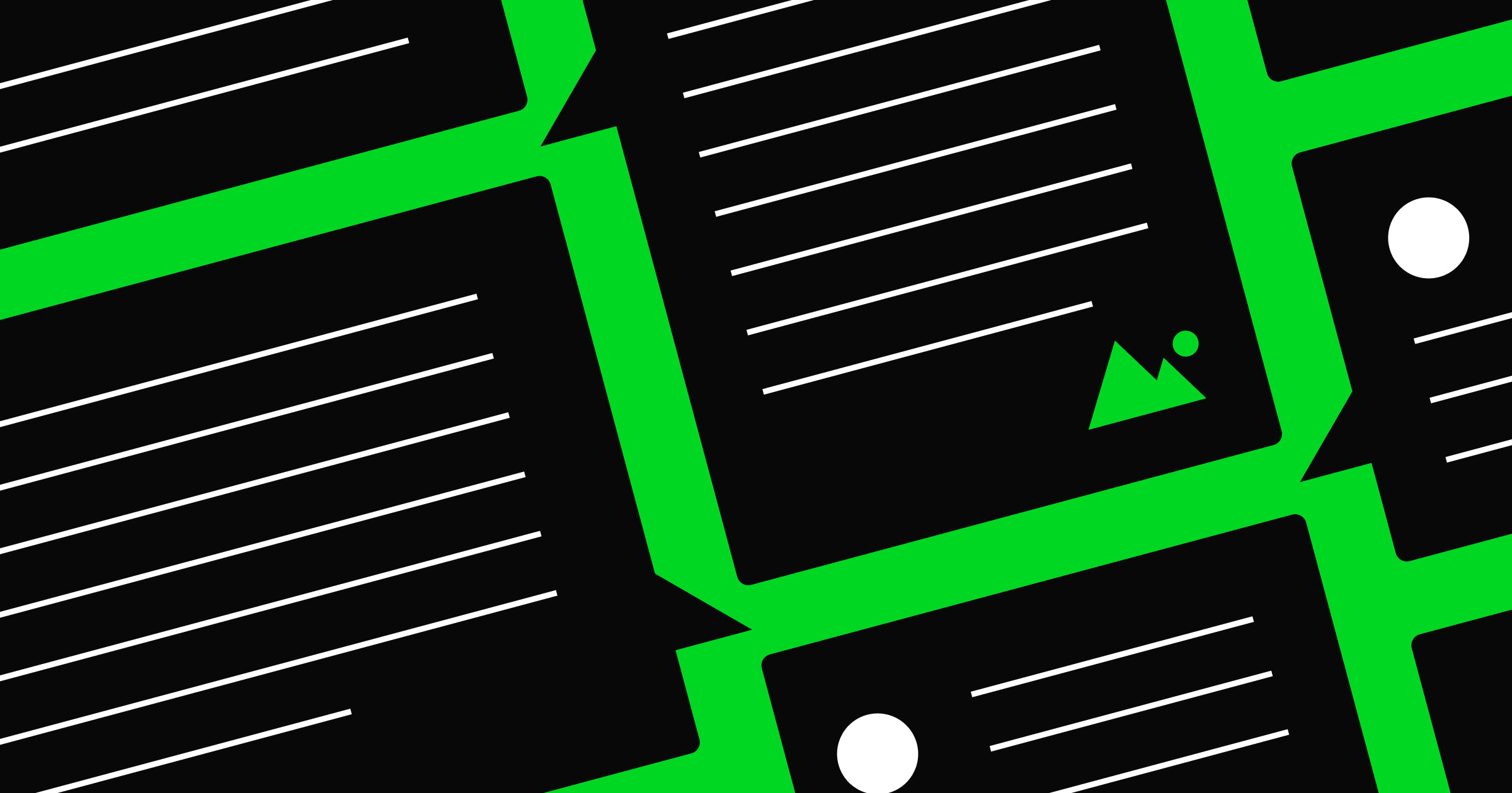
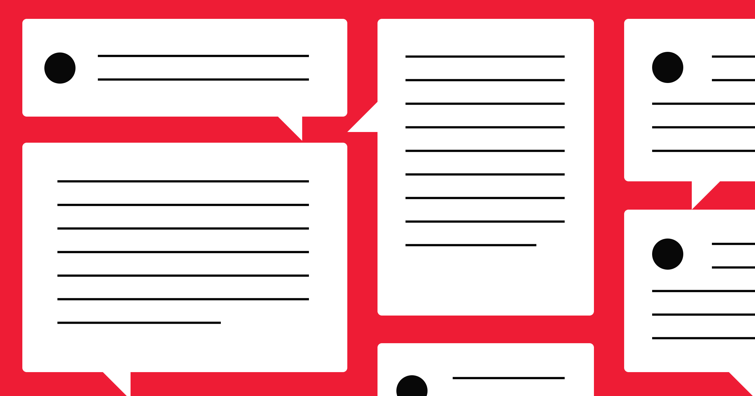
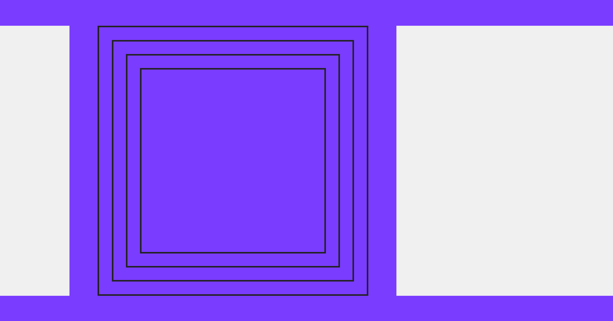
Neumorphism combines the tactile styling of skeuomorphism with the flatness of modern design, resulting in soft-edged components. It leverages shadows and highlights to create a subtle, raised effect that some appreciate for its minimalist feel.

Neomorphism; an evolution of two design styles

Neumorphism is essentially a hybrid of skeuomorphism and flat design, rendered through a modern design lens.As you explore skeuomorphism and flat design, you’ll see how both inform neumorphism. This knowledge can help you decide which elements truly enhance your product’s look.

Skeuomorphic beginnings

Neumorphism isn’t the first design style to emulate 3D and material textures. We can trace neumorphism back to skeuomorphism, which also attempted to mimic the physical world.

An image of the 1997 Apple.com website.
These buttons on the left hand nav from Apple’s 1997 website have a blunt sense of dimensionality that are one of the hallmarks of skeuomorphism.

Skeuomorphic design rose to prominence in the mid 90s. The idea was to make navigating the digital world and internet feel familiar through its use of 3D and objects from everyday life.

Elements like the trash bin or the folder icon made it clear what purpose they served. Additionally, websites had different types of clunky 3D user interface (UI) elements that mimicked actual buttons and sliders and used harsh drop shadows. It was common to see wood grain, plastic, shiny metal, and other organic-looking textures. Today, skeuomorphism looks clumsy and antiquated,  but at the time, the design world embraced these as leading techniques in product and UI design.

The rise of flat design

Flat design was a response to the overly elaborate web designs of skeuomorphism. While skeuomorphism took a complicated approach to replicating the real world, flat design attempted to simplify things. This design style started showing up in the early 2000s, popularized in large part by Microsoft.

A menu from the Windows 10 operating system. It is an iconic example of flat design.
Flat design is most often associated with Microsoft, and this menu from Windows 10 shows a keen sense of structure and a straightforward user experience.

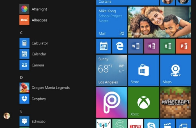
Flat design is based on minimalism — if something doesn’t help a visitor interact with a website, it’s left out. It strips websites and designs down to only what’s necessary. Instead of realism, flat design takes a two-dimensional approach. Typography is easy to read and color palettes are bright. This design concept places an emphasis on organization, with everything coming together to provide absolute clarity.

Skeuomorphism + Flat Design = Neumorphism

Neumorphic UI draws from both skeuomorphic and flat design concepts, offering a sense of physicality in a more refined way. While we still see some mimicking of real world elements (such as neumorphic buttons), neumorphism embraces the minimalistic look of flat design, which prioritizes ease of usability over ornamentation.

With a gentle touch, neumorphism bends light and shadows to create a sense of dimensionality. Rounded corners and thin lines are favored over blunt geometry. Generous amounts of gray or white space give every element plenty of breathing room, resulting in open and inviting layouts.

Neumorphism sculpts pixels through blur, light, shadows, and geometry. It’s a minimal aesthetic with simple color palettes, but it also has depth and dimensionality. By embracing neutrality, it delivers an unencumbered user experience.

The rapid ascent of neumorphism

Most track the birth of neumorphism to 2020 when designer Alexander Plyuto posted this concept design for a mobile banking app. With this design, Alexander introduced a more nuanced and contemporary approach that moved away from the heavy-handed physicality of skeuomorphism.

Alexander Plyuto's design for a mobile banking app — the start of neumorphic design.
Image source: Dribbble

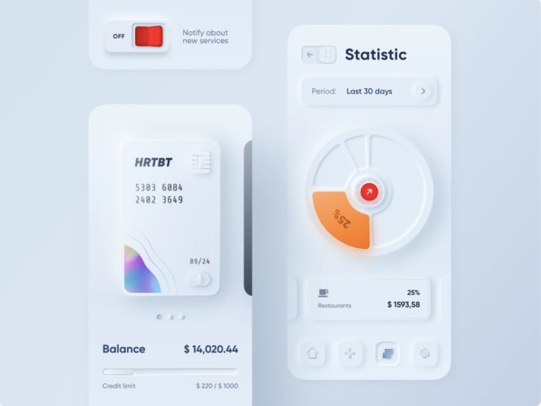
Neumorphism is often referred to as “soft UI” and we can see this in Alexander’s design. Visuals seem to lift off from the screen with a featherlike lightness. UI elements are embedded into a faint background. The drop shadows are light and feel natural. Harmony is favored over sharp contrasts.

Examples of neumorphic design

A grid of examples of neumorphic design.
Image source: Dribbble

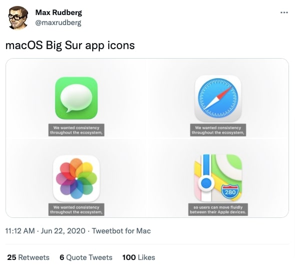
Alexander’s introduction of skeuomorphism made a huge impact and caught on quickly with designers excited to use this fresh aesthetic. Most prominently, was Apple’s 2020 launch of macOS Big Sur which featured skeuomorphic app icons that were touched with subtle drop shadows, depth, light patterns, and smooth curves. Apple’s adoption of neumorphism brought this design philosophy to a huge audience. The neumorphic style fit right into Apple’s ethos of “Think Different” and was a strong differentiator to Microsoft’s flat design. It was an aesthetic that felt like the future, instead of the stale design traditions of the past.

A tweet by Max Rudberg showing off the macOS Big Sur app icons.
Source: @maxrudberg

When something gets a lot of attention very quickly, it’s bound to receive scrutiny. There were grumblings about neumorphism before Apple used it, but this roll out of Big Sur brought on a flood of criticism. A major gripe was that there wasn’t any proof that it increased usability. Designers saw it as superfluous decoration that had no other point than being contrarian to standard design.

If neumorphism had remained small, it probably wouldn’t have fallen out of favor so quickly. The hype around neumorphism made its faults come to light in a flash, with designers all asking the same questions about usability. By 2021, most designers had eschewed it for design styles that already had a proven track record.

Pros and cons in UI design

Neumorphism brings a modern, eye-catching aesthetic thanks to its subtle shadows and highlights, but its reliance on low contrast can pose significant usability challenges. Designers often debate whether the visual novelty outweighs potential accessibility hurdles.

Accessibility challenges and user experience

Neumorphism may be a modern aesthetic but it’s been called out for accessibility issues, particularly for those with visual impairments.

When everything blends together in a cloud of low-contrast, it can be hard to differentiate between what’s on the screen. When designs fall below a certain color contrast ratio, buttons blend into the background and fonts become illegible.

Designers also note that neumorphism has similar issues as skeuomorphism when it comes to UI. Elements like buttons or sliders need signifiers indicating their functionality, as well as if they’ve changed states. When they’re in a monochromatic layout, with only shadows and light being employed to differentiate them, it can be impossible to tell whether or not they’ve been engaged. Plus, there’s no clear organization or direction showing what should be interacted with first.

Neumporphism may be a shiny and stylized look, but the accessibility issues and lack of obvious structure and functionality have led to this design style being used less often.

That’s not to say that the neumorphic style has disappeared entirely. Light and Day, an example from the Webflow Showcase, avoids some of the inherent problems of neumorphism by using a bit more contrast between the edges of its elements. We’re fans of how pronounced these buttons are, making sure that we can detect a change in their states.

Light and Day — an example of Neumorphic design from the Webflow Showcase.

Neumorphism may have its flaws, but in the hands of capable designers — and when used thoughtfully — it can transcend these limitations.

Is there a future for neumorphism?

In 2025, it’s likely designers will continue using neumorphism in limited but stylistically notable ways, like integrating soft dimensionality in elements like cards and subtle backgrounds, while maintaining accessibility standards.

The days of having entire websites rendered in neumorphism are behind us, but it will undoubtedly continue to have an influence.

Neumorphism works best when it’s used in small amounts and designers will likely continue to use it for things like card layouts or to frame elements like images or graphics that aren’t meant to be functional. In designs with strong contrast, accessible color schemes, and obvious UI elements, neumorphism’s blending of light, shadows, and dimensionality can still work as embellishments that add a touch of low-key realism.

Neumorphism won’t be relegated to the dustbin of obsolete design. There’s potential in its shiny sense of realism. We can look back at the roots of skeuomorphism, with its obnoxious fake textures and awkward buttons, and today see how it’s become much more slick and refined. Neumorphism will likely evolve as well, retaining an organic and modern sensibility while building more accessibility into the design style. Neumorphism’s legacy may be mixed, but its influence remains tangible.

Get into the flow of work faster with Blueprints

Software Stack Editor · April 2, 2025 ·

Traditional ways of innovating are inefficient, fragmented, and slow. That’s why, according to McKinsey, only 6% of CEOs are satisfied with the way they do it. They don’t need evolution. They need an intervention. 

That means putting innovation to work by making sure it drives measurable outcomes for critical projects. So Miro is changing to meet the moment; providing a turbocharged system for faster collaboration with superpowers like composable workflows, flexible formats, and customizable layouts – all supported by AI baked into everything.

[embedded content]

Forget about jumping between tools, apps, and browser windows. Forget about endless meetings, multiple updates, and version control meltdowns. Forget about work feeling like wading through treacle.

Instead, picture everything you need in a single place, with ready-made templates so you never need to start from scratch, customizing your workflows so they work perfectly for you. Imagine moving between docs, diagrams, tables, and timelines with zero friction, so all your notes, ideas, plans and goals sit in the same place where you actually bring them to life. 

“This isn’t just an upgrade on your existing tools; it’s an accelerant for innovation. No wasted time. No lost context. Just faster progress from strategy to execution.”

Now picture modern fonts, streamlined navigation, and vibrant colors, where every design choice has been carefully crafted to make collaboration feel more effortless, inspiring and productive than ever.

This isn’t just an upgrade on your existing tools; it’s an accelerant for innovation. It means discovery, definition, and delivery happen on the same canvas. No wasted time. No lost context. Just faster progress from strategy to execution.

While we think everyone will benefit from a speed boost, we’re particularly excited to unleash the potential of Product teams so engineers, designers, and product managers can get from idea to outcome faster. And because they can’t do it alone, it also means improving collaboration and unlocking better ways of working across the business.

Let’s start by looking at how we’re upping the pace for Planning and Roadmapping. 

A faster path from idea to impact

Product teams are the engine room of innovation, influencing the breakthrough products that actually get built. But traditional planning tools tend to result in roadmaps that are hard to follow and aren’t connected to specific tasks.

They also miss a critical step because behind every great product is a great insight. And figuring out what customers want is a whole other challenge. Let’s say you’re looking for data to inspire the discovery phase for your next feature. You check out Salesforce or some other CRM tool. Trawl through Jira or Notion. Dip into Zendesk, Gong or Intercom. None of these sources speak to each other, so is it any surprise teams struggle to align on their most important priorities?

With Miro, you can already move from feedback to features faster by bringing all your people and data together in one place, transforming insights synthesis from a solo effort into a team sport. Now we’re excited to launch Miro Insights (formerly Cardinal) to help teams make even smarter decisions about what to build next.

Miro Insights doesn’t just bring your data sources together – it brings them to life, using AI to spotlight backlog recommendations, map feedback to product strategy, and even forecast the revenue value of future features. You can sign up for early access now.

Once you know what you want to build, it’s time to make a plan. While the canvas naturally turns planning into a collaborative experience, the downside is that you can end up with a ton of content – sticky notes, diagrams, comments – that’s pretty hard for newcomers to navigate.

That’s why we’ve already released Spaces. With Spaces, all the boards, documents and data you could possibly need are grouped together in one place. Entire projects are accessible in a couple of clicks, including every comment and conversation that informed the final decision. So teams can jump straight into real work – no friction, no frustration.

But then we thought, ‘Why not go a step further?’ If we really want to help teams put innovation to work, then a blank canvas might not always be the best option. Especially for something like product planning and roadmapping. What if we could make it a simple, repeatable process instead?

Today we’re introducing Blueprints to take the guesswork out of projects and help streamline key use cases like planning and roadmapping.

Blueprints are ready-made Spaces that contain all the boards you need to get the job done. Think of them as a way to strike a balance between productivity and agility. Nobody needs the chaos that comes with completely undefined ways of working. On the other hand, too many restrictions and you get the sort of bureaucracy that grinds employee engagement into dust.

Because Blueprints are customizable, they can flex to accommodate whatever way of working suits your teams best. Like building blocks that you can re-arrange or build on top of until you’ve created the perfect workflow for you. 

How does it work in practice? Well, our Blueprint for roadmap planning features 11 boards split into three sections to guide you through your vision and objectives, with worksheets for individual teams to define their strategies, initiatives, and trade-offs, and finally a consolidated planning section to put all your team inputs into a company-wide roadmap, timeline, and stakeholder presentation.

Not only are these boards customizable (think your brainstorm needs a SWOAR instead of a SWOT? Go right ahead and change it), they all have AI tools – and everything else – baked right in. Let’s say you’re using the product vision template. You’ve got dozens of sticky notes with suggestions and feedback. So you use the AI assistant to do the hard work of turning it into a structured doc. If it needs more work, just switch to Focus Mode, going full screen on the document to drown out any other distractions until it’s edited to perfection.

With the discovery and definition phase complete, your team starts to think about delivery. They need a way to share early concepts with stakeholders without bouncing back and forth between different tools like Figma. So they turn to a new format: Slides.

Now they can simply select the relevant work on the canvas and turn it into a presentation at the touch of a button. It’s easy to re-order and add content, convert it into brand colors, or import a PDF from Google Slides or PowerPoint. That means they can take advantage of interactive experiences like dot voting, counters, and T-shirt sizing. So just like the rest of the product planning process, it isn’t only faster, it has collaboration at the core.

Keep pace with AI transformation

We’ve seen how Miro supports Product teams through better organization and customizable blueprints. Now let’s take a look at how we can help IT teams with a process that’s going to get a lot of attention from the C-suite this year: AI transformation.

Yeah, okay, #rollseyes and all that. But according to McKinsey, 92% of companies plan to increase their AI investment in the next three years. That means IT teams need to have an answer. But they can’t do it alone. Miro breaks down the walls between IT and the rest of the business so they can work together to define the opportunity, build a winning strategy, and manage their organization through the transition.

Miro is already the place where a lot of this work happens. That means it’s the perfect place to get stakeholders in sync: Running workshops on everything from strategic overviews to on-the-ground implementation, so every team can get on board – then get to work. 

To make the process even faster, we’ve created two AI Transformation Blueprints. These customizable templates help teams run an AI capability assessment, map out human/AI touchpoints, plan the implementation, and track performance. 

Not to get too meta, but teams can even use AI to crack the AI transformation code. For instance, by creating an Action Shortcut to auto-generate a list of AI use cases for consideration. They can also customize their Miro board for technical diagramming – taking advantage of all the tools and features you’re used to (multiplayer collaboration, super smooth UI, a full-screen Diagramming Format) with an added AI shape pack. So it’s easy to drag and drop AI agent icons, define human touchpoints, and set automation triggers.

As AI adoption accelerates, the companies that can design, implement, and scale AI workflows the fastest will have a major competitive advantage. With Miro, this transformation isn’t just an idea – it’s a structured, executable plan that puts strategy, workflow design and implementation tracking all in one place. And it actually uses AI to make AI delivery even faster.

How do we know it works? Because we’re doing it ourselves. “As a company that sits at the intersection of technology and innovation, it’s important that Miro is constantly embracing new and faster ways of working,” says Tomás Dostal-Freire, Miro’s CIO and Head of Business Transformation. “Using AI to define how our team members should partner with AI for their daily activities, give time back to employees to work on higher value-add initiatives, and ultimately improve our productivity and quality of output is a huge part of that. And of course we’ve mapped all of these workflows on Miro.”

In fact, Miro’s AI Transformation Blueprints are actually based on the processes Tomás and his team developed. “We were able to nail this workflow really fast,” he explains. “For one thing, we already have our entire business strategy and org structure already defined in Miro. And like most IT teams, we have a lot of experience running transformation projects. When you put those two things together, it’s pretty powerful. So even though ‘AI Transformation’ sounds like this incredibly difficult thing, what you find is that you already have a lot of the tools and expertise you need. Miro just supercharges the pace.” 

“Even though ‘AI Transformation’ sounds incredibly difficult, you already have a lot of the tools and expertise you need. Miro just supercharges the pace.”

Of course, that expertise doesn’t only exist inside IT. For all that AI Transformation usually starts within the CIO organization, it’s relevant to all parts of the business. One of Miro’s greatest strengths is bringing together leaders from every department into a single workspace so they can define the vision and direction of their AI strategy together.

We think that by combining the collaborative power of the canvas with customizable Blueprints, flexible formats, and AI, organizations will truly be able to unlock the full potential of their innovation projects. And it doesn’t stop with insights synthesis, product planning and roadmapping, or AI transformation.

New Blueprints are available right now for critical jobs like goal setting, customer journey mapping, process design, and organizational planning – with more to follow. And it’s not just us – the Miro community has been hard at work building its own Blueprints,  including an AI Enablement Sprint, Research Alignment Workshop, and Epic Feature Planning.

Not sure where to start? Miro Solution Partners can provide tailored workshops, training, and implementation support to help you turn snail-paced innovation projects into fast-moving success stories. They can also help with broader AI, agile, or cloud transformation initiatives – including customizing new features to align with your specific business needs – so you see immediate value from your Miro investment. 

Get ready for new ways to learn and test your skillset with Webflow University

Software Stack Editor · April 2, 2025 ·

We’re investing in more learning pathways and assessments to allow you to better test and showcase your expertise.

Starting today, we’re debuting new ways to learn, assess, and authenticate your skills and knowledge of Webflow. From the time and effort you put into strengthening your skillset to being able to share a verifiable certification with your network, Webflow University is designed for professionals, by professionals. Keep reading to learn more about the changes.

What’s new

Everyone approaches learning differently, but honing your expertise is key to advancing your career, expanding your practice, and building your professional reputation. That’s why we’re broadening our investment in Webflow University by launching a range of new skill assessments for all users and certifications for professionals. Here’s what’s new:

Free skill assessments

If you want to test your knowledge as you learn, take advantage of our new, free skill assessments. Available in Webflow University, these options are excellent evaluations of your current standing and are ideal for everyone, from individuals who are just starting out to those looking to scale their knowledge quickly. Currently, we offer free tests for:

  • Webflow 101: The ultimate course to learn the fundamentals of web design and development
  • Welcome to Optimize: Learn how to use Webflow Optimize to improve your site’s conversion rate using testing, personalization, and the power of AI
  • Accessibility on the web: Learn about accessibility on the web and how to create inclusive and accessible sites without writing code

But it doesn’t end here — we’re adding more free options across more courses, so stay tuned!

A screenshot of the Webflow 101 course header and table of contents
Webflow 101 course page

Webflow Practitioner Certification

We’re excited to introduce our brand new Webflow Practitioner Certification. This new accreditation not only allows you to showcase your true skills but also ensures you’re equipped with the deepest, most current expertise of our Website Experience Platform. 

The first of our new line of certifications geared towards professionals and teams, the Webflow Practitioner Certification is specifically designed for hands-on users who are seeking a verifiable credential. With a fee of $100 to take the exam, the Webflow Practitioner Certification includes:

  • A more comprehensive exam structure that adheres to certification industry standards
  • New exam questions that have been written and reviewed by a team of Webflow subject matter experts
  • A proctored exam to ensure an authentic and fair assessment of your Webflow expertise, hosted by Certiverse 
  • Verifiable digital credentials via Accredible, where you can check your credential’s authenticity and share your results on LinkedIn and other platforms

Upon passing the Webflow Practitioner Certification exam, you’ll earn a Webflow-verified digital badge and certificate that showcases your industry credibility, sets you apart from the competition, and reinforces confidence in your skills.

The Webflow Practitioner Certification certificate and badge
Webflow Practitioner Certification certificate and badge

Certified Webflow Partner pre-qualification exam

Previously, applying to become a Certified Webflow Partner required passing four different exams. Today, that has been streamlined into one, free entrance exam. This exam is ideal for any freelancer or agency looking to test their skills and join our growing network of Certified Webflow Partners. 

Webflow Certified Partners are highly skilled in client collaboration and project management. They excel in finding and winning new clients, connecting with a thriving community, and promoting their work in Webflow’s Marketplace. If this sounds of interest to you, learn more about becoming a Certified Webflow Partner.

A screenshot of the hero section of the Certified Webflow Partners page
Certified Webflow Partner page

What this means for you 

No matter where you are in your career, continuously sharpening your expertise is essential. That’s why we’re excited and committed to providing learning opportunities for everyone at every skill level. From free assessments for those just starting out to professionals seeking credentials for their team, you have the flexibility to choose how you want to learn and showcase your Webflow expertise.

The free skill assessments, the Webflow Practitioner Certification, and the Certified Webflow Partner pre-qualification exam are all available starting April 2, 2025. Looking to get started?

Have one of our legacy certifications?

If you currently have a Webflow 101, CMS, Layouts Level 1, or Layouts Level 2 certification, your existing certifications will stay active for 12 months after the date they were earned. Moving forward, starting with the Webflow Practitioner Certification, certifications will be valid for two years. We highly recommend exploring our new certification or trying our free skill assessments to continue growing your expertise.

What’s to come

We’re thrilled to be scaling our educational offerings while strengthening certification and expertise across our community and partners. Following the exciting launch of our new Webflow Practitioner Certification and accessible education pathways, we’ll continue to incorporate your valuable feedback into Webflow University to ensure we’re able to support your career goals every step of the way.

We’re not just dedicated to your continued success with Webflow — we’re investing in it with more learning opportunities on the horizon. We can’t wait to reveal our upcoming plans that we’ve developed alongside you, our team, and our community.

14 content promotion strategies to boost your brand’s online presence

Software Stack Editor · April 2, 2025 ·

image

Without promotion, even the best content can go unnoticed.

Properly advertising your website ensures it reaches your intended audience. Without the right content promotion strategies, all the time and resources spent creating valuable blogs and web designs go to waste.

To make sure target audiences discover and engage with your content, you must seize opportunities to connect with potential customers, build your brand, and drive conversions.

Learn how to promote content to magnify your company’s online presence.

Why content promotion strategies matter

Promoting your online material increases visibility, driving more traffic to your website by generating interest in your offering. Strong strategies maximize your return on investment in content creation and help build brand awareness and authority within your industry.

Content promotion also improves your search engine rankings. When more people engage with your brand, search engines recognize your site as a valuable resource and rank your site higher, leading to higher discoverability and more organic traffic over time.

For example, promotion strategies like influencer collaborations and guest posts can generate opportunities for high-quality backlinks, boosting your search engine optimization (SEO) efforts.

Overall, content promotion is a critical aspect of a successful digital marketing strategy and is necessary for sustained growth and long-term success.

14 content and marketing promotion strategies for 2025

Effective content promotion strategies capture attention and drive audience engagement. Here are 14 promotion techniques with best practices to ensure your content reaches its full potential.

1. Boost visibility with advanced SEO techniques

Advanced SEO techniques involve optimizing your content so your website ranks higher in search engine results pages (SERPs), increasing visibility and organic traffic. When your pages appear toward the top of search results, they attract more clicks and drive traffic without affecting your advertising budget.

Best practices:

  • Conduct keyword research. Use long-tail keywords relevant to your audience to shape content that addresses their needs and pain points.
  • Consider on-page SEO. Optimize metadata like titles, descriptions, and headers with targeted keywords and images with alt text.
  • Prioritize technical SEO. Ensure your website loads quickly, is mobile-friendly, and has a proper URL structure.
  • Use schema markup. Use structured data and rich snippets to help Google and other search engines understand and accurately index your content.

2. Link to top-performing content

Internal linking requires adding hyperlinks within your content that direct visitors to other pages on your site. These links improve the user experience by guiding readers to relevant content without them having to leave your website for additional information.

Best practices:

  • Link to high-value pages. Identify your website’s cornerstone content and best-performing pages and link to them from relevant new material.
  • Use descriptive anchor text. Ensure the linked text is informative, is relevant, and summarizes the destination page’s topic.
  • Audit links regularly. Periodically review and update internal links so they lead to current, valuable content.

3. Share valuable content with email subscribers

Email marketing involves sending targeted content directly to a subscriber’s inbox. It’s an effective tactic for delivering personalized content, generating leads, and building lasting relationships with your audience.

Best practices:

  • Segment your list. Group subscribers and potential leads into segments based on their behavior and interests to send more relevant content.
  • Personalize emails. Include the subscriber’s name in the subject line and copy, and tailor content to their preferences to encourage conversions.
  • Include clear calls to action (CTAs). Craft CTAs encouraging email recipients to take specific actions, such as reading an article or downloading a resource.

4. Make your content shareable

Ensuring content is shareable makes it convenient for website visitors to circulate your blog posts and recommend your products on social media platforms. This extends your brand’s reach as people share your content across different channels and allows you to reach new audiences without additional marketing effort.

Best practices:

  • Add social sharing buttons. Add prominent CTA buttons to draw attention and encourage visitors to share content.
  • Include engaging visuals. Add eye-catching multimedia like images, infographics, and videos that entice people to share.
  • Optimize click-to-share elements. Highlight noteworthy quotes, statistics, and facts that people can share and credit to you with one click directly from your website.

5. Create social media content for broad distribution

Tailoring content specifically for social networks like Facebook and TikTok lets you use each platform to direct traffic back to your website. With over 5 billion users worldwide, these platforms help you reach a wider audience quickly.

Best practices:

  • Generate platform-specific content. Create content that plays to each platform’s strengths, such as stories and visuals for Instagram, articles for LinkedIn, and posts for X.
  • Maintain a consistent posting schedule. Identify peak engagement hours and keep a regular posting schedule to continuously engage your audience.
  • Use hashtags and tags. Increase the discoverability of your social media profiles and website by adding trending hashtags to posts and tagging related accounts.

6. Implement an omnichannel marketing strategy

Omnichannel marketing means creating a seamless, consistent experience across all online and offline channels. It’s a multichannel content promotion technique that ensures a uniform brand message and user experience through your website, social media profiles, and physical locations.

Best practices:

  • Uphold consistent branding. Follow a business style guide to maintain cohesive branding across all channels, considering elements like colors, tone of voice, and typography.
  • Integrate marketing campaigns. Synchronize content promotions across your website, email, and social media so they reach multiple target audiences simultaneously.
  • Leverage journey mapping. Understand and optimize the various touchpoints in your customer’s journey.

7. Repurpose and update existing content

Content repurposing involves adapting existing content into different formats, like translating long-form written articles into graphics or videos. This extends your material’s lifespan by reaching larger audiences in various formats.

You can also update existing content on your website with new information, images, and SEO enhancements and promote it as if it were brand new. Regular updates keep your brand relevant and help reengage your existing audiences while appealing to new ones.

Best practices:

  • Convert blog posts into videos. Create short video summaries of your most popular articles.
  • Turn data into infographics. Allow visitors to visualize statistics and data points through infographics, making them more digestible and shareable.
  • Compile articles into ebooks. Combine related blog posts and topics into comprehensive guides or ebooks.
  • Add new insights. Include recent data, trends, and case studies to provide the most reliable, up-to-date information and gain an edge over competitors.‍
  • Reshare on social media. Promote updated content through email newsletters and on platforms like Facebook, Instagram, and TikTok.

8. Promote popular content with CTA banners

CTA banners are prominent advertisements on your website that encourage visitors to take action. They usually appear at the bottom or side of the screen and draw attention to high-value content for visibility and engagement.

Best practices:

  • Place CTAs strategically. Place CTA banners in high-traffic areas like the homepage or at the end of articles.
  • Create clear messages. CTA banners offer limited space, so use concise and compelling language with action-oriented phrases, such as “Try it for yourself!” or “Buy now!” to prompt action.
  • Perform A/B testing. Test different versions of your website by comparing various designs and placements to find the most effective, conversion-optimized combination.

9. Use paid advertising

Paid advertising requires paying for ad placements on platforms like Google, Facebook, and Instagram to promote your content. Paid ads can target specific demographics to ensure your content quickly reaches a highly relevant audience who’s more likely to take action.

Best practices:

  • Target your campaigns. Use detailed targeting and search retargeting campaigns to reach your ideal audience.
  • Write compelling copy. Write engaging, persuasive ad copy that includes relevant keywords to encourage clicks.
  • Monitor and optimize. Regularly track ad performance with data analytics tools and make adjustments to improve results.

10. Partner with influencers

Working with influencers is a marketing technique that involves collaborating with individuals and brands who have large, loyal followings to promote your content. Influencer marketing can amplify your company’s reach by connecting you to new audiences and lending credibility to your brand with positive reviews.

Best practices:

  • Identify the right influencers. Choose influencers whose values, audiences, and content style align with your brand identity.
  • Generate collaborative content. Work with influencers to create authentic content that resonates with their followers while promoting your brand.
  • Track results. Measure the impact of influencer campaigns on traffic and engagement to see how they benefit your bottom line.

11. Create video content

Video content can include interviews, customer testimonials, and product or service demos. Videos are highly engaging and convey complex information in a more digestible package than lengthy articles or stat-packed infographics. You can also add a presenter or a voiceover with background music to humanize your videos and provide a personal touch.

Best practices:

  • Be concise. Keep videos engaging and to the point to maintain viewer interest and reduce bounce rates.
  • Prioritize top-quality production. Invest in high-grade video production, including clear audio, high-resolution recording, and professional editing.
  • Optimize for SEO. Use relevant keywords in video titles, descriptions, and tags.

12. Encourage employee advocacy

Ask employees and teammates to share company content on their personal social media profiles. They can extend your reach by circulating brand-related information, such as offers and user testimonials, and lend your promotions a personal touch and credibility.

Best practices:

  • Provide shareable content. Give employees and team members easily shareable content they can repost, such as prewritten posts or visuals that capture attention and are quick to consume.
  • Incentivize sharing. Offer incentives and recognition to employees who actively share brand-related content.
  • Track and measure. Keep tabs on the impact of employee advocacy to see how it affects reach and engagement.

13. Engage in online communities

Actively participate in forums, social media groups, and other online spaces where your target audience gathers. This helps you establish a brand presence and improve your company’s authority while sharing your content with an interested audience.

Best practices:

  • Provide value. Share helpful insights, answer questions, and contribute to discussions without overly promoting your content and products or services.
  • Maintain consistent engagement. Regularly participate in communities to build trust and recognition and establish your position as a thought leader in your industry.
  • Share relevant content. When appropriate, share your brand’s content as a resource that adds value to the community.

14. Host webinars and live events

Webinars are interactive online sessions where you can share valuable content and engage directly with your audience. These events let you engage with attendees on a personal level while providing in-depth brand-related information and answering questions in real time.

Best practices:

  • Choose relevant subjects. Select topics that address your target audience’s needs and interests.
  • Spread the word. Promote the event on your website, email, and social media channels to attract attendees.
  • Invite real-time engagement. Encourage active participation during the event through Q&A sessions, polls, and interactive discussions.

Support content promotion with Webflow

Implementing an effective, well-rounded promotion strategy maximizes your content’s impact and encourages meaningful engagement. But whatever approach you take, you must back it up with a high-performing website.

With Webflow, you can access advanced SEO tools, seamless app integrations, and a visual content management system. Webflow’s features provide everything you need to amplify your content’s reach.

Start growing your business with Webflow today.

10 Best ServiceNow Alternatives and Competitors in 2025 [Updated April]

Software Stack Editor · April 1, 2025 ·

After evaluating numerous ServiceNow alternatives for organizations worldwide, I’ve identified superior options for teams finding ServiceNow too complex or expensive. These ServiceNow alternatives deliver comparable ITSM functionality without requiring specialized support resources.

When implementing ServiceNow alternatives in 2025, I’ve documented how the right ServiceNow alternative transforms service delivery while significantly reducing costs. Organizations consistently report that these ServiceNow alternatives offer more intuitive interfaces and faster deployment than ServiceNow’s lengthy implementation process.

Why Look for ServiceNow Alternatives? 

ServiceNow undoubtedly helps you create smooth and organized workflows for managing your data, IT systems, and services.

The platform, however, isn’t suitable for every team. Let’s go over some of the drawbacks of the solution. 

Below are the top three reasons (according to verified reviews) to consider ServiceNow alternatives and competitors in 2025:

ServiceNow’s costs will sneak up on you

ServiceNow requires regular maintenance, updates, and support to run smoothly and securely. And these ongoing services often attract extra fees, adding to the total cost.

Setting up and integrating ServiceNow into a company’s existing systems can be expensive and time-consuming. Often, companies hire specialized consultants to ensure everything goes smoothly, which adds even more to the overall cost.

The learning curve is too steep for teams with limited IT support

Customizing ServiceNow to fit your unique workflows and processes can be tough, especially if you run a small IT team with limited resources. 

Furthermore, the platform’s learning curve is steep. This means you’ll need to train your employees to use the platform effectively, which can be time-consuming and expensive. 

ServiceNow lacks low-code UI/UX flexibility

ServiceNow is quite rigid and tough to customize. 

Often, users tailor their workflows to suit the tool, which can result in inefficiencies and a decrease in overall productivity.

This tool isn’t your best option if you value customizing workflows to suit specific processes.

What Are the Best ServiceNow Alternatives & Competitors in 2025?

After extensively testing dozens of ITSM platforms, I’ve identified these 10 ServiceNow alternatives as the most effective replacements for organizations seeking better value. These top ServiceNow alternatives deliver comparable functionality at lower price points, with many ServiceNow competitors offering more intuitive interfaces and faster implementation.

My evaluation of ServiceNow alternatives focused specifically on workflow automation capabilities, user experience, customization options, and total cost of ownership—the key factors organizations consider when selecting ServiceNow alternatives in 2025.

‍

Top Solutions What They Do
SmartSuite All-in-one work management platform that integrates project management, task tracking, and collaboration tools into a single, customizable workspace.
Freshservice Ticketing system for streamlining customer support.
Jira Service Management ITSM with an extensive library of pre-built workflows.
ClickUp Unified platform for task management, project management, and collaboration.
Zendesk Customer support and engagement across multiple channels (social media, emails, chat, and others).
Freshdesk Comprehensive features for ticketing, automation, and customer support.
HelpScout Personalized and human-centric customer support experience.
SysAid Integrates AI in IT service management for seamless service management.
Atera Integrates remote monitoring and management, ticketing, and billing into a single, user-friendly solution.
SolarWinds Service Desk An AI-powered IT service management platform that streamlines service delivery.

SmartSuite is an easy to use, no-code platform that allows you to organize your workflows with ease. It’s well-suited for businesses looking to tailor their work management software to a centralized platform. 

Full disclosure: While SmartSuite is our platform, we’ll share an unbiased view of the tool’s abilities and why it stands out from other ServiceNow alternatives. 

SmartSuite offers a flexible platform for managing business processes and collaborating on projects. This helps address some of ServiceNow’s shortcomings while also allowing .

Let’s dig into some of its features.

Features #1: Workflow Automation

SmartSuite’s workflow automation saves you time on routine and manual tasks. Set up automations without any code. All you need to do is create custom automation rules that trigger specific actions based on trigger requirements. 

Here’s how it works:

  • Set up workflows: You can create workflows using a simple drag-and-drop interface. For example, you can design a workflow that sends a notification once a task is completed.
  • Automatic execution: These workflows run automatically when triggered by a specific action. For example, if you complete a task, its status changes automatically to show the task is completed. 
  • Keep everyone informed: You can set workflows to update records and send notifications when deadlines for critical tasks are near. This ensures that everyone involved receives updates without needing to constantly check in manually.

Try it out for yourself ⤵️

Feature #2: Real-time collaboration and communication

SmartSuite lets you collaborate with your team directly on the platform. Team members won’t need to switch applications to communicate while working on a project. 

[embedded content]

This means each conversation is organized within the context of specific tasks.

Some of its key functionalities include:

  • Comments and @Mentions: Team members can leave comments directly on tasks or documents and tag each other for instant feedback and discussion.
  • Live Updates and Notifications: Changes made in the project are updated in real time, and automated notifications keep everyone informed about updates, deadlines, and changes.
  • Shared Workspaces and Document Editing: Multiple users can work on the same document or task simultaneously, with changes visible to all in real time. This way, you’re sure of seamless teamwork and productivity.
  • Guest Role: This role is specifically designed for external users such as contractors. 

For IT teams, the ability to set up custom dashboard while enabling real-time communication is a game-changer. 

Here’s an example

Feature #3: Project Management

With SmartSuite, you can plan, track, and manage projects of different sizes. 

The platform presents a dashboard that provides you with a real time overview of your projects, tasks, and team performance in a visual format. 

[embedded content]

 Below are its key functionalities:

  • Dependency Fields: This feature helps you to establish task sequences for an enhanced project workflow. This way, you can define task relationships like predecessors and successors to ensure your tasks are completed logically. 
  • Gantt View: With this view, you can have a visual timeline of project tasks, showing their start and end dates, as well as dependencies between them. This helps track project progress and ensure tasks are completed on schedule. 
  • Team-Based Dashboards: With this views, managers can plan their whole team’s priorities and next steps, along with getting a centralized repository for files and assets.
  • Files and Deliverables: Attach key deliverables, provide feedback, and manage versions – all right in the context of your project work.
  • Assign and Track Projects: See your team’s time entries and filter them in any number of ways to build customized reports. 

‍

Additionally, SmartSuite’s Gantt view allows for customization of project templates and integration with other views like Kanban and Calendar for comprehensive task management.

SmartSuite pricing plans

SmartSuite offers a 14-day free trial and a forever-free plan with access to automation, team collaboration, authentication, and much more. 

As for the paid plans, choose from four options:

  • Team: Starts at $12/user per month
  • Professional: Starts at $28/user per month
  • Enterprise: Starts at $35/user per month
  • Signature: Customized plan tailored to your organization’s needs and team size.

Why do we think SmartSuite is the best alternative to ServiceNow?

Unlike Servicenow, SmartSuite offers countless work templates that help you get started without needing to tap into technical teams or consultants. 

Furthermore, the platform lets every department manage and automate processes within SmartSuite, whereas ServiceNow cannot easily support non-IT processes. 

‍

Below is how SmartSuite compares to ServiceNow:

‍

‍

Ready to try out the tool? Click here to get started. 

‍

SmartSuite’s Pros and Cons

✅ Modern / Intuitive interface

✅ Supports both Process and Projecy Managemntworkflow automation and work management

✅ Enterprise-grade Security and ComplianceExtremely generous free plan with access to advanced features

✅ 200+ templates across 35 business process categoriesfor different use cases

✅ Comprehensive IT / GRC CapabilitiesNo-code automation to streamline your workflows

❌ Only 25 native integrations Limited native integrations

2. Freshservice & Freshdesk

Best for: Helping IT teams automate and streamline service desk operations.

Similar to: Jira and Zendesk.

Freshservice helps organizations streamline their IT operations and service delivery. 

The cloud-based platform provides features like a ticketing system, self-service portal, knowledge base, asset management, and more.

Unlike Servicenow, Freshservice offers IT and business teams a less technical and cost-effective platform for improved productivity, operational transparency, and increased ROI. 

Combined with Freshdesk, it can be a solid option for IT management and technical support.

Key Features

  • Ticketing System: A centralized platform to track and manage IT support requests efficiently, ensuring timely resolutions.
  • Self-Service Portal: Enables users to independently find solutions and submit requests, reducing the workload on IT teams.
  • Asset Management: Monitors and manages IT assets, including hardware and software, to optimize utilization and maintenance.
  • Omnichannel support: Freshdesk allows customers to reach out via multiple channels like email, phone, chat, social media, and more.
  • Automation: Freshdesk automates tasks like ticket assignments, repetitive responses, and workflow management to improve efficiency.

Pricing plans 

As with every Freshworks products, pricing is affordable and varies based on the number of agents you have on the platform, along with which features you’d like included. 

Note that advanced support capabilities like custom roles and customer segmens are only available on premium plans. Freshdesk and Freshsuite both have the same price per agent.

Choose from 4 plans, all of which have a free trial: 

  • Starts at $19 per month billed annually, or $29 billed monthly.
  • Growth: $49 per month billed annually or $59 billed monthly.
  • Pro: $95 per month billed annually, or $115 billed monthly.
  • Enterprise: $119 per month billed annually, or $145 billed monthly.

Pros and Cons 

✅ The platform’s interface is simple to set up and customize.

✅ Strong automation capabilities.

✅ Seamless integration with other Freshworks products and third-party tools.

❌ Lack of direct integration with HR and recruiting software.

❌ Outdated support resources.

❌ Slow customer support.

3. Jira Service Management 

Best for: IT service management (ITSM) and enterprise service management (ESM). 

Similar to: Freshservice and Zendesk.

Jira Service Management solution enables teams to easily receive, track, manage, and resolve customer requests.

The platform is designed to bring together IT, development, operations, and business teams to collaborate.

Contrary to ServiceNow, Jira is easy to implement, integrate, and scale in the long run.

Key features

  • Request Management: Allows teams to manage work across various channels, this way, your employees and customers will receive the help they need quickly.
  • Incident Management: Enables development and IT operations teams to respond rapidly to incidents, resolve them, and continuously learn from them.
  • Plugins: Offers a wide variety of plugins for additional integrations, workflow enhancements, reporting, and automation.

Pricing 

Jira Service Management offers four pricing plans:

  1. Free: $0, for up to 3 agents, basic features.
  2. Standard: $17.65 per agent/month, includes custom-branded help center, alerts, on-call schedules, unlimited email notifications, and 9/5 support.
  3. Premium: $44.27 per agent/month, adds AI-powered services, virtual agent, asset and configuration management, advanced alert integrations, and 24/7 support.
  4. Enterprise: Custom pricing, adds advanced analytics, security, and unlimited automations, with up to 150 instances and 24/7 dedicated support.

Pros and Cons 

✅ Centralized incident ticketing system that provides full visibility into ongoing issues.

✅ Robust automation features to establish predefined workflows and triggers.

❌ Dependence on plugins for certain features, which some users find inconvenient.

❌ Non-technical users don’t tend to enjoy Jira’s interface.

4. ClickUp

Best for: Project management, team collaboration, and task organization.

Similar to: Asana, Monday.com and Basecamp.

ClickUp provides an all-in-one platform that combines features like tasks, documents, goals, and chat in one place for increased productivity. 

In comparison to ServiceNow, Clickup has a highly customizable and flexible interface that you can tweak to suit the needs of your team. 

It’s not purpose-built for IT, and may lack some of ServiceNow’s automation and code-generating capabilities, but many IT teams prefer it’s simple interface with lots of features. 

Key features

  • Task and project management: ClickUp provides a range of task management features like Gantt charts, Kanban boards, and custom automation to help teams plan, track, and deliver projects effectively. 
  • Collaboration: ClickUp provides tools like real-time editing, comments, and mentions.
  • Reporting and visibility: ClickUp offers dashboards, workload views, and goal tracking to provide teams with better visibility of project progress. 

Pricing

ClickUp offers the following pricing plans:

  1. Free Forever: $0, suitable for personal use, includes 100MB storage and essential features.
  2. Unlimited: $7 per user/month, ideal for small teams, offers unlimited storage, integrations, dashboards, and more.
  3. Business: $12 per user/month, best for mid-sized teams, adds advanced time tracking, automations, and more.
  4. Enterprise: Custom pricing, designed for large teams, includes white labeling, advanced permissions, and dedicated support.

Pros and Cons

✅ Offers excellent flexibility and customization options to fit different team needs.

✅ Effective for monitoring jobs and projects, especially for smaller teams.

✅ Affordable.

❌ Some users have reported challenges with the desktop app and integrations.

❌ Doesn’t support complex process automation.

5. Zendesk

Best for: Customer service management for handling support tickets across multiple channels. 

Similar to: Freshdesk, Zoho Desk.

Zendesk is a customer service tool that helps organizations deliver better customer experiences. 

In comparison to ServiceNow, Zendesk focuses on providing a centralized ticketing system to organize customer inquiries and support requests across multiple channels like email, chat, phone, and social media.

Key Features

  • Multi-channel support: This allows customers to reach out via email, chat, phone, social media, and more.
  • Live chat: For effective customer support and engagement.
  • Automation: To streamline workflows, route tickets, and provide quick resolutions.

Pricing plans

Zendesk offers four main basic pricing plans:

  1. Suite Team: $55 per agent/month, includes basic support features.
  2. Suite Growth: $89 per agent/month, adds advanced tools like multiple ticket forms and SLAs.
  3. Suite Professional: $115 per agent/month, includes custom analytics and skills-based routing.
  4. Suite Enterprise: $169 per agent/month, offers advanced customization and compliance features.

💡 Note that Zendesk’s cost is sneaky, as some of the IT support capabilities will need to purchased as add-ons. 

Pros and Cons

✅ Offers features like live chat, ticketing, knowledge base, automation and analytics.

✅ Customizable to meet specific business needs.

❌ Ticket management could be improved, with users wanting more filters and the ability to create folders.

❌ Extra costs can scale quickly. 

6. HelpScout

Best for: Personalized services for customers.

Similar to: Zendesk and Freshdesk. 

HelpScout helps organizations deliver efficient, personal support to their customers through shared inbox platform that leverages AI to help support reps handle more tickets.

It’s a good ServiceNow alternatives for teams that want to handle simple support tickets without getting too technical.

Key features 

  • Automation: Freshdesk automates tasks like ticket assignments, repetitive responses, and workflow management to improve efficiency.
  • Self-service: The tool provides a knowledge base and community forums to enable customers to find answers independently.
  • Customization: Freshdesk can be customized to fit the specific needs of a business.   

Pricing plans

Help Scout offers three pricing plans:

  1. Standard: $22 per user/month, includes 2 shared inboxes, 1 knowledge base, automated workflows, and basic reporting.
  2. Plus: $44 per user/month, adds 5 shared inboxes, 2 knowledge bases, 25 light users, advanced permissions, and custom reporting.
  3. Pro: $65 per user/month, offers 25 shared inboxes, 10 knowledge bases, 50 light users, enterprise security, HIPAA compliance, and dedicated support.

Unlike ServiceNow, which targets large enterprises with extensive ITSM capabilities and complex workflows, Help Scout focuses on providing simpler, more affordable customer support tools suitable for smaller teams.

Pros and Cons 

✅ Extremely easy to learn and use, with a simple and intuitive interface.

✅ Offers useful workflows to automate actions like sending notifications for bad customer ratings.

❌ The user interface could be improved for tracking open, in-progress, and resolved tickets.

❌ Does not support live tehnical support features like screen control and risk identification. 

7. SysAid

Best for: ITSM for automated ticketing, asset management, and workflow automation.

Similar to: Atera, SolarWinds Service Desk.

SysAid is an IT service management (ITSM) solution that helps organizations deliver exceptional automated service. 

The tool delivers a knowledge base to help customers find answers to common questions and a conversational AI chatbot to provide instant support. 

SysAid is a better alternative to ServiceNow for teams looking for a flexible solution with a drag-and-drop workflow builder. 

Key features 

  • Automated help desk and ticketing system: SysAid allows users to create and monitor support tickets, with features like automatic ticket creation from emails and self-service portals for users to report issues.
  • Asset management: SysAid enables tracking and management of hardware, software, and other IT assets across the organization.
  • Workflow automation: SysAid can automate various IT processes like employee onboarding, patch management, and more.

Pricing plans

SysAid doesn’t disclose pricing on its website. You must contact their sales team to get a quote. Unlike ServiceNow, however, it offers more flexible and customizable plans and has free trials.

SysAid offers three main pricing plans:

  1. Help Desk: Designed for lean teams, includes incident management, self-service portal, service catalog, asset management, and basic reporting.
  2. ITSM: For mid-sized organizations, includes all Help Desk features plus ITIL package, workflow automation, third-party integrations, and advanced SLA management.
  3. Enterprise: For large teams, includes all ITSM features with unlimited agents, automation rules, and custom columns, plus premium service.

Pros and Cons

✅ Robust help desk functionality for managing incidents, requests, and problems.

✅ Customize workflows and reports to meet company needs.

✅ Effective search function.

❌ Workflows can be difficult to create and modify.

❌ Outdated user interface. 

❌ Long implementation process.

8. Atera 

Best for: Remote monitoring and management (RMM), and IT automation for IT departments.

Similar to: SolarWinds Service Desk, SysAid.

Atera is an all-in-one IT management platform that offers remote monitoring and management, professional services automation, and remote access abilities for IT professionals and managed service providers.  

Atera is a better alternative to ServiceNow for teams without excessive training. The platform provides an intuitive interface that enables IT teams to easily navigate and manage tasks, and has recently gotten an AI upgrade that customers love. 

Key features 

  • Remote Monitoring and Management (RMM): Atera’s RMM software offers full visibility and control over IT infrastructure to allow users monitor and manage devices, servers, and networks proactively.
  • Patch Management: Atera automates software patching and updates for Windows, Mac, and various applications to keep systems secure and up-to-date.
  • Helpdesk and Ticketing: Atera’s integrated helpdesk and ticketing system enables IT teams to manage support requests and incidents efficiently. 

Pricing plans

Atera offers two main pricing plans for IT departments:

  1. Professional: $149 per technician/month (billed annually) or $169 (billed monthly). This plan includes unlimited devices, remote monitoring, patch management, helpdesk, ticketing, and automation tools.
  2. Power: $169 per technician/month (billed annually) or $199 (billed monthly), which adds advanced security features, network discovery, and more customization options.

Compared to ServiceNow, which provides comprehensive ITSM solutions for large enterprises, Atera focuses on a pay-per-technician model, making it more cost-effective for smaller IT teams.

Pros and cons 

✅ Effective patch management and security scanning.

✅ Intuitive user interface and easy deployment.

✅ Action AI flags issues to IT support representatives.

❌ Limited mobile app functionality.

❌ Basic reporting capabilities.

9. SolarWinds Service Desk 

Best for: ITSM focusing on incident, asset management, and ticketing. 

Similar to: Freshservice and Zendesk.

SolarWinds Service Desk provides an AI-powered knowledge base to help your team with the resources they need to solve problems efficiently. 

Plus, the tool provides a cheaper alternative to help you cut costs while improving your team’s productivity. 

Unlike ServiceNow, you can set up the solution in a few days and fit it seamlessly into your existing workflows, but the interface is outdated and clunky.

Key Features 

  • Incident Management: Automates ticket routing, prioritization, and reporting to efficiently track and resolve IT incidents.
  • Change Management: Implements a structured approach to managing changes, ensuring compliance with organizational policies and industry standards.
  • IT Asset Management: Provides comprehensive visibility into IT assets, including hardware, software, and licenses, enabling effective lifecycle management and cost optimization. 

Pricing plans 

SolarWinds Service Desk offers three pricing plans:

  1. Essentials: $39 per technician/month, includes incident management, knowledge base, service portal, asset management, and SLA management.
  2. Advanced: $79 per technician/month, adds custom fields, advanced automations, virtual agent, network discovery, and API access.
  3. Premier: $99 per technician/month, includes visual CMDB, advanced support, and up to 1,500 API calls per user per minute.

All plans support unlimited users and provide 24/7 live chat support.

Pros and Cons

✅ Easy implementation. 

✅ Vast automation options. 

❌ Navigation can sometimes be confusing.

❌ Outdated interface.

Conclusion

We’ve examined both the strengths and limitations of the ServiceNow platform alongside the best ServiceNow alternatives available in 2025.

By now, you should have identified which ServiceNow alternative best addresses your specific needs. Many organizations find that SmartSuite stands out among ServiceNow alternatives for its ability to consolidate multiple workflows into a single platform.

Unlike other ServiceNow alternatives that focus solely on ITSM, SmartSuite enables teams to collaborate in one unified environment rather than managing work across disconnected systems.

Sign up for SmartSuite and make your dream of an all-inclusive workspace a reality.

[embedded content]

Read More

Website analytics 101: A quick start guide to driving better website performance

Software Stack Editor · April 1, 2025 ·

If you aren’t leveraging data to inform your website decisions, you’re missing out on critical revenue driving opportunities.

Teams managing websites are faced with making choices constantly. From CTA placement to understanding their core audience, content editors, designers, and developers need to align their decisions with key business goals to maximize revenue and attribute their efforts to real business value. 

To do this, these teams need actionable data. 

In this post, we cover the basics of website analytics and reveal how we’re making website data accessible and actionable for everyone.

Website analytics overview

Website analytics refers to the process of measuring, collecting, and analyzing data about website visitors and their behavior. They are a treasure trove of information about your visitors — who they are, where they’re located, what devices they use, what content they’re engaging with, and more. 

Website analytics are the true unlock in understanding what about your website is working and what’s not, providing a clear picture of overall website performance. Once a baseline for website performance is established, you can take it one step further and develop website testing and experimentation programs to refine the user experience and maximize conversions.

Before we get into the power of using analytics to improve engagement with your site, let’s cover some basic terminology.

Metrics and terminology

There’s a standard set of terms that most website analytics tools will use in assessing data about website traffic:

  • Visitors, sometimes called unique visitors: The total number of new and returning visitors to your website within a given timeframe. 
  • Sessions: A session represents a single visit to your website, including all interactions, page views, etc. a visitor has before leaving or becoming inactive.
  • Session duration: The average amount of time visitors spend on your website per session.
  • Time on page: Average amount of time visitors spend on a given page.
  • Pageviews: The total number of pages viewed across all sessions.
  • Bounce rate: The percentage of visitors who leave without interacting with your website or visiting another page.
  • Clicks: Track what elements are most clicked on your website (navigation options, interactive elements, etc.)
  • Click-through rate (CTR): Analyzes how often users click on specific elements, such as links, buttons, or CTAs.
  • Scroll depth: Tracks how far users scroll down a page.
  • Conversion rate: Measures the percentage of visitors who complete a desired action on your website.

These metrics work together to help understand visitor behavior. By understanding how visitors interact with your website, you can make any number of improvements to optimize their user experience and your website’s overall impact on your business.

Setting goals for growth: Sitewide vs. per-page optimization

Next, it’s important to understand how to align performance or business goals with website analytics. First, there are sitewide goals which focus on broader metrics such as overall conversion rate and bounce rate, providing a picture of how the entire website is performing. Second, per-page goals are more granular, tracking specific actions on individual pages (such as form submissions on a contact page or pricing page). While sitewide goals provide an idea of general trends and business impact, per-page goals allow brands to dial in on more targeted optimization opportunities.

Some common pages to configure goals for include:

  • Homepage
  • Blog or content pages
  • Contact page
  • Product or service pages
  • Checkout page

As the SEO landscape impacts traffic, teams need to focus their goals on concrete business objectives rather than vanity metrics like jumps in traffic that don’t convert. In today’s environment, conversions drive business growth so the importance of optimizing for per-page and sitewide goals cannot be overstated.

Traffic sources and acquisition

In addition to basic dashboard reporting language and goal setup, it’s important to know where your website visitors come from. Below are common website traffic sources: 

  • Direct: These are visitors who type your URL directly into their browser or access your website from a saved bookmark.
  • Organic: These visitors find your website through unpaid search engine results.
  • Paid: These are visitors who land on your website through paid advertising campaigns, such as Google Ads or social media promotions.
  • Social: Organic traffic generated from social media platforms.
  • Referral: Visitors who land on your website by clicking links from other websites.
  • Email: Visitors who click links in email campaigns or newsletters.

Traffic source data informs key parts of a website strategy. If you notice pages you want high traffic volumes for are coming from social, consider testing your web copy for improved SEO to drive more organic traffic growth.

Pulling it all together

Now that we have a basic understanding of the terminology and concepts, let’s look at how a team can pull this together to drive a better user experience and higher conversions.

Example:

A team learns by looking at scroll depth data that many of their visitors scroll past their demo request CTA without clicking and filling out their form. To optimize their page for conversion, the team starts to test the demo request CTA placement, and experiments with ways to make the CTA more visually prominent.

Through separate analysis, the team finds that data shows visitors spend more time engaging with product benefit sections, so they refine their messaging to better highlight the value of a demo, and move their CTA placement closer to the information supporting a demo request.

Leveraging key website data, the team is able to enhance the user experience by understanding how visitors are engaging with their website and eliminating points of friction, simultaneously streamlining demo requests to boost conversions and revenue.

Meet Webflow Analyze

To connect these pieces one step further, you need the right tool in place to provide the data to inform your strategy. That’s where Webflow Analyze comes in. 

Webflow Analyze provides built-in website analytics that make it easy for teams to understand key website metrics — no code or tagging required. With contextual insight summaries highlighting key points of interest — top pages, top events, visitor journeys, etc. — it’s a powerful tool that transforms insights into actionable strategies in seconds.

Webflow Analyze streamlines decision making in a few ways:

  • Designers can validate hypotheses and prove that Page A outperforms Page B in driving conversions, providing leadership with key recommendations.
  • Content editors can make smart decisions about where to prioritize efforts on page optimization to get the most return on their time.
  • Designers can look at engagement metrics and understand their most effective CTAs and then refine page layouts for optimal user experience.

Teams can bring this data up side-by-side as they design right in Webflow, a seamless extension of their existing workflows.

A screenshot showcasing Webflow Analyze, an on-page analytics tool, tracking engagement for the Webflow 101 course. The interface displays user sessions, bounce rate, and top events alongside the course content, which covers web design fundamentals.

The team at Walker & Dunlop uses Webflow Analyze as a key lever to use better data to scale their impact. “Recently, we realized we didn’t know how often a certain navigation bar button was used, so I hopped into Webflow Analyze and had the answer in 10 seconds” says Allison Phillips, Senior Digital Marketing Manager. “Being able to use those kinds of insights so easily and in real time is huge.”

Take action with analytics

Decisions become much easier when you have access to the right insights from your analytics. Having a tool like Webflow Analyze right alongside you in building your website experience makes it significantly easier to make your data actionable. 

Now that you have your foundations in analytics set, you’re ready to make revenue-driving decisions for your website. 

Learn more about Webflow Analyze and discover how it can help you deliver a better visitor experience and more conversions today.

How to craft website copy that engages readers

Software Stack Editor · April 1, 2025 ·

image

Quality website copywriting converts interested site visitors into committed clients.

Excellent website copy increases conversions, enhances brand awareness, and maximizes visibility on search engines. It takes readers on a journey through your site, eventually addressing all their questions about you or your client’s brand. 

This article will give you tips for writing website copy that meets all those objectives.

The purpose of website copy

Here are just some of the ways crafting compelling web copy turns casual website visitors into loyal clients.

Enhances your search engine visibility

Copywriting with SEO in mind helps make your site more visible. When people look up content on search engines, algorithms try to pull up the most relevant results. So, if you create web copy that matches those search queries, you’re more likely to earn a higher ranking on the search engine results page (SERP). 

Improves your brand authority and awareness

Publishing knowledgeable web copy establishes your brand as a source of information in your industry. This has a dual effect: Search engines will recognize this authority and improve your SERP ranking, and readers will refer to your content more since it’s a credible resource. In both cases, people are more likely to find and engage with your website.

Increases conversion rates

Web copy can subtly guide website visitors through your marketing funnel, increasing sales. Headlines pique readers’ interest, copy informs them about your offerings, and calls to action (CTAs) direct them toward conversion.

Addresses user needs

Whether readers are troubleshooting your product or considering signing up, your web content should answer all their questions about your brand directly. With this information readily available, people won’t need to turn to third-party blogs for answers about your offering, which can keep them on your page for longer.

6 tips on how to effectively write copy for a website

Whether you’re writing the copy yourself or reviewing the work of others, keep these web copywriting tips in mind to make sure you’re publishing the best content.

1. Understand your target audience

Before you start writing, learn about your audience and their needs. Use a tool like Google Analytics to track your typical website visitor’s age, location, and interests. You can also explore your competitors’ websites to see who they are targeting. Then, tailor your copy to your audience’s pain points. 

For example, the content you write for freelancers might explain how to manage multiple clients, while copy aimed at in-house teams might instead address building a strong company culture.

2. Avoid complex language

When writing website copy, avoid industry jargon and lengthy text. This style can confuse or overwhelm site visitors, steering them away from your page. Instead, use shorter sentences and precise wording that makes your message clear. Always double-check your work with a tool like Grammarly to look for other ways to simplify your writing.

3. Conduct keyword and competitor research

One way search engines learn about your content is by analyzing its keywords. Use tools like Semrush or Ahrefs to find industry-specific phrases and topics that readers often research. With this information, you can write website copy that matches people’s search intent.

These same marketing platforms can tell you which keywords your competitors are ranking highly for. You can draft similar copy that covers those keywords to stay competitive in search results.

4. Constantly review your content metrics

With the help of marketing tools like Webflow Analyze or GA4, track metrics to learn how effective your website copy is. Here are a few key performance indicators to keep an eye on: 

  • Page views — How many site visitors you receive.
  • Average engagement time — How long your page was in the foreground of someone’s device.
  • Conversion rate — The number of people completing a desired task, such as making a purchase or signing up for a newsletter.
  • Bounce rate — The percentage of people who leave your site without interacting with it.

Tracking these (and other) engagement metrics tells you whether your web copy is driving people to take action on your site or not. Webflow Analyze lists this information directly in your dashboard, so you don’t need to manage third-party applications.

5. Make sure the information is updated

Keep your website copy evergreen, meaning it’s relevant no matter when a reader might see it. To make evergreen content: 

  • Leave out timelines — When possible, avoid mentioning specific dates or events that can quickly become outdated. 
  • Avoid jargon — Instead, use terms and ideas that have lasting relevance in your industry.
  • Explore timeless concepts — Create content that addresses long-standing issues, themes, or questions.

For any web pages requiring time-sensitive text, like a product launch homepage or a listicle analyzing current industry trends, update the content on a regular schedule so it stays relevant.

6. Keep accessibility in mind

Readers come from all different backgrounds, so write copy that carefully follows accessibility guidelines to make sure all site visitors can engage with your page. Common best practices include using inclusive language, hierarchical formatting, and readable fonts.

Key elements of effective website copy

Here are a few components you should consider while writing content for your site.

Strong SEO strategies

Your website copy should include the keywords and topics you uncovered in your SEO research. But don’t just stuff each page full of these terms and hope for the best — search engines might perceive this as spammy, which can hurt your ranking. 

Instead, address why people search for those words and phrases. For example, the title of this article starts with “How to” because people don’t just want to know what web copy is — they want to learn how to write it well.

Clear audience connections

Use the second person (“you”) and provide relevant examples to speak directly to your audience and their needs. This approach signals that you’ve created a product or service with readers in mind, making your content more relatable.

For example, when writing a service page, mention how each feature addresses a specific pain point or use case. Site visitors experiencing these issues will connect with this copy and may be more motivated to make a purchase or sign up for a service.

Intuitive instructions

To encourage people to take specific actions after visiting your site, write CTAs with clear directives, like “Subscribe to our newsletter” or “Sign up for free.” 

Readers should also be able to understand where they’ll go next when clicking a link or button — otherwise, you risk confusing them and causing increased site bounces. For instance, a button that says “Contact us” should lead to an email form rather than a general “About” page.

High credibility

To boost your authority, support any claims your web copy makes with studies, data, and user testimonials. It’s also a good idea to ask subject matter experts to review your drafts before publication. That way, you don’t inadvertently upload inaccurate information.

Complementary platform details

Learn about other tools readers may use alongside your product, and write web copy to capitalize on those connections. Using this technique, you may attract new customers from brands you partner with. 

For example, a project management software company might notice that many of their users rely on Slack for team communication. By highlighting the company’s Slack integration in relevant blog posts — like one about tips for improving remote work collaboration — they might reach Slack users who haven’t yet discovered the project management tool.

Inspirational text

Write website content that offers open-ended ideas about how readers can use your product. Give them inspiration for what they can do with it, and let them do the rest. They could find use cases you never considered, but if your website copy is too prescriptive, you could discourage their ideas.

Say you offer project management planning software. If all of your web copy focuses on technical terms related to leading a construction team, you’ll appeal to a smaller audience. But if you mention multiple use cases, such as managing multiple clients or handling personal tasks, more people might sign up for your service. These customers could use it to do tasks you didn’t necessarily expect, such as planning a wedding or launching a startup.

Publish effective, user-tested website copy with Webflow

Crafting good website copy takes practice, but following these writing tips will get you off to a strong start. As your writing improves, you’ll soon discover the need to revisit old web content to update it.

That’s when your choice of web design platform makes all the difference. With edit mode in Webflow, you can edit your copy directly in a visual canvas safely and securely — without relying on developers for every text change. Marketing teams can use this feature to quickly update messaging, refine CTAs, and implement SEO improvements without technical bottlenecks.

‍Webflow Optimize lets you test different copy variations to see which version resonates most with your audience. Create A/B tests for headlines, product descriptions, or CTAs — without relying on developers.

Gestalt principles of design: The 7 key ideas

Software Stack Editor · April 1, 2025 ·

The Gestalt principles help us understand how we process visual information by either starting with the whole and then working our way to the parts, or by attempting to break a confusing whole into its simpler component parts.

In this article, we break down what is Gestalt psychology, the seven Gestalt principles of design, and how to apply it to your work.

What is Gestalt psychology?

Gestalt psychology is a theory that looks at human perception. It originated in Austria and Germany during the early 20th century as a counter to the principles of elementalist and structuralist psychology. Max Wertheimer, Wolfgang Köhler, and Kurt Koffka are the pioneers of Gestalt psychology.

Why these principles matter for modern web design

These principles are crucial for ensuring that modern websites effectively deliver information and engage users. By applying Gestalt theories, web designers can craft visually coherent layouts that guide user attention and enhance overall usability.

Key Gestalt principles of design

When it comes to our interpretation of visual stimuli, we’re always looking for the simplest possible way to understand a thing. The Gestalt psychologists called this the: Law of Prägnanz (aka “good figure” or “law of simplicity”).

People interpret ambiguous or complex images as the simplest form(s) possible.

So instead of seeing the design of the Olympic logo as a bunch of clipped circles and leaf shapes, we just see an arrangement of interlocking rings.

olympic logo
As per the Law of Prägnanz, we see the Olympic logo as interlocking rings, instead of a bunch of meaningless, complex shapes.

You can try to see the more complex arrangement, but it takes more effort — your eyes just want to return to the simpler pattern.

There are seven Gestalt web design principles:

  1. Principle of proximity
  2. Principle of closure
  3. Principle of similarity
  4. Principle of continuity
  5. Principles of perception
  6. Principle of organization
  7. Principle of symmetry

Now that you have a general idea of the seven Gestalt principles of design, let’s take a deeper dive into each one.

Gestalt principle of proximity

The Gestalt principle of proximity is when we see objects that are close to each other as more related than objects that are far apart.

Visually, distance defines relatedness. Objects that are close together are seen as related, while objects that are far apart … aren’t.

For example, take a look at Google’s News site, below. The text “Headlines” is clearly related to all the content in the card below — even though it’s not enclosed within the card.

Google News
Proximity helps us keep the complex relationships at play in this image straight. You can also combine proximity and common regions to create more complex effects.

Gestalt principle of closure

The Gestalt principle of closure is when we see a complex arrangement, we look for a single, recognizable pattern.

We’re always trying to bring meaning and order to meaningless chaos (and we’re not talking about your last relationship), and our eyes do that via reification: the filling in of missing data to make sense of something we see.

You can see this in action in this (sadly rejected) design for OneFund by Mike Erickson of Logomotive.

onefund logo
Your mind’s search for closure creates an F out of nothing.

Here, we aren’t given all the visual information we need to form the letter F, but we extrapolate the missing information provided by the shadows to create the letter. We do that because, otherwise, the image is just a few seemingly random blocks of black with some type below.

Closure is basically what makes all minimal logos work.

Gestalt principle of similarity

The Gestalt principle of similarity is when we see elements that share characteristics as more related than those that don’t.

You’ve already seen a few examples of similarity in action (see the uniform connectedness section, and in MailChimp’s design in the invariance section). But to zoom in a little more, take a look at this design from Designer News:

designer news
The circular icon helps us understand that the two Site Design posts are related (i.e., the same type of post).

Here, the web page icon with the yellow background serves to connect the two Site Design posts, making it clear that they are the same type of post. The fact that the same color appears in the Subscribe button to the right might make you think it’s also related somehow, but the different shape and the text help differentiate it.

Gestalt principle of continuity

The Gestalt principle of continuity is when we see elements that are on a line or curve as more related than elements that aren’t on the line or curve.

continuity
We know those three dots are related because of continuation.

As Subaru’s Zero Landfill site illustrates, lines and curves help us understand relationships too. As you can see in the screenshot above, it’s obvious that the dots on that rough ring are closely related to each other — at least, more so than they are to the text in other areas of the page.

Gestalt principle of perception

The Gestalt principle of perception is when people instinctively perceive objects as either figure (the focal point) or ground (background).

When several objects are juxtaposed, we naturally create a sense of spatial relationships between them, even in the absence of overt visual cues. That means that even very simple arrangements of objects can be used to create a sense of relationship, and hence, even a hint of narrative.

blue background

One of the ways we do that is by comparing the two (or more) objects’ size, automatically judging the smaller object to the figure, and the larger to be the ground. You can see that in the images above — whatever its color, we always see the smaller rectangle as the figure, the larger as the background.

We also tend to be pretty creative in interpreting such relationships, using past experiences to instill visual content with a narrative. For example, in the image above, I can’t help but see the little rectangle as a person, looking out toward a view of a darkening sky.

You can take advantage of this in your website designs to draw focus away from larger elements and toward smaller ones. That’s one reason that a copy plus button combo laid on top of a full-bleed image draws attention to the button.

old evernote homepage
Evernote uses figure/ground to draw your eye to that Sign Up button.

You can also use visual cues like drop shadows to clarify spatial relationships between different elements. It’s why you’ll find so many shadows in Google’s material design guidelines

Gestalt principles of organization

There are five principles that fall under the umbrella of organization: uniform connectedness, common regions, common fate (synchrony), parallelism, and focal points

Uniform connectedness

Uniformed connectedness happens when we see elements that are visually connected as more related than elements with no connection.

uniform connectedness
The shapes on the left seem more related than those on the right — even where the shapes are the same.

In the image above, the large blue rectangle and the smaller blue circle on the left seem more related than the shapes on the right — even though the repetition of blue also suggests a connection.

Note that the connecting element (the small rectangle above) doesn’t have to actually touch the other objects to create this sense of relationship. That explains why arrows are often used to connect text to an image, as you can see in the image below.

responsive web design
The arrows help us connect copy and image to better grasp the graphic’s message.

Without the arrows, it’s possible to connect “it looks good here & here” to the corresponding images, but that would require some inference on the viewer’s part to understand that one “here” refers to the tablet, the other to the phone. The arrows make the connections between copy and image clearer, making the whole thing easier to grok.

Common regions

Common regions happen when you see elements as part of a group if they’re enclosed within the same region.

You see websites using this visual trick all the time. In fact, it’s become one of the hallmarks of what many people decry as the increasing homogeneity of web design. But that doesn’t lessen the technique’s power in clarifying relationships between various groups of design elements.

The principle of common regions helps us connect headline, body copy, and image into a story.

In the screenshot above (taken from Google’s Now site), the designer uses giant cards to help us understand that the headline, image, and paragraph are all related. We immediately get that “The right information at just the right time” defines the topic of both the image and the copy below and that “Assistance around the clock” is introducing a new group of elements.

Common fate (synchrony)

Common fate happens when we see elements that move in the same direction as more related than elements that are stationary or move in different directions.

the boat
The Boat keeps image and text related via common fate.

You can see the principle of common fate play out with beautiful dramatism on The Boat, which uses parallax scroll to both convey the chaotic tossings of a storm and the forward momentum of the story it tells.

With all that motion going on, you’d be forgiven for missing the fact that the text in the center of the screen above is related to the two foreground images it sits between. But as the boat and storm-tossed waves move generally to the right of the screen, the relationship between foreground text and images becomes clearer —because they move up the screen. (Though the designers added drama by having text and image tilt and shift as you scroll.)

Parallelism

Parallelism happens when we see parallel elements as more related than non-parallel elements.

To see parallelism in action, I can’t think of a better example than Italian Futurist F.T. Marinetti’s classic visual poem “Parole in liberta” (“Free words” or “Words in liberty”).

Lines of parallel text help us make sense of this complex tangle of letters.

Amidst this chaotic jumble of text, Marinetti offers occasional breathers of (relative) clarity and relatedness by setting a few lines of type parallel to each other. These parallel lines create tension with the otherwise scattered text, but also create relief by momentarily restoring a normal reading experience to the dynamic composition.

Focal points

Focal points are points of interest, emphasis, or difference capture and hold our attention.

Focal points serve as the key to so many elements of web design that it almost feels odd to point it out. But that centrality makes it all the more important to intelligently and purposefully apply emphasis and difference — after all, as the saying goes, “if everything’s emphasized, nothing is.”

Of course, there are all kinds of ways to create emphasis in a design, including:

  • Dramatic color changes , such as when a CTA button or other link is given a highly contrasting color
  • Dramatic size changes , such as a hero headline set at 72pt
  • Typographic emphasis , like bolding, italics, all caps, etc.
  • Dramatic whitespace , like when you place a focal point in total isolation from other elements

Two additional concepts often discussed alongside these organizational principles are invariance and multistability. Invariance describes our ability to recognize objects despite variations in scale, rotation, or perspective, while multistability explores how ambiguous images can flip between multiple interpretations. Incorporating these ideas can give you deeper insight into how users perceive and interact with your designs.

Gestalt principle of symmetry

The Gestalt principle of symmetry is when people perceive symmetrical elements as part of a unified group.

It should come as no surprise that people tend to look for order in objects, and symmetry is one means of doing that. That’s why symmetry is so satisfying to us: it’s a simple, harmonious rule that conveys a sense of order and rightness in things. That’s probably why symmetry proves so popular in governmental buildings throughout the world. (And why 3-column designs are all the rage.) Studies have also shown that our standard for “beauty” in faces depends largely on symmetry.

While symmetrical shapes are satisfying, they can also seem a bit static or stale due to all that harmoniousness. Sometimes they lack a sense of movement or dynamism. That problem offers designers an opportunity: by adding an element of imbalance to an otherwise symmetrical design, you can draw attention to the point of imbalance. Might just be the perfect place for your call to action, no?

‍

Responsive web design best practices and examples [2025 guide]

Software Stack Editor · April 1, 2025 ·

That’s the idea behind responsive web design: building a website that automatically adapts to different screen sizes, from large desktop monitors to smartphones. Instead of creating separate versions for every device, responsive design ensures that one website functions properly across all formats, maintaining performance, usability, and visual consistency.

Responsive web design basics

Your website should look great and work well on every screen, no matter the device. But if your layout is fixed, meaning it stays the same size no matter the screen, it can create problems on both large and small devices. On mobile devices and tablets, visitors may need to zoom in to read text or struggle to tap buttons. On laptops and desktop monitors, content can look stretched, unbalanced, or hard to navigate.

Responsive web design solves these issues by adapting a site’s layout, content, and functionality to fit the user’s screen and device. The result is a consistent, user-friendly experience across desktops, tablets, and phones.

Responsive vs. adaptive design

Responsive and adaptive design both improve the user experience, regardless of the device, but they rely on different approaches.

Responsive design uses a single, fluid layout that resizes and repositions content based on the screen size. It relies on flexible grids and CSS media queries to stretch or shrink elements. Think of it as one layout that flexes to fit any space.

Adaptive design uses multiple fixed layouts tailored to specific screen widths. It detects the device type and adjusts the layout accordingly, switching templates depending on whether you’re on a phone, tablet, or desktop.

While adaptive design gives you more control over how the site appears on different screens, responsive design is typically more flexible, easier to maintain, and better suited for modern web development, especially as new device sizes and screen sizes continue to emerge.

Key responsive web design terms

Below are some of the most important terms to know, organized in the order you’re likely to encounter them while designing, starting with layout fundamentals and moving into styling, sizing, and mobile-friendly techniques:

  • Fluid grids define widths using percentages instead of fixed pixels. This allows page elements to scale proportionally with the screen size rather than staying rigid or breaking the layout.
  • Flexible images resize within a container to prevent content from overflowing or distorting. They adapt to the available space so designs remain legible on smaller screens.
  • Media containers are parent elements — often called wrappers — that hold media like images, videos, and galleries. In responsive design, they’re typically styled with max-widths and fluid properties so that media scales correctly within the layout.
  • Max-width is a CSS property that sets an element’s maximum width. Unlike width, which sets a fixed size, max-width allows elements to shrink on smaller screens while preventing them from stretching too wide on larger ones.
  • Rem and em units are relative units that scale with font size — rem from the root element (like html) and em from the font size of the parent element. Designers often use them for spacing, sizing, and typography in responsive layouts.
  • Fluid properties use relative units like percentages, viewport width (vw), or em (relative to font size) instead of fixed units like pixels. These values scale automatically based on the screen or container size.
  • Relative sizing uses units like percentages, em (relative to the parent’s font size), or rem (relative to the root font size) that adjust based on font or screen size. This makes elements more flexible and better suited to different devices.
  • Breakpoints are specific screen widths where the website layout changes. They give you control over how a design responds to different screen sizes. For example, you might use a breakpoint at 768 pixels to switch from a desktop to a tablet layout.
  • Media queries are CSS rules that apply styles based on screen characteristics like width, height, and orientation. They power breakpoints and are foundational to responsive web design.
  • Viewport is the visible area of a web page on a user’s device. Setting the viewport correctly in your HTML lets your layout scale properly across screen sizes.
  • Overflow refers to content that extends beyond its container. In responsive design, managing overflow helps avoid layout issues like horizontal scrolling or cut-off elements on smaller screens.
  • Fixed sizing uses exact units, like pixels, to define element dimensions. While useful in some contexts, designers typically avoid fixed sizing in responsive design because it doesn’t adapt to different screen sizes.
  • Mobile-first means designing for the smallest screen first, then progressively adapting the layout for larger screens. That way, mobile users get the best possible experience rather than forcing them to navigate a desktop-first design.
  • Hamburger menus are icons — typically three stacked horizontal lines — that toggle navigation menus. They’re especially common on mobile, where they help save space and keep the interface clean on smaller screens.

Responsive web design best practices

A responsive website relies on thoughtful design choices that improve usability, readability, and accessibility, no matter the device. Here’s how to make your website responsive by applying best practices to each area.

Design for diverse devices

Users expect a seamless experience no matter how they access your site. A design that doesn’t adjust to different screens frustrates visitors, hurts engagement, and even affects your SEO rankings, as search engines prioritize mobile-friendly websites.

Best practices

  • Adopt a mobile-first approach by designing for smaller screens first, then scaling up for larger ones.
  • Use flexible grids and fluid layouts so content adjusts naturally.
  • Set media queries at breakpoints (like 480 pixels, 768 pixels, and 1024 pixels) to optimize layouts for standard device sizes.
  • Regularly test your website across different devices and browsers to catch inconsistencies early.

Typography and text

Poorly sized text makes your site difficult to read on smaller devices and less accessible to all audiences. However, well-implemented typography improves legibility and helps visitors absorb every element of your website, leading to a better overall experience.

Best practices

  • Use relative units like em and rem for font sizes instead of fixed pixels so text scales fluidly.
  • Set a comfortable base font size (usually around 16 pixels for desktop), and adjust it slightly for smaller or larger screens using media queries.
  • Maintain proper line height, generally 1.4–1.6 times the font size, to improve legibility.
  • Limit line lengths to around 50–75 characters to prevent overwhelming readers with long blocks of text.

Width and height

Width and height settings control the size of elements on a web page. Using flexible width and height values allows elements like images, containers, and sections to adapt smoothly without causing layout issues.

Best practices

  • Use percentage-based widths (e.g., width: 90%) instead of fixed pixel values so elements scale with their parent containers.
  • Avoid setting fixed heights unless absolutely necessary. Let content determine height naturally to prevent overflow or cut-off issues on different screens.
  • Apply max-width properties to images and containers to keep them from stretching too wide on large screens.

Navigation

Navigation is how visitors find information on your website. In responsive design, it refers to menus and links that adjust to different screen sizes while remaining easy to use on all devices. For example, tapping a hamburger icon on a smartphone should reveal a vertical list of navigation links that are easy to read and interact with. If navigation is too small, crowded, or hidden on mobile, users may struggle to find what they need — and when that happens, they’re more likely to leave the site altogether.

Best practices

  • Use a full horizontal menu on larger screens, and switch to a hamburger menu or collapsible menu for mobile users.
  • Make navigation links easy to tap — aim for a touch target size of at least 44 by 44 pixels.
  • Use clear, concise labels for navigation links to reduce confusion and improve scanability.
  • Add smooth menu transitions so users can easily tell when the menu opens or closes.

Images

Responsive images scale and adjust based on the screen size and resolution of the user’s device. Large, unoptimized images take longer to load and can slow your site’s performance, especially on mobile. In contrast, images that are too small may appear blurry on high-resolution displays like Apple’s Super Retina or Samsung’s AMOLED screens.

Best practices

  • Use flexible images with max-width: 100% and height: auto, so they scale within their containers.
  • Compress images before uploading to reduce file size and improve loading speed without sacrificing quality.
  • Avoid fixed dimensions that may cause images to stretch or distort on different screens.

Accessibility

Accessibility in responsive design means making your site usable for people of all abilities, including those with visual, auditory, or motor impairments.

A truly responsive website gives more visitors clear paths to navigate and interact with your content. Prioritizing accessibility helps reach a wider audience, meet legal standards in many countries, and improve SEO by increasing engagement and click-through rates.

Best practices

  • Use high color contrast between text and backgrounds for better readability.
  • Provide descriptive alt text for all images so screen readers can convey visual content to users with vision impairments.
  • Ensure interactive elements like buttons and links are accessible via keyboard navigation (tabbing) and screen readers.
  • Design navigation menus, forms, and CTAs to be large enough and well-spaced for visitors with limited dexterity.

8 responsive web design examples

From portfolios to information-packed reports, here are eight websites that provide consistent user experiences across different screen types.

1. ThreeSixtyEight

ThreeSixtyEight’s website header on desktop shows a bright red background with black-and-white text, an image, and a hamburger menu.
Source: ThreeSixtyEight

ThreeSixtyEight’s website features a vibrant red background and bold typography. Based on this visual style and the prominent tagline, “Living on radical candor and coffee,” audiences understand that ThreeSixtyEight is an outspoken brand. And this message appears accurately, regardless of screen size. 

On desktop, the content spreads out with ample whitespace, while it becomes more vertical and compact to fit a smartphone’s screen. The tablet layout balances the two, providing a comfortable viewing experience across devices.

The typography also adjusts to all screens for readability. Font sizes and spacing automatically increase or decrease, ensuring text legibility on small and large screens. Meanwhile, scroll indicators and interactive prompts are visible and functional across the board, allowing readers to click with a mouse or tap using a finger. Together, these elements improve the user experience (UX) by helping visitors navigate the site.

2. Plantible Foods

Plantible’s website header on desktop shows the Plantible logo, the company slogan, and colorful thumbnails.
Source: Plantible Foods

Plantible’s homepage (created by We Met Before) has vibrant images and bold logos across devices, reinforcing brand recognition from the outset. The most crucial sections, like “Our Story” and “Applications,” are prominent in all views. And clear navigation labels ensure key messages remain in focus, encouraging people to explore.

While the visual identity stands out, the site doesn’t sacrifice functionality. The layout adjusts on smaller screens to accommodate the lack of space, with the menu button becoming an expandable hamburger menu on smartphones and tablets. Changes like this make the site more accessible without cluttering the screen.

The website also creates a visual hierarchy that draws attention to critical areas of the page. For example, the scrolling ticker at the bottom of the screen reads, “Plantible is a biology company unlocking the power of plants, for the health of people & planet — beginning with food.” This functional design choice gives viewers more information about the company and its goals, encouraging them to explore the whole page.

3. Fable Homes

A screenshot of Fable Homes’ website on desktop, with a cream-colored background, a gradient image, and the text, “Own your first home with no deposit.”
Source: Fable Homes

The Fable Homes website, created by Vimalan Vijayasekaran, uses soft pastel colors, two-dimensional visuals, and gradients. These inviting design choices encourage readers to spend more time on the site. To keep visitors engaged, Fable Homes immediately offers a value proposition: “Own your first home with no deposit.”

Action-oriented elements, like the “Learn more” and “Apply today” buttons, appear next to the menu at the top of computer and tablet screens. Placing CTAs at the top of the page catches readers’ attention and encourages them to click.

For smartphones, the menu turns into a collapsible hamburger arrangement to save space without compromising navigation. The CTA sits in the middle of the screen to make it more noticeable, which boosts interaction.

4. Hello Folk

Hello Folk’s website has the text “we design to make living easier and more enjoyable” against a white background with a looping video.
Source: Hello Folk

Despite the abundance of text on Hello Folk’s homepage, the agency’s in-house design team created a website with enough whitespace to keep the layout legible and spacious across devices.

Like most other sites on this list, the content has increased spacing between elements on laptops and desktops, with more compactness and verticality to fit smaller screens. The navigation bar also remains a hamburger menu for consistency.

The standout element, however, is the first multimedia that appears on the page: a looping video. Regardless of screen size or device, the video loads quickly, indicating a well-optimized site that doesn’t sacrifice speed or performance.

5. Raca Studio

Raca Studio’s website header highlights Raca’s logo with a hamburger menu and a project thumbnail.
Source: Raca Studio

Raca Studio’s minimalist design and indigo overlays immediately fit the business’s style guide. Marcin Mikołajczyk created this responsive website with the bold “raca” and “Design Studio” text prominently appearing across devices, ensuring the company conveys its brand identity loud and clear.

Hovering over each case study removes the indigo overlay and reveals the image’s original colors on a desktop browser, while tapping and holding does the same on tablets and smartphones. Some projects have architectural blueprints instead of pictures, showing how Raca Studio’s designs translate to the real world.

Raca uses other interactive elements as well, such as hovering over the hamburger menu icon in the top-right corner to enlarge the button and make it white. Tapping and holding achieves the same effect on touch-enabled devices. These interactions help users understand exactly where they are on the site, improving usability and encouraging exploration.

With consistent color palettes and gestures, Marcin’s responsive design creates an aesthetically pleasing and functional brand portfolio.

6. Z1 Digital Studio

A screenshot of Z1 Digital Studio’s website on desktop. It has a dark background with the text “The finest digital crafters you can rely on” and a video montage.
Source: Z1 Digital Studio

Z1 Digital Studio’s website has a dark theme, bold white typography, and high-contrast visuals. The multimedia behaves the same on all devices: fast-loading and engaging. 

As the homepage loads, the text “The best digital studio you can partner with” rearranges itself to become “The finest digital crafters you can rely on.” A video montage of Z1’s prominent clients follows. These well-optimized animations effectively communicate the studio’s messaging and engage viewers.

The “Let’s Talk” CTA button is part of the navbar on the laptop and desktop versions, and it transforms into a dotted square that moves when interacted with. It expands into the full menu on tablets and smartphones. Moving elements like this and the CTA messaging encourage people to interact with the site.

7. History of Animation

The History of Animation website header highlights the words “The History of Animation” with a playful cartoon image in the background.
Source: History of Animation

The History of Animation website, designed by Hung Vinh, is a scrollable journey through the decades of animation’s evolution. Classic typography and visuals blend with modern parallax effects to create a three-dimensional perspective, regardless of screen size.

Scrolling reveals a hamburger menu in the top-left corner and social media links in the top right, allowing you to navigate to any page or share the site. The page also encourages you to scroll for more information. When navigation features are consistent across devices, it’s more straightforward for people to use, no matter how they access it.

With plenty of negative space, Hung uses images, text, and animations across computers and mobiles without congesting the layout. For example, the font size and spacing adjust to ensure users can read the paragraphs on small and large screens.

8. Hello Bello’s State of Parenthood

The State of Parenthood website has a cream-colored background. The page uses creative typography and iconography, including CTA buttons to download the website report and an image of a mother holding her child.
Source: State of Parenthood

Hello Bello’s State of Parenthood website, created by Brains, highlights challenges for new parents. The creative agency’s brainchild combines a playful, pastel-colored design with versatile typography and line art animations. Each statistic pairs with a visual to make the design engaging and informative across devices.

The landing page banner fills a computer screen and reveals a left-sided panel menu. For smartphones and tablets, the menu adapts to become an expandable “Jump to a Section” bar at the top of the screen for convenient navigation.

Important action-oriented elements, like the “dive into the report” button and “download the report” CTAs, are in the same position across screen sizes. This visibility encourages you to click or tap the report, boosting engagement.

Build a website that works everywhere

A site that doesn’t adapt to different screen sizes leaves potential visitors behind. Building with responsive design principles in mind ensures your content looks great and functions well on any screen, at any time.

With Webflow, you can design one website that adapts to every screen size. Webflow’s visual design platform makes it easy to apply responsive design best practices, so you deliver a seamless, accessible experience for every visitor.

Build websites for everyone in Webflow.

The most effective banner ad sizes for online advertising

Software Stack Editor · March 31, 2025 ·

image

Selecting the right banner ad size is crucial to maximizing its visibility and engagement.

As advertising evolves for a digital era, more brands are moving away from giant billboards and vinyl banners in favor of digital marketing platforms. One common tactic is posting banner ads on websites and social media platforms, which are more cost-effective and can reach a broader audience.

But with a different medium comes unique challenges — as it turns out, there are many banner sizes to choose from and even a worldwide bureau standardizing them. To optimize your banner designs, you’ll need to follow a few best practices that can help you navigate these recommendations.

Banner advertising: The basics

Banners are a type of display advertising that consists of a rectangle filled with text, a call to action (CTA), and sometimes an image. Readers typically see these banners in a website’s headers or margins. 

The ads aren’t necessarily related to the site they’re on, although they can be. Web publishers build blank spaces into their layouts so other companies can rent them to advertise. To make it easier for designers to create banners for multiple sites, publishers and designers use standardized sizes established by the Interactive Advertising Bureau (IAB).

The IAB standard ad sizes: Desktop and mobile

Among its many guidelines and regulations, the IAB sets standard banner sizes for desktop and mobile banners. They also set banners’ maximum file size, CPU load, and number of allowable file requests. Here are the most common banner ad sizes. 

Desktop banner ad sizes

Desktops have plenty of space on the screen, so the IAB has established many options designers can use. Here are the most common desktop banner sizes and their official IAB names:

  • Leaderboard (728×90 pixels) — A wide horizontal banner that developers usually place above the navigation menu or between sections on a page.
  • Super leaderboard (970×90 pixels) — A long, flat banner that stretches across the page horizontally.
  • Billboard (970×250 pixels) — A large, wide rectangle that offers ample space for images, headlines, and multiple calls to action.
  • Medium rectangle (300×250 pixels) — A small but noticeable banner that gives just enough space for a headline and a CTA.
  • Skyscraper (120×600 pixels) — A tall, thin ad that stretches vertically along the left or right margin of a page.
  • Portrait (300×1050 pixels) — A tall rectangle with a portrait orientation that offers ample space for large image ads.

Mobile banner ad sizes

Designers have to get creative using the limited space on mobile screens. To make ads more consistent across devices, the IAB has set the following standard banner sizes for mobile screens:

  • Medium rectangle (300×250 pixels) — A standard banner that’s the same size on desktop but takes up much more of the screen on mobile.
  • Mobile small banner (120×20 pixels) — A small rectangle that’s just large enough for a CTA button.
  • Mobile medium banner (168×28 pixels) — A noticeable banner size that can fit some text alongside a CTA button.
  • Mobile large banner (216×36 pixels) — A large banner for image ads that need more space to clearly display a graphic.

Top tips for choosing the right banner ad size

The shape and size of your banner ad help determine where it can appear and on which devices. For example, a tall, thin banner might work great for a desktop site, but you probably won’t find a good place for it on a mobile page. Here are a few tips to consider when selecting banner ad sizes.

Consider device requirements

First and foremost, think about where you want your banner ad to appear. If you want it on mobile and desktop sites, make two different versions: a billboard or leaderboard that uses the space available on a desktop site and a medium mobile banner that fits nicely onto a smaller screen. Alternatively, you can make one medium rectangle (300×250) that responds to any device.

Match your messaging to the size and shape

Use the width and height of your banner ad to your advantage. If you have enough space for an image ad, find a visual that fills the banner and leaves enough space for clever messaging and a CTA. This tactic is great for showcasing a new product design or creating a consistent brand image. 

If the ad is smaller, make the CTA button the focus instead. Compact banners don’t give you room to explain your brand, so snappy, action-oriented language may encourage readers to click and explore your longer-form content.

Adapt to the platform

Consider the types of sites where you’re placing banner ads and experiment with ways to play to their strengths. For instance, if you’re renting spaces on an online dictionary’s page, a portrait banner works well in the side margins, offering a tall, eye-catching space for vertical content. But if you’re advertising on a tech blog, a leaderboard is your best bet because it fits neatly between headings in the article.

Align with your budget

Larger banners tend to cost more, as do ads placed on high-traffic websites. Determine how much you’re willing to spend and plan your banner ads to make the most of every dollar spent. 

A small banner on a popular social media platform like Facebook or Reddit often costs more, but it may outperform a large billboard ad placed on a site with less traffic. Still, those smaller sites could be worth your time if you cater to their niche market because you’ll be reaching your target audience directly.

5 banner ad design best practices

Once you select the size and shape, it’s time to design the actual content in your banner ad. Consider the following five best practices to help you optimize your banners for maximum visibility and engagement.

1. Evaluate the context

Consider where you’re inserting your ads into the user experience. If readers are in the middle of a critical or engaging task like signing up for a service, don’t use banner ads on that page. This interruption could pull them away from important actions, or they may ignore the banner if they’re engrossed with what they’re doing. Instead, wait to place CTAs in more natural breaks, such as at the end of the article or on related content pages, where people are more receptive and likely to engage.

2. Personalize your banner ads

With the power of automation and cookies, you can tailor banner ads for users’ interests, location, and demographics. For example, if you run a site that offers travel packages, use geofencing to advertise for plane tickets that depart from the nearest airport. This localized advertising style is more likely to suit your users’ specific needs and interests, encouraging them to click on your ad.

3. Establish a visual hierarchy

Start with the most prominent element, like the focal point of an image, and use the golden ratio (1:1.618) to size your CTA button, text, and graphics relative to that starting size. This strategy will create a clear, eye-catching visual hierarchy.

4. Keep it simple

Avoid cluttering the ad with text, CTAs, and images. Remember that your banner will appear when users are doing something else, so there’s very little cognitive load available to interpret your ad. Readers may gloss over a busy image with too many words because it fails to quickly communicate a clear message. 

5. Perform A/B testing

The best way to validate your banner ad designs is to test them with real users. Use an A/B testing tool to test your ads with different audiences. Then, analyze the results to discover which combinations of colors, sizes, and CTAs work best. Update your designs if necessary, and document all your findings so you can apply the lessons you learned to future marketing campaigns.

Drive more conversions with Webflow

Choosing the right banner ad size is just the first step in creating an effective digital advertising strategy. The true power of banner ads lies in their ability to drive qualified traffic to your website when properly designed and strategically placed. Well-crafted banners with clear messaging and compelling visuals can significantly improve click-through rates and introduce new potential customers to your business.

By combining effective banner design with a thoughtfully created website experience, you can create a seamless journey that turns ad clicks into meaningful conversions. Start by implementing the best practices outlined above, and continuously test and refine your approach to maximize your return on investment.

How to Use SmartSuite’s Time Tracking Log Field Effectively

Software Stack Editor · March 28, 2025 ·

Mastering Time Tracking in SmartSuite

[embedded content]

If you’re looking to start using SmartSuite’s Time Tracking Log field, whether it’s for measuring time on tasks, building project-level rollups, or creating timesheets, this SmartTips guide has you covered.

Hi, I’m Gavin Brennen, a Product Specialist here at SmartSuite. In this episode, we’ll walk through everything you need to know to get the most out of this powerful field type — so you can track time efficiently and streamline your workflows.

Getting Started: Where to Find It

We’ll be working in a Project Management template, which you can find in the SmartSuite’s Solution Template Library from the SmartSuite Workspace homepage.

Step 1: Navigate to the Tasks Table

Once you’re in the solution, head over to the Tasks table. Here you’ll find the Time Tracking Log field. This is a unique field type that lets users:

  • Start a timer to automatically track time
  • Manually log time retroactively

To add this field to your own solution:

  1. Create a new field by clicking the “+” button to add a new field.
  2. Type in “Time Tracking” and select the Time Tracking Log field from the Project Essentials category.
  3. Choose your display format:
    • Pill style with color
    • Clear style (no background color)
  4. For this example, let’s use the pill style with teal as the color.

Just like that, you’ve added a Time Tracking Log field to your table.

How to Use the Time Tracking Log

Now that your field is ready, let’s look at how to log time.

Option 1: Start the Timer

  1. Click the Start Timer button.
  2. The timer begins tracking time globally for that specific task.
  3. Click Stop Timer when you’re done.

Option 2: Manually Add Time

  1. Click the dropdown on the field.
  2. Hit the plus (+) icon to log time manually.
  3. Enter a duration like 3h 30m, select the date, and add notes.

You can also add time via:

  • Duration Input: Enter time like 2h 15m.
  • Date Selector: Mark when the time was spent.
  • Note: Add a quick description of the work.
  • Start-End Time Range: Log time using specific start and end points.

The field automatically sums all entries for a record, making it perfect for tracking total time spent on a task.

Tracking Time at the Project Level

So, what if you want to calculate total time spent across all tasks in a project?

Important Note:

SmartSuite’s Rollup field does not support the Time Tracking Log field. But don’t worry — we’ve got a workaround!

Step-by-Step: Create a Formula Field

  1. Go to the Projects table.
  2. Add a new Formula field.
  3. Click Advanced Editor.

We’re going to pull time from linked records using dot notation and sum it up:

SUM([Project Tasks].[Task Time])

This formula pulls the time value from each linked task and totals it. But there’s a catch – the result is shown in seconds.

Convert Seconds to Hours

To make it readable, divide the total by 3,600 (the number of seconds in an hour):

SUM([Project Tasks].[Task Time]) / 3600

Now you’ll see time in hours! Rename this field to something like “Total Project Hours”.

Example:

If your tasks have the following time entries:

  • Task 1: 3.5 hours
  • Task 2: 2 hours
  • Task 3: 1.5 hours

Your Total Project Hours formula will now correctly display 7 hours.

Expand to Timesheets and More

The real power of this feature comes when you link your time-tracked records to other tables — like:

  • Projects
  • Clients
  • Team Members (Staffing Tables)

This opens the door to creating:

  • Timesheets
  • Client billing summaries
  • Project efficiency reports

All using just the Time Tracking Log and a bit of formula magic.

Wrapping Up

That’s a wrap on SmartSuite’s Time Tracking Log field! Whether you’re logging individual task time or rolling it up to a project summary, this tool helps you keep a tight handle on your workflows.

Got questions? We’re always happy to help. And until next week, keep on enjoying SmartSuite!

‍

Low fidelity vs. high fidelity: Differences between design prototypes

Software Stack Editor · March 27, 2025 ·

image

Designers typically use the word “fidelity” when they discuss design assets.

This word explains the level of detail and functionality that the design has. This measure captures the level of detail in content, visuals, and interactivity. Low fidelity pulls in key placeholders, while high fidelity mirrors the final design closely. Fidelity can vary in content, visuals, and interactivity. Low fidelity design typically has the basic elements of the final design, while high fidelity looks as close as possible to the final design. 

In this article, we explore the difference between low and high fidelity so you can know when to use a low fidelity prototype versus when it’s better to go with a high fidelity one.

What is low fidelity? 

“A picture is worth a thousand words” is one of the most famous adages in design. Simply put, it means a single still image can convey incredibly complex or sophisticated ideas. Low fidelity (lo-fi) designs are the initial glance of a future product and help team members evaluate design ideas and concepts. Speed of creation and simplicity of design are two integral properties of low fidelity design. 

How low fidelity design looks and works

Low fidelity design assets have only bare minimum visual details that help team members understand the idea. For example, the design for a mobile app screen might look like a combination of text and boxes that give people a better understanding of the structure of the screen, the content, and functionality. User flows help you connect individual screens or steps, ensuring that each action your user takes leads them to the next part of the experience without confusion. Even in low fidelity, mapping out these flows can reveal potential friction points early on.

Low fidelity design can be created both on paper (i.e., paper sketches, paper prototypes) or digitally (i.e., using prototyping tools like Balsamiq, Sketch, or Invision). 

When to use low fidelity design

Low fidelity design works best for the early stages of the product design process (during the ideation phases). Team members create low fidelity designs when they have a lot of ideas they want to explore in a short period. Team members can create low fidelity designs in real time during a brainstorming session. For example, they can sketch a particular screen of an app on a piece of paper or a whiteboard.

Low fidelity design is also suitable for testing the information architecture of a future product. Team members can prototype low fidelity user flows and see how a user might navigate within a product or tool. It will give you a clear understanding of whether the navigation scheme the team chooses to use is clear and logical. 

How to build a simple low fidelity prototype

Start with basic sketches or wireframes, focusing on structure instead of detailed visuals. Next, outline user flows by labeling essential interactive areas. Finally, gather quick feedback to see if your concept resonates. These simplified steps can help validate core ideas before you invest in high fidelity.

Different approaches to low fidelity

Teams often pick from two main approaches: physical (paper sketches and whiteboard flows) or digital (basic wireframing tools). Physical models offer quick collaboration, while digital wireframes are easier to store and share. Both can be merged based on team preferences.

Wireframing is a straightforward method that strips away visuals, letting you focus on hierarchy and placement. Mockups, though slightly more detailed, still rely on minimal color and typography to highlight functionality.

The benefits and downsides of low fidelity design

Low fidelity design brings a few significant benefits:

  • Make it easier to evaluate product concepts: Visual details such as color selection and styles can distract viewers. Since lo-fi designs have the bare minimum when it comes to visual details, they can help direct attention to the core concept. 
  • Everyone can create low fidelity designs: You don’t have to have any special skills to create a lo-fi design. As long as you have a piece of paper and pen, you can visualize what a future product will look like. This means non-designers can participate in the design process. 
  • Fast creation process: Lo-fi designs can be created during live brainstorming sessions. 
  • Easy to tweak: Easy to modify during live sessions, encouraging immediate feedback.

But low fidelity design has also its downsides:

  • Not suitable for usability testing: Lo-fi design requires some level of imagination to understand how the future design will look and work. It makes low fidelity prototypes not suitable for usability testing with real or potential users.
  • Inability to convey the dynamism of interactions: Since low fidelity design assets don’t feature interactions or animated transitions, they can feel dull.

What is high fidelity?

High fidelity (hi-fi) design closely matches the final result of a product’s design. Content, visual styles, and animated transitions — all work together to make high fidelity assets look and work as close to the final product as possible.   

How high fidelity design looks and works

High fidelity designs are typically represented by pixel-perfect, production-ready, interactive prototypes. They have almost the same level of visual details as a final product. 

Hi-fi design is typically created using digital prototyping or coding tools. For example, if you design a website and want to create a high fidelity prototype, you can use a tool like Webflow. 

When to use high fidelity designs

High fidelity designs are typically created during the later stages of the product design process. When a product team clearly understands what they want to build, they increase the level of fidelity to better understand the look and feel of a future product. Hi-fi prototypes become a source of truth for the engineering team that will code the design. 

High fidelity design assets are good for evaluating visual design and aesthetics because they provide you with an opportunity to see whether your design works together as a unit. 

The benefits and downsides of high fidelity design

High fidelity design have a lot of significant benefits:

  • Convey the look and feel of a finished product: It’s possible to evaluate design not only from a functional point of view but also from an aesthetic point of view. This property makes hi-fi artifacts more presentable to stakeholders, who will clearly know how a finished product will look and therefore be more likely to give it the green light. 
  • The ability to test animated transitions: Hi-fi assets help team members test the motion language of a product (i.e., visual transitions between individual states, micro animations, etc.).
  • Suitable for usability testing: Test participants won’t be able to notice any differences between a hi-fi prototype and a finished product. As a result, test participants will behave more naturally when interacting with high fidelity designs, and usability testing results will closely resemble interactions with an actual product. 

But high fidelity prototypes also have a few major downsides:

  • Time-consuming to create and modify: Compared to low-fidelity designs, high fidelity prototypes take more time to make. Introducing changes to these designs also takes significantly longer. 
  • Require special skills and tools: High fidelity prototypes are created using prototyping or coding tools. Unlike low fidelity designs that anyone can create, these  designs require visual design skills.

Bringing low fidelity to high fidelity in stages

Test each screen with a lightweight prototype first. Once the core structure feels right, you can enhance visuals, add detail, and refine interactions to match final specifications. This incremental process keeps you from overinvesting early or missing feedback opportunities.

Part of the product design process is transforming low fidelity designs to high fidelity ones. The team first needs to understand what they want to build clearly; low fidelity can help with that. As soon as the team understands and has buy-in on the design direction, they can start to increase the level of fidelity. And remember:, it’s not always necessary to design all assets in high fidelity — it’s OK to have low fidelity in some parts of a product and high fidelity in others.

Robots, crawlers, and SEO: Making sense of the robots.txt file

Software Stack Editor · March 27, 2025 ·

image

A well-crafted robots.txt file helps you guide the behavior of search engine bots.

Your website serves as your most powerful inbound marketing asset, so it’s crucial to strategically manage which pages search engines can access. With robots.txt, you can block non-essential pages from search engine crawlers to ensure your most valuable content receives attention and indexing priority, maintaining a focused, high-quality presence in search results.

A robots.txt file provides directives to give you control over how different web crawlers explore your company’s site. Read on to learn how crawlers work, what they look for in a robots.txt file, and how to write them.

What’s a robots.txt file?

These plain text files go into a site’s root directory and tell search engine crawlers like Googlebot and Bingbot which pages to crawl and which to ignore.

Depending on traffic volume, search engine bots may try to crawl your site daily, which could bog down the web server and slow load times. But with a robots.txt file, you can identify pages and resources crawlers should skip, reducing the number of requests your company’s web server needs to process.

Why is robots.txt essential for SEO?

Web crawlers can take up a lot of processing power, especially if several are simultaneously exploring your company’s site. A robots.txt file gives you some control over how they crawl your content, which can result in the following SEO benefits.

Optimized crawl budget

Search engines assess a site’s authority, speed, and size to determine how long they’re willing to expend resources crawling it. Use your robots.txt file to exclude unnecessary files so crawlers will discover important pages during their limited time on your site.

Blocked duplicate content

Duplicate or redundant content can lead to canonicalization issues where search engines can’t determine which page is the best source of truth. Without that information, they can’t select the best result to show for a related search query. Excluding all but the most accurate content keeps your site from being penalized with lower positions on search results pages.

Conserved processing power

Crawlers are extremely well-optimized to affect your web server as little as possible. But the impact is still measurable, and a robots.txt file gives you some control over how much these crawlers impact your site’s performance. 

For example, your robots.txt file can exclude large video files from being crawled so your web server doesn’t need to waste power serving them to a bot. Instead, your processors can focus on loading pages for site visitors, which Google and other search engines take into account when ranking pages.

How does a robots.txt file work?

Robots.txt files establish rules that web crawlers check before exploring a site. You organize these rules into groups that apply to any or all crawlers, referred to as “user agents,” in the file itself. Set rules for specific user agents or use an asterisk (*) to refer to all crawlers (except those that ignore the asterisk, like AdsBot-Google and AdsBot-Google-Mobile).

With robots.txt files, you can define guidelines for anything on your site, such as:

  • Web pages — HTML, PDF, and XML files that you don’t want bots to crawl
  • Directories and subdirectories — Whole sections of your site you want crawlers to avoid
  • Media files — Unused or unimportant images, videos, or audio files
  • Resource files — Scripts or style files that don’t offer valuable information to search engines

Robots.txt syntax 

Each group starts with one or more user agent, followed by all the rules you want them to follow. Everything is case-sensitive, so make sure to double-check your writing. 

The following group would tell Google’s robot, Googlebot, not to crawl a page called “example-file.html”:

User-agent: Googlebot
Disallow: /example-file.html

Here are all the directives you can use in a robots.txt group:

  • User-agent — The crawler(s) you want the group to target
  • Disallow — Anything you don’t want the user agent to crawl
  • Allow — Anything you want the user agent to crawl, even within a disallowed directory
  • Sitemap — A link to a file that lists all of a website’s URLs
  • Crawl-delay — How many seconds the user agent should wait between crawling files (although most search engines, including Google and Yandex, ignore this directive)

Here’s a robot.txt file example that creates rules for Googlebot and Bingbot specifically:

User-agent: Googlebot
User-agent: Bingbot
Disallow: /no-crawl/
Allow: /no-crawl/except-this-one.html
Crawl-delay: 3
Sitemap: https://www.example.com/sitemap.xml

This robots.txt specifies that Googlebot and Bingbot should not crawl the /no-crawl/ subfolder, except for a specific file, except-this-one.html, within that directory. The Crawl-delay directive sets a 3-second pause between each request to prevent server overload, and the Sitemap directive provides the location of the sitemap, which helps search engines understand the site structure more efficiently. 

How to create a robots.txt file in 4 steps

Here’s a straightforward process for creating a robots.txt file and uploading it to your site.

1. Create a new TXT file

Open a basic text editor like Notepad or TextEdit. Don’t use a word processor like Microsoft Word because it’ll use characters like curly quotes that crawlers don’t parse correctly. 

Create a new file, name it “robots,” and save it as a TXT file. Remember that the name is case-sensitive, and it must be lowercase. If given the option, select UTF-8 encoding. 

2. Write rules

Use the syntax guide above to write rules for the user agents you want to affect. Here’s a list of the most common user agents: 

  • Google:
    • Googlebot
    • AdsBot-Google*
    • AdsBot-Google-Mobile*
    • GoogleOther
  • Bing:
    • Bingbot
    • AdIdxBot
  • Applebot
  • YandexBot
  • DuckDuckBot
  • Baiduspider
  • Facebot
  • Slurp

* These two web crawlers ignore the asterisk (*) user-agent value. Your TXT file must explicitly address these agents.

3. Upload the file

Upload your robots.txt file into your website’s root directory. This process depends on your web development platform. 

Webflow creates a robots.txt file automatically for your site when you create it. You can then add your robots.txt rules and sitemap to the file on the SEO tab under Site settings.

4. Test the file

To check whether your file is live, navigate to its URL in a browser window.

When you’re ready to test whether the file works, check various search engine tools like Google Search Console, which provide logs for each crawl of your site. Review those records to see whether the bots ignored the pages you excluded.

Limitations of a robots.txt file

Your robots.txt file will give you some control over how bots crawl your company’s site, but it does suffer from a few limitations. Here are the ones you’ll need to remember while writing rules for your file.

Not all crawlers are good

Bad actors create bots that ignore the robots.txt file so they can scrape your site for data or search for security vulnerabilities. Since these “bad bots” use the same processes as the good ones, there’s no way to prevent them from scraping your site without hindering the good crawlers.

Specific bot rules override general rules

If you have rules for specific bots, they will follow them and ignore the general ones. That means you’ll need to repeat any general rules that should also apply to them. 

For example, with the following groups in your robots.txt file, Bingbot won’t crawl an HTML file called “no-bing.html,” but it will crawl the /no-crawl/ directory.

User-agent: *
Disallow: /no-crawl/
User-agent: Bingbot
Disallow: /no-bing.html

To fix that, add a new “Disallow” rule to the Bingbot group like so:

User-agent: Bingbot
Disallow: /no-crawl/
Disallow: /no-bing.html

Robots.txt controls crawling, not indexing

Crawling is the process of discovering and understanding web pages, while indexing involves storing and organizing that content to make it searchable. 

A robots.txt file prevents search engine crawlers from crawling certain pages, but it doesn’t affect whether they index them. Thankfully, there’s an easy fix: To block a web crawler from indexing your page, use a noindex robots tag.

For example, even if you block a page in your robots.txt file, search engines could still show that page in results. But these platforms won’t have a description, image, or content to show in the result — they just have a title based on the URL slug. If you use noindex to block a web crawler from indexing a page, the search engine won’t even know the content is there, so it won’t appear in search results. 

Worth noting: Google will only be able to see the noindex tag if you remove the robots.txt rule so it can crawl the page.

Disallowed files can still be crawled if referenced externally

Search engine crawlers don’t check the robots.txt file when following external links. If a bot crawls another website that links to a page on your site, it’ll discover and crawl it even if you set a disallow rule for it. As mentioned above, you’ll have to place a noindex robots tag in the page’s metadata to avoid this.

Optimizing robots.txt files with Webflow

A fine-tuned robots.txt file gives you more control over how search engine bots crawl your site, which helps you optimize your site’s performance and SEO. While the file itself is fairly lightweight, a lot of planning goes into its creation to ensure you’re excluding the correct files, creating consistent rules, and identifying the proper user agents.

With Webflow, you can create a robots.txt file for your site and use our built-in SEO tools to manage your website’s visibility in search engines. Use these features to establish a consistent, far-reaching web presence that drives traffic. 

Get started with Webflow today to start taking advantage of these benefits.

Streamlining marketing workflows: Clay and Webflow join forces

Software Stack Editor · March 26, 2025 ·

image

Today’s marketing teams need to ensure their tech stack drives the best quality opportunities and enables seamless content creation, personalization, and lead generation.

Why? Because in an era where 91% of marketing leaders report their website drives more revenue than any other channel it’s clearer than ever that the website has become the central hub for digital marketing, lead generation, and customer engagement.

Despite this collective acknowledgment of how critical websites are as a revenue driver, our survey data revealed leaders still lack the right technology and workflows they need to boost efficiency, improve collaboration, and scale their website ROI.  

For B2B marketing teams, this is especially important as alignment with sales is a key growth lever. Websites must not only attract visitors but also generate high-quality leads enriched with useful data.

That’s why today, we’re excited to announce a new partnership between Clay and Webflow that simplifies content management, enabling marketing teams to update content dynamically and push structured data directly into Webflow. 

A more efficient way to manage content in Webflow 

Webflow empowers marketers, designers, and developers to create visually-stunning websites without writing code. Now, with the Clay App for Webflow, marketing teams can effortlessly build and update landing pages, personalize dynamic content, and streamline their workflows. Whether you’re working across multiple client sites or refining your digital experience, the App makes managing Webflow content simpler and more efficient.

With the Clay App, users gain even more control over their content workflows:

  • Easily add and update CMS collection items: Push data into Webflow from Clay without switching between tools.
  • Real-time updates: Keep Webflow CMS content fresh and dynamic with instant changes from Clay.
  • Scale content creation: Manage multiple campaigns, landing pages, and client projects with ease.

This partnership ensures lead generation efforts remain agile, responsive, and deeply integrated with the broader sales funnel — and that’s the difference maker. And with Webflow being one of the most highly requested and widely used integrations within the Clay ecosystem, it’s yet another signal of how essential Webflow is to modern marketing workflows.

[embedded content]

How marketers are harnessing the power of Clay and Webflow 

Our customers are already seeing the benefits of connecting Clay and Webflow. Marketing teams are leveraging the sophisticated capabilities of both platforms to help them manage — from automating hours of manual research and dynamically personalizing content to generating custom landing pages and streamlining data enrichment.  

One such example is cloud-based enterprise security company Verkada, which needed a way to dynamically generate personalized landing pages for their ABM and outbound campaigns. Previously, creating these pages was a time-consuming, manual effort, limiting their ability to scale targeted outreach.

With Clay’s automation capabilities and Webflow’s flexible CMS, Verkada’s growth team now generates hundreds of personalized landing pages at the click of a button — tailored with job titles, company logos, and other prospect-specific details.

“I can click a button and generate 600 landing pages right now because of the way we’ve connected Clay to Webflow. We use these pages across ABM campaigns, outbound emails, and inbound follow-ups,” says Talia Schleifer, Growth Associate at Verkada.

Get started today with Clay’s Webflow integration

Bringing Clay into your Webflow workflow is simple. If you’re already using Webflow for content management, you can start leveraging Clay to:

  • Automate CMS updates without manual data entry
  • Ensure consistency across multiple Webflow sites and landing pages
  • Improve collaboration between marketing, sales, and content teams

Ready to supercharge your Webflow experience? Start using Clay for Webflow today, view Clay University for help setting up impactful Claybooks, and attend a webinar on April 2nd that covers how to dynamically update your website with Webflow and Clay.

9 best website migration plugins to move your website (plus an alternative platform)

Software Stack Editor · March 26, 2025 ·

Plugins migrate your WordPress site without the hassle of manually moving files and databases.

Using plugins to migrate a WordPress site to a new platform secures your content, maintains your site’s functionality, and prevents long downtimes. Whether you’re switching to a new hosting provider or just looking for a fresh start, the right tools handle the technical details and save you time.

Read on to learn about several WordPress migration plugins and discover why Webflow is a strong alternative.

9 popular WordPress site migration plugins

Here are nine of the best WordPress migration plugins to help you transfer the necessary files, databases, and content from your old website to a new location.

1. Duplicator

Duplicator bundles your entire site into one package, including themes, plugins, and the database. You can install this package in a new location, letting you migrate without advanced technical skills. And if you manage multiple sites with the same structure, Duplicator lets you create standardized packages with custom files and settings you can reuse several times.

One of Duplicator’s primary features is their Migration Wizard, which guides you through unpacking the files and setting them up on the new server. During this transition, the platform lets you exclude unnecessary files or database tables for customized migrations. Duplicator also supports server-to-server imports, so you don’t have to manually download files to your computer.

While this plugin offers a relatively smooth migration experience, it can cause issues with other plugins or menu layouts.

Pricing:

  • Lite: No cost, but limited features
  • Basic: $39.60 per year
  • Plus: $79.60 per year
  • Pro: $159.60 per year
  • Elite: $239.60 per year

2. Migrate Guru

Like Duplicator, Migrate Guru moves your site’s files and database directly between servers without downloading them to your computer first. This speeds up the migration process and reduces the risk of losing data. It also supports sites with up to 200 GB of data.

Migrate Guru is compatible with thousands of hosting providers and stays online during the transfer, so visitors can continue browsing the site without the migration affecting their experience. The plugin also includes built-in error handling and an automatic rollback feature for undoing changes.

This platform is free, but it doesn’t offer as many advanced customization options as other WordPress migration tools.

Pricing: Free

3. Jetpack

Jetpack (formerly VaultPress) specializes in website security, performance optimization, and content backups. Like the other tools on this list, it automatically transfers your entire site to popular hosts without relying on external developers. The platform’s migration tool is compatible with Jetpack’s other features, so it’s convenient for existing users.

Migration packages come with VaultPress Backup plans to ensure your site stays protected without data loss during transfer. But this is only available with paid Security or Complete plans, and you’ll need to purchase additional features — such as artificial intelligence (AI) assistance and malware scanning — separately.

Pricing:

  • Security: $9.95 per month
  • Growth: $9.95 per month
  • Complete: $24.95 per month

4. UpdraftPlus

UpdraftPlus automatically saves your site’s themes, plugins, and database before moving to a new hosting provider or domain.

The plugin has remote storage options like Dropbox and Google Drive, which allow you to store your WordPress data off-site for added security. It also supports scheduled backups to protect your website without manual intervention.

These features are free, but if you’re looking for advanced tools like incremental backups or multisite support, you might want the premium version: UpdraftPlus Premium.

UpdraftPlus Pricing:

UpdraftPlus Premium Pricing:

  • Personal: $70 per year
  • Business: $95 per year
  • Agency: $145 per year
  • Enterprise: $195 per year
  • Gold: $399 per year

5. WP Migrate

WP Migrate specializes in database migrations between two WordPress sites. You can search for and replace content within your database so links and paths update correctly during migration. This minimizes data corruption and keeps your site running smoothly.

The plugin offers granular control, letting you choose exactly which files or database tables to include or exclude during export. It also integrates with WP Engine’s Local WordPress Development tool, allowing you to drag and drop ZIP archives for a quick site setup. This makes it a viable option if you’re working on multisite projects.

But if you need to do advanced tasks like creating custom redirects or cleaning data, you may need the support of other tools.

Pricing for individual use:

  • Basic: $49 per year
  • Standard: $99 per year
  • Plus: $189 per year
  • Premier: $219 per year

6. All-in-One WP Migration

All-in-One WP Migration condenses migration into three steps: Install the plugin, export your site into a single file, and use the drag-and-drop feature to import it to the new location. The tool automatically adjusts URLs during import so links and media files work on the new site.

This plugin is compatible with various hosting providers and supports multiple versions of WordPress and PHP. It also integrates with popular cloud storage services like Amazon Web Services and Microsoft Azure for data backup and site restoration.

While All-in-One WP Migration covers most basic migration requirements, you’ll need more premium extensions for large websites with lots of data.

Pricing: Free

7. Solid Backups – NextGen

Solid Backups – NextGen (formerly BackupBuddy) isn’t strictly a WordPress migration tool — its primary purpose is to store a backup of your website. But you can still use the plugin to move your WordPress site to a different server by completing a backup and restoring it on the new platform.

Once you upload your data, this plugin securely stores your WordPress website’s pages, media, and settings without breaking internal links or file references. This means you can change domain names or move to a new host without 404 errors.

The plugin also supports scheduled backups, allowing you to automate site protection in the background. And for added security, Solid Backups – NextGen includes built-in error handling and rollback options.

Since website migration isn’t this plugin’s main focus, you may need alternative tools to access advanced features.

Pricing:

  • 1 website with 20 GB of included storage: $8.25 per month
  • 5 websites with 125 GB of included storage: $16.58 per month
  • 10 websites with 300 GB of included storage: $24.92 per month
  • 25 websites with 1,000 GB of included storage: $33.25 per month
  • 26+ websites: Custom quote

8. Bluehost Site Migration

Bluehost offers a WordPress migration plugin that transfers your site from an existing hosting provider to Bluehost. After signing up for an account, download the plugin and enter your site details to move your data. If you want to keep the same domain name, use the platform’s temporary domains.

However, the plugin is limited to migrations to Bluehost and doesn’t support WordPress multisite setups. You might want to explore other tools if you’re migrating from a local environment or need a more versatile solution.

Pricing:

  • Free: Some sites may qualify for a free migration
  • Paid: If your site doesn’t meet Bluehost’s criteria, you can use their paid migration service

9. SiteGround Migrator

SiteGround Migrator is a free migration plugin from the WordPress directory. Designed specifically for moving websites to SiteGround hosting, this tool automates most steps to get your site up and running without technical issues. The plugin works directly within your WordPress dashboard and lets you initiate the transfer without switching between multiple platforms.

To start the migration, generate a transfer token from your SiteGround control panel. Then, install the plugin on your existing WordPress site, enter the token, and let SiteGround do the rest.

The plugin is specifically for SiteGround, so you can’t use it for local site transfers or full multisite migrations. Other options might be better if you want to move from a local host setup or need more flexibility.

Pricing: Free

Webflow: A great alternative for migrating your WordPress site

Webflow is an excellent alternative to complicated plugins, external developers, and complex backend work. Instead of transferring files and databases manually, import your WordPress content to Webflow for free. Here’s how:

  • Export your WordPress data as an XML file.
  • Convert this data into a CSV file.
  • Upload the CSV into Webflow’s Collections panel to map fields and organize your content.

Once you transfer your data, you can design visually while Webflow generates clean code in the background — all while the platform optimizes your site for search engine optimization (SEO) and responsive design.

Webflow’s platform eliminates the need for coding and plugin maintenance by offering a clean slate to create modern, responsive websites.

Make WordPress migration hassle-free with Webflow

Migrating your website doesn’t have to require technical expertise. With the right website migration tool, you can make the transition from WordPress smoothly. Webflow lets you import your WordPress files in just a few steps. And once your files are in place, you can recreate your site’s design using Webflow’s visual canvas — without writing custom code.

Get started with Webflow and migrate your website.

Serif vs sans serif: Choosing the right font for your web design

Software Stack Editor · March 26, 2025 ·

Choosing the right font for a project is one of the most critical tasks in visual design.

Font design has evolved significantly over the centuries. Designers adopted serif fonts long ago for print, while sans serif fonts emerged more recently to embody a clean, modern style that resonated with evolving tastes and digital advancements.

When it comes to your website, a good font has a huge influence on your user experience. Not only does it affect the readability of your content, it can also set the tone and theme for your site and establish the feeling visitors associate with your site and brand.

One of the biggest factors in how a typeface is perceived is if it’s serif or sans serif. Each has its own unique characteristics, which can significantly impact how readers perceive them.

Let’s explore the differences between these two categories, their advantages and disadvantages, and how you can use either of them in your next project.

What is a serif typeface?

A serif font is a typeface with small lines or “feet” that extend off of the letters.

An image showcasing the MS Serif font. The words read
An example of a serif font. Courtesy of Wikimedia Commons

These lines are called serifs, giving it the name serif font. Designers adopted serif fonts centuries ago, and they’ve been popular in books, newspapers, and magazines for a long time. Until the 19th century, nearly all books used serif type.

Popular serif fonts

Times New Roman is perhaps the most notable serif typeface of the late 90s and early 2000s. It first appeared in 1932 in The Times of London newspaper because it allowed more letters in a narrow newspaper column without sacrificing readability.

Times New Roman also became a default choice for early websites, contributing to its widespread use in documents and advertising.

Some other notable serif fonts include Didot, Bodoni, Georgia, and Garamond.

Pros of serif fonts

  • Nostalgic, yet unique: Serif fonts have a classic lookthat can feel formal or nostalgic. They evoke distinct emotions thanks to their longtime presence in print.

Cons of serif fonts

  • Print-friendly but tricky on small screens: Serif fonts often feel comfortable for long-form print because the serifs help guide the reader’s eye. On low-resolution or small screens, they might appear jagged or blurry, hurting readability.

What is a sans serif typeface?

Naturally, a sans-serif font is a typeface that doesn’t have serifs in the typeface. The “sans” in the term “sans-serif” is a French word that means “without.” Typically, sans serif faces have lower stroke contrast than serifs.

Popular sans serif fonts

The first known use of a sans serif typeface was in 1816. The typeface was created by typefounder William Caslon IV and was named “Grotesque.” Some examples of modern sans-serif fonts include Arial, Helvetica, Futura, and Calibri.Just like serif fonts, sans serifs can appear differently across device resolutions. It’s helpful to preview samples on various screens to maintain a crisp, clear design.

Pros of sans serif fonts

  • Easy to read on screens: Sans serif fonts are easier to read on device screens, including low-resolution screens, because they have a clean and simple design.
  • Minimalist and clean look: The absence of serifs makes sans serif fonts a popular choice for designers who want to create a clean and modern look in a user interface.

Cons of sans serif fonts

  • Might feel too minimal for certain brands: A purely minimalist look can come across as plain unless paired with other distinct design elements.

How serif vs sans serif fonts shape brand perception

Font choice can convey a brand’s personality and values. A serif font might suggest heritage, trust, or a more formal tone, while sans serif fonts often project a contemporary, approachable vibe that appeals to modern audiences and digital platforms.

Choosing serif or sans serif for your project

The choice between serif and sans serif fonts depends on many factors, such as what you’re going to use it for, and how.

Beyond just picking a font style, remember to adjust spacing, margins, and kerning so each font remains legible across devices and screen sizes.

Consider brand personality: Serif fonts can lend an air of tradition or formality, while sans serifs may feel more welcoming and easygoing.

Serif fonts are commonly used for printed materials such as books, newspapers, and magazines because the serifs help guide readers’ eyes. This is especially valuable for long passages of text in articles or books, but serifs aren’t always the best choice for certain aspects of web design.

This isn’t to say you can’t use serifs on websites — just be mindful of things like placement, size, kerning, and spacing so it’s legible for your users. Modern brands like One Medical, Spindrift, Great Jones, and Chobani have used serif fonts prominently in their headers and logos. Serif fonts might work well for standout headlines in some brands, while sans serif typefaces often provide an approachable look for body text.

Compared to serif fonts, sans serif fonts are often considered more modern and informal in style, making them a good choice for digital products such as websites and mobile apps. Tech companies often use sans serif fonts for body text when creating digital products because sans serif fonts make brands or products appear new and innovative.

It’s worth noting that these aren’t strict rules. You can choose your fonts based on your own styles and use cases. For many designers, serif vs sans serif readability can guide decisions around brand trust and user engagement. In fact, many designers choose font pairings that include both serif and sans serif typefaces throughout their web designs. Just be sure to test your designs on various devices to ensure your font choices remain legible across screen sizes.

Use serif, sans serif, or a blend based on your brand experience

Think about tone and context. The best thing about design is it’s what you make of it. Whether you go all-in on serif, san serif, or both, make sure that it complements your design and the story you want to tell.

Ready to put these fonts into action? Whether you’re starting from scratch or need inspiration, explore templates to jumpstart your next project or Made in Webflow for more inspiration.

🚀 New Templates in Miroverse

Software Stack Editor · March 26, 2025 ·

February, the shortest month of the year, was packed with creativity in Miroverse! Our incredible Creators shared 127 new templates, ranging from playful boards to celebrate International Women’s Day to structured frameworks for strategic planning. 

If you have a Miro board that could help others, now’s the perfect time to publish your template.

Curious about publishing your first template? Submit today! 

You can also visit the Creator Toolbox to learn more.

Phillip Nalesny | Most Published Miroverse Creator 🚀

Phillip Nalesny, a Learning & Agility Enthusiast with a deep focus on psychological safety in teams, published five templates in February! His Games templates and (Pre) PI Planning Board help teams collaborate effectively and stay engaged.

Thank you, Phillip, for your generosity in sharing your knowledge with the Miroverse community. We can’t wait to see what you create next! 

The Foundation Sprint Workshop by Design Sprint Academy was copied 170 times last month — proof that tried-and-tested methods never go out of style. This framework helps teams define the right problem, pinpoint their unique differentiators, and craft a testable hypothesis.

Huge congratulations to the Design Sprint Academy team! We look forward to your next contributions.

Kaospilot | Most Viewed Miroverse Creator 🚀

Kaospilot’s 5E Experience Design Model was viewed 841 times in February! As a school for creative leadership & meaningful entrepreneurship, Kaospilot builds powerful frameworks to help teams design impactful experiences, from events to learning journeys.

Your insights are helping thousands of creators elevate their work — thank you for sharing! We’re excited to see what you create next.

JCG | Most Liked Miroverse Creator 🚀

February is a great time to reset and refine team communication, and 20 community members liked & saved JCG’s 1:1 Doc. (for Managers/Line-Report) [V4]. This template encourages open, structured discussions, helping managers provide better support.

JCG, thank you for creating tools that empower teams. Keep the great ideas coming!

Every month, our submission review team highlights one outstanding template, and in February, John Sexton’s Business Value Framework stood out for its exceptional design and use of advanced Miro features.

John, congratulations on this well-earned recognition! Your work is setting a high standard in Miroverse. 

Explore thousands of templates created by and for the Miro community in Miroverse. Discover a new template you loved? Share what you’ve found in the thread below. 👇

If you can’t find the template you’re looking for, submit it in Template Requests.

Maximize affiliate revenue: Proven affiliate revenue strategies in the AI age

Software Stack Editor · March 25, 2025 ·

image

New cutting-edge techniques and tools, such as AI content generation platforms, have created opportunities for affiliates to thrive if they’re willing to embrace them.

Affiliate marketers face the challenge of going beyond the basics of posting referral links or codes. They also need to find ways to truly maximize affiliate revenue through well-crafted strategies designed for a changing digital landscape. 

Adopting innovative affiliate revenue strategies is more critical than ever to outpace competitors and create results. Below, learn more about the actionable tactics and proven methods designed to help you maximize affiliate revenue and drive sustainable growth in today’s dynamic market.

Understanding the affiliate marketing landscape

Your first step toward maximizing your affiliate revenue should be maintaining a deep understanding of the landscape. 

Shifts in consumer behavior, platform algorithms, and new monetization strategies seemingly sped up following the 2020 pandemic, leading to a need for content creators and affiliates to become more nimble in their strategic efforts.

For example, more content creators embraced affiliate-model revenue streams as a way to bolster their total income from their work. Affiliate revenue for content creators increased 12% year-over-year in 2024.

This growth in the affiliate pool means expanded opportunities (over 80% of brands work with affiliates), but also more competition. In turn, it’s more necessary to prioritize cultivating a trusted relationship with one’s audience and a strong reputation for quality content.  

Let’s do a quick rundown of some other factors to consider for increased success. 

  • Selecting a niche: Affiliate marketing spans multiple niches. Whether your focus is on technology, design, education, or entrepreneurship, there’s tremendous potential to grow your revenue.
  • B2B potential: According to reports, nearly 6 out of 10 products promoted by affiliates are B2C. With increased competition, savvy affiliate marketers explore their options and aren’t afraid to branch out if it makes sense for their overarching strategy.
  • Channel diversification: The past several years saw numerous new channels spring into existence, while others evolved into entirely new environments. Whether the affiliate strategy hinges on managing a newsletter, growing an audience with micro-videos, or building a closed community, many creators now realize the importance of branching out across multiple platforms instead of relying on only one. This provides a moat that can outlast the rises, falls, and challenges that come with generating revenue in an exclusively digital ecosystem.

Leverage technology and AI for smarter marketing

Affiliate marketing provides more than just a revenue stream; it’s a dynamic ecosystem where content creators, educators, influencers, and digital professionals share and interact with their audience to effectively promote products and services. Regardless of the techniques or channels used, the foundational principles play an important role in successful outcomes. 

The best affiliates realize this quickly and use this knowledge to scale — even as they evolve and implement new tactics along the way.

To truly maximize affiliate revenue, you need to learn to harness the power of technology and artificial intelligence. Here are some strategies that integrate the latest digital tools into your affiliate revenue strategies:

  1. Data-driven decisions: Leverage analytics and AI-powered insights to understand audience behavior. Using data to predict trends and optimize content ensures that your campaigns remain effective.
  2. Personalization at scale: AI enables personalized content experiences. Tailored email campaigns and customized web interactions can significantly improve conversion rates by addressing individual user interests.
  3. Automation for efficiency: Automate routine tasks like social media scheduling, content posting, and performance tracking. Automation not only saves time but also ensures consistency across your campaigns.

Integrating tech into your workflows helps create campaigns that are not only efficient but also highly effective at maximizing affiliate revenue.

Create high-value content that converts

High-quality content is the cornerstone of any affiliate marketing program designed  to maximize revenue. 

Whether you’re writing blogs, producing videos, building a social media brand, or hosting webinars, your content must be both informative and actionable in order to inspire your audience to convert. 

Here are some essential tips for creating content that drives results:

  • Educate your audience: Offer in-depth insights into trends, tools, and tactics relevant to your niche. For instance, discussing how AI is revolutionizing digital marketing can attract tech enthusiasts and forward-thinking marketers.
  • Solve real problems: Identify and address the challenges your audience faces. When your content provides clear, actionable solutions, it naturally builds trust and encourages engagement.
  • Storytelling and case studies: Incorporate real-world examples and case studies to illustrate successful strategies. This approach bridges the gap between theory and practice, making your advice more tangible.
  • Visual appeal: Enhance your content with visuals such as infographics, charts, and videos. Visual aids not only break up text but also help convey complex ideas more effectively.

By integrating these practices into your content creation process, you can develop compelling affiliate revenue strategies that drive higher conversion rates.

Build trust and transparency with your audience

Trust serves as the currency that powers affiliate marketing success. 

But how can you build and maintain trust to ultimately grow your influence and maximize affiliate revenue?

  • Be transparent: Always disclose your affiliate relationships. Transparency is essential for building a loyal audience that values your honest recommendations.
  • Provide genuine reviews: Offer balanced and authentic reviews of products or services. Authenticity in your feedback reinforces your credibility and encourages your audience to trust your insights.
  • Engage with your community: Actively respond to questions and feedback. Engaging with your audience not only builds relationships but also provides valuable insights for future content.
  • Provide educational resources: Share tutorials, webinars, and comprehensive guides. When you position yourself as a valuable resource, your audience is more likely to trust and act on your recommendations.

Implementing these practices creates a loyal following, ensuring that your affiliate revenue strategies are grounded in trust and transparency.

Scaling your affiliate efforts

Once you’ve established a solid foundation, a natural subsequent step is to focus on growth. Consider these strategies to help you take your affiliate strategy to the next level:

  • Diversify your channels: Expand your reach by leveraging multiple platforms — social media, email marketing, YouTube, podcasts, and more. Each channel offers unique opportunities to connect with new audiences.
  • Collaborate and network: Partner with other content creators or influencers. Organic and paid collaborations can introduce your content to a broader audience and foster new ideas and strategies.
  • Continuous learning: Stay up to date on the latest trends, tools, and technologies by engaging in webinars, workshops, and online courses. A commitment to learning ensures your affiliate revenue strategies remain on the cutting-edge.
  • Monitor and adapt: Use analytics to monitor the performance of your campaigns. Regularly review and adjust your tactics to optimize your results in real time.

These strategies for scale not only enhance your ability to grow affiliate revenue but also ensure your initiatives are sustainable in the long term.

Grow your affiliate revenue with Webflow

Maximizing affiliate revenue in the digital age requires a multifaceted approach — one that combines technology, personalized content, and authentic engagement. By leveraging AI, data-driven insights, and innovative content strategies, you can develop effective affiliate revenue strategies that drive lasting growth.

If you’re a content creator, educator, or influencer looking to take your affiliate marketing efforts to the next level, consider exploring opportunities that offer robust support and scalable rewards. 

The refreshed Webflow Affiliate Program is designed to help you maximize affiliate revenue with competitive commission rates, dedicated resources, and a tiered rewards system that recognizes your effort and dedication.

To start maximizing your affiliate revenue, apply to the Webflow Affiliate Program today.

11 graffiti fonts to give your designs an edgy look

Software Stack Editor · March 22, 2025 ·

Give your web design a grungy look with graffiti fonts.

Graffiti fonts have a lot of personality — their bold, dramatic design helps them stand out against gritty street environments. Using a graffiti-based typeface online has the same effect, making your website’s content stand out amongst the rest.

Many graffiti-based fonts are based on real street art, so they give that characteristic urban look to copy. Let’s discuss five common types of street graffiti before exploring how each style shows up in our top 11 graffiti fonts.

Common types of street graffiti

The style a graffiti artist chooses depends on their skill level, intention, and message. Here are the five main street styles:The designs vary widely, but graffiti letters typically share a bold, eye-catching style that reflects each artist’s personality.

Tags

A photo of a turquoise wall covered in different graffiti tags and stickers.

Tagging is how most graffiti artists get started — it’s a quick way to develop the artist’s unique handstyle. Graffiti tags are essentially stylized signatures. They’re swift, monochromatic, and identify artistsalong busy streets.

Bubble letters

A photo of the words “block party” spray painted on a wall in bubble letters.

After mastering tags, most artists move on to spray painting “throw-ups,” or “throwies” (bubble letters squished against each other). Basic throw-ups have two paint colors: one for the outline, one for the fill.

After throw-ups, some artists progress to “hollows,” which have blank space between the letters. Hollows are more difficult than throw-ups because they’re harder for artists to correct if they make mistakes.

Handwriting

The words “The writing is on the wall” on a wall in regular handwriting.

Some graffiti artists develop a unique handwriting style to complement their message — this can be cursive, printed, brushstrokes, calligraphy, or a combination. Strictly speaking, this isn’t a graffiti “style,” but it’s very common and has inspired many fonts on our list.

Stencils

A stencil of the words “stop making stupid people famous” spray painted onto a concrete wall.

For a long time, most graffiti artists snubbed stencils because using pre-cut templates doesn’t require much artistic skill. Banksy shifted opinions with complex, evocative stencil art. These days, artists often use stencils to communicate social or political messages.For a dynamic effect, you can experiment with a 3D text generator before finalizing your color choices or highlight angles in stenciled letters.

Wildstyle

A word spray painted on a wall in wildstyle graffiti font.

Wildstyle involves letters that are often unrecognizable to non-artists due to their complexity — they can be stretched, twisted, and ornamented with 3D elements, spikes, arrows, and flares. Like tags, wildstyle is unique to each artist, so it acts as a code between graffiti artists.

Graffiti text generators to preview your lettering

Graffiti text generators help you visualize how your text will look in a street-art context. They’re a quick and easy way to try out different type treatments, color combinations, and layering effects before finalizing your design.

The 11 best graffiti fonts

Graffiti font alphabets mimic the street graffiti styles above. Because they’re atypical, most are used as display fonts and not for body copy. Use them to spice up headings and logos, but use a simpler typeface, like Helvetica or Inter, for paragraph text to improve readability.

To make sure you find the font you need, we’ve compiled the 11 best graffiti fonts for web design. This list covers every category, from tagging to stencils.

All of them are 100% free for both personal and commercial use.

1. Another Tag

The words “Another Tag” in the font of the same name on a blue background.

Another Tag is a bold, all-caps font inspired by more sophisticated tagging practices. This alphabet includes two versions of each letter (with and without extra ornamentation).

2. Street Soul

The font Street Soul spelling out “Street Soul” on a green background.

Street Soul is an old-school font with tagging-inspired graffiti letters. The strokes inside the Q and O characters give it a unique touch.

3. Antihero

This swatch of gold paint is covered by the word “ANTIHERO” in a font of the same name.

Antihero is a thick-penned all-caps font mimicking handwritten graffiti and featuring realistically textured brushstrokes. It’s free to download from 1001 Free Fonts.

4. A Dripping Marker

On a purple background, the words “Graffiti-like font, ‘A drippin marker’” are above an alphabet written in A Dripping Marker font.

A Dripping Marker mimics handwritten marker or graffiti strokes, including the drips. It’s ideal for projects related to arts and crafts or in the horror genre.

5. BlowBrush

This free font, “Blow Brush,” spells out its own name in capitals atop a greyscale image of a train station and a short paragraph.

BlowBrush is a classic brush style with a unique twist: half-size vowels that nestle into the consonants.

6. Fusterd

The type brush font “Fusterd” spells out its name in white text on a photo of a greyscale rose covered in water droplets.

Fusterd is a textured script font with an elegant handwriting feel. There are lots of subtly different underline and paint blotch options to choose from, so it’s great if you want to add custom flourishes.

7. Attack Graffiti

In a rainbow gradient, “Attack Graffiti” is written in the font of the same name on a concrete wall.

The first of the bubble styles on this list, Attack Graffiti features highlights that give it a 3D effect. It’s a playful, retro-style uppercase-only font with additional glyphs for “FF” and “TT.”

8. Sprite Shadow

The words “Sprite Shadow” written on a yellow background in the bubble graffiti font of the same name.

Sprite Shadow is a highly legible bubble font with a grungy cartoon feel. It’s ideal for international projects, as it has an extensive set of non-English characters, including Cyrillic letters.

9. Capture It

The words “CAPTURE IT, FONT BY KOCZMAN BALINT” above an alphabet, all written in the “CAPTURE IT” font.

Stencil fonts are very bold — too bold for many projects. (They might even be some of the worst fonts for web design.) But if you’re looking for a dramatic effect, perhaps involving a social or political message, stencil fonts work well.

In metallic tones, stencil style Capture It looks like rusted metal lettering and has military overtones. In non-metallic colors, it’s a more standard stencil font.

10. World Conflict

A stencil font called “World conflict” spells out its name and “free front by vladmir nikolic.”

A messier stencil font, World Conflict suggests work that’s been done in a hurry under dangerous circumstances. The font is caps-only and has limited punctuation, so it’s better for short, simple messages.

11. Chase Zen Jackulator

The words “Chase Zen Jackulator” in a wildstyle graffiti font of the same name.

Wildstyle graffiti is notoriously impenetrable, but if you’d like to experiment with a wildstyle font, Chase Zen Jackulator is on the more legible side.

Keep in mind that accessibility may be an issue with this font (and with graffiti typefaces in general). Play around with different color combinations to increase readability and limit your use of this font to headings.

The best sources for free graffiti fonts

If none of the above fonts seems quite right, don’t worry — there are many cool fonts for web and graphic design, including free and low-cost options. You can also browse the following collections of free fonts:

  • FontSpace has a massive collection of free fonts for personal and commercial use, and they add new fonts regularly.
  • DaFont also offers an ever-expanding collection of free fonts. It features an instant preview that lets you try fonts before downloading.
  • Font Squirrel includes a useful font identifier that can analyze an image and tell you which fonts appear in it.
  • 1001 Free Fonts boasts 75,000 free fonts.
  • Urban Fonts has a great search interface to help you find the perfect font.

If you’re really struggling, find a font generator tool (including Webflow’s free font generator) to test fonts until something inspires you.

When choosing the best font for your site, consider font size and complementary fonts to make sure your chosen font loads correctly across browsers and devices and is legible to the most viewers.

Now that you’ve explored eye-catching graffiti options, let’s see where you can find even more type inspiration on Webflow.

Additional font resources on Webflow

To learn more about typography in general, check out our guidelines on web-safe fonts.

Webflow University also offers a course in advanced web typography that covers positioning, backgrounds, colors, breakpoints, effects, and more.

Streamlining Your Onboarding With A Learning Dashboard, Read more

Software Stack Editor · March 21, 2025 ·

[embedded content]

Welcome back to another episode of SmartTips. I’m Gavin Brennen, Product Specialist here at SmartSuite, and today we’re diving into how to build a Learning Management System (LMS) using SmartSuite.

This LMS setup will house your Standard Operating Procedures (SOPs)—a single, centralized place where every department can find exactly what they need to do their jobs correctly and consistently. Whether you’re onboarding new team members or outlining critical workflows, this system becomes your internal source of truth.

Let’s walk through how to build it step by step.

What Is a Learning Management System in SmartSuite?

A Learning Management System in SmartSuite is a digital workspace designed to:

  • Store and organize all SOPs
  • Simplify onboarding for new hires
  • Standardize task execution across departments
  • Scale with your team as your organization grows

No matter your industry, having one centralized SOP hub boosts clarity and productivity.

Step 1: Set Up the SOPs Table

Start by creating a table to store all of your SOPs. This will serve as the foundation of your LMS.

Key Fields to Include:

  • SmartDoc: This is where the actual SOP content lives. Use formatting tools to add charts, images, checklists, or structured documentation.
  • Video Link: Add a Loom or YouTube URL if your SOPs are in video format.
  • Image Field: Useful for displaying thumbnails or visuals in card views.
  • Linked Departments: Connect each SOP to relevant departments using a linked record field that connects to your Onboarding Tracks table.
  • Status: Track the SOP review or approval process.
  • Global Rank (Number Field): Determines the learning order across all departments.

You can also create a form view for team members to submit SOPs as they document processes. This encourages a culture of shared knowledge.

Step 2: Create the Onboarding Tracks Table

This table defines department-specific learning tracks by linking SOPs to the relevant departments.

Include the following:

  • Department Name or Track Title
  • Linked SOPs Field to show all SOPs related to that track

This linkage becomes powerful when you build a dashboard that automatically filters SOPs based on selected departments.

Step 3: Build the Interactive LMS Dashboard

The dashboard brings your LMS to life with an easy-to-navigate interface. Here’s how to set it up.

How to Build the Dashboard:

  1. Create a New Dashboard View
    Go to “Create New View” and select “Dashboard.”
  2. Enable Edit Mode
    Click the Edit toggle to begin customizing.
  3. Add a Record Selector Widget (Department Selector)
    • Source: Onboarding Tracks Table
    • Use this to choose the department or track you’re viewing.‍
  4. ‍Add a Second Record Selector Widget (Filtered SOP List)This only works if the first record selector is linked to a table that has a connection to the SOPs table.
  1. Source: Instead of selecting the SOPs table directly, select the linked SOPs from the first widget.
  2. This allows you to filter SOPs dynamically based on the selected department.
  3. Add a Record Details Widget
    • Source: The filtered SOP list
    • Display: SmartDoc, Video Link, Owner, and any other key SOP details

This setup allows users to select a department, view all relevant SOPs in order, and access full SOP details in one clean dashboard.

How the SOP Learning Order Works

To define the order in which SOPs should be learned, use the Global Rank field in the SOPs table.

  • Rank 1: First SOP to complete
  • Rank 2–15: Subsequent SOPs in order

This provides a linear learning path across all departments or can be filtered by department-specific tracks.

Final Thoughts

Building a Learning Management System in SmartSuite is a powerful way to:

  • Accelerate onboarding
  • Improve process consistency
  • Centralize institutional knowledge

The more SOPs you document, the more value your LMS will provide. It’s an investment in clarity, accountability, and team enablement.

If your team is scaling or you’re looking to formalize your operations, this is a great place to start. Until next week, keep enjoying SmartSuite.

  • « Go to Previous Page
  • Page 1
  • Interim pages omitted …
  • Page 9
  • Page 10
  • Page 11
  • Page 12
  • Page 13
  • Interim pages omitted …
  • Page 44
  • Go to Next Page »

Get your Software Stack together. softwarestack.tech

Software Stack

© 2024–2025 - Software Stack is a trading name of SouthwestCIO Limited ac ompany registered in England & Wales 11319049

  • Knowledgebase
  • Home
  • About Us
  • Contact Us