Our view at Stack - Simplify web development with Webflow, reduce costs, and deliver professional results. No-code, responsive, and SEO-friendly. Explore your creative potential!
Small in form yet mighty in function, microinteractions are the unsung heroes of website design.
Web design is all in the details. One of those details are microinteractions, which are small, subtle design elements that relay information or enhance user experience (UX) and engagement.
From providing feedback to communicating little details, microinteractions make websites feel more intuitive, robust, and, thus, complete.
What are microinteractions?

Originally coined by Dan Saffer, microinteractions are the ‘mini moments’ inside and around a digital product’s features, tasks, and triggers.
Microinteractions are a subset of both UX and interaction design as they share properties and functionalities between the two disciplines. Generally, they are tiny focused moments, or interactions, involving sensory engagement in response to or initiated by the user or the digital product. Think of when your phone provides a small vibrational haptic feedback response when you tap the thumbs-up or ‘like’ button on social media or an animating transition when you scroll down on a web page.
Microinteractions are usually triggered when a visitor clicks, hovers, or taps on a particular design or web element. For example, think of the times you’ve hovered your cursor over a call-to-action (CTA) button and it changes colors or has a shadow.
The purpose of a microinteraction is to direct, guide, or inform users, improve usability, boost engagement, and convey personality through added design details. These added design details close the interaction gap between a person and technology in real-time. Their goal is to materialize our expectations and anticipations into tiny indicators, responses, and moments.
Microinteractions in web design
The primary purpose of a microinteraction is interaction, or more specifically, intentional interaction. In web design, microinteractions engage a site visitor through small animations, web motion graphics, or visual aesthetics.
Microinteractions transform would-be static actions into dynamic experiences in the following ways:
- Guide visitors — Think parallax scrolling animations or even a simple scroll bar indicator, both of which inform and direct website visitors. This feature also appears as the progress indicator when you fill in a multi-page signup form, validation/error messages, inline validation/error messages, webpage notifications, popups, and so on.
- Improve engagement — Further the site’s narrative or branding, enhance user experience, or make small details more interesting. Interactive elements play a key role in engaging site visitors.
- Provide feedback — Think of online shopping. What always happens after adding something to your cart? You see an item, tap or click ‘add to cart’ and… interaction complete. Right? Not exactly. There’s no immediate indicator that the item is in the cart, no feedback. Instead, the micro animation provides feedback, closing the interaction gap by making it known to you with its little ‘cart filling’ animation and possible haptic vibration.
7 microinteractions examples in web UX
Let’s check out these 7 examples of web microinteractions in action.
1. COVILLA’s hover and page animations

From hovering effects to smooth animations and click-to-reveal transitions, Ty Hughey’s COVILLA uses microinteractions that enhance the cloneable’s wanderlust theme, furthering its dreamy, picturesque aesthetic. Whether you’re looking for a travel niche cloneable or need inspiration, COVILLA is a treasure trove of microinteractions.
2. AppMail’s loading, scrolling, and floating effects

Next, we have AppMail from Joseph Berry. Ever so smooth with a swipe or scroll gesture, AppMail uses loading, scrolling, and floating effects, evoking a seamless effortlessness in the web page’s design. The added floating elements enhance this effortless fluidity, rounding out the site’s narrative while furthering its core offering: seamless, interactive emails for business.
3. Jomor Design’s hover animations and page transitions

Agencies and solo creatives alike can get a lot out of this one — Jonathan Morin’s Jomor Design is brimming with microinteractions from which to draw inspiration. Jonathan’s use of hovering effects alone is enough to stop and applaud, but the site doesn’t stop there. The additional scrolling animations, micro-animated design elements, and rotating, color-changing, bouncing CTA buttons truly showcase Johnathan’s creative expression and eye for detail.
4. GSAP Scrolltrigger’s scrolling animations

Continuing, we have Timothy Rick’s Scrolltrigger, a true visual treat. Timothy uses scroll animations, page transitions, and floating images to create a stunning contemporary visual aesthetic and effect, sometimes used in luxury and high-end brand websites. These little details add a creative and expressive flare to the cloneable’s branding. Further, they act as subtle guides, informing visitors on the would-be site’s offerings: furniture, decor, office, and tech.
5. Glidespeakers’ carousel image slider & navigation bar

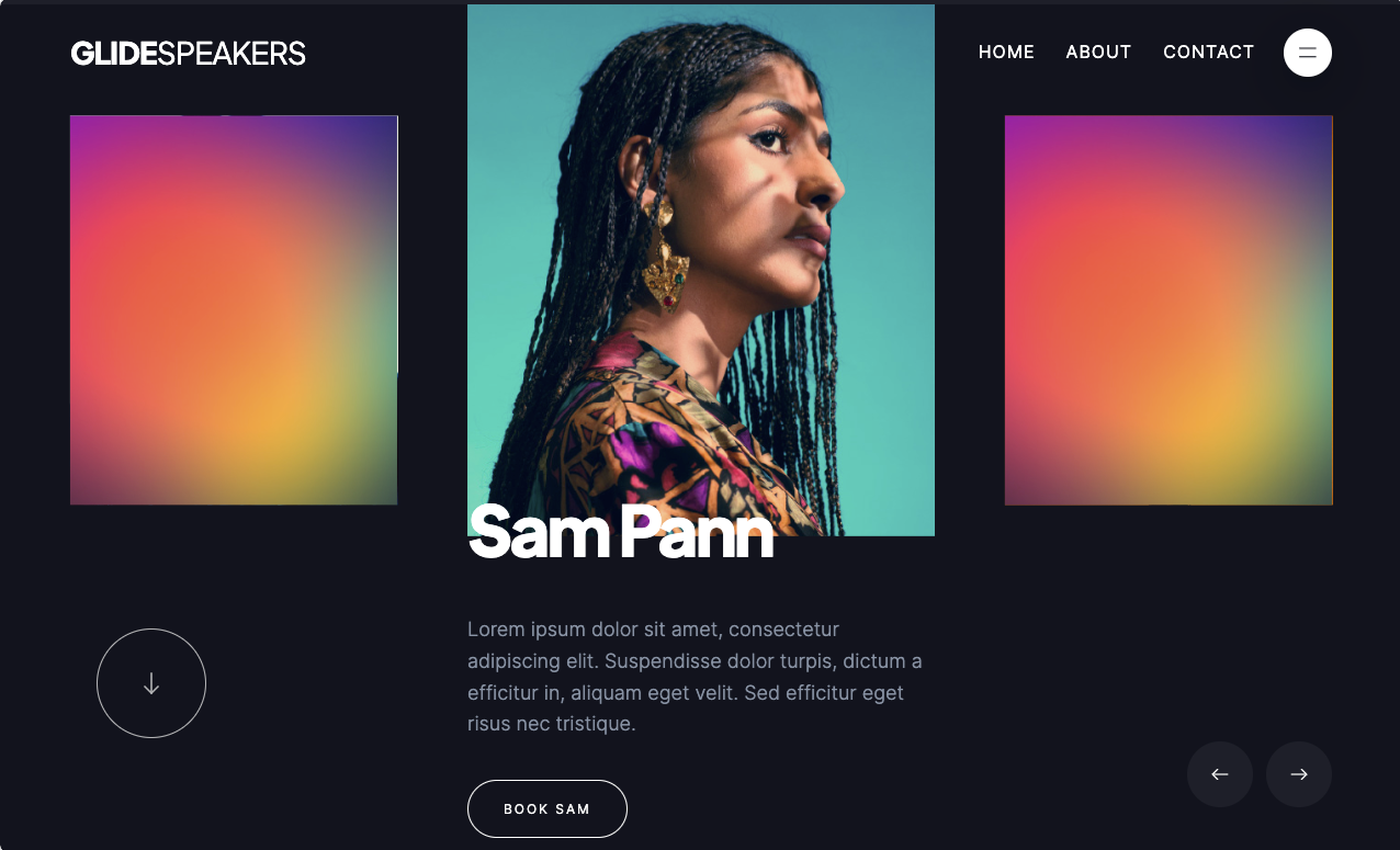
Another cloneable by Ty Hughey, Glidespeaker, is a micro-interactive beaut. From gliding carousels to color and image-changing hovers, navigation animations, web page transitions, and its ever-so-smooth vertical and horizontal scrolling, this cloneable feels elegant, sophisticated, and sexy. The added microinteractions truly enhance the cloneable’s aesthetic and tonality, further cementing that sweet, subtle sleekness into the mind’s eye of site visitors.
6. Pitch’s scrolling transitions

Next, we have Pitch by Bjorn Encuțescu. Through its micro interactive design elements and added visual charms, Pitch evokes a delightful allure. From its use of color-changing page switches to its incorporation of scrolling animations, page transitions, hover effects, and content animations, Pitch uses microinteractions to excite and engage site visitors immediately from the jump.
7. Joseph Berry’s preloader screen and fully-load interactive portfolio

Joseph Berry’s award-winning awwwards cloneable features a simplistic preloader screen animation that sets the site’s tone immediately on load. Upon tapping the animated-on-hover ‘enter’ CTA, the site slides open to reveal a micro interactive haven. No wonder this site’s the winner for CSS innovation.
Joseph’s use of microinteractions enhances the site’s charms, conveys personality, and showcases the designer’s talents and range as an interaction designer. There’s a reason this one’s a winner; do yourself a favor and give it a click-through.
Want some more inspiration? Check out these emerging web design trends for 2024.
Best practices for implementing microinteractions in web design
Effective microinteractions are organized in design and purposeful in their implementation. That said, when incorporating microinteractions into your web and UI/UX design projects, consider these best practices.
Microinteractions should:
- Be clear and purposeful. Focus on a single task every time. Your purpose (and goal) is to enhance, guide, or inform, not overload. Don’t exhaust but enhance the overall composition of your website’s design. Microinteractions are only effective when you incorporate them with deliberate, measured intent.
- Further a digital product’s user experience and functionality. Define your microinteraction design rules and standards to maintain consistency. Make your digital product feel complete and whole. Close that gap by creating familiarity through responsive, purposeful micro-interactions and subtle designs.
- Foster engagement and delight end users. While subtlety is key, microinteractions can be pleasant little moments that enhance and close the gap in the interaction’s design, incorporating delightful design elements and UI.
- Be usable and accessible. Consider people with disabilities when designing these microinteractions. Provide alternative feedback (visual, haptic, sonar, etc.) variations for people regardless of abilities to ensure inclusivity in accessibility.
- Include well-structured information architecture. From top to bottom, document the whole process per microinteraction and detail how and when each builds upon the next. Keep things tidy by deleting any and all unused styles, defective animations, and interactions. These outdated features can negatively impact your site’s performance and overall SEO (more on that below).
- Be thoughtful. Avoid the excessive use of microinteractions, which can negatively impact your website’s performance and SEO. For example, excessive visual noise and a slow page load speed can increase your site’s bounce rate. Conversely, well-placed, thoughtful implementation can increase visitor engagement.
Adhering to these best practices when implementing microinteractions in your web and UX design should ensure an effectively integrated design.
Include microinteractions in your next design with Webflow
Microinteractions are the unsung heroes in our digital designs. They allow you to bring expressive animations to your website experience to inform, engage, and delight your visitors. With Webflow’s powerful visual development platform, you can build complex interactions and animations in a completely visual canvas — without even thinking about the code.
Discover how you can bring your website to life with our free interactions course in Webflow University.
If Webflow is of interest and you'd like more information, please do make contact or take a look in more detail here.
Credit: Original article published here.
