Our view at Stack - Simplify web development with Webflow, reduce costs, and deliver professional results. No-code, responsive, and SEO-friendly. Explore your creative potential!
Designing responsive websites ensures people can enjoy your content, regardless of device.
From smartphones and tablets to laptops and ultra-wide monitors, responsive website design allows websites to adapt fluidly to different screen sizes and resolutions.
Responsive design lets you control how elements move around the screen to deliver visuals as intended. Read on to find responsive web design examples to inspire your own.
8 responsive web design examples
From portfolios to information-packed reports, here are eight websites that provide consistent user experiences across different screen types.
1. ThreeSixtyEight
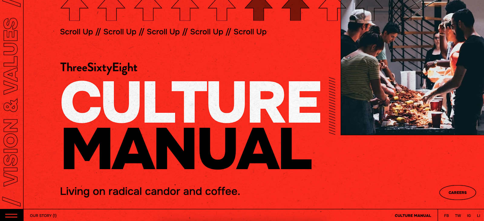
ThreeSixtyEight’s website, created by their design team, features a vibrant red background and bold typography. Based on this visual style and the prominent tagline, “Living on radical candor and coffee,” audiences understand that ThreeSixtyEight is an outspoken brand. And this message appears accurately, regardless of screen size.
On desktop, the content spreads out with ample whitespace, while it becomes more vertical and compact to fit a smartphone’s screen. The tablet layout balances the two, providing a comfortable viewing experience across devices.
The typography also adjusts to all screens for readability. Font sizes and spacing automatically increase or decrease, ensuring text legibility on small and large screens. Meanwhile, scroll indicators and interactive prompts are visible and functional across the board, allowing readers to click with a mouse or tap using a finger. Together, these elements improve the user experience (UX) by helping visitors navigate the site.
2. Plantible Foods
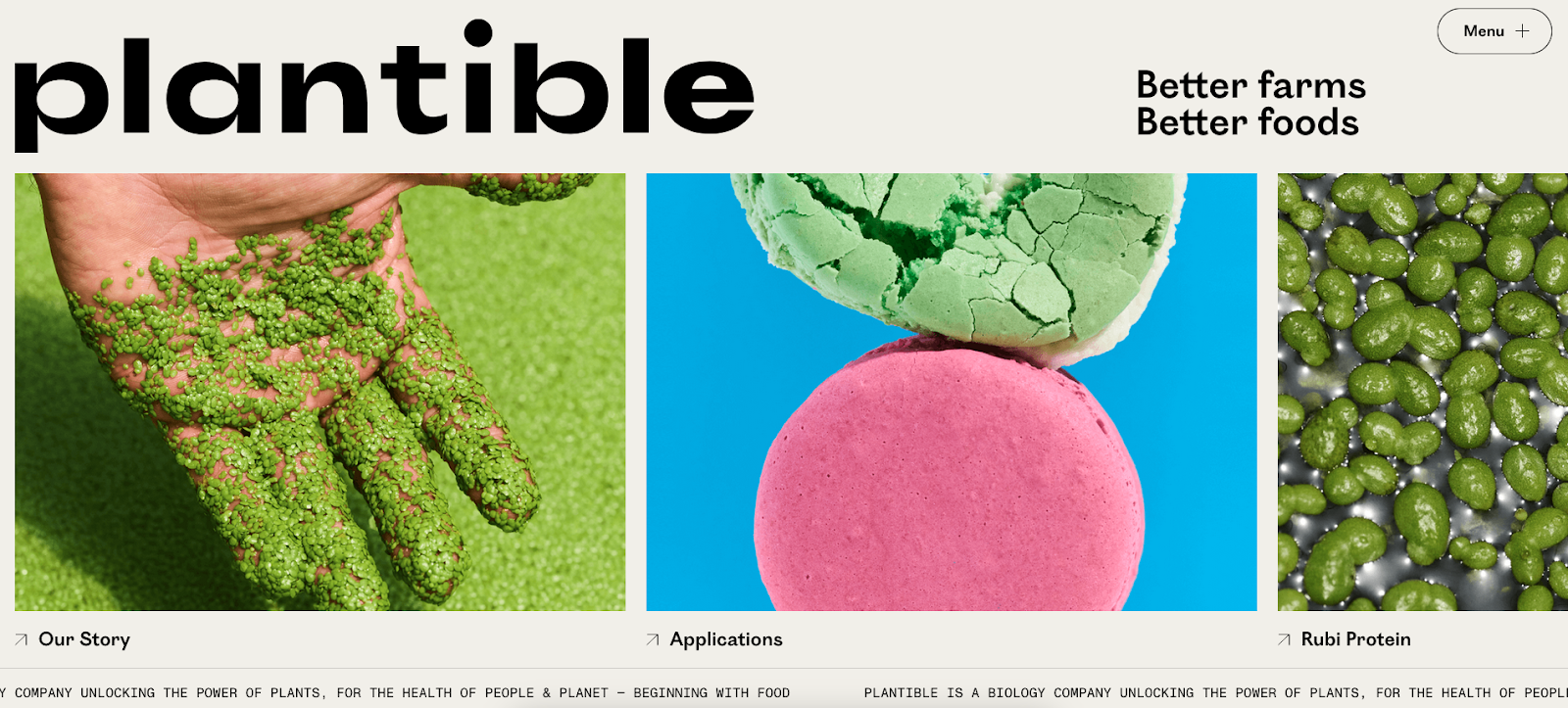
Plantible’s homepage (created by We Met Before) has vibrant images and bold logos across devices, reinforcing brand recognition from the outset. The most crucial sections, like “Our Story” and “Applications,” are prominent in all views. And clear navigation labels ensure key messages remain in focus, encouraging people to explore.
While the visual identity stands out, the site doesn’t sacrifice functionality. The layout adjusts on smaller screens to accommodate the lack of space, with the menu button becoming an expandable hamburger menu on smartphones and tablets. Changes like this make the site more accessible without cluttering the screen.
The website also creates a visual hierarchy that draws attention to critical areas of the page. For example, the scrolling ticker at the bottom of the screen reads, “Plantible is a biology company unlocking the power of plants, for the health of people & planet — beginning with food.” This functional design choice gives viewers more information about the company and its goals, encouraging them to explore the whole page.
3. Fable Homes
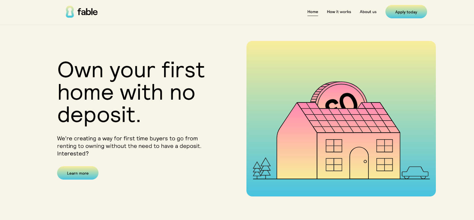
The Fable Homes website, created by Vimalan Vijayasekaran, uses soft pastel colors, two-dimensional visuals, and gradients. These inviting design choices encourage readers to spend more time on the site. To keep visitors engaged, Fable immediately offers a value proposition: “Own your first home with no deposit.”
Action-oriented elements, like the “Learn more” and “Apply today” buttons, appear next to the menu at the top of computer and tablet screens. Placing CTAs at the top of the page catches readers’ attention and encourages them to click.
For smartphones, the menu turns into a collapsible hamburger arrangement to save space without compromising navigation. The phone’s CTA sits in the middle of the screen to make it more noticeable, which boosts interaction.
4. Hello Folk
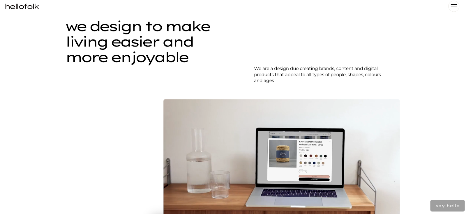
Despite the abundance of text on Hello Folk’s homepage, the agency’s in-house design team created a website with enough whitespace to keep the layout legible and spacious across devices.
Like most other sites on this list, the content has increased spacing between elements on laptops and desktops, with more compactness and verticality to fit smaller screens. The navigation bar also remains a hamburger menu for consistency.
The standout element, however, is the first multimedia that appears on the page: a looping video. Regardless of screen size or device, the video loads quickly, indicating a well-optimized site that doesn’t sacrifice speed or performance.
Ultimate web design
From 101 to advanced, learn how to build sites in Webflow with over 100 lessons — including the basics of HTML and CSS.
Start course
↗
Start course
5. Raca Studio

Raca Studio’’s minimalist design and indigo overlays immediately fit the business’ style guide. Marcin Mikołajczyk created this responsive website with the bold “raca” and “Design Studio” text prominently appearing across devices, ensuring the company conveys their brand identity loud and clear.
Hovering over each case study removes the indigo overlay and reveals the image’s original colors on a desktop browser, while tapping and holding does the same on tablets and smartphones. Some projects have architectural blueprints instead of pictures, showing how Raca Studio’s designs translate to the real world.
Raca uses other interactive elements as well, such as hovering over the hamburger menu icon in the top-right corner to enlarge the button and make it white. Tapping and holding achieves the same effect on touch-enabled devices. These interactions help users understand exactly where they are on the site, improving usability and encouraging exploration.
With consistent color palettes and gestures, Marcin’s responsive design creates an aesthetically pleasing and functional brand portfolio.
6. Z1 Digital Studio
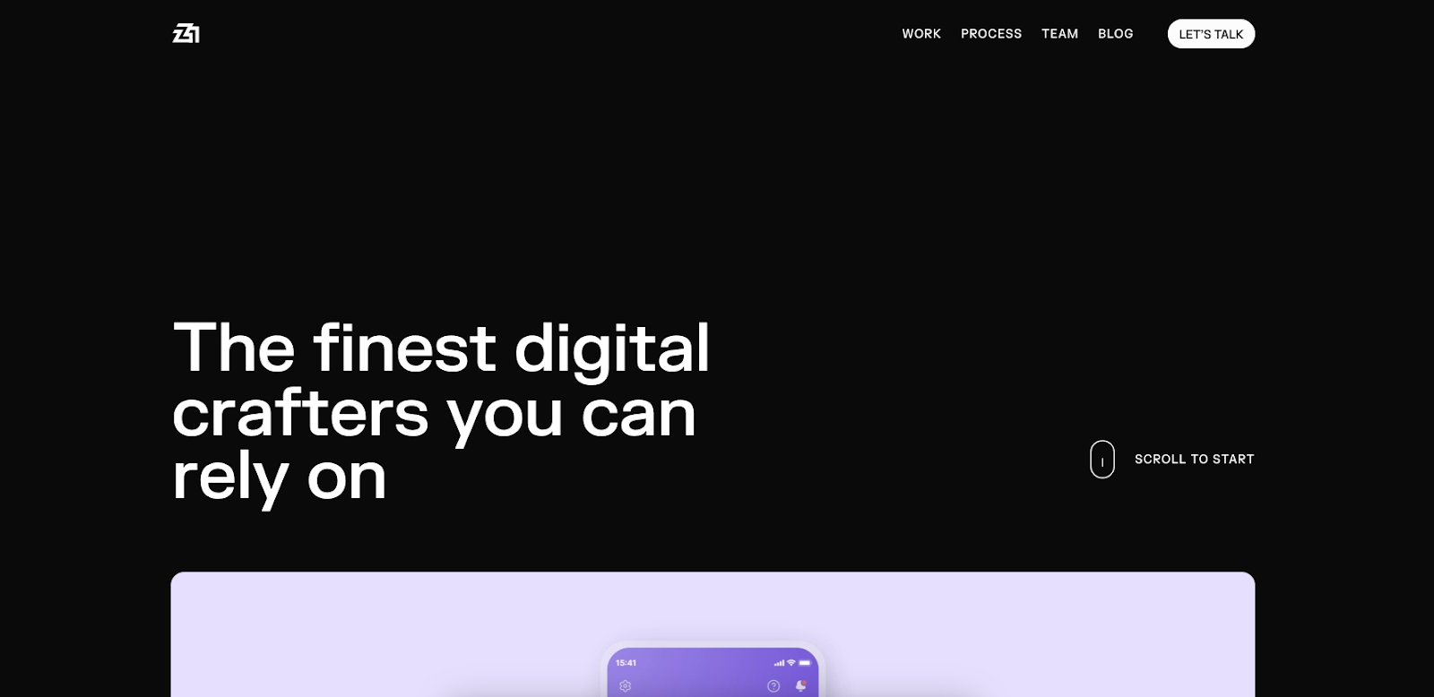
Z1 Digital Studio’s website has a dark theme, bold white typography, and high-contrast visuals. The multimedia behaves the same on all devices: fast-loading and engaging.
As the homepage loads, the text “The best digital studio you can partner with” rearranges itself to become “The finest digital crafters you can rely on.” A video montage of Z1’s prominent clients follows. These well-optimized animations effectively communicate the studio’s messaging and engage viewers.
The “Let’s Talk” call-to-action (CTA) button is part of the navbar on the laptop and desktop versions, and it transforms into a dotted square that moves when interacted with. It expands into the full menu on tablets and smartphones. Moving elements like this and the CTA messaging encourage people to interact with the site.
7. History of Animation
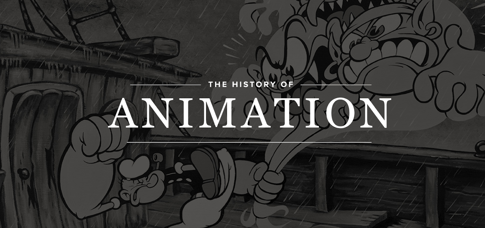
The History of Animation website, designed by Hung Vinh, is a scrollable journey through the decades of animation’s evolution. Classic typography and visuals blend with modern parallax effects to create a three-dimensional perspective, regardless of screen size.
Scrolling reveals a hamburger menu in the top-left corner and social media links in the top right, allowing you to navigate to any page or share the site. The page also encourages you to scroll for more information. When navigation features are consistent across devices, it’s more straightforward for people to use the site, no matter how they access it.
With plenty of negative spacing, Hung uses images, text, and animations across computers and mobiles without congesting the layout. For example, the font size and spacing adjust to ensure users can read the paragraphs on small and large screens.
8. Hello Bello’s State of Parenthood
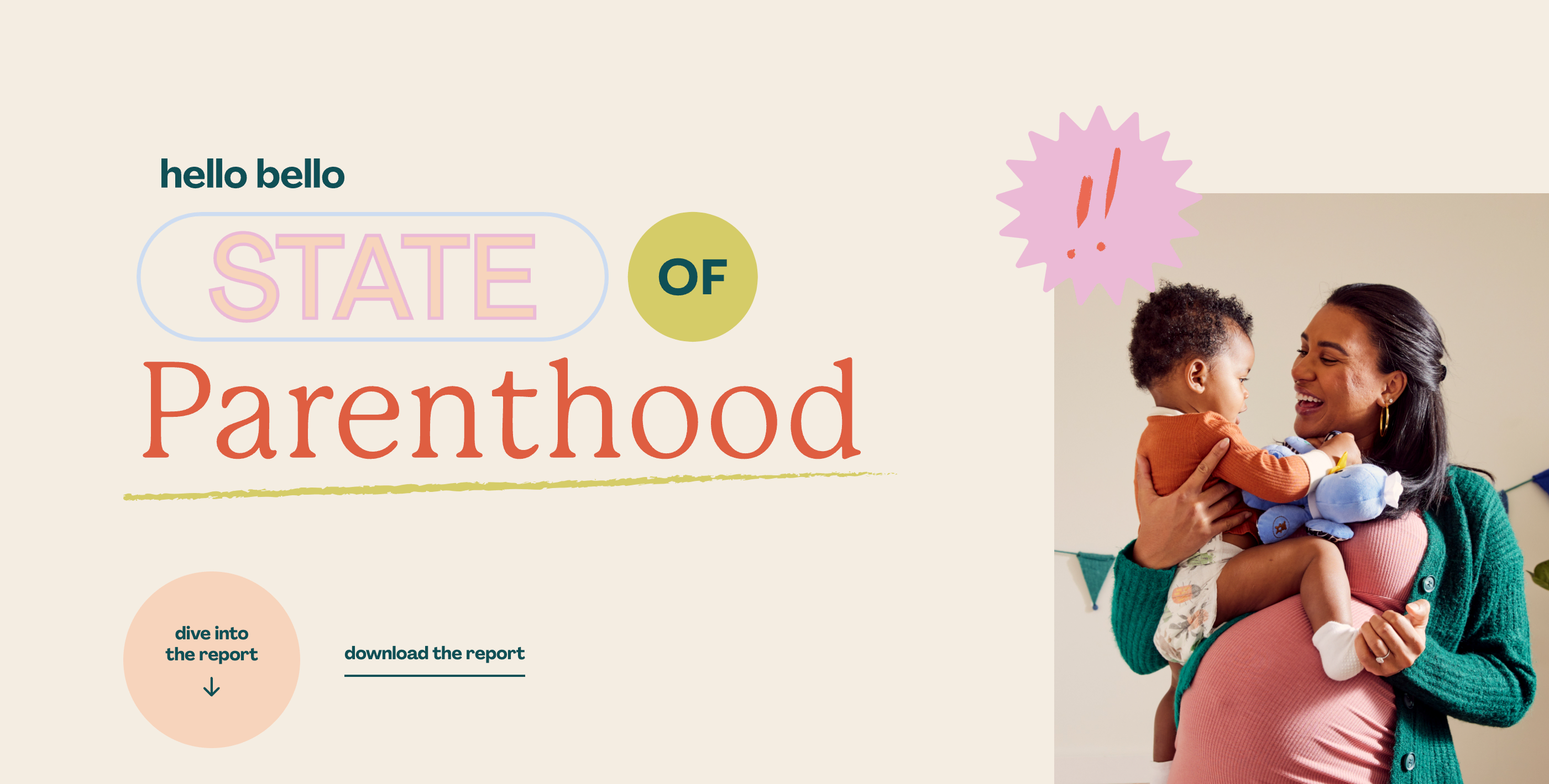
Hello Bello’s State of Parenthood website, created by Brains, highlights challenges for new parents. The creative agency’s brainchild combines a playful, pastel-colored design with versatile typography and line art animations. Each statistic pairs with a visual to make the design engaging and informative across devices.
The landing page banner fills a computer screen and reveals a left-sided panel menu. For smartphones and tablets, the menu adapts to become an expandable “Jump to a Section” bar at the top of the screen for convenient navigation.
Important action-oriented elements, like the “dive into the report” button and “download the report” CTAs, are in the same position across screen sizes. This visibility encourages you to click or tap the report, boosting engagement.
Build responsive web designs with Webflow
Responsive design allows users to interact with your page from the device of their choice, increasing engagement. The designs on this list combine visually pleasing layouts with functionality to create well-rounded, value-adding websites. And designers made them all in Webflow, a visual-first environment for building responsive sites without relying on developers.
Beyond Webflow’s design tools and content management system, you can learn responsive best practices to improve your design thinking. Start creating with Webflow today.
Unleash your creativity on the web
Build completely custom, production-ready websites — or ultra-high-fidelity prototypes — without writing a line of code. Only with Webflow.
Get started for free
↗
Get started for free
Last Updated
August 20, 2024
If Webflow is of interest and you'd like more information, please do make contact or take a look in more detail here.
Credit: Original article published here.
