Our view at Stack - Simplify web development with Webflow, reduce costs, and deliver professional results. No-code, responsive, and SEO-friendly. Explore your creative potential!
It’s hard to believe we’re through those full 31 days, but with a longer month comes even more stunning sites built in Webflow. Last month, Webflow sites trended towards immersive experiences, muted color palettes, and delightful interactions.
We’re always impressed with the caliber of work our community is building and creating month-to-month, and so many really brought their A-game with interactive portfolios, quality video content, and eye-catching, bold typefaces.
Here’s a round up of some of our favorites from March 2024.
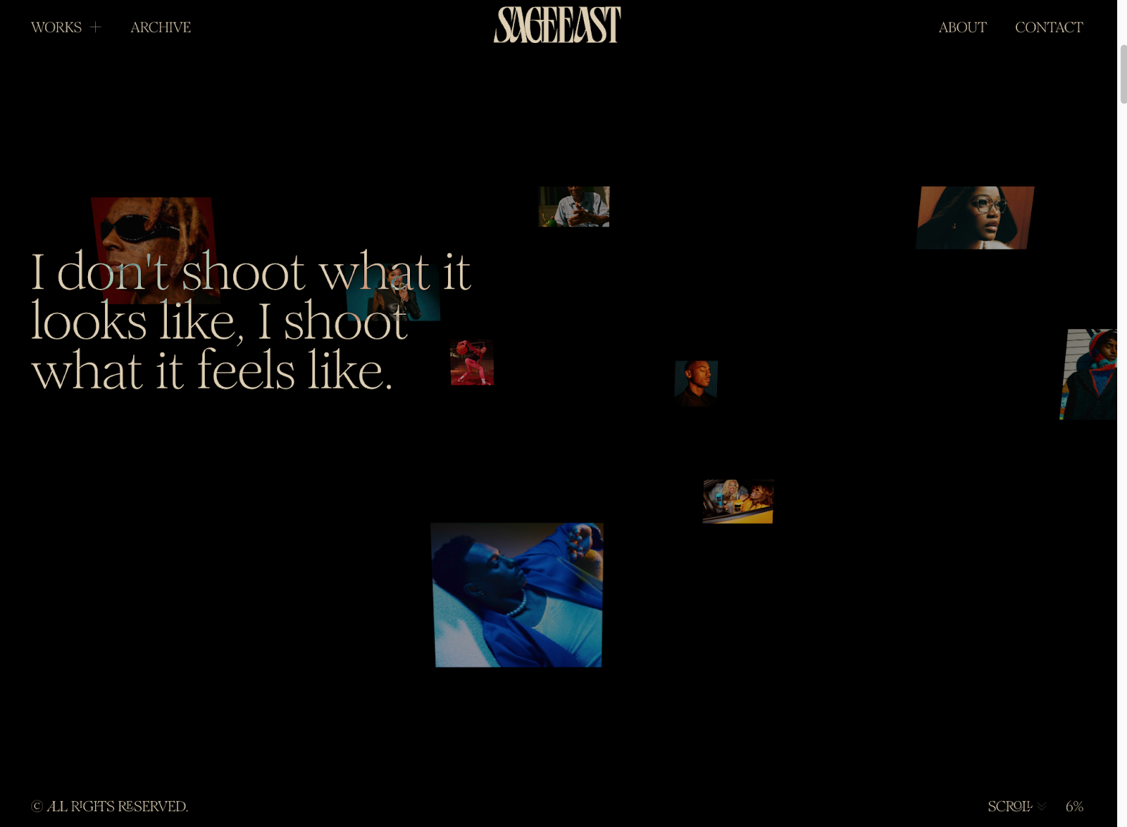
Sage East is a visual storyteller and photographer with a prolific client roster in the advertising and editorial worlds. She specializes in manipulating color and light and bringing emotion into her work, as well as “showing representation on both sides of the camera.”
Her portfolio is an immersive journey, with a stunning scroll animation that takes you through vibrant shots of her photography work on a clean black background. We especially love the scroll tracker in the footer that displays how far down the page you’ve made it.
As you continue to scroll through her work, videos and photography come into closer view against complementary gradients with such slick precision that really draws you into the site. Best of all, Sage offers a list view for users that prefer a full screen experience. For anyone looking for inspiration on how to showcase creative work or examples of clean yet impactful motion graphics, this portfolio site does an excellent job of spotlighting projects while displaying unique creative style and taste.
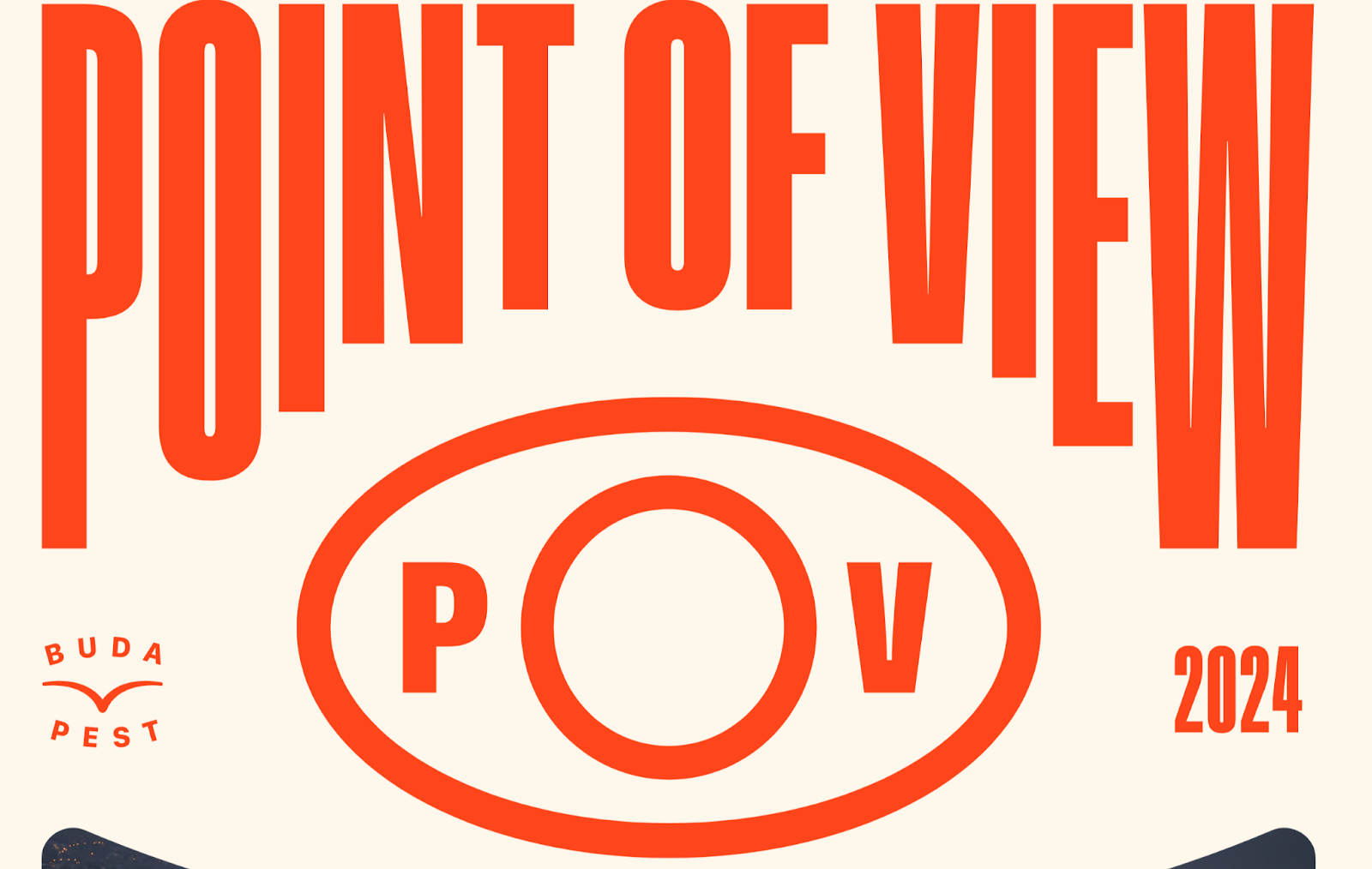
POV Budapest is the brainchild of two of the city’s local design studios who wanted to create a platform to celebrate and connect visual professionals. As Hungary’s first design conference, it aims to “enhance international collaboration, foster inspiration, and boost the local design community’s growth.”
The conference website is a fun, bold, modern take on event marketing. With giant red san serif font, scrolling tickers, and full-bleed imagery, it easily captures your attention — inviting you to scroll further and learn more. We’re big fans of the Lineup page, which takes creative inspiration from festival posters yet offers a classic list view for anyone who prefers a traditional event calendar look.
The micro-interactions and animations hidden across pages provide the type of subtle moments that really show off that this event is for designers and creatives — without going too overboard or compromising accessibility. We love the pop art feel and encourage anyone looking to put a fresh spin on their event site to explore the full site.
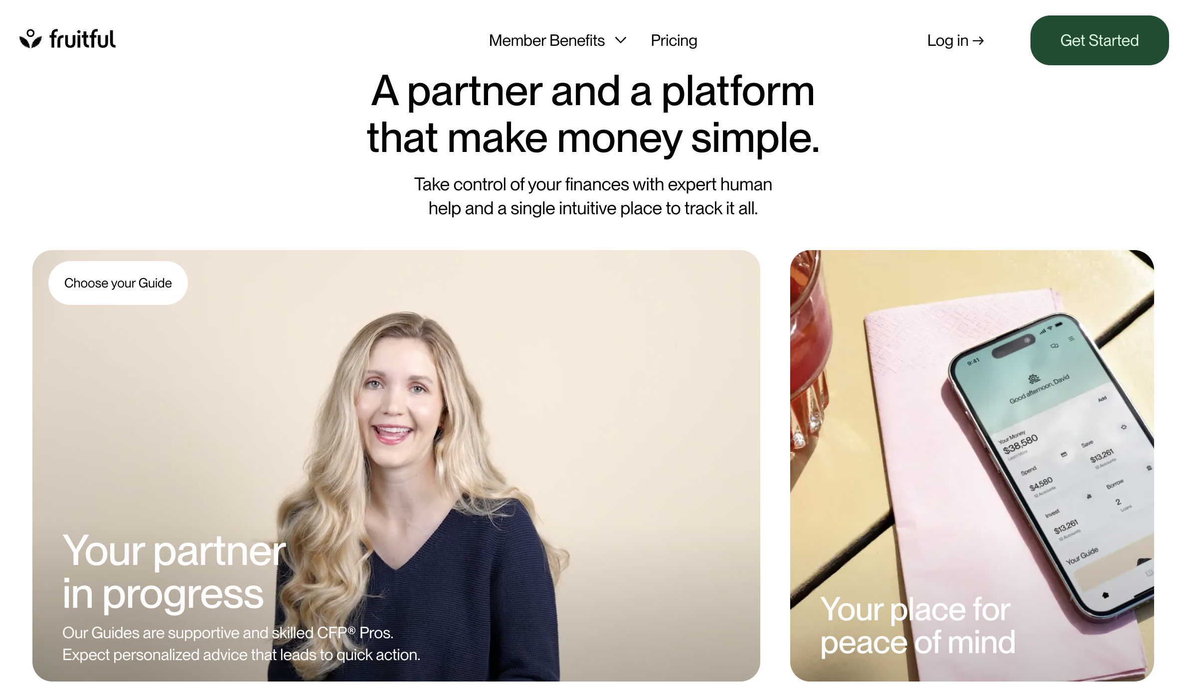
Fruitful is a financial wellness membership that provides users with access to a financial planner, a high-yield savings account, and expert-tailored investment portfolios. The website’s sleek and clean aesthetic feels like an apt representation of the company’s core goal to make money simple.
The homepage hero features a full screen sizzle reel of the Fruitful Guides, centering the business and the services around the real, human aspect of the business. We love the muted color scheme, high-quality videos, and easy-to-follow content. The subtle illustrations woven in alongside portrait photography across the site helps communicate both the human and services sides of the company.
The slick scroll animations are masterful, and the micro-interactions are so delightful you almost forget you’re browsing through a financial services company’s website. Anyone looking for top-tier video testimonial inspiration, examples of smooth multi-page scroll animations, or interactions that create tiny moments of delight should look no further.
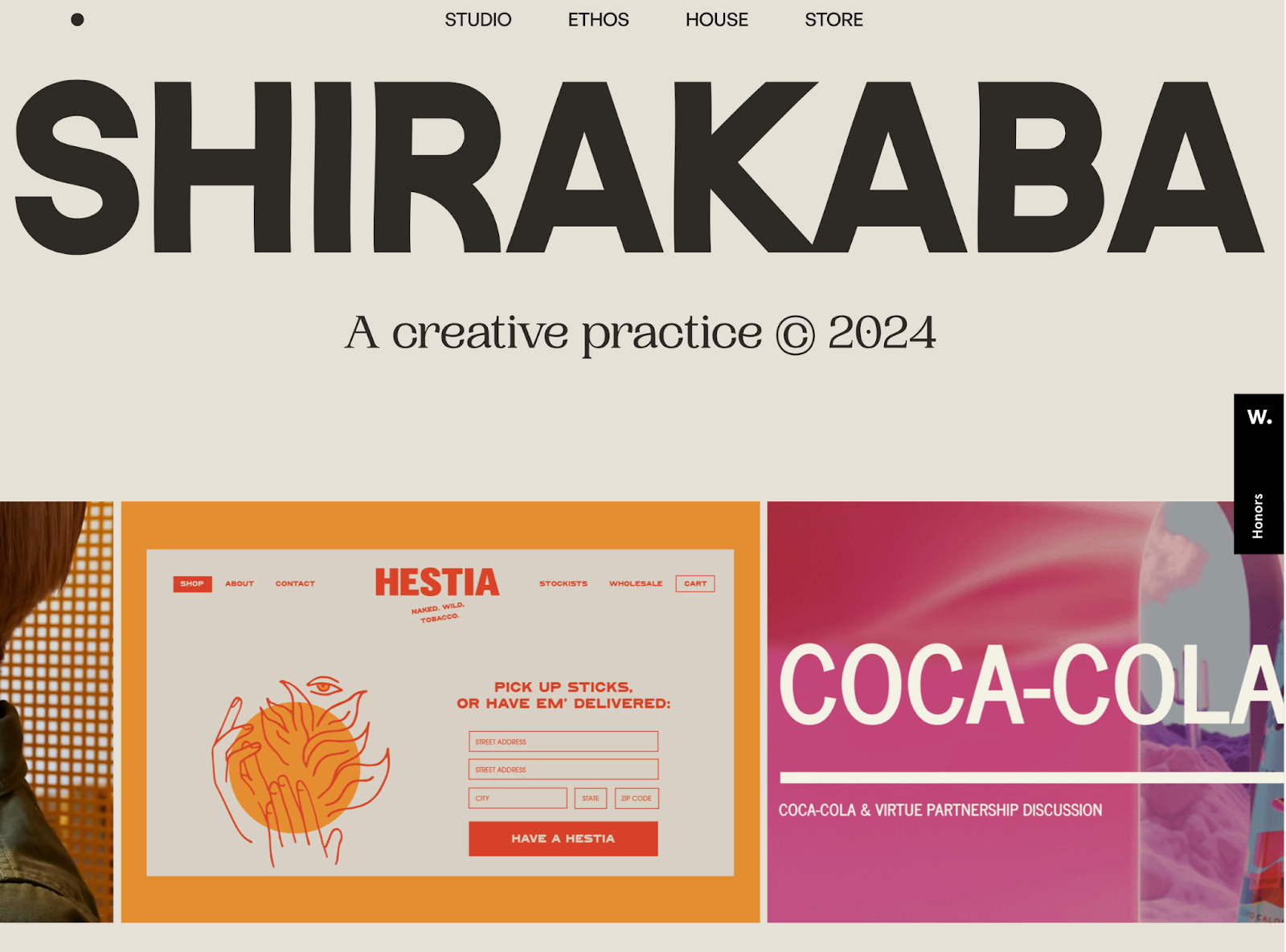
SHIRAKABA STUDIO is the design practice of Sara Ridky & Jimi Filipovski. This two-person team of experienced Creative Directors have a decade under their belt, offering services in web design, brand design, digital product design, social strategy, and more. Clients they’ve worked with range from Adidas and McDonalds to Carhartt, Mongo DB, and Mac Miller.
Their website functions more like a portfolio site, with a homepage that showcases past work in an above-the-fold carousel and below-the-field list. The quality of imagery of past projects makes it easy to understand the caliber of the creative work the team has done, and the way the team fills space on the page is satisfying and not overwhelming.
We love the attention to detail and how they focus on bringing users into their world — from the curated playlists, to the placeholder for your project to be featured on their past work list, to the digital tour of their SHIRAKABA house. And the team perfectly highlights their capitalized business name throughout the site with their use of a modern, capitalized typeface across pages.
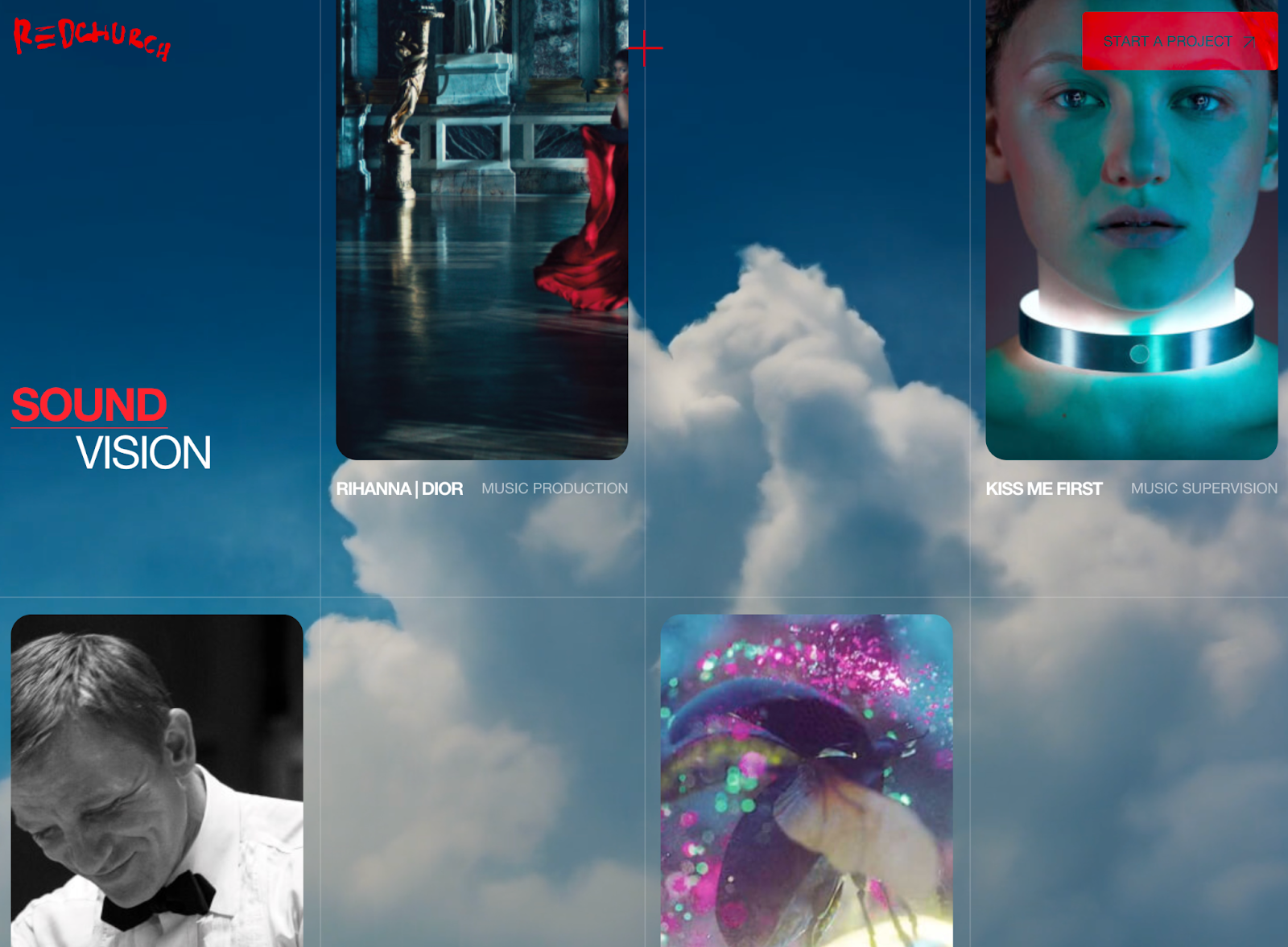
Redchurch is a creative studio that focuses on two key pillars: sound and vision. The London-based studio’s past work includes campaigns with Rihanna for Dior, Scarlett Johansson for Huawei, and projects with IKEA and James Bond.
From the jump, the perfect color treatment on the supercut of past work on the homepage hero gives users a preview of the studio’s high-quality work. We love the black and red color scheme featured throughout this site, the snazzy silver balloon homepage pre-loader, and expert-level scroll animations. The use of 3D animations is jaw-dropping, and while the team really flexes its creative muscles across the website, we love how they pare things back when needed, such as their simple navigation menu that simply jumps to different sections of their single-scroll site page.
We’re big fans of the red-patterned pre-loader between site pages, the use of hover elements, and subtle interactions present throughout this stunning, sleek website. The Redchurch team’s twist on a classic “Contact Us” CTA button — swapped for a “Start a Project” button — is also a reminder of how creative work is an integrated effort, inviting users to begin their journey with them today, rather than simply inquire about services that could be provided to them.
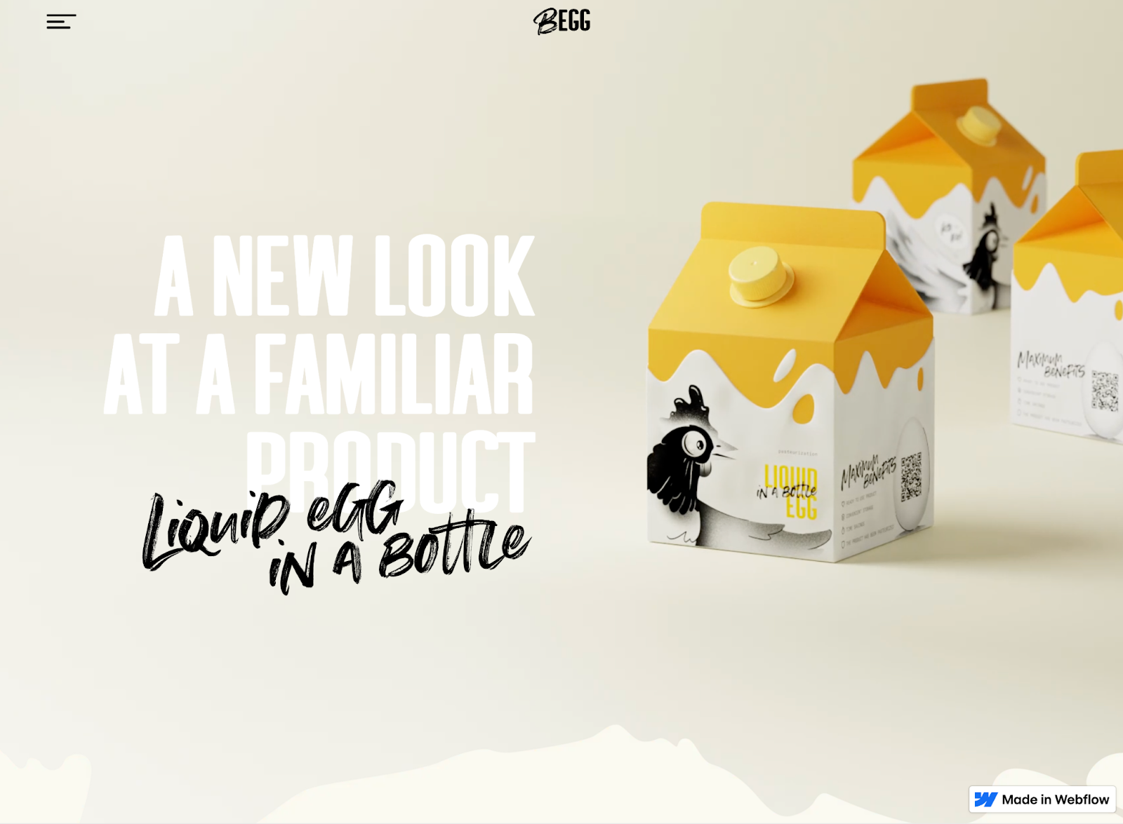
BEGG is an egg product manufacturer, offering both liquid eggs and liquid egg white products from free-range chickens.
The website is a fun visualization of how creative, expert design decisions can amplify any product — even eggs. We love how they’ve brought their packaging design aesthetic to life on the web — through the color scheme, multiple typefaces, and chicken illustrations. The fun interactions around nutritional info is a clever way to communicate essential information in a delightful way.
Our favorite moment on the site is when they use a stencil-like typeface in the recipe section, showcasing a photo of an egg dish within the lettering as you scroll. It’s the small details and subtle animations that really bring this website to life, and similar to how they describe their company as “a modern approach” — this site is the digital manifestation of that description for a farm product website.
Show off your latest project
Whether you’ve been building for a client, your company, or your own special project — we’d love to see what you’ve been working on. Submit your site to Made in Webflow for a chance to be featured on our monthly roundups!
If Webflow is of interest and you'd like more information, please do make contact or take a look in more detail here.
Credit: Original article published here.
