Our view at Stack - Simplify growth with an all-in-one platform. Powerful marketing, sales, and support automation. Integrated CMS. Scalable software. Crafted for customer experience.
Your pricing page is a prime opportunity to take control of the price conversation and make it even easier for people to buy.
Searching for a product’s price is a natural part of a customer’s buying decision. The majority of people who have made it down the funnel far enough to consider buying from you will likely look at your pricing page.
What does a great pricing page look like? To inspire you, we break down the must-haves of a good pricing page and share the best examples of pricing page design. Check them out below.

What makes a great pricing page?
If your pricing page isn’t well-designed and user-friendly, you risk losing people before they click the “Buy Now” button. You’ll notice the best pricing pages have clean layouts, use simple language that speaks to the customer, and aim to inspire trust between the business and the user.
Let’s take a look at the must-have features of a high-performing pricing page.
User-Friendly Layout
The best pricing pages are easy for users to navigate. This doesn’t mean you need to design your pricing page in the same way you would a landing page, which are often pared down for the purpose of getting a form submission.
You can still include plenty of information in your pricing page, but the fonts, colors, links, and buttons must be easy to follow with the eye. Even if you have multiple products and packages — like HubSpot does — it should be clear where users have to click to see the pricing for their desired product.
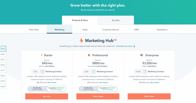
Remember to keep important information above the fold, such as a value proposition and at least one call-to-action button.
Hot tip: Interested in learning more about marketing terms such as “above the fold” and “call-to-action”? Check out our podcast below, and make sure to follow for more useful content.
Simple Language
The pricing page can be a good place to get fancy with jargon, especially if your target customer is an advanced professional in their field. But for at least one package, consider keeping the information accessible and jargon-free — so that someone who’s not an expert in the field can tell which package would work best for their team.
You can toy with this rule depending on the package, too. For instance, on HubSpot’s pricing page, the starter package for Marketing Hub uses extremely simple language. “Forms,” “email marketing,” and “live chat” are easy to understand. Non-marketers will immediately know what they would get out of a starter subscription.
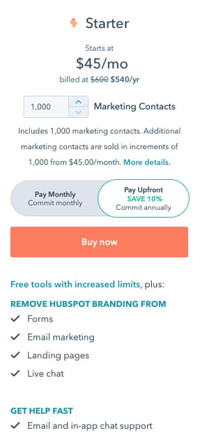
For the professional package, however, the story is different. “ABM tools and automation,” “A/B testing,” and “Omni-channel marketing automation” are highly specialized terms that only the most experienced marketers will understand.
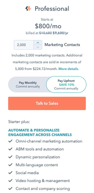
Your language will differentiate your packages and make it clear to a user which one they should choose.
Crystal Clear Pricing
The best pricing pages have clear packages that accommodate a wide variety of company sizes and budgets. Or, if you serve primarily enterprise firms, you’ll make it clear through your language that you only serve that segment. Instead of including pricing, for instance, you might instead include a “Talk to sales” button so that enterprise buyers can get a quote.
Consider including both monthly and yearly subscription terms, especially if you sell a SaaS product. If you’d like to acquire customers abroad, give users the ability to see pricing in their local currency, too. These small changes will ensure that there are no barriers to conversion. Remember to A/B test your pricing to find out what works best for your customers.
Ready to look at some of the best pricing pages online? We’ve curated the best ones below.
Pricing Page Examples
1. HubSpot
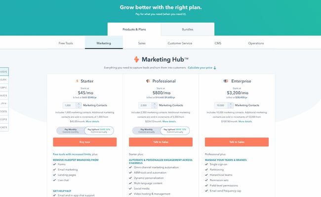
The HubSpot CRM platform is comprised of five products: Marketing Hub, Sales Hub, Service Hub, Content Hub, and Operations Hub. The pricing page, however, keeps it simple by offering each one individually, giving users a chance to choose the one that most applies to their needs. If users are interested in a bundle, they can toggle the tab at the top to get bundle pricing.
Note the differences in call-to-action buttons, too. Everyone can get immediately started with a Starter subscription through the self-service “Buy now” button. But if you’re interested in a more advanced suite, the page prompts users to “Talk to sales” instead.
This is an excellent example to copy if you sell multiple products within one suite, and especially if you serve a wide range of customers, starting from freelancers all the way to enterprise companies. The calls-to-action should be different for each one.
2. Box
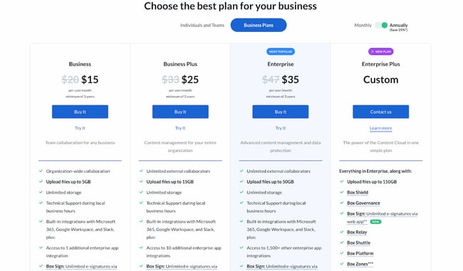
Box’s pricing page is informative, intuitive, and actionable — starting with the heading right at the top of the page, which prompts users to “choose the best plan” for their business. One thing they did really well was allowing users to choose their buyer persona by offering two call-to-action buttons at the top: “Individuals and Teams” and “Business Plans.” This makes the user experience far simpler. After all, if you’re thinking about buying Box for your business, there’s really no reason you’d need to see the personal pricing plans (and vice versa).
Another thing they do well is highlight the most cost-effective option on the page — not only by labeling it “Most Popular,” but also by designing that option to pop out. That’s a great way to generate more click-throughs on that package.
3. Zendesk
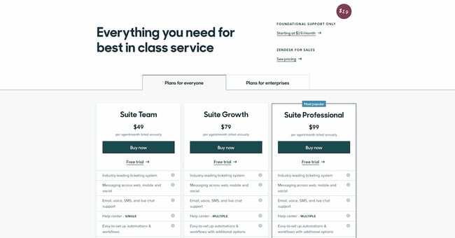
The first thing you see when you arrive at Zendesk’s pricing page is the header text: “Everything you need for best in class service.” Pricing pages can sometimes make users a little uncomfortable, and it’s reassuring copy like this that builds trust between a business and its prospects.
We love that the pricing page is divided among several sections: “Plans for everyone,” “Plans for enterprises,” and “Frequently asked questions, answered.” Providing a lot of information like this on your pricing page is really helpful for your users, but it can be hard to do it in a way that doesn’t confuse people or create clutter on the webpage. Dividing the information into clearly marked tabs and sections is a great way to make the information manageable for your users.
Finally, if you scroll down a little on Zendesk’s pricing page, you can find a prompt to see the plans compared. We love how they show the full list of features and what you get with each plan — all without the user navigating away from the page. This sort of transparency help your salespeople sell the right product to the right customers, which ultimately helps satisfy customers long-term and reduce churn.
4. Detectify
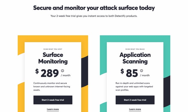
Detectify’s pricing page design is a little out of the ordinary, but it makes for a really cool user experience. Users can choose between two simple options, depending on their use case. Users can either buy a security subscription for websites they’re hosting, or for applications they’re building. This works really well for a single product with a price that only changes depending on what you’re using it for.
Plus, we’re suckers for simple calls-to-action. Both of the buttons prompt the user to start a free trial, making it simple for visitors to understand what they need to do.
5. Wistia
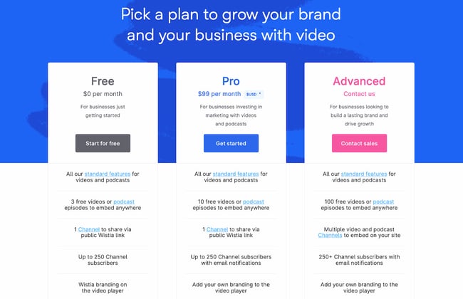
Like any page on your website, design is just as important as the information you provide. Wistia has one of the most visually pleasing pricing pages we’ve seen thanks to a nice, clean, and colorful layout, and whimsical lines that align with their playful brand.
They also use language that makes it easy for visitors to find a pricing plan that suits their needs. Under each option, they provide a short description of the ideal customer for that option. For example, the Pro version is “For businesses investing in marketing with videos and podcasts.”
Finally, we love that the amount of videos you can create is included in the feature comparison. Why? Because it clearly states the value of each subscription; there’s no guessing. Wistia successfully speaks their customers’ language.
6. Casper
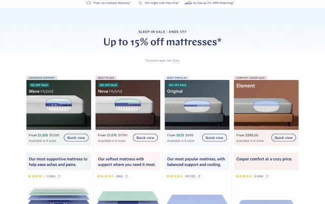
Thanks to minimal copy and great use of negative space (i.e. the blank space surrounding objects in design), this page is both well-designed and easy to follow. But what we really love on this page is their well-worded refund policy: “After you buy your mattress online, we’ll ship it for free. If you’re not in love, we have a 100-night trial. We’ll pick it up and give you a full refund after the 30-Night Adjustment Period. “
The fact that the company will go to a dissatisfied customer’s house and pick up the mattress for no charge, along with giving a full refund, is a great testimonial to their dedication to customer service. This serves as a way to build trust with prospects before they even buy, and is sure to help create advocates down the road.
If you have a refund policy, be sure to include it on the pricing page to reassure users who may be on the fence about buying.
7. Squarespace
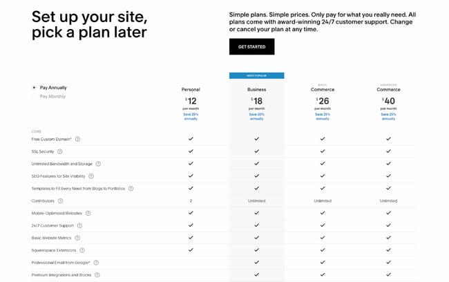
Like Zendesk, Squarespace employs strong header copy: “Set up your site, pick a plan later.” Right away, they’re reassuring users that they don’t have to pay just to try it out; visitors can immediately try the platform by clicking the “Get Started” button.
We also love that they include frequently asked questions right on the same page as the pricing matrix. That way, users can get many of their questions answered without having to dig for answers.
8. Ticketleap
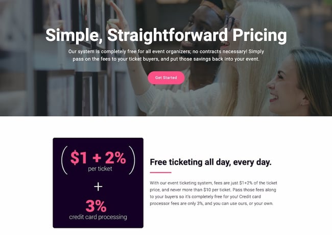
Here’s another take on header copy from Ticketleap that captures users’ attention right away. When you arrive at their pricing page, the first thing you see are the words “Simple, Straightforward Pricing.” This phrasing aims to make users feel like Tickleap is on their side — they won’t get secretly up-charged once they sign up on the platform.
Later down the page, users can calculate how much they would pay for Ticketleap and get the simple pricing they were promised at the top of the page.
9. Slack
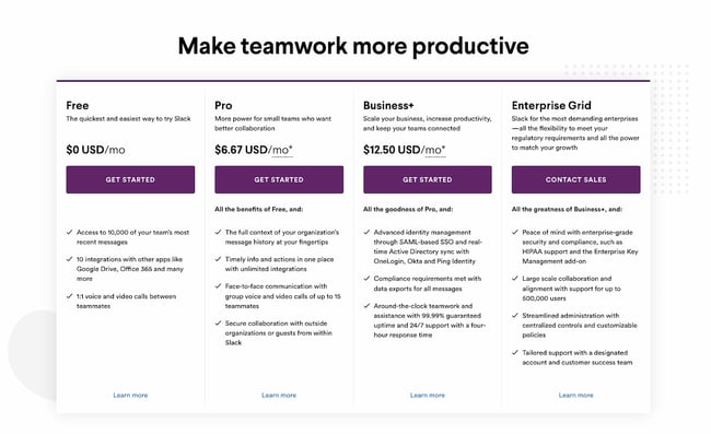
Slack’s pricing page is another example of great page design. The pricing options are within a simple, easy-to-scan table that is pleasing to the eye, and their feature comparison is easy to skim. Notice that their Enterprise Grid subscription prompts users to “Contact Sales.” This is a great way to prompt high-caliber customers to get an account manager and work out a custom solution.
Finally, although the header copy is simple, it effortlessly conveys Slack’s value proposition. The app will help your company “make teamwork more productive” — and more productive teams result in an increased ROI.
10. BombBomb
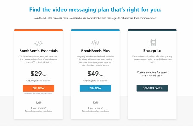
The folks at BombBomb took a different approach than most. The very first thing you see when you land on their pricing page is a large header saying “Find the video messaging plan that’s right for you,” along with a simple three-column chart on the packages that are available. Only when you scroll down do you see the individual features for each subscription.
This is a great example of a business designing its pricing page based on specific goals. If your goal is to keep it simple while increasing sign-ups, this is one way to help your cause. Take note of the reassuring subheader copy, too: “Join the 50,000+ business professionals who use BombBomb video messages to rehumanize their communication.” From that, you know that others have benefited from using this product, too.
11. Pagevamp
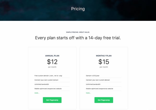
Trust elements are great additions to any pricing page. Pagevamp took the cue and placed their trial policy right at the beginning of the page, which says that “Every plan starts off with a 14-day free trial.” Copy like this might prime a user to look at the price packages and think to themselves, Hey, if I don’t like the product, I don’t have to commit.
While no one wants their customers to churn, you increase the value of your product by providing a free trial. If you force customers to sign a yearly contract without a trial, you’re essentially saying, “I know you’ll want out, so I’m locking you in for a year.” That’s a poor policy that might generate short-term revenue but create unhappy customers and poor word-of-mouth down the line.
12. Acquia
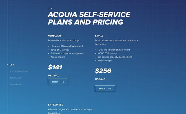
The simpler your business’ pricing page, the better user experience you’ll offer — but this gets harder the more complex your product and pricing model. Acquia is one such company, but they do a great job in this example. When you land on the page, you don’t see the product’s pricing. Instead, you get information on choosing the right self-service option for you.
You also have the option to contact Acquia directly and get an agent to help you pick the right product. This is important if you offer a complex product that might stump professionals who don’t specialize in your field.
As you scroll down, you can then see pricing depending on the region where you’re located. For each one, you get two options: a “Personal” self-service option or “Small” self-service option. Enterprise businesses also have the ability to get in contact with the sales team. This makes it easy to select a package depending on your background and buyer persona; again, there’s no need to guess.
The Right Pricing Page Design Will Boost Conversions
Take your time building your pricing page — it’s one of the most important factors in a customer’s buying decision. Test it repeatedly, change elements and colors, and keep the design user-friendly and clean. In no time, your company will see more leads come in through the pricing page, increasing conversions and boosting your revenue.
Editor’s note: This post was originally published in December 2015 and has been updated for comprehensiveness.
![]()
If Hubspot is of interest and you'd like more information, please do make contact or take a look in more detail here.
Credit: Original article published here.
